Tag Archives: windows

What to do if SkyDrive disappears from Windows 8.1 Explorer?

Here is the scenario. You are working away in Windows 8.1 and want to save a document to SkyDrive. You look for the SkyDrive link in Windows Explorer but it is not there.

image

Don’t panic; your documents are most likely fine and you can get to them in the web browser via http://skydrive.live.com

Still, that is inconvenient. How can you restore the Explorer link, other than by rebooting and hoping it reappears?

The solution is to open a command prompt (press Start button and type command) and then type:

%systemdrive%\windows\system32\skydrive.exe

and press Enter. You don’t need to run the command prompt with administrator rights.

All going well, SkyDrive will reappear:

image

What if it doesn’t? Now you have to check the logs or event viewer and look for specific errors. But the simple technique described first has always worked for me.

First thoughts on Surface 2

After a day or two with Surface 2 and the Touch 2 keyboard, a few thoughts.

image

First, I am typing this on my desktop PC. I would have used the Surface 2, as I like to match the tool to the review, but no Live Writer on Surface (my favoured blog authoring tool) and no, Word is not as good for this.

That neatly demonstrates the app issue on Windows RT; but despite that I expect to use Surface 2 frequently in the coming months. It is an excellent tablet, with its chief advantages over the older Surface being performance and Windows 8.1, which includes Outlook.

Performance on Surface 2 is around 4 times faster for graphics – see previous post – and more than twice as fast in general.

The touch keyboard, now with backlighting, is also much improved.

I know I am in a minority here, but to me the Windows RT concept makes good sense. A locked-down version of Windows that is almost legacy-free, though it is still Windows and capable of throwing up mystifying dialogs and hiding settings in strange places.

It seems to me that if there is any hope for the Windows 8 app ecosystem, then it will be driven by tablets like this one, and Nokia’s new Lumia 2520 which also runs Windows RT. Desktop users are mostly ignoring the app platform. There are a few signs of life, like the new Facebook app, and things like Xbox Music are now decent. MediaMonkey, which I like for its Flac support, runs nicely on Surface 2.

Isn’t an iPad Air better? In some ways for sure. Usability, performance, size and weight, and rich app availability are all in the iPad’s favour, and price is similar. The reason you might get a Surface though is for Office, USB 3.0, HDMI out, SD card, and the clever keyboard cover. I also like having more than one app to view, whether that is Word and Excel on the desktop, or Word and Caculator, or the split view that works in the new app world.

I’ve hit a few snags with Surface 2. Sound is less good than on Surface RT, tending to be thin and reedy, unless you use headphones or external speakers. The Touch 2 keyboard sometimes stops responding, which I hope is a driver issue (perhaps the update downloaded this morning will fix it).

I also suspect that build quality on Surface 2 falls short of Surface RT. It is still “Vapor Mg” but I already have a slight dent in the bezel on mine whereas on my old RT it is still perfect and I wonder if it is thinner.

The extra price for the 64GB vs 32GB SSD is absurd. Why not make them all 64GB and increase the price by a fraction?

Is Microsoft serious about selling Surface 2? There does not seem to be much stock around, and it is not yet listed on Amazon.co.uk, although it has been on sale since yesterday.

Those that do discover it will like it, provided they understand the difference between Windows RT and Windows x86, something which – bizarrely – Microsoft still seems keen to disguise.

Upgrading Hyper-V Server 2012 to 2012 R2: minor hassles

I have a couple of servers running Hyper-V Server, the free version of Microsoft’s hypervisor.

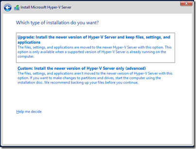
Hyper-V Server R2 is now available with some nice improvements. I tried an in-place upgrade. You do this by running setup from within a running instance of the server. This did not work when going from 2008 to 2012, but I am glad to report that it does work for 2012 to 2012 R2:

image

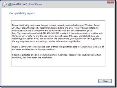
You will need to make sure that all the VMs are shut down before you run the upgrade. Otherwise you get a message and the upgrade fails:

image

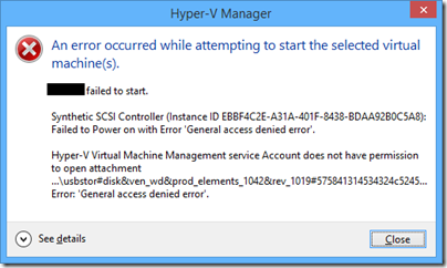
In my case the upgrade was smooth and not too lengthy. However I was warned that because I use a pass-through drive in one VM, that this might cause a problem. It did, and the VM failed to start after the upgrade:

image

The fix was trivial: remove the pass-through drive and then add it back. After that the VM started.

Then I hit another problem. Although my VMs had started, they had no network connectivity, even after I upgraded the integration components. These VMs run Server 2008 R2, in case that makes a difference (I doubt it). The virtual switch still showed in Hyper-V settings but no traffic passed through to the VMs.

I tried two solutions. Removing the NIC from the VM and re-adding it made no difference (and this is also a poor solution since you then have to reconfigure the NIC in the VM). However deleting the virtual switch and replacing it with a new one of the same name and configuration was successful. The virtual NICs then have to be reconnected to the new virtual switch, but this is painless.

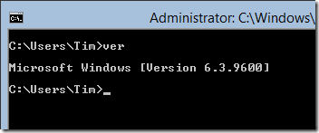
The UI for the new version looks exactly the same as before. However the Windows version number has changed from 6.2.9200 to 6.3.9600, so you can verify that the OS really was upgraded:

image

Is it better to avoid in-place upgrades? A clean upgrade is safer, if you do not mind exporting and re-importing the VMs, or moving them all to another host, before the upgrade. On the other hand, with the upgrade cycle now faster than before, in-place upgrade makes sense as a way of keeping pace with little pain.

Review: Surface Touch Cover 2

Windows tablets present a design challenge because they include desktop applications which are designed for keyboard and mouse, rather than touch – not least Microsoft Office, which for some of us accounts for a significant proportion of the time spent using the device. So far there has been consensus therefore that Windows tablets need some easy way of using a keyboard and mouse or trackpad. How to achieve this without losing the benefits of a tablet  is not easy. Bluetooth is one solution, but means three devices rather than one in your bag. Screens that twist over to form tablets are another, but the devices tend to be heavy and the twisting action inconvenient. Detachable keyboard/trackpads are the favoured solution, but leave you the problem of a loose keyboard to look after once you have detached it. If it stays always attached, perhaps you should have bought a laptop.

Microsoft’s Surface tablet has the most elegant solution I have seen. When it was launched a year ago, it included two optional keyboard covers. The Type cover is a thin keyboard with real clacky keys.  The touch keyboard is almost flat, though the keys are slightly raised. You can detach them, but they fold back behind the device, automatically disabling the keys, at which point they are unobtrusive.

Many people liked the idea of the touch keyboard, but found typing frustrating with more errors than they normally make. For this reason, the Type keyboard is more popular among Surface users. It is possible that more Touch keyboards were sold, since they are slightly cheaper and more often bundled with the device, but in actual use I see more Type keyboards.

That is a shame, because the Touch keyboard is design-wise a better solution. It adds very little bulk to the Surface, and when folded back under the device for tablet use, it feels perfectly natural, whereas the Type keyboard feels odd because of the keys that are then on the underside.

When Microsoft announced the Touch Cover 2, it said that by adding more sensors (14 times as many apparently) and more intelligence to the cover and its drivers, it had improved the typing accuracy. As a Surface user I was excited to try the Touch Cover 2 and see if it lives up to these claims. If it does, I will happily ditch the Type cover.

image

The Touch Cover 2 is the same price as before, £99 in the UK or $120 in the US. It is compatible with every Surface, including the original Surface RT. It is also fractionally thinner, 2.5mm as opposed to 3mm. Third, it is now backlit, which makes a big difference on those odd occasions when you are typing in dim light, such as on an aircraft when the cabin lights are dim.

Looking at old and new side by side though, you would be forgiven for thinking not much has changed – the new one is the lower of the two, and note that my original is a US layout and the new one UK:

image

Here are a few more points of detail:

  • The new keyboard has function key labelling F1-F12. As is now common, the default is the non-Fn meaning, and you have to press Fn first to get the function key. The old keyboard also has an Fn key, but you have to work out which top key to press. The right Alt key is now labelled Alt Gr.
  • The purpose of two of the special keys has changed. The new keyboard no longer has volume keys, though it does have a volume mute. In their place are two keys controlling the brightness of the backlight.
  • The design of the trackpad has changed slightly. On the old touch cover, the left and right “buttons” are on the edge of the keyboard outside the etched area that represents the trackpad. On the new cover, these buttons are within the etched area, which means that the trackpad seems slightly bigger, but in reality is not.
  • The underside of the touch cover used to have a fabric finish. On Touch Cover 2 it is now smooth plastic. This is one detail where I prefer the older cover, though maybe it helps to get it that 0.5mm thinner.

The following picture shows the backs of the old and new keyboard covers side by side, with the new one on the left:

image


Touch cover 2 in use

Now for what really matters. How is the Touch Cover 2 in use?

My first thought was to try a speed test. I went along to this online test and tried it several times with the old touch cover, then with the new one. The results favoured the new cover, perhaps by around 20%, though how you evaluate it depends on the weighting you give to errors versus speed.

Then I sat down to write this review. This is where my opinion of the new Touch Cover began to swing in its favour. I find real-world typing on the Touch Cover 2 substantially more pleasant than with the earlier version. Measuring words per minute does not fully represent the improved experience. Of course this is a personal thing and your experience may vary.

The backlighting is low key (ha!) but improves usability. The way this works is that the white lettering on the keys is illuminated so it stands out more.

image

Note that if you think it is not working, you probably just need to increase the brightness using the special keys.

Is it as good as a real keyboard, or even a Type Cover? I doubt it ever will be, especially if you are someone who does not look at the keyboard while you type. The problem is that the slight etching round the keys makes it harder for your fingers to know where they are, though typing with audible key clicks helps.

Another factor is that if you are not at a desk, the lightness and thinness of the touch cover counts against it, since it flexes slightly on your lap.

That said, with practice you can get good speed and accuracy. As a cover, it is so much more elegant than the Type Cover that overall I might just prefer it, even though I still rate the Type Cover slightly better for typing.

One caveat though: I used the Touch Cover 2 with both Surface RT and Surface Pro, and had an annoying problem. If I stay typing in one app everything is fine, but if I switch apps than sometimes the keyboard stops responding. Oddly, opening Device Manager and pressing the up and down arrows a few times seems to fix it. Perhaps my Touch Cover 2 is faulty, but I suspect a driver issue, which means hope for a fix soon. I will be trying it soon with a Surface 2 and will be interested to see if the problem remains.

The keyboard also seems to mark easily. I have only had it for a day, but can already see slight fading of the black finish on the keys I type most often.

Mobility always involves compromise. If you want the very best keyboard for typing, it won’t be a touch cover. In fact, for best productivity I prefer a high quality Bluetooth or USB keyboard to either of the Type or Touch covers.

That does not detract from what Microsoft’s engineers have achieved with the Touch Cover 2. Flip it back, and you have a tablet; flip it forward, and you protect your screen; place it on a desk and you have a productive typing machine.

Glitch aside, I recommend the Touch Cover 2 as a good option with a new Surface and a worthwhile upgrade from the first Touch cover.

7 types of Windows 8 users and non-users

When I was in Seattle earlier this month I visited the Microsoft Store in Bellevue. I nearly bought a Nokia Lumia 1020, but also observed an enthusiastic salesperson showing off Surface 2 (a pre-launch demo unit) to an older customer. She watched patiently while he showed how it handled pictures, SkyDrive, Office, Email, Facebook and more. At the end she said. “I don’t need any of that. Show me your cheapest laptop.”

image

Yes, it’s tough for Microsoft. The incident got me thinking about computer users today and whether or not they are in the market for Windows 8 (or the forthcoming Windows 8.1).

Here is a light-hearted at some categories of users. And yes, I think I have met all of them. For those that are saying no, what would change their minds?

1. The Apple fan.

Switched to Mac from Windows XP around 2007. Has Mac, iPhone, iPad. So much easier, no anti-virus nags, boots quicker, less annoying, always works smoothly. Occasionally runs a Windows app on Parallels but nothing non-nuclear would persuade them to switch back.

Buying Windows 8? No.

2. The Enterprise admin.

In latter stages of migration from Windows XP to Windows 7. Still a few XP machines running awkward apps or run by awkward people. Last holdouts should be gone by year end. Job done, won’t even think about another migration for 3-5 years. Next focus is on BYOD (Bring your own device); will be mostly iPhones and iPads with the occasional Android or Windows 8 tablet.

Buying Windows 8? Mostly no.

3. The older Windows user

Son thinks a Mac would be better, but Windows works fine, is well understood, and does all that is needed. No desire to upgrade but when PC conks out will look for the most familiar looking machine at a good price. Would prefer Windows 7 but may be forced into Windows 8 if those are the only machines on offer.

Buying Windows 8? Maybe reluctantly.

4. The PC guy

This is the guy who understands PCs back to front. Never saw the point of Macs, overpriced, fewer apps, and little different in functionality. First thing to do with a new PC is either spend 3 hours removing all the crapware, or reinstall Windows from scratch. The Windows 8 user interface took some adjustment at first but fine with it now, likes the slightly better performance, and even uses a few Metro apps on the Surface Pro tablet.

Buying Windows 8? Yes, best Windows yet.

5. The tablet family

Used to update the family PC every few years, but mum got an iPad, son got an Android tablet, then dad went Android too, and now they spend so much time doing email, games, web browsing, YouTube, Facebook and BBC iPlayer on the tablets that the PC gets little use. It’s still handy for household accounts but it won’t be replaced unless it breaks.

Buying Windows 8? Not soon, and maybe not ever.

6. The tried it once never again person

It was embarrassing. Used Windows for years, then a friend brought over a Windows 8 laptop. Clicked on desktop, but with no Start button how do you run anything? Clicked around, right-clicked, pressed ESC, pressed Ctrl-Alt-Del, but nothing doing. Friend was laughing. Now the sight of Windows 8 evokes a chill shudder. Never, just never.

Buying Windows 8? No way.

7. The “Make it like 7” person

Windows 8? No problem, it’s just like 7 really. Installed Start8, got the Start menu back, set it to boot to desktop, set file associations for PDF and images to desktop apps, and never sees the Metro environment.

Buying Windows 8? Kind-of, but will never run a Metro app.

Usability: Microsoft’s big weakness

The iPhone, or maybe the iPod, was the beginning of the era of usability. Make something nice to use, reasoned Apple, and users will come flocking.

After the iPhone came the iPad; and then Android which while lacking the polish of iOS, mostly has the same characteristics of appliance rather than computer in its user interface.

What about Microsoft? It has learned to some extent. Windows Phone is a user-friendly operating system. The touch interface in Windows 8, although a shock to existing Windows users, shows obvious effort towards usability and sometimes succeeds. Navigating the weather app, for example, is a pleasure.

There are times though when Microsoft seems to have learned nothing. Take the new SkyDrive integration in Windows 8.1 for example. It is foundational in Microsoft’s effort to wrest Windows into being a cloud-centric operating system, where you could lose your device, buy a new one, log in, and find all your stuff. I’ve posted about its progress here.

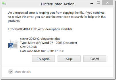
But then you are on a train, say, with a poor internet connection, and you double-click a file in SkyDrive that has not been downloaded to your PC. This is the dialog you see (at least, it is the one I just saw):

image

There is so much wrong with this dialog that I don’t know where to start. But I will have a go.

First, I doubt the error is really unexpected. If my internet connection is poor, problems downloading stuff from SkyDrive are expected, not unexpected. You would think that the client could figure out, “It looks like I have a poor connection to SkyDrive” and inform the user accordingly.

Second, the error number. The dialog invites me to search for help using this number; however to do so I would have to copy it manually as it is unselectable. The number of course is in hexadecimal, so there is a high chance of copying an O instead of a zero as the difference is not obvious other than to programmers. Nor is it clear where I should search. Should I bang the number into Bing and hope for the best? Such searches can be fruitful, but they can also go badly wrong when you hit sites that tell you to download their utility to clean your registry, or some such nonsense.

Third, there is space for a human-understandable description of the error, but it is says “No error description available”. Lazy programming somewhere. Maybe in a code base the size of Windows it is too much to expect helpful messages for every error but this is not something users should normally see.

Fourth, there are three choices: Try Again, Skip and Cancel. Bearing in mind that I double-clicked only one document, what is the difference between Skip and Cancel?

Fifth, there is a More details button but it is disabled. Why, if no more details are available, does this More details button appear at all? Though I’d suggest that Error 0x80040A41 is a great candidate for “More details” rather than being something non-technical users are expected to make sense of.

What should happen? First, SkyDrive and/or its client should work better. This is a critical feature; but users are complaining (yes, I found this by searching for the error code) and it seems that problems persist in Windows 8.1 RTM. Microsoft has been working on file sync for decades, yet upstarts like Dropbox work more smoothly.

Second, when bad things happen, I am all in favour of plain English. I don’t see any reason ever to confront users with error numbers in hex. Put it in a technical details option by all means. In this particular case, why not something like, “Windows is having problems downloading from SkyDrive. You may have a poor internet connection; please try again later, and if the problem persists, contact support.”

Getting this right is not easy; but for as long as ordinary users see this kind of dialog in day to day use of Windows, the flight to iPad and Android will continue.

Update: the error fixed itself when I found a better connection

Windows 8.1 and cloud-centric computing

If your iPad breaks or gets stolen, it’s bad but not that bad. The chances are that there is no data on the iPad that is not copied elsewhere, especially if you let Apple’s iCloud do its default thing and copy everything you create. Get a new iPad, sign in, and you can carry on where you left off; the apps are there, the data is there too, even if you do not actually have a backup of the device itself.

Google’s Chromebook goes even further in this direction. When you sign into the device you sign into Google and all your data is there.

This kind of freedom from worry about losing apps or data stored on the device seems to be Microsoft’s goal with Windows as well, though it is more difficult because historically applications have complex local installs, sometimes protected by activation tied to the PC itself, and data is stored locally in your user folders – Documents, Pictures, Music and so on – or in some cases elsewhere, depending on how well behaved the application is. In order to defend against data loss if the PC is lost or damaged, you have to keep regular backups, or make a conscious effort not to store data locally.

Windows 8.1 includes a significant change. It is optional, but the default is that documents save to SkyDrive (note that the name will change soon) by default.

image

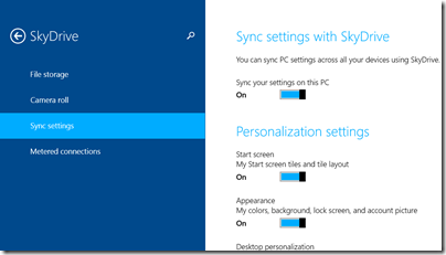
This is in addition to synchronisation of settings, passwords and application data. Again, SkyDrive is where this data gets stored. You can see and control what is synchronised in Charms – PC Settings – SkyDrive -  Sync Settings:

image

The list is extensive and includes web browser favourites (provided you use Internet Explorer) and “settings and purchases” within apps. Note that apps in this context means new-style Windows Store apps, not desktop applications. Separately, there is a Camera Roll setting that syncs images and optionally videos from the Camera Roll folder in your  Pictures folder.

How close then is Window 8.1 to a cloud-centric experience, where you could thrown your machine in the bin, buy another one, sign in and carry on where you left off?

It is getting there, but in practice there are plenty of snags and oddities. The big one is desktop apps, of course, which do not participate in this synchronisation other than via SkyDrive if you save documents there. You will have to reinstall the applications as well as reconfigure them. That said, certain desktop applications now have a subscription model. Two big examples are Microsoft Office, if you buy via an Office 365 subscription, and Adobe’s Creative Cloud which includes Photoshop, Dreamweaver, Audition and so on. Using cloud-aware applications such as these helps, but it is not seamless. For example, in Office 2013 I have to reconfigure the Quick Access Toolbar and copy my custom templates manually to a new machine.

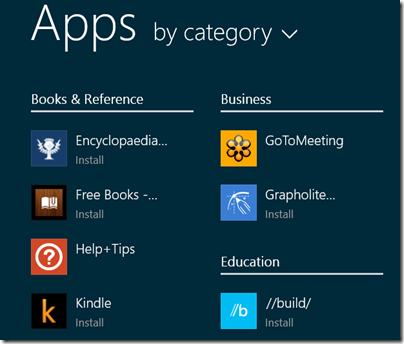
New-style apps do roam to a new machine and you can now use them on up to 81 different machines, which should be enough for anyone. Note though that your apps, which are listed when you sign into a new machine with a Microsoft account , are not actually installed until you run them for the first time. Not a problem is you are on the internet, but worth knowing before you catch that flight. In the following example, only two of the apps are actually installed:

image

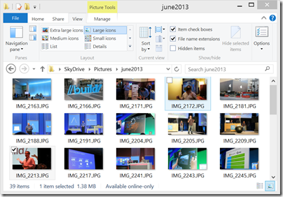
Microsoft takes a similar approach with SkyDrive documents. The feature called SkyDrive “smart files”, described here, means that documents are by default only available online. I can see this catching people out, especially with pictures, for which a thumbnail shows even when the actual picture has not yet been downloaded. Here are some pictures I took at Microsoft Build in June; they are on SkyDrive but although they look as if they are on my PC a message in the status bar says “Available online only.”

image

A nice feature in terms of seamlessly connecting to cloud storage without filling your local hard drive (or often, small SSD drive), provided you understand it. Of course, you can mark a file or folder to be available offline if you choose, in which case it is downloaded.

Some things are confusing. If you have a domain-joined machine then passwords do not sync, which makes sense for security, but also raises the question of what all this consumer SkyDrive stuff is doing on a domain-joined machine anyway? Of course there are other ways of doing something similar in domain environments:

  • Settings determined by Group Policy
  • Default document location set to corporate shared folder
  • Roaming profiles

The odd thing though is that you can link a Microsoft account (SkyDrive, App Store account) to a domain account and you then end up with a mixture of consumer and corporate features which work in different ways. It would be tempting simply to block the use of Microsoft accounts completely – which you can do with group policy – especially if you are concerned about sensitive corporate documents arriving on consumer cloud services and mobile devices through the magic of sync.

It is also confusing that Office 365 users cannot use SharePoint in Office 365 to sync settings.

I also feel that the user interface in Windows 8.1 needs some work in this area. Here are some things I find odd:

Applications like Paint and Notepad use a principle of “default to where you last saved.” This means that even if you set SkyDrive as the default document location, if you save once to the documents or pictures folder on the PC, it will default to that local destination next time you use it.

Since both SkyDrive and the local PC have a folder called Documents, it would be easy not to notice.

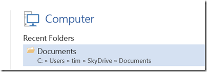
Office 2013 is even more confusing. I have Office 365, so when I hit save in Word I get offered Office 365 SharePoint, SkyDrive, “Other web locations” which includes an on-premise SharePoint, and Computer. Oddly, if I hit Computer, the default location is SkyDrive:

image 

Much of this confusion is a legacy problem as Microsoft attempts to transition Windows to become a cloud-centric OS, but it could be better done. I would suggest clear naming to help users know whether a save location is local or cloud. Most of all, I would like to see consistency between consumer and corporate deployments so that a domain-joined PC can have the same options that work in the same way, except that data is stored to a corporate location.

Microsoft completes Windows 8.1, it says, but developers are unable to test their apps

Microsoft has released Windows 8.1 to its hardware partners according to VP Antoine Leblond; but developers will be unable to test whether or not their apps work on the updated operating system until it is also in the hands of users:

While our partners are preparing these exciting new devices we will continue to work closely with them as we put the finishing touches on Windows 8.1 to ensure a quality experience at general availability on October 18th. This is the date when Windows 8.1 will be broadly available for commercial customers with or without volume licensing agreements, our broad partner ecosystem, subscribers to MSDN and TechNet, as well as consumers.

One reason for subscribing to MSDN is to get early access to new versions of Windows for test and development, so this is a surprising and disappointing move.

We pay thousands for MSDN access so we can test our software/apps properly, early testing, before GA, is an important part of that process! We don’t care about a couple of bugs in your OS, we about bug in our software. Most of us actually want to support Windows 8.1, a lot of us want to get apps ready for the awesome 8.1 features, but we can’t properly do that unless we get the RTM bits before the public gets the Windows 8.1 update!

says one comment to Leblond’s post.

It is hard to make sense of Microsoft’s reasoning here, though Microsoft’s Brandon LeBlanc comments that despite the RTM (Release to Manufacturing), Windows 8.1 is not altogether finished:

We are continuing to put the finishing touches on Windows 8.1 to ensure a quality experience at general availability

he says.

Windows 8 needs more high quality apps in order to win users over to its new tablet-friendly user interface, so it is unfortunate that Microsoft is not doing more to help developers support it.

On Steve Ballmer and Microsoft’s future

The announcement that Microsoft CEO Steve Ballmer will retire “within the next 12 months” prompts some quick reflections on Ballmer and the state of his company.

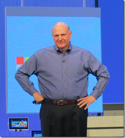
Ballmer suffers from lack of charisma on stage, and this combined with missteps like failing to compete effectively in mobile devices, nearly buying Yahoo at a ludicrous price, the Kin debacle, making far too many Surface RT devices, and the poor reception overall for Windows 8, means that Ballmer’s time as CEO may be judged harshly.

image

Many commentators seemingly forget that Microsoft’s financial results under Ballmer have been generally excellent. Further, if we blame Ballmer for the various blunders that occurred during his time as CEO, we should also credit him for the successes, like Windows 7, the steady improvements in Windows server, and the market success of Xbox versus Sony PlayStation (though not forgetting the red ring of death nor the numerous loss-making quarters for entertainment and devices).

Nor would it be correct to portray the Ballmer years as conservative turn-the-handle profit making from Windows and Office. Under Ballmer, Microsoft is transitioning towards the cloud with Office 365 and Windows Azure (with considerable success), and he was willing to take bold steps with both Windows (“reimagined” in Windows 8) and Office (moving towards a subscription model).

It is worth noting too that by all accounts Microsoft is not an easy company to direct. From my perception, its overly bureaucratic and somewhat dysfunctional management style was allowed to develop under former CEO Bill Gates, and while you can blame Ballmer for failing to fix it, the last reshuffle shows his effort to pull the company towards a more collaborative and efficient way of working:

We are rallying behind a single strategy as one company — not a collection of divisional strategies. Although we will deliver multiple devices and services to execute and monetize the strategy, the single core strategy will drive us to set shared goals for everything we do. We will see our product line holistically, not as a set of islands. We will allocate resources and build devices and services that provide compelling, integrated experiences across the many screens in our lives, with maximum return to shareholders. All parts of the company will share and contribute to the success of core offerings, like Windows, Windows Phone, Xbox, Surface, Office 365 and our EA offer, Bing, Skype, Dynamics, Azure and our servers.

What should the new CEO, and Ballmer in his final months, do now? I will refer to you to this interview with Scott Guthrie about what happened when he was reshuffled, along with several other Microsoft execs, to take on Windows Azure. Just to remind you, Azure was not a success when first launched, being both difficult to use and poorly presented by Microsoft.

We did an app building exercise about a year ago, my second or third week in the job, where we took all the 65 top leaders in the organisation and we went to a hotel and spent all day building on Azure," said Guthrie. "We split up everyone into teams, bought a credit card for each team, and we said: ‘You need to sign up for a new account on Azure and build an app today. It was an eye-opening experience. About a third of the people weren’t able to actually sign up successfully, which was kind of embarrassing. We had billing problems, the SMS channel didn’t always work, the documentation was hard, it was hard to install stuff.

“We used that [experience] to catalyze and said: ‘OK, how do we turn this into an awesome experience?’ We came up with a plan in about four to five weeks and then executed.”

Azure was based on decent technology, but prior to the changes Guthrie describes, it was a relatively hostile platform for developers. Put another way, it was not so much the strategy that was wrong, as the way it was executed.

I recall similar comments from the former Windows chief Steven Sinofsky about how Windows 7 was designed, based on what users found annoying in Windows Vista.

Something I see frequently at Microsoft is good ideas poorly executed or spoilt by errors of detail, and Ballmer could have done more to insist on higher standards. Recently I have been working with Office 365, and while the underlying platform is strong, working with it can be infuriating. It needs Guthrie’s approach: get people to try the product, watch what goes wrong, and fix it.

Microsoft’s devices and services strategy makes a lot of sense but the company needs more attention to detail to make it work.

Lenovo’s bundled Start menu: more OEM trouble for Microsoft

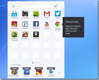
Lenovo and SweetLabs announced a deal yesterday whereby the Pokki app store and Start menu replacement will be pre-installed on Windows PCs.

This has been widely interpreted as a response to user dissatisfaction with the Windows 8 Start screen, which replaces with the hierarchical Windows 7 Start menu with a full-screen tiled view of application shortcuts. The press release, though, focuses more on the app store element:

Apps are dynamically recommended in the Pokki Start menu, app store, and game arcade to users by SweetLabs’ real-time app recommendation system, which matches the right apps with the right users. This system has already served one billion app recommendations this year, and the addition of Lenovo substantially extends the reach of this distribution opportunity for app developers looking to be promoted on brand new Windows 8 devices.

image

In other words, this is not just an app launcher but also a form of adware or if you prefer a third-party app store; the apps it installs will not be Windows Store apps running in the tablet-friendly Windows 8 environment, but desktop apps.

Microsoft could benefit I suppose if users concerned about missing the Start menu buy Windows 8, but in every other respect this is a retrograde step. Users who do want a Start menu would be better off with something like Start8 which will not nag them to install apps, which makes you wonder if Lenovo’s motivation is more to do with a lucrative deal than with pleasing its users. Microsoft’s strategy of building momentum for its own Windows 8 app store and platform will be undermined by this third-party effort.

Once again this illustrates how the relationship between Microsoft and its OEM partners can work to the detriment of both. The poor out of the box experience with Windows has been one of the factors driving users to the Mac or iPad over the years, and this is in large part due to trialware bundled by partner vendors.

Windows 8 is a special case, and there is no doubting the difficulty long-term Windows users have in getting used to the new Start screen. The new Start button in Windows 8.1 will help orient new users, but Microsoft is not backing away from Live Tiles or the Start screen. Lenovo’s efforts will make it harder for users to adjust, since they would be better off learning how to use Windows 8 as designed, rather than relying on a third-party utility.

Microsoft has Surface of course, which despite huge writedowns is well made and elegant, though too expensive; and this has not pleased the OEMs who previously had Windows to themselves.

It all makes you wonder if the famous gun-wielding cartoon of Microsoft’s organization chart should now be redrawn with the guns pointing between Microsoft and its hardware partners. After all, Windows Phone might also have gone better if the likes of Samsung and HTC had not been so focused on Android.