Tag Archives: windows 8

Windows 8 compatibility issues: speech input, secure Flash drives

Two items I have reviewed recently over on the gadget blog have given me pause for thought concerning Windows 8 compatibility. This is good in my experience when it comes to desktop applications, but sometimes that is not enough.

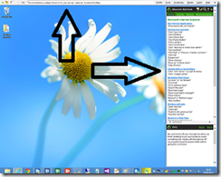
The first was Dragon NaturallySpeaking 12, Nuance’s excellent voice recognition system. It works fine on Windows 8, on the desktop that is. Dragon works by intercepting voice input across the whole of Windows. When it runs, it puts a bar across the top of your desktop and a sidebar with helpful tips and shortcuts.

image

Dragon appears not to work at all in the Windows 8 “Modern UI”. Whatever hooks it has in place to accept input and control mouse and keyboard do not apply outside the desktop environment.

Microsoft says Windows 8 is great for accessibility and ran a sessions at last year’s BUILD conference on developing accessible apps. Here is one on assistive technologies for Windows 8. However on my quick look I did not see much on speech input. Assuming though that Microsoft has worked out a way of making this happen in the Modern UI, it is obvious that Nuance will have some work to do adapting Dragon. Neither the bar across the top, nor the sidebar will work in the “immersive” Modern UI which is mostly full-screen apps.

The second product was a Kingston secure USB Flash Drive. This thing works by means of a utility that you have to run, which lets you enter a password to unlock the encrypted drive. The utility is a desktop app, so will not work as-is on Windows RT (ARM) devices, on which you cannot install desktop applications. Kingston could create a Modern UI app, but I am not sure how easy it would be to have an app that unlocked an encrypted drive to make it available across the whole of Windows. Let’s assume though that Microsoft has made provision for this scenario in Windows 8. Kingston still has work to do adapting its firmware.

Just to be clear, both these items work perfectly in the Windows 8 desktop environment on Intel.

I have asked Nuance and Kingston for comment.
Developing for the Windows Runtime: a few more notes from the field

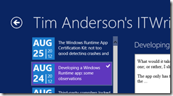
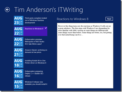
I have been poking around in the code for my Windows Runtime ITWriting.com reader, which is based on this MSDN sample. The list of posts looks like this:

image

Not bad, but that block showing the date of each post is based on Windows Team Blog page, which is nothing to do with me. What would it take to modify the design?

The problem with sample code is that when you copy and paste you do not really know how the code works, and sometimes issues are hidden. The MSDN article, while it does a good job explaining most parts of the app, does not explain how the date block is put together. A few observations then from my efforts to modify this.

Most of the code for this date block is in the ResourceDictionary element in App.xaml, which means it can easily be reused on multiple pages. The code is a ControlTemplate element, which means it defines a custom control. This is then referenced within a DataTemplate element on the pages where it appears. The DataTemplate defines how the bound data appears in the list.

Reading a block of XAML and trying to visualise how it will render is not much easier than viewing a photo in a binary editor. However, you cannot view App.xaml in a visual designer, since it is not a visual page. The only solution I could think of was to copy the ControlTemplate out of App.xaml into a page where I could see the design, tweaking it, and then copying it back.

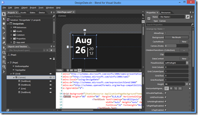
I started a new project in Blend, and copied the Canvas code from the DateBlockTemplate, and replaced the data bound values with hard-coded examples. So far so good: I could now tweak the design.

image

My design skills are rubbish so I ended up with a simpler layout. In my adaption, the month and day appear on one line, as in “Aug 26”.

This led me to another problem. In the sample, the month and day are bound as separate fields, for example:

<TextBlock.Text>
<Binding Path="PubDate" Converter="{StaticResource dateConverter}" ConverterParameter="month"  />
</TextBlock.Text>

How could I concatenate the two bindings to appear in one TextBlock? In Windows Presentation Foundation (WPF) you can do this with the MultiBinding class, but this did not seem to work in WinRT XAML. Rather than go further down that route, I decided to amend the DateConverter class which is also part of the sample, to add a conversion that returns both the month and the day.

DateConverter.cs users the new DateTimeFormatter class.  The documentation explains that this takes a “format template string” but does not offer a reference for constructing formats. I experimented and ended up with:

DateTimeFormatter dateFormatter = new DateTimeFormatter("{month.abbreviated(3)} {day.integer(2)}");

which turns out to work.

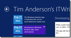
Now my list of posts looks like this:

image

Not as stylish as before, but at least it is different.

The Windows Runtime App Certification Kit: not too good detecting crashes and hangs

Now that I have a lovely ITWriting.com App I thought I should check out whether it is ready to fly.

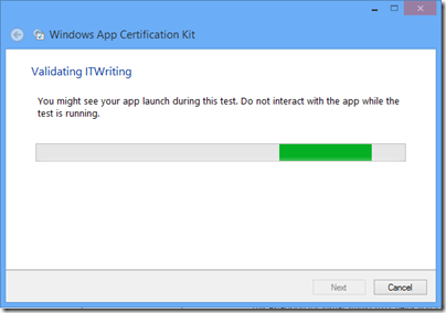
I therefore ran the App Certification Kit that installs with Visual Studio 2012.

image

The tool asks you to select an installed app and then exercises it. I saw my app open, though I did not see it get beyond the first screen.

image

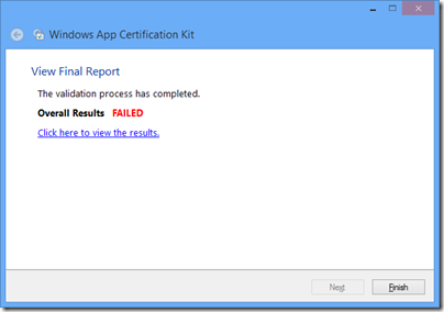
Eventually – bad news:

image

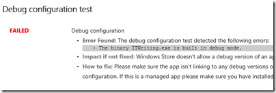
However, there is only one thing wrong with it:

image

Yes, the version installed is the debug build. I can fix this simply by rebuilding in release configuration.

What does the Kit test? Here is the list:

  • Crashes and hangs test
  • App manifest compliance test
  • Windows security features test
  • Supported API test
  • Performance test
  • App manifest resources test
  • Debug configuration test
  • File encoding
  • Direct3D feature level support
  • App Capabilities test
  • Windows Runtime metadata validation

That sounds most impressive and makes a great list for you to show to your customer.

I am sceptical though. If the app was not exercised beyond the opening screen, might it not be a bit buggy after all?

I inserted the following line of code into the the Click event handler for reading a blog:

int iCrash = 1 / string.Empty.Length;

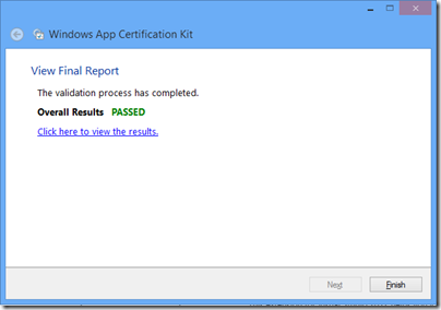
I then rebuilt the app in release mode and ran the App Certification Test. Great news!

image

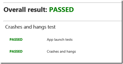
and specifically:

image

Thanks though to my umm, bug-unfix, the app crashes whenever I click to read a blog.

I mention this not to poke fun at the App Certification Kit, but to observe that it does not do a good job of automatically detecting crashes and hangs.

The implication is that the human testers are the ones who will do this before an app is admitted to the store. I think they would find my obvious bug; but how much time will they have to test every feature of an app?

Developing a Windows Runtime app: some observations

What would it take to create a Windows 8 Modern UI content reader for this site? Just for fun, I built a simple one; or rather, I slightly adapted Microsoft’s Metro style blog reader tutorial.

The app only has four screens (or pages) but despite its simplicity I found the tutorial somewhat fiddly. Getting the data from the WordPress RSS feed is simple, thanks to the Windows.Web.Syndication namespace which is part of .NET Framework 4.5. Most of the work is in the user interface, which means switching between XAML and C#. Of course as a developer I would rather work in C#.

Further, the Visual Studio editor for C# is better than the editor for XAML. In C# I can easily navigate the code using Go to Definition, Find all References, and so on.  In XAML it takes longer to find things like referenced styles and resources. Plus XAML is XML, which I find harder to read than an elegant language like C#. Even commenting out a line is more hassle in XML.

I did not like the colours used by the tutorial for the list of posts in SplitePage.xaml. It took me a while to work out what to change. Was the colour defined in a resource, or in a template, or in a style, or directly coded as an attribute of the relevant TextBlock object?

Of course you can open the XAML in Blend if you prefer, the designer-oriented tool that comes with Visual Studio 2012. Blend is more complex than the Visual Studio XAML editor, but may be better once you have figured out how it works.

The amount of work involved in making your app well-behaved is proportionately larger if your app is essentially very simple. You have to deal with different layouts for different screen sizes and orientation, as well as the small Snapped layout. You also have to consider what happens if your app is suspended and resumed.

The above means that despite the apparent simplicity of a Modern UI interface, with its chunky buttons, there is more to consider than with, say, a Windows Forms application whose window is never rotated and over which you have full control.

Still, I was pleased with my app which has reasonable functionality based on a small amount of work.

Visual Studio 2012 is impressive, though I did experience some screen corruption after switching back and forth between the Metro and Visual Studio environments for debugging. Restarting Visual Studio fixes it. Using the simulator seems more robust in this respect.

image

The App Bar

One thing though. If you squint at the above screenshot, you will see that I have put a Read button to the right of the post title. Clicking or tapping this opens the post in a embedded web browser view that is nearly full-screen. However, this Read button is not included in the tutorial, which says:

On the split page, we must provide a way for the user to go to the detail view of the blog post. We could put a button somewhere on the page, but that would distract from the core app experience, which is reading. Instead, we put the button in an app bar that’s hidden until the user needs it.

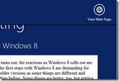
This may in fact be an excuse to include an App Bar in the tutorial; but I disagree with it. With the App Bar, the user has to right-click or swipe down to display the App Bar, and then click or tap the View Web Page button.

image

That is two actions rather than one. Is it really better than having a small button in the UI?

It seems to me that tucking things into the App Bar is fine in cases where there is real merit in an immersive experience, such as in the web browser, but less compelling when you already have a screen with a back button and a scrollable list. I was also concerned that users might not realise they needed to display the App Bar in order to use the app properly.

Let the design debate continue.

Design-centric

Microsoft’s Modern UI continues a trend which began with Windows Presentation Foundation (the first incarnation of XAML), which is to make a platform richer for UI designers and more challenging for developers who lack design skills. Nothing wrong with that; but if you remember how easy it was to snap together an app in Visual Basic 3.0, you may feel that something has been lost.

I guess that recognition of that fact was one of the motivations behind Visual Studio LightSwitch, in which you define the data and business rules, but the screens are generated for you. LightSwitch has complexities of its own though.

Can you trust Windows 8 Storage Spaces?

I have been watching a few Storage Spaces threads on Microsoft’s support forums with interest. Storage Spaces is a new way to manage disk storage in Windows 8 and Server 2012. It lets you create a pool from two or more drives, create virtual drives on them with an option for RAID-like resilience, and add or remove physical drives as needed when drives fail or more storage is needed.

image

A great feature, and particularly since it comes from the server team you would expect it to be solid. Nobody can afford to use storage that is unreliable.

Look at this thread though, based on Windows 8 Enterprise Evaluation which should be the RTM code:

I had three empty discs which I used for it: 320 GB, 1 TB, 2 TB. The manager told me that the maximum capacity for this setup would be ~2 TB.

I then proceeded to fill the space up, resulting in a horrible write speed of ~20 MB/sec. Okay, that can be accepted, it is a software solution, after all.

Here’s the kicker, though: Upon reaching ~0.9 TB, the storage space vanished! Yes, vanished.

After invoking the Storage Space Manager, I discovered that the space was deemed “full” and that I was to add another disc. I also took a look at the volumes itself. Hmmh. The 320 GB disc was 100% filled, the 1 TB was at 32% and the 2 TB at 16%. And what are 32% of 1 TB and 16% of 2 TB? Why, 320 GB!

So, instead of creating a Parity storage space, it simply downsized every hard disc to the lowest denominator, i.e. 320 GB.

Which means that there are two massive problems here:

  1. It’s lying about the remaining capacity (which is confusing in itself: The manager talks about the storage space having a 2 TB capacity, but directly above it talks about a 3.01 pool capacity?)
  2. It also gives no warning when the real capacity is reached and the pool is deemed “full”. It simply takes the pool offline (instead of, say, reverting to a “read-only” mode with a warning) and you have to bring it online manually. Not fun.

and later, from another user:

Today while I copied data over to it, it once again reached “full” status and turned itself “offline” – but this time it won’t come back “online” – it changes right back to “offline” as soon as I try to bring it online…  So essentially I cannot access any of the data on the drive anymore.

or this (which likely refers to the RP) – the article to which it comments is worth a read too.

I’ve run into a major problem with storage spaces. My storage space is full. Having a full storage space puts it into an error state, and it goes offline. You can click “Bring online” but it immediately goes offline again.

So, I can’t free space on it, because I can’t get it online to delete stuff. And, more importantly, I can’t get anything off of it because it won’t stay online.

It seems my only option is to add three drives, as I had it set to parity. The only problem? I don’t have three more drives to add.

Even bugs in in the RP worry me. Storage is so fundamental that I would expect a feature like this to be 100% solid early in the release cycle, or pulled.

Update: It now seems to me that Storage Spaces is working as designed (phew!) though it is understandable that users are confused. See the new post here.

Embarcadero previews Metropolis in RAD Studio XE3: fake Metro apps?

Embarcadero has released a video (embedded at the foot of this post) previewing RAD Studio XE3, the next version of the application development suite which includes Delphi and C++ Builder.

Two big new features are Metropolis applications and an new HTML5 Builder tool which looks like a next-generation PHP Builder.

Metropolis – a neat name until Microsoft back-pedalled on the Metro designation for Windows Runtime apps – appears to be a framework for apps that look like Windows Runtime apps but in reality are not. At least, that is my presumption for “VCL Metropolis applications”. The VCL (Visual Component Library) is a Delphi framework (usable also in C++ Builder) which is tied to Windows and GDI, the old-style Windows graphics API, along with many other Win32 APIs. GDI does not work in the Windows Runtime.

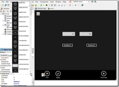
image

No matter, all we need is full-screen apps, touch input, and a don’t-call-it-Metro look and feel, and presto, Windows Runtime apps in all but name. They might even run on Windows 7.

image

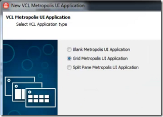
A glimpse at the controls.

image

Except that there will be significant differences between Metropolis and Windows Runtime. No support for Contracts, for example, the Windows Runtime mechanism for inter-app communication; no delivery from the Windows Store; no support for Windows RT.

The big issue though is this: why would you want a desktop app to look like a Windows Runtime app? And will not users be mightily confused?

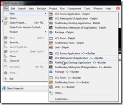
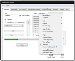
The video then goes on to talk about converting existing apps with a “Convert to Metropolis UI” menu option. It turns out though that you can also create FireMonkey Metropolis apps, and the Convert to Metropolis UI option is shown with a FireMonkey app, not a VCL app. Since the FireMonkey framework is designed for cross-platform and uses custom drawing for all its controls, potentially a FireMonkey app could be a real Windows Runtime app, though I get the impression it probably is not.

image

I do think Embarcadero needs absolute clarity here, which is notably lacking in this preview. There is no point in pretending that a Win32 app is a Windows Runtime app when it is not. I have asked for further information.

HTML5 Builder

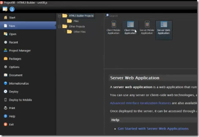
There is also a quick look at HTML5 Builder.

image

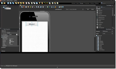
This tool targets server-side development with PHP, as well as apps for web,iOS,Android, Blackberry and Windows Phone. My guess is that there is PhoneGap/Cordova under the covers. I also saw some jQuery in the demo.

image

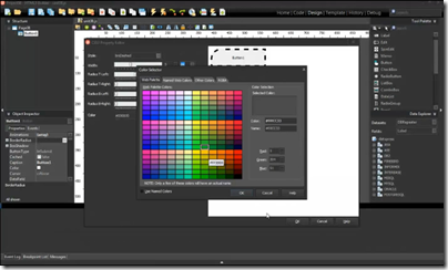
Here is a look at the CSS3 colour picker.

image

Update: looks like Embarcadero found a way to fake Live Tiles as well:

Metropolis applications are really traditional "desktop" applications styled to look like the Metro UI.
The TLiveTemplate component spawns a new process in the WinRT space which is is an actual WinRT LiveTile application. The LiveTile communicates with the Metropolis "desktop" backend via HTTP/REST to start/stop the application or update the LiveTile.

The screenshots are drawn from this video, or you can watch it on the Embarcadero site here.

For more info from attendees of the RAD Studio XE3 world tour see also:

http://members.adug.org.au/2012/08/22/highlights-of-the-sydney-xe3-event/

https://forums.embarcadero.com/thread.jspa?threadID=75773

Installing Kodak All-in-One Printer driver on Windows 8

I have been busy upgrading computers to Windows 8 now that the RTM is available. So far so good, though I ran into a problem with a printer which, oddly, worked fine in the Windows 8 Release Preview.

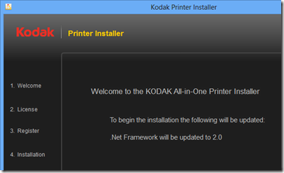
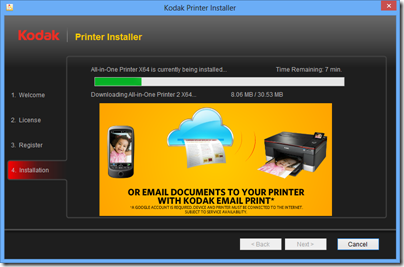
The printer is a Kodak All-on-one. Kodak has a universal installer for all its all-in-one printers. When I ran this, I got a message that .NET Framework 2.0 was needed and would be updated.

image

It would then try to install .NET 2.0, but fail.

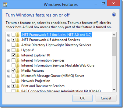
Easy, I thought, just install .NET first. In Windows 8, you do this through Control Panel – Programs – Turn Windows features on or off.

image

I installed .NET Framework 3.5, which includes 2.0, and re-tried the Kodak printer install. Same message, same error.

I also tried running the installer in compatibility mode for Windows 7 and Windows XP. No go.

Time for some serious troubleshooting. I presumed that if I could figure out what the installer was looking for when it failed to detect .NET Framework 2.0, I could fix it.

First, I checked the official instructions for detecting .NET in an installer. This was already correct.

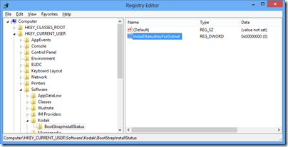
Next, I downloaded Process Monitor to see if I could spot the registry query or file search the installer was making. I noticed that aio_install.exe, the Kodak installer, unpacks a setup into a temporary location and runs from there. I copied the extracted files and ran the setup. Using Process Monitor, I discovered a registry query to HKCU\Software\Kodak\BootStrapInstallStatus and the REG_DWORD key InstallStatusKeyForDotnet. This was currently set to 1. In a spirit of experimentation I changed the 1 to a zero.

image

Next I re-ran setup. It worked perfectly.

image

I still do not know why that registry key was set, but I am not inclined to pursue it further. Possibly if .NET Framework 2.0 is already installed before you run the Kodak installer for the first time, the problem does not arise.

If you encounter this problem though, I suspect the following two steps will be sufficient:

1. Install .NET Framework 3.5 using Control Panel.

2. If installing the printer driver fails, check for the registry key HKCU\Software\Kodak\BootStrapInstallStatus\InstallStatusKeyForDotnet and set it to 0.

Windows 8 release now available; you should install it

Windows 8 is now available for download on MSDN and TechNet, which means the final code is in the hands of a large number of Microsoft-platform professionals. I have been trying out the release, which I installed both as an upgrade over the Release Preview (it does not really upgrade it, but does keep a few settings and documents), and as a clean install on a virtual machine.

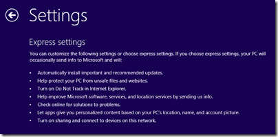
The first thing I noticed was the default settings:

image

You can click Customize to get more information and control over these settings, and I recommend that you do. The one that troubles me most is:

Let apps give you personalized content based on your PC’s location, name, and account picture.

I am not sure how the picture helps with that, but presume it is code for giving apps permission to use it and potentially to share it. The matter of sharing location is difficult; it certainly makes sense for numerous apps from Weather to TripAdvisor; but allowing third-parties to track your physical location is a big ask. Still, if you want the full experience you have to compromise your privacy; that is the choice.

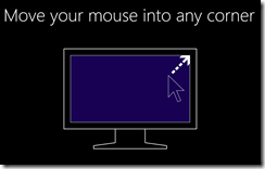
Next I was interested to see what guidance Microsoft would give to new users. This appeared just after setup and before the Start screen is shown for the first time, and takes the form of one or two short but insistent animations:

image

When I installed on a tablet, I got a second animation about swiping in from the sides.

It seems to me that Microsoft is trusting too much that users will enjoy “discovering” the Windows 8 user interface. Perhaps some will; but I was expecting to be offered something like a video and an introductory manual. I think users will click past this and still get stuck.

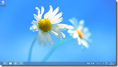
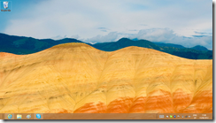
Next, I noticed the new aero-less desktop theme.

image

I do not have strong feelings about this, but admit to some puzzlement about why Aero translucency has gone. Power consumption is a possibility, but why not offer it as an option for desktop users, for example? Still, this is a small detail as far as I am concerned.

Microsoft has chosen a flower for the default desktop background, not unpleasant though a bold choice in some ways. A flower is a strong, evocative image that some will therefore react against, given that a desktop background can be a sort of personal statement.

image

Not many desktop backgrounds are supplied on the install DVD. There is a Flowers theme and another called Earth, which I found rather bleak.

image

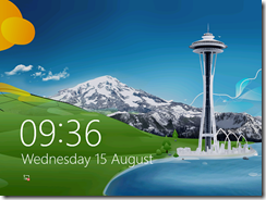
The default lock screen is a painting based, I think, on the Seattle Space Needle.

image

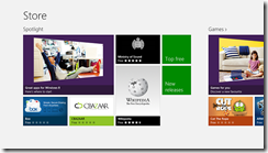
Disappointments? My biggest disappointment is with the RTM Store. I was hoping for a host of new applications, but in fact the Store, while containing a few new apps, is still sparsely populated.

image

This is a problem for Microsoft because Windows 8 badly needs a few compelling apps to persuade doubters that Metro, sorry Modern UI, is not worthless. I love Wordament, yes, but in general we still await great Windows 8 apps.

The best news, I guess, is that I have little to say about the install process. It was smooth, quick, and it worked. No unknown devices in Device Manager on the Samsung Slate; but I realise that this is the one device that everyone has been using to test Windows 8, so I guess this is not surprising. Not all PCs will fare so well.

Businesses should of course be cautious about rolling out a new version of Windows (and will be); and anyone installing this on a machine they use for real work will naturally take a backup first, in case of disaster or just some essential application not working.

If you can though, you should install this new release. Performance is good, it is a decent upgrade from Windows 7 even if you do not use a tablet, and it is only by using it for a while that you will get a feel for the strengths and weaknesses of Microsoft’s new operating system.

Windows 8 RTM: it’s better than you may have heard

Poor old Microsoft. Windows 8, the reimagining of Windows, is getting a mixed reception. There is a kind of alliance, with those who you would expect to oppose Microsoft (open source advocates, Apple enthusiasts and so on) lining up with Windows diehards who dislike too much change. Like Windows stalwart Woody Leonhard (remember those endless Office tips?) who says, under the headline Windows 8 review: Yes it’s that bad:

From the user’s standpoint, Windows 8 is a failure — an awkward mishmash that pulls the user in two directions at once. Users attracted to the new touch-friendly Metro GUI will dislike the old touch-hostile desktop underneath. By the same token, users who rely on the traditional Windows desktop will dislike having to navigate Metro to find settings and apps they intuitively locate in Windows 7.

He adds:

I can confirm after months in the trenches and talking with many hundreds of testers that anyone who defines "real work" as typing and mousing won’t like Windows 8 one little bit.

I disagree. In fact, I had the opposite experience. I installed Windows 8 Release Preview for a non-technical friend, on an old laptop with no touch capability, and was so sure that she would dislike it that I kept the backup image of her Windows 7 install ready to zap it back on.

It did not happen. She was flummoxed at first of course, but after pinning a few applications to the taskbar and learning how to navigate Start, she was fine. All her old desktop apps still work and she cannot see what the fuss is about. Now and again she pops into Modern UI land and plays a game or uses the Facebook/Twitter integration in the People app and it is not a problem.

This has made more impression on me that my own experience, which I tend to discount being used to the bleeding edge. I should mention though that I have no desire to go back to Windows 7, even on my desktop. I like the speed of Windows 8; I like having Hyper-V; I like having the taskbar on both my displays, and it works fine.

I also have Windows 8 on the Samsung Slate which I bought last year, and words cannot describe how much better it is than Windows 7 on the same device. That said, I cannot really recommend the Samsung; its battery life is too short, its design falls short in several places, and it is too expensive to be a mainstream hit. However, it has given me a feel for how well the Windows 8 UI works on a tablet.

My view is this. Windows 8 has plenty of failings, but they are the failings of transition to a better place, not the failings of something that will never work properly. Most of the problems which rile people so much can be fixed with a small amount of effort and perhaps a read of a survival guide. I did one, and there are others just as good or better.

It seems to me to be simply dishonest to portray Windows 8 as this horrible thing that is a nightmare to use. I do not have any evidence for that, beyond the initial painful moments that I have seen at first hand. I do realise that someone might be so much put off by those initial moments that they never want to touch it again, and will declare the same to anyone who will listen, but regard it as my job, as a technical communicator, to help users get past that towards a fairer judgment.

image

Windows 8 is ready, but many of its users are not.

Why I want a Windows RT (ARM) tablet

Microsoft has now announced that the first Windows RT tablets will come from Asus, Dell, Lenovo, Samsung, and from Microsoft itself with Surface.

image

Windows 8 on ARM is a different thing to Windows 8 on Intel. On Intel, most Windows applications will run. On Windows RT, the ARM version, only Windows Runtime apps (also known at Metro-style, Modern and Windows Store) will run. There is still a desktop mode, but it is reserved for a special version of Office along with a few utilities like Explorer.

On the face of it, the Intel version is a better deal, because “you get it all.” However, there are times when less is more; in fact, that phrase practically defines the success of Apple’s iOS, which does not run applications coded for Mac OS X.

The problem is this. On a tablet, the Windows desktop is a horrid experience, unless you get out not only your tablet, but also your keyboard and your mouse or stylus. Even the stylus can be a problem, and having lived with Windows 8 on a Samsung Slate tablet for some months, I find a mouse works best.

We have seen this before, with the old Windows tablets starting with Windows XP. OEMs came up with clever designs with twist screens and styluses which clip into the side. These machines certainly have their uses, but they were not mainstream and they were not cheap. Intel Windows 8 tablets will have all the same problems. The poor experience offered by the Windows desktop user interface with touch was a key reason why Microsoft came up with the radical WinRT alternative.

Windows RT on the other hand promises a better tablet experience. with the additional bonus of longer battery life and a lighter, more efficient device. You cannot install desktop apps, but if the Windows 8 ecosystem fails to come up with WinRT apps to cover the essential computing activities, then the Windows 8 project will have failed in its goals.

There is also Microsoft Office of course, which makes some effort to support touch control though it could be better. Still, I would rather have Office which at least has been designed with the knowledge that some users will be controlling it with touch, than all those other desktop applications which presume keyboard and mouse.

The importance of having Office there is that it makes the difference between having to have a laptop with you as well while on the road, and being able to get all your work done on the tablet alone.

This issue does not seem to be well understood either by Microsoft’s OEM partners nor by the general public. I do not blame the latter. On the high street or at the airport, there will be rows of Windows 8 tablets with similar Start screens, and the difference between Windows RT and Windows Intel will be hard to convey. I can imagine salespeople saying, “You should get this one, it is the full Windows,” and steering customers towards the awkward, confusing experience that is Windows 8 on an Intel tablet.

One disappointing remark buried in the announcement:

Over 90% of the RTM applications in the Windows Store support Windows RT

That means 10% of WinRT apps currently do not support ARM, presumably because there is some native x86 code in there.