Tag Archives: windows 8

Microsoft Project Austin: superb C++ code sample for Windows 8

No time to blog in detail about this; but developers with any interest in Windows 8 should check out Project Austin, a sample project for Windows 8 whose quality exceeds most of what is currently available in the Windows Store.

This is a simple note-taking app but beautifully rendered and with support for adding photos, sharing via Charms, and more:

It’s amazing how useful just a pen and a paper are by themselves. But when you take that concept to the computer realm and expand it to do things like add photos and annotate them right on the spot, and digitally share what you create, then the possibilities are endless.

say the project’s creators. More to the point:

Austin aims to demonstrate with real code the kind of device-optimized, fluid and responsive user experience that can be built with our newest native tools on the Windows8 platform.

Most of the code has been put on CodePlex under the Apache 2.0 license. It demonstrates C++ AMP, the new parallel library for GPU computing, as well as C++ coding for the Windows Runtime.

I downloaded and built the project with few issues, following the helpful guidance here. I did have to add the boost libraries manually to the include path.

image

It is not completely stable but is already very pretty.

image

Immersive UI of course. The tools disappear while you are working. I am still not sure how well I like this, but it is good to see examples of how Microsoft thinks this should work.

Information Density in Metro, sorry Windows Store apps

Regular readers will recall that I wrote a simple blog reader for Windows 8, or rather adapted Microsoft’s sample. The details are here.

This is a Windows Store app – a description I am trying to get used to after being assured by Microsoft developer division Corp VP Soma Somasegar that this really is what we should call them – though my topic is really the design style, which used to be called Metro but is now, hmm, Windows Store app design style?

No matter, the subject that caught my attention is that typical Windows Store apps have low information density. This seems to be partly due to Microsoft’s design guidelines and samples, and partly due to the default controls which are so boldly drawn and widely spaced that you end up with little information to view.

Part of the rationale is to make touch targets easy to hit with fat fingers, but it seems to go beyond that. We should bear in mind that Windows Store apps will also be used on screens that lack touch input.

I am writing this on a Windows 8 box with a 1920 x 1080 display. Here is my blog reader, which displays a mere 7 items in the list of posts:

image

This was based on Microsoft’s sample, and the font sizes and spacing come from there. I had a poke around, and after a certain amount of effort figuring out which values to change in the list’s item template, came up with a slightly denser list which manages to show 14 items in the list. The items are still easily large enough to tap with confidence.

image

Games aside though, I am noticing that other Windows Store apps also have low information density. Tweetro, for example, a Twitter client, shows only 11 tweets to view on my large display.

The densest display I can find quickly is in Wordament, which is a game but a text-centric one:

image

I have noticed this low information density issue less with iPad apps. Two reasons. One is that iOS does not push you in the same way towards such extremely large-looking apps. The other is that you only run iOS on either iPhone or iPad, not on large desktop displays.

Is Windows 8 pushing developers too far towards apps with low information density, or has Microsoft got it right? It is true that developers historically have often tried to push too much information onto single screens, while designers mitigate this with more white space and better layouts. I wonder though whether Windows 8 store apps have swung too far in the opposite direction.

When will Blend, Microsoft’s Visual Studio design tool, be done? Not for a while says Soma Somasegar

During the Visual Studio 2012 launch last week I took the opportunity to ask Developer division Corp VP Soma Somasegar when Blend, Microsoft’s design tool for Visual Studio 2012, will be finished. A tricky question to answer, since there are multiple versions, as explained here:

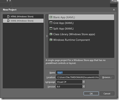
  • Blend for Windows Store apps (HTML or XAML) is fully released and available as part of Visual Studio 2012

    image

  • Blend for WPF and Silverlight is in preview. For production you are meant to use the old Blend 4, unless you are targeting Silverlight 5 where you have no choice but to use the preview version.
  • Blend for Windows Phone is part of the Windows Phone SDK 7.1

The SketchFlow prototyping tool is also part of the preview Blend.

So when will Blend for Visual Studio 2012 be done? Somasegar refers to HBlend, which is the HTML version, and XBlend, which is for XAML.

“We shipped HBlend, and we shipped a preview of XBlend. It will take several months to finish. We also want to continue adding to HBlend. So I can’t tell you that Blend is ever going to be done [laughs],” he told me.

That said, the full Blend for Visual Studio 2012 will come out of preview sometime. Will it coincide with the first update for Visual Studio, announced for later this year?

“It is going to be later than the update, but I don’t have a specific timeframe,” he said.

Personally I have mixed (ha!) feelings about Blend. On the one hand, it is obvious that the simple designer in the Visual Studio IDE is insufficient, and that the rich Blend tool is needed, for those who can make sense of its intricate user interface. On the other hand, the designer aspect of Microsoft’s tooling seems to me messy, with too many versions of Blend and overlap between Blend and Visual Studio which gives developers a difficult choice: do I work with Blend, or stay within the simpler but more limited IDE tools?

SharpDX: Managed DirectX for Metro from the community

One of the disappointments in Microsoft’s new Windows Runtime platform is lack of support for XNA, a gaming/fast graphics API which wraps DirectX and is supported on Windows, Windows Phone and on Xbox 360.

Developer Alexandre Mutel has stepped up to fill the gap with the open source SharpDX, which also provides access to the DirectX API from C#, supports both desktop and Windows Runtime development. One of the first games to use SharpDX, ARMED, has already arrived in the Windows Store.

image

In addition, Mutel says “it will certainly be possible to use ShardDX from Windows Phone 8”.

SharpDX was made possible by a custom tool called SharpGen which generates the .NET API automatically from the DirectX SDK.

The puzzle is why Microsoft did not make more effort to support XNA in Windows 8, or failing that to provide an alternative for .NET developers.

If you want to use SharpDX, be prepared for considerable effort learning the API, as there is little documentation so far. Still, it will likely be easier than learning C++, which is the official solution for DirectX on the Windows Runtime.

Ancient game plays better in Windows 8 than Windows 7

Windows 8 runs the 1999 game Age of Empires II better than Windows 7, which curiously messes up the screen graphics unless you terminate the Windows Explorer process – a fact that I noted in December 2010. Here is the game in Windows 7:

and in Windows 8, without fiddling with Explorer:

image

The fact that the game runs better in Windows 8 is probably due to some obscure bug-fix, though I like to think that somewhere in the development team is a fan of this old but excellent game (it is great multi-player) who decided to make it work.

Gadget Writing: some posts you may have missed

There are two sites at ITWriting.com and if you follow the RSS feed for this one you may have missed the posts at the other. This site covers software development and IT admin topics, while Gadget Writing covers mobile devices, audio, general software tips and reviews, and in general has a more consumer flavour.

Among the popular posts is the Desktop Windows 8 survival guide which is a guide to those awkward issues you will encounter when using Windows 8 on a traditional keyboard and mouse PC rather than a tablet. This has been considerably updated and expanded from its first version.

Gadget Writing has its own RSS feed which is here.

Here are some other recent posts:

This may be why your computer is crashing

I was asked to look at a PC which was misbehaving. Sometimes it worked, but increasingly it was freezing or crashing. Sometimes the hard drive would corrupt and needed Windows repair before it would boot. I took a look. I … Continue reading →

Review: Audyssey Lower East Side Audio Dock Air for Apple AirPlay

Based in Los Angeles, Audyssey specialises in audio processing software. This is used in home theatre equipment such as multi-channel receivers, and also finds its way into TVs, mobile devices and cars. In 2010 Audyssey started making its own audio … Continue reading →

Farewell to the Squeezebox

It looks as if Logitech has discontinued the Squeezebox, a range of devices for playing music streamed from the free Logitech Media Server. Logitech also runs a streaming service on the internet, Mysqueezebox.com, which supports internet radio, Spotify integration and … Continue reading →

The one thing missing from Windows 8 tablets announced so far: simplicity

This week at IFA in Berlin PC manufacturers have been showing off their shiny new Windows 8 tablets. Vendors are competing for who has the cleverest way of combining touch-screen, tablet, trackpad and keyboard into a single portable device. Here … Continue reading →

Free competition: Win a Kingston DataTraveler Locker+ secure USB Flash Drive

Ever worry about exposing confidential data by losing a USB Flash drive? Easy to do; but worry no more. A DataTraveler Locker+ secure drive is password protected, and after 10 failed attempts the data is wiped. Read our full review … Continue reading →

Understanding Windows 8 Storage Spaces: confusing but powerful

Early users have been running into trouble with Windows 8 Storage Spaces. The same technology is used in Server 2012. I posted about the issues here. Storage Spaces is a way of virtualising disk drives. You manage physical drives in … Continue reading →

Review: Kingston DataTraveler Locker+G2 secure USB Flash drive

Ever lost a USB Flash drive? Do you even know? There are so many around now that it would be easy to drop one and not to notice. Most of the time that does not matter; but what if there … Continue reading →

Review: Dragon NaturallySpeaking 12. Stunning accuracy, a few annoyances

I am writing this review, or should I say dictating, in Nuance’s Dragon NaturallySpeaking 12, the latest version of what is in my experience the most accurate speech recognition system out there. Accuracy has got to the point where the … Continue reading →

The one thing missing from Windows 8 tablets announced so far: simplicity

This week at IFA in Berlin PC manufacturers have been showing off their shiny new Windows 8 tablets. Vendors are competing for who has the cleverest way of combining touch-screen, tablet, trackpad and keyboard into a single portable device. Here is the HP Envy:

image

or take a look at this PC Pro preview of the Toshiba Satellite U920T:

Ratchets stretch up and down the panel’s rear, with a central puck keeping the action light and smooth, and the screen flips up and back with a fluid action.

Sony has a Surf Slider, Dell XPS Duo slots into a keyboard dock.

I do understand the reason for all these gimmicks. Sometimes you want a tablet, sometimes you want a laptop, and the idea is to combine them into a hybrid device, just as Windows 8 itself lets you flip between Modern UI (formerly known as Metro) and Desktop.

At the same time though, there is a risk that these vendors are not learning from the past. Two things in particular:

  • The failure of Microsoft’s first Tablet PC. Most models had twist screens and keyboards and styluses. The styluses were prone to getting lost, the twist screens and keyboards were expensive, and tablets became premium-priced devices that were inconvenient to use. Faced with the choice between Tablet PCs and cheaper, simpler laptops, most customers chose laptops.
  • The success of Apple’s iPad. A keyboard is an optional extra, but most manage without it. The screen has a single button, there are a couple of switches and a volume control on the side, it has a dock connector, and that is it. Nor is it premium-priced, at least, not in the context of Apple’s range.

Looking at the effort Microsoft has put into the touch-friendly Modern UI it is obvious that Microsoft has made provision for tablet-only users. Start screen, big icons, easy install and removal of apps, most of the frequently used settings available without going to the Desktop. It is also obvious that Microsoft intends Windows to go further in this direction. Office 2013 just has OneNote MX in the Modern UI, but more is coming.

Where then are the devices that focus on the simplicity of a single slate, with a wireless keyboard on offer if needed, priced to compete sensibly with Apple and Android tablets?

Maybe there will be some of these; but the messaging coming out of IFA is all wrong and I predict that once again many customers will opt for “just a laptop” once again and for the same reasons as before.

This of course will do nothing to disrupt the tablet/iPad market.

One other thing. The IFA unveilings make Microsoft’s forthcoming Surface look better than ever. This does have an optional keyboard, but it is built into a touch cover, and from what I can tell Microsoft has successfully avoided rachets and gears.

If Surface succeeds and flipping hybrids fail, you can be sure there will be a ton of Surface-a-likes at the 2013 IFA.

Understanding Windows 8 Storage Spaces: confusing but powerful

Early users have been running into trouble with Windows 8 Storage Spaces. The same technology is used in Server 2012. I posted about the issues here.

Storage Spaces is a way of virtualising disk drives. You manage physical drives in a pool of storage, and allocate virtual drives from that pool. The virtual drives can be bigger than the actual space available; this is called “thin provisioning”. When you are running out of physical space, you can add additional drives.

It sounds great and it probably is (I am reserving judgement to some extent depending on long-term reports from the field) but it can be confusing, especially if you use Parity for resilience. This user setup a Parity space with three drives, 1TB, 2TB and 320GB. Storage Spaces told him that 2TB would be available (less than the total capacity because it is resilient against drive failure). However the space was exhausted at less than 1TB. Worse still, at this point the drive vanished from his system.

This is all working as designed, though it seems to me that there is plenty of potential for confusion. Here is how I understand it.

1. A Parity space writes data over three or more drives. Therefore, if you only have three drives available, it will be unable to add more data once the smallest drive is full. One small and two large drives is a bad case for a Parity space. It is better either to have four or more drives, or else drives of equal size.

An alternative is to use a mirrored space. This works by duplicating data on two drives. In the example, that should yield 1TB + 320GB of space by mirroring the data on the 2TB drive – more than was available with Parity. With a larger number of drives though, or equally sized drives, Parity is more efficient.

2. When the storage space is full, Windows takes it offline. This is to protect your data. Once you have fixed the problem by adding more drives, you can bring the space online again.

What if you have no drives handy and you NEED access to your data? You try bringing the space online, but Windows immediately takes it back offline because the error condition still exists (and Windows or its applications can be chatty about writing data).

The solution is to mark the space as read-only which you do with PowerShell. Then you can bring it back online and access your files.

Why so confusing?

Storage spaces comes from the server team and is also available in Windows 8. It is possible that the management interface is less helpful than it could be because of that, on the grounds that IT admins are more willing to plough through documentation.

For example, it would be helpful if the spaces manager would calculate the actual capacity available with the currently attached drives and the selected resilience, and tell you that, rather than giving a nominal figure which means “this is the space which these drives can provide though you might have to add more drives to make use of it all”.

Next, there is the question of alerts. The Windows Action Center should alert you if the space is nearly full. However the value of the notification area in Windows was reduced when the Windows 7 team decided to hide most notifications by default, thanks to abuse of the system by third-party software.

Incidentally I always set the notification area to Always show all icons and notifications. If I don’t like a third-party notification, I remove the application or prevent it from running automatically. Right-click the notification area and choose Customize notification icons to make this change.

image

Returning to storage spaces, I have seen several users say they did not see alerts which suggests they are not tuned quite correctly; or maybe users are just in the habit of ignoring notifications.

Third, why doesn’t Windows mark full spaces as read-only when full, instead of taking them offline? Vanishing drives are unsettling for users. Make them read-only would be easier to understand. My space is full – I cannot add more data.

Further reading

Detailed MSDN article about Storage Spaces

Post by Darren Moss with PowerShell examples for taking a space read-only or offline/online. Darren Moss is a Senior Program Manager at Microsoft.

Guest post with a view from the enterprise: Microsoft is getting it right with Windows 8

The following is a guest post from a contact who holds a senior IT role in the finance industry.
image

I think Microsoft is getting it right. I don’t recall saying this about anything they have done before, which makes this a matter of some significance to me. My view on W8 is that it is a purely transitional state to a brave new world and that a number of strategic concerns are driving W8’s capabilities. Here’s what I think is going on:

1. MS thinks the the PC is over.

Well, that may be a bit extreme, perhaps it would be better to say that given MS’s dominant position, the PC will be over before anyone can take it away from them, so now is the time to maximise the cash being extracted from this cow by minimizing the investment.

The implication is that computing is heading in 2 directions – ‘down’ to phones and tablets and ‘up’ to the cloud. MS is trying in the cloud space, if not perhaps succeeding brilliantly. In the phone/tablet space

W8 is (at least potentially) a serious contender to iOS.

2. MS loves enterprises (and people who sometimes look like them, e.g. educational organizations)

Office is where MS’s money is coming from. Office is the (only?) reason the W8 has a legacy desktop. This enables corporates (many of whom won’t take W8, but there had to be a story for them) and educational users to upgrade while staying with Office.

Also, notably, Apple is conspicuous for sticking to the mass retail market. This is making a number of tricky issues for enterprises such as mine when it comes to developing corporate mobile applications on iOS.

3. MS is taking good UI chances

This is a big one. Apple has always had good old WIMP GUI right. In the new world they have opened in iOS, the UI, while easy to use, is fundamentally application-centric. In fact the iOS home view of app icons is scarily reminiscent of the Windows 3.x Program Manager.

The W8 ‘modern’ UI with its active tile concept provides something that opens up the possibility of a task-oriented UI. This could be a huge benefit to enterprises and is, at least, a good marketing angle for MS.

4. Corporate users could be excellent gateway users

What if every corporate BlackBerry user wanted to get rid of Blackberry Enterprise Server? oh – they do :-). What’s the alternative? Nothing from Apple (and no sign of anything coming). a huge slice of those corporates already use Exchange (must be 99+%). What if MS was able to offer secure mobile device management with a modern UI platform? Looks like a good way of capturing a lot of that market. Think of all those corporate mobile users with a W8 phone – MS gets to bypass head-to-head competition with Apple for this slice of the market. How many people bought Windows PCs because they had to learn Windows at the office? ok, maybe not a huge number, but it’s not a bad (affluent) group to use as the basis of chipping away at Apple mind-share.

5. What if those corporates were looking to replace PCs both real and virtualized) with tablets?

It’s already the case that an iPad can do anything that the vast majority of enterprise users do with their PC (once you include VPN desktop access). Put office on the device (with cloud storage) and an enterprise can be shown a way to make massive reduction in desktop PC costs. The only compelling reasons for another type of device are software development and large UI footprint (multi-monitor). The MS Surface offers the possibility of a device that:

  • looks like your new corporate mobile device
  • can do everything (including Office) that your PC can do
  • is at a much lower price point

so that’s my view in the crystal ball. If MS were thinking that the PC was dead and wanted to avoid a (probably losing) head-on fight with Apple, their entrenched position in the enterprise looks like their best starting point. Offering enterprises a possible post-PC future with unified mobile and desktop UX based on Windows phones and tablets with Azure or private cloud back-end looks like it might be a strategy. the coming (already started) implosion of RIM looks like an opportunity for Windows phone to kick-start the adoption process.

What would W8 look like if this was what MS was thinking?

  • it would have a modern UI, distinctly different from Apple’s, not being WIMP-like
  • it would be NOW, to help point to a future enterprise based on W phones and tablets to help capture the RIM refugees.
  • it must contain Office, at all costs to sustain the enterprise story

oh look, that’s what W8 is like. So, for all the noise around how nasty W8 is, I think it’s indistinguishable from what it would be like if MS really had a plan that might work. The inelegant dual-UI can be thought of as a consequence of the need for a migration path for existing apps, a recognition that all those office users are starting out on PCs and (possibly) that they couldn’t engineer a real modern UI office in time.

The final irony is that Vista may turn out to be the biggest boost for this strategy. Major enterprises that I have seen have generally moved their desktop fleet onto every second (or more) big Windows release.

Nobody moved to Vista, those who were due to move held off because it was so awful. Everybody went (and most are still in the process of going to) Windows 7. As a result, none of the enterprise customers have to actually implement W8 for their desktop fleet – they just have to drink MS’s Kool-Aid for the future and be able to use W8 phones and tablets, where most of the ugliness disappears.

Uh-oh, here come the OEM improvements to Windows 8

Reports from a Samsung event today indicate that the company is implementing its own version of the Windows 7 Start menu, which it calls the S Launcher.

The all-in-one PCs Samsung unveiled this morning are the first Windows machines to sport the S Launcher, a simple widget that acts just like the old start button: Click, start typing (say “keyboard”) and it instantly shows you the settings and apps that relate to your term. There’s also a separate settings icon for quick access to the most commonly needed controls.

On the face of it that sounds like a good move. The general reaction to the removal of the Start button in Windows 8 has been mixed at best. Why not put something like it back?

It is hard for Microsoft to object to this. The official line is the Microsoft’s partners add value to Windows with customization and software unique to each vendor, enabling them to differentiate. There is also the matter of fees paid by third-parties such as browser or security software vendors, to pre-install their stuff and win lucrative traffic or subscriptions.

This is a big one though. Microsoft must care about its new Start menu, to have resisted all pleas from its customers to reinstate the old-style version as an option.

It is also obvious that this is not just about usability. The Start screen is the gateway to the new Windows: Modern UI, Windows Store, tie-in with Windows Phone, Windows Tablets and Xbox, and more.

Here it gets interesting. Although Microsoft and Samsung are both selling Windows, the objectives of the two companies are not altogether aligned. Samsung is a big Android vendor; and even within the Android world, it is promoting Galaxy as a brand and links to its televisions. Samsung also sells Windows Phone, but you would hardly know it.

You can think of it as two separate ecosystems, one based around Windows and Microsoft, the other based around Samsung, which happen to intersect in the area of desktop operating systems.

Samsung then does not care whether the Modern UI, Windows Store and Windows Phone are hits. In fact, when it comes to Windows Store and Windows Phone, it may prefer that they fail.

It is not even that simple. If the Microsoft and Windows ecosystem continues to decline, who can take on Apple? It is in Samsung’s interests as an OEM Windows vendor for Microsoft to succeed, as the same time as other parts of its business would prefer that it fails. Complex.

If nothing else, the S-launcher show how little Microsoft and its hardware partners are aligned when it comes to Windows marketing strategy.

What about the users though? Will they not benefit from having a more familiar way to launch their applications? Personally I doubt it. The problem I have with utilities like this is that they break the design work Microsoft puts into Windows, introducing inconsistency and often working less well than what is baked into the operating system.

I will add too that the Windows 8 Start screen is actually not the monster it is made out to be. It is richer than the old one, with its Live Tiles and large icons, and once you have learned how to organise it in the way you want, it is an effective launch manager. The fast incremental search in the Start screen works brilliantly.

It would benefit Samsung’s users more if the company focused on helping them learn how to get the best from Windows 8 and its new user interface, rather than encouraging them to avoid some of its key features.

Now you know why Microsoft is doing Surface and the Microsoft Store with its Signature PCs, tweaked (or untweaked) to run as designed.