Tag Archives: web design

Adobe Creating the Web, offers Edge animation tool for free

It is less than a year ago that Adobe pivoted wholeheartedly from Flash to HTML, a moment that to mind was marked by the acquisition of Nitobi, the PhoneGap company, announced at MAX in October 2011.

Yesterday Adobe clarified its plans for its new wave of web design tools branded Edge. These are as follows:

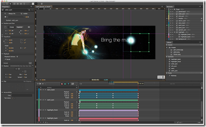
Edge Animate

A motion and interactive design tool for animating web content with HTML, JavaScript and CSS.

image

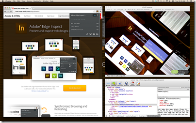
Edge Inspect

Preview HTML content on mobile devices for test and debug.

image

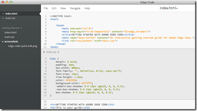
Edge Code

This is a commercial product based on the open source Brackets project – a similar relationship to the one that exists between Adobe PhoneGap and the open source Cordova project.

Edge Code adds Adobe integrations such as with Edge web fonts and Typekit, and with PhoneGap Build.

image

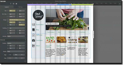
Edge Reflow

image

Design tools for CSS, preview expected by end of 2012.

Edge Web Fonts

Free web font service for open source fonts.

TypeKit

Commercial font library service.

PhoneGap Build

Package web apps as native apps for mobile platforms, without needing to install SDKs on your own machine.

PhoneGap Build is free for open source apps, or costs $9.99 per month for up to 25 private app builds.

The Edge tools are only available through Creative Cloud, Adobe’s subscription service, cementing the company’s move to a subscription model for its products. As a tempter, Edge Animate is currently available even to those with the base, free subscription – though you have to agree to be on a marketing list for email, mail and telephone.

image

Will the Edge tools replace Dreamweaver, the web design tool in Creative Suite? I was told not, and that an update for Dreamweaver is in preparation. Dreamweaver is the “one production tool” as opposed to the Edge tools each of which focus on one narrow area of features. Adobe describes this as task-focused tools.

More information in yesterday’s San Francisco keynote here.

Adobe Muse: so what is wrong with Dreamweaver?

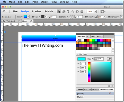
Adobe has released a preview of Muse, a new web site design tool.

My first reaction was one of be-musement. What is wrong with Dreamweaver, the excellent web design tool included in Creative Suite? Bearing in mind that there is also a simplified Dreamweaver aimed at less technical business users, called Contribute.

Here are some distinctive features of Muse:

1. It is aimed at non-coders. The catch phrase is “Design and publish HTML websites without writing code”. Muse actually hides the code. I installed Muse on a Mac, and one of the first things I looked for was View Source. I cannot find any such feature. You have to preview the page in the browser, and view the source there. That is in contrast to Dreamweaver, where the split view shows you simultaneous HTML and visual designers, and you can edit freely in either.

2. It is an Adobe AIR application. I discovered this in a bad way. It would not install for me on Windows:

image

A curious error. Luckily I am also working on a Mac right now, and there it worked fine.
image

3. It will be sold by subscription only. The FAQ answer is worth quoting in full, as it describes one of the key advantages of cloud computing:

Muse will be sold only by subscription because it will allow the Muse team to improve the product more quickly and be more responsive to your needs. Traditionally Adobe builds up a collection of new features over 12, 18 or 24 months, then makes those changes available as a major upgrade. It is anticipated that new updates of Muse will be released much more frequently, probably quarterly. New features will be made available when they’re ready, not held to be part of an annual or biannual major upgrade. This will enable us to stay on top of browser and device compatibility issues and web design trends, as well as enabling us to respond to feature requests and market changes in a much more timely fashion.

I am reminded of Project Rome, a cancelled project which was also intended to be subscription only. Rome was for desktop publishing, Muse is for web design; otherwise there are plenty of parallels.

4. Muse promotes Adobe hosting via Business Catalyst, and if you select Publish this is the sole option:

image

Of course you can also Export as HTML. Still, it looks as if Muse is intended as part of a wider initiative which will include hosting and web analytics.

5. Muse is not a Flash authoring tool. Check out the Features page. The word Flash does not appear. Nor did any hidden Flash content appear when I exported a page as HTML. My guess: there is a quiet Flash crisis at Adobe, and the company is hastening to make its tools less Flash-centric, in favour of something more cloud and HTML 5 based. I do not mean that Flash is now unimportant. It is still critical to Adobe, and after all Muse itself runs on Flash. However it is being repositioned.

A few comments. Unfortunately I’ve not yet spoken to Adobe about Muse, but the obvious question is reflected in my heading: what is wrong with Dreamweaver? To answer my own question, I can see that Dreamweaver is a demanding tool, and that Muse, while still aimed at professionals, should be easier to learn.

On the other hand, I recall many early web design tools that tried to hide the mechanics of web pages, some more successful than others, and that in the end Dreamweaver triumphed partly thanks to its easy access to the code. Some still miss HomeSite, an even more code-centric tool. What has changed now?

Needless to say, Dreamweaver is not going away, but there is clearly overlap between the two tools.

Of course non-coders do need to be involved in web site authoring, but the trend has been towards smart content management tools, such as WordPress or Drupal, which let designers and coders develop themes while making content authoring easy for contributors. Muse is taking a different line.

Watch this space though. Even on the briefest of looks, this is an impressive AIR application, and it will be interesting to see how it fits into Adobe’s evolving business strategy.

Update: Elliot Jay Stocks blogs about the code generated by Muse, which he says is poor, and his opinion that it is too much print-oriented:

warning signs are present in this public beta that suggest Muse is very much a step in the wrong direction.
Review: Web Design for Developers by Brian Hogan

The title of this book struck a chord with me. I’m comfortable with code but I don’t find design easy. Design is not magic though, and design skills can be learned. Maybe a typical developer will never be a great designer, but the ability to create web pages that look professional and attractive should be achievable.

Brian Hogan’s book Web Design for Developers (Pragmatic Bookshelf) looks like it might be the answer. Sub-titled “A programmer’s guide to design tools and techniques” it is aimed at developers who have “little or no design background”.

The book starts well, with a section called “The Basics of Design”. There are chapters on sketching out a layout, selecting or creating a colour scheme – with helpful insight into something that seems from outside like a black art – and a chapter on fonts and typography, explaining mysteries like the baseline grid and leading.

Hogan makes an interesting comment about fixed font sizes and accessibility. It used to be assumed that relative fonts are better for accessibility, as you can use the browser to increase the size. Hogan argues that zoom tools in the application or the operating system are better, since resizing fonts while images remain fixed makes a page look bad, so it is OK to use fixed font sizes.

The next part covers graphics, using Adobe Illustrator and Photoshop; Hogan says these are industry standards and you should use them if possible. There is a chapter on logo design, and three chapters creating a design mock-up for a web page, including a detailed step-by-step on designing an icon. Useful chapters, though I would have liked this section to be longer. There is too much on the mechanics of using Photoshop, and not enough on the design decisions themselves. How do you go about deciding what size each section of a page should be? How do you avoid making a page too busy and cluttered, or leaving too much space so that elements look detached from one another? What’s the secret to adding decorative elements without making the page look like a flashback to Geocities?

Unfortunately, rather than drill further into these topics, Hogan devotes the rest of the book to more mechanics, including working with HTML and CSS, how to achieve compatibility across different browsers, exporting images from Photoshop, search engine optimization, and performance issues. There’s plenty of good advice, though some is out-of-date: Hogan says that “at the time of writing, IE 6 has more active users than Firefox”. That is no longer the case.

Although these are important topics, to my mind they are not especially challenging for developers, who know how to look up a CSS reference or figure out how to deal with cross-browser compatibility. Working out how something should look is more challenging than the implementation.

Hogan lost the “for developers” focus and ended up writing a book that could better have been called “Web Design Essentials” or something similar.

Not a bad book then; but not what I was hoping for. I do think the general topic of “Design for developers” is under-served, especially as design has become far more important in the last few years, for numerous technical and strategic reasons, and would like to see further books on the subject.