Tag Archives: web authoring

Book Review: Smashing UX Design (a great read for developers too)

That the abbreviation UX can appear in a book title without expansion says a lot about the extent to which user-focused design is now embedded in the web development industry. The theory behind it is that User Experience is primary when designing a web site. The word "experience" suggests that this is not just about usability, or attractiveness, or performance, or enjoyment, but rather about all those things and how they combine when the end user is navigating your site.

image

This book is for professional designers who want techniques for putting UX design into practice. The authors, Jesmond Allen and James Chudley, work for UX consultancy Cxpartners, based in Bristol in the UK, and the book is written from their perspective, including tips on how to work with your clients. That said, this is an excellent read even if you do not fall into that niche, thanks to the expertise and professionalism which informs the content.

There is a note right at the start of the book about the interaction between development and design teams which seems to me of key importance:

In order to produce designs that development teams can utilize, it is helpful for UXers to understand the development process they will be using. As external consultants, we do not always have the opportunity to work with development teams on a daily basis as they create a functional product from our designs, although we always strive to make ourselves available to developers as they work. Internal UX staff will likely have a much closer relationship with their development teams.

Some developers may see UX activities as troublesome big design up front. However, UX activities contribute to requirements gathering and backlog prioritization activities. These activities typically take place long before development sprints begin.

In order to produce robust products, it is important that UX research and design activities take place throughout the design and build cycle, whether it is product managers, UXers, or developers who perform the activities.

The emphasis is mine. A bad scenario, for example, runs like this. The project is initiated and handed to a design team, who come back with good-looking sketches and mock-ups. The developers then implement the design, but discover that it does not quite work as-is, maybe because the designers did not appreciate every nuance of the workflow, or because of evolving new requirements, or performance problems, or any number of other issues.

At this point the developers may endeavour to match the not-quite-working design as closely as possible, blaming shortcomings on the “bad design”. Or they may adapt the design to work better technically, potentially wrecking the design concept and delivering something which users will perceive as odd. This scenario is more likely to occur when budgets are particularly constrained and the design team external.

Note that Agile methodology has always emphasized that the team is the whole team – stakeholders, developers, designers, users, everyone – so it makes sense to keep designers involved right through the process. Put another way, do not allocate a design budget and spend it all up-front, before development begins.

It all comes down to communication, respect and understanding between team members, which is why this book is one that developers as well as designers should read.

Be clear: this is not a book about technology, so look elsewhere (perhaps to one of the other Smashing titles) if you want help with making beautiful web pages using CSS, or a how-to guide for building web sites. Smashing UX Design is about the process rather than the outcome, though there are plenty of practical tips along the way.

The book is in four parts. Part one is a general introduction to the concepts behind UX design and planning UX projects. Part two covers tools and techniques for UX research and evaluation, such as running requirements workshops, usability tests, surveys, analytics, and expert reviews.

The third part is about tools and techniques for UX design. If you are wondering what an Ideation Workshop is, you will find out how to run one here. Another technique described is how to create a "user persona", a fictional user who represents a category of users. There is also a discussion of wireframes, sketches and prototypes.

Finally, the fourth part looks in more detail at UX design for specific site pages, including the home page, search, product pages, shopping carts, images and tables. This is the section of most general interest, being full of practical suggestions and thought-provoking comments on what makes web pages work well for the user.

There is a too-brief chapter on mobile UX and this is a weakness of the book: not much on how tablets and smartphones are impacting UX design.

If you run or plan to run a web design business, then the book is perfect. It is also a great read for professional web developers. Individuals who are doing their own web design, or just want to understand it better, will find good content here but also a rather jargon-heavy style and probably more information than they need about working with clients and running workshops of various kinds.


First impressions of Google TV – get an Apple iPad instead?

I received a Google TV as an attendee at the Adobe MAX conference earlier this year; to be exact, a Logitech Revue. It is not yet available or customised for the UK, but with its universal power supply and standard HDMI connections it works OK, with some caveats.

The main snag with my evaluation is that I use a TV with built-in Freeview (over-the-air digital TV) and do not use a set top box. This is bad for Google TV, since it wants to sit between your set top box and your TV, with an HDMI in for the set top box and an HDMI out to your screen. Features like picture-in-picture, TV search, and the ability to choose a TV channel from within Google TV, depend on this. Without a set-top box you can only use Google TV for the web and apps.

image

I found myself comparing Google TV to Windows Media Center, which I have used extensively both directly attached to a TV, and over the network via Xbox 360. Windows Media Center gets round the set top box problem by having its own TV card. I actually like Windows Media Center a lot, though we had occasional glitches. If you have a PC connected directly, of course this also gives you the web on your TV. Sony’s PlayStation 3 also has a web browser with Adobe Flash support, as does Nintendo Wii though it is more basic.

image

What you get with Google TV is a small set top box – in my case it slipped unobtrusively onto a shelf below the TV, a wireless keyboard, an HDMI connector, and an IR blaster. Installation is straightforward and the box recognised my TV to the extent that it can turn it on and off via the keyboard. The IR blaster lets you position an infra-red transmitter optimally for any IR devices you want to control from Google TV – typically your set-top box.

I connected to the network through wi-fi initially, but for some reason this was glitchy and would lose the connection for no apparent reason. I plugged in an ethernet cable and all was well. This problem may be unique to my set-up, or something that gets a firmware fix, so no big deal.

There is a usability issue with the keyboard. This has a trackpad which operates a mouse pointer, under which are cursor keys and an OK button. You would think that the OK button represents a mouse click, but it does not. The mouse click button is at top left on the keyboard. Once I discovered this, the web browser (Chrome, of course) worked better. You do need the OK button for navigating the Google TV menus.

I also dislike having a keyboard floating around in the living room, though it can be useful especially for things like Gmail, Twitter or web forums on your TV. Another option is to control it from a mobile app on an Android smartphone.

The good news is that Google TV is excellent for playing web video on your TV. YouTube has a special “leanback” mode, optimised for viewing from a distance that works reasonably well, though amateur videos that look tolerable in a small frame in a web browser look terrible played full-screen in the living room. BBC iPlayer works well in on-demand mode; the download player would not install. Overall it was a bit better than the PS3, which is also pretty good for web video, but probably not by enough to justify the cost if you already have a PS3.

The bad news is that the rest of the Web on Google TV is disappointing. Fonts are blurry, and the resolution necessary to make a web page viewable from 12 feet back is often annoying. Flash works well, but Java seems to be absent.

Google also needs to put more thought into personalisation. The box encouraged me to set up a Google account, which will be necessary to purchase apps, giving me access to Gmail and so on; and I also set up the Twitter app. But typically the living room is a shared space: do you want, for example, a babysitter to have access to your Gmail and Twitter accounts? It needs some sort of profile management and log-in.

In general, the web experience you get by bringing your own laptop, netbook or iPad into the room is better than Google TV in most ways apart from web video. An iPad is similar in size to the Google TV keyboard.

Media on Google TV has potential, but is currently limited by the apps on offer. Logitech Media Player is supplied and is a DLNA client, so if you are lucky you will be able to play audio and video from something like a NAS (network attached storage) drive on your network. Codec support is limited.

In a sane, standardised world you would be able to stream music from Apple iTunes or a Squeezebox server to Google TV but we are not there yet.

One key feature of Google TV is for purchasing streamed videos from Netflix, Amazon VOD (Video on Demand) or Dish Network. I did not try this; they do not work yet in the UK. Reports are reasonably positive; but I do not think this is a big selling point since similar services are available by many other routes. 

Google TV is not in itself a DVR (Digital Video Recorder) but can control one.

All about the apps

Not too good so far then; but at some point you will be able to purchase apps from the Android marketplace – which is why attendees at the Adobe conference were given boxes. Nobody really knows what sort of impact apps for TV could have, and it seems to me that as a means of running apps – especially games – on a TV this unobtrusive device is promising.

Note that some TVs will come with Google TV built-in, solving the set top box issue, and if Google can make this a popular option it would have significant impact.

It is too early then to write it off; but it is a shame that Google has not learned the lesson of Apple, which is not to release a product until it is really ready.

Update: for the user’s perspective there is a mammoth thread on avsforum; I liked this post.

Adobe Acrobat X puts the focus on security and usability

Adobe has announced Acrobat X (pronounced Acrobat ten), the latest PDF document creator with its associated free reader, which will be available in November.

The Acrobat product is a bit of a chameleon. The PDF format – now an ISO standard – has three distinct roles.

The first and original role is as a means of distributing electronic documents that look the same everywhere. This has never been a goal of HTML, which was designed to give the browser, or “user agent”, flexibility over how to render documents. Word processor formats are also compromised in this respect, because they are for editing, whereas PDF is for output. This is how most users encounter PDFs – a document format which is somewhat annoying, especially when it opens to a full page view and you cannot read a thing, but which does show each page as originally designed.

The second role is for print professionals. This is a logical extension of the first role: the same characteristics make it ideal as a format for delivery to a printer. If terms like Preflight, Calibrated CMYK, Trap presets and Job Definition Format mean anything to you, this may be how you use PDF.

The third role is as the forms client in Adobe enterprise workflow systems. When I attended Adobe’s Partner Conference in Amsterdam, this usage was the area of focus. I saw case studies such as processing applications for planning permission, invoicing, and health insurance applications.

Is there any conflict between these roles? I believe there is, though Adobe will disagree. There are features in Acrobat and Adobe reader which exist to support its role in enterprise systems, but do not matter to the more common use of PDF, for distributing static documents. In particular, the ability to execute script and host Flash applications has value if you think of PDF as an application client, but if you just want to read a document it adds bloat and security risk.

Still, we should not complain too much. PDF is both useful and, for most of us, free – particularly now that PDF export is a standard feature in Microsoft Office and in many Mac applications.

After that preamble, what is new in Acrobat X? I’ve been trying a late pre-release, and from what I have seen the changes are more in the realm of the user interface, usability and security, than in new capabilities, though I would still describe this as a major update. Here are the highlights.

First, Adobe has responded to PDF security issues by introducing a new protected mode on Windows, which according to Adobe is the only platform where significant malware attacks via PDF occur. All write calls are sandboxed by default, making it hard for malware to infect a PC. Apparently this is just the first phase, and a future version will restrict read calls as well. Another weakness in the current sandbox is that it does not protect the Windows clipboard.

Second, Adobe has polished and simplified the user interface. In a web browser, a PDF appears without any additional controls or toolbars other than a small toolbar that appears if you hover the mouse around the bottom centre of the page.

image

Adobe’s intent is to make moving from HTML to PDF so seamless you hardly notice, further embedding the format into the web.

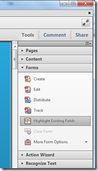
Acrobat’s user interface has also been revamped. There are a few basic commands on the traditional menu and toolbars, but most of the features are accessed through a tabbed right-hand column, with tabs for Tools, Comments and Share. It is similar to the old Office task pane. I think it is successful, making features easier to find and use.

image

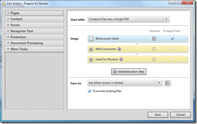
One of the sections in the Tools pane is called Action Wizard, which is a new macro feature in Acrobat Pro. “Macro” is not quite right; it is more of a wizard authoring tool, with some pre-prepared wizards that you can use as-is or modify. The following illustration shows one of these wizards in edit mode.

image

The Action Wizard should both speed up repetitive tasks, and ensure that important steps are not omitted. The focus is on preparing documents, for example for review, distribution, or web publishing.

Third, Adobe is having another go at the portfolio feature, introduced in Acrobat 9 but perhaps not used as much as the company had hoped. Portfolios let you combine multiple documents into one, for single file distribution with some added features in the container. If you are nostalgic for the Microsoft Office Binder, you will like Portfolios.

Acrobat X makes portfolios easier to create, and adds features like layouts and visual themes, so you can achieve slick effects with little effort. Organisations might create their own themes so as to promote their brand.

image

It is cool stuff, but if the portfolio feature in Acrobat 9 found little use, I am not sure that this new improved version will make much difference. Maybe the need for gathering multiple documents into one is not as great as Adobe imagines.

Other features include Microsoft SharePoint integration, enhanced OCR (optical character recognition), and improved copy and paste from PDF to editable documents such as Word and Excel, while preserving formatting – this last quite an important feature since this is a common source of frustration.

I am not sure about portfolios, and have some concern that Adobe has pushed too many features into Acrobat. Nevertheless, I found myself liking the new Acrobat. The usability effort has paid off, and I found it more enjoyable to use than previous versions. Performance seems better as well. Taken together with security improvements on Windows, this is a welcome upgrade.

Update: UK price details are as follows

  • Acrobat X Standard is expected to be £278 ex VAT (£132 upgrade)
  • Acrobat X Pro is expected to be £444 ex VAT (£190 upgrade)
  • Acrobat X Suite (includes Acrobat X Pro, Photoshop CS5, Presenter 7, Captivate 5, Media Encoder CS5, LiveCycle Designer ES2) is expected to be £953 ex VAT (£635 upgrade)

Adobe extends SVG, HTML 5 support in Illustrator

Adobe has released a preview of the Illustrator CSS5 HTML5 Pack. There is already an HTML 5 Pack for Dreamweaver.

Illustrator CS5 could already export in SVG (Scalable Vector Graphics) format, but the pack adds some interesting features.

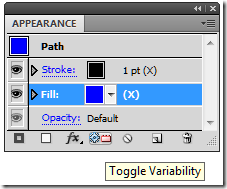
One is the ability to specify strokes and fills as variables, so that you can modify them in JavaScript.

image

Exporting an image that uses this feature creates a JavaScript file as well as the SVG itself.

You can also mark an Illustrator object as Canvas. This will convert the object to a bitmap that is drawn to a Canvas element within SVG.

There is also increased support for CSS (Cascading Style Sheets). You can use CSS to define fills, strokes, opacity, gradient, position, and named character styles.

Other features in the Pack include the ability to detect the HTML window size and vary the SVG that is delivered accordingly – to support mobile browsers.

When Apple’s Steve Jobs posted his thoughts on Flash – still online despite the company’s change of heart on cross-platform development tools for iPhone and iPad – he remarked:

Perhaps Adobe should focus more on creating great HTML5 tools for the future, and less on criticizing Apple for leaving the past behind.

Of course Adobe was doing this anyway, but it is interesting to see HTML 5 support now being extended. Export more HTML 5 goodness at the forthcoming MAX conference next month.

If you try the new HTML5 Pack read the installation instructions carefully. You have to back up certain files, otherwise it may affect whether you can apply future official updates.

Speeding page load with dynamic JavaScript

I’m delighted that ITWriting.com is sufficiently popular to sustain some advertising. I’m not pleased though with the impact on performance. The problem is that ads such as those from Google Adsense or Blogads are delivered by remote scripts. It usually looks something like this in the HTML:

<script type="text/javascript"
  src="http://some/remote/script.js">
</script>

When the browser encounters this script, it stops and waits until the script returns. This means that your site’s performance depends on the performance of the site serving the script. At times I’ve noticed significant slowdown – though to be fair, Google is normally faster than most others in my experience.

So how can this be fixed? I’ve spent some time on the problem, but with limited success. Ideally I’d like an Ajax-y solution where the ads flow in after the rest of the page had loaded and rendered, because the content is more important than the ads. The first step though is to place the scripts at the end of the page, so that the rest of the content is downloaded first. However, the ads have to appear towards the top of the page, otherwise the advertisers will not be happy. I tried inserting the script dynamically like so:

var addiv = document.getElementById("addiv"); //where the ad is  to appear
var theScript = document.createElement("script");
theScript.type="text/javascript";
theScript.src = "http://some/remote/script.js"; 
addiv.appendChild(theScript);

While this works after a fashion, it does not do the job. The problem is that the script typically calls document.write. If you are lucky, the ad will appear at the bottom of the page. If you are unlucky, the ad will replace the entire page.

What I needed to do is to capture the output sent to document.write and then insert the HTML dynamically. It turns out that JavaScript makes this easy. We can simply override document.write with our own function. Like so:

var addiv = document.getElementById("addiv"); //where the ad is  to appear
var adHtml = ”;
var oldWrite = document.write;
document.write = function(str)
{
    adHtml += str;
}
<script type="text/javascript"
  src="http://some/remote/script.js">
</script>
document.write = oldWrite;
addiv.innerHTML = adHtml;

This is brilliant, and in fact works perfectly for some of my ad scripts. Unfortunately it does not work for the slowest performer. The problem is that I have no control over the content of the remote script. In the non-working case, the remote script does not return HTML. It returns another script, which references another remote script. Now I have to figure out how to handle all the possible cases where scripts return scripts, which might or might not call document.write.

I’d be interested if anyone has a generic solution. There is a library here that looks like it might be helpful.

Another reflection is that it is in the interests both of advertisers and publishers to have scripts that execute fast and/or behave in a predictable manner that is friendly towards deferred loading techniques. It is no use writing convoluted code to deal with a particular script, when it might change at any time and break the site.

Going Mobile

In the back of my mind I knew that this blog looked terrible on a mobile, but I did nothing about it until @monkchips complained that it was unreadable on his HTC Magic, which runs Google Android 1.6.

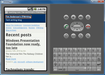
I don’t have an Android device, but I grabbed the SDK, ran up the emulator, and had a look. The page took ages to load, and did not work properly even when fully loaded.

I figured “there’s a plugin for that”, and there is – several in fact. I settled on the WordPress Mobile Pack. Installed, configured, and a short time later was up and running.

I had a few hassles, mainly because most of my wordpress installation is not writeable by the web server, and this plugin needs to write themes on installation and temporary images after that, so I had to loosen permissions slightly. I then set the themes directory back to read-only, and configured the cache so that Apache will only serve images.

I still only get a score of Fair (2 fails) from the MobiReady report. Still, progress. I am ahead of bbc.co.uk which gets Bad (10 fails); but behind microsoft.com which rates Good (0 fails).

The plugin also tells me that 5% of the traffic to this site is from mobile users. More than I had expected.

Beep beep.