I am developing a web site for playing bridge, a project which kicked off in March when lockdown caused bridge clubs everywhere to close. There are lots of sites where you can play bridge online, but not many options (particularly back in March) for clubs that wanted to run their own online sessions.
It’s going OK with a number of clubs now using it every week, though it is still in development. I have learned a painful lesson though. In order to proceed as quickly as possible, I started my project with the Visual Studio template for an ASP.Net Core application with ASP.NET Core Identity – the latter an easy decision since it handles all the complications of registration, password reset and so on. (I did end up having to re-plumb it to use int rather than GUID for the primary key but that is another story).
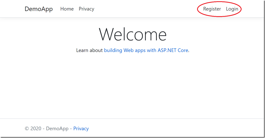
The default home page the template generates looks like this, with options in the menu to Register or Login.
Registration and login are fundamental concepts that have been part of the web forever. It’s simple for a developer to understand: you register to create an account, you login if you already have an account.
The painful discovery is that this is not obvious to everyone, particularly to an older demographic that did not grow up with computers. Another factor is that cookies, browser-saved passwords and single sign-on with Google/Facebook etc means that this whole area is a bit of a mess and there are people who just kinda expect web sites to know who they are (which in one way horrifies me but I do see the massive convenience).
The consequence is that a surprising (to me) number of people had difficulty knowing whether Registration or Login was what they needed. They would Register, then return to the site and hit Register again. Why is this site asking for my details again? Maybe a security thing? Oh no, why does it now say username not available?
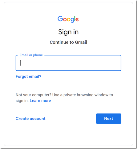
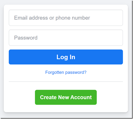
This is because asking the user to make this choice is not good design. Registration is rare, login is common. Further, Register is a confusing word. We sometimes use the word register when accounts already exist. Create Account is better. And a better UI is just Login. I need to access this website. Then, underneath the username/password request, an option that says “I need to create an account”. The two options should not be equally prominent; and if you look at how many prominent sites design this, that is what they do:
Lesson learned; but I wish this had occurred to me sooner!


