I’ve just received a Toshiba NB300 Netbook, which looks like it will be useful for blogging and web access during a couple of conferences coming up shortly – up to 11 hours battery life, great. I am interested in the user experience when starting out with a new machine, so made a few notes.
I regard this as a critical issue. Microsoft and its OEM partners are up against Apple, a company which pays careful attention to the user experience, from box unwrapping on. Apple charges a premium of course; Windows machines are generally cheaper, and there is an unwritten deal that you put up with a certain amount of foistware and rough edges for the sake of better value overall. On the other hand, if users do not feel good about a product they are unlikely to recommend it to others; Apple has won a fanatical following partly thanks to this attention to detail.
So how was the Toshiba? Better than the Samsung/Vodafone Netbook about which I blogged last month, but still not great.
I switched on and was immediately guided through a registration wizard, being assured that this would activate my warranty. Next I was prompted to activate TEMPRO, a Toshiba service which is meant to send me alerts concerning software updates and so on. I tried to do so, but the activation wizard told me the serial number was invalid, though as far as I can tell it is correct. Next, TEMPRO sent me an alert that my warranty was not registered. You what?
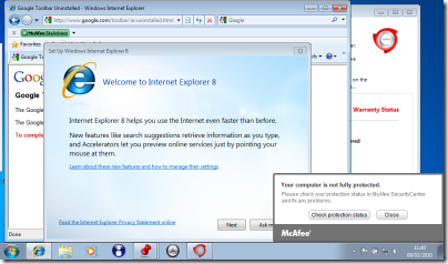
Trying to imagine what a typical user might do, I clicked the Register button just in case. This started up Internet Explorer for the first time. Next, Google popped up a dialog asking me to agree to its privacy policy for the pre-installed Google toolbar. I clicked Disagree and it started uninstalling. In the meantime, IE started its welcome wizard and McAfee started badgering me that I was not fully protected. Here’s my screen a few minutes after first power-on:
The problem here is that a bunch of different applications want to get you to agree some terms or set up a subscription, and they are all competing for attention. It is all very predictable, and the end result is ugly. You would think that someone could figure out how to do this in an organised manner.
I took a look at Control Panel. There was a ton of stuff installed although Toshiba is certainly not the worst when it comes to the bundling game. Pre-installed software included the following:
- Adobe AIR
- Amazon.co.uk
- eBay.co.uk
- Java 6
- McAfee Security Center (reboot required on uninstall)
- Silverlight 3
- Office Home and Student 2007 trial (reboot required on uninstall)
- Powerpoint 2007
- Microsoft Works 9
- Photo Service powered by myphotobook
- An amazing number of Toshiba utilities – I counted 24
- Wild Tangent games
- Windows Live Essentials
I tried Office 2007 trial, which asked to install an ActiveX control to check whether Office 2007 was already installed. This seems a clumsy solution, and perplexing for the user. I let it install, then clicked Buy Now, which got me to a web site where I could purchase it for £86.04.
Microsoft Works 9.0 is also installed in a full version, but whereas Office 2007 has an icon on the desktop, Works is hidden away in the Start menu. It might be all you need on a Netbook, except that its default document formats are unhelpful, if you need to share them with others. Works can open Microsoft’s Office 2007 XML formats (.docx, .xslsx) to some extent, but things went a little awry after I uninstalled Office 2007 trial. Double-clicking a .docx raises a Save As dialog defaulting to .docm, the macro-enabled Open XML format, which is something to do with the Microsoft Open XML Converter. I can’t imagine why it is doing that. Office 2007 will be going back on shortly.
A Toshiba utility called Web Camera Application has an annoying menu which docks to the side of the screen and pops up when you move the mouse there. Since Microsoft has worked hard on the taskbar area, which is where always-on utilities normally live, I’m not clear why Toshiba thinks this is a good idea. Having said that, the similar effort at the top of the screen which handles the Fn keys (known as Flash Cards) is not so bad: mouse activation is off by default, and it shows at a glance what all these keys do. Fn-F8 disables wireless for flight mode, for example. If you want to get rid of the side menu but not the top one, open it and right-click. Uncheck Auto Run and then click Close. If you then want it back, choose Start – All Programs – Toshiba – Utilities – Web Camera Application.
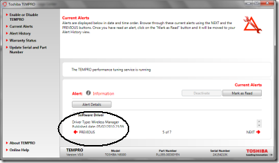
Toshiba pre-installs a multi-function utility called Toshiba Bulletin Board. It includes a Message Center which raises alerts, some of which link to TEMPRO as mentioned above. This turns out to be a bit of a usability disaster too. Here’s what happens. I get a notification that there are alerts to be read. I open Toshiba Bulletin Board and click a hyperlink to open Message Center. It says TEMPRO has some alerts to read, so I click Open. Now I’m in TEMPRO which apparently was not designed with the short 1024×600 screen in mind. It has lots of stuff in a huge dialog, leaving only 1.5 lines of space for the actual message, with a tiny scroll bar next to it. I’ve encircled the message in the pic below so you can see it:
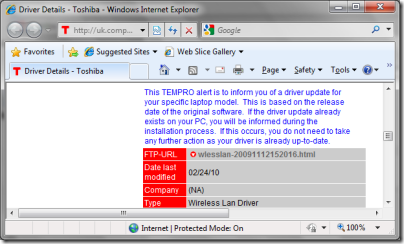
This one is a new software driver. Sounds like something useful, so I click Alert Details. This takes me to a web page called Driver Details. It has a big download icon, but clicking that does nothing. The page says:
To download your chosen file, simply click on the filename below.
Curiously, the “filename” is actually a link to an HTML page.
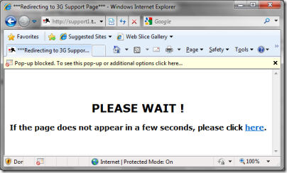
I click it. Now I’m here:
The IE pop-up blocker is doing its stuff, and if I’m impatient I can click a link. I wait a few seconds, nothing happens, so I click the link.
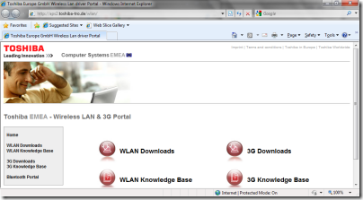
Help! Now I’m at some kind of portal with four big buttons and no clue which to click:
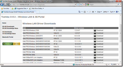
I vaguely recall it was a wireless driver so using my knowledge of acronyms I click WLAN Downloads:
Lovely! Now I have a list of around 25 downloads for various operating systems. All I have to do is decide whether my adapter is Intel, Atheros or Realtek, and which version and operating system I require.
Sorry, Toshiba, this is a bad joke. You’ve installed your special utility supposedly to make it easy to keep your product up-to-date, it takes multiple clicks to get anywhere useful, and it is so hopeless that it cannot even select the right driver automatically.
By the way, there is yet another update utility called Toshiba Service Station that comes with an intimidating agreement saying it will keep your data for seven years. I tried that too when prompted; it said No software updates available. How many update utilities does a little netbook need?
While I’m beating up this machine, let me mention the partitioning. The hard drive is only 250GB, but it is divided into three partitions: a small hidden partition for some clever recovery stuff, then two equally-sized partitions one called Windows and the other Data. There’s a case for having a separate partition for the operating system, though I don’t much like it on a Windows client machine because getting the sizes right is a challenge. However, Toshiba hasn’t really done what the names imply. Everything is on the Windows partition, including the data. In other words, the user’s home directory and documents are on the operating system partition. The only thing on drive D is an irritating directory called HDDRecovery which includes a readme pleading with you not to delete it.
Drive D may be handy though – I expect I’ll be trying MeeGo on here soon.
Lessons not learned
I like Toshiba machines, I know Windows backwards, and likely this machine will do a great job for me. Nevertheless, I can see that it has all sorts of usability issues, and that these are mostly not Microsoft’s fault but put there by the OEM vendor.
It beats why there isn’t some kind of usability trial where the prototype is put before a user, who is asked to turn the machine on and, as they say, follow the on-screen directions. The issues are not hard to spot. Toshiba is not a small company; it has the skills and resources to make a machine that offers a pleasing user experience.
It also beats me why resources are devoted to half-baked software like Toshiba Bulletin Board and TEMPRO, which are counter-productive, instead of aiming to integrate seamlessly with the good usability work Microsoft has done in Windows 7.
