Tag Archives: tablets

Surface Go: Microsoft has another go at a budget tablet

Microsoft has announced Surface Go, a cheaper, smaller model to sit at the budge end of its Surface range of tablets and laptops.

The new model starts at $399, will be available for pre-order today in selected territories, and ships on August 2nd.

In the UK, the Surface Go is £379 inc VAT for 4GB RAM and 64GB storage, or £509.99 inc VAT for 8GB RAM and 128GB storage.

image

I go back a long way with Surface, having been at the launch of the first device, Surface RT, back in 2012. The device was a flop, but I liked it. The design was genuinely innovative and sought to make sense of a Windows in transition from desktop-only to a viable touch/tablet device. It failed primarily because of the poor range of available apps, lack of user acceptance for Windows 8, and somewhat underpowered hardware. There were also keyboard issues: the fabric-based Touch keyboard was difficult to use because it gave no tactile feedback, and the Type keyboard less elegant and still somewhat awkward.

Surface Pro came next, and while it was more useful thanks to full Windows 8 and an Intel Core i5 CPU, it was disappointing, with battery life issues and a tendency to stay on in your bag, overheating and wasting battery. There were other niggling issues.

The big disappointment of Surface for me is that even with full, Apple-like control over hardware and software, the devices have not been trouble-free.

Another issue today is that Windows 10 is not designed for touch in the same way as Windows 8. Therefore you rarely see Windows tablets used as tablets; they are almost always used as laptops, even if they are 2-in-1 devices. The original kickstand design is therefore rather pointless. If I got another Surface it would be a Surface Laptop or Surface Book.

Of course they are not all bad. It is premium hardware and some of the devices are delightful to use and perform well. They are expensive though, and I suggest careful comparison with what you can get for the same money from partners like HP, Lenovo and others.

What about this one? Key specs:

  • 10″ screen, kickstand design
  • 1800 x 1200 (217 PPI) resolution
  • 8.3mm thick
  • USB-C 3.1 port, MicroSD, headphone jack socket
  • Intel® Pentium® Gold Processor 4415Y
  • Windows Hello camera supporting face-recognition log in
  • Up to nine hours battery life
  • Intel® HD Graphics 615
  • Display supports Surface Pen with 4096 levels of pressure sensitivity
  • Signature Type Cover with trackpad supporting 5-point gestures
  • Windows Hello face authentication camera (front-facing)
  • 5.0 MP front-facing camera with 1080p Skype HD video
  • 8.0 MP rear-facing autofocus camera with 1080p HD video
  • Single microphone
  • 2W stereo speakers with Dolby® Audio™ Premium

It sounds a great deal for £379 or $399 but you will pay more, for three reasons:

  • The base spec is minimal in terms of RAM and SSD storage and you will want the higher model
  • The Type Cover is essential and will cost – a Pro Type Cover is $159.99 and this may be a bit less
  • The Surface Pen is £99.99 or $99.99

This means your $399 will soon be $550 or more.

It could still be a good deal if it turns out to be a nice device. The Hello camera is a plus point, but where I would particularly recommend a Surface is if you want Pen support. Microsoft is good at this. Unfortunately I do not get on well with pen input, but some people do, and for artists and designers it is a real advantage.

Another go at Windows 8 from Microsoft’s hardware partners but strategy puzzles remain

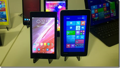
I am at the IFA consumer electronics event in Berlin, and have been struck by the number of new Windows 8 tablets on display. Some are hybrid laptop/tablet affairs, but there are also small tablets at keen prices (less than $199) which look superficially similar to Android tablets.

image

Under the covers though, they could not be more different. Android, like it or loath it, is well designed for tablets and low-maintenance for the user. Windows 8 on the other hand is a PC operating system with a split personality: apps that run in the don’t-call-it-Metro environment (Windows Store apps) and which work well with touch; and desktop applications most of which are hard to operate with touch.

Today’s PCs should also be low-maintenance; but they are vulnerable to badly behaved applications or even malware, applications that insist on installing themselves at start-up executables; applications that hijack file associations and cause confusion, and so on. Users have to understand the Windows Control Panel or burrow around in utilities like Task Manager and System Configuration (msconfig) to fix problems.

Microsoft foresaw this when Windows 8 was launched, and created a safer version of the operating system called Windows RT. It is perhaps not quite as low maintenance as Android, but since you cannot install desktop applications, all apps are sandboxed and can be easily installed or removed. Windows RT runs on ARM chipsets.

Unfortunately Windows RT was a flop, thanks to its confusing name and a lack of compelling apps in the Windows Store. Users seemed to be demanding “full Windows”, running on Intel chipsets, so that any Windows software can be installed.

There is no inherent reason, as far as I am aware, why x86 Windows cannot be locked down in the same way as Windows RT; this was a decision Microsoft made to differentiate the two. However they are not locked down, and therefore just as vulnerable and complex as any other PC.

The optimistic view is that the new wave of tablets will stimulate Windows Store app development and revive Windows 8. A Toshiba representative assured me that updates Microsoft made in Windows 8.1 had increased user acceptance of the new user interface.

I will not believe this though until we see Windows 8 tablets flying off the shelves in the same way as Android tablets or iPads; and further, I do not expect this to happen. Nor am I sure that they will be good for non-expert users; if they are like most PCs (and they are), they will get gradually slower and less usable as stuff (often unwanted) gets installed; Java, Ask Toolbar, Google Chrome and Toolbar, Silverlight, Flash, Adobe AIR and all the rest.

The current wave of tablets also makes me wonder what is the long-term thinking. With the near-demise of Windows RT, my expectation is that some future iteration of Windows Phone designed for larger displays will take its place, hopefully with full Windows Runtime compatibility or at least easy porting.

However, Windows 9 “Threshold” is also on the way. Are we going to end up with Windows 9 x86 tablets in form factors such as 7” and 8” tablets, as well as Windows Phone OS tablets in similar sizes? Or will Microsoft remove the desktop and lock down the OS in Windows 9 for phones and small tablets, to make it more like Windows RT, and call it Windows Phone 9?

CEO Satya Nadella speaks of “One Windows” but we are not close to it yet, and the developer story still seems uncertain to me. The one sure point is that Microsoft will use the Universal App concept to assist developers in targeting multiple Windows platforms (and perhaps even iOS and Android via Xamarin integration). The question though: what will those multiple Windows platforms look like a year or two from now?

Asus bets on everything with new UK product launches for Android, Google Chromebook and Microsoft Windows

Asus unveiled its Winter 2014 UK range at an event in London yesterday. It is an extensive range covering most bases, including Android tablets, Windows 8 hybrids, Google Chromebooks, and Android smartphones.

image

Asus never fails to impress with its innovative ideas – like the Padfone, a phone which docks into a tablet – though not all the ideas win over the public, and we did not hear about any new Padfones yesterday.

The company’s other strength though is to crank out well-made products at a competitive price, and this aspect remains prominent. There was nothing cutting-edge on show last night, but plenty of designs that score favourably in terms of what you get for the money.

At a glance:

  • Chromebook C200 dual-proc Intel N2830 laptop 12″ display £199.99 and C300 13″ display £239.99
  • MeMO Pad Android tablets ME176C 7″ £119 and 8″ ME181 (with faster Z3580 2.3 GHz quad-core processor) £169
  • Transformer Pad TF103C Android tablet with mobile keyboard dock (ie a tear-off keyboard) £239
  • Two FonePad 7″ Android phablets: tablets with phone functionality, LTE in the ME372CL at £129.99  and 3G in the ME175CG at £199.99.
  • Three Zenfone 3G Android phones, 4″ at £99.99, 5″ at £149.99 and 6″ at £249.99.
  • Transformer Book T200 and T300 joining the T100 (10.1″ display) as Windows 8 hybrids with tear-off keyboards. The T200 has an 11.6″ display and the T300 a 13.3″ display and processors from Core i3 to Core i7 – no longer just a budget range. The T200 starts at £349.
  • Transformer Book Flip Windows 8.1 laptops with fold-back touch screens so you can use them as fat tablets. 13.3″ or 15.6″ screens, various prices according to configuration starting with a Core 13 at £449.
  • G750 gaming laptops from £999.99 to £1799.99 with Core i7 processors and NVIDIA GeForce GTX 800M GPUs.
  • G550JK Gaming Notebook with Core i7 and GTX 850M GPU from £899.99.

Unfortunately the press event was held in a darkened room useless for photography or close inspection of the devices. A few points to note though.

The T100 is, according to Asus, the world’s bestselling Windows hybrid. This does not surprise me since with 11 hr battery life and full Windows 8 with Office pre-installed it ticks a lot of boxes. I prefer the tear-off keyboard concept to complex flip designs that never make satisfactory tablets. The T100 now seems to be the base model in a full range of Windows hybrids.

On the phone side, it is odd that Asus did not announce any operator deals and seems to be focused on the sim-free market.

How good are the Zenfones? This is not a review, but I had a quick play with the models on display. They are not high-end devices, but nor do they feel cheap. IPS+ (in-plane switching) displays give a wide viewing angle. Gorilla Glass 3 protects the screen; the promo video talks about a 30m drop test which I do not believe for a moment*. The touch screens are meant to be responsive when wearing gloves. The camera has a five-element lens with F/2.0 aperture, a low-light mode, and “time rewind” which records images before you tap. A “Smart remove” feature removes moving objects from your picture. You also get “Zen UI” on top of Android; I generally prefer stock Android but the vendors want to differentiate and it seems not to get in the way too much.

Just another phone then; but looks good value.

As it happens, I saw another Asus display as I arrived in London, at St Pancras station.

image

The stand, devoted mainly to the T100, was far from bustling. This might be related to the profile of Windows these days; or it might reflect the fact that the Asus brand, for all the company’s efforts, is associated more with good honest value than something you stop to look at on the way to work.

For more details see the Asus site or have a look in the likes of John Lewis or Currys/ PC World.

*On the drop test, Asus says: “This is a drop test for the Gorilla glass, and is dropping a metal ball on to a pane of it that is clamped down, not actually a drop of the phone itself.”

CES analyst predicts flat global consumer tech sales, massive dominance of smartphones and tablets, drift towards low-end

At CES in Las Vegas yesterday, CEA Director of Industry Analysis Steve Koenig presented data and predictions on global tech spending trends. The figures come out of CEA Research and are based on sales tracking at retail outlets around the world supplemented by other data.

image

This being CES, I was expecting a certain amount of hype around how consumer technology is changing the world, but in fact Koenig’s presentation was matter-of-fact and somewhat downbeat. He said that the overall consumer tech spending trend is flat, with rising spend in emerging markets (especially China) more or less making up for declining spend in mature markets, which he says is due to market saturation. His figures show 2% growth in spending in 2013 but a 1% decline in 2014. Given the uncertainty of this kind of forecast, let’s call it flat.

The “market saturation” factor is a point to ponder. It suggests that technical devices are “good enough” for longer. It also suggests that overall the new gadgetry on show at CES is not sufficiently exciting to persuade us to spend a higher proportion of our income on consumer electronics.

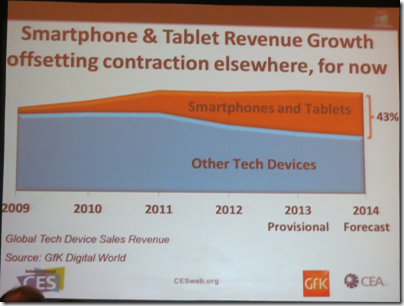
Looking at his figures though, it is not just a matter of saturation. Another factor is device convergence. We are spending less on cameras and camcorders because a smartphone is good enough. We are spending less on printers because there is less need to print stuff; we can view it on a tablet. We don’t need a SatNav any more; we use a smartphone (or it is built into the car’s dashboard). In fact, we are loving our smartphones and tablets so much that spending on almost any other kind of tech is in decline. Here’s the slide showing how these mobile devices are forecast to account for 43% of consumer tech spending in 2014:

image

Spending on smartphones is forecast to increase by 9% in 2014, and on tablets 6%. Almost the only other broad category for which significant revenue growth is forecast in 2014 is video games consoles, thanks to the launch of new generation Xbox and PlayStation boxes (maybe Steam boxes too). That is a product cycle, not a long-term trend. Personally (my thoughts, not Koenig’s) I reckon games consoles will decline thanks to competition from smartphones, tablets and smart TVs. Global TV sales are expected to increase by 2% in units.

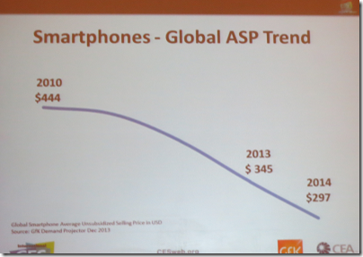
The other big picture trend identified by Koenig is the reduction in the average selling price (ASP) of smartphones and tablets. Smartphone ASP is down from $444 in 2010 to $297 in 2014.

image

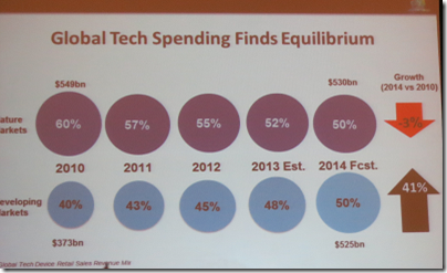
This trend is partly because the quality of cheaper devices has improved, but also because the emerging markets which are spending more are also markets that want lower prices. Taken together, this translates to a significant shift towards the low end. Overall, CEA forecasts that tech spending in developing markets, primarily on low end devices, will equal tech spending in mature markets for the first time in 2014.

image

Of course this is largely an Android story. I will add though some reflections on what has happened with Windows in the light of these trends. Microsoft was right to adapt Windows for tablets, but if you look at how Windows 8 was launched there was too much focus on the high-end, trying to copy Apple rather than compete with Android. That was a mistake, and it is only recently that OEMs like Asus, with its T100 Windows 8.1 tablet, have started to come out with decent low-end devices. Nokia on the other hand has done exactly the right thing with its Lumia Windows Phones, building market share with excellent low-end smartphones. Whether that momentum will be sustained following Microsoft’s acquisition will determine the fate of the phone platform. 

Finally, note that forecasting the future is never easy and this time next year the picture may look quite different.

Update: Koenig’s slide deck is here.

Review: Acer Iconia W3 with Windows 8.1 Preview

Attendees at Microsoft’s Build conference last month were given an Acer Iconia W3 tablet, presumably because it is the earliest examples of Windows 8 on an 8″ tablet. I find it hard to assess; it seems good value but is a frustrating device.

The specs in summary:

  • Processor: Intel Atom Z2760 1.50 GHz Dual-core
  • Memory: 2GB
  • Storage: 64GB SSD
  • Card slot: MicroSD up to 64 GB
  • Display: 8.1″ Active Matrix TFT Colour LCD WXGA 1280 x 800
  • Graphics: Intel Graphics Media Accelerator HD, shared memory
  • Wireless: 802.11b/g/n, Bluetooth
  • Ports: HDMI, Micro USB, headset/speaker jack
  • Cameras: Front and rear
  • Microphone: Yes
  • Battery: 2-cell Li-Polymer 6800 mAh
  • Size and weight: 11.4 x 134.9 x 219 mm, 500g
  • Price: Around £350 or $430

Since this is an x86 device, it comes with full Windows 8.x, not the locked-down Windows RT edition. My guess is that Acer did this because Windows RT has been a hard sell, thanks to the poor selection of Windows Store apps on offer, indifferent performance, and confusion among customers when they discover that none of their existing Windows apps will run.

On the other had, do you really want full desktop Windows on an 8.1″ device? I view it with mixed feelings. Technically it runs well, and means that you have amazing capability in a small and highly portable device. The case against is that desktop Windows is designed neither for touch, nor to run on such a small screen. In order to use it, you need good eyesight and ideally a keyboard and mouse. The mouse is especially important, since targeting small desktop icons with fingers (at which I have become quite adept on larger Windows slates) is a real challenge on this tiny display.

image

There is a matching Bluetooth keyboard/dock (included in the picture above) which is available for around $80 and which was also handed out at Build. The underside of the keyboard forms a kind of case.

image

I am typing this review, naturally, on this very keyboard, and I am would not want to tackle it with only the on-screen keyboard. It feels cheap and plastic though, and I saw one Build delegate struggling with a broken key after only a day of use. Keyboards are quite delicate (some more than others), and arguably it would make more sense to protect the keyboard with the tablet, than the tablet with the keyboard.

Another issue is that the Bluetooth keyboard does not include a trackpad, perhaps because it would require a docking connector rather than just Bluetooth. However as mentioned above, the lack of a mouse is equally troublesome in desktop Windows. Therefore I have plugged in a USB mouse in order to work on this review.

Of course, once you have loaded your bag with keyboard and mouse as well as tablet, you begin to wonder whether a conventional laptop would have been easier. I admire Microsoft’s Surface design, where the keyboard cover does include a trackpad, and where the keys on the Type cover are folded inside the cover and therefore protected in your bag. The Surface Pro is far more expensive, but Surface RT not so much, and I suggest that Surface RT is a more satisfying product despite its locked-down desktop, especially with Windows 8.1 which includes Outlook.

The Iconia W3 also has a grainy screen. It is usable, but the worst screen I have seen for a while, and not helped by a high-gloss reflective surface.

Annoyance number three is the micro USB port. Few devices expect to find micro USB on the PC side, so you will need an adaptor. The Build handout included one, but I suspect this is not in the box by default. Even with an adaptor though, it is a nuisance, though I appreciate the difficulty in including a USB A port on a slim device like this.

Performance is no more than so-so, which is what you would expect from the Atom CPU. On SunSpider 1.0, for example, with IE11, the W3 scores 671.5ms, better than Surface RT at 1029.2ms but behind Surface Pro at 209ms. I think it is good enough for a device of this kind.

The device does get uncomfortably hot though, in an area at back right which I presume is close to the CPU.

The W3 does have its plus points. Battery life is good, Office Home Premium is included in the price, and it is what it claims to be: a small tablet capable of running full desktop Windows. That means you can use VLC to watch videos on a flight, or Live Writer for writing blog posts, or FileZilla for FTP, or Putty for SSH, to mention a few utilities that I miss on Windows RT.

Making sense of this device means reversing your thinking about Windows. You should plan to spend most of your time in the “Modern” tablet user interface, while occasionally dipping into the desktop. If that mode of working makes sense for you, and you want an 8.1″ device, the Iconia W3 is a reasonable purchase. Take note of all the caveats though. A close look at this device makes you realise why Microsoft embarked on the Surface project.

I am done with laptops

2012 was the year I lost interest in laptops. It happened in February, when I was in Seattle and purchased a Samsung Windows 7 Slate for the purpose of testing Windows 8.

This Slate has an Intel Core i5 CPU and is a flawed device. With Windows 7 it was particularly bad, since Windows 7 is not much fun for touch control. Windows 8 is much better, though now and again the screen will not respond to touch after being woken from sleep, and a cold reboot is needed.

That said, performance is fine, and the Slate has a couple of characteristics which I like. One is small size. It fits easily in almost any bag. In fact, I can put this Slate, an iPad and a Surface RT in a bag and they take up no more room that with a typical 15.6” laptop.

The second is convenience. If you are travelling, a laptop is an awkward and unsocial thing. I have come to dislike the clamshell design, which has to be unfolded before it will work, and positioned so that you can type on the keyboard and see the screen.

I do not pretend that desktop Windows has a great user interface for touch control, but I have become more adept at hitting small targets in the likes of Outlook. In addition, many tasks like browsing the web or viewing photos work fine in the touch-friendly “Metro” personality of Windows 8.

What about when you need to sit down and do some serious typing, coding, or intricate image manipulation? This is when I pull out a keyboard and mouse and get something similar to a laptop experience.

image

The above shows my instant coffee-shop office, with wireless keyboard and mouse, and internet connection through mobile phone. Though I have abandoned the keyboard and mouse shown, preferring a Bluetooth set I picked up late last year which leaves does not require a free USB port.

I am not sure why I would ever want another laptop. When in the office, I prefer a PC under the desk to a laptop on the desk. A tablet, whether Windows, Android or iOS, works better for mobility, even if mobility means watching iPlayer in the living room rather than travelling around the world.

Nor do I like hybrid tablets with twisty screens and keyboards, which lose the simplicity and instant usability of the tablet concept. I make an exception for Microsoft’s Surface RT, particularly with the touch keyboard cover, which does not get in the way or take up significant space, but does form a usable keyboard and trackpad when needed. There will always be an advantage to using a physical keyboard, since even if you get on fine with a soft keyboard there is no escaping the large slice of screen it occupies. Well, until we can type with detected thought processes I guess.

I am told that an iPad with a Logitech Ultrathin keyboard is also a nice combination, though I have not tried this yet.

Review: Cooking the QOOQ way – do you want a tablet in your kitchen?

Throw out those cookery books. What you really want is a kitchen gadget that has thousands of recipes, searchable with a few quick taps, with video demonstrations for the tricky bits and extra features like auto-created shopping lists and the ability to play background music, right?

image

If that sounds good to you, you should take a look at the QOOQ, a 10” tablet designed for the kitchen. It is splash-proof and wipe-clean, with legs that sensibly lift it clear of the surface in case any pools of liquid should appear (not that they would).

Last week I visited Unowhy, the company behind QOOQ, at their Paris head office. I also got to try the QOOQ for a couple of days. It is a great little device, but there are some caveats, and note that you need an on-going subscription for full usage. Read on to see if QOOQ is for you.

The device

A QOOQ is a capacitive-touch tablet powered by a ARM Cortex A9 dual core chipset and running Linux. No, it is not Android; it reports itself as a QOOQ-specific Linux build, and the software is written in native code using the QT framework. It is also locked down so that you cannot get access to the operating system without a service password that is not supplied. This means you cannot install applications other than a few supplied utilities. This is an appliance, not a general-purpose tablet, though it does have a web browser, an email client, a photo viewer and a music player so it covers the basics.

The device feels sturdy and well made, though note that the protruding legs make it an awkward thing for most purposes other than sitting on a kitchen surface. There is a USB port and an SD card slot, so you can add music files or photos. An obvious secondary purpose is to add some family photos and have them display as a slideshow.

On the right-hand side of the unit are controls for on-off and volume.

image

On the left, the ports and headphone socket, behind a rubber cover that has an annoying tendency to come loose. You get card slot, USB 2.0 port, wired ethernet and audio. Nice to see the wired ethernet socket but I doubt this gets much use; how many households have wired ethernet in the kitchen?

image

I did not test battery life in detail but it worked fine for a few hours; however this is unimportant since it can be mains-powered during normal use.

Music sounds pretty good even through the built-in speakers. Of course you can get better sound using an external powered speaker.

Wi-Fi support covers B G and N standards and worked well for me.

Overall the hardware is excellent, well designed for its purpose. The main problem, aside from the loose cover mentioned above, is that if you operate the screen while cooking you will likely want to touch the screen sometimes with hands covered in food. QOOQ can easily be wiped clean, but a few dabs of flour or butter on the screen and it gets hard to read. A small hardware rocker for scrolling and clicking would help, so that you could avoid touching the screen itself.

The software

In the main, interacting with QOOQ feels like running a single application, though the web browser runs full screen and takes you out of it to some extent. The browser seems to be based on WebKit (like Apple Safari, Android and Google Chrome) and includes Flash player 10.1 though this is disabled by default; the system warns that it may run out of memory if Flash is enabled. Think of the browser as something basic for occasional use, though it does come into play for the QOOQ help system such as it is (more on that later). You could also look up recipes on the internet outside the QOOQ system (perish the thought) and take advantage of the device that way.

I could not figure out how to get screengrabs, so had to make do with the old point-the-camera-at-the-screen routine. Here is the home page.

image

You can see the idea. The main menu is on the left hand side, giving access to recipes, index of chefs, cooking guide, meal planner, shopping list, and the all-important search.

The home page includes  a spotlight recipe, online magazine, and on the right hand side, a customisable column of supplementary apps, including web browser, internet radio, weather app, video player, and access to local storage, though this last is limited to photos and music files.

Once into a recipe, QOOQ has a commendably clear layout. You get tabs for ingredients, utensils, and then the heart of it, preparation with step-by-step instructions. In the best case, there is a video available, to which the steps are hot-linked so that tapping a step shows how to do it in the video. Brilliant. If there is no video, then you get a colour picture of the finished dish as a minimum. There is also information on preparation time and cooking time.

image

Now the not-so-good. QOOQ is made in France and recently adapted for the English market. The biggest market is the USA, so all the weights and measures are in US-style cups, tablespoons, and imperial pounds and ounces. There was no way to change this in the review unit though Unowhy mentioned that metric measurements are on the way so there is hope.

There is also a problem with the videos. Most of the videos were recorded in French with chefs explaining their actions. In order to adapt them for English, Unowhy has overdubbed these with a rather wooden voiceover translation. You can still hear the French original faintly in the background. Not good.

Selecting Help is unrewarding for English users. You get a page not found message.

image

Along with the core recipe database, QOOQ has some other features. There is a meal planner, which works but sometimes caught us out. You cannot select Saturday and choose a meal; you have to select a recipe and add it to Saturday.

You can have QOOQ generate a shopping list and email it to you. This could be useful, though I was amused to see “13 3/8 tbs. Water” on my shopping list.

There is also a rather complex system of user profiles, tastes and techniques which frankly I never fully figured out (and help is no help as you can see above).

image

Users can build up profiles of which ingredients they like and which techniques they have mastered, which one assumes are taken into account if you use QOOQ’s meal suggestion feature, and possibly in other ways. I suspect many users will ignore this aspect of QOOQ.

Searching for a recipe

Cooking a meal is merely the last step in a process that begins with the harder task of deciding what to cook. QOOQ has a search feature that lets you search by recipe name, or by ingredient.

image

This is a little confusing. There are two search tabs. The first search tab is for “All QOOQ”.  You can search for recipes here, but only by name. If you select ingredients, you will be searching the food encyclopaedia, and end up with an entry all about onions, for example, rather than recipes containing onions. If you want to search by ingredient, you need the ingredient tab. Search shows the number of results as you type.

image

The results are shown in a scrolling list, in one of two views. The detail view is the best, and shows preparation time, difficulty, cost of ingredients, and cost to acquire the recipe if you do not have a full subscription (more on this later). You can filter the view in various ways, such as only recipes with videos. You can sort by various fields such as calories, or preparation time.

Despite the richness of the information, QOOQ’s search could do with some work. It is disappointing that you cannot filter by specialist requirements such as vegetarian or gluten-free meals. The search is also too complicated. QOOQ should learn from Google and have a single search page with intelligent results. Another limitation is that the recipe search does not account, we think, for synonyms, so you might have to experiment. Still, it is good enough and you will likely find what you want if QOOQ has it on offer.

Note that some of the recipes are on the internet and will be downloaded on the fly. This aspect works seamlessly, and any background downloads are invisible to the user.

The recipes

This is the heart of it. How are the recipes?

This is a collection for serious cooks. Note that Unowhy has focused on chefs, and persuading well-regarded chefs to share their techniques and recipes under the eye of a video camera. That is fantastique and beyond price for professionals or ardent throwers of dinner parties. I found QOOQ better than any cookery book I can think of for suggesting cooking ideas and enabling me to judge how feasible each recipe would be, bearing in mind available skills, ingredients, and batterie de cuisine.

That said, QOOQ leans strongly towards the high end of cooking. My search for a lowly Christmas Pudding came up blank; and the synonym Plum Pudding was no better.

image

I also looked in vain for general techniques like how to roast a duck (having enjoyed duck brûlée on a recent occasion); the duck recipes are all more advanced and interesting than that.

In other words, there are many wonderful recipes here that will inspire you, but I am not sure it is ideal as an everyday companion for the less expert, though this could easily be fixed by adding more content.

You are meant to be able to add your own recipes using software downloaded from the QOOQ site, but I could not find it; the French language site is more extensive so it is probably there somewhere.

The cost

Is QOOQ worth it? That is the question, and to answer this we need to look at the cost.

A QOOQ costs $399 which is about £260. For this you get the tablet and 1000 “recipes, videos and techniques”.

My loan QOOQ was able to search 3681 recipes. What about recipes beyond the supplied 1000?

Here you have two choices. You can purchase an all-you-can-eat (ho ho) subscription which is $99.00 (£65) per year or  $9.90 (£6.50) per month. Alternatively, you can buy individual recipes for credits. Recipes seem to cost between 2 and 8 credits, and a credit costs $4.90 for 20, so that means recipes cost from 50c to $2.00, or from about 30p to £1.30. Once purchased, a recipe is yours for ever.

Unless you are a professional, the individual recipes strike me as better value, especially as you can use them again and again.

Bear in mind though that there are countless free recipes on the internet, which you can even view on the QOOQ using the built-in browser. Certainly the QOOQ offers a premium experience and its recipes are exclusive. Having an expert chef explain a recipe to you in the comfort of your own kitchen is worth a lot. But this is not a mass market proposition.

A Google Nexus 7 or Nexus 10  device propped up against the toaster is not quite so good for cooking, but works in or out of the kitchen. A quick search for “splashproof iPad case” got me some results too.

Final thoughts

A QOOQ is a smart device with some fabulous content; yes it is the ideal gift for the cookery enthusiast who has everything. It is somewhat quirky and the transition from French to English is frustrating and incomplete in places.

Is it for the rest of us though? In its current form, probably not. That said, there is potentially a wide market for these recipes and videos, particularly if the company can build up a bigger collection of true English videos or improve the production of the French videos with English dubbing.

QOOQ would also benefit greatly from true social media integration. Currently you can rate your own recipes, but you cannot see other people’s ratings. I would like to see user ratings and discussions fully integrated, so you can learn what other people liked, what went wrong, discuss alternate ingredients and techniques and so on.

In the end it is all about the content, which is why the company would do well to promote its content more strongly apart from the device. We were told in Paris that users can subscribe to the web site and get recipes without having to buy a QOOQ, but I cannot see any way to do that currently (perhaps you can do this in French). This is needed, along with iPad and Android apps.

The QOOQ was born not out of a desire to make a kitchen tablet, but because the founders wanted a way of preserving recipes and skills. It was “how to immortalise recipes before you die”, as explained by company co-founder Guillaume Hepp.

The QOOQ should be a premium way to get the content, rather than the main delivery channel.

You can get your QOOQ here.
How bad is the Surface RT?

I have just read this piece on Slate entitled Why is the Surface so bad? after using the device for most of yesterday, on a train and at a technical event.

image

Oddly, I like the Surface RT increasingly, though I too am puzzled by some of its shortcomings.

Here are some of the issues I am aware of:

  • The apps. This is the biggest issue. Where are the delightful apps? For example, the mail client is barely adequate. The music app is annoying, though there is plenty to stream if you have an Xbox Music Pass. It cannot play FLAC files, which I use for my Squeezebox-based system at home.

    How hard is it for a company the size of Microsoft to write a superb mail app and a superb music app for its critical new product? I would guess that a small fraction of the advertising budget would have been enough. Why was there no one at Microsoft with the guts to throw them back at the team that developed them and say, “Not good enough, we do not have a product.”

  • Performance is so-so. It is not terrible in my experience, but at times makes you wonder if Windows 8 is too much on a Tegra 3; or whether it needs a whole lot more optimisation. Battery life is also OK but could be better. I got 7 hours or so yesterday, with wi-fi on constantly, and some of the time powering a phone being used as a wi-fi hotspot.
  • I got errors updating Microsoft Office. Mostly fixed by exiting the Office Upload Center. There’s no excuse for that. This is the appliance model. Microsoft knows exactly what hardware I have and what software I have, and has locked it down so I can only install sandboxed apps from the Store. Testing various update scenarios is easy.
  • For that matter, why is there an Office Upload Center? It is dreadful error-prone software. Dropbox has no Upload Center. Is it so hard to sync documents with SkyDrive or SharePoint – how long has Microsoft been batting at this problem?
  • I am concerned by reports of early keyboard disintegration, though mine is still OK

Enough griping though. Here is why I like this device.

First, I have no problem with the weight and I like the solid feel of the unit. The Surface is compact. The Surface with its keyboard is about 350g lighter and 4mm slimmer than my Samsung Slate without a keyboard; I am including the cover because I would never travel with a slate without a cover.

Second, unlike the Slate (magazine) reviewer, I do think the keyboard cover is a breakthrough. The Touch keyboard provides a usable full keyboard and trackpad while not adding any significant bulk; it forms a useful cover when closed, and when folded back it does not get in the way while you use Surface as a slate. I find myself using it in Slate mode frequently. Do not believe those who say you need keyboard and mouse to operate a Surface; there is only an argument for this if you never venture out of the desktop.

I can do more than occasional typing on the Touch keyboard; it is fine for longer documents as well.

Third, I can do real work with the Surface. Yesterday I sat with Surface on my lap, typing notes into Word, with Mail docked to the left, and Twitter open in desktop IE alongside Word. For all its faults, I found that the Surface worked well in this context.

Fourth, if you know Windows, there are things you can do that are difficult with other tablets. VPN to my office and remote desktop to a Windows 7 machine there is built in and works well. SharePoint via WebDAV is a shortcut in the Windows File Explorer.

Of course you could do all this with a laptop. So why not have a laptop, which you can buy for less money than a Surface? It is certainly an option; but as I have adapted first to the Samsung Slate running Windows 8, and now to the Surface, I find laptops bulky and inconvenient. I think of a laptop more as I used to perceive a desktop PC, something which is best suited to permanent siting on a desk rather than being carted around.

Further, the Surface really is a tablet. Imagine you want to show some photos to a friend or colleague. On a laptop that is awkward. The keyboard gets in the way. On a tablet like the Surface it is easy; just open the folder in the full-screen photo app and swipe through the images, with the keyboard cover folded back. Pretty much any tablet will do that equally well – or better if you have a Retina iPad – but it shows that Surface is not just a laptop in disguise.

There are reasons why I get better results from the Surface than some. One is that I know Windows 8 well, having used it intensively for many months. Another is that I am familiar with Windows foibles, so when these appear in the Surface I am likely to know what to do. Of course they should not appear at all; see above.

Microsoft seems to have created a device with many flaws, but one that is useful and sometimes delightful even despite those flaws.

Windows 8 launches: key questions remain, but Surface shines

I am in New York for the launch of Windows 8. This morning was the general launch; the Surface RT launch is to follow this afternoon. Windows chief Steven Sinofsky introduced the event. I was intrigued by how dismissive he was about a key Windows 8 issue: the learning challenge it presents to new users. He gave the impression that a few minutes experimenting will be enough, though he also referred to a guide that may be new; yesterday I picked up a small booklet which I had not seen before, introducing Windows 8.

Next Microsoft’s Julie Larson-Green and Michael Angiulo came on to show off a few details about the Windows 8 user interface, followed by Ballmer who gave what is for him a muted address about how great Windows 8 is going to be. Solid facts were few, but Microsoft did mention that over 1000 devices are certified for Windows 8.

So what is Windows 8 all about? It’s a tablet, it’s a laptop, it’s a PC we were told, in other words, everything. But everything is also nothing, and my sense is that even Microsoft is struggling to articulate its message, or at least, struggling to do so in ways that would not offend key partners.

Personally I like Windows 8, I find it perfectly usable and appreciate the convenience of the tablet format. That said, I look at all these hybrid devices and my heart sinks: these are devices that are neither one thing nor another, and pay for it with complexity and expense. Will they win over users who might otherwise have bought a MacBook? I am doubtful.

Windows RT and Intel Atom devices are more interesting. If Microsoft and its partners can push out Windows 8 devices that inexpensive and work well on tablets without keyboard clutter, that is what has potential to disrupt the market.

That brings me on to Surface. It is all in the body language: the conviction that was missing from the Windows 8 keynote in the morning was present in the Surface keynote in the afternoon. Even the room was better, with stylish Surface fake pavement art in the corridor and smart white seating.

image

General Manager Panos Panay showed off little details, like the way the rear camera angles so that it is level when the Surface is set on its kickstand. He talked about Microsoft’s drop tests, claiming that they had tested 72 different ways to drop a Surface and designed it not to break. He demonstrated this by dropping it onto a carpet, which was not too challenging, but the fact that Sinofsky successfully used it as a skateboard was more impressive.

image

No doubt then: Microsoft has more enthusiasm for Surface, described by Panay as “the perfect expression of Windows”, than it does for the 1000 certified devices from its partners, though the company would never admit that directly.

What is the significance of Surface? It goes beyond the device itself. It will impact Microsoft’s relationship with its hardware partners. It embodies an Apple-like principle that design excellence means hardware designed for software designed for hardware. It shows that the “OK but nothing special” approach of most Windows hardware vendors is no longer good enough. If Surface is popular, it will also introduce demand for more of the same: a 7” Surface, a Surface phone, and more.

Despite its quality, the success of Surface is not assured. The biggest problem with Windows 8 now is with the lack of outstanding apps. That is not surprising given that the platform is new, and you would think that users would make allowance for that. On the other hand, they may lack patience and opt for better supported platforms instead, in which case building app momentum will be a challenge.

Microsoft financials: still growing in the cloud era, but watch out for tablets

I am in the habit of putting Microsoft’s results into a simple table. Here are the latest:

Quarter ending June 30th 2012 vs quarter ending June 30th 2011, $millions

Segment Revenue Change Profit Change
Client (Windows + Live) 4145 -598 2397 -511
Server and Tools 5092 +568 2095 +409
Online 735 +55 -6672 -5927
Business (Office) 6291 +339 4100 +399
Entertainment and devices 1779 +292 -263 -276

It is easy to spot the stars: Server and Office.

It is also easy to spot the weaklings, especially Online, which reported a breathtaking loss thanks to what the accounts call a “goodwill impairment charge”. This translates to an admission that the 2007 acquisition of aQuantive was a complete waste of money.

Mixed signals from Entertainment and devices, where revenue is up but a loss is reported. Since this segment munges together Xbox and Windows Phone, it seems plausible that the phone is the main culprit here. Microsoft identifies payments made to Nokia and the addition of Skype as factors.

Windows is down, in part because Microsoft’s upgrade offer for Windows 8 means some revenue is deferred, though one would imagine that worldwide reports of stagnant PC sales are a contributory factor as well.

If you add up the figures, and allow for overheads, it comes to a wafer-thin operating income of $192 million and a $0.06 loss per share.

What do the figures tell us? Two things: Microsoft still makes a ton of money, and that it is exceedingly bad at acquisitions. I am not sure how a company can mislay $6.2bn without heads rolling somewhere, but that is not my area of expertise.

Microsoft’s Server 2012 family has impressed me so my instinct is that we will see good figures continue there.

On the Office side, it is not all Word and Excel. “Exchange, SharePoint and Lync together grew double-digits,” Microsoft said in its earnings call, adding that Lync revenue is up 45%.

That said, how many server licences can you sell in the cloud era? How can Microsoft grow Azure without cannibalising its server sales?

It is tempting to state, like James Governor at Redmonk, that this is The End of Software: Microsoft Posts a Loss for the First Time ever. Microsoft’s figures have stubbornly refused to prove this though; and a quarter where revenue has risen though poisoned by an acquisition disaster is not the moment to call it.

Microsoft has survived the cloud. The bigger question now is whether it can also survive tablets eating into its Windows sales, not helped by Google pushing out Nexus 7 at casual purchase price – see my first take here.

All eyes then on the new Windows 8 and Office 2013.