Tag Archives: metro

Huge icons in Windows 8 Metro

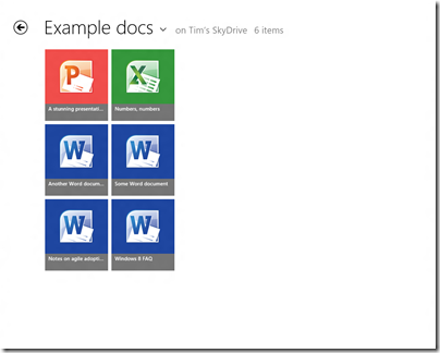
This is the SkyDrive Metro-style app running on my 1280 x 1024 desktop, in its default view. Note that each icon is 185 x 211 px. The actual title of each document is in relatively small text though still readable.

image

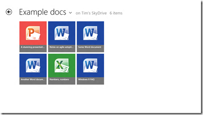
On my slate I only get two rows per screen:

image

You can set it to Detail view which gives nine rows on the desktop display and six rows on the slate.

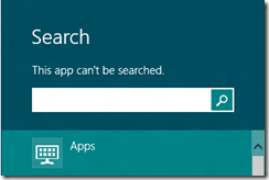
Touch-friendly, undoubtedly, but is this really best-practice design? What if you have lots of documents in a folder? I suppose it is just swipe-swipe-swipe, not helped by the fact that the SkyDrive app cannot be searched:

image

nor is there any way that I can see to sort the documents, say by last modified.

Of course you can do all these things in the touch-hostile desktop application.

Both the app and Windows 8 itself are pre-release so may improve, but I would like to see a smarter approach to browsing and selecting documents in Windows 8 Metro-style.

For more on Windows 8, see my review on The Register.

Adobe Flash in Windows 8 Metro, but not technically a plug-in

Today’s Windows 8 rumour is that Adobe Flash will be baked into Internet Explorer 10 in Windows 8, not only in the desktop edition but also in Metro.

Until this is confirmed by Microsoft, it is only a rumour. However, it seems likely to me. The way this rumour mill works is:

  • Some journalists and book authors working closely with Microsoft already have information on Windows 8 that is under non-disclosure.
  • Some enthusiast sites obtain leaked builds of Windows 8 and poke around in them. Unlike new Mac OS X releases, Windows builds are near-impossible to keep secure because Microsoft needs to share them with hardware partners, and mysteriously copies turn up on on the Internet.
  • When an interesting fact is leaked, this allows those journalists and book authors who already have the information to write about it, since most non-disclosure agreements allow reporting on what is already known from other sources.

That is my understanding, anyway. So when you read on WinUnleaked.tk that Flash is in IE10 you may be sceptical; but when Paul Thurrott and Rafael Rivera report the same story in more detail, you can probably believe it.

Back to the main story: presuming this is accurate, Microsoft has received Flash source code from Adobe and integrated it into IE10, in a similar manner to what Google has done with Flash in Chrome. This means that Flash in IE10 is not quite a plug-in. However, on the Metro side the inclusion of Flash is apparently a compatibility feature:

So, Microsoft has extended the Internet Explorer Compatibility View list to include rules for popular Flash-based web sites that are known to meet certain criteria. That is, Flash is supported for only those popular but legacy web sites that need it. This feature is not broadly available for all sites.

say Thurrott and Rivera, though I presume this only applies to the Metro IE10 rather than the desktop version.

Does this make sense? Not altogether. Oddly, while I have heard plenty of criticism of Windows 8 Consumer Preview, I have not heard many objections to the lack of Flash in Metro IE. Since Apple does not support Flash on iOS, many sites already provide Flash-free content for tablet users. Further, on the x86 version of Windows 8 there is an easy route to Flash compatibility: just open the site in the desktop browser.

That said, there is still plenty of Flash content out there and being able to view it in Windows 8 is welcome, especially if you can make your own edits to the compatibility list to get Flash content on less well-known sites. My guess is that Microsoft wants to support Flash for the same reason Android devices embraced it: a tick-box feature versus Apple iOS.

One further thought: this is a sad moment for Silverlight, if Microsoft is supporting Flash but not Silverlight on the Metro side of Windows 8.

Microsoft appeals to Windows 8 Metro developers not to stray from the official API

Microsoft’s John Hazen has posted on the official Building Windows 8 blog about the security and reliability principles in the Metro platform in Windows 8. Hazen explains how apps are installed from the Windows store, use contracts to interact with the operating system, and have to ask user consent for access to device capabilities such as the webcam or GPS, or to access user data such as documents and music.

The most intriguing part of the document comes when Hazen appeals to developers to stick to the API that is referenced in the official Windows 8 Metro SDK:

Resist the temptation to find ways to invoke APIs that are not included in the SDK. This ultimately undermines the expectations that customers have for your app. APIs that are outside the SDK are not guaranteed to work with Metro style apps either in this release or in future releases, so you may find that your app doesn’t function properly for all customers. These APIs may also not function properly in the async environment that is foundational to Metro style app design. Finally these APIs may undermine customer confidence by accessing resources or data that Metro style apps would not normally interact with. For all these reasons, we have provided checks in the Windows App Certification Kit to help you catch places where you might have inadvertently called interfaces not exposed by the SDK.

While it is possible to hide or obfuscate calls to APIs that are not included in the SDK, this is still a violation of customer expectations and Store policy. In the end, we have created this platform to help developers like you to build amazing apps that work well with the system and with other apps and devices to delight customers. Working with the Metro style SDK is fundamental to your realizing that goal.

The worrying aspect of this appeal to developers to play nice is Hazen’s admission that crafty developers may find ways to escape the Metro sandbox, undermining both the security and the privacy protection built into Metro. The main protection against this is such such an app should be blocked from the Windows Store, but can Microsoft check with 100% confidence that no hidden or obfuscated API calls exist? How effective is the Metro sandbox?

My guess is that the danger will be greater on the x86 version of Windows 8 than in Windows RT, which is locked down to prevent any third-party desktop applications from being installed. Nevertheless, a large part of the non-Metro Windows API must exist in Windows RT, to support the desktop, Explorer and Microsoft Office.

A little colour returns to Visual Studio 11 – but not much

Microsoft has responded to user feedback by re-introducing colour into the Visual Studio 11 IDE. The top request in the official feedback forum was for more colour in the toolbars and icons.

image

Now Microsoft’s Monty Hammontree, who is Director of User Experience, Microsoft Developer Tools Division – it is interesting that such a post exists – has blogged about the company’s response:

We’ve taken this feedback and based on what we heard have made a number of changes planned for Visual Studio 11 RC.

That said, developers expecting a return to the relatively colourful icons in Visual Studio 2010 will be disappointed. Hammontree posted the following side by side image:

image

This shows Visual Studio 10 first, then the beta, and then the forthcoming release candidate. Squint carefully and you can see a few new splashes of colour.

image

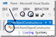
You can also see the the word toolbox is no longer all upper case, another source of complaint.

Hammontree explains that colour has been added to selected icons in order to help distinguish between common actions, differentiate icons within the Solution Explorer, and to reintroduce IntelliSense cues.

Did Microsoft do enough? Some users have welcomed the changes:

You have to appreciate a company that listens to there [sic] users and actually makes changes based off feedback. You guys rock!

while others are doubtful:

with respect, I fear that the changes are token ones and that whoever’s big idea this monochromatic look is, is stubbornly refusing to let go of it in spite of the users overwhelming rejection of it.

or the wittier:

I’m glad you noticed all the feedback about the Beta, when people were upset that you chose the wrong shade of gray.

While the changes are indeed subtle, they are undoubtedly an improvement for those hankering for more colour.

Another issue is that by the time a product hits beta in the Microsoft product cycle, it is in most cases too late to make really major changes. The contentious Metro UI in Windows 8 will be another interesting example.

That said, there are more important things in Visual Studio 11 than the colour scheme, despite the attention the issue has attracted.

Hands on: building an app for Windows 8 Metro

How difficult is it to build an app for the Windows Runtime (WinRT), which powers Metro-style apps in Windows 8?

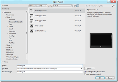
Here is how I created a simple calculator app (this is one in an occasional series) using Visual Studio 11 beta. I started with a new Visual C# Windows Metro Style project, choosing a blank template.
image

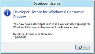
A slight complication is that you are prompted to install a Developer License, which means logging into your Windows Live account.
image

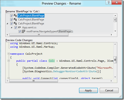
Next, I had to layout the controls. Visual Studio creates a single-page app with a main page called BlankPage.xaml. I renamed this to Calc.xaml. I also used Visual Studio’s refactor menu to rename the page class from BlankPage to Calc.
image

The default application has a black background, which seems gloomy. I changed the Background of the container grid to white.

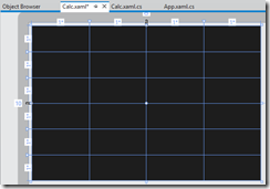
My basic calculator design is based on six rows and four columns, so I added 6 RowDefinitions and 4 ColumnDefinition to the XAML grid. The units for RowDefinitions and ColumnDefinitions can be set to Auto, Pixel or Star. Star means the unit is a weight which is calculated at runtime. For example, if you set the value of one RowDefinition.Height to 2 and the others to 1, the first one would be twice as high as the others. Here is my basic grid:
image

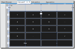
Next, I placed controls in the grid. The easiest way to get them to fill the space neatly is to set their HorizontalAlignment and VerticalAlignment properties to Stretch. Then you control the margin round the control with the Margin property. You can have a control fill more than one cell by using the Grid.ColumnSpan and Grid.RowSpan properties.

I found it easier to add the controls in code using copy and paste.
image

A Grid has no FontSize property, and although the Page has a FontSize property it does not seem to be inherited by the controls. I therefore set the FontSize individually for each control but there must be a better way of doing this.

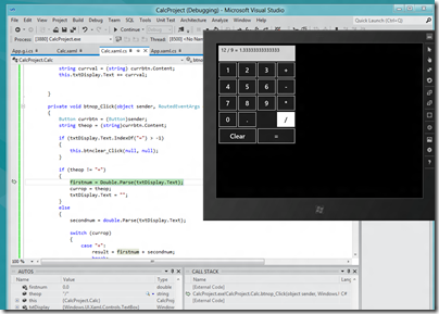
I then wrote minimal code that performs calculations without always crashing, and tested the app.  When you debug, you can choose Local Machine, Simulator, or Remote Machine. I found it easier to debug using the simulator, since if you use Local Machine and Visual Studio is running on the main display, then the app you are debugging becomes invisible if you hit a breakpoint or exception. The simulator seems really good (it is actually a remote session into your own machine) and I would like some way of running all Metro apps in a window like this, not just for debugging!
image

A few reflections

A developer with experience of C# and XAML (which is also used by Windows Presentation Foundation and by Silverlight) will not have much trouble getting started with WinRT, though I noticed that XAML is substantially cut-down, as Patrick Klug observes here.

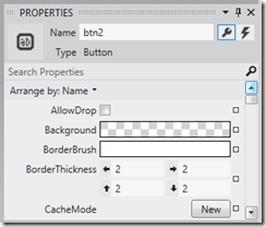
Visual Studio 2011 is an excellent IDE although I do not much like the new property editor; a minor point, but I find the latest go at prettification detrimental to usability; it is too busy. This may be a matter of familiarity and it is a minor point.
image

The XAML visual designer is slow to refresh even with my simple app, so this could be annoying with a more complex layout.

Layout with XAML works well, though it is more difficult than say Windows Forms for a new developer. It is easy to get peculiar results unless you do everything with pixel layout, which is not the best approach.

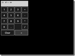
What about Metro itself? Apps always run full screen, and I had a problem with this in that my little calculator does not need all that space.
image

I am not a designer; and I suppose with a bit of effort you could add some decoration or effects to use the space, or add extra features. But why?

I was thinking about the Atari ST the other day, following the death of Jack Tramiel. The ST did not really multitask, but to get around the problem of needing to run a second app without closing the first, it had the concept of desktop accessories, available from a pull-down menu. My calculator would work well as a desktop accessory in Metro, except there is no such concept – unless you count the “Snap” split view. I wonder if Microsoft is too religious about its “Immersive UI” concept.

A few reservations then; but that does not take away from the overall impression of a strong integrated development experience for building Metro-style apps.
Run Metro apps in a window on Windows 8

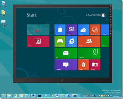
I have been drilling into Visual Studio 11 beta recently. This includes a simulator for debugging Windows 8 Metro style apps and I was surprised by the way it works. Unlike the Windows Phone emulators, which are isolated environments for testing apps, the simulator is actually a window into your own machine.

image

You can do some strange stuff. For example, you can not only debug your app in the simulator, you can run up Visual Studio 11 on the desktop within the simulator and edit it as well. It will not let you run the simulator within the simulator though – I tried!

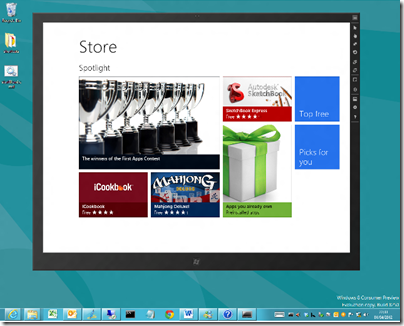
It occurred to me that the metro simulator accomplishes one of the things some users of the consumer preview have asked for. It lets you run Metro apps in a window, so that you can resize them, minimize them, and avoid the jarring context switch between full-screen Metro and the normal desktop with the taskbar.

image

What is the simulator? It is actually a remote desktop session into your own machine. Normally you cannot do this, as Windows client only allows one session at a time and you already have one running, but Microsoft has given itself special permission.

Running Metro apps in a windows is not its intended purpose but it is interesting to try as it shows how this might have worked if Microsoft had taken a more desktop-centric approach to the dual personality in Windows 8.

A further thought is to consider why the Visual Studio team decided to do things this way. Microsoft’s developers saw the necessity of working in the Visual Studio IDE while also exercising the Metro-style app.

Well, what if you are not a developer, but you still want to have Excel open while you check out, for example, the Bing Finance app? It is not only developers that may have good reasons to have a desktop and a Metro app running side by side.

Dual monitors accomplish this of course, and to some extent so does the “Snap” split view if you have the right screen resolution, but running Metro in its own window is a rather convenient solution.

Developers dislike monochrome Visual Studio 11 beta

Microsoft is having trouble convincing developers that its new Metro-influenced Visual Studio user interface, in the forthcoming version now in beta, is a good idea.

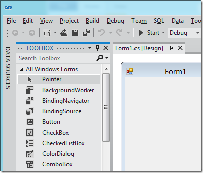
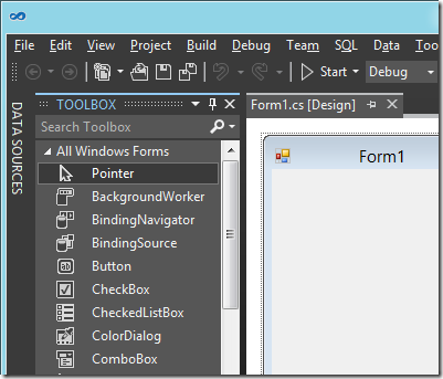
To be more precise, it is not so much Metro, but the way Microsoft has chosen to use it, with toolbox icons now black and white. The change also affects menus such as IntelliSense in the code editor. Here is the new design:

image

or you can choose a “Dark” colour scheme:

image

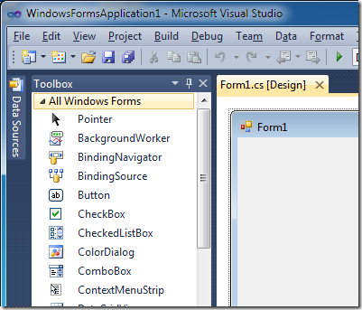
and the old 2010 design for comparison:

image

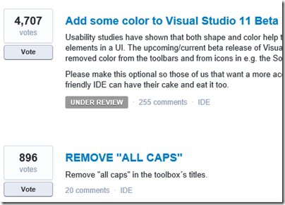
Developers voting on this over at UserVoice, the official feedback site, have made this the single biggest issue, with 4707 votes.

image

They do not much like the All Caps in the toolbox names either.

Microsoft has marked this as “Under review” so maybe there could yet be a more colourful future for Visual Studio 11.

Developers: will you do Metro?

It is fascinating to watch the Metro-fication of all things Microsoft, from the Xbox 360 user interface to Windows Phone to Windows 8 to forthcoming versions of Office and other applications.

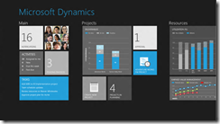
Future versions of Dynamics products were previewed at the Convergence 2012 event (which included a session called CRM goes Metro) and there are a bunch of screenshots here.

image

Microsoft calls Metro a design language and you can see its guiding principles here. Calling it a language does not seem quite right; the word “style” is more accurate, but it does have building block elements (and yes it is blocky) which I guess make it more than just a style.

A safe prediction at this point is that all Microsoft’s products will be touched by Metro influence, even though not all will become full Metro apps running on the Windows Runtime (WinRT).

In the past the style adopted by Microsoft for its own applications have strongly influenced third-party applications as well. Once Windows, Office, Dynamics and other apps have a Metro look, other apps that do not may begin to look dated or out of place.

Metro is controversial though, perhaps even more so than the Office Ribbon which replaced menus in Office 2007 and 2012. There is some connection: members of the Office team who worked with Steven Sinofsky on the design of Office 2007, including Julie Larson-Green and Jensen Harris, are now working with him on Windows 8. Harris has written extensively about the work on Office 2007 on his Office User Interface Blog, though the last substantial post was in 2008.

What’s not to like about Metro? Here’s a few arguments against:

  • Beauty is in the eye of etc; but the blockiness of the Metro style does give it a utilitarian appearance. In Windows Phone 7 it is nice to use, but not so great to look at.
  • The Live Tile concept, where shortcut blocks can be populated with current information, adds a random element to Metro start screens which does not always look good.
  • The emphasis on simplicity and immersion makes Metro vulnerable to the accusation that it wastes too much precious screen space.
  • Metro tends to be a horizontally scrolling style, though I am not sure if this is baked into the guidelines. This takes some adjustment since most of us are more used to vertical scrolling to see more content.
  • Metro seems to be optimized for a touch UI, and while its advocates insist that it is just as good with keyboard and mouse, that is a stretch. Metro seems to be a big bet on touch as the future of human-computer interaction.

On the other hand, the usability of Windows Phone 7 is a point in its favour, and some are convinced. Paul Greenberg, in a positive take on Microsoft’s strategy based on his trip to Convergence 2012, says:

They have nailed UX (a.k.a user experience). Nailed it. Their combination of the extremely well done Metro interface and their work on natural user interfaces involving voice and touch is the new gold standard – and I’m someone who loves Apple products. (please, Mac fanboys, spare my life.)

I would be interested to hear from developers whether you expect to embrace the Metro style in your apps, wither in WinRT or elsewhere.

Fixing a Metro-style app in Windows 8 Consumer Preview

I am a fan of Wordament for Windows Phone and Windows 8. This is a Metro-style app. I was annoyed though to discover that it was broken on my Windows 8 slate. That is, it could not be launched because it did not exist when searching the Start menu, nor in the “All apps view”, but it could not be installed because the Store considered that it was already installed.

I could go into Store – Settings – Accounts and see it listed under “View your apps”, where it also said it was installed.

There was some kind of warning of problems, in that from time to time Windows 8 had been offering to fix a problem with Wordament, usually after I had set the slate to sleep while the app was running. When prompted, I always accepted and let it do its stuff, but the result of the last effort was the app had disappeared completely.

How to fix this? I found one piece of official advice for a similar problem which suggested refreshing the PC. This is not much fun because you lose all installed applications other than Metro apps – ugh. I did a bit of digging.

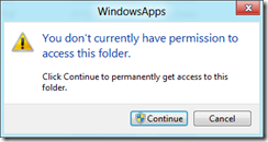
My first thought was to try manually deleting the app to see if I could trigger a reinstall. I got a little way with this. I found that Metro-style apps are installed into the WindowsApps folder, which is a sub-folder of Program Files. However, if you double-click this folder you get an access denied message, though the message also invites you to continue.

image

I did not wish to trample all over the security features of Windows 8, though following a hunch I did try restarting in safe mode. You can do this by choosing Settings – More Settings and clicking Restart now under Advanced startup. The PC restarts and you get to a “Choose an option” screen where you can click Troubleshoot. Next, click Windows Startup Settings and then Restart. This gets you the familiar F8 options including Safe mode.

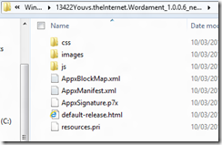
In Safe mode you have read-only access to the WindowsApps folder, and there I could see the Wordament install files.

image

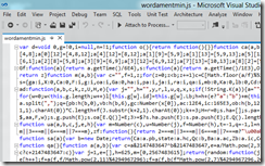
Here you can verify that this is an HTML and JavaScript app, just as its creators said. The JavaScript is minified so opening it up is not all that rewarding.

image

Still, I could confirm that the app was in fact installed, but I could not run it.

I had another idea. If all I needed was a shortcut to the app, perhaps I could grab one from another profile on the machine. I restarted in normal mode, created another user (which must be one with a Microsoft Live ID) and logged in as that user (shutdown /l logs off without shutting down). I installed Wordament, and it ran fine.

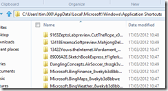
So where are the per-user shortcuts? Easy, just go along to c:\users\[username]\AppData\Local\Microsoft\Windows\Application Shortcuts and there they are.

image

Again I had to grab permission to access this folder, but doing this in a user folder is not so bad as in a system folder.

I copied the shortcut to the same location in my normal home folder and lo, Wordament reappeared in the Start menu.

image

Not too bad; but it seems to me that Windows 8 should have a built-in way of fixing this kind of problem – perhaps it has, and I missed it.

Two web browsers one too many in Windows 8 Consumer Preview

A few days in, and the reactions to Windows 8 Consumer Preview are coming thick and fast, mostly strong reactions, with love for Metro on a tablet and hate from annoyed Windows users looking for the Start menu.

For myself, I have it installed on a tablet (Samsung Series 7 Slate bought for the purpose) and on a desktop, where I am using it for my work.

It is going OK, though one annoyance to add to the list is coping with two instances of Internet Explorer. It sounds simple: Metro IE is the no-plugin version, Desktop IE is the full version. There is more to it that that though. Where are you going to put your favourites, in Metro or in Desktop? Except that Metro IE has no favourites, just the option to “Pin to start menu”.

image

More seriously, pages open in Metro IE are invisible in Desktop IE and vice versa, and the two browsers do not share cookies, so you might wonder why Amazon does not recognize you when you remember you signed in yesterday – but that was in Metro and you are now in Desktop.

Users are going to hate this, unless Microsoft can do some tweaking, or even (perish the thought) have a setting that says “Only use desktop IE”.

The IE problem is a consequence of the Windows 8 split personality, where one half almost literally does not know what the other half is doing. John Gruber says:

The recurring theme of these Windows 8 reviews: the brand-new Metro UI is elegant, clever, original and shows much promise; the updated classic Windows desktop is better than ever; the two environments don’t flow well together.

Nicely put, though I do not agree that Microsoft is trying to anticipate Apple supposedly converging OSX and iOS (read the rest of the link). I think Microsoft sees the future of the PC as tablet-shaped, or at least, that the non-tablet segment of the PC market is essentially legacy and will not grow. If some users stay on Windows 7 for ever, that will not matter much provided that Metro succeeds on tablets.

Microsoft could have put Windows Phone on tablets and matched Apple’s iOS and OSX split. It could have make Windows 8 the underlying operating system of both but maintained the split. It chose not to, except to the extent that Windows on ARM is pretty much iOS, where the desktop nearly disappears – it is relegated to a kind of runtime for utilities and Microsoft Office.

I do think Microsoft has work to do on the seams between Metro and Desktop, but I also believe that its main rationale in making Windows 8 dual personality is to force its uptake. The danger, if it had released Windows Metro as a separate OS, is that it would have won good reviews but failed in the market, as happened with Windows Phone in its first year. Microsoft is going for all-or-nothing: if Windows Metro fails, then Windows client fails with it.

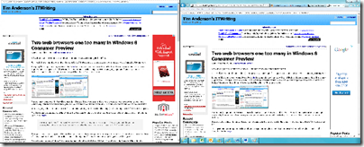
PS the above grab is not a stitched screen, but an actual view of my dual monitor setup.