Tag Archives: metro

Ah, Microsoft! Should it give up Windows Phone, adopt Android, abandon Windows 8 “Metro”? No, and here is why.

On Windows 8, Gruber puts it succinctly:

Rather than accept a world where Windows persisted as merely one of several massively popular personal computing platforms, and focus on making Windows as it was better for people who want to use desktop and notebook PCs, Microsoft forged ahead with a design that displeased traditional PC users and did little to gain itself a foothold in the burgeoning tablet market.

The implication is that Microsoft should make Windows “9” more like Windows 7, and give up trying to push Windows as a tablet OS.

And Charles Arthur argues:

To add to all the advice being ladled out to Satya Nadella, Microsoft’s new chief, here’s another piece: stop bothering with Windows Phone. It’s a waste of money which will never pay off.

Instead, focus the efforts of Microsoft and soon-to-be subsidiary Nokia on forking Android – because that way you can exploit the huge number of Chinese handset makers who want to burst out of China and sell to the rest of the world.

These pieces raise deep questions. Can Microsoft – which, you recall, announced record revenue for its most recent financial quarter – prosper in applications and services while ceding the client to Apple and Google?

Despite its record revenue, I do not want to belittle Microsoft’s problems. Windows Phone has some momentum, but only as a distant third in the smartphone market. Windows 8 is broadly unpopular and its tablet personality has not taken off or driven the big app opportunities that were hoped for. OEMs are withdrawing from the PC market, with Sony the latest casualty, while others such as Asus are experimenting with Android/Windows hybrids – this last a huge testimony to the failure of Windows 8 as a tablet OS.

And let’s not forget the Surface RT writedown, and the withdrawal of all OEM support for Windows RT, the ARM variant of Windows 8.

Stephen Sinofsky, who masterminded Windows 8, but left soon after its launch for reasons that are still not entirely clear, was not a fool though.

image

He saw, correctly, that while Windows 8 was a big risk, carrying down a path of incremental improvements to Windows 7 would not stem its decline. Instead, he crafted a new Windows that can still be “Windows 7” when configured and used that way, but which also runs a modern operating system:

  • Apps deployed from a store, isolated from one another and from the OS, seamlessly kept up to date
  • Roaming data and settings for all users, not just in carefully managed enterprises
  • A true touch-friendly OS, not just Windows desktop with better touch support bodged on top

I have no doubt that this is the direction for client operating systems. There is still a role, and will be for the foreseeable future, for open operating systems like desktop Windows, Mac OSX, Linux, which can run unrestricted applications and are infinitely tweakable, but such operating systems are high maintenance, vulnerable to malware, and painful when you buy a new personal computer and want to migrate.

My guess is that in Windows vNext we will see a softening of the division between the Windows Runtime “Metro” environment and that of desktop Windows. It is already known that previews of the next Windows update show Metro apps on the desktop taskbar, and more integration may become. Metro Apps in floating desktop windows? The taskbar present in both environments? Could there be provision for desktop apps, subject to some restrictions, to be deployable from the Windows Store as Apple has done for OSX? Such things are possible and at this point would help to drive Metro adoption by making Windows Store apps more acceptable to desktop users, but without losing the underlying benefits of the Windows Runtime.

What though of Windows Phone? It seems to me obvious that “Windows Phone” and “Windows Runtime” have to become one operating system. It is not yet clear how the mix of device form factors will settle in the coming years. It may not be dominated by tablets; I have seen arguments that converged “phablet” devices will eat into the traditional tablet market. The laptop-style device is by no means dead, as the success of Google’s Chromebooks demonstrate; I have gone off the clamshell design myself, but it makes sense if you want to have a screen and keyboard in a single device without the expense of hybrid designs where the screen pulls off to make a tablet. Operating system vendors need to be flexible and to support a variety of screen sizes and touch/keyboard/mouse configurations. For Windows then:

  • The Windows Phone runtime and the Windows Runtime need to come together as a single development platform. Phone apps should run on full Windows and Windows Runtime apps should run on the Phone subject to designing for smaller screens.
  • There will be some Windows devices that run only the touch-friendly environment, and some that run desktop Windows as well.

If you follow this reasoning, then abandoning Windows Phone makes little sense, unless you abandon both Windows Phone and the “Metro” platform in Windows 8, because they will become the same thing.

But why not do that then? Microsoft could let iOS and Android handle the phone/tablet/phablet platform, preserve Windows as a desktop OS for running Office, Photoshop, Autocad and so on, and focus on apps for iOS and Android including Office and rich clients for Office 365. Adapt Visual Studio so that it targets iOS and Android (maybe a deal with Xamarin?).

This scenario may prevail whether or not Microsoft encourages it, but it seems to me a doomed strategy that will result in a much shrunken Microsoft. The problem is that if you own the client OS, you can direct users to your own platform services, making it hard for others to compete at the same level.

Think of Apple and mapping. Apple was willing to take a significant blow to its reputation by rolling out an inferior mapping service with iOS 5.0, to meet a long-term goal of removing dependency on Google Maps. Mapping is strategic because via maps can come location-based marketing which is a big deal.

Now think of that from Google’s perspective. Despite having the best maps, it could not prevent Apple driving a majority users to its own inferior mapping service, because it did not own iOS.

This is not quite what Charles Arthur is suggesting though. His proposal:

Forking Android wouldn’t be trivial, but Microsoft could take the Android Open Source Platform (AOSP) that is already widely used in China and put new services on top. It is already licensing Here maps from Nokia (the bit that’s not being sold to it). It could add its own mail client and app store. It has its own search engine, Bing, which has needed a major mobile deal. As with Windows Phone, setting up or signing in to an outlook.com email account could be your first step. Everything’s ready.

Most useful of all, developers who have written Android apps would be able to port them over with minimal effort – as has happened with Amazon’s Kindle Fire effort.

In other words, he suggests that by forking Android Microsoft could continue to own the operating system on its own devices, but could get access to a wider range of apps.

Unfortunately there are too many downsides and too little benefit:

  • Google is working hard to make Android unforkable, via increasing the dependency on proprietary Google Mobile Services. Microsoft could make an Android-based device, but without Google Mobile Services it would be in effect a new variant, neither Android nor Windows Phone but something else. Amazon has done this with Kindle Fire, but is starting from the base of a successful line of eBook readers. Why would anyone buy Microsoft’s Android devices?
  • Microsoft’s remaining developer community would be broken irretrievably by yet another dramatic change of direction.
  • Whatever the differences may be between the Windows Runtime or Phone Runtime, and Windows Desktop, the differences between Android and Windows Desktop are even greater. The synergy between the two would be lost. The strategy for supporting multiple form factors outlined above would no longer be possible.

Last night I talked to a Microsoft partner about the state of Microsoft’s client platform. His company provides IT services and some software development for local businesses. He understands the unpopularity of Windows 8, but said that most objections disappear after a day of handholding. He sees the value of Windows Runtime in business for security and easy deployment. He is writing a Windows Runtime app as part of a solution in the healthcare industry, where tablets will be used. He worries about lack of security in Android.

One final thought. There are only two companies that own an entire stack from cloud to device, for businesses and consumers. One is Microsoft (strong in the enterprise, weak in consumer devices, weak in search). The other is Google (weak in the enterprise, strong in consumer devices, strong in search). I do not count Apple because it has no cloud application platform to compete with Office 365/Google apps or Azure/Google App Engine. I do not count Amazon because it has no Office 365 (software as a service) and no mobile phone (yet).

It would be a mistake for Microsoft to cede a key part of that stack to a competitor, leaving Google standing alone.

Windows Runtime flaws spoil new Windows Store (Metro) apps

The Windows Runtime, the new touch-friendly platform in Windows 8. It solves many problems. Not only is it tablet-friendly, but apps are sandboxed for security, and easy to deploy. No setup hassles, just one-click (or tap) install or uninstall. It also supports three types of development covering most tastes: native C++, .NET Framework, or HTML and JavaScript. In order to ensure responsive apps, Microsoft made many of the APIs asynchronous, so that users would not have the frustration of a frozen user interface or spinning hourglass during long operations.

At least, that is the theory. When I came to write my own simple app though, I was surprised how fiddly it was, and that something trivial like displaying a tweet including a working hyperlink turned out to involve Run elements, a ContentControl, a converter class and so on. Even then, I could not get the mouse cursor to turn to a hand icon when hovering over the link.

This hands-on experience gives me sympathy with others struggling to implement more complex projects. Some have posted about their experiences. Here is Frank Krueger, who has ported his neat iCircuit electronic circuit simulator from iOS and Android to Windows RT:

You would be shocked to see some of the crazy bits of code I had to put in because the Win8 platform, while very rich, is also very generic and doesn’t help you at all to build standard apps (document based, tools, etc.) That is to say, Cocoa is a very mature platform designed to make apps feature-rich and consistent while also making the developer’s life easy. WinRT on the other hand gives you rectangles and a blog post that says “good luck”.

He lists a number of problems, including having to reboot Windows constantly while testing the Share Charm; having to disable media elements in he app because of 500ms delays, no control over buffer sizes, and playback issues; and graphics issues:

I want to do real-time 2D vector drawing. Direct2D is perfect for this. But WinRT puts all sorts of limitations on onscreen rendering, most notably: you can only have 1 DirectX swap chain (view) per window. That means I can’t use Direct2D for rendering the scope which means the scope is slower than it needs to be. Dear Microsoft, go spend a few minutes and see how beautifully CocoaTouch and OpenGL work together on iOS. You might get inspired.

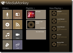
Next up is Media Monkey, a popular Windows media player which has been ported to the Windows Runtime platform. I was pleased to see this, as it lets me play FLAC music files on Surface RT. It is not very stable yet though, and I have had difficulty getting it to index the collection of FLAC files which I have on a network-connected drive.

image

What I found most interesting though were comments about the difficulty of displaying lists beyond a trivial size. One user complained:

When I first started MM scanning my music library, I was seeing the Album list grouped into sections headed up by the Alphabet letters. However, as more Albums got added, the heading letters vanished – and I now have an unbroken list of Albums – a great wodge that is very tiresome to navigate through by scrolling.

to which the Czech developer replied:

It’s a big problem, but not in MediaMonkey, but in system itself. Disabling groups is only crashes prevention because of system limitation :-(. Because of this we cannot use semantic zoom as well.

This has caused me to wonder whether part of the reason for the small number of excellent Windows Store apps is the difficulty developers have in getting them to work right. If so, that is a sad state of affairs for Microsoft’s shiny new platform.

In fairness, this is version 1.0, and the best hope is that a significant update to the platform will come before too long with improved controls, performance and features.

Microsoft’s Design Language – Tiles and Chromelessness – Prospects for Windows 8

Among the most illuminating sessions at Microsoft’s BUILD conference earlier this month was Will Tschumy’s presentation on the Microsoft Design Language.

Tschumy says that Microsoft began a new focus on design back in 2003 (think Office Ribbon). Then came Windows Phone and Metro (only he did not call it that), and now:

Microsoft is the only organization with a single, consistent design language across each screen we touch

he explained., noting that Xbox as well as the phone uses this same design language.

So what is it? The core idea, he says, is “content before chrome”. This is an old idea, which Google drew attention to with its 2008 web browser called Chrome – a playful title for something which properly should have been called Chromeless. Chrome sported a minimal user interface, putting the focus on the web content, and laying the foundations for web applications where the browser disappears and you forget that you are looking at a web page.

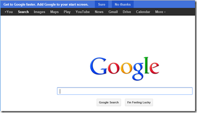
This is actually consistent with Google’s approach from its earliest days, when the Google home page was just a search box and a couple of buttons – a purity of design now spoilt by a menu bar and nagging ads, but you can still see it.

image

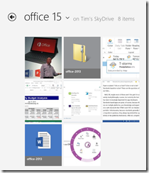
But I digress. What has Microsoft done with the concept? A good example is to compare the SkyDrive “Metro” app with the same folder in Windows File Explorer. Here is Skydrive:

image

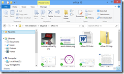
and here is Windows File Explorer:

image

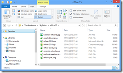
Or possibly:

image

if you are like me and prefer the “Details” view.

The point here is that the “Modern” SkyDrive app has a high ratio of content to chrome, and large icons which preview the content where possible make the content stand out, whereas in File Explorer there is more UI. Of course this is the Windows 8 File Explorer which is also influenced by the same design language. My Details view, which I like because I get higher information density, is closer to an old-style computer approach where the focus is on the number of bytes in the file above what the image happens to look like.

Mixed feelings them, but I do understand what Microsoft is driving at. Spend some time with Microsoft’s Surface RT – no, not on the desktop, on the Metro side – while using some of the better new apps and you begin to appreciate the idea.

Tschumy spelt out five design principles, though only three of these seem to be substantial:

  • Pride in Craftsmanship: fluff
  • Be fast and fluid: Performance matters
  • Authentically digital: not skeuomorphic
  • Do more with less: minimalism
  • Win as one: fluff

No mention then of the “signposting” inherent in the metro transport signs which gave Metro its now-forsaken name, and in fact discoverability is a weakness of Microsoft’s design language; it seems hard to create a UI that is both “content before chrome” and highly discoverable. The common functionality encapsulated in the Windows 8 Charms bar, where features like Search are handled by a UI that is the same in every app, is one attempt to fix this, though first you have to learn how to use the Charms bar. Note the number of users who thought the Wikipedia app had no search function.

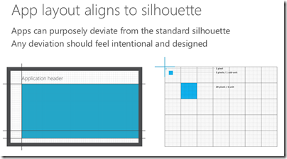
There is also a visual aspect to Microsoft’s design language, which Tschumy does a good job of explaining. Align to a standard grid, he said, unless you need to deviate from it for good reasons.

image

From here we get the tiled look which characterises Metro and which certainly has merits; it tends to be clear though not always beautiful.

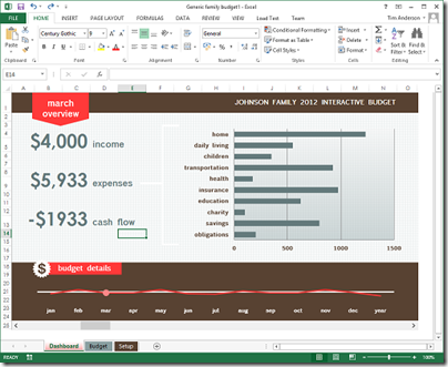
Understanding the rationale behind these design principles helps to make sense of new Microsoft products such as Office 2013 and Visual Studio 2012, both of which have been met with mixed reactions on the grounds that they look a bit washed-out, the user interface is hard to focus on. The thinking is that this helps the content, which is what you care about, to stand out more.

image 

That said, I am not convinced by this approach in the context of a productivity tool like Office or Visual Studio. You may care more about the content; but if you want to change the content, then you also care about the tools and want to find them quickly. Scroll bars that fade into the background are great, until you need to scroll the document.

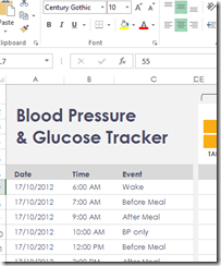
It is also interesting to browse the sample templates in Excel 2013. I grabbed the above screen from there, which seemed to illustrate the design principle of content before chrome, but in other cases I notice that the designers have gone for a washed-out look in the content as well.

image

This makes no sense to me, other than that the designer, observing the fade-into-the-background theme in the chrome, decided to match the content to it in order to get a consistent appearance. Now you cannot see the content or the chrome – uggh! This is what happens when you try to get a very large company working together on a common but somewhat counter-intuitive vision; not everybody gets it.

Which brings me neatly back to Windows 8. I mentioned the Surface RT above; I will be writing more about this, but I do find it a delightful device and one which expresses the Windows 8 and Microsoft Design Language vision better than any other aside from perhaps a Windows phone – unfortunately I have not yet got my hands on a Windows 8 phone to review but hope to do so eventually. It is also a flawed device of course, partly because the performance is less than “fast and fluid” in some cases (like Excel), but mainly because the apps are lacking.

It does seem to me though that Windows 8 has great potential and brings something new to the tablet world. Unfortunately there is uncertainty about whether either Microsoft or its OEM and retail partners have the will and the vision to get past the current hump of unfamiliarity and immaturity for that potential to be fulfilled. Microsoft has spent eye-wateringly huge amounts of money marketing Windows 8 and Surface RT; but I do not think that money has been spent strategically, it has just been thrown at the usual agencies. Many are still flummoxed by what Windows 8 is for, and that is apparent even amongst the OEMs that are manufacturing and selling it.

What will now happen post-Sinofsky, the man whose balls of steel brought Windows 8 to market? In his memo noting the appointment of Julie Larson-Green as head of Windows engineering, Ballmer says:

Her unique product and innovation perspective and proven ability to effectively collaborate and drive a cross company agenda will serve us well as she takes on this new leadership role.

The highlighting is mine. A cross company agenda is exactly what Microsoft needs; but if the new Windows leadership is less determined than the old, it could equally easily pull apart rather than together.

Adobe AIR for Metro promised for first half of 2013

Adobe Game Developer Evangelist Lee Brimelow has stated on Twitter that AIR for Metro is coming next year.

we’re working on Air for Metro. It should be available first half of next year.

AIR is a way of compiling Flash applications to run outside the browser.

[Microsoft no longer uses the term Metro. We are meant to say Windows Store Apps; but that is even more confusing.]

Hands on Windows 8 development: Twitter and hyperlink hassles

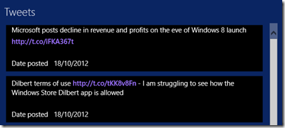
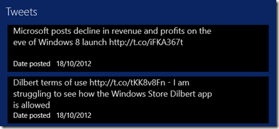
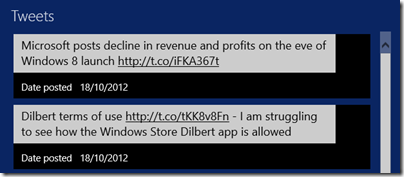
I have been messing around with a Windows 8 app to present content from ITWriting.com in an app, mainly as a learning exercise. I came up with the idea of showing recent tweets on the main page of the app. Like this:

image

I thought this would be easy, but encountered several problems. I am developing in XAML and C#; this aspect would probably be easier in HTML.

The first problem: retrieving the tweets. The Twitter REST API version 1.1 has GET statuses/user_timeline which does what I want, except that it requires “user context”, in other words a Twitter log-in. That is an unacceptable requirement for a user simply viewing my tweets, rather than their own timeline.

The deprecated  Twitter RSS API on the other hand is perfect. Unfortunately:

Please note that there is no support for the RSS response format in API v1.1. Properly versioned API v1 URLs will cease functioning in March 2013

Never mind, it will do for the moment. I created a Twitter data source which retrieves the tweets as RSS. In my XAML I have a ListView which is bound to this data source. This ListView has an ItemTemplate which defines what appears in the list. I added a TweetItemTemplate in the Resources section of the XAML which displays each tweet in a TextBlock. So far so good.

image

No hyperlinks though – they are dead. What is the use of a tweet without hyperlinks? Not much. I thought of a hack which would let you click or tap an entire tweet, look to see if a hyperlink is there, and then launch it. Ugly, and would only work for one hyperlink per tweet.

TextBlock does not support hyperlinks. However there is a way to do this using RichTextBlock. This supports a collection of inline elements. You can have a Run element containing text, then an InlineUIContainer containing a HyperLinkButton, then another Run element and so on. The Hyperlink will be out of alignment, as shown here, but you can fix that by tweaking margins and padding.

Of course, this approach does mean parsing the tweet to extract the URLs and then building the RichTextBlock content. So in place of my simple TextBlock binding I now have this:

  <ContentControl Content="{Binding Path=Title,Converter={StaticResource tweetToBlocks}}"></ContentControl>

I have also written a converter class which takes the bound value, builds the RichTextBlock in C#, and returns it. This gets you the result in the first image in this post. Not too bad, and the links work.

What is annoying though is that the mouse pointer does not change to a hand icon when you hover over the link. I thought I could fix this by subclassing HyperLinkButton and adding code to change the cursor on the PointerEntered event:

Window.Current.CoreWindow.PointerCursor = new Windows.UI.Core.CoreCursor(Windows.UI.Core.CoreCursorType.Hand, 1);

This does not work. At least, you can see a flash as the cursor tries to change, but it is overridden by the RichTextBlock which changes it back to a text select cursor. I have not found a way round this yet.

I then tried another approach. You can use a RichEditBox which does support links. The approach is different; you set the text of the Document property and then use the Link method to assign a link to a TextRange within it. It works; but I was frustrated to find that the mouse pointer still does not change to a hand when over the link. The RichTextBlock actually works just as well and is more integrated with XAML.

image

I am sure you could fix this by using a WebView – embedded IE – for each tweet, but that seems to me an unduly heavyweight approach. Better perhaps would be a single web view showing all the tweets, which I might try when I have a moment.

Even so, I was surprised how tricky it is to show tweets with hyperlinks in a ListView.

Adapting the Items Page template in a Windows Runtime app

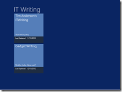
A while back I adapted a sample application in order to create an app for Windows 8. I am mulling over putting it in the Windows Store, but it needed some work. In particular, I wanted to add a Twitter feed to the front page. There is plenty of space:

image

Sounds easy; but inspecting the layout code I realised that I did not understand it all that well at first.

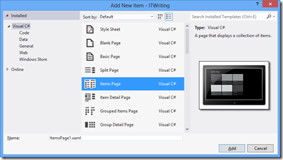
It is based on the Items Page template in Visual Studio 2012, and there is a fair amount going on in that template:

image

  • The contents are data-bound, which is great at runtime but inconvenient at design time as the page is empty.
  • The contents are layout-aware which means that they account for the four views possible in a Windows Runtime app: landscape, portrait, snapped, and filled. The “filled” name is a little misleading; this is an app which occupies most (but not all) of the screen when another app is snapped to one side.
  • The page uses resources and templates for its element styling, which are defined either in the page itself, or in StandardStyles.xaml which resides in the Common folder in your project (added automatically in projects which use the ItemsPage template).

It’s worth adding some dummy data early on so you can see what the page really looks like:

image

For example, imagine that you want to use a smaller item size that the default 250 x 250 size. Proceed as follows:

  1. Copy the DataTemplate called Standard250x250ItemTemplate from StandardStyles.xaml. Place it in the Page.Resources section of ItemsPage1.xaml (or whatever you called your ItemsPage). Rename it to, say, “MyItemTemplate”.
  2. Modify it to use a smaller size. You will probably want to adjust the bound elements as well, plus change the references to the standard Brush elements like  ListViewItemPlaceholderBackgroundThemeBrush as well.

Here is how the page looks with the space for the image removed, the DataTemplate height set to 50, and the height of the bound Title field set to 20:

image

Note that this template is not used by the Snapped view. For that, you will need to copy and modify the Standard80ItemTemplate, or make your own template suitable for an item in the Snapped view.

The code that determines which templates are used in which state is in the VisualStateManager.VisualStateGroups element. This has a Storyboard animation for the Portrait and Snapped views. The way this works:

  1. The default view is landscape. This is why in the XAML there is a GridView called itemGridView which is visible, and a ListView called itemListView which is hidden (Visibility="Collapsed").
  2. In the Snapped view there is only room for a single-column list, not the grid. Therefore the Storyboard for the Snapped view sets the itemListView to visible and the itemGridView to hidden.
  3. When you change back to a non-Snapped landscape view, the layout reverts to the default. Code for this in in LayoutAwarePage.cs, also in the Common folder.

After working this out I was better able to adapt my own page. More on that another time!

Developing for the Windows Runtime: a few more notes from the field

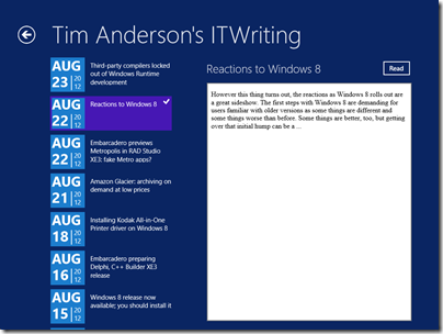
I have been poking around in the code for my Windows Runtime ITWriting.com reader, which is based on this MSDN sample. The list of posts looks like this:

image

Not bad, but that block showing the date of each post is based on Windows Team Blog page, which is nothing to do with me. What would it take to modify the design?

The problem with sample code is that when you copy and paste you do not really know how the code works, and sometimes issues are hidden. The MSDN article, while it does a good job explaining most parts of the app, does not explain how the date block is put together. A few observations then from my efforts to modify this.

Most of the code for this date block is in the ResourceDictionary element in App.xaml, which means it can easily be reused on multiple pages. The code is a ControlTemplate element, which means it defines a custom control. This is then referenced within a DataTemplate element on the pages where it appears. The DataTemplate defines how the bound data appears in the list.

Reading a block of XAML and trying to visualise how it will render is not much easier than viewing a photo in a binary editor. However, you cannot view App.xaml in a visual designer, since it is not a visual page. The only solution I could think of was to copy the ControlTemplate out of App.xaml into a page where I could see the design, tweaking it, and then copying it back.

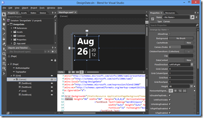
I started a new project in Blend, and copied the Canvas code from the DateBlockTemplate, and replaced the data bound values with hard-coded examples. So far so good: I could now tweak the design.

image

My design skills are rubbish so I ended up with a simpler layout. In my adaption, the month and day appear on one line, as in “Aug 26”.

This led me to another problem. In the sample, the month and day are bound as separate fields, for example:

<TextBlock.Text>
<Binding Path="PubDate" Converter="{StaticResource dateConverter}" ConverterParameter="month"  />
</TextBlock.Text>

How could I concatenate the two bindings to appear in one TextBlock? In Windows Presentation Foundation (WPF) you can do this with the MultiBinding class, but this did not seem to work in WinRT XAML. Rather than go further down that route, I decided to amend the DateConverter class which is also part of the sample, to add a conversion that returns both the month and the day.

DateConverter.cs users the new DateTimeFormatter class.  The documentation explains that this takes a “format template string” but does not offer a reference for constructing formats. I experimented and ended up with:

DateTimeFormatter dateFormatter = new DateTimeFormatter("{month.abbreviated(3)} {day.integer(2)}");

which turns out to work.

Now my list of posts looks like this:

image

Not as stylish as before, but at least it is different.

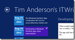
Developing a Windows Runtime app: some observations

What would it take to create a Windows 8 Modern UI content reader for this site? Just for fun, I built a simple one; or rather, I slightly adapted Microsoft’s Metro style blog reader tutorial.

The app only has four screens (or pages) but despite its simplicity I found the tutorial somewhat fiddly. Getting the data from the WordPress RSS feed is simple, thanks to the Windows.Web.Syndication namespace which is part of .NET Framework 4.5. Most of the work is in the user interface, which means switching between XAML and C#. Of course as a developer I would rather work in C#.

Further, the Visual Studio editor for C# is better than the editor for XAML. In C# I can easily navigate the code using Go to Definition, Find all References, and so on.  In XAML it takes longer to find things like referenced styles and resources. Plus XAML is XML, which I find harder to read than an elegant language like C#. Even commenting out a line is more hassle in XML.

I did not like the colours used by the tutorial for the list of posts in SplitePage.xaml. It took me a while to work out what to change. Was the colour defined in a resource, or in a template, or in a style, or directly coded as an attribute of the relevant TextBlock object?

Of course you can open the XAML in Blend if you prefer, the designer-oriented tool that comes with Visual Studio 2012. Blend is more complex than the Visual Studio XAML editor, but may be better once you have figured out how it works.

The amount of work involved in making your app well-behaved is proportionately larger if your app is essentially very simple. You have to deal with different layouts for different screen sizes and orientation, as well as the small Snapped layout. You also have to consider what happens if your app is suspended and resumed.

The above means that despite the apparent simplicity of a Modern UI interface, with its chunky buttons, there is more to consider than with, say, a Windows Forms application whose window is never rotated and over which you have full control.

Still, I was pleased with my app which has reasonable functionality based on a small amount of work.

Visual Studio 2012 is impressive, though I did experience some screen corruption after switching back and forth between the Metro and Visual Studio environments for debugging. Restarting Visual Studio fixes it. Using the simulator seems more robust in this respect.

image

The App Bar

One thing though. If you squint at the above screenshot, you will see that I have put a Read button to the right of the post title. Clicking or tapping this opens the post in a embedded web browser view that is nearly full-screen. However, this Read button is not included in the tutorial, which says:

On the split page, we must provide a way for the user to go to the detail view of the blog post. We could put a button somewhere on the page, but that would distract from the core app experience, which is reading. Instead, we put the button in an app bar that’s hidden until the user needs it.

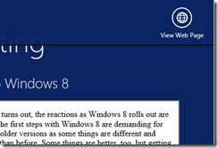
This may in fact be an excuse to include an App Bar in the tutorial; but I disagree with it. With the App Bar, the user has to right-click or swipe down to display the App Bar, and then click or tap the View Web Page button.

image

That is two actions rather than one. Is it really better than having a small button in the UI?

It seems to me that tucking things into the App Bar is fine in cases where there is real merit in an immersive experience, such as in the web browser, but less compelling when you already have a screen with a back button and a scrollable list. I was also concerned that users might not realise they needed to display the App Bar in order to use the app properly.

Let the design debate continue.

Design-centric

Microsoft’s Modern UI continues a trend which began with Windows Presentation Foundation (the first incarnation of XAML), which is to make a platform richer for UI designers and more challenging for developers who lack design skills. Nothing wrong with that; but if you remember how easy it was to snap together an app in Visual Basic 3.0, you may feel that something has been lost.

I guess that recognition of that fact was one of the motivations behind Visual Studio LightSwitch, in which you define the data and business rules, but the screens are generated for you. LightSwitch has complexities of its own though.

Embarcadero previews Metropolis in RAD Studio XE3: fake Metro apps?

Embarcadero has released a video (embedded at the foot of this post) previewing RAD Studio XE3, the next version of the application development suite which includes Delphi and C++ Builder.

Two big new features are Metropolis applications and an new HTML5 Builder tool which looks like a next-generation PHP Builder.

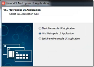
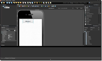
Metropolis – a neat name until Microsoft back-pedalled on the Metro designation for Windows Runtime apps – appears to be a framework for apps that look like Windows Runtime apps but in reality are not. At least, that is my presumption for “VCL Metropolis applications”. The VCL (Visual Component Library) is a Delphi framework (usable also in C++ Builder) which is tied to Windows and GDI, the old-style Windows graphics API, along with many other Win32 APIs. GDI does not work in the Windows Runtime.

image

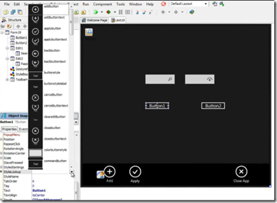
No matter, all we need is full-screen apps, touch input, and a don’t-call-it-Metro look and feel, and presto, Windows Runtime apps in all but name. They might even run on Windows 7.

image

A glimpse at the controls.

image

Except that there will be significant differences between Metropolis and Windows Runtime. No support for Contracts, for example, the Windows Runtime mechanism for inter-app communication; no delivery from the Windows Store; no support for Windows RT.

The big issue though is this: why would you want a desktop app to look like a Windows Runtime app? And will not users be mightily confused?

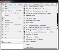
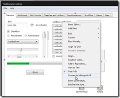
The video then goes on to talk about converting existing apps with a “Convert to Metropolis UI” menu option. It turns out though that you can also create FireMonkey Metropolis apps, and the Convert to Metropolis UI option is shown with a FireMonkey app, not a VCL app. Since the FireMonkey framework is designed for cross-platform and uses custom drawing for all its controls, potentially a FireMonkey app could be a real Windows Runtime app, though I get the impression it probably is not.

image

I do think Embarcadero needs absolute clarity here, which is notably lacking in this preview. There is no point in pretending that a Win32 app is a Windows Runtime app when it is not. I have asked for further information.

HTML5 Builder

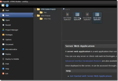
There is also a quick look at HTML5 Builder.

image

This tool targets server-side development with PHP, as well as apps for web,iOS,Android, Blackberry and Windows Phone. My guess is that there is PhoneGap/Cordova under the covers. I also saw some jQuery in the demo.

image

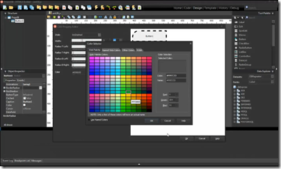
Here is a look at the CSS3 colour picker.

image

Update: looks like Embarcadero found a way to fake Live Tiles as well:

Metropolis applications are really traditional "desktop" applications styled to look like the Metro UI.
The TLiveTemplate component spawns a new process in the WinRT space which is is an actual WinRT LiveTile application. The LiveTile communicates with the Metropolis "desktop" backend via HTTP/REST to start/stop the application or update the LiveTile.

The screenshots are drawn from this video, or you can watch it on the Embarcadero site here.

For more info from attendees of the RAD Studio XE3 world tour see also:

http://members.adug.org.au/2012/08/22/highlights-of-the-sydney-xe3-event/

https://forums.embarcadero.com/thread.jspa?threadID=75773

BBC web site has a Metro look

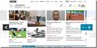
The BBC redesigned its web site last year borrowing elements of Microsoft’s Metro design language, as seen in Windows 8, Windows Phone, and Office 2013. Note the tiles, the typography, the horizontal scrolling, the way elements stand out against a pale background.

image

The BBC site is the 5th most popular in the UK and 47th in the world according to Alexa.

This strikes me as a significant design win for Microsoft. One of the goals of redesigns is to make your stuff look fresh and modern, while other stuff looks dated, and it helps drive an upgrade cycle. 

Update: amended to clarify that the design update was last year. Details here and here. Also interesting to note considerable hostility from users. Another point of similarity with Windows 8!