Tag Archives: ios

Adobe announces strong results though much of the business looks flat

Adobe has announced its financial results for its second quarter. Revenue is up 9% year on year, and profits are up too, so it looks like a strong quarter. However, the success is really limited to a couple of business segments.

Here is the comparison with the equivalent quarter last year:

  Q2 2010 Q2 2011
Creative and interactive 429.3 433.1
Digital Media 139.3 136.7
Digital Enterprise 231.9 283.5
Omniture 91.9 115.9
Print and publishing 56.6 54

Adobe has changed the segmentation of these figures since last time I looked, removing the confusing Platform and splitting out Digital Media. Broadly:

  • Creative and interactive is most of Creative Suite and the Flash platform including both developer tools and streaming servers. It also includes the nascent Digital Publishing Suite for  Apple iPad and tablet publications.
  • Digital Media is Creative Suite Production Premium and individual sales of Photoshop. Premiere Pro, After Effects and Audition.
  • Digital Enterprise Solutions is the LiveCycle middleware, now rebranded as part of the Digital Enterprise Platform, plus the content management platform acquired with Day Software in October 2010, and Acrobat.
  • Omniture is self-explanatory; this is the analytics business acquired in 2009.
  • Print and Publishing is a bunch of tools including, oddly, ColdFusion but not InDesign. Technical authoring sits here, as does Director.

So what do these figures tell us? Creative Suite is trundling on OK, but no more than that, particularly when you consider that Q2 included the release of a paid-for upgrade, CS5.5. Revenue from Digital Media is slightly down, as is Print and publishing.

The strong results are in Digital Enterprise, following the acquisition of Day, and in Omniture.

Both of these were smart acquisitions in my view, though I am not a financial analyst. In a connected era, analytics is crucial, with great potential for integration with the design and development tools.

The enterprise middleware also seems to be going well. This is really a strange amalgam of the old Adobe document publishing and workflow servers with the application services that came from Macromedia. Throw Day software into the mix, with Roy Fielding’s content-centric vision for application development, and you have an interesting platform.

Adobe is also benefiting from the Apple-led revolution towards design-centric software.

That said, not everything is going Adobe’s way. The momentum behind both HTML5 and Apple iOS is a threat to the Flash business. Never mind the technical arguments, the fact is that designers are more likely to be working on removing Flash from their web pages than putting it in. Adobe also needs to sustain its prices, and there is plenty of downward pressure on software prices today, partly driven by Apple and its App Store model. I also get the impression that the hosted services at Acrobat.com have not taken off in the way Adobe had hoped.

Hands On with Appcelerator Titanium Studio

I spent some time today trying out Appcelerator’s new Titanium Studio. Titanium is a cross-platform framework that lets you compile apps for Apple iOS, Google Android, RIM Blackberry, and desktop operating systems. Its chief attraction is the mobile aspect, particularly as it claims to build “native apps”.

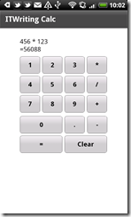
I am thoroughly bored of writing calculator apps, but having embarked on this this test case I am keeping going since it makes it easier to compare one with another. I started by writing it for Android on Windows. I had some setup issues, but once resolved it pretty much worked, though the development process was fairly painful.  There is no visual GUI designer and my calculator has quite a few buttons, so I ended up counting pixels and trying out my work by debugging in the emulator. Performing a build and running in the emulator is a lengthy operation, so this is a tedious way to work. Come back Visual Studio, all is forgiven!

I persevered though, and eventually had my calculator up and running on my HTC Desire.

image

The design could be improved; but it is good enough for my purpose. Unfortunately though the GUI is not as responsive as I would like. It is easy to lose taps if you tap a little too fast, which is a serious flaw in a calculator. In this respect, the Titanium build is better than the PhoneGap/JQuery app I built, but still not good enough for a production app.

Time to port to iOS. Here I ran into a number of difficulties. I installing Titanium Studio on a Mac, copied the project from Windows and tried to open it. Titanium Studio complained about the absence of the Android SDK and eventually froze trying to fully initialize the workspace. Force Quit, delete the project, and try again. This time I created a new project and just copied over the app.js file that has my source code. Titanium Studio was happier; but the app would not open in the iOS Simulator.

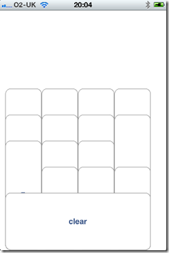
The problem: I have installed the latest Xcode and IOS 5.0 beta SDK. Even if you target iOS 4.x, Titanium is not quite compatible. However, my iPhone is still on iOS 4.3, and I was able to deploy the app to the device. Unfortunately the GUI was scrambled. This is how it looked:

image

Not good. Eventually I worked out the problem. On Titanium for Android there is no need to specify the height of buttons and labels; this automatically sizes to the content. On iOS though, if you do not specify the height it stretches the object from whatever you specify as top down to the bottom of the container.

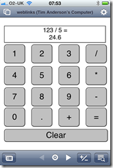
I added height attributes to sort out the GUI, though I am still scratching my head over one issue. I specified a different value for the top attribute of a label and a button, but they were rendered at the same vertical position. Odd. I simply compensated for this and ended up with a workable GUI. Here it is on the iPhone:

image

The good news: this is by far the best performing of all the cross-platform solutions I have tried. I cannot out-tap it, and it would be fine in this respect for a production app.

Note that attempting to debug using the community edition raises this message:

image

No debugging without a subscription; a strong incentive to subscribe.

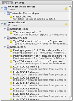
It is also worth noting that you can open the project generated by Titanium in Xcode. I wondered if that might shed light on the compatibility issues. It is an interesting thing to try, as you see the innards of Titanium’s code, complete with a number of reported issues.

image

I also get this:

image

Still, time to wrap up. I am impressed with the performance of my app on the iPhone, but disappointed on Android. On the other hand, the whole point of Titanium is to achieve cross-platform, otherwise you might as well use Objective C. Of course there may be ways to improve the performance; I just dived in and tried out the tool without chasing up possible optimisations.

Easy database apps for iPad and iPhone with FileMaker Pro and Go

FileMaker Pro is a database manager from FileMaker Inc, a wholly owned subsidiary of Apple. It is a capable produce that has been around for over 20 years and is the dominant Mac-based database manager, though there is also a Windows version. FileMaker has evolved relatively slowly, with more focus on usability than on features. In comparison to Microsoft Access, FileMaker wins on usability and scalability, but Access has a more traditional approach based on SQL and programming with Visual Basic for Applications. FileMaker has a drag-and-drop script editor and support for AppleScript on the Mac.

Although the script editor is frustrating for someone used to writing code, it does work. As well as manipulating the data, you can set and retrieve local and global variables, perform loops and display custom dialogs; it is not as limited as it may seem at first.

A FileMaker database can be huge, with 8 terabytes specified as the theoretical limit. External databases are accessible through ODBC on both Windows and Mac.

The number of users supported by FileMaker is limited. The desktop product supports up to 5 concurrent users, and FileMaker Server up to 250 users. FileMaker has its own built-in security system, though FileMaker server can also authenticate against an external directory. Security is fine-grained, and you can even specify permissions for an individual record.

I have not looked at FileMaker for a few years, but renewed my interest when the company came out with FileMaker Go, a runtime client for Apple iOS. Given that FileMaker runs scripts you might have thought this would be restricted, bearing in mind this provision in the App Store guidelines:

2.7 Apps that download code in any way or form will be rejected

This is normally taken to prohibit runtimes like Java or Adobe Flash/AIR. Well, either someone decided that FileMaker scripts are not code; or there are special rules for an Apple subsidiary, which is reasonable enough. Anyway, FileMaker Go is in the App Store and does run scripts.

What this means is that you can create apps in FileMaker Pro and deploy them to iOS without going via the App Store. There are two models. FileMaker Go can open a file hosted by FileMaker desktop or server, in which case it behaves like a Mac or Windows client, or alternatively you can transfer a file to FileMaker Go to run locally. Transferring a file is easy using iOS launch service; essentially, if you can access the file via the internet or an email attachment, you can just tap it on the device and it will open in FileMaker Go. The advantage of running locally is offline use, whereas the advantage of the client-server model is that all users have the most up-to-date version of the data, and the database can be much larger. FileMaker is a real server application; this is not just file sharing. This also means that FileMaker must be running with the database open if you want to to use the client-server approach.

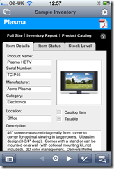
I tried FileMaker Go with a simple example and it works well. In essence it is delightful; you just open your database either locally or over the network, and it works. Here is a sample app on the iPhone 4:

image

That said, there are things that do not work, spell checking for example. It is also stripped of anything other than client features, so you cannot modify database structure, create new databases, or publish from the device to other clients. You also have to be careful with layout size. Most layouts designed for the desktop will need modification to work well.

There are a couple of issues. One is performance. It is just about bearable, but has that lethargic feel that you get with interpreted code on a relatively slow processor.

Another issue is synchronisation. If you want to work offline, how do you update your main database with any changes? The issue is little different with FileMaker Go than it is with a laptop, and it is discussed here. You have several choices:

1. Don’t synchronize, use client-server.

2. Treat your local database as read-only.

3. Use import and export. Existing records will simply be overwritten by imported ones.

4. Use a third-party tool. However the tool mentioned here, SyncDek, probably does not work with FileMaker Go since it needs to run a Java process on the client.

5. Roll your own. “FileMaker Pro has all the tools needed to create a robust synchronization system” says the guide; but it is non-trivial to implement this.

It is worth mentioning that FileMaker Pro also has an Instant Web Publishing feature that gives another route to mobile access and may perform better. There are pros and cons. The big one is offline, only available with FileMaker Go. Another is scripts. Some scripts work in Instant Web Publishing, but FileMaker Go is more compatible in this area.

I think this is significant for businesses where iOS devices are turning up. Many business apps do resolve down to forms over data, and this is is an easy way to deliver this kind of application to iOS users.

How is FileMaker pro as a programming tool? Just for fun, and because I have done it for other mobile development tools, I built a calculator in FileMaker. I do not recommend FileMaker for general-purpose programming; but it has the essentials, a form designer and scripting. Here is the result on an iPhone 4:

image

Oddly the biggest struggle I had was finding an easy way to display the input and result. In the end I added a field to the database just for this purpose. If a FileMaker expert could let me know a better way to update a text label on a layout via script, I would be interested to know.

The calculator is slow too, not for the calculation of course, but the operation of the user interface. Still, it does demonstrate that FileMaker Go is indeed able to download code and run it.

Update: I replaced the display field with a merge variable, which works better as it avoids focus issues and the keyboard popping up. Thanks to the commenter for the suggestion.

Mobile development research shows complex picture

Vision Mobile has published its report on mobile development. It is a detailed report and worth reading, though I would be wary about taking it too seriously since some of the results are puzzling. This is what the report is based on:

We spent the last few months quizzing developers and industry executives about the future of mobile. Our research included 20+ industry executives, along with 900+ developers from 75+ countries working on 8+ major platforms.

There are a few surprises. Android fragmentation is generally regarded as a problem, particularly since operators are slow or reluctant to release updates, but according to the report Android is the least fragmented platform after Apple iOS; the worst is Java ME.

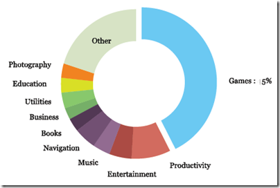
Here are a couple of charts I found interesting. What kinds of apps are people paying for?

image

Source: Developer Economics 2011

It is games that dominate, but at 45% they are still less than half of the whole. Note that these stats are based on iOS sales tracked by App Annie.

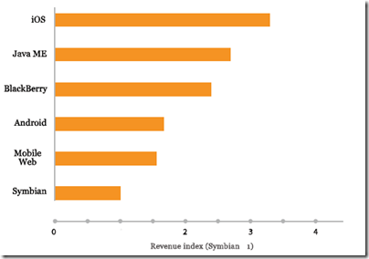
In terms of monetisation, iOS is the most revenue-generating platform according to the report, and Android well down.

image

Source: Developer Economics 2011

Windows Phone is too small to make this list, but the report notes:

Windows Marketplace offers a trial version for applications, which doesn’t help developers monetise from impulse purchases – a
naive differentiation move on the part of Microsoft.

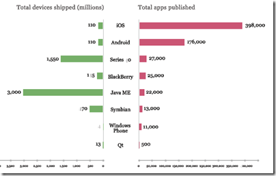
There is a fascinating section on winners and losers in the mobile platform race. There is almost no correlation between number of devices shipped and the number of apps published.

image

Source: Developer Economics 2011

Java ME is way ahead on devices shipped; but these are feature phones for a market that buys relatively few apps.

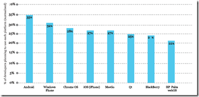
Finally, a look at the platforms developers are planning to use, and the ones that plan to abandon. Here is the first:

image

Source: Developer Economics 2011

I am not sure what to  make of this one. 621 developers were surveyed, and placed Android top, Windows Phone 2nd, Chrome OS third, and iOS level pegging with MeeGo in fourth place. I could almost believe it if it means which additional platforms, since many will already be developing for iOS. I wonder if the question was clearly put?

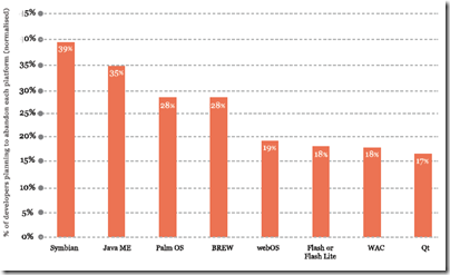
Next comes a chart of platforms developers are planning to abandon:

image

Source: Developer Economics 2011

Bad news for Symbian and Java ME, and also uncomfortable reading for HP with webOS and Adobe with Flash. However, only 285 respondents for this part of the survey.

There are harsh words for Adobe. The report gives several reasons why Flash is losing the battle for developer mindshare, including the abandonment of Flash Lite and the perception that “by focusing on large business partners, Adobe has been unable to cultivate momentum among developers in the long-tail.”

Microsoft is praised for its developer tools, but the decline of Windows Mobile and “lacklustre sales” for Windows Phone raise questions over whether it can create a viable market for mobile developer. The report is not always clear about when it means Windows phones of all kinds, and when it means the new Windows Phone 7+ platform.

The report shows that actual usage of Windows Mobile and Windows Phone by developers has gone down from 39% to 36% between 2010 and 2011, while Flash/Flash Lite has increased from 22% to 34%. It is rather hard to make sense of this alongside the other figures showing platform intent and abandonment intent and again it makes me wary of the report’s accuracy.

Frankly, it is hard to discern any safe bets in such a complex market, though Apple seems to be a consistent platform from a developer perspective – provide that the company does not decide to absorb the functionality of your app into iOS itself.

Financial Times ports app to web to avoid iTunes

The Financial Times, which is among the few web publications that seems able to make sense of paywalled content, is launching a web application [paywalled article] for mobile devices, specifically to bypass Apple’s iTunes App Store. Here they are side by side.

image image

Rob Grimshaw, managing director of FT.com, said the FT had no plans to pull out of any apps store, but that it would encourage users to adopt the web app with a marketing campaign, including a week’s free access.

The issue highlighted in the FT’s own article is analytics. The FT says it wants to "secure a direct relationship with readers." Apple currently does not divulge information about subscribers to publishers.

Another possible factor may be Apple’s insistence that all subscriptions and in-app purchases are offered through its own payment system, ensuring a 30% cut of every transaction. Publishers may also offer subscriptions on their own site, but may not undercut the App Store, nor include links to such offers within the app, as detailed here.

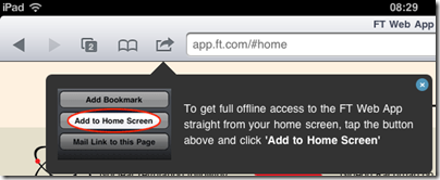
Is the web app as good? Well, A banner encourages the user to pin the app to the home screen so that it behaves more like an app:

image

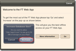
Further, the web app makes use of HTML 5 local storage to enable offline reading and prompts the user to increase its local storage space:

 image

With these two features, the web option can be nearly as good as a native app. However, while there are advantages for the FT, there will be little or no intrinsic advantage for subscribers, who like the convenience of purchasing through the App Store, unless the web option is cheaper or better. Perhaps it is: the FT’s Tim Bradshaw says it is “actually faster than native”.

The dark side of Apple’s success with iOS is the company’s control over the platform and tax on all transactions within it. Interesting to see the FT turning back to the open web in an effort to win back a little freedom.

A pivotal moment for Microsoft as it attempts to escape its Windows legacy

image

Last year I wrote a piece for The Register on 25 years of Windows. I even ran up Windows 1.0 in a DOS box to have a look.

The surprising thing about Windows is not how much has changed in 25 years, but how little. The WIMP model (Windows, Icons, Menus, Pointer) has stayed the same. Inevitably, Windows was completely rebuilt during that period, in the form of Windows NT, but Microsoft was careful to make the user interface reassuringly familiar. Windows NT 3.1 looked the same as Windows 3.1, but did not crash so often. Windows NT 4.0 used the Windows 95 user interface. Further, as far as possible old applications still ran. In fact, Notepad on Windows 1.0 looks very like Notepad on Windows 7.

Then Apple releases the iPhone in 2007, and suddenly Microsoft has a problem. Apple demonstrates that it is possible to create a touch user interface, without a stylus, that really works. Apple does this by creating a new operating system, iOS, which is incompatible with its existing OS X used for desktops and laptops. Yes, much of the underlying code is the same, but OS X applications do not run. Nobody would expect them to on a phone; but then Apple does the iPad, approaching the screen size of a laptop, but still iOS, touch-centric, and incompatible with Mac OS X.

The advantage of Apple’s clean-room approach is that there are no compromises or fudges to make applications built for keyboard and mouse somehow work. iPhone and iPad are huge hits, and users seemingly do not mind sticking with OS X for their productivity applications like Microsoft Office and Adobe PhotoShop, and using the iPad and iPhone for web browsing and for apps that are more about consuming than creating – except that productivity apps like the iWork suite are now creeping onto iOS, and this together with the web application/cloud computing model may mean that OS X gets used less and iOS more over time; but OS X is not going away.

What about Microsoft? It has a big hit with Windows 7, but suddenly it all feels rather legacy. What about the new computing model which is mobile, touch-centric, and enjoyable to use in a way previously unknown in computing? One thing is sure: Microsoft cannot continue with WIMP. It has to break with 25 years of Windows and find a different user interface model.

2010, and Microsoft does Windows Phone 7. This is Microsoft’s iOS: same old Windows underneath, though based on the cut-down Windows CE, but otherwise a complete break from the past. The user interface is a new touch-centric effort called Metro and based on sliding tiles. The main thread of continuity for developers is its app platform based on Silverlight, which runs .NET code written in C# and Visual Basic.

You might have thought that Microsoft would follow Apple by using the phone OS for other form factors as well, and making Silverlight its core app platform for Windows (the cross-platform dream is long gone).

Instead, Microsoft embarked on a third strategy.

“We introduced a new platform based on standard web technologies”, says program manager Jensen Harris in his preview video. Windows 8 uses elements from the Windows Phone 7 UI, but driven by HTML and JavaScript rather than by Silverlight. Well, maybe you can use Silverlight instead; or maybe native code. Not everything is clear yet; but what Microsoft is choosing to focus on is its use of web technology.

Who will buy touch-centric Windows 8 devices? Microsoft’s problem: there is already a touch-centric OS out in the market, supported by countless third-party apps. As it has discovered with Windows Phone 7, it is not enough to do a decent alternative. So what, says the market, we already have iOS, and if we want something non-Apple, there’s Android. And WebOS. And Blackberry PlayBook.

The one thing Microsoft can do that others cannot is run Windows. Not new Windows, but old Windows. There is a reason why Windows 7 was the fastest-selling operating system of all time – most of the business world runs on Windows.

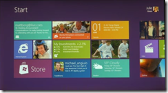
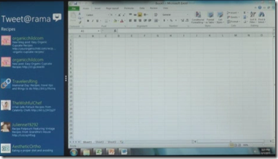
Therefore Windows 8 does both. There’s the new platform, and there’s the old platform, and you just swipe between them.

image

Windows 8 is a migration strategy. Is a mobile, touch-centric UI the future of client computing? Quite possibly, but in the meantime you have all this old stuff to run, not least Microsoft Office. Here is the answer: run both.

There are a few problems with this strategy.

First, while Microsoft will focus on the new HTML-based platform, in the real world people will buy Windows to run their existing Windows apps. That means they will need keyboard and mouse. Windows 8 OEMs will be fighting an old battle: how to make devices that run well as tablets, but also have keyboard and trackpad, and a competitive price. We have seen that approach fail with the old Tablet PC line and its swivel screens.

Alternatively, we will see touch-only devices and users will curse as they try to run Excel.

Second problem: Microsoft’s Windows team is focused on the new UI. The old one will likely be pretty much Windows 7. The success of Windows 7 was driven by innovations and improvements that matter whatever you run, rather than ones that you can only use if you are running apps built for the new platform.

A split personality means divided attention, and one or other or both will suffer. Is Windows 7 now frozen in time as the last of its line? That does look possible.

Third, what is the developer story? Hitherto, the Windows developer story has been pretty simple and single-minded. There is native code and the Windows API, or for the last decade or so there has been .NET. All-conquering C# has been the unifying language from desktop to server, with Silverlight bringing it to the browser.

Now Microsoft is saying HTML and JavaScript. Plaudits from the standards folk – who mostly do not run Windows and still will not – but confusion for the Microsoft-platform community.

That said, I will be surprised if Silverlight is not also an option for new-style apps, enabling Windows Phone apps to be ported easily.

Even so, there must be a reason for Microsoft’s emphasis on HTML and JavaScript for local apps as well as web applications. It does feel as if the one common thread to the company’s developer story has suddenly been cut, and for no good reason given that Silverlight fits perfectly with the new UI model.

Let me add, it is hard to see a future for the Windows Phone 7 OS, given what we have seen in Windows 8. It seems plausible that Windows Phone 8+ will use the same code as Windows 8, which is another reason to suppose that Silverlight will be fully supported.

I can see where Microsoft wants to get to. It wants to succeed in mobile and in the new touch-centric world, as the alternative is gradual erosion of its entire market and Windows ecosystem. Is this the best way, and will it work? Open questions; and the company has some tricky positioning to do, especially to its developers. The forthcoming Build conference will be critical.

Infragistics: upbeat on Windows Phone but also building for Apple iOS, Google Android

I spoke to Dean Guida, CEO and co-founder of Infragistics, at TechEd in Atlanta earlier this week. Infragistics makes components, mainly for Windows but now beginning to support non-Windows clients. There is a set of jQuery controls in preparation, and “Our roadmaps are also going to deliver native on Android and iPhone,” Guida told me. “We have a lot of software companies that use our tools in their commercial apps, and a lot of enterprises, and we feel that we need to do it,” though he adds, “we feel that the best and the smartest business solution is to go mobile web.”

image

Infragistics has a focus on data visualization, and Guida showed me some great-looking components that show animated charts, with a huge range of customisation options, and including geo-spatial and timeline controls.

I was intrigued to find Guida more upbeat about Windows Phone than most commentators, though I make allowance for the fact that his company has a component suite for the platform. “More than half of our customers told us that they’re either building or they will build for Windows Phone in the next 12 months,” he told me.

His view, which I share, is that they key advantage of Windows Phone is to Microsoft-platform enterprises rather than to consumers. “It’s so easy to extend their knowledge of Silverlight and extend apps, that they’ll be able to extend the data and the access to information this way. I think that’s going to be a beachhead for Microsoft.”

Of course Microsoft has marketed Windows Phone to consumers so far, and has told businesses they should continue to use Windows Mobile 6.5, clearly a dead-end. It may be easier when the company is able to move on from this mixed messaging and get behind Windows Phone as a business mobile platform.

Continuing a contrarian theme, Guida is also positive about Windows Presentation Foundation (WPF). “It’s huge, especially in the financial markets. They’ve made big bets on it. They’ve built a lot of their trading apps and a lot of their internal apps on it. We’ve been telling Microsoft this for years,” he says.

The problem I guess is that while WPF/Silverlight makes sense for data visualisation for internal apps where you control the platform, for broad reach apps that are visible to the rest of us, Adobe Flash or some other approach is a better fit.

It is understandable that companies like Infragistics are keen to talk up the Microsoft platform. Their business depends on it. It is true that Infragistics is now experimenting with other platforms like Apple iOS and Google Android, but historically developers on non-Microsoft platforms have not formed a strong component market.

“They don’t get it as much as Microsoft developers,” says Guida. “We used to have a ton of Java components. I was at the second JavaOne conference. We built some of the first AWT components, JavaBeans, Swing components. There’s a lot more pain developing for these platforms than on the Microsoft platform, Microsoft has done a great job with the tooling. Why have that pain? I think there is a distinction between the Microsoft and the non-Microsoft developer, that they have a higher tolerance for, pain’s probably not the right word, but a higher tolerance for taking longer to get stuff done. I can only believe that over time maturity will happen. It’s really about satisfying a business need or a consumer need. These platforms are different, but if we go in and give them the tools, why not? We’re really just this year starting to get there.”

It is a brave hope; but looking at the Infragistics site, there are currently no Java controls on offer, and even the 2008 NetAdvantage for JavaServer Faces (JSF) seems to have disappeared. If the Microsoft client platform does decline, the future will be challenging.

Battle of the portables: Netbook vs Apple iPad 2

A semi-serious comparison

The popularity of tablets has seriously undermined the market for netbooks, according to many reports. But to what extent are the two comparable, and if they are, is a tablet unequivocally superior? I’m asking the question as much as answering, because I am trying out an iPad 2 and intrigued to see to what extent it can replace the netbook with which I normally travel. I have found I prefer the netbook to a laptop when out and about: the lightness and long battery life is worth the performance limitations for me.

The comparison is not straightforward. An iPad is a thing of beauty, whereas a typical netbook is an obvious compromise, nearly a laptop but limited in memory and performance. For some people that is enough; they will say, it is not about features, it is about the experience, and it is night and day.

Even so there are things that the netbook does better. What follows are some notes on the subject, based on the iPad vs a Toshiba NB 300 netbook with which I am familiar. I may add or amend the entries, so check back for updates.

1. Price

iPad2: £399 (wi-fi with 16GB)

Toshiba netbook: £230.00 (based on typical current price of NB305)

Winner: netbook

the netbook comes with Windows 7 starter, a crippled version of Windows, and only 1MB RAM. You probably want to add 1GB RAM (£17.00). If you want to join your netbook to a business domain you’ll need to upgrade Windows 7 to the Professional version; if you want to get rid of the annoying ads in Office Starter you’ll need to upgrade Office too.

2. Ease of setup:

iPad2: Switch on, and it asks you to connect to a computer running iTunes. This actually has its annoyances. iTunes is rather slow and bloated especially on Windows. When you connect, the default is auto-sync, which means iTunes will attempt to copy its music library to your iPad, likely not have enough room, and copy a random selection. If you have an iPhone, you will also get all your iPhone apps copied across, like it or not, which means you have to delete the ones you do not want.

Toshiba netbook: I recounted the “fairly dismal” experience of setting up a Toshiba netbook here. The main problem is all the trialware that is pre-installed, plus a bunch of Toshiba utilities of varying quality. Rather than repeat it all here, I will show show the screenshot a few minutes after first power-on:
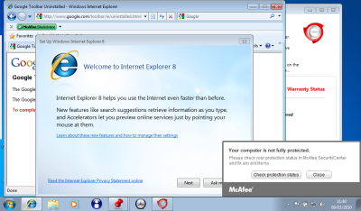
Winner by a mile: iPad 2

3. Boot time

iPad 2: instant

Toshiba: ages. Better from hibernation, though still much slower than iPad 2. Better from sleep, but I am not a big fan of sleep because it drains the battery and occasionally crashes on resume.

Winner by a mile: iPad 2

4. Multi-tasking, or the ability to do several things at once

iPad 2: does multi-task but the experience is not great. Only one app is visible at a time, and to switch you have to double-click the big button, swipe through a list of apps, and tap the one you want.

Toshiba: It’s Windows. Fortunately Microsoft changed its mind about having a limit of three apps you can run at once. You can run lots of apps, switch between them with alt-tab or by clicking a taskbar icon, and size them small so you can see more than one on-screen at one time.

The simplicity of one app to view is meant to be an advantage of iOS; but while the Windows model can be troublesome – see the above screenshot for proof- I’d like to see some improvement in this part of iOS. It is not a matter of screen size: the screen size on the netbook is similar to that of the iPad.

Winner: netbook

5. Keyboard

iPad 2: soft keyboard that obscures half the screen, or add-on physical keyboard.

Toshiba netbook: traditional clamshell design with integrated keyboard.

I do a lot of typing, and my speed is substantially better on a physical keyboard. However I do not like carrying lots of accessories, and while the iPad add-on  keyboard is fine at a desk, if you are in a confined space such as an aeroplane the clamshell design works better than a loose keyboard.

That said, I recall hearing how a school that issued all its pupils and staff with iPads was surprised by how few wanted keyboards. Some kids apparently prefer the soft keyboard to “all those buttons”, so it may depend what you are used to. However, even if you replaced the “Keyboard” heading with “Text input”, my vote would still go to the netbook.

Winner: netbook

6. Touch control

iPad 2: yes

Toshiba netbook: no

I’m putting this in just to make the point. Even a Windows tablet, with a stylus, is less convenient to use with touch than an iPad.

Winner by a mile: iPad 2

7. Applications

iPad 2: A bazillion apps available in the app store, cheap or free to purchase, a snap to install. Not so many for iPad as for iPhone, but still a good number.

Toshiba netbook: It’s Windows. They are a bit slow to load, but I run Microsoft Office, Outlook, several web browsers, music apps, games, network utilities and all sorts of other stuff.

Winner: I am going to call this a tie. There are some beautiful apps for the iPad 2, but I miss the features of Windows apps like Office. With the netbook my experience is that I can do almost anything that I can do with a desktop PC, although more slowly, but that is not the case with the iPad 2. On the other hand, the way apps can be installed and removed in a blink on the iPad 2 is a delight compared to Windows setup.

8. File system and storage

iPad 2: There is a file system, but it is hidden from the user.

Toshiba netbook: Yes. I can save a document from one app, and open it in another. I can connect to it over a network and copy files from one folder to another. Not possible on the iPad 2 without workarounds like iTunes and DropBox; and even then some things are difficult. For example, you cannot save a document from Pages on the iPad directly to your DropBox. Let me add that the netbook has a 250GB hard drive, whereas the iPad gets by with a maximum of 32GB solid state storage – though also note that solid state storage is faster to access, and that because the iPad is designed to work like that it does not feel particularly space-constrained.

Winner by a mile: netbook

9. Connectivity

iPad 2: Wireless network, or devices that accept Apple’s proprietary connector. You can attach the iPad to a PC with USB, but only iTunes really understands it, unless you just want to copy photos and videos. Apple offers an add-on camera connectivity kit for downloading photos from a camera, and AirPrint for printing over a network. It is annoying that you have to buy add-ons to do what a netbook does out of the box.

Toshiba netbook: Three standard USB ports, you can attach external hard drives or most USB devices such as printers.

Winner: netbook

10. Battery life

iPad 2: Apple says up to 10 hours, but I have never managed as much as that. Maybe 7 or 8 hours.

Toshiba netbook: I get about 6 hours on wifi, more than that without.

In practice, I have no quibble with either machine – though I am envious of Amazon Kindle owners with their one month charge.

Winner by a whisker: iPad 2.

11. Portability

iPad 2: no bigger than a pad of paper. It is not exactly pocketable, but slips easily into any kind of bag or briefcase. It perhaps needs the protection of a case, but even in a case it is not bulky.

Toshiba netbook: fatter and uglier than an iPad, but still very portable. The worst thing is the power supply, if you need it: the Apple mains adaptor is much smaller than Toshiba’s effort.

Winner by a whisker: iPad 2

12. Watching videos

iPad 2: Great. It is like a portable TV or DVD player, but better – as long as you have a strong wifi connection and BBC iPlayer or the like. Just prop it up on its stand (most cases have one) and enjoy.

Toshiba netbook: it works but the graphics capabilities are inferior and it feels like you are looking at a netbook.

Winner by a mile: iPad 2

13. Built in cameras and microphone

iPad 2: two cameras, front and back, and a microphone that works.

Toshiba netbook: webcam and microphone, but they are junk; I have not seen a netbook with anything decent.

Winner by a mile: iPad 2

14. Reading eBooks

iPad 2: iBooks app and Amazon Kindle app. I prefer the Kindle app, though whether it will survive Apple’s assault on alternative readers I am not sure.

Toshiba netbook: Kindle app, as well as Adobe Reader etc.

A tablet is great for reading, much better than a netbook. However despite its humble appearance Amazon’s Kindle device really is better for reading, thanks to a screen you can read in sunlight, much longer battery life, and free internet access to download books everywhere.

Winner: iPad 2, though a Kindle is better

15. Attract admiring glances

iPad 2: Yes

Toshiba netbook: No

Winner: I did say “semi-serious”.

Hands On with Adobe Flash Builder 4.5 for Android

I have been trying several cross-platform development tools for mobile, and today I set out to create an Adobe AIR app for Android using the new Flash Builder 4.5, available separately or as part of the Creative Suite CS5.5.

I made another calculator app, which may seem boring but gives me a chance to compare like with like.

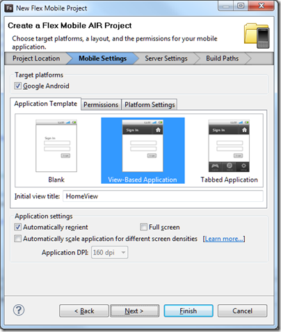
You get started by running up Flash Builder and creating a new Flex Mobile Project.

image

The disappointment here is that only Android is supported, so it is not all that cross-platform. According to Adobe’s Andrew Shorten:

An update to Flash Builder, scheduled for June 2011, will provide additional options to package Flex applications for Apple iOS and will include built-in support for packaging both Flex and ActionScript applications for BlackBerry Tablet OS.

so we have not got long to wait.

Flash Builder is based on Eclipse. The IDE is slow at times, for example when switching to visual design mode, but the platform is familiar to many developers and it feels reassuringly enterprise-ready. I find it a productive environment.

I laid out a screen with buttons and a label to display the output. The alignment tools work well although I made them a little too small as you will see shortly. Then I started writing code. The language of Flash Builder is ActionScript, which is based on JavaScript.

Here I met my first little annoyance. You can easily create a click handler for a button by right-clicking in the designer and choosing Generate Click Handler, or by clicking Generate Event Handler in the properties window. However, I thought it would be smart for most of my buttons to share the same event handler. All I need to do is to read the label of the button which was clicked, and pass it to my addnum routine that processes the input:

protected function btn_clickHandler(event:MouseEvent):void
{
    var theButton:Button = Button(event.currentTarget);
    addnum(theButton.label);
}

This works fine, but the IDE does not let you select an existing event handler for a button. You can paste it in, or add in in the source code editor, which is what I ended up doing. The source code editor is rather good, with excellent code completion, hover-over help for keywords, and so on.

image

The second annoyance was with the label. I wanted to add a border. I selected the label but could not see a border property. I went to the full list of properties and found exotic things like dominantBaseline in the style list but still no border.

Then I found this in the reference for a label:

Borders are not supported. If you need a border, or a more complicated background, use a separate graphic element, such as a Rect, behind the Label.

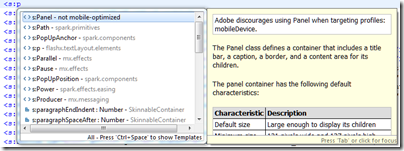
I wondered if a panel would work, and started to type it in the editor:

image

Well, it looks as if Panel is overkill for simply getting a border, but it was interesting to see the editor report that “Adobe discourages using Panel when targeting profiles: mobileDevice”. I decided to do without a border for the moment.

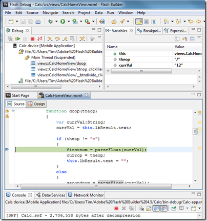
I finished the coding and successfully ran the project in the Android simulator. Next, I attached a device and created a new Run Configuration for a device attached via USB. I plugged in my HTC Desire running Android 2.2. Provided USB debugging is enabled on the device, this works well. Not only could I run on the device; I could also set a breakpoint and debug on the device. Everything was a bit slow in debug mode but it worked.

image

Finally, I built a release version using Export Release Build on the Project menu. You have to sign the package, but there is a wizard to create a certificate for testing.

Here it is on the device – as I mentioned, the size of the buttons needs a little work:

image

So how is performance, bearing in mind that the app is trivial. Well, the good news is that performance is OK, though launch is a little slow, except for one thing that I have not figured out. Sometimes I touch a button, and see the graphic effect as the button depresses, but the input does not register. It seems most prone to this just after launching, and usually a second tap works fine.

The vsize reported for the app process by the Dalvik Debug Monitor is around 200K, similar to that for the PhoneGap version.

Overall I am impressed, though I would like to understand the button issue, and I am beginning to wonder if my year-old HTC Desire is a bit under-powered for AIR. Device performance is improving rapidly, and Flash optimization is part of the design process for mobile graphics chips, so my guess is that AIR will be more than viable as a cross-platform toolkit for mobile. You also get the benefit of all those lovely Adobe design tools.

Microsoft’s Azure toolkit for Apple iOS and Android is a start, but nothing like enough

Microsoft ‘s Jamin Spitzer has announced toolkits for Apple iOS, Google Android and Windows Phone, to support its Azure cloud computing platform.

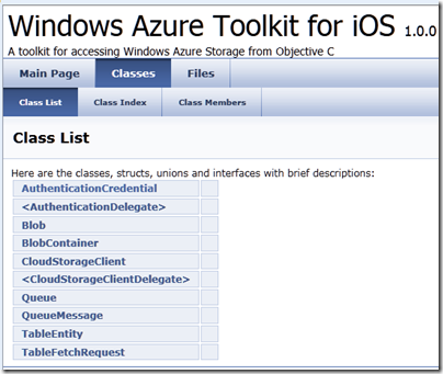
I downloaded the toolkit for iOS and took a look. It is a start, but it is really only a toolkit for Azure storage, excluding SQL Azure.

image

What would I hope for from an iOS toolkit for Azure? Access to SQL Server in Azure would be useful, as would a client for WCF (Windows Communication Foundation). In fact, I would suggest that the WCF RIA Services which Microsoft has built for Silverlight and other .NET clients has a more useful scope than the Azure toolkit; I realise it is not exactly comparing like with like, but most applications built on Azure will be .NET applications and iOS lacks the handy .NET libraries.

A few other observations. The rich documentation for WFC RIA Services is quite a contrast to the Doxyfile docs for the iOS toolkit and its few samples, though Wade Wegner has a walkthrough. One comment asks reasonably enough why the toolkit does not use a two or three letter prefix for its classes, as Apple recommends for third-party developers, in order to avoid naming conflicts caused by Obective C’s lack of namespace support.

The development tool for Azure is Visual Studio, which does not run on a Mac. Microsoft offers a workaround: a Cloud Ready Package which is a pre-baked Azure application; you just have to amend the configuration in a text editor to point to your own storage account, so developers without Visual Studio can get started. That is all very well; but I cannot imagine that many developers will deploy Azure services on this basis.

I never know quite what to make of these little open source projects that Microsoft comes up with from time to time. It looks like a great start, but what is its long-term future? Will it be frozen if its advocate within Microsoft happens to move on?

In other words, this looks like a project, not a strategy.

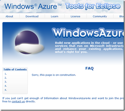
The Windows Azure Tools for Eclipse, developed by Soyatec and funded by Microsoft, is another example. I love the FAQ:

image

This sort of presentation says to developers: Microsoft is not serious about this, avoid.

That is a shame, because a strategy for making Azure useful across a broad range of Windows and non-Windows clients and devices is exactly what Microsoft should be working on, in order to compete effectively with other cloud platforms out there. A strategy means proper resources, a roadmap, and integration into the official Microsoft site rather than quasi-independent sites strewn over the web.