Tag Archives: apple

Apple iCloud: i is for integrated

Apple has announced iCloud, smart cloud storage for Apple devices.

The iCloud will store documents, email, contacts and appointments, and synch the data to multiple devices including iPad, iPhone, iPod touch, Mac or PC. You get 5GB free with more available to purchase. Books are synched so that your place is saved from one device to the next, a feature borrowed from Amazon Kindle.

Apple has also exposed an API for developers:

Apple apps are seamlessly integrated with iCloud, and we’ve given developers the tools to make their apps work with iCloud, too. So you’ll be able to paint a masterpiece, play a game, create reminders, edit stock lists, and more — and have it all stay with you on all your devices.

This API allows for key-value pairs to be stored as well as documents.

The iCloud also backs up settings, including device settings and app data. If your iOS device is stolen, restoring it should be just a matter of reconnecting:

When you set up a new iOS device or need to restore the information on one you already have, iCloud Backup does the heavy lifting. Just connect your device to Wi-Fi and enter your Apple ID and password. Your personal data — along with your purchased music, apps, and books from iTunes — will appear on your device.

This is similar to what Google is promising for the Chromebook; in fact, there are quite a few parallels there.

Email is also synchronised, provided you use Apple’s me.com email account. Users of Microsoft Exchange or similar server-based systems already have the experience of email, appointments and contacts synched across all devices; now iCloud brings this to all Apple users.

There is also special provision for music. In this case you do not actually have to upload the tracks in most cases, since Apple will “scan and match” your collection. This applies to CDs you have ripped as well as iTunes purchases, which strikes me as a big concession from the music industry, since there is actually no way to tell if you ripped your own CD or copied it from a friend. You do have to pay $24.99 annually for this though, so it is a kind of music subscription. However it falls short of Spotify’s play-anything offer, since you have to acquire each track by some separate means first.

Taking each feature individually, there is little new here other than Apple’s deal with the music companies. Taken together though, this is a big deal. Apple iOS devices are no longer tied to an iTunes installation on Mac or PC; they are now cloud devices. If you think as I do that cloud+device is the direction of computing today, this is a key move.

One weak point is collaboration. The iCloud seems to be a private store, whereas with technology like Microsoft SharePoint or Google Apps you can publish documents to selected individuals or to the world.

I expect it is just a matter of time before Apple adds document sharing based on Apple IDs or me.com email identities. Another obvious move would be some sort of web site integration so you can publish certain kinds of data.

Another weak point is system requirements. Some features will require iOS 5 or OS X Lion. However, in the past iOS upgrades have been free so that is unlikely to be a problem; and even an upgrade to Lion will only be $29.00, provided your Mac is compatible – it needs Intel Core 2 Duo or better.

There is also the question of whether you want to store all your critical data on Apple’s servers. In my own encounters with Apple’s online security I have not been impressed. Someone managed to sign up for iTunes using my email address once; I could have had full access to his account and stored credit card details. Apple also uses the notorious “security questions” technique for resetting passwords. It is also not clear whether data in iCloud is encrypted.

That said, as with the iPad versus Microsoft’s Tablet PC, I am struck by how Apple has taken a feature which Microsoft has worked on for years but failed to implement sensibly and consistently. Microsoft had Live Mesh for example back in 2008 complete with an API for synchronising documents across PCs. The API was poor, there was an operating system component which could be problematic to install, and mobile device support never really came. Then in 2010 Microsoft scrapped most it and replaced it with a new Live Mesh based on SkyDrive which is now part of Windows Live Essentials. It is an optional extra for Windows users and aimed at consumers; business users can get some of this using Exchange and SharePoint as mentioned above, though these are usually privately hosted. Everything is an extra, some things free, some things paid for. In the confusion third party services like Dropbox have flourished.

Microsoft will learn from Apple and we will see a nicely integrated cloud story in Windows sometime around 2014, based on past performance.

Financial Times ports app to web to avoid iTunes

The Financial Times, which is among the few web publications that seems able to make sense of paywalled content, is launching a web application [paywalled article] for mobile devices, specifically to bypass Apple’s iTunes App Store. Here they are side by side.

image image

Rob Grimshaw, managing director of FT.com, said the FT had no plans to pull out of any apps store, but that it would encourage users to adopt the web app with a marketing campaign, including a week’s free access.

The issue highlighted in the FT’s own article is analytics. The FT says it wants to "secure a direct relationship with readers." Apple currently does not divulge information about subscribers to publishers.

Another possible factor may be Apple’s insistence that all subscriptions and in-app purchases are offered through its own payment system, ensuring a 30% cut of every transaction. Publishers may also offer subscriptions on their own site, but may not undercut the App Store, nor include links to such offers within the app, as detailed here.

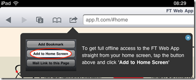
Is the web app as good? Well, A banner encourages the user to pin the app to the home screen so that it behaves more like an app:

image

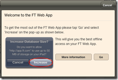
Further, the web app makes use of HTML 5 local storage to enable offline reading and prompts the user to increase its local storage space:

 image

With these two features, the web option can be nearly as good as a native app. However, while there are advantages for the FT, there will be little or no intrinsic advantage for subscribers, who like the convenience of purchasing through the App Store, unless the web option is cheaper or better. Perhaps it is: the FT’s Tim Bradshaw says it is “actually faster than native”.

The dark side of Apple’s success with iOS is the company’s control over the platform and tax on all transactions within it. Interesting to see the FT turning back to the open web in an effort to win back a little freedom.

Apple, Google: risks of third–party platforms for developers

This week there are a couple of stories about companies whose business was affected by the third-party platform on which they deploy.

The first is from a post from Beamitdown Software’s Dennis Morin whose iFlowReader app for iOS is no longer viable following changes Apple has made to its developer agreement, insisting that add-on content for apps must be sold through Apple’s purchase system, where it is subject to a 30% fee. Beamitdown’s product is an eBook reader, and the content is eBooks, on which the company gets a 30% commission from the publisher. No profit.

It is also worth reading Morin’s interview with CNET in which he adds some detail.

Morin’s complaint is that Apple changed the rules; and reading his account of how difficult it was to communicate with Apple and how unsatisfactory and unreasonable the outcome is, it is hard not to be sympathetic.

On the  other hand, was it sensible to build a business on a platform that you do not control, and with a product that competes, and was always likely to compete, with a similar service from the owner of that platform?

Ask Skyhook, which is trying to offer location services on Android devices, and is suing Google for allegedly blocking Skyhook’s deal with Motorola to favour of its own services. The action has unearthed  correspondence between Google and Motorola that shows the limits of Android’s openness, though I have no idea about the merits of the legal action. Note that a key point here is not the Android OS itself, but Google’s applications which include Android Market. You will notice that the cheapest Android devices, like the famously poor Next Tablet, do not include the Android Market or other Google applications; they use Android source code but are not fully part of the ecosystem:

Is compatibility mandatory?

No. The Android Compatibility Program is optional. Since the Android source code is open, anyone can use it to build any kind of device. However, if a manufacturer wishes to use the Android name with their product, or wants access to Android Market, they must first demonstrate that the device is compatible.

How can I get access to the Google apps for Android, such as Maps?

The Google apps for Android, such as YouTube, Google Maps and Navigation, Gmail, and so on are Google properties that are not part of Android, and are licensed separately. Contact android-partnerships@google.com for inquiries related to those apps.

Who determines what will be part of the compatibility definition?

Since Google is responsible for the overall direction of Android as a platform and product, Google maintains the Compatibility Definition Document for each release. We draft the CDD for a new Android version in consultation with a number of OEMs, who provide input on its contents.

The Next tablet and devices like demonstrate why Google having a measure of control over Android is not a bad thing. However it gets uncomfortable if you want to put out a device that uses Android in ways that conflict with Google’s goals.

What are Google’s goals? It is a good question; but my assumption is that Android is intended to promote Google’s services such as search, and to make your Google identity central to your digital life so that you use Google mail, payments, Google Apps and so on. Further, Android is a strategic play to prevent Apple from owning mobile outright, at least at the high end, and in that respect it is proving successful.

The newly announced Chromebook is more closely tied to Google and delivers more obvious benefit to the company, but whether it will be as successful as Android is doubtful.

The bottom line is that if you choose to deploy on someone else’s platform, you have to take account of the risk that entails. This is nothing new – try marketing an office suite for Windows – but the extent to which the platform is controlled has been taken to a new level by Apple, and even Android has its risks. The nearest thing to an open platform that has broad reach is the Web and web technologies.

Battle of the portables: Netbook vs Apple iPad 2

A semi-serious comparison

The popularity of tablets has seriously undermined the market for netbooks, according to many reports. But to what extent are the two comparable, and if they are, is a tablet unequivocally superior? I’m asking the question as much as answering, because I am trying out an iPad 2 and intrigued to see to what extent it can replace the netbook with which I normally travel. I have found I prefer the netbook to a laptop when out and about: the lightness and long battery life is worth the performance limitations for me.

The comparison is not straightforward. An iPad is a thing of beauty, whereas a typical netbook is an obvious compromise, nearly a laptop but limited in memory and performance. For some people that is enough; they will say, it is not about features, it is about the experience, and it is night and day.

Even so there are things that the netbook does better. What follows are some notes on the subject, based on the iPad vs a Toshiba NB 300 netbook with which I am familiar. I may add or amend the entries, so check back for updates.

1. Price

iPad2: £399 (wi-fi with 16GB)

Toshiba netbook: £230.00 (based on typical current price of NB305)

Winner: netbook

the netbook comes with Windows 7 starter, a crippled version of Windows, and only 1MB RAM. You probably want to add 1GB RAM (£17.00). If you want to join your netbook to a business domain you’ll need to upgrade Windows 7 to the Professional version; if you want to get rid of the annoying ads in Office Starter you’ll need to upgrade Office too.

2. Ease of setup:

iPad2: Switch on, and it asks you to connect to a computer running iTunes. This actually has its annoyances. iTunes is rather slow and bloated especially on Windows. When you connect, the default is auto-sync, which means iTunes will attempt to copy its music library to your iPad, likely not have enough room, and copy a random selection. If you have an iPhone, you will also get all your iPhone apps copied across, like it or not, which means you have to delete the ones you do not want.

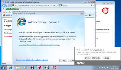
Toshiba netbook: I recounted the “fairly dismal” experience of setting up a Toshiba netbook here. The main problem is all the trialware that is pre-installed, plus a bunch of Toshiba utilities of varying quality. Rather than repeat it all here, I will show show the screenshot a few minutes after first power-on:

Winner by a mile: iPad 2

3. Boot time

iPad 2: instant

Toshiba: ages. Better from hibernation, though still much slower than iPad 2. Better from sleep, but I am not a big fan of sleep because it drains the battery and occasionally crashes on resume.

Winner by a mile: iPad 2

4. Multi-tasking, or the ability to do several things at once

iPad 2: does multi-task but the experience is not great. Only one app is visible at a time, and to switch you have to double-click the big button, swipe through a list of apps, and tap the one you want.

Toshiba: It’s Windows. Fortunately Microsoft changed its mind about having a limit of three apps you can run at once. You can run lots of apps, switch between them with alt-tab or by clicking a taskbar icon, and size them small so you can see more than one on-screen at one time.

The simplicity of one app to view is meant to be an advantage of iOS; but while the Windows model can be troublesome – see the above screenshot for proof- I’d like to see some improvement in this part of iOS. It is not a matter of screen size: the screen size on the netbook is similar to that of the iPad.

Winner: netbook

5. Keyboard

iPad 2: soft keyboard that obscures half the screen, or add-on physical keyboard.

Toshiba netbook: traditional clamshell design with integrated keyboard.

I do a lot of typing, and my speed is substantially better on a physical keyboard. However I do not like carrying lots of accessories, and while the iPad add-on  keyboard is fine at a desk, if you are in a confined space such as an aeroplane the clamshell design works better than a loose keyboard.

That said, I recall hearing how a school that issued all its pupils and staff with iPads was surprised by how few wanted keyboards. Some kids apparently prefer the soft keyboard to “all those buttons”, so it may depend what you are used to. However, even if you replaced the “Keyboard” heading with “Text input”, my vote would still go to the netbook.

Winner: netbook

6. Touch control

iPad 2: yes

Toshiba netbook: no

I’m putting this in just to make the point. Even a Windows tablet, with a stylus, is less convenient to use with touch than an iPad.

Winner by a mile: iPad 2

7. Applications

iPad 2: A bazillion apps available in the app store, cheap or free to purchase, a snap to install. Not so many for iPad as for iPhone, but still a good number.

Toshiba netbook: It’s Windows. They are a bit slow to load, but I run Microsoft Office, Outlook, several web browsers, music apps, games, network utilities and all sorts of other stuff.

Winner: I am going to call this a tie. There are some beautiful apps for the iPad 2, but I miss the features of Windows apps like Office. With the netbook my experience is that I can do almost anything that I can do with a desktop PC, although more slowly, but that is not the case with the iPad 2. On the other hand, the way apps can be installed and removed in a blink on the iPad 2 is a delight compared to Windows setup.

8. File system and storage

iPad 2: There is a file system, but it is hidden from the user.

Toshiba netbook: Yes. I can save a document from one app, and open it in another. I can connect to it over a network and copy files from one folder to another. Not possible on the iPad 2 without workarounds like iTunes and DropBox; and even then some things are difficult. For example, you cannot save a document from Pages on the iPad directly to your DropBox. Let me add that the netbook has a 250GB hard drive, whereas the iPad gets by with a maximum of 32GB solid state storage – though also note that solid state storage is faster to access, and that because the iPad is designed to work like that it does not feel particularly space-constrained.

Winner by a mile: netbook

9. Connectivity

iPad 2: Wireless network, or devices that accept Apple’s proprietary connector. You can attach the iPad to a PC with USB, but only iTunes really understands it, unless you just want to copy photos and videos. Apple offers an add-on camera connectivity kit for downloading photos from a camera, and AirPrint for printing over a network. It is annoying that you have to buy add-ons to do what a netbook does out of the box.

Toshiba netbook: Three standard USB ports, you can attach external hard drives or most USB devices such as printers.

Winner: netbook

10. Battery life

iPad 2: Apple says up to 10 hours, but I have never managed as much as that. Maybe 7 or 8 hours.

Toshiba netbook: I get about 6 hours on wifi, more than that without.

In practice, I have no quibble with either machine – though I am envious of Amazon Kindle owners with their one month charge.

Winner by a whisker: iPad 2.

11. Portability

iPad 2: no bigger than a pad of paper. It is not exactly pocketable, but slips easily into any kind of bag or briefcase. It perhaps needs the protection of a case, but even in a case it is not bulky.

Toshiba netbook: fatter and uglier than an iPad, but still very portable. The worst thing is the power supply, if you need it: the Apple mains adaptor is much smaller than Toshiba’s effort.

Winner by a whisker: iPad 2

12. Watching videos

iPad 2: Great. It is like a portable TV or DVD player, but better – as long as you have a strong wifi connection and BBC iPlayer or the like. Just prop it up on its stand (most cases have one) and enjoy.

Toshiba netbook: it works but the graphics capabilities are inferior and it feels like you are looking at a netbook.

Winner by a mile: iPad 2

13. Built in cameras and microphone

iPad 2: two cameras, front and back, and a microphone that works.

Toshiba netbook: webcam and microphone, but they are junk; I have not seen a netbook with anything decent.

Winner by a mile: iPad 2

14. Reading eBooks

iPad 2: iBooks app and Amazon Kindle app. I prefer the Kindle app, though whether it will survive Apple’s assault on alternative readers I am not sure.

Toshiba netbook: Kindle app, as well as Adobe Reader etc.

A tablet is great for reading, much better than a netbook. However despite its humble appearance Amazon’s Kindle device really is better for reading, thanks to a screen you can read in sunlight, much longer battery life, and free internet access to download books everywhere.

Winner: iPad 2, though a Kindle is better

15. Attract admiring glances

iPad 2: Yes

Toshiba netbook: No

Winner: I did say “semi-serious”.

Hands On with Adobe Flash Builder 4.5 for Android

I have been trying several cross-platform development tools for mobile, and today I set out to create an Adobe AIR app for Android using the new Flash Builder 4.5, available separately or as part of the Creative Suite CS5.5.

I made another calculator app, which may seem boring but gives me a chance to compare like with like.

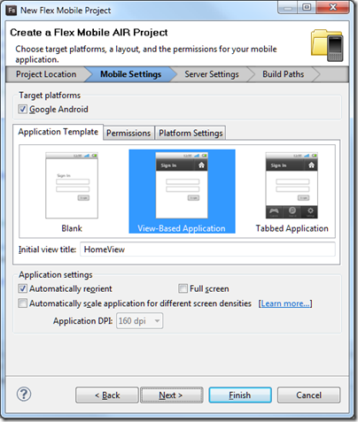
You get started by running up Flash Builder and creating a new Flex Mobile Project.

image

The disappointment here is that only Android is supported, so it is not all that cross-platform. According to Adobe’s Andrew Shorten:

An update to Flash Builder, scheduled for June 2011, will provide additional options to package Flex applications for Apple iOS and will include built-in support for packaging both Flex and ActionScript applications for BlackBerry Tablet OS.

so we have not got long to wait.

Flash Builder is based on Eclipse. The IDE is slow at times, for example when switching to visual design mode, but the platform is familiar to many developers and it feels reassuringly enterprise-ready. I find it a productive environment.

I laid out a screen with buttons and a label to display the output. The alignment tools work well although I made them a little too small as you will see shortly. Then I started writing code. The language of Flash Builder is ActionScript, which is based on JavaScript.

Here I met my first little annoyance. You can easily create a click handler for a button by right-clicking in the designer and choosing Generate Click Handler, or by clicking Generate Event Handler in the properties window. However, I thought it would be smart for most of my buttons to share the same event handler. All I need to do is to read the label of the button which was clicked, and pass it to my addnum routine that processes the input:

protected function btn_clickHandler(event:MouseEvent):void
{
    var theButton:Button = Button(event.currentTarget);
    addnum(theButton.label);
}

This works fine, but the IDE does not let you select an existing event handler for a button. You can paste it in, or add in in the source code editor, which is what I ended up doing. The source code editor is rather good, with excellent code completion, hover-over help for keywords, and so on.

image

The second annoyance was with the label. I wanted to add a border. I selected the label but could not see a border property. I went to the full list of properties and found exotic things like dominantBaseline in the style list but still no border.

Then I found this in the reference for a label:

Borders are not supported. If you need a border, or a more complicated background, use a separate graphic element, such as a Rect, behind the Label.

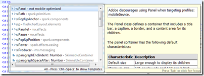
I wondered if a panel would work, and started to type it in the editor:

image

Well, it looks as if Panel is overkill for simply getting a border, but it was interesting to see the editor report that “Adobe discourages using Panel when targeting profiles: mobileDevice”. I decided to do without a border for the moment.

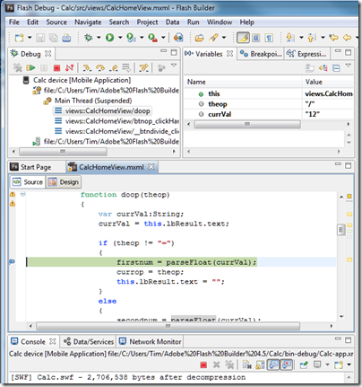
I finished the coding and successfully ran the project in the Android simulator. Next, I attached a device and created a new Run Configuration for a device attached via USB. I plugged in my HTC Desire running Android 2.2. Provided USB debugging is enabled on the device, this works well. Not only could I run on the device; I could also set a breakpoint and debug on the device. Everything was a bit slow in debug mode but it worked.

image

Finally, I built a release version using Export Release Build on the Project menu. You have to sign the package, but there is a wizard to create a certificate for testing.

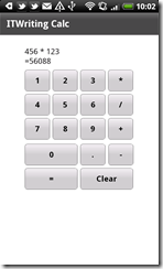
Here it is on the device – as I mentioned, the size of the buttons needs a little work:

image

So how is performance, bearing in mind that the app is trivial. Well, the good news is that performance is OK, though launch is a little slow, except for one thing that I have not figured out. Sometimes I touch a button, and see the graphic effect as the button depresses, but the input does not register. It seems most prone to this just after launching, and usually a second tap works fine.

The vsize reported for the app process by the Dalvik Debug Monitor is around 200K, similar to that for the PhoneGap version.

Overall I am impressed, though I would like to understand the button issue, and I am beginning to wonder if my year-old HTC Desire is a bit under-powered for AIR. Device performance is improving rapidly, and Flash optimization is part of the design process for mobile graphics chips, so my guess is that AIR will be more than viable as a cross-platform toolkit for mobile. You also get the benefit of all those lovely Adobe design tools.

Google seeks to automate the home

Google made a bunch of announcements at its Google I/O keynote today. It showed off the next version of Android, called “Ice Cream Sandwich”; it announced its Music Beta, a service which looks a lot like Amazon’s Cloud Player, in which you upload your music collection to the cloud; it announced movie rentals.

The most intriguing announcements though were about how Android devices will be able to connect to other devices in future. The Open Accessory API lets manufacturers create devices which talk to Android over USB, and in future over Bluetooth, in a standard manner. The idea is that if you have an Android-compatible device – Google demoed an exercise bike – you can attach your smartphone and do some clever stuff, such as controlling it, analysing its data, or whatever is appropriate.

A related idea is called Android@Home. Google has developed a new lightweight wireless protocol which will let manufacturers create household devices that can communicate with Android:

We previewed an initiative called Android@Home, which allows Android apps to discover, connect and communicate with appliances and devices in your home.

image

The automated home is a grand concept where almost any device, from a light to a coffee maker to a fridge or a door becomes available to control and program. However, the examples Google gave were not exciting: playing a CD by waving it at a player, coding an alarm clock to turn the light on gradually. Big deal.

It is not really a new concept. Sun had ideas to develop Java as a universal runtime and language to automate the home. Microsoft has similar thoughts, maybe using the .NET Micro Framework. So far none of these efforts have come to much – will Google’s initiative be different?

Probably not; but there is something else going on here. I travel a bit, and it is now common to find an iPod dock in your hotel room. If you have an Ipod or iPhone you just plug in and go; if you have a non-Apple device, you are out of luck. That is a kind of pressure exerted on every guest, a hint that they might be better off with an Apple device.

Google wants to do the same for a variety of other devices, but with respect to Android. Here is a refrigerator, and by the way, if you have an Android device you can do this other clever stuff like, I don’t know, alerting you if the temperature goes too high, or letting you peek at the contents from your smartphone so you can see if you need to buy milk.

Same with the Open Accessory API. If Google can sign up enough manufacturers, it will be increasingly difficult for non-Android devices to compete.

That said, we did not hear much about Google TV at today’s keynote. Why? Because it has flopped; a reminder that not all Google’s efforts succeed.

Hands On with RunRev LiveCode: rapid development for iOS, Android, Mac and Windows

RunRev LiveCode is a cross-platform development tool for Mac, Windows, Linux, Web, Apple iOS and, from this month, Google Android.

image

It is an individualistic tool inspired by Apple’s original (but now obsolete) HyperCard and HyperTalk, in which the building blocks of your application are stacks and cards. A stack is like a window, and a card is like a panel overlaid on that window. Unlike HyperCard, LiveCode is not a virtual card stack where each card can represent a record in a database; it is simply a means of building a graphical user interface.

A key attraction of LiveCode is that it now supports the two dominant smartphone platforms. I have been looking at a number of different approaches to mobile development, most recently PhoneGap; how does LiveCode compare to the competition? In order to get some hands on experience I set out to create my simple calculator application in LiveCode.

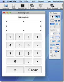
Coming almost new to LiveCode, I found that building this application took longer than it had done in PhoneGap, which uses HTML and JavaScript. I created a new stack and dragged some buttons onto it easily enough, but found that the approach to coding took some getting used to. There are lots of tutorials, but I found the easiest way to learn was to read through chunks of the user guide [pdf], which does a better job of explaining how to code.

One annoyance is that each object, such as a button, has its own script window, which appears as a tab in the editor. Although my calculator is simple, it does have a fair number of buttons, so you end up constantly switching between tabs. If you amend some code, you have to remember to click Apply before the change takes effect. If you forget, you run the application and puzzle over why it seems to be running an old version. The environment is strongly GUI-centric; you will not like it if you are an enthusiast for Model-View-Controller architecture.

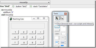
The environment is dynamic, so you can test the stack you are working on at any time simply by switching it to browse mode. This is why it is called Live Code. In this respect it is similar to the Live View in Adobe’s DreamWeaver.

image

I had to get used to writing:

put firstNumber * secondNumber into theResult

instead of

theResult = firstNumber * secondNumber

I was impressed by LiveCode’s ability to change types on the fly and to work out correctly whether you wanted to do something with a string value or a numeric value.

The language is more English-like than most languages, though I am not sure if it really easier. The language minimises use of punctuation which helps readability. Cases in switch statements fall through, C style, unless you remember to include break statements, which is traditionally a common source of bugs.

I got my calculator working on Windows. I tried building for what RunRev calls Web, but was put off by the plug-in requirement:

image 

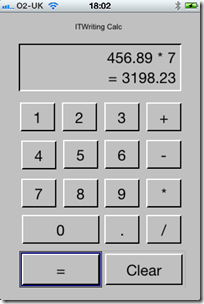
I then moved the project to a Mac to try it on iOS. Everything still worked, but I spent some time resizing the stack and repositioning the buttons to look half-way reasonable on an iPhone. I may be missing some tricks here, but scaling and positioning controls does not seem to be a strong point for LiveCode.

LiveCode does feel that bit more at home on a Mac, reflecting its origins.

image

I was impressed with how easy it was to build the app for iOS. The way cross-platform works in LiveCode is that you open a dialog called Standalone Application Settings. There is a tab for each supported platform, in which you specify options specific to each platform. The options for iOS are extensive, including supported devices, hardware access requirements, orientation options, external libraries and so on. You can then test immediately on the simulator. For on-device testing, you use the Organizer in Xcode to copy the compiled app across.

image

The good news is that the app ran well, much better than than the PhoneGap/jQuery Mobile version, though it did not look as nice and in fairness the other app’s performance issues are likely more to do with jQuery Mobile than PhoneGap itself.

Although I found it a bit of a hassle getting started, nevertheless I was able to build a working app for Windows, Mac and iOS in a few hours, so I should not complain.

Of course there is a lot more that LiveCode can do. It has database libraries, graphical effects, an embedded web browser on some platforms, XML and text processing support, and more. It is also extensible; there is probably not much that cannot be achieved with sufficient effort.

I have not tried the Android support as my version does not include it; though I did notice that the Android options dialog is basic compared to what is available for iOS.

My first impression of LiveCode is positive, but with reservations. It looks to me like a viable and productive route to cross-platform development, or you might use it just as a quick route to app development for iOS, but I did not enjoy working in the IDE which feels quirky and unsophisticated compared to other modern IDEs. My little app works well though, and that suggests it would be worth trying it for something more advanced.

Apple iPad, Pages and Microsoft SharePoint – it works

I’ve been trying out an Apple iPad 2 recently, and one of the topics that interests me is the extent to which it can replace a laptop.

That is a nebulous question of course – it depends what you use a laptop for – but one essential from my perspective is the ability to create and edit documents. Therefore I installed Apple’s iWork apps in their iPad guise: Pages, Numbers and Keynote.

Now, one iPad annoyance is that accessing its storage is more awkward than with a laptop. You cannot simply copy files to and fro over a network. You can copy files to the iPad using a network browser app like Stratospherix FileBrowser, but that works by opening recognised file types.

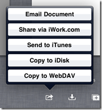
As for Pages, how it stores documents is opaque to the user. They save as you type, and you can manage them in a My Documents view within Pages, but if you want to move them elsewhere you have to use one of five options: email, iWork.com which is cloud storage for iWork apps, send to iTunes for synchronization, copy to iDisk which is cloud storage for MobileMe, or copy to WebDAV.

image

The options for opening a document are similar, but without the email or for some reason iWork.com options.

None of these options appealed greatly, except possibly the last one. I use SharePoint, which supports WebDAV, might this enable me to open and save documents from Pages direct to SharePoint? This is convenient for me, since I have SharePoint as a mapped drive in Windows Explorer, and it works both on the internal network and over the internet.

I typed a document in Pages, then went to My Documents and chose Copy to WebDAV. I chose Word format. Then I entered the URL, username and password for my SharePoint server.

Rather to my surprise, it connected immediately, and performance was good. I then went to my mapped SharePoint drive in Windows Explorer and there it was.

image

It works the other way too. I typed a document in Word 2010 and saved it to SharePoint in the default .docx format. Pages can import .docx, and the document opened smoothly.

image

I appreciate that I am in a small minority of individuals running SharePoint – I do it for test and review – but for business users this is a handy feature. Individuals might want to check out DropDAV, though I’ve not tried the service.

Update: I have tried this successfully with both SharePoint 2010 and SharePoint 2007. If SharePoint is using a port other than 443 for secure access, then you enter the full URL in Pages, for example https://sharepoint.yourdomain.com:444

However I have not yet been able to get this to work with SharePoint in Office 365.

Apple’s iPad 2 Smart Cover: great stand, poor cover

I’ve been trying Apple’s iPad 2 recently, complete with the official Smart Cover.

image

This was shown off at the launch event. It is meant to combine various features:

  • Keep your screen safe from scratches
  • Turn the iPad on and off when opened and closed
  • Clean the iPad screen with its microfiber lining
  • Form a support for the iPad for typing
  • Form a stand for the iPad so you can use it as an expensive digital photo frame

Although a cover seems a simple thing, it seems the results of considerable design effort. It has a magnetic strip which attaches to the left long edge of the unit. The magnet is strong, the fit is perfectly snug, the iPad does turn on and off as advertised.

So what’s wrong? One issue is that unless you detach it completely, the cover is a nuisance when open. You can fold it round the back, but it slips and slides a bit as well as covering the rear camera. So you can detach it, but then you have to put it somewhere, and the magnetic strip is more fiddly to detach and re-attach than a simple slip-on cover.

More seriously, users have complained about several issues:

  • Cover is too flimsy to offer good protection
  • The close fit of the hinge lessens over a few weeks, presumably as the metal bends and stretches slightly
  • The microfiber lining forms the base when used as a stand, so picks up dirt that then gets deposited on your screen

Some users say it it flops over when used as a stand, but I believe this is because they are folding it the wrong way. You must fold it against the grain, so the microfiber is on the outside. Otherwise, yes it flops.

My view: the Smart Cover makes a poor cover, but a great stand. Of course it is a huge price to pay for just a stand, but if you are using the iPad to watch BBC iPlayer, for example, the stand is perfect, much better than trying to prop it up somehow.

image

It is a terrible cover though. Bear that in mind before you buy.

Funbridge: bridge for iPhone and iPad

There are several bridge app for Apple’s iPhone and iPad, but the one I’ve had most fun with is called, appropriately, Funbridge. This is already well-established as a Windows application, where you play against a computer but can compare your performance to other players, making the results much more interesting.

The iOS version is currently a free app, and has just been updated to include Tournaments as well as one-off games, now called Training.

image

In the latest version, you have to log in to play more than a couple of games, though the account is free.

image

Bidding and play is straightforward, with a few caveats. There is no fine-grained control over bidding conventions; you can choose between Beginner, Advanced, Expert, American Standard, Acol, or Polish system. Unless you choose Acol, these are all strong no trump, 5 card major systems. It is worth reading up on the systems used in detail, as otherwise you will get unpleasant surprises.

Note that during both bidding and play, Funbridge will call back to the server before every decision. This means you cannot play offline, and if you are playing where the internet connection is weak, such as on a train, you can expect frustrating delays; games can take so long that you forget what has been played!

image

During play just tap a suit to display all the cards you hold in that suit, then tap a card to play. Take care – there is no undo, and it is all too easy to tap the wrong card and then watch with horror as you see your safe contract sailing down to a penalty.

You can choose to withdraw on a hand, in which case it is not scored, but if you then play it again, you are given a kind of informational score that does not count towards your ranking. It can still be interesting to see how a different line works out.

Once play has completed, you get to compare your score with others and see how many IMPS (International Match Points) you achieved.

image

A really nice feature is that you can click the magnifying glass and get details of each contract, including card-by-card analysis. So if you are amazed at how well or badly someone managed to do, you can see how it happens. Sometimes, I have to say, it happens only because of a baffling misplay. I imagine this happens when the computer is playing on the other side, unless there are serious bugs in the engine.

A Tournament is a sequence of 10 games, at the end of which you can see how you rank among the other players, currently ranging from 150 to 750 or so in number. Scoring in tournaments seems to alternate between IMPs and Pairs scoring – the difference being that Pairs scoring rewards small differences in the score and makes big differences less costly, whereas with IMPs the reverse is true.

Overall it is enjoyable, though as in real bridge there are moments of frustration. The hands seem tilted towards more interesting or better than average holdings, though it is hard to be sure.

One complaint: the server seems to get too busy at times and the software does not cope particularly well; you click Connect and there is no error message, nothing happens.

Enjoy it for nothing while you can – it is “currently free” but I suspect will eventually attract a subscription cost – maybe a similar subscription rate to the desktop version, €74.00 for a year, or maybe something different.