Tag Archives: android

A great big phone: Samsung Galaxy Mega review

How big can a phone go? Samsung seems to be testing the limits with the 6.3″ Samsung Galaxy Mega. How big is that? Here it is laid over a paperback book:

image

In fact, open the book, and the Galaxy Mega proves to be almost exactly the size of the printed area on the page, suggesting that this would make an excellent e-reader. I installed Amazon Kindle and so it does, though the screen is a little too glossy and the battery life too short for perfection.

Hold it to your ear though, and the Mega is big enough to feel faintly ridiculous, outside of places like San Francisco where daft-looking gadgets are the norm. That said, it is slim and smooth in the hands – maybe a bit too silky, it would be easy for it to slip out of your hands – so carries its bulk with good grace.

If you are constantly on the phone, and do not use a headset, the Mega is unlikely to be for you. Still, for many of us voice calls are a long way down the list of reasons for carrying a smartphone. Internet, games, email, text messaging and photography may well be higher.

What about writing and spreadsheeting? I got out my favourite Logitech Bluetooth keyboard, installed OfficeSuite Pro from Mobile Systems Inc, and started to type.

image

I can get real work done on this; but I am unlikely to choose to do so. In fact, the screen size is not the problem. There are other issues. One is that the Galaxy Mega should be supplied with a prop-up cover or stand, since for functions like word processing with a keyboard, or watching YouTube or BBC iPlayer, it is best stood up on its side. Another is that the Android OS and its applications seem primarily designed for touch. The on-screen keyboard seems to pop-up even when not required, though ESC usually dismisses it, and getting at the formatting controls is just a bit awkward.

I also found that I could easily out-type OfficeSuite Pro on the Mega. I thought this might be an OS issue, but Infraware’s Polaris Office (which comes free for download with the Mega) is better in this respect, though less good overall than OfficeSuite Pro.

As a productivity device then, the Mega is not quite there and I will still want to take a Surface RT or some other suitable device on the road. It does work though, which has some appeal, and note that these Office suites also work well as viewers for Microsoft Office formats.

The hardware

Open the box, and you will see that, other than size, there is little else notable. Mine came with a 4GB SD card included.

image

The device feels solid and well-made. The audio and headset jack is on the top edge, volume rocker on the left, and power on the right. On the front, at the base, is the home button. There are also soft buttons to its right and left for Menu and Back. These are backlit, but the backlight is usually off, which means you have to remind yourself at first that they really are there. I am not sure why Samsung does not put a little etching to indicate their presence.

The screen is great, though I would prefer less gloss, but it is bright and responsive so no real complaint.

The camera is decent but unspectacular. Good enough that most users will be happy, but not good enough to attract photo enthusiasts.

Battery life is decent, though not outstanding. 24 hours of normal usage will be fine, but over two days you will likely need a charge.

One thing worth emphasising: the Galaxy Mega may be bigger than the S4, but it is less powerful. The S4 has a quad-core 1.9GHz chipset, 13MP rear camera, 16GB memory, 1920×1080 resolution, and so it goes on. You are going to buy the Mega over the S4 for only two reasons: price, or because you really want that big screen.

Software

The Galaxy Mega runs Android 4.2 Jelly Bean with Samsung’s TouchWiz interface. I doubt anyone will have trouble with basic navigation, but it fails to delight.

One of its notable features is called Multi-Window. This runs as a pull-out application launcher, by default docked to the left of the screen. Here is the tab, which annoyingly obscures some text:

image

and here it is pulled out:

image

If you perform the right gestures with the right apps (not all of them work) you can get two apps running side by side by pulling them out from the bar:

image

The vertical bar lets you resize the apps freely.

I think this whole thing is a mistake. While having two apps to view seems useful, even the Mega’s screen is not large enough to make it work with desktop-style convenience, and Android apps are designed for full-screen use. Nor do I like the bar as an alternative app launcher; it is unnecessary and gets in the way. This is another example of an OEM trying to improve an OS and making it worse. It is not too bad though, as you can easily disable it (drag down from the top and tap Multi-Window so it fades).

Incidentally, I had trouble getting a screenshot of the multi-window bar. The normal approach failed as touching any button makes it retreat. I used the deprecated DDMS in the ADK (Android Developer Kit). This required finding the Developer Options on the device. Bizarrely, you enable Developer Options by repeatedly tapping Build number in About Device. Odd.

Samsung store and apps

In its effort to make its devices distinct from other Android devices, Samsung is building its own ecosystem, including the Samsung app store which is prominent in the default configuration.

 image

What is the value for the user in this, given that the official Google Play store is also available? None, other than that it is good that Google has some competition. That said, this is where you can get Polaris Office for free, which is worth having.

Similar examples of duplication versus Google’s ecosystem are evident elsewhere, for example Samsung’s ChatOn versus Google Talk (now Google+ Hangout), though ChatOn does not do voice or video; and Samsung cloud backup versus Google’s cloud backup. For example, photo backup to Samsung’s cloud (once you register) is on by default; but this feature is also available in Google+, for Google’s cloud.

Overall this is confusing for the user and I am not sure how this game ends. It contributes to a sense that Android remains messy and disorganised versus Apple iOS or even Windows Phone, though in compensation it has wonderful functionality.

Samsung Air View is an attempt to bring the benefits of mouse hover to a touch interface by detecting the finger over the screen. For example, you can preview an email message.

image

Plenty of potential here; though I found it unreliable. I still have not got magnification in web pages to work, despite turning this on in settings.

WatchOn lets you control your TV via an app that shows what is on. This worked for me though it feels like solving a problem I do not have.

The Music app isupports DLNA; but while it detected my Logitech Media Server I had trouble playing anything without stuttering.

Summary

There is a lot packed into the Mega and I have not done it justice above, but picked out some highlights. It is highly capable; but I hesitate to recommend it unless the combination of a large screen and a smartphone is perfect for you; if you do lots of web browsing, email and YouTube, but not many phone calls, or if your eyesight is such that having everything a bit larger is an advantage, it could be just the thing.

The disappointment is that Samsung has not made more sense of the large screen. The Multi-Window feature is not good, and in the end it just feels like a big phone. The fact that its spec is well behind that of the Galaxy S4 is another disadvantage.

The Galaxy Mega also exhibits the Samsung/Android problem of duplicated functionality, contributing to a user experience that is less tidy and more confusing than it needs to be.

Personally I am hopeful for the day when a single device will simplify my life and I will no longer have to carry phone, camera and tablet or laptop. This one does not get me there; but maybe with a bit more refinement a future iteration will.

Technical summary

  • Android 4.2.2 (Jelly Bean)
  • 6.3″ 1280 x 720 LCD screen
  • USB 2.0
  • MicroSD slot
  • MHL support (enables HDMI out from USB port)
  • GPS and GLONASS
  • 720p video supports MPEG4, H.263, H.264, VC1, WMV7 etc.
  • Cameras: 8 megapixel rear, 1.9 megapixel front, LED Flash
  • Video recording up to 30fps
  • Audio support including MP3,AAC,WMA,FLAC,OGG etc.
  • Qualcomm Snapdragon 400 with Krait 1.7GHz dual core CPU and Adreno 305 GPU
  • Comms: FDD LTE, HSPA-PLUS,HSDPA,HSUPA,EDGE,GPRS,FDD LTE,802.11 a/b/g/n/ac,Bluetooth 4.0 LE,NFC
  • RAM: 1.5GB
  • Storage: 8GB on board
  • 3200mAh battery
  • Size: 167.6 x 88 x 8mm
  • Weight: 199g

Acknowledgement: thanks to Phones4u for loan of the review sample.

Email hassles with Android and Exchange: couldn’t open connection to server

I have an Asus/Google Nexus 7 which is set up to receive mail from Exchange 2010.

At least, it was. Some time ago it stopped receiving mail. When the mail client tried to sync, I got this message:

image

“Couldn’t open connection to server due to security error”.

The message is not particularly clear. I went back into the account settings and verified everything (including Accept all SSL certificates, since mine is self-signed) and it was all fine – as I knew it would be, since it used to work.

The error, it turns out, is to do with ActiveSync policies. Exchange is detecting that the device is not in conformance, and refusing to sync. Odd, since my ActiveSync policies are relaxed and allow anything.

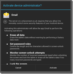
I removed the account and added it back. Ah, now I have this dialog:

image

I tapped Activate and everything was fine. Mail now syncs again.

I am still not sure how you find this dialog if it does not pop up automatically.

Not just Instagram: the Windows Phone (and BlackBerry, Firefox OS) app problem

I like the Windows Phone OS and use one day to day. However it has become impossible to do my job in technical journalism without either an Apple iOS or Android device alongside it. The reason is that I review gadgets and find increasingly that they come with app support – but only for iOS or Android.

The Fitbit exercise tracking gadget, for example.

image

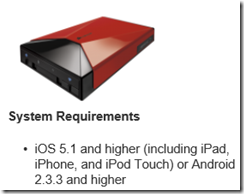
Or the Corsair Voyager Air wireless hard drive, almost inaccessible from Windows Phone (you can do it with a firmware update and DLNA).


image

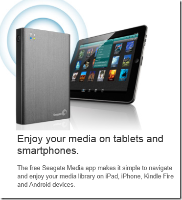
Or the Seagate Wireless Plus. Actually this one is better as it has a web UI, but no app.

image

My bank is Nationwide and has an app – uh oh.

image

It’s not just Instagram.

image

Where do Microsoft and Nokia go from here? Or other contenders like BlackBerry and Firefox OS? The answer of course is to sell lots of devices so that discontented users beat up the companies that do not support them. But selling lots of devices is difficult when the customer says, “it’s a nice phone, but it does not work with my portable hard drive. Or my bank. Or my Fitbit.”

The Mac survived versus the PC for many years with this kind of problem. It takes a loyal customer base and excellent 1st party and niche apps. There are still areas of strength which Microsoft and its phone partners could exploit (though they have been poor at this to date). Enterprise integration with Windows Server and System Center. Consumer integration with Xbox.

If the company can get it right with Windows tablets that would help too, especially combined with unification of the Windows 8 and Windows Phone app platforms.

Unfortunately for Microsoft though, the market has already decided that only two mobile platforms matter, and that will not be easy to change.

Creative Pros prefer iOS says Adobe, explaining lack of Android support in new apps

Adobe has shown a new touch app for Kuler, its web application for creating and choosing colour themes, which will be available in June.

image

I asked Scott Morris, Senior Marketing Director of Creative Cloud, about Android and whether apps like this will also be supported there.

“That is coming out to begin with at least only as an iOS app,” he told me. “For PhotoShop Touch and Adobe Ideas we do have those avaialble both for iOS and Android. What we do know is that there’s very few creative pros using Android tablets. There’s many more who are using Android phones, but more still using iPhones.”

Morris says that no decision has yet been made on porting the Kuler app to iPad or Android, but adds, “we are going to start with iOS as we are with most of our apps now because that is the most popular platform for creative professionals.”

Perhaps not surprising given the popularity of Macs among designers, but disappointing for Android users.

A secondary question is whether Adobe is using its own cross-platform app tools, either Flash or PhoneGap, for Kuler and future apps. The web version of Kuler is being converted from Flash to HTML, making PhoneGap a possibility. If it is, then you would have thought extending support to other platforms would be a no-brainer.

Windows Phone 8 enterprise security versus Blackberry 10 Balance and Samsung Knox

How good is Windows Phone 8 security? Actually, pretty good. The key features are described here [pdf]:

  • Trusted Boot prevents booting to an alternative operating system, using the UEFI secure boot standard.
  • Only signed operating system components and apps can run.
  • App sandboxing:

    No communication channels exist between apps on the phone other than through the cloud. Apps are isolated from each other and cannot access memory used or data stored by other applications, including the keyboard cache.

  • Private internal app distribution by businesses who register with Microsoft
  • Password policies set through Exchange ActiveSync (EAS)
  • Built-in device management client
  • Bitlocker encryption when set by EAS RequireDeviceEncryption policy. AES 128 encryption linked to UEFI Trusted Boot.
  • SD card data is not encrypted, but the OS only allows media files to be stored on SD cards.
  • Information Rights Management can prevent documents being edited, printed, or text copied (other than tricks like photographing the screen).
  • Remote Wipe

The security features in Windows Phone 8 are largely based on those in full Windows, since the core operating system is the same. However, devices are more secure since they are not afflicted by the legacy which makes desktop Windows hard to lock down without damaging usability.

While the above sounds good, note that in most cases a simple PIN will get you access to everything. On the other hand, unless the PIN is seen it is not all that insecure, since you can set policies that lock or wipe the phone after a few wrong attempts.

Does Microsoft therefore have a good story versus Blackberry 10 Balance and Samsung Knox, both of which feature secure containers that isolate business apps and data from personal? The approach is different. In Windows Phone the focus is on the whole device, whereas the other two have the concept of segmentation, letting users do what they like (including installation of games and so on) in one segment, while the business gets to control the other.

Windows Phone does in fact have a somewhat similar feature aimed at children. Kids Corner lets you create a "fun" segment containing specified apps and games, sandboxed from the main operating system. While this is currently designed for children borrowing your phone, you can see how it could be adapted to create a personal/business split if Microsoft chose to do so.

For the time being though, you might worry about the potential for users to install a malicious app or game that manages to exploit a bug in Windows Phone and compromise security.

Even if the business can lock down the device so that users cannot install apps, this impairs the user experience to the extent that most users will want another phone for personal use. The attraction of the Blackberry and Samsung approach is the way it combines user freedom with business security.

Is Microsoft doing a good job of articulating the enterprise features of Windows Phone 8? That is a hard question to answer; but my observation is that Nokia, the main Windows Phone vendor, seems to focus more on consumer features like the camera and music, or general features like maps and turn by turn navigation. Enterprise features are hardly mentioned on the Nokia stand here at Mobile World Congress in Barcelona, while Microsoft does not have a stand at all. On the other hand, you would think that the company’s strong partner ecosystem would be effective in communicating the presence of these features to enterprises.

Power shifts at Mobile World Congress: Samsung rises, Apple absent, Google hidden, Microsoft missing

Mobile World Congress, now under way in Barcelona, is a big event. Exact numbers are not available, but I have heard talk of 70,000 trade attendees; it is not something you can safely ignore if you have a presence in the mobile industry.

image

Nevertheless Apple chooses to ignore it, preferring its own exclusive events. This is a strategy that has worked in the past, but this year it may be less clever. Several have said to me that Apple is falling behind, being too slow to innovate its iOS device family. Of course many here are using Apple devices, but the momentum for now is elsewhere, though one magical announcement could change that any time.

Samsung on the other hand has the biggest stand here (actually several stands) and is everywhere. The underlying story is how Samsung is moving on from being an Android device vendor and focusing on Samsung-specific features. In the consumer world that means hooks into Samsung TVs or its new HomeSync media box with a Terabyte of storage, intended to be the place for all your music and video, as well as enabling Android games in your living room.

The bigger Samsung news though is its enterprise offering, called Knox, which creates a secure, encrypted container on your Samsung smartphone or tablet exclusively for business use. IT admins have full control over access and app deployment. This is the same approach used by Blackberry with the Balance feature in its new Blackberry 10 devices. Knox is implemented by third-parties, and links with Active Directory, making this an attractive proposition for businesses getting to grips with the challenge of mobile device management.

Crucially, Knox works only with Samsung devices. It is based on a secure edition of Linux and includes a hardware element so that other device vendors cannot implement Knox, though they could create their own similar system.

Blackberry on the other hand has not taken a stand at this event. Instead, it has parked itself in a hotel across the road, which its staff informally call Blackberry Towers. The symbolism is unfortunate. Last year it had a big stand; this year it is out of the mainstream. Blackberry’s new devices look good but its key business selling point is Balance, which means it will not be happy about Samsung’s Knox.

Microsoft is a puzzle, as is not uncommon for the company. Via Windows Phone it is a premier sponsor (which I imagine means a ton of cost) but does not have a stand. Windows Phone is mainly represented by Nokia, though it can be glimpsed elsewhere such as on the HTC stand. This is a company that wants to convince us that it is a serious force in mobile? Windows 8 is meant to be a new start on tablets; so where is Surface RT or Surface Pro?

I also wonder if the company has left it too late to establish Windows Phone as the best choice for secure mobility. I have been talking to Centrify here at Mobile World Congress, one of the third-parties implementing Knox solutions. Everything in a Centrify Knox deployment is controlled by Active Directory, and it forms an elegant and secure option for enterprises who want to give employees the freedom of a personal device combined with the security and manageability of a mobile device. I also saw how app developers can query Active Directory attributes on Knox Android devices just as they would with a Windows application.

So where is Microsoft with its enterprise smartphone story? It has all the pieces, including Active Directory itself, Bitlocker for device encryption, and System Center for management, but it has not yet assembled them for Windows Phone.

At least it is better than last year when it ran embarrassing "smoked by Windows Phone" demos.

Google is another puzzle. Last year a huge stand and a hall dedicated to Android; this year, nothing. Android may have won the mobile OS wars, but do initiatives like Knox show how Google is failing to reap the benefits? Possibly. It does seem to me that Google is now engaged in differentiating its own products and services from what you might call generic Android; and its absence from Mobile World Congress is likely part of that effort.

HP goes Android: what does that say about Windows 8?

Here at Mobile World Congress in Barcelona HP has announced a 7” Android tablet which will be available in April.

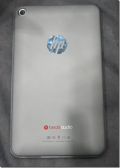
I took a quick look at the Mobile Focus event today. The back of the device is more interesting, showing logos for HP and for Beats Audio.

image

From the front you would be pushed to distinguish it from, say, Google’s Nexus 7. Black screen, runs Android.

I asked the guy on the stand what is distinctive about HP’s little Android slate in a crowded market. He said it had above average build quality, above average sound thanks to Beats Audio (you can find this discussed here), and support for HP’s printing system.

Not much, in other words; but the more interesting question is why HP is doing this. One reason is price. This will be a relatively cheap device, substantially less than any of HP’s windows machines, and without it HP would have little to no presence in the consumer tablet market.

Why not a Windows RT or Windows 8 device? That is the heart of it, and more interesting than the slate itself. HP is not giving up on Windows tablets, but it is positioning them more as business machines whereas the new slate is a consumer device.

The problem is that Microsoft has so far failed to make Windows 8 viable for this kind of market. It is too expensive, too peculiar, and there are too few worthwhile apps. That, and the Windows Runtime platform is not yet good enough, as developers at the sharp end discover. This means that HP has little choice but to go Android.

The form factor is also a problem. 7” seems to be beyond Windows Phone 8 territory, but too small for Windows 8 or RT bearing in mind the desktop and Office aspect. It is an awkward gap in the Windows offering.

The impression I got from several vendors at the show is that Microsoft is on the right lines with Windows 8, but the first release is disappointing on the tablet side.

What if HP starts to experiment with Android tablets that can be used like laptops, with neat keyboard cases and office-style applications? In the end the market will decide on the balance between Android and Windows, with the signs currently that Microsoft will struggle to gain momentum in the consumer tablet market.

Cross-platform frameworks ordered by percentage of shared code

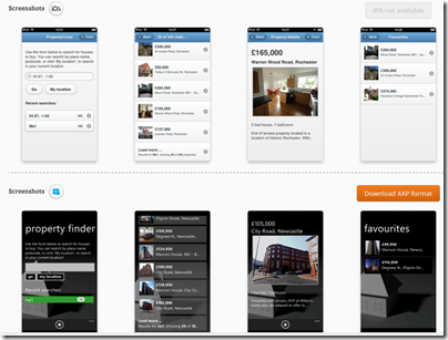
Following my piece on different approaches to building the user interface in cross-platform frameworks, twitter user Sam Hogarth pointed me to the PropertyCross project. This implements a non-trivial application in 8 different cross-platform tools, covering Android, iOS and Windows Phone. Note that only four of the frameworks support Windows Phone.

Using the pie charts presented for each framework, I was able to order them by percentage of shared code as follows:

1= Adobe AIR (100%), JQTouch (100%) , RhoMobile (100%), Sencha Touch (100%)

5. Appcelerator Titanium (around 90%)

6. JQuery Mobile (around 80%)

7. Xamarin (around 40%)

8. Native (0%)

A couple of notes. Of the 100% frameworks, three do not support Windows Phone, and the one which does (Rhomobile) seems to be a bit broken on Windows Phone, judging by the screenshots. The Property Details and Favourites pages do not render properly.

You would get more code sharing with Xamarin if you only supported two rather than three platforms. That is logical: since it does not abstract the GUI.

In most cases (not Rhomobile) it is striking how different Windows Phone appears versus iOS and Android, even with jQuery Mobile which uses HTML5.

image

Contract Bridge on a tablet: Funbridge vs Bridgebase vs Bridge Baron

Bridge is an ideal game for a tablet, well suited to touch control and the kind of game you can play for a few minutes or a few hours at a time, which is excellent for travellers.

So what are the choices? Here is a quick look at some favourites.

Funbridge is available for iPhone, iPad and Android. There are also versions for Windows and Mac. The Android edition is the newest but works fine, though of all of them it is the iOS release that is the nicest to use.

image

The way Funbridge works is that you always play against a computer, though this is on the internet rather than running locally, but your scores are compared with other humans playing the same hands. I have not tried the “Two players game” so I am not sure how that works, except that the other player has to be a “friend” in the Funbridge community system. It looks like you play with your friend against two bots.

Funbridge has a lot to like. The user interface is excellent, much the best of all the tablet bridge software I have used and better than most desktop bridge software too. There is a good variety of game options, including one-off games, tournaments of 5 games each, and a series ladder you can climb from 1 club to 7 no trumps. You can select one of 6 conventions, including ACOL, SAYC (American Standard), and 5 card major at three levels from beginner to expert. I think this is a hint that to get the best from Funbridge you should use the 5 card major system.

Another nice feature of Funbridge is that you can go back and replay a hand to try a different line of play. You can also see all the other scores on any hand, and how they were bid and played.

Funbridge is not perfect though. The bidding is eccentric at times, and it can be hard to persuade your partner bot to play in no trumps rather than a suit. There is definitely an art to winning at Funbridge that is a different from what it takes to win at a real bridge table.

Since you are playing against a cloud-based server, you can only play if you have an internet connection. Not so good for most flights.

Funbridge is a pay per game service. Currently 50 deals costs £1.49 (about 3p each) or if you pay more the per-deal cost falls to under 2p. Unlimited deals for a year costs £69.99.

That said, you can get 10 games a week for free, though you only get the 10 free games if you have no paid games in your account; slightly unfair to the paying customers.

Bridgebase is available for iPad, iPhone, Android and Amazon Kindle. Bridgebase also offers a browser-based game based on Adobe Flash. Like Funbridge, you can only play with an internet connection. You can either play with human opponents, or solo with three bots.

image

Of course human opponents are more fun, though there are advantages to playing with bots. No pressure, you can think for as long as you like, and none of the issues which afflict online bridge, such as players simply disappearing when in a bad contract, or being bad tempered if you make a mistake.

The Bridgebase user interface is OK though feels clunky compared to the smoothness of Funbridge. As in Funbridge, you can compare your score with other human players even if you play against bots. You cannot replay games, but you can undo your play which means you can easily cheat against the bots if you feel so inclined. Against humans your opponents have to approve an undo, which they will be reluctant to do other then in cases of genuine mis-taps.

The biggest problem with Bridgebase is the standard of the bots, which is much weaker than Funbridge. The play can be quite bizarre at times, sometimes excellent, sometimes daft.

A weak feature is that if your computer partner wins the auction, it also plays the contract, sometimes badly. I do not see the point of this. You may find yourself playing “hideous hog” style (Victor Mollo’s character who always tried to play the contract) as it is painful reaching a good contract but watching the bot throw it away.

Bridgebase is free to play, though there are subscription options online to get some extra features.

Bridge Baron is available for Android, iPad, iPhone, Amazon Kindle and Barnes and Noble Nook. It is inexpensive (£13.99 currently on the App Store) but you have to pay separately for each platform. Unlike the other two games, Bridge Baron runs entirely on your device, which is good if you are offline, but means you do not compare your score against other humans. You can set the standard from novice to advanced.

Bridge Baron plays well enough to be fun, though well short of the best computer players. You can replay games at will. You can compare your score against the Baron’s score, review the bidding and play, and undo your play at will. You can also ask for a hint from the Baron.

The Bridge Baron user interface is basic, a little worse than Bridgebase (though faster) and much worse than Funbridge. I do not know why the card icons are so small; it is like playing on a huge table.

image

Still, good fun and good value.

Conclusion

All three of these games have something to commend them. Funbridge for the best user interface and a standard good enough to be enjoyable despite a few eccentricities. Bridgebase for the option to play with real people, and for free play with bots. Bridge Baron for playing offline.

On the other hand, Bridgebase is spoilt by the poor play of its bots. Bridge Baron is dull because you cannot compare your score with other humans. Funbridge is the one I choose if I have some deals available, but can get expensive if you play a lot, and you will get annoyed with your computer partner from time to time.

There is nothing on a tablet that comes close to Jack Bridge for standard of play.

Finally, note there is no bridge app for Windows RT. So if you are a bridge addict with a Surface RT, you are out of luck.