VMware Cloud on AWS: a game changer? What about Microsoft’s Azure Stack?

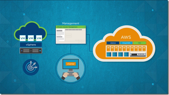
The biggest announcement from VMWorld in Las Vegas and then Barcelona was VMware Cloud on AWS; essentially VMware hosts on AWS servers.

image

A key point is that this really is VMware on AWS infrastructure; the release states “Run VMware software stack directly on metal, without nested virtualization”.

Why would you use this? Because it is hybrid cloud, allowing you to plan or move workloads between on-premises and public cloud infrastructure easily, using the same familiar tools (vCenter, vSphere, PowerCLI) as you do now, presuming you use VMware.

You also get low-latency connections to other AWS services, of which there are far too many to mention.

This strikes me as significant for VMware customers; and let’s not forget that the company dominates virtualisation in business computing.

Why would you not use VMware Cloud on AWS? Price is one consideration. Each host has 2 CPUs, 36 cores, 512GB RAM, 10.71TB local flash storage. You need a minimum of 4 hosts. Each host costs from $4.1616 to $8.3681 per hour, with the lowest price if you pay up front for a 3-year subscription (a substantial investment).

Price comparisons are always difficult. A big VM of a similar spec to one of these hosts will likely cost less. Maybe the best comparison is an EC2 Dedicated Host (where you buy a host on which you can run up VM instances without extra charge). An i3 dedicated host has 2 sockets and 36 cores, similar to a VMware host. It can run 16 xlarge VMs, each with 950GB SSD storage. Cost is from $2.323 to $5.491. Again, the lowest cost is for a 3 year subscription with payment upfront.

I may have this hasty calculation wrong; but there has to be a premium paid for VMware; but customers are used to that. The way the setup is designed (a 4-host cluster minimum) also makes it hard to be as flexible with with costs as you can be when running up individual VMs.

A few more observations. EC2 is the native citizen of AWS. By going for VMware on AWS instead of EC2 you are interposing a third party between you and AWS which intuitively seems to me a compromise. What you are getting though is smoother hybrid cloud which is no small thing.

What about Microsoft, previously the king of hybrid cloud? Microsoft’s hypervisor is Hyper-V and while there are a few features in VMware ESXi that Hyper-V lacks, they are not all that significant in my opinion. As a hypervisor, Hyper-V is solid. The pain points with Microsoft’s solution though are Cluster Shared Volumes, for high availability Hyper-V deployments, and System Center Virtual Machine Manager; VMware has better tools. There is a reason Azure uses Hyper-V but not SCVMM.

Hyper-V will always be cheaper than VMware (other than for small, free deployments) because it is a feature of Windows and not an add-on. Windows Server licenses are not cheap at all but that is another matter, and you have to suffer these anyway if you run Windows on VMware.

Thus far, Hyper-V has not been all that attractive to VMware shops, not only because of the cost of changing course, but also because of the shortcomings mentioned above.

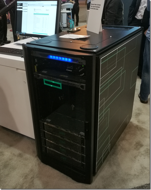
Microsoft’s own game-changer here is Azure Stack, pre-packaged hardware which uses Azure rather than System Center technology, relieving admins of the burden of managing Cluster Shared Volumes and so forth. It is a great solution for hybrid since it really is the same (albeit with some missing features and some lag over implementing features that come to the public version) as Microsoft’s public cloud.

Azure Stack, like VMware on AWS, is new. Further, there is much more friction in migrating an existing datacenter to use Azure Stack, than in extending an existing VMware operation to use VMware Cloud on AWS.

But there is more. Is cloud computing really about running up VMs and moving them about? Arguably, not. Containers are another approach with some obvious advantages. Serverless is a big deal, and abstracts away both VMs and containers. Further, as you shift the balance of applications away from code you write and more towards use of cloud services (database, ML, BI, queuing and so on), the importance of VMs and containers lessens.

Azure Stack has an advantage here, since it gives an on-premises implementation of some Azure services, though far short of what is in Microsoft’s cloud. And VMware, of course, is not just about VMs.

Overall it seems to me that while VMware Cloud on AWS is great for VMware customers migrating towards hybrid cloud, it is unlikely to be optimal, either for cost or features, especially when you take a long view.

It remains a smart move and one that I would expect to have a rapid and significant take-up.

Unhealthy Identity synchronization Notification: a trivial solution (and Microsoft’s useless troubleshooter)

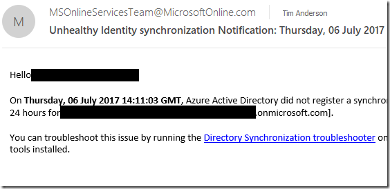
If you use Microsoft’s AD Connect, also known as DirSync, you may have received an email like this:

image

It’s bad news: your Active Directory is not syncing with Office 365. “Azure Active Directory did not register a synchronization attempt from the Identity synchronization tool in the last 24 hours.”

I got this after upgrading AD Connect to the latest version, currently 1.1.553.

The email recommends you run a troubleshooting tool on the AD Connect server. I did that. Nothing wrong. I rebooted, it synced once, then I got another warning.

This is only a test system but I still wanted to find out what was wrong. I tweaked the sync configuration, again without fixing the issue.

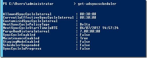
Finally I found this post. Somehow, AD Connect had configured itself not to sync. You can get the current setting in PowerShell, using get-adsyncscheduler:

image

As you can see, SyncCycleEnabled is set to false. The fix is trivial, just type:

set-adsyncscheduler –SyncCycleEnabled $true

Well, I am glad to fix it, but should not Microsoft’s troubleshooting tool find this simple configuration problem?

Email hassles with migration to Windows 10 – if you use Windows Live Mail

Scenario: you are using Windows 7 and for email, Windows Live Mail, Microsoft’s free email application. You PC is getting old though, so you buy a new PC running Windows 10, and want to transfer your email account, contacts and old messages to the new PC.

Operating systems generally come with a built-in mail client, and Windows Live Mail is in effect the official free email client for Windows 7. It was first released in 2007, replacing Windows Mail which was released with Vista in 2006. This replaced Outlook Express, and that evolved from Microsoft Mail and News, which was bundled with Internet Explorer 3 in 1996. Although the underlying code has changed over the years, the user interface of all these products has a family resemblance. It is not perfect, but quite usable.

Windows 8 introduced a new built-in email client called Mail. Unlike Windows Live Mail, this is a “Modern” app with a chunky touch-friendly user interface. Microsoft declared it the successor to Windows Live Mail. However it lacks any import or export facility.

The Mail app in Windows 10 is (by the looks of it) evolved from the Windows 8 app. It is more intuitive for new users because it no longer relies on a “Charms bar” to modify accounts or other settings. It still has no import or export feature.

The Mail app is also not very good. I use it regularly now myself, because there is an account I use which works in Mail but not in Outlook. I don’t like it. It is hard to articulate exactly what is wrong with it, but it is not a pleasure to use. One of the annoyances, for example, is that the folders I want to see are always buried under a More button. More fundamentally, it is a UWP (Universal Windows Platform) app and doesn’t quite integrate with the Windows desktop as it should. For example, pasting text from the clipboard is hilariously slow and flashes up a “Pasting” message in an attempt to disguise this fact. Sometimes it behaves oddly, an open message closes unexpectedly. It is like the UWP Calculator app, another pet hate of mine – I press the Calculator key on my Windows keyboard, up comes the Calculator, then I type a number and it doesn’t work, I have to click on it with the mouse before it accepts input. Just not quite right.

I am getting a little-off topic. Back to my scenario: how are you meant to transition from Windows Live Mail, the official mail client for Windows 7, to the Mail app in Windows 10, if there is no import feature?

In one way I can explain this. First, Microsoft does not really care about the Mail app. Everyone at Microsoft uses Outlook for email, which is a desktop application. This is important, because it means there is no internal pressure to make the Mail app better.

Second, Microsoft figures that most people now have a cloud-centric approach to email. Your email archive is in the cloud, so why worry about old emails in your Mail client?

This isn’t always the case though. A contact of mine has just been through this exact scenario. He has happily used Windows Live Mail (and before that Outlook Express) for many years. He has an archive of old messages which are valuable to him, and they are only in Windows Live Mail.

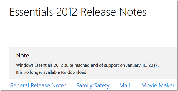
Unfortunately Microsoft does not currently have any solution for this. The answer used to be that Windows Live Mail actually works fine on Windows 10, so you can just install it. However Microsoft has declared Windows Live Essentials, of which Live Mail is a component, out of support and it is no longer available for download.

image

Incidentally I am writing this post in Windows Live Writer, another component of Essentials, but which fortunately has been published as open source.

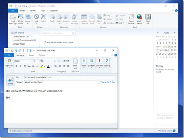
If you can find the Windows Live installation files though, it still runs fine on Windows 10. You do need the full setup, called wlsetup-all.exe, rather than the web version which downloads components on demand. Here it is, installed and connected on Windows 10:

image

This application is no longer being maintained though, and there are some compatibility issues with some email services. This will get worse. The better answer then is to migrate to full Outlook. However, Microsoft makes Outlook expensive for home users, presumably to protect its business sales. Office Home and Student does not include Outlook, and to buy it separately costs more, currently £109 in the UK. Another option is to subscribe to Office 365 and pay a monthly fee.

Even if you intend to migrate to Outlook eventually, it may make sense to use Live Mail for a while on Windows 10. There is an export option to “Exchange” format which means you can migrate messages from Live Mail to Outlook.

This is all more work than it should be, for what must be a common scenario. You would think that migrating from the official mail client for Windows 7, to the official mail client for Windows 10, would not be so difficult.

Mio MiVue 688: record your driving

The Mio MiVue 688 is a high quality dashcam which will record your journeys as well as alerting you to lane drift and speed cameras.

image

In the box is the device itself – around 90 x 45 x 37mm – together with a vehicle power adapter and a suction mount. You will need a couple more things to get going: a Micro SD memory card (8GB to 128GB) and a USB Mini-B to type A cable, presuming you want to connect it to a PC. It is always annoying to find that that you have to buy extras, though you may have some spares anyway, and also annoying that MiVue still use the older Mini-B connector which is relatively uncommon now.

The MiVue 688 has a rechargeable battery, though for full use you will want to keep it powered continuously with the adapter.

After charging, the first thing you will want to do is to set the date and time as well as your preferred distance measure. Being in the UK I set it to miles.

In doing so, you will get an idea of how the MiVue’s controls work. There is a nice bright LED colour display, but it is not touch control. Instead, there are 6 buttons:

  • Power button on the left edge
  • Event button (for emergency recording) on the front right
  • Four function buttons on the right edge

The control system is not all that intuitive. By default the unit records when it is on. The function keys come into play when you go into the menu. The top key is the menu key; it displays or exits the current menu. The next key is Enter. The two lower keys are cursor keys. At first you might think that the buttons align with the menu item you want to operate, but they do not. Of course you are not intended to operate this fiddly menu system while driving.

The normal use is that recording starts as soon as the unit receives power, in other words when you start the engine. It then records continuously, creating 3-minute video files. If it runs out of space it overwrites old files.

When you start recording you get a view of what it is recording on the screen. After a short time, this blanks out and you just get the time. However it is still recording.

The device has a Sony Exmor video processor, does 1080p video recording and displays on a 2.7″ screen. It has an F1.8 aperture and a 140⁰ wide angle lens.

The MiVue 688 in use

I tried the MiVue on a 3-hour journey on a rather damp day. The first challenge is mounting the MiVue, the main problem being getting the power cable connected without it hanging dangerously or getting in the way. I found some short lengths of gaffer tape essential, to secure the cable to the edge of the windscreen. The MiVue cable is fortunately fairly long.

I then sited the camera towards the top of the windscreen. Again, care is needed as you do not want it to obscure your view.

I found the way the device works confusing at first. In particular, I thought that when the screen changed from the live recording to the clock, that recording had stopped. It was only when I got back and connected the device to a PC that I realised the entire journey was on video. I do think this is preferable; despite the emergency button, you want the recording to happen without having to think about it.

image

My journey passed without incident, but having a recording, given how simple this is to achieve, does make sense. If you are the innocent party in a collision, it will provide crucial evidence. Note that it records your speed and exact location as it goes, thanks to built-in GPS. A side-effect of having a dashcam may be that you are less inclined to take chances, knowing that there will be evidence.

When we parked, I removed the MiVue, because I did not want the embarrassment of risking theft of my loan gadget. This is a dilemma, as the MiVue has a parking function that will automatically record if it detects a collision when parked. If you think someone might steal the device though, that will not help you.

Annoyances

Wiring up the MiVue all felt a bit DIY and it would be good to see provision for dashcams built into modern vehicles. I also found several nits with the MiVue:

  • Menu system not intuitive
  • Old type of USB connector
  • Getting started leaflet barely adequate (you can download a slightly better manual)
  • Packaging does not make it clear that you need to supply your own memory card and USB cable – as well as Gaffer tape or equivalent

Extras

On the plus side, there are a few extras. The safety camera warnings worked, though if you have SatNav of some kind you probably already have this. There is the parking function mentioned above. The speed always shows, and since this is more accurate than my in-car speedometer this is a benefit.

A camera feature lets you take still images. Could be handy after an incident.

A motion sensor kicks in a recording automatically in the event of sudden movement. This also tends to happen when handling the unit, for example connecting it to a PC!

There are also some Advanced Driver Assistance features. Specifically, this covers Lane Departure Warning (could be a life-saver if you fell asleep), which beeps if you drift out of your lane; and Front Collision Warning System which beeps if it thinks you are driving too close to the vehicle in front.

These are handy features, but require regular calibration to work. You have to tell the MiVue where is the horizon and where is the end of your bonnet (hood). You cannot do this while driving so require a passenger.

I would have thought the AI for this kind of feature could do this calibration automatically as systems like this evolve.

MiVue Manager

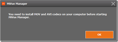
You can download a MiVue Manager app to help you view your videos. I did not get on well with this. The first annoyance was that the MiVue Manager app insists on running with admin rights on Windows. Next, I found it still did not work because of missing codecs.

image

However I can view the videos fine using the Windows 10 built-in app, or VLC. So I gave up on the MiVue Manager.

Conclusion

The MiVue 688 will cost you around £150 and works well. As noted above though, there are some annoyances and you might prefer a touch control unit like the 658, which is a similar price.

I am still impressed. The quality of the video is very good, and this MiVue provides significant benefit at modest cost.

More information here.

Review: Libratone Zipp Mini

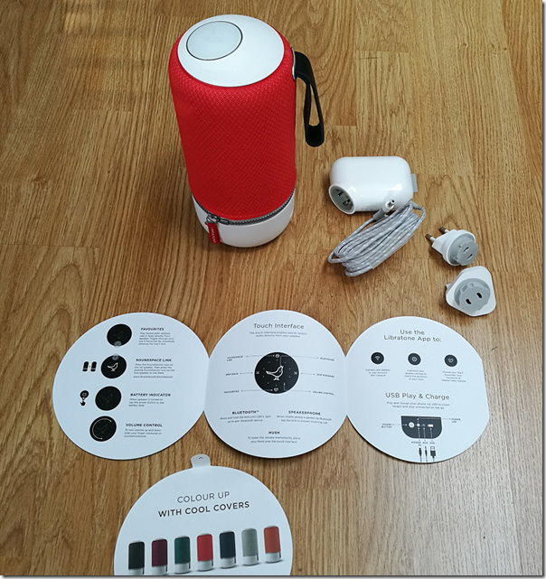
I am quite taken with this Libratone wireless speaker, though I had a few setup hassles. The device comes in a distinctive cylindrical box with a nightingale image on the top. Unpack it and you get a medium-size desktop (or table or shelf) speaker, around 22cm high, with a colourful cover that looks zipped on and a carry strap. There is also a power supply with UK and European adaptors, and a very brief instruction leaflet.

image

Plug in, and the device starts charging. The leaflet says to download the app (for iOS or Android) and “set up and play”. It was not quite so easy for me, using Android. The app is over-designed, by which I mean it looks great but does not always work intuitively. It did not find the speaker automatically, insisted that a wi-fi connection was better than Bluetooth, but gave me no help connecting.

After tinkering for a bit I went to the website and followed the steps for manual wi-fi setup. Essentially you temporarily disconnect https://www.itwriting.com/blog your normal Wi-fi connection, connect your wi-fi directly to the Zipp, go to 192.168.1.1 in the browser, select your home wi-fi network, enter the password, and you are done.

Everything worked perfectly after that. I fired up Spotify, played some music, selected the Zipp under Spotify Connect, and it sounded great. For some Android apps you may need a Bluetooth connection though, or you can use DLNA. The beauty of Spotify Connect is that the connection is direct https://www.itwriting.com/blog the speaker to the internet, it does not depend on the app running, so you can switch off your phone and it still plays. It is actually a better solution than Apple Airplay for internet streaming.

image
The Nightingale button

Control is either via the app, or through the Nightingale button on the top of the speaker. The button works really well. Tap to pause or resume. Slide finger clockwise or anti-clockwise for volume. Skip forward or back by tapping the right or left edge. Then there is a neat “hush” feature: place your hand over the button and it mutes temporarily.

A bit more about the sound. Although this is the smaller Zipp Mini, you can tell that Libratone has taken trouble to make it sound good, and it is impressively rich and full considering the size of the unit. You are getting your money’s worth, despite what seems a high price.

I spent some time comparing the Zipp with Squeezebox Radio, another (but sadly discontinued) wireless audio device I rate highly. Both are mono, both sound good. I did notice that the Zipp has deeper bass and a slightly softer more recessed treble. I cannot decide for sure which sounds better, but I am slightly inclined towards the Libratone, which is actually high praise.

One lovely feature of the Zipp is internet radio, which comes via Vtuner. This is hidden in the feature called Favourites. You select favourite radio stations in the app, with the default being BBC stations and Classic FM. You can change your favourites by tapping the Nightingale icon in the app (another hidden, over-designed feature) and tapping My Radio.

image

Once set up, tap the heart button on the Nightingale button on the device to switch to radio. Tap twice to skip to the next station. Internet radio does not depend on having the app running, it works directly https://www.itwriting.com/blog the Zipp.

The Zipp has a power button, press and hold to power on or off, tap to show remaining battery. It also has an aux jack socket, for wired playback https://www.itwriting.com/blog any source, and a USB socket which you can use either for charging a phone, or for playback https://www.itwriting.com/blog music files on USB storage (I did not try this, but a wide range of formats are supported, including MP3, WAV, FLAC, Ogg Vorbis, WMA, AAC, AIFF and ALAC). You can also use USB for wired playback https://www.itwriting.com/blog iOS, but not https://www.itwriting.com/blog other devices.

Apple Airplay is supported and worked great when I tried it with an iPad. One thing to note: there is currently no iPad app, so you have to search for the iPhone app, which does also work on the iPad.

This very flexible device also supports Bluetooth 4.1 and you can use it as a speaker phone, just tap the Nightingale button to answer a call, so yes it has a microphone too. It also supports DLNA which means you can “play to” the device on some applications, such as Windows Media Player.

If you have more than one Zipp you can connect them for multi-speaker playback. You can select Stereo if you have two speakers or more, but Libratone recommend something they call FullRoom, which means leave it to their digital signal processing (DSP).

Sadly I only have one Zipp, but there are a few options in the app to set DSP optimization for things like Outdoor, Shelf and Floor. I did not notice a huge difference.

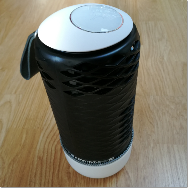
You can get different colour covers, and I tried removing mine. It is a bit fiddly, and the current Zipp Mini does not quite match the explanation on the Libratone site. The handle on this Zipp does not come off; you unzip the cover, twist to disconnect the zip, then feed the handle through the hole. Not something you are likely to do often.

image
The device naked

Finally, if you are curious like me, here are some specifications:

  • Class D amplifier
  • 1 x 3” woofer, 1 x 1” tweeter 2 x 3.5” low frequency radiators
  • Frequency response 60-20,000 Hz (no dB range specified)
  • Maximum volume 96 dB SPL/1m
  • 2400 mAhs battery
  • Bluetooth 4.1
  • 10 hours of playback approx.

Conclusion? I really like the Zipp Mini. It sounds great, supports a wide range of standards, and works well for Internet radio. I like the appearance, the Nightingale button is elegant, and you can expand it with more speakers if needed. This or the larger Zipp model might be all the hi-fi you need.

Caveats: many of the features are a bit hidden, initial setup I found fiddly, the supplied instructions are hopelessly inadequate, and with all those choices it can get confusing.

No matter, it is a lovely device.

More information on the vendor’s site here.

HP’s Elite Slice and the problem with modular PCs

“HP reinvents the desktop” says the press release announcing the Elite Slice, a small modular PC, composed of square sections which you stack together.

image

“It is the first modular commercial desktop with cable-less connectivity” adds the release, which caused me to pause. I was sure I had seen something like it before; and certainly it looks not unlike Acer’s Revo Build:

image

Acer’s Revo Build

Nevertheless, I have a high regard for HP’s PC products, and often recommend them, so I was interested in the Elite Slice.

The base unit is 6.5″ (16.51cm) square and 1.38″ (3.5cm) deep and can be powered from a display using a USB Type-C cable to minimise cables. Various specifications are available, with 6th gen Intel Core i3, i5 or i7, and up to 32GB RAM. HDMI and DisplayPort video output is included. Storage is SSD from 128GB to 512GB. Availability is from the end of September 2016, and price is “from £500”.

In practice you are likely to spend more than that. On HP’s US site, you can order an Elite Slice G1 with Windows 10 Pro, Core i5, 8GB RAM, 256GB SSD, USB mouse, 65 watt power supply for $1235.00 (around £950).

So what modules can you get? On offer currently is an optical disk drive and a Bang & Olufsen audio module. There is also a mounting plate that lets you fix the unit to the wall.

There are other options that are not actual modules, but can be specified when you purchase. These include a wireless charging plate (so you can charge your phone by placing it on top of the Slice) and a fingerprint reader.

There is also a HP Collaboration Cover which once again has to be specified with your original purchase. This is for conferencing and adds the functionality of a Skype for Business (Lync) phone. You can buy this bundled with the audio module as the “Elite Slice for Meeting Rooms”, priced from £649.

I looked at the Elite Slice at the Showstoppers press event just before the IFA show in Berlin last week. It is a good looking unit and will likely be fine as a small business PC.

That said, I am a sceptic when it comes to the modular concept. For a start, the HP Elite is not all that modular, with several options only available on initial purchase (fingerprint reader, wireless charging, conferencing cover). “Covers … require factory configuration and cannot be combined with other Slice covers” says the small print; so if you want wireless charging as well as conferencing, bad luck.

Second, the HP Elite Slice is actually less modular than a traditional PC. While I was looking at the PC, another visitor asked whether a more powerful GPU is available. “We are looking at doing a GPU module” was the answer. However, buy a standard PC with a PCI Express slot and you can choose from a wide range of GPUs, though you might need to upgrade the power supply to run it; that is also easily done.

The downside of a traditional PC is that it is bulky and clunky compared to a neat thing like the Elite; but it sits under the desk so who cares?

Be warned too that if you buy a HP Elite in the hope of a regular flow of exciting modules over the next year or two, you may well be disappointed. Another bright idea will come along and the Elite will be forgotten – just as we heard nothing from Acer about the Revo Build at this year’s IFA.

More details on the Elite Slice are here.

Honor 8 smartphone first look

I’m just back from Paris and the European launch of the Honor 8 smartphone.

Honor is wholly owned by Huawei though the relationship between the two businesses is a tad opaque. I’ve been told that Honor is run as a separate business focusing on a young internet-oriented market, though there is shared technology (it would be crazy not to). The Honor 8 represents a significant strategy shift in that it is a relatively high-end phone, whereas previous devices have been mid-range or lower.

One of the first things you notice about the Honor 8 though is its similarity to the Huawei P9, launched in Europe in April 2016, is obvious. That is no bad thing, since the P9 is excellent and the Honor 8 cheaper,  but the business strategy is a bit of a puzzle. Honor says its phone is targeting a different market, and it is true that the shiny glass body of the Honor 8, in a pleasing blue shade on my review unit, is jauntier than the grey metallic finish of the P9. The P9 is also a fraction slimmer. Yet the devices are far more alike than different, and I would happily pull out the Honor 8 at a business meeting. The Honor 8 also benefits from a few extra features, like the rear smart key.

The P9 has the benefit of Leica branding and shared technology for its camera. An Honor/Huawei PR person told me that this is a software-only distinction and that if you look at the hardware sensors the two phones are very similar. Should photographers therefore get the P9? Possibly, though for a casual snapper like myself I have not noticed a big advantage. See below for some comparative snaps.

image
The Honor 8 (left) and the Huawei P9 (right).

To get a bit of context, the Honor 8 is being launched at €399 with 4GB RAM and 32 GB storage, or €449 with 4GB RAM and 64GB storage (inc VAT). That should equate to around £345 and £390 in the UK. The P9 was launched at £449 for 3GB RAM and 32GB storage, substantially more, though as ever real-world prices vary, and in practice a P9 today will likely cost only a little more than an Honor 8 if you shop around. The 8-core Kirin processor is the same, and the screen is the same resolution at 1920 x 1080. Both models also feature a dual-lens 12MP rear camera, 8MP front lens, and a rear fingerprint reader.

Out of the box

image

The Honor 8 immediately impressed me as a nicely packaged device. You get headset, charger, USB C cable, SIM removal tool, quick start guide (not much use but does have a diagram showing exactly where to insert dual Nano-SIMs and microSD card) and a couple of stickers for good measure. I am not a fan of the headset which lacks any ear-bud gels so it not secure or comfortable for me, but tastes vary.

The glass body is attractive though shiny and easy to smear. Honor can supply a simple transparent case – more a tray than a case – which will offer a little protection, but most users will want something more.

Switch on and there is the usual Android palaver and confusion over permissions. Here I did notice something I dislike. I got a notification saying I should “complete device setup” and “Allow App Services to push messages”:

image

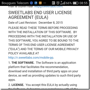
Rather than tapping Allow, I tapped the notification and found an app installer and an invitation to “Choose the apps that come with your phone”. I tapped to see the EULA (End User License Agreement) and found it was a Sweetlabs app that “facilitates the recommendation, download and installation of third party apps.”
image

This is horrible; it is deceptive in that it is presented as part of system setup and performs no useful function since you can easily install apps from the Google Play store; at least one of the apps offered by Sweetlabs (Twitter) was actually already installed. My opinion of which apps are “Essential” differs from that of Sweetlabs:

image

I did not agree the Terms and Conditions. We have seen this kind of thing before, on Windows, and it is damaging to the user experience. History may repeat with Android.

Other than that, setup was straightforward.

Things to like

Fortunately, there is plenty to like. As on the P9, the fingerprint reader on the back is excellent; in fact, I like this feature so much that I sometimes absent mindedly tap the back of other phones and expect them to unlock for me. On the Honor 8 though, it is even better, since the fingerprint reader is also a “Smart key” which you can configure to open an app or take an action such as starting a voice recording or opening the camera. You can configure up to three shortcuts, for press, double press, press and hold.

image

Another neat feature, also not on the P9, is the Smart Controller. This is a universal infra-red controller app and it seems rather good. I pointed it at a Samsung TV and after trying a few functions it declared a “best match” and seems to work fine.

image 

The camera

The camera is a key selling point for the Honor 8. One lens is RGB, the other monochrome, auto-focus is better with two lenses, and the ISP (Image Signal Processor) takes advantage by recording extra detail. There is also a great feature called Wide Aperture which lets you adjust the focus after the event.

When the camera app is open you can swipe from the left to select a mode. There are 16 modes:

Photo
Pro Photo
Beauty
Video
Pro Video
Beauty Video
Good Food
Panorama
HDR (High Dynamic Range)
Night Shot
Light Painting
Time-lapse
Slow-Mo
Watermark
Audio note
Document Scan

After just one day with the device I have not tried all the modes, but did take a look at Pro Photo which gives you control over the metering mode, ISO sensitivity, shutter speed, exposure compensation, focus mode (automatic or manual), and white balance.

image

These same controls are on the P9 though with a slightly different UI and this causes me to wonder exactly what is the Leica contribution that is on the P9 but not the Honor 8. There are a few extra settings on the P9 if you swipe in from the right, including film mode, RAW mode and a Leica watermark option.

How is the camera in use? I took some snaps and was pleased with the results. I also tried taking a similar picture on the Honor 8 and the P9, and comparing the results:

image
A Paris landmark (P9 left, Honor 8 right)

You can’t tell much from the full view, especially since I’ve resized the images for this post, so here is a detail from the above:

image
Detail view (P9 left, Honor 8 right)

Much difference? Please do not draw conclusions from one snap but these support my impression that the Leica-enhanced P9 takes slightly sharper pictures than the Honor 8, but that a casual user would be happy with either.

Performance

The performance of the Honor 8 seems similar to that of the P9 which I reviewed here. The P9 features a Kirin 955 SoC versus the slightly older Kirin 950 in the Honor 8; the specs are similar. Both have 4 Cortex A72 cores, up to 2.5GHz in the Kirin 255 versus up to 2.3GHz in the Kirin 950. In each case, these are supplemented by 4 Cortex A53 cores at up to 1.8GHz and a quad-core Mali T880 MP4 GPU.

Geekbench 3, for example, reports 1703 single-core score and 6285 multi-core, one figure slightly worse, one slightly better than the P9. A run with PC mark came up with a Work Performance Score of 5799, below the P9 at 6387, with the difference mainly accounted for by a poor “Writing score”; other scores were slightly ahead of the P9, so something may be sub-optimal in the text handling and scrolling.

image

Conclusion

I do like this phone; it looks good, feels responsive, and comes with some distinctive features, including the superb fingerprint reader, dual lens rear camera, smart key and smart controller. It does not seem to me to be a young person’s phone particularly, and I can see some people choosing it over a P9 not only for its lower price but also for a couple of extra features. Photographers may slightly prefer the P9, which also has a fractionally slimmer body and a more elegant, understated appearance. In the general phone market, the Honor 8 is competitively priced and well featured; I expect it to do well.
Raspberry Pi does Audio at the Wigwam HiFi Show 2016

The Wigwam Hifi Show is an unusual event, in that most of the exhibitors are not vendors with their latest and shiniest, but enthusiasts showing off their own systems. It is a lot of fun, with plenty of exotic and/or old equipment that you will not see or hear elsewhere.

image

I have exhibited at the show in the past, and try to do something a little different each time. This year I thought it would be interesting to contrast the many multi-box and expensive systems with something at the other end of the scale. I was impressed when I reviewed the IQAudio Pi-DigiAMP+ for issue 36 of the MagPi magazine, so I took it along.

This unit is a board that plugs in on top of the main Raspberry Pi board.

image

It is very simple, the only external connectors being power in, and left and right speaker terminals. It includes a DAC and a class D amplifier, based on the Texas Instruments (TI) TAS5756m chipset. The DAC is based on a Burr-Brown design.

I assembled my unit using a Raspberry Pi 2, the above board, and the matching case and power supply from IQ Audio. The power supply is the XP Power VEF50US15 which means I get up to 2x20w; if you use a VEF65US19 you can get 2x35w (both available from the IQAudio site).

Here it is in the room at Scalford Hall, home of the Wigwam event.

image

The speakers shown are the Cambridge Audio Aero 6, though we also had a pair of Quad 11L and tried them both.

The way things work at this event is that you sleep in your room the night before, and the next morning the bed is removed and it becomes your exhibition room. Having tried the system with the bed in place, I was distressed to find it sounding markedly worse (bloated bass) once the bed was removed. With no time for proper experimentation we dragged the mattress back out of the cupboard and leant it against the wall, which improved matters; we also used foam bungs in the speaker ports to tame the bass. Not ideal, but shows the difficulty of getting good sound at short notice in small hotel rooms.

The Cambridge Audio Aero 6 speakers I would describe as a good budget choice; they sell for around £350. Philosophically (as with the Quads) they are designed to be clean, detailed and uncoloured. The choice of floorstanders rather than small standmounts was deliberate, as I wanted to demonstrate that using a tiny amplifier does not necessarily mean a small sound.

Having said that, we also put the Quads on from time to time, which are small standmounts. The sound was not radically different, though bass extension is less and to my ears the 11Ls are a little less precise than the Aeros, with a warmer sound. I preferred the Aeros but as ever with loudspeakers, tastes vary.

The complete parts list as shown:

  • Raspberry Pi 2 £26.00
  • IQAudio Pi-DigiAMP+ £57.99
  • IQAudio Pi-CASE+ £15.60
  • 15v Power Brick XP Power VEF50US15 £25.50

If I were buying today, I would recommend the new Raspberry Pi 3 and the more powerful 19v power supply which increases the cost by about £10.00.

So that is between £125 and £135 for the complete device, and then whatever you choose for the speakers.

For the demonstration I brought along a router with wi-fi, to which I attached a hard drive with lots of FLAC files ripped from CD, along with a few high-res files. The router lets you attach a USB drive and share it over the network, so I configured Volumio on the Pi to use that as its source. In a typical home setup, you would probably store your music on a NAS device and use your existing home network.

Where’s the amplifier?

There was a steady stream of visitors from around 10.00am to the close of the show at around 17.00. The goal was not to be the best sound at the show, but rather to be the smallest and still deliver decent sound quality, and for many visitors I think we succeeded. We stuck the equipment list on the wall and lots of people photographed it with the intention of looking into it further.

image
A demo under way: spot the mattress leaning against the wall and the smaller Quad speakers alongside the Cambridge Audios.

A number of visitors knew of, or were even using, a Pi for streaming, but the idea of having the amplifier included on a small board was less familiar; it was fun when people asked where the amplifier was, or whether the speakers were active (they are not). Some were really astonished that you can get respectable sound quality from such a small box.

Volume was more than sufficient for a room this size and frankly plenty for most home situations though of course not for huge rooms or loud parties.

Note that despite playing loud throughout the day the amp board did not get warm at all; this is because a Class D design delivers almost all the power supplied as output to the loudspeakers.

A few early comments from the forums:

“The super small Raspberry Pi based system by onlyconnect was a brilliant demo of what can be achieved by something tiny and low cost.”

“I wouldn’t have thought it possible if I hadn’t have heard it… To boot, completely taking price out of the equation, it was one of the better sounding systems at the show to my ears, I enjoyed that more than some far, far more expensive rigs.”

“Highlights. Onlyconnect’s raspi based system, honestly why pay more for music around the house?”

“Onlyconnect’s Raspberry system was impressive and wins the GVFM award.”

“Onlyconnect’s mini/budget system – just amazing how good a £125 raspberry pi setup containing streamer, dac, preamp and 35w per channel amp could sound. I can’t forget how flabbergasted another listener was to discover the total system cost  -” I’ve obviously doing it all wrong all these years”

“I spent a while looking for the amplifier, following the cables etc like everybody else. I was impressed by the sound coming out of the Cambridge Audio speakers, I would certainly put this in the top 40% of rooms based on the sound quality, maybe higher.”

DatAshur encrypted drives: protect your data but be sure to back it up too

The iStorage DataAshur USB flash drive is a neat way to encrypt your data. Lost USB storage devices are a common cause of data theft anxiety: in most cases the finder won’t care about your data but you can never be certain.

image

The DatAshur is simple to operate but highly secure, presuming it meets the advertised specification. All data written to the drive is automatically encrypted with 256-bit AES CBC (Advanced Encryption Standard with Cipher Block Chaining) and meets the US FIPS 140-2 standard. The encryption is transparent to the operating system, since decryption is built into the device and enabled by entering a PIN of 7 to 15 digits.

Note that a snag with this arrangement is that if your PC is compromised a hacker might be able to read the data while the drive is connected. If you are really anxious you could get round this by working offline, or perhaps using Microsoft’s clever Windows to Go (WTG) technology where you boot from a USB device and work in isolation from the host operating system. Unfortunately DatAshur does not support WTG (as far as I know) but there are alternatives which do, or you could boot into WTG and then insert your DatAshur device.

Normally you enter the PIN to unlock the drive before connecting it to a PC or Mac. This does mean that the DatAshur requires a battery, and a rechargeable battery is built in. However if the battery is exhausted you can still get your data back by recharging the device (it charges whenever it is plugged into a USB port).

OK, so what happens if a bad guy gets your device and enters PINs repeatedly until the right one is found? This will not work (unless you chose 1234567 or something like that) since after 10 failed tries the device resets, deleting all your data.

You should avoid, then, the following scenario. You give your DatAshur drive to your friend to show it off. “I’ve just updated all my expenses on this and there is no way you’ll be able to get at the data”. Friend fiddles for a bit. “Indeed,and neither can you”.

Here then is the security dilemma: the better the security, the more you risk losing access to your own data.

The DatAshur does have an additional feature which mitigates the risk of forgetting the PIN. You can actually set two PINs, a user PIN and an admin PIN. The admin PIN could be retained by a security department at work, or kept in some other safe place. This still will not rescue you though if more than 10 attempts are made.

What this means is that data you cannot afford to lose must be backed up as well as encrypted, with all the complexity that backup involves (must be off-site and secure).

Still, if you understand the implications this is a neat solution, provided you do not need to use those pesky mobile devices that lack USB ports.

The product tested has a capacity from 4GB to 32GB and has a smart, strong metal case. The plastic personal edition runs from 8GB to 32GB and is less robust. An SSD model offers from 30GB to 240GB, and larger desktop units support SSD or hard drive storage from 64GB to 6TB, with USB 3.0 for fast data transfer.

Prices range from around £30 inc VAT for an 8GB Personal USB stick, to £39.50 for the 4GB professional device reviewed here, up to £470 for the monster 6TB drive or £691 for a USB 3.0 external SSD (prices taken from a popular online retailer). The cost strikes me as reasonable for well-made secure storage.

More information on DatAshur is here.

Microsoft Band: do you want to track your health? and with a Microsoft device?

Data on human health has immense value. At an individual level, use of that data has the potential to enhance well-being and productivity, to extend life, and in some cases to avert disaster – such as prompting early investigation into a heart condition. In aggregate, more data on human health enables deeper medical research, especially when combined with other data about lifestyle, profession, location, diet and so on. Medicine is big business, so this is a business opportunity as well as (one hopes) a benefit to humanity.

There is also a dark side to this data. The more data an insurance company has on our health, the more likely they are to exclude the conditions we are most likely to suffer (defeating the purpose of insurance) or to ratchet up premiums for worse risks. Do we trust the industry, whether that is the IT industry or the insurance industry, to safeguard our personal data from being used against us?

The value of this data goes some way to explaining the IT industry’s obsession with fitness gadgets, an obsession that seems to go beyond the demand. I tried a Fitbit for several months, a wristband version. It is a great device, and I found the data interesting, but not enough to motivate me to keep the thing charged up and on my wrist, after the novelty wore off.

The reality is that most of us strike a balance between keeping vaguely fit while not allowing health concerns to dominate our lives. Coffee may be bad for you, but it is also a lovely drink; there is no point in extending life if you cannot also enjoy it.

How much health data, then, is too much?

These questions are likely to come to the fore as increasing numbers of health-monitoring devices come our way, especially multi-purpose devices that do health monitoring as one of several useful functions.

image

Enter Microsoft Band, which the company successfully kept under wraps until a couple of days ago. It’s $199, works with Windows Phone, Android and iOS, and packs in a lot of features, though its 48 hours battery life is too short for my liking (I am hard to please; my plain old watch has a 10-year battery life).

Band hooks into the Microsoft Health platform. There are apps for all three supported phones, and data goes into a cloud service which delivers “intelligent insights” for you. “The more you share with Microsoft Health, the more accurate and helpful your insights will become,” says the blurb. There seems to be a link with Health Vault, a service which provides for sharing of health information with health professionals; of course the company says privacy and security are highly protected.

If I buy one (only available in the US currently) it will be more for its non-health features. Microsoft Band (by linking to your mobile over low-energy Bluetooth) will do calendar alerts, email previews, plain old watch mode (so it is actually a smartwatch), facebook posts, Twitter messages, weather, and (on Windows Phone only), Cortana, Microsoft’s digital assistant.

There is a built-in microphone and you can speak to Cortana on the go. I’ve been trying Cortana since it was was announced at Microsoft’s Build conference earlier this year, and she/it is pretty good. Cortana is not just voice activated search; it is also an example of voice UI, so you can make appointments, take notes, or ask for directions. Its voice recognition and question parsing is impressive, in my experience, though of course not perfect.

As ever I have a developer’s eye on this and I think it is interesting. Voice recognition, touch screen, and semi-permanent link with a smartphone is a powerful combination, if Microsoft opens this up to developers; and I will find it surprising if it does not.

In fact, there are already third-party apps, if you count the Starbucks partnership. You can pair a Starbucks card with Microsoft Band, and pay for coffee with it. The method is rather low-tech: the Band will display a barcode which the Starbucks scanner can read, but still, it beats searching for your card or even pulling out your mobile.

And there is of course the health tracking aspect. There are a ton of sensors here:

  • GPS
  • UV monitor (detect when sunscreen is required)
  • Optical heart rate sensor
  • Gyrometer
  • 3-axis accelerometer
  • “Galvanic skin response”: probably measures electrical conductivity of the skin to assess moisture level
  • Skin temperature
  • Microphone and touch screen

Haptic vibration is used for alerts.

image

Can Microsoft make a success of the Band and steal a march from Apple, whose Watch (which also does fitness tracking) is coming early next year? Apple’s device will be more beautiful, more expensive, and has more functions; but it will not work so well with Android or Windows Phone.

The big downer with Microsoft Band is that it is US only for the moment. Health Vault is already in the UK so we may see a UK release; the possibilities for global rollout are uncertain.

Tech Writing