Account options when setting up Windows 10, and Microsoft’s enforced insecurity questions

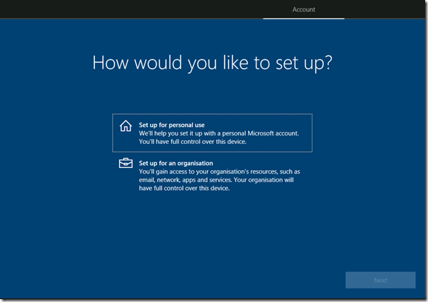
How do you sign into Windows 10? There are now four options. I ran through a Windows 10 setup using build 1803 (which was released in April this year) and noted how this has evolved. Your first decision: is this a personal or organisational PC?

image

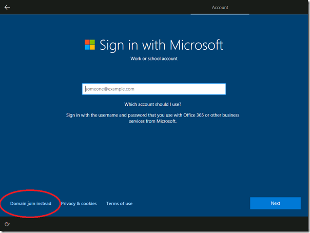
If you choose Setup for an organisation, you will be prompted to sign into Office 365, also known as Azure AD. The traditional Domain join, for on-premises Active Directory, has been shunted to a less visible option (the red encircling is mine). In larger organisations, this tends to be automated anyway.

image

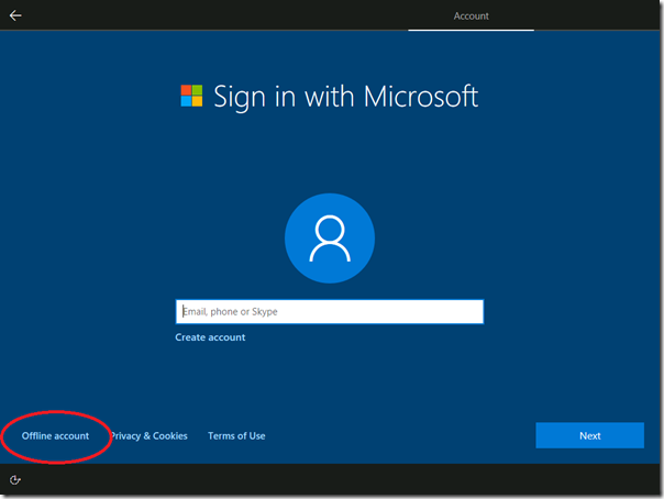
But this one is personal. It is a similar story. You are prompted to sign in with a Microsoft account, but there is another option, called an Offline account (again, the red circle is mine).

image

This “Offline account” was in Windows 7 and earlier the only option for personal accounts. I still recommend having an administrative “offline account” set up so you can always be sure of being able to log into your PC, even without internet. Think about some of the scenarios. Someone might hack your Microsoft account, change your password, and now you cannot even log onto your PC. Unless you have an offline account.

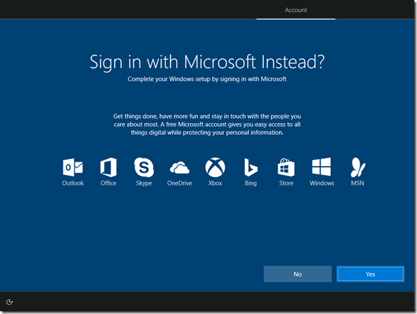
I’ve been awkward and selected Offline account. Windows, or rather Microsoft, does not like it. Note the mind games in the screenshot below. Although I’ve made a positive selection for Offline account, the default and highlighted option now is to change my mind. I do not like this.

image

Now I can set up my offline account. A screen prompts for a username, then for a password, all the time nagging that I should create an online account instead.

image

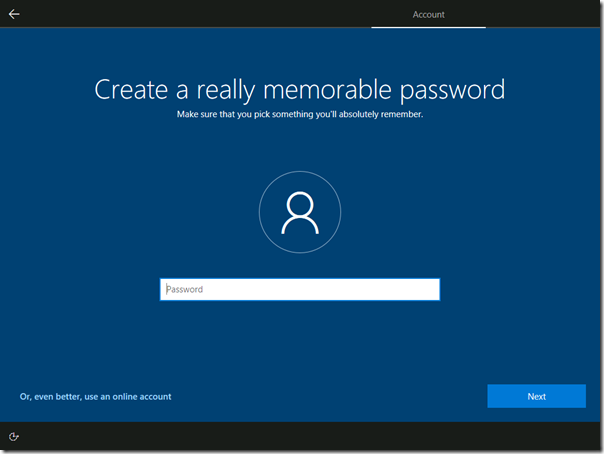
I type and confirm the password; but now I get this:

image

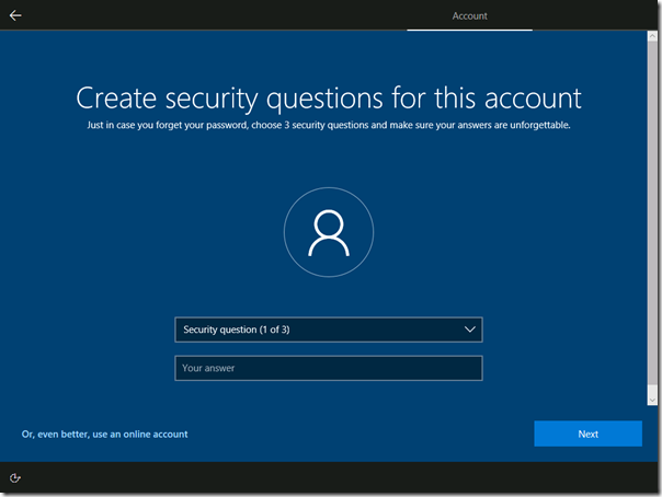
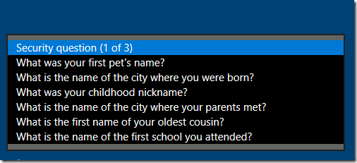
Yes, I have to create “security questions”, with no option to skip. If you try to skip, you get a “This field is required” message. Worse still, they are from a pre-selected list:

image

I really hate this. These are not security questions; they are insecurity questions. Their purpose is to let me (or someone else) reset the password, forming a kind of back door into the PC. The information in the questions is semi-secret; not impossible for someone determined to discover. So Microsoft is insisting that I make my account less secure.

Of course you do not have to give honest answers. You can call your first pet yasdfWsd9gAg!!hea. But most people will be honest.

Does it matter, given that a PC account offers rather illusory security anyway? Unless you encrypt the hard drive, someone who steals the PC can reset the password by booting into Linux, or take out the disk and read it from another PC. All true; but note that Microsoft makes it rather easy to encrypt your PC with Bitlocker, in which case the security is not so illusory.

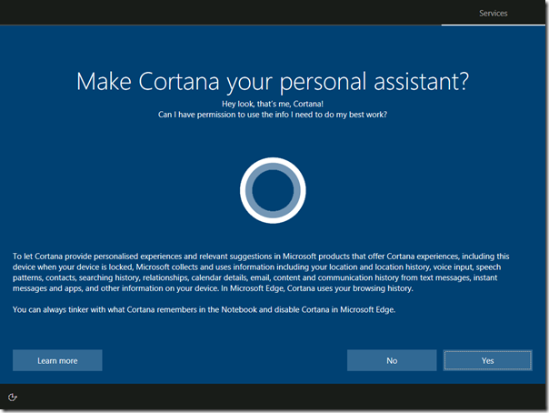
Just for completeness, here is what comes next, an ad for Cortana:

image

Hey Cortana! How do I delete my security answers?

I do get why Microsoft is doing this. An online account is better in that settings can roam, you can use the Store, and you can reset the password from one PC to restore access to another. The insecurity questions could be a life-saver for someone who forgot their password and need to get back into their PC.

But such things should be optional. There is nothing odd about wanting an offline account.

Surface Go: Microsoft has another go at a budget tablet

Microsoft has announced Surface Go, a cheaper, smaller model to sit at the budge end of its Surface range of tablets and laptops.

The new model starts at $399, will be available for pre-order today in selected territories, and ships on August 2nd.

In the UK, the Surface Go is £379 inc VAT for 4GB RAM and 64GB storage, or £509.99 inc VAT for 8GB RAM and 128GB storage.

image

I go back a long way with Surface, having been at the launch of the first device, Surface RT, back in 2012. The device was a flop, but I liked it. The design was genuinely innovative and sought to make sense of a Windows in transition from desktop-only to a viable touch/tablet device. It failed primarily because of the poor range of available apps, lack of user acceptance for Windows 8, and somewhat underpowered hardware. There were also keyboard issues: the fabric-based Touch keyboard was difficult to use because it gave no tactile feedback, and the Type keyboard less elegant and still somewhat awkward.

Surface Pro came next, and while it was more useful thanks to full Windows 8 and an Intel Core i5 CPU, it was disappointing, with battery life issues and a tendency to stay on in your bag, overheating and wasting battery. There were other niggling issues.

The big disappointment of Surface for me is that even with full, Apple-like control over hardware and software, the devices have not been trouble-free.

Another issue today is that Windows 10 is not designed for touch in the same way as Windows 8. Therefore you rarely see Windows tablets used as tablets; they are almost always used as laptops, even if they are 2-in-1 devices. The original kickstand design is therefore rather pointless. If I got another Surface it would be a Surface Laptop or Surface Book.

Of course they are not all bad. It is premium hardware and some of the devices are delightful to use and perform well. They are expensive though, and I suggest careful comparison with what you can get for the same money from partners like HP, Lenovo and others.

What about this one? Key specs:

  • 10″ screen, kickstand design
  • 1800 x 1200 (217 PPI) resolution
  • 8.3mm thick
  • USB-C 3.1 port, MicroSD, headphone jack socket
  • Intel® Pentium® Gold Processor 4415Y
  • Windows Hello camera supporting face-recognition log in
  • Up to nine hours battery life
  • Intel® HD Graphics 615
  • Display supports Surface Pen with 4096 levels of pressure sensitivity
  • Signature Type Cover with trackpad supporting 5-point gestures
  • Windows Hello face authentication camera (front-facing)
  • 5.0 MP front-facing camera with 1080p Skype HD video
  • 8.0 MP rear-facing autofocus camera with 1080p HD video
  • Single microphone
  • 2W stereo speakers with Dolby® Audio™ Premium

It sounds a great deal for £379 or $399 but you will pay more, for three reasons:

  • The base spec is minimal in terms of RAM and SSD storage and you will want the higher model
  • The Type Cover is essential and will cost – a Pro Type Cover is $159.99 and this may be a bit less
  • The Surface Pen is £99.99 or $99.99

This means your $399 will soon be $550 or more.

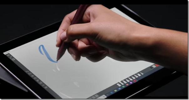
It could still be a good deal if it turns out to be a nice device. The Hello camera is a plus point, but where I would particularly recommend a Surface is if you want Pen support. Microsoft is good at this. Unfortunately I do not get on well with pen input, but some people do, and for artists and designers it is a real advantage.

Ubuntu goes minimal (but still much bigger than Alpine Linux), cosies up to Google Cloud Platform

Ubuntu has announced “Minimal Ubuntu”, a cut-down server image designed for containerised deployments. The Docker image for Minimal Ubuntu 18.04 is 29MB:

Editors, documentation, locales and other user-oriented features of Ubuntu Server have been removed. What remains are only the vital components of the boot sequence.  Images still contain ssh, apt and snapd so you can connect and install any package you’re missing. The unminimize tool lets you ‘rehydrate’ your image into a familiar Ubuntu server package set, suitable for command line interaction.

says Canonical.

29MB is pretty small; but not as small as Alpine Linux images, commonly used by Docker, which are nearer 5MB. Of course these image sizes soon increase when you add the applications you need.

I pulled Ubuntu 18.04 from Docker Hub and the image size is 31.26MB so this hardly seems a breakthrough.

Canonical quotes Paul Nash, Group Product Manager for Google Cloud Platform, in its press release. The image is being made available initially for Amazon EC2, Google Compute Engine, LXD, and KVM/OpenStack. The kernel has been optimized for each deployment, so the downloadable image is optimized for KVM and slightly different than the AWS or GCP versions.

Pusher: a nice solution for sending messages and notifications to web and mobile apps

Pusher is a London company which runs cloud services for publish/subscribe in web and mobile applications. The idea is to deliver real-time updates, a concept that has many use cases. Examples include price updates in finance apps, status updates to track a delivery, news updates, or anything where users want to monitor progress or keep in touch with fast-moving developments.

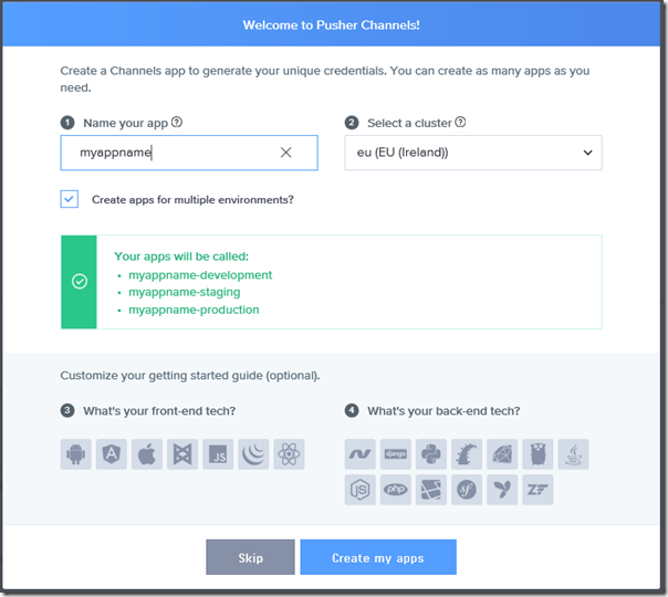
The service passed my “get up and running quickly” test. I created a free account (limited to 100 connections and 200k messages per day) and a new channel:

image 

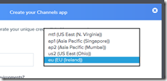
I’m guessing it runs on AWS, looking at the datacentre locations:

image

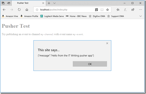
I chose a JavaScript client and ASP.NET MVC for the back end. On my PC I pasted the JavaScript into a web page running locally on Apache (in Windows Subsystem for Linux). I also created a new ASP.NET MVC project and added the sample code with some trivial modifications. I was able to send a message to the web page; it triggers an annoying alert but of course you could easily amend this to update the UI in more user-friendly ways.

image

Of course you could roll your own solution for this but what you get with Pusher is all the plumbing pre-done for many different clients and automatic scalability.

Pusher also has a service called Beams (formerly Push Notifications) which lets you send notifications to Android and IOS apps.

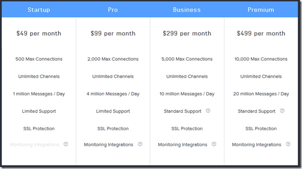
Pusher or roll your own? As with many cloud services, you are putting a high level of trust in Pusher (security and reliability) if you use the service, and you will need a paid subscription:

image

You are saving considerable development time though, and as Google and Apple update their SDKs or change the rules, Pusher will presumably adapt accordingly.

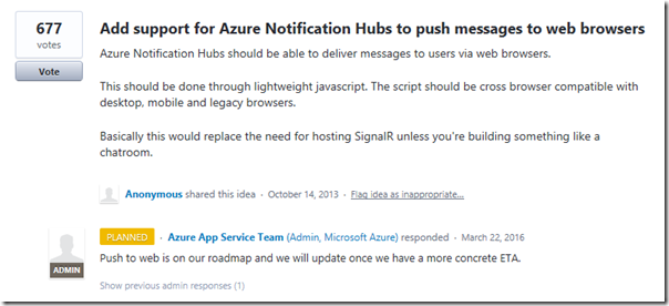
Can Azure easily do this, I wondered? I headed over to Azure Notification Hubs. I noticed that the amount of admin you have to do to support each device is greater. Second, Microsoft promised to support “push to web” in March 2016:

image

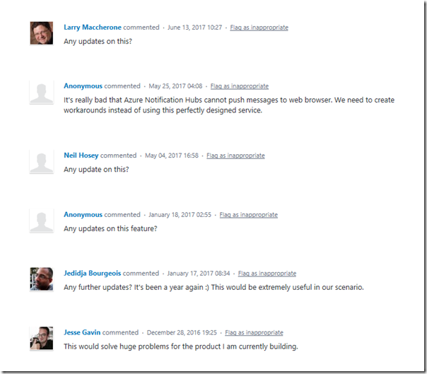
… but has not done so nor even bothered to update those asking:

image

It is odd that Microsoft, with all its drive behind Azure, is still in the habit of leaving customers in the dark in certain areas.

Notes from the Field: dmesg error blocks MySQL install on Windows Subsystem for Linux

I enjoy Windows Subsystem for Linux (WSL) on Windows 10 and use it constantly. It does not patch itself so from time to time I update it using apt-get. The latest update upgraded MySQL to version 5.7.22 but unfortunately the upgrade failed. The issue is that dpkg cannot configure it. I saw messages like:

invoke-rc.d: could not determine current runlevel

2002: Can’t connect to local MySQL server through socket ‘/var/run/mysqld/mysqld.sock

After multiple efforts uninstalling and reinstalling I narrowed the problem down to a dmesg error:

dmesg: read kernel buffer failed: Function not implemented

It is true, dmesg does not work on WSL. However there is a workaround here that says if you write something to /dev/kmsg then at least calling dmesg does not return an error. So I did:

sudo echo foo > /dev/kmsg

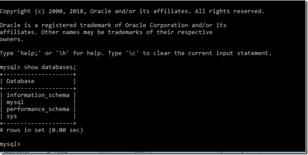
Removed and reinstalled MySQL one more time and it worked:

image

Apparently partial dmesg support in WSL is on the way, previewed in Build 17655.

Note: be cautious about fully uninstalling MySQL if you have data you want to preserve. Export/backup the databases first.

Instant applications considered harmful?

Adrian Colyer, formerly of SpringSource, VMWare, and Pivotal, is running an excellent blog where he looks at recent technical papers. A few days ago he covered The Rise of the Citizen Developer – assessing the security impact of online app generators. This was about online app generators for Android, things like Andromo which let you create an app with a few clicks. Of course the scope of such apps is rather limited, but they have appeal as a quick way to get something into the Play Store that will promote your brand, broadcast your blog, convert your website into an app, or help customers find your office.

It turns out that there are a few problems with these app generators. Andromo is one of the better ones. Some of them just download a big generic application with a configuration file that customises it to your requirements. Often this configuration is loaded from the internet, in some cases over HTTP with no encryption. API keys used for interaction with other services such as Twitter and Google can easily leak. They do not conform to Android security best practices and request more permissions that are needed.

Low code or no-code applications are not confined to Android applications. Appian promises “enterprise-grade” apps via its platform.  Microsoft PowerApps claims to “solve business problems with intuitive visual tools that don’t require code.” It is an idea that will not go away: an easy to use visual environment that will enable any business person to build productive applications.

Some are better than others; but there are inherent problems with all these kinds of tools. Three big issues come to mind:

  1. Bloat. You only require a subset of what the application generator can do, but by trying to be universal there is a mass of code that comes along with it, which you do not require but someone else may. This inevitably impacts performance, and not in a good way.
  2. Brick walls. Everything is going well until you require some feature that the platform does not support. What now? Often the only solution is to trash it and start again with a more flexible tool.
  3. Black box. You app mostly works but for some reason in certain cases it gives the wrong result. Lack of visibility into what it happening behind the scenes makes problems like this hard to fix.

It is possible for an ideal tool to overcome these issues. Such a tool generates human-understandable code and lets you go beyond the limitations of the generator by exporting and editing the project in a full programming environment. Most of the tools I have seen do not allow this; and even if they do, it is still hard for the generator to avoid generating a ton of code that you do not really need.

The more I have seen of different kinds of custom applications, the more I appreciate projects with nicely commented textual code that you can trace through and understand.

The possibility of near-instant applications has huge appeal, but beware the hidden costs.

David Bowie’s Welcome to the Blackout released on CD

David Bowie’s Welcome the Blackout, originally a Record Store Day vinyl exclusive, has now been released on CD and streaming services.

image

The album is excellent, a live performance taken from Earls Court London on June 30th and July 1st 1978. The tour is the same one from which the earlier release Stage was taken, but on this one both the performance and the recording is superior in my opinion. I have reviewed it based on the vinyl release here.

Now the CD is here, packaged in a tri-fold sleeve even though there are only 2 CDs. Two of the inner panels are blank black, which I guess is a design reference to the title.

You also get a fold-out with sleeve notes and a small poster, which was not included in the vinyl release. There is a a review of one of the concerts by David Hancock (first published 30th June 1978 which must mean it is of the 29th June performance NOT featured here, but it matters little). The front of the fold-out is the cover of the tour programme/magazine, called ISOLAR 2.

Apparently these extras are a limited release (though I would guess a large number has been produced). There is also an unlimited release in a standard jewel case without the booklet (as I understand it).

image

The sound of the CD is fine and similar to the vinyl. This is not something to take for granted, as CDs are often mastered for a louder sound at the expense of dynamics.

Recommended if you don’t have the vinyl and want a physical release.


On Microsoft Teams in Office 365, and why we prefer walled gardens to the Internet jungle

Gartner has recently delivered a report called Why Microsoft Teams will soon be just as common as Outlook, which gave me pause for reflection.

The initial success of Office 365 was almost all to do with email. Hosted Exchange at a reasonable cost is a an obvious win for businesses who were formerly on on-premises Exchange or Small Business Server. Microsoft worked to make the migration relatively seamless, and with strong Active Directory support it can be done with users hardly noticing. Exchange of course is more than just email, also handling calendars and tasks, and Outlook and Exchange are indispensable tools for many businesses.

The other pieces of Office 365, such as SharePoint, OneDrive and Skype for Business (formerly Lync) took longer to gain traction, in part because of flaws in the products. Exchange has always been an excellent email server, but in cloud document storage and collaboration Microsoft’s solution was less good than alternatives like DropBox and Box, and ties to desktop Office are a mixed blessing, welcome because Office is familiar and capable, but also causing friction thanks to the need for old-style software installations.

Microsoft needed to up its game in areas beyond email, and to its credit it has done so. SharePoint and OneDrive are much improved. In addition, the company has introduced a range of additional applications, including StaffHub for managing staff schedules, Planner for project planning and task assignment, and PowerApps for creating custom applications without writing code.

We have also seen a boost to the cloud-based Dynamics suite thanks to synergy between this and Office 365.

Having lots of features is one thing, winning adoption is another. Microsoft lacked a unifying piece that would integrate these various elements into a form that users could easily embrace. Teams is that piece. Introduced in March 2017, I initially thought there was nothing much to it: just a new user interface for existing features like SharePoint sites and Office 365/Exchange groups, with yet another business messaging service alongside Skype for Business and Yammer.

Software is about usability as much or more than features though, and Teams caught on. Users quickly demanded deeper integration between Teams and other parts of Office 365. It soon became obvious that from the user’s perspective there was too much overlap between Teams and Skype for Business, and in September 2017 Microsoft announced that Teams would replace Skype for Business, though this merging of two different tools is not yet complete.

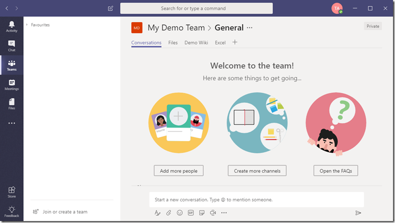
image

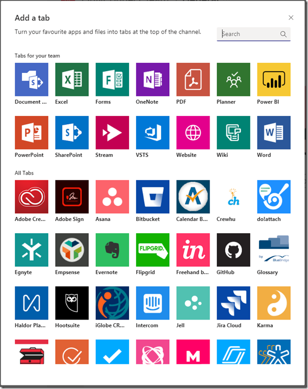
To see why Teams has such potential you need only click Add a tab in the Windows client. Your screen fills with stuff you can add to a Team, from document links to Planner to third-party tools like Trello and Evernote.

image

This is only going to grow. Users will open Teams at the beginning of the day and live there, which is exactly the point Garner is making in its attention-grabbing title.

A good thing? Well, collaboration is good, and so is making better use of what you are paying for with an Office 365 subscription, so it has merit.

The part that troubles me is that we are losing diversity as well as granting Microsoft a firmer hold on its customers.

It all started with email, remember. But email is a disaster, replete with unwanted marketing, malware links, and some number of communications that have some possible value but which life is too short to investigate. In the consumer world, people prefer the safer world of Facebook Messenger or WhatsApp, where messages are more likely to be wanted. Email is also ancient, hard to extend with new features, and generally insecure.

Business-oriented messaging software like Slack and now Teams have moved in, to give users a safer and more usable way of communicating with colleagues. Consumers prefer Facebook’s walled garden to the internet jungle, and business users are no different.

It is a trade-off though. Email, for all its faults, is open and has multiple providers. Teams is not.

This will not stop Teams from succeeding, even though there are plenty of user requests and considerable dissatisfaction with the current release. Performance can be poor, the clients for Mac and mobile not as good as for Windows, and there is no Linux client at all.

Third-parties with applications or services that make sense in the Teams environment should hasten to get their stuff available there.

Review: Mixed Up Deluxe CD by the Cure

The Cure has released a 3-CD deluxe edition of Mixed Up, originally released as a double album or single CD in November 1990.

image

Parts of this release have already appeared on vinyl in two limited Records Store Day 2018 releases: Mixed Up, and Torn Down.

A few words about the CD. Why would anyone buy a CD in this streaming era? It is a waste of money if you just want to listen to the music, but you do get some nice packaging, weird squirly, blocky artwork, photos of the band and of memorabilia from the day, and a 32-page booklet with notes and credits. When physical media has disappeared completely I will miss these things, even though the wretched small size of CD artwork means you have to squint to read the credits.

The idea for Mixed Up came to Robert Smith when he was wondering what came next after the Prayer Tour, the 76 shows which followed the release of the epic album Disintegration in 1989. There were “increased tensions in the band”, according to a quote from Smith in the booklet. “I had to think of something else in the meantime.”

The original thought was to compile the extended mixes made for 12″ singles into an album, since some of these releases were out of print and sought-after by fans.

As he worked on the album though, he moved beyond that initial concept. The early 12″ mixes of songs like Primary, Lovecats and Inbetween Days seemed to him inferior to the more recent releases, so he moved from compiling to reworking existing mixes of earlier songs. In fact, neither Lovecats nor Primary appeared at all on the original Mixed Up. In addition, two tracks on the original Mixed Up (A Forest and The Walk) were re-recorded from scratch as the multi-tracks were missing.

image

Here is how the original Mixed Up (November 1990) breaks down:

Lullaby (Extended Mix): same as 12″ Fiction FICX 29 (1989)

Close To Me (Closer Mix): Same as 12″ FICSX 36 (1990), different from earlier extended mix on 12″ Fiction FICSX 23 (1985)

Fascination Street (Extended Mix): same as 12″ Elektra 0-66704 (1989, US/Canada only)

The Walk (Everything Mix): new recording for Mixed Up.

Lovesong (Extended Mix): Same as 12″ Fiction FICSX 30 (1989)

A Forest (Tree Mix): New recording for Mixed Up.

Pictures Of You (Extended Dub Mix): same as Fiction Records FICXB 34 where it is called Strange Mix (1990), but different from FICXA 34

Hot Hot Hot!!! (Extended Mix): same as 12″ Fiction FICSX 28 (1988)

Why Can’t I Be You? (Extended Mix):(LP only; omitted from the CD for space reasons): Same as 12″ Fiction Ficsx 25 (1987)

The Caterpillar (Flicker Mix): New extended mix for Mixed Up

In Between Days (Shiver Mix): New extended mix for Mixed Up; different from earlier 12″ Fiction FICSX 22 (1985)

Never Enough (Big Mix): New song recorded for Mixed Up

This made it a curious release, essential for Cure fans thanks to new material included but poor in terms of collecting previously released extended mixes.

What about the new 3CD set. The set breaks down as follows:

CD1: Mixed Up 2018 remaster

This is simply a remaster of the 1990 release. Track release as above, but Why Can’t I Be You still omitted (it is on the next CD in the set)

CD2: Mixed Up Extras

This CD includes (at last) most of the early extended remixes which were not on the original Mixed Up. Tracks:

Let’s Go to Bed (Extended Mix 1982)

Just One Kiss (Extended Mix 1982)

Close to Me (Extended Mix 1985)

Boys Don’t Cry (New Voice Club Mix 1986)

Why Can’t I Be You? (Extended Mix 1987)

A Japanese Dream (12″ Remix 1987)

Pictures of You (Extended Version 1990)

Let’s Go To Bed (Milk Mix 1990)

Just Like Heaven (Dizzy Mix 1990)

Primary (Red Mix 1990)

The Lovecats (TC & Benny Mix 1990)

Inevitably, there are still a few tracks missing. These are Primary (Extended Mix 1981); The Lovecats (Extended Version 1983); and In Between Days (Extended Version 1985). The notes refer to a digital release though I am not sure where or whether they have been released. Smith says of these versions that Primary was “basically a 7″ instrumental cut into the 7″ single mix”, that Lovecats was not really a remix, but rather the original single mix before it was edited down, and that In Between Days was “extended by person or persons unknown” and nothing to do with him.

Of these the only one I care about is Lovecats; I would like to have the full version here.

CD3: Torn Down

This is where Smith lets himself go and makes new mixes of favourites from the Cure’s back catalogue. “Compared to most of the Mixed Up remixes, my versions tend to work with the existing song structure; they’re pretty much the same length and tempo as the original … I found myself happier working within those structural restraints,” he says in the notes. That said, he found elements in the songs that had previously been buried, including the actual sound of heavy rain at the start and end of A Night Like This, which he brought out in the new mix.

Three Imaginary Boys (Help Me Mix)

M (Attack Mix)

The Drowning Man (Bright Birds Mix)

A Strange Day (Drowning Waves Mix)

Just One Kiss (Remember Mix)

Shake Dog Shake (New Blood Mix)

A Night Like This (Hello Goodbye Mix)

Like Cockatoos (Lonely in the Rain Mix)

Plainsong (Edge of the World Mix)

Never Enough (Time to Kill Mix)

From the Edge of the Deep Green Sea (Love in Vain Mix)

Want (Time Mix)

The Last Day of Summer (31st August Mix)

Cut Here (If Only Mix)

Lost (Found Mix)

It’s Over (Whisper Mix)

So how are the new mixes? An interesting way to hear them is to play the original followed by the remix, easy to do if you rip your CDs to a computer or streaming system. You can hear some themes, such as a more techno feel to the new mixes, and that Smith’s vocals are more forward. Three Imaginary Boys, for example, gives you a new perspective on an early song, with the “Can you help me” vocal from the end moved to the beginning of the song, hence the name “Help Me Mix”.

Shake Dog Shake benefits from the extra clarity of a modern mix and sounds more sinister and colourful than the original.

It tends to be lesser-known songs that benefit most. It is difficult to re-approach a magnificent song like Plainsong without making it worse, and in this case it is as expected.

Perhaps then it is better not to listen to them alongside the originals but to enjoy it as a whole. Cure fans will enjoy it even though it is not in any sense ground-breaking.

The complete package

This collections gets a warm welcome from me. I have always enjoyed Mixed Up, and I am delighted now to get treats like the earlier extended mixes of Close To Me. Just One Kiss, and the other extended mix of  Pictures of You, which to me are the definitive versions.

The sound quality is excellent, and kudos to mastering engineer Tim Young for showing some restraint in mastering so that these songs are not wrecked by excessively LOUD mastering.