Review: Nuance Dragon Naturally Speaking 13

I have great admiration for Nuance Dragon Naturally Speaking, mainly because of its superb text recognition engine. New versions appear regularly and the recognition engine seems to improve a little each time. The recently released version 13 is no exception, and I am getting excellent results right now as I dictate into Word.

If you are still under the illusion that dictation is not viable unless you are unable to type, it may be that you have not tried Dragon recently. Another possibility is that you tried Dragon with a poor microphone. I recommend a high quality USB headset such as those from Plantronics or Jabra. USB is preferred since you are not dependent on the microphone preamplifier built into your PC, which is often poor.

At the same time, Dragon can be an intrusive application. The problem is that Dragon tries to accomplish two distinct tasks. One is to enable dictation and to some extent transcription of recordings, which is something anybody might want to take advantage of. For example, one of my uses is transcribing interviews, where I play my recording into a headset and read it back into the microphone. It is a lot quicker than the normal stop-start typing approach and even if it is a little less accurate the time-saving is worthwhile.

Incidentally, Dragon is nowhere near smart enough yet to transcribe an interview directly. Background noise combined with the variety of accents used make this generally a hopeless task. In principle though, there is no reason why software should not be able to accomplish this as both processing power and algorithms improve so watch this space.

The other task for which people use Dragon is as an assistive technology. Those unable to use mouse and keyboard need to be able to navigate the operating system and its applications by other means, and Dragon installs the hooks necessary for this to work. This is where the intrusive aspect comes to the fore, and I wish Dragon had a stripped down install option for those who simply want dictation.

I had some issues with the Outlook add-in, which I do not use anyway. Outlook complained about the add-in and automatically disabled it, following which it was Dragon’s turn to sulk:

image

That said, it is possible to configure it as you want. Because of this kind of annoyance, I tend to avoid Dragon’s add-ons for applications like Microsoft Outlook and Internet Explorer. If you are using Dragon as an assistive tool though, you probably need to get them working.

Dragon can be fiddly then, which is why users who dive in and expect excellent results quickly may well have a bad experience. Speech recognition and interaction with applications that were primarily designed for mouse and keyboard is a hard task; you will have to make some effort to get the best from it.

What’s new?

So what is new in version 13? The first thing you will notice is that the Dragon bar, which forms the main user interface, has been redesigned. The old one is docked right across the top of the screen by default and has traditional drop-down menus. You can also have it floating like this:

image

The new bar has modern touch-friendly icons, though these turn out to be drop-down menus in disguise:

image

There is also an option to collapse the bar when not in use, in which case it goes tiny:

image

Another user interface change is that the handy Dragon Sidebar, a help panel which shows what commands you can use in the current application and which changes dynamically according to context, has been revamped as the Learning Center. Here it is in Word, for example:

image

I like the Learning Center, which is a genuine help until you are familiar with all the commands.

The changes to the Dragon  user interface are mostly cosmetic, but not entirely. One innovation is that the Dragon Bar now works in Store apps in Windows 8. Here I am dictating into Code Writer, a Store app:

image

It works, but this seems to be work in progress. Dragon is really a desktop application, and I found that some commands would mysteriously bounce me back to the desktop, and others just did not work. For example, the Bar prompted me to open the Dictation Box for an unsupported application, and moments later informed me that it could not be used here.

Another issue is that the Bar sits over the full-screen app, obstructing some of the text. You can workaround this by shunting it to the right. My guess though is that you will have a frustrating time trying to use Dragon with Store apps; but it is good to see Nuance making the effort.

What else is new? Well, Nuance has made it easier to get started, and no longer forces you to complete a training exercise (training Dragon to understand you, not you to understand Dragon) before you can use a profile. It is not really a big change, since you should do this anyway in order to get good results.

There is also better support for web browsers other than Internet Explorer. In particular, there are extensions for Chrome and Firefox which Nuance says gives “full text control”.

Worth upgrading?

If you want or need speech to text, Dragon is the best option out there, much better in my experience than what is built into Windows, and better on Windows than on a Mac. In that respect, I recommend it; though with the caveat that you should work with a high quality microphone and be willing to invest time and effort in training its recognition engine and learning to use it.

If you have an earlier version, even as far back as 11, is 13 worth the upgrade? That is hard to say. The user interface changes are mostly cosmetic; but if you use the latest Microsoft Office then getting the latest Dragon is worth it for best compatibility.

The other factor is the gradually improving speech recognition. Comparing the accuracy of, say, version 11 with version 13 would be a valuable exercise but sadly I have not found time to do it. I can report my impression that it makes fewer errors than ever in this version, but that is subjective.

Frankly, if you use dictation a lot, get the latest version anyway; even small improvements add up to more productivity and less frustration.

LibreOffice is four years old, plans Android version

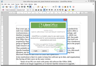
Four years ago, on 28th September 2010, the open source LibreOffice productivity suite was created by forking OpenOffice. This Microsoft Office alternative offers a word processor, spreadsheet, presentation graphics, vector drawing package, and database manager. Its origins are in a German suite called Star Office, which was acquired by Sun Microsystems in 1999. In an effort to disrupt Microsoft, Sun made Star Office free and open source, creating OpenOffice.org. However Sun itself was acquired by Oracle Corporation in 2010, and LibreOffice was created by a breakaway group of OpenOffice contributors who were wary of what might happen to the project under Oracle’s stewardship.

image

They probably need not have worried, since Oracle donated OpenOffice to the Apache foundation in 2011. It is still performing its intended function as a Microsoft disruptor; see for example this report of the Italian city of Udine moving from Microsoft Windows and Office to Linux and OpenOffice.

A key motivation is that it is easier to keep free software up to date, and organisations like having all their users on the same version:

"Some of our PCs are stuck with pretty old software like Office 2000, which is no longer supported, as we haven’t had the resources to upgrade," Gabriele Giacomini, the innovation and economic development councillor for the municipality of Udine, told ZDNet.

"By switching to open source, we will have the chance to allow our employees to work with the latest version of the suite”

Microsoft, of course, wants to address this by persuading users to subscribe to Office rather than buying it outright; though this does not solve the problem of out of date Windows versions (but watch this space).

But what about LibreOffice? What is the point of having two major open source productivity suites based on essentially the same products?

Good question; but one possible differentiator is that LibreOffice is working on an Android port. The Document Foundation, which runs the LibreOffice project, is inviting tenders for implementation of the suite on Android, complete with a basic interface for integrating with the user’s “preferred cloud storage”.

Another point of interest is that the Foundation is asking for commercial tenders rather than hiring its own coders to work with the open source community.

That said, there is already an Android port of OpenOffice, called AndrOpen Office, though this is a fork and not an official Apache OpenOffice project.

Are these multiple forks healthy proliferation, or open source confusion? That depends on your point of view, though it does show the ability of the open source community to respond to obvious needs.

It seems to me though that the suite would be more attractive to businesses if LibreOffice and OpenOffice could merge, and develop an official Android version of the suite.

My guess is that productivity software on tablets (and phablets) will be a key battleground as users do an increasing proportion of their work on mobile devices rather than PCs or laptops. Microsoft already has an iOS version of Office, and one for Android in preparation. There is also a version of Office for the Windows 8 “Metro” personality in preparation.

Open source advocate Glyn Moody has posted about the LibreOffice project here.

Testing mobile apps: Xamarin goes live with Test Cloud for iOS and Android (but no Windows Phone)

Testing a mobile app is challenging, thanks to operating system fragmentation combined with diversity of hardware. In April 2013 Xamarin acquired a company called LessPainful, specialists in functional testing for mobile apps, which had created a mobile app testing tool called Calabash. Calabash is based on Cucumber, and lets you define test steps and then combine them into natural language tests. LessPainful also had a cloud testing service which let you run tests on remote physical devices and see visual test reports.

Eighteen months on, Xamarin has now gone live with Test Cloud, and has announced some big names which it says are using the service, including Dropbox, Flipboard and eBay.

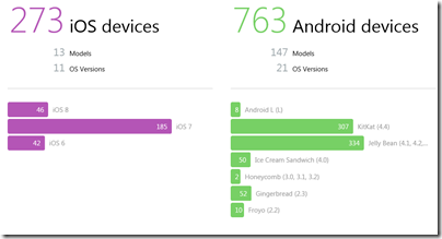
There are currently 1036 devices (the number changes regularly) in the Test Cloud, including 273 iOS and 763 Android (Windows Phone is not supported, but Amazon’s Fire Phone and Kindle Fire does appear in the list).

image

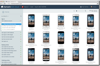
You write your tests either in Calabash or in C#, upload your app and the tests to Test Cloud, wait a while, and then get notification that the tests are done and a report ready to view.

image

You can simulate events such as changes in location, device rotation, network dropouts, and of course user interactions like taps and gestures. You get screenshots and performance data (memory and CPU usage) for each test step.

You can also integrate with CI (Continuous Integration) systems like TFS, Jenkins and TeamCity to automate testing.

Writing and maintaining tests is hard work, of course, but for businesses that can afford the investment in both time and money, Test Cloud is likely to be a great improvement on manually gathering up as many devices as you can find and installing your app on all of them.

The cost is significant though, starting at $1000 per month for up to 2 apps and 200 device hours. You have to pay annually too, so it looks like a strategy of just buying one month towards the end of your development cycle will not work.

That said, I have been told that Xamarin will be coming out with an Indie version in the future that has a lower price.

Android apps on Chrome: how it works and what it may become

Google announced at its I/O conference in June 2014 that Android apps are coming to its Chrome OS. Earlier this month product managers Ken Mixter and Josh Woodward announced that the first four Android apps are available in the Chromebook app store: Duolingo, Evernote, Sight Words and Vine.

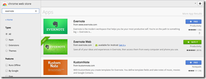
I delayed posting about this until I found the time to investigate a little into how it works. I fired up an Acer C720 and installed Evernote from the Chrome web store (in addition to Evernote Web which was already installed).

image

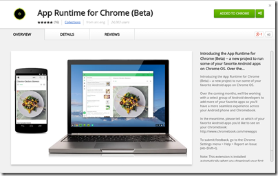
When you install your first Android app, Chrome installs the App Runtime for Chrome (Beta) (ARC) automatically.

image

Incidentally, I found Evernote slightly odd on Chromebook since it is runs in a window although the app is designed to run full screen, as it would on a phone or tablet. This caught me out when I went to settings, which looks like a dialog, and closed it with the x at the top right of the window. Of course that closes the app entirely. If you want to navigate the app, you have to click the back arrow at top left of the window instead.

But what is the App Runtime for Chrome? This seems to be an implementation of the Android runtime for NaCl (Native Client), which lets you run compiled C and C++ code in the browser. If you browse the parts of ARC which are open source, you can see how it implements the Android Open Source Project (AOSP) for arch-nacl: a virtual processor running as a browser extension.

Not all of ARC is open source. The docs say:

Getting Started with ARC Open Source on Linux

=============================================

A small set of shared objects can be built which are part of ARC currently.

A fully running system cannot currently be built.

It is early days, with just four apps available, ARC in beta, and developers asked to contact Google if they are interested in having their Android apps run on Chrome OS. However, an independent developer has already ported ARC to desktop Chrome:

ARChon runtime lets you run unlimited number of Android APKs created with chromeos-apk on Chrome OS and across any desktop platform that supports Chrome.

The desktop version is unstable, and apps that need Google Play services run into problems. Still, think of it as a proof of concept.

In particular, note that this is Android Runtime for Chrome, not Android Runtime for Chrome OS. Google is targeting the browser, not the operating system. This means that ARC can, if Google chooses, become an Android runtime for every operating system where Chrome runs – with the exception, I imagine, of Chrome for iOS, which is really a wrapper for Apple’s web browser engine and cannot support NaCl, and Chrome for Android which does not need it.

Imagine that Google gets ARC running well on Windows and Mac. What are the implications?

The answer is that Android will become a cross-platform runtime, alongside others such as Flash (the engine in Adobe AIR) and Java. There has to be some performance penalty for apps written in Java for Android running in an Android VM in the browser; but NaCl runs native code and I would expect performance to be good enough.

This would make Android an even more attractive target for developers, since apps will run on desktop computers as well as on Android itself.

Might this get to the point where developers drop dedicated Windows or Mac versions of their apps, arguing that users can just run the Android version? An ARC app will be compromised not only in performance, but also in the way it integrates with the OS, so you would not expect this to happen with major apps. However, it could happen with some apps, since it greatly simplifies development.

Foobar2000 goes mobile: funding secured for iOS, Android and Windows Phone versions

Popular free music player foobar2000 is coming to mobile platforms, following a successful community fundraising campaign.

image

Curiously this is not a Kickstarter campaign even though it looks similar.

The project is the outcome of collaboration between Steve Elkins (known as “Spoon”) who is the creator of dBpoweramp, an excellent audio converter and CD ripper for Windows, and foobar2000’s originator Peter Pawlowski.

The mobile version of foobar2000 will run on iOS 6 or later, on iPhone, iPod and iPad; Android v4 or later on phones and tablets; and Windows Phone 8 and Windows 8.1 tablets, ARM and Intel.

There will be both free and “fully featured premium” versions.

Additional projects for cloud synchronization and backup, and for social interaction built into foobar2000, have not yet received enough funding to proceed, and look unlikely to do so.

Foobar2000 is loved for its speed and efficiency, easy extensibility with plug-ins, and advanced functionality. Its user interface is functional rather than beautiful, though it is also easily customised. I use foobar2000 with a large collection, mostly Flac files ripped from CD, and foobar2000 manages the database transparently and with instant results.

Exactly what features mobile foobar2000 will have is not clear. The best source of public information I can find is this thread which includes input from Spoon. There may or may not be ads in the free versions; the cost of the premium versions is unannounced.

Microsoft Azure: new preview portal is “designed like an operating system” but is it better?

How important is the Azure portal, the web-based user interface for managing Microsoft’s cloud computing platform? You can argue that it is not all that important. Developers and users care more about the performance and reliability of the services themselves. You can also control Azure services through PowerShell scripts.

My view is the opposite though. The portal is the entry point for Azure and a good experience makes developers more likely to continue. It is also a dashboard, with an overview of everything you have running (or not running) on Azure, the health of your services, and how much they are costing you. I also think of the portal as an index of resources. Can you do this on Azure? Browsing through the portal gives you a quick answer.

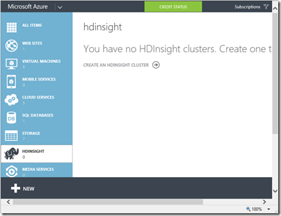
The original Azure portal was pretty bad. I wish I had more screenshots; this 2009 post comparing getting started on Google App Engine with Azure may bring back some memories. In 2011 there were some big management changes at Microsoft, and Scott Guthrie moved over to Azure along with various other executives. Usability and capability improved fast, and one of the notable changes was the appearance of a new portal. Written in HTML 5, it was excellent, showing all the service categories in a left-hand column. Select a category, and all your services in that category are listed. Select a service and you get a detailed dashboard. This portal has evolved somewhat since it was introduced, notably through the addition of many more services, but the design is essentially the same.

image

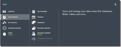
The New button lets you create a new service:

image

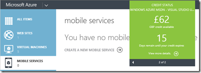
The portal also shows credit status right there – no need to hunt through links to account management pages:

image

It is an excellent portal, in other words, logically laid out, easy to use, and effective.

That is the old portal though. Microsoft has introduced a new portal, first demonstrated at the Build conference in April. The new portal is at http://portal.azure.com, versus http://manage.windowsazure.com for the old one.

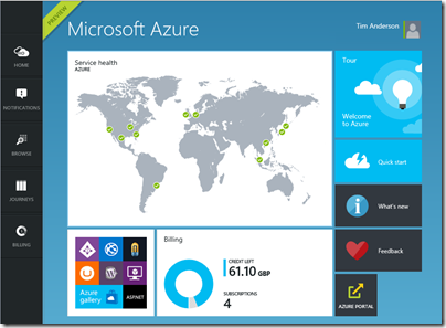
The new portal is different in look and feel:

image

Why a new portal and how does it work? Microsoft’s Justin Beckwith, a program manager, has a detailed explanatory post. He says that the old portal worked well at first but became difficult to manage:

As we started ramping up the number of services in Azure, it became infeasible for one team to write all of the UI. The teams which owned the service were now responsible (mostly) for writing their own UI, inside of the portal source repository. This had the benefit of allowing individual teams to control their own destiny. However – it now mean that we had hundreds of developers all writing code in the same repository. A change made to the SQL Server management experience could break the Azure Web Sites experience. A change to a CSS file by a developer working on virtual machines could break the experience in storage. Coordinating the 3 week ship schedule became really hard. The team was tracking dependencies across multiple organizations, the underlying REST APIs that powered the experiences, and the release cadence of ~40 teams across the company that were delivering cloud services.

The new portal is the outcome of some deep thinking about the future. It is architected, according to Beckwith, more like an operating system than like a web application.

The new portal is designed like an operating system. It provides a set of UI widgets, a navigation framework, data management APIs, and other various services one would expect to find with any UI framework. The portal team is responsible for building the operating system (or the shell, as we like to call it), and for the overall health of the portal.

Each service has its own extension, or “application”, which runs in an iframe (inline frame) and is isolated from other extensions. Unusually, the iframes are not used to render content, but only to run scripts. These scripts communicate with the main frame using the window.postMessage API call – familiar territory for Windows developers, since messages also drive the Windows desktop operating system.

Microsoft is also using TypeScript, a high-level language that compiles to JavaScript, and open source resources including Less and Knockout.

Beckwith’s post is good reading, but the crunch question is this: how does the new portal compare to the old one?

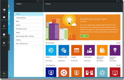
I get the sense that Microsoft has put a lot of effort into the new portal (which is still in preview) and that it is responsive to feedback. I expect that the new portal will in time be excellent. Currently though I have mixed feeling about it, and often prefer to use the old portal. The new portal is busier, slower and more confusing. Here is the equivalent to the previous New screen shown above:

image

The icons are prettier, but there is something suspiciously like an ad at top right; I would rather see more services, with bigger text and smaller icons; the text conveys more information.

Let’s look at scaling a website. In the old portal, you select a website, then click Scale in the top menu to get to a nice scaling screen where you can set up autoscaling, define the number of instances and so on.

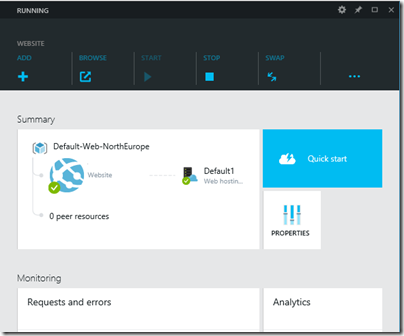
How do you find this in the new portal? You get this screen when you select a website (I have blanked out the name of the site).

image

This screen scrolls vertically and if you scroll down you can find a small Scale panel. Click it and you get to the scaling panel, which has a nicely done UI though the way panels constantly appear and disappear is something you have to get used to.

There are also additional scaling options in the preview portal (the old one only offers scaling based on CPU usage):

image

The preview portal also integrates with Visual Studio online for cloud-based devops.

The challenge for Microsoft is that the old portal set a high bar for clarity and usability. The preview portal does more than the old, and is more fit for purpose as the number and capability of Azure services increases, but its designers need to resist the temptation to let prettiness obstruct performance and efficiency.

Developers can give feedback on the portal here.

Microsoft OneDrive and OneDrive for Business: a guide for the perplexed

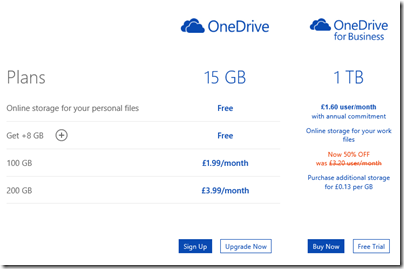
Microsoft’s price plans for additional cloud storage are odd:

image

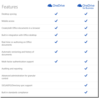
Hmm, £1.60 per month for 1TB or £3.99 for 200GB. Difficult decision? Especially as OneDrive for Business appears to be a superset of OneDrive:

image

It is not that simple of course (and see below for how you can get 1TB OneDrive for less). The two products have different ancestries. OneDrive was once SkyDrive and before that Windows Live Folders and before that Windows Live Drive. It was designed from the beginning as a cloud storage and client sync service.

OneDrive for Business on the other hand is essentially SharePoint: team portal including online document storage and collaboration. The original design goal of SharePoint (a feature of Windows Server 2003) was to enable businesses to share Office documents with document history, comments, secure access and so on, and to provide a workplace for teams. See the history here. SharePoint supported a technology called WebDAV (Web Distributed Authoring and Versioning) to allow clients to access content programmatically, and this could be used in Windows to make online documents appear in Windows Explorer (the file utility), but there was no synchronization client. SharePoint was not intended for storage of arbitrary file types; the system allowed it, but full features only light up with Office documents. In other words, not shared storage so much as content management system. Documents are stored in Microsoft SQL Server database.

SharePoint was bolted into Microsoft BPOS (Business Productivity Online Suite) which later became Office 365. In response to demand for document synchronization between client and cloud, Microsoft came up with SharePoint Workspace, based on Groove, a synchronization technology acquired along with Groove Networks in 2005.

I have no idea how much original Groove code remains in the the OneDrive for Business client, nor the extent to which SharePoint Online really runs the same code as the SharePoint you get in Windows Server; but that is the history and explains a bit about why the products are as they are. The OneDrive for Business client for Windows is an application called Groove.exe.

OneDrive and OneDrive for Business are different products, despite the misleading impression given by the name and the little feature table above. This is why the Windows, Mac and Mobile clients are all different and do different things.

OneDrive for Business is reasonable as an online document collaboration tool, but the sync client has always been poor and I prefer not to use it (do not click that Sync button in Office 365). You may find that it syncs a large number of documents, then starts giving puzzling errors for which there is no obvious fix. Finally Microsoft will recommend that you zap your local cache and start again, with some uncertainty about whether you might have lost some work. Microsoft has been working hard to improve it but I do not know if it is yet reliable; personally I think there are intractable problems with Groove and it should be replaced.

The mobile clients for OneDrive for Business are hopeless as DropBox replacements. The iOS client app is particularly odd: you can view files but not upload them. Photo sync, a feature highly valued by users, is not supported. However you can create new folders through the app – but not put anything in them.

Office on iOS on the other hand is a lovely set of applications which use OneDrive for Business for online storage, which actually makes sense in this context. It can also be used with consumer OneDrive or SharePoint, once it is activated.

The consumer version of OneDrive is mostly better than OneDrive for Business for online storage. It is less good for document collaboration and security (the original design goals of SharePoint) but more suitable for arbitrary file types and with a nice UI for things like picture sharing. The Windows and mobile clients are not perfect, but work well enough. The iOS OneDrive client supports automatic sync of photos and you can upload items as you would expect, subject to the design limitations of Apple’s operating system.

Even for document collaboration, consumer OneDrive is not that bad. It supports Office Web Apps, for creating and editing documents in the browser, and you can share documents with others with various levels of permission. 

What this means for you:

  • Do not trust the OneDrive for Business sync client
  • Do not even think about migrating from OneDrive to OneDrive for Business to get cheap cloud storage
  • No, you mostly cannot use the same software to access OneDrive and OneDrive for Business
  • Despite what you are paying for your Office 365 subscription, consumer OneDrive is a better cloud storage service
  • SharePoint online also known as OneDrive for Business has merit for document collaboration and team portal services, beyond the scope of consumer OneDrive

Finally, what Microsoft should do:

  • Create a new sync client for OneDrive for Business that works reliably and fast, with mobile apps that do what users expect
  • Either unify the technology in OneDrive and OneDrive for Business, or stop calling them by the same name

I do understand Microsoft’s problem. SharePoint has a huge and complex API, and Microsoft’s business users like the cloud-hosted versions of major server applications to work the same way as those that are on premise. However SharePoint will never be a optimal technology for generic cloud storage.

If I were running Office 365, I think I would bring consumer OneDrive into Office 365 for general cloud storage, and I would retain SharePoint online for what it is good at, which is the portal, application platform, and document collaboration aspect. This would be similar to how many businesses use their Windows servers: simple file shares for most shared files, and SharePoint for documents where advanced collaboration features are needed.

In the meantime, it is a mess, and with the explosive growth of Office 365, a tricky one to resolve without pain.

Microsoft has a relatively frank FAQ here.

Postscript: here is a tip if you need large amounts of OneDrive storage. If you buy Office 365 Home for £7.99 per month or £79.99 per year (which works out at £6.66 per month) you get 1TB additional storage for consumer OneDrive for up to 4 users, as well as the main Office applications:

image

The way this works is that each user activates Office using a Microsoft account. The OneDrive storage linked to that account gets the 1TB extra storage while the subscription is active.

Another option is Office 365 Personal – same deal but for one user at £5.99 per month, or £59.99 per year (£4.99 per month).

Even for one user, it is cheaper to subscribe to Office 365 Home or Personal than to buy 1TB storage at £3.99 per month per 200GB. When you add the benefit of Office applications, it is a great deal.

Despite the name, these products have little to do with Office 365, Microsoft’s cloud-hosted Exchange, SharePoint and more. These are desktop applications plus consumer OneDrive.

Microsoft releases WinJS cross-browser JavaScript library but why?

Microsoft has announced WinJS 3.0:

The Windows Library for JavaScript (WinJS) project is pleased to announce the general availability of its first release – WinJS 3.0 – since the open source project began at //BUILD 2014.

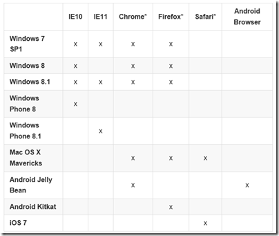
Much of WinJS will run on any modern browser but the browser support matrix has a number of gaps:

image

You can also see what runs where from this status table.

But what is WinJS? Note that it comes from the Windows apps team, not the web development team at Microsoft. WinJS was designed to enable app development for Windows 8 “Metro” (also known as the Windows Runtime) using JavaScript, CSS and HTML. Back in 2010, when Microsoft signalled the end of Silverlight and the rise of HTML 5 for browser-based applications, early versions of WinJS would already have been in preparation. Using WinJS you can share code across a Windows 8 app, web apps, and via an app packager like Apache Cordova, in apps for Android and iOS as well.

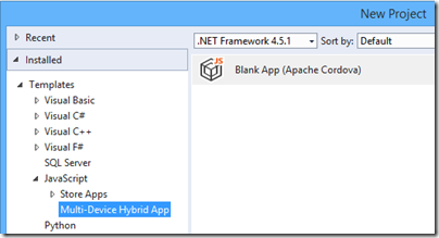
Note that Cordova is now integrated into Visual Studio, using the catchy name Multi-Device Hybrid App:

image

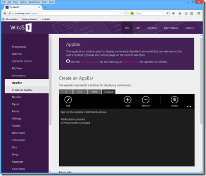
If you want to know what kind of controls and components are on offer in WinJS, you can find out using the excellent demo site here. This is Firefox:

image

Quick summary then: WinJS lets you build apps that look like Windows 8 Store apps, but which run cross-browser and cross-platform. But who wants to do that?

Maybe Microsoft does. The messaging from the company, especially since CEO Satya Nadella took over from Windows guy Steve Ballmer, is “any device”, provided of course that they hook up to Microsoft’s services. That messaging is intended for developers outside the company too. Check out the current campaign for Microsoft Azure, which says “consume on any device”.

image

This could be a web application, or it could be a client app using Azure Mobile Services or an ASP.NET Web API application to connect to cloud data.

You do not have to use WinJS to consume Microsoft’s services of course. Why would developers want to use the look and feel of a rather unloved app platform, rather than the native look and feel of Android or iOS? That is an excellent question, and in most cases they will not. There could be cases though, for example for internal business apps where users care most about functionality. What is the current stock? What is the lead time? Show me this customer’s order history. A WinJS app might not look right for the platform, but the UI will be touch-friendly, and ease of rollout across the major mobile platforms could trump Apple’s design guidelines.

If you are writing a pure web application, users expectations concerning native look and feel are not so high. The touch-oriented design of WinJS is its main appeal, though other web frameworks like JQuery Mobile also offer this. The “Metro” design language is distinctive, and Microsoft will be making a renewed push for Windows Store apps, or Universal Apps, as part of the new wave of Windows called Windows 9 or “Threshold”. WinJS is the way to build apps for that platform using JavaScript and HTML, with the added bonus of easy porting to a broad range of devices.

This is a hard sell though. I am impressed by the effort Microsoft has put into making WinJS work cross-platform, but will be surprised to see much usage outside Windows Store apps (including Windows Phone). On the other hand, it does help to keep the code honest: this really is HTML and JavaScript, not just a wrapper for Windows Runtime APIs.

Lifetime registration as a Windows Store developer, now from £12

Microsoft has removed some friction from developing for the Windows Store (whether phone or Windows 8) by removing the requirement to pay an annual subscription:

As we continue to execute on the vision to integrate the Windows and Windows Phone developer experiences, we have taken another step by moving to a one-time lifelong Dev Center registration fee.

says Microsoft’s Todd Brix in a post today. He adds that the 600,000 developers already registered are covered, with no additional fee required.

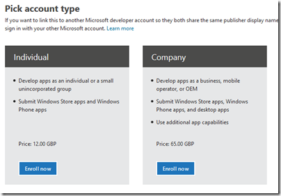
How much is the fee? Brix does not say, and I could not find it quickly, so I started the signup process. I was offered individual registration for just £12.00. A company registration is £65.00.

image

Both fees are of course negligible for a developer, compared to the cost of developing an app that is worth installing. Considering that Microsoft has had problems with junk apps filling its store, you could argue that fees are justifiable as a means of restraining the flow of meaningless or malicious apps.

The counter-argument is that fees deter developers from getting started, and that today’s hobbyist may come up with the next Minecraft. It is better to control quality with a robust checking process before apps are admitted into the store.

I had a quick glance today, and have the impression that Microsoft has made progress in removing the worst offenders, following some agitation at the end of last month.

Microsoft is laying the foundation for another go at its app platform with the launch of Windows 9, about which we will hear more in a couple of weeks time.

Review: Kingston Predator 1TB USB stick, huge capacity but at a price

You can never have too much storage. Cloud storage has solved some problems – for example, it is probably what you now use to show images to a friend or customer – but there are still plenty of cases when you want your stuff with you. Videos, large engineering drawings, backups, virtual hard drives, high resolution audio files; the list goes on.

The advent of tablets and ultrabooks with SSDs in place of hard drives also means that on-board storage has actually reduced, compared to that laptop you used to carry with you.

image

Enter Kingston, with the HyperX Predator 1TB USB 3.0 flash drive (there is also a 512GB version). Open the tin box and there it is, complete with key ring and USB cable.

image

It’s small compared to a hard drive, but large for a USB stick, measuring 72mm x 26.94mm x 21mm. However, the chunky size and zinc alloy case do give you the sense that Kingston means business.

image

The pen does not come with the drive; I have included it in the picture above to give you an idea of the size; it is not really that large. Note too that the zinc alloy sleeve pulls out to protect the the USB connection; it slides open and shut a little too easily for my liking. Still, it is a smart design.

What about the performance? Kingston specifies 240 MB/s read and 160 MB/s write. On my Core i5 PC with USB 3.0 I get that or slightly better copying a file:

image

There are some caveats though. Initially I tried using the supplied USB cable, but the drive did not work properly. If I tried to copy a 1.5GB file the drive dismounted itself and the copy failed. I plugged the drive directly into the USB 3.0 port and it then worked perfectly.

I then tried the drive on a laptop that which has a USB 3.0 port. It worked fine with or without the cable. I am not sure what to conclude from this other than USB can be finicky.

The design of the device means that you may not be able to push the USB connection fully home, or that the device may protrude below the base of your laptop or tablet. In these cases you do need the cable.

At this price I would like to see integrated encryption, though users can use Windows Bitlocker or similar to protect their data if it is sensitive.

Despite these niggles, the device is gorgeous and amazing, in terms of the capacity you can now put in your pocket.

Is it good value? It depends what you pay of course. Right now, this thing costs £679.98 on Amazon.co.uk, supposedly a 42% saving on an RRP of £1,169.99. But you could save some money by getting one of those portable USB 3.0 cases and sticking a 1TB SSD inside; currently a Samsung 1TB SSD costs £285.75 on Amazon as well as boasting better performance: 540 MB/s read and 520 MB/s write, though even USB 3.0 will slow it down a bit.

What you would end up with though is a portable drive that is bulkier and for which a cable is unavoidable. You cannot hang it on a keyring. It is less convenient.

So there it is: if you want a handy USB stick with 1TB capacity now you can have it, but at a price.

Specification

  • USB 3.0 backward compatible with USB 2.0
  • File format: exFAT
  • Speed1 USB 3.0: 240MB/s read and 160MB/s write. USB 2.0: 30MB/s read and 30MB/s write
  • Dimensions without key ring: 72mm x 26.94mm x 21mm