A close look at Word for the iPad. What is included and what is missing?

I have been having a closer look at Word for iPad. This has limited features compared to Word for Windows or Mac, but how limited?

image

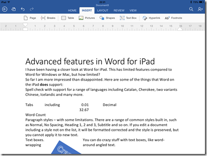
So far I am more impressed than disappointed. Here are some of the things that Word on the iPad does support:

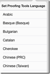
Spell check with support for a range of languages including Catalan, Cherokee, two variants Chinese, Icelandic and many more.

image

Tabs including left, center, right and Decimal

Paragraph styles – with some limitations. There are a range of common styles built in, such as Normal, No Spacing, Heading 1, 2 and 3, Subtitle and so on. If you edit a document including a style not on the list, it will be formatted corrected and the style is preserved, but you cannot apply it to new text.

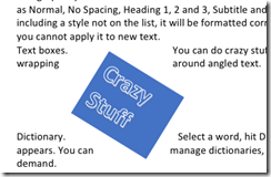
Text boxes. You can do crazy stuff with text boxes, like word-wrapping around angled text.

image

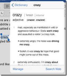
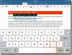
Dictionary. Select a word, hit Define, and a dictionary definition appears. You can manage dictionaries, which seem to be downloaded on demand.

image

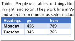
Tables. People use tables for things like formatting minutes: speaker in left column, actions in right, and so on. They work fine in Word on iPad. You can insert a table, type in the cells, and select from numerous styles including invisible gridlines.

image

Track changes. You can review changes, make comments,suggest new text, approve changes made by others, and so on.

image

You can change the direction of text by 90°.

You can edit headers and footers.

You can insert page numbers in a variety of formats.

You can use multiple columns. You can insert page breaks and column breaks.

You can change page orientation from portrait to landscape.

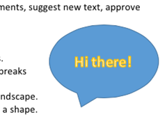
Shapes are supported, and you can type text within a shape.

image

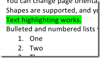
Text highlighting works.

image

Bulleted and numbered lists work as expected

Footnoting works.

Word count is available, with options like whether to include footnotes, plus character count with or without spaces.

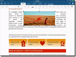
Pictures: you can insert images, resize, stretch and rotate them (though I have not found a crop function) and apply various effects.

Overall, it is impressive, more than just a lightweight word processor.

What’s missing?

So what features are missing, compared to the desktop version? I am sure the list is long, but they may be mostly things you do not use.

One notable missing feature is format support. Desktop Word supports OpenDocument (.odt) and can edit the old binary .doc format as well as the newer .docx (Office Open XML). Word for iPad can only edit .docx. It can view and convert .doc, but cannot even view .odt. Nor can you do clever stuff like importing and editing a PDF. Here are a few more omissions:

  • No thesaurus.
  • No equation editor.
  • No character map for inserting symbols – you have to know the keyboard shortcut.
  • Paragraph formatting is far richer in desktop Word, and you have the ability to create and modify paragraph styles. One thing I find annoying in Word for iPad is the inability to set space above or below a paragraph (let me know if I have missed a feature)
  • Academic features like endnotes, cross-references, index, contents, table of figures, citations.
  • Watermarks
  • Image editing – but you can do this in a separate app on the iPad
  • Captions
  • Macros and Visual Basic for Applications
  • SmartArt
  • WordArt
  • Templates
  • Special characters (you need to know where to find them on the keyboard)
  • Printing – I guess this is more of an iPad problem

Office for iPad versus Office for Surface RT

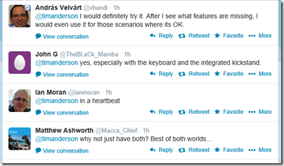
If you have Microsoft’s Surface tablet, would you rather have the equivalent of Office for iPad, touch-friendly but cut-down, or the existing Office for Surface RT? I took a sample of opinion on Twitter and most said they would rather have Office for iPad. This is Office reworked for tablet use, touch friendly in a way that desktop Office will never be.

image

Then again, Office on Surface RT (VBA aside) is more or less full desktop Office and can meet needs where Office for iPad falls short.

If Microsoft is still serious about the “Metro” environment, it will need to do something similar as a Windows Store app. Matching the elegance and functionality of the iPad version will be a challenge.

I typed this on the iPad of course, using a Logitech Bluetooth keyboard. I would not have wanted to do it with the on-screen keyboard alone. However for the final post, I moved it to Windows (via SkyDrive) in order to use Live Writer. Word on the Surface has a Blog template I could have used; another missing feature I guess.

Microsoft has exceeded expectations. This would sell well in the App Store, but you need an Office 365 subscription, making it either a significant annual cost, or a nice free bonus for those using Office 365 anyway, depending on how you look at it. The real target seems to be business users, for whom Office 365 plus Apple iPad (which they were using anyway) is now an attractive proposition.
Microsoft CEO Satya Nadella introduces Microsoft Office for iPad, talks up Azure Active Directory and Office 365 development

New Microsoft CEO Satya Nadella has announced Office for iPad at an event in San Francisco. Office General Manager Julie White gave a demo of Word, Excel and Powerpoint on Apple’s tablet.

image

White made a point of the fidelity of Office documents in Microsoft’s app, as opposed to third party viewers.

image

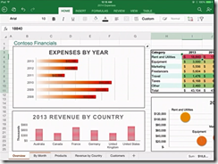
Excel looks good with a special numeric input tool.

image

Office will be available immediately – well, from 11.00 Pacific Time today – and will be free for viewing, but require an Office 365 subscription for editing. I am not clear yet how that works out for someone who wants full Office for iPad, but does not want to use Office 365; perhaps they will have to create an account just for that purpose.

There was also a focus on Office 365 single sign-on from any device. This is Azure Active Directory, which has several key characteristics:

1. It is used by every Office 365 account.

2. It can be synchronised and/or federated with Active Directory on-premise. Active Directory handles identity and authentication for a large proportion of businesses, small and large, so this is a big deal.

3. Developers can write apps that use Azure Active Directory for authentication. These can be integrated with SharePoint in Office 365, or hosted on Azure as a separate web destination.

While this is not new, it seems to me significant since new cloud applications can integrate seamlessly with the directory already used by the business.

Microsoft already has some support for this in Visual Studio and elsewhere – check out Cloud Business Apps, for example – but it could do more to surface this and make it easy for developers. Nadella talked about SDK support for iOS and other devices.

Microsoft hardly mentioned Android at the event, even though it has a larger market share than iOS. That may be because of the iPad’s popularity in the enterprise, or does it show reluctance to support the platform of a bitter competitor?

Microsoft is late with Office for iPad; it should perhaps have done this two years ago, but was held back by wanting to keep Office as an exclusive for Windows tablets like Surface, as well as arguments with Apple over whether it should share subscription income (I do not know how that has been resolved).

There was also a brief introduction to the Enterprise Mobility Suite, which builds on existing products including Azure Active Directory, InTune (for device management) and Azure Rights Management to form a complete mobility management suite.

Nadella made a confident performance, Office for iPad looks good.

What is coming up at Build, Microsoft’s developer conference next week? Nadella said that we will hear about innovations in Windows, among other things. Following the difficulties Microsoft has had in marketing Windows 8, this will be watched with interest.

Flash developers fret as Adobe doubles down on PhoneGap


Adobe has announced Experience Manager Apps for Marketers and Developers. This comes in two flavours: Experience Manager Apps is for marketers, and PhoneGap Enterprise is for developers. The announcements are unfortunately sketchy when it comes to details, though Andre Charland’s post has a little more:

  • Better collaboration – With our new PhoneGap Enterprise app, developer team members and business colleagues can view the latest version of apps in production, development and staging

  • App editing capabilities – Non-developer colleagues can edit and improve the app experience using a simple drag-and-drop interface from the new Adobe Experience Manager apps; this way developers can focus on building new features, not on making updates.

  • Analytics & optimization – Teams can immediately start measuring app performance with Adobe Analytics; we’re also planning to incorporate functionality so teams can start A/B testing their way to higher app engagement and monetization using Adobe Target.

  • Push notifications – Engage your customers on-the-go with push notifications from Adobe Campaign

  • Support and training – PhoneGap Enterprise comes with SLA and support so customers can be rest assured that Adobe PhoneGap has their back.

Head over to the PhoneGap Enterprise site and you get nothing more than a “Get in touch” button.

image

Announcement-ware then. Still, enough to rile Flash and AIR (Adobe Integrated Runtime) developers who feel that Adobe is abandoning a better technology for app development. Despite the absence of the Flash runtime on Apple iOS, you can still build mobile apps by compiling the code with a native wrapper.

Adobe… this whole thread should make you realize what an awesome platform and die hard fans you have in AIR. Even after all that crap you pulled with screwing over Flex developers, mitigating Flash to just games, retreating it from the web, killing AS4 and god knows what else you’ve done to try to kill the community’s spirit. WE STILL WANT AIR!

says one frustrated developer.

Gary Paluk has also posted on the subject:

I have invested 13 years of my own development career in Adobe products and evangelized the technology over that time. Your users can see that there is a perfectly good technology that does more than the new HTML5 offerings and they are evidently frustrated that you are not supporting developers that do not understand why they are being forced to retrain to use inferior technologies.

Has Adobe in fact abandoned Flash and AIR? Not quite; but as this detailed roadmap shows, plans for a next-generation Flash player have been abandoned and Adobe is now focused on “web-based virtual machines,” meaning I guess JavaScript and other browser technologies:

Adobe will focus its future Flash Player development on top of the existing Flash Player architecture and virtual machine, and not on a completely new virtual machine and architecture (Flash Player "Next") as was previously planned. At the same time, Adobe plans to continue its next-generation virtual machine and language work as part of the larger web community doing such work on web-based virtual machines.

From my perspective, Adobe seemed to mostly lose interest in the developer community after its November 2011 shift to digital marketing, other than in an “apps for marketing” context. Its design tools on the other hand go from strength to strength, and the transition to subscription in the form of Creative Cloud has been brilliantly executed.

Entering Microsoft’s XAML labyrinth: is it worth it?

I spent some time at the weekend working on a Bridge game for the Windows Store. I am writing it in XAML and C#. The UI is hardly demanding, given that Bridge is a card game, but it has made me take a fresh look at XAML, the markup language for a Windows Store App user interface (unless you use HTML and JavaScript). XAML is also used in Windows Presentation Foundation and in Silverlight/Windows Phone.

As part of the game, the user selects a “bid” which consists of a number from 1 to 7 and a suit of cards (or double, redouble or pass). Most bridge games show this as a grid though functionally it is like a combo-box (choosing from a pre-defined range of options).

Naturally I looked for the easiest way to accomplish this. The solution I came up with was to nest TextBlock controls in Border controls in Grid cells. Then I wrote C# code that detects which cell the user taps and updates the background of the selected Border accordingly.

image

I have in mind to replace the text with graphics and make the numbers a bit smarter at some future date. My solution works fine; here it is at runtime:

image

At the weekend I happened to be chatting with a developer more expert in XAML than myself, who told me I had done it wrong. In XAML everything should be in Style definitions. I should use a ListView and design it in Blend.

Well, I knew that I had somewhat subverted how XAML is meant to work, so I sat down to investigate this different approach. A ListView looks nothing like what I want out of the box.

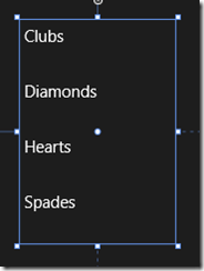
image

However, with the magic of XAML it can be transformed. I made the ListView horizontal by defining an ItemsPanelTemplate in Application.Resources:

<ItemsPanelTemplate x:Key="ItemsPanelTemplate1">
  <StackPanel Orientation="Horizontal"/>
</ItemsPanelTemplate>

and adding 

ItemsPanel="{StaticResource ItemsPanelTemplate1}

as an attribute of the ListView.

Then I added an ItemTemplate to draw the kind of block that I wanted:

<ListView.ItemTemplate>
    <DataTemplate>
        <Border BorderThickness="1" Height="130" Width="130" BorderBrush="Black">
            <TextBlock FontSize="24" FontWeight="Bold" HorizontalAlignment="Center" VerticalAlignment="Center"
                       Text="{Binding Name}" Foreground="Black" />
        </Border>
    </DataTemplate>
</ListView.ItemTemplate>

Note that I am using a DataTemplate because the ListView is bound to an ObservableCollection in the proper XAML way.

At this point I am close to what I want – never mind that the numbers are missing, they can easily be added with a second ListView:

image

However I do not want that little tick mark appearing, the selected background colour is not to my taste, and the spacing of the items is wrong. How do I fix that?

My search led me to this post which explains a far-from-obvious series of steps you can take in Blend. The steps did not quite work for me but got me on track to create a new Style resource which I called ListViewItemStyleNoGlyph and which lets me adjust the margin and also a previously hidden property called SelectionCheckMarkVisualEnabled. Blend generated a substantial block of code for this:

image

This has helped and now my ListView looks like this:

image

Well, it is nearly there and I can see that with a bit more effort I can get what I want. Even so, I am beginning to wonder whether my initial approach, in which I understood all the code, had advantages over this exploration into the labyrinth.

Is XAML well loved out there? I came across this post by Paul Stovell from a couple of years back which seems relevant. “I’ve lived and breathed the technology for the last six years”, he says, but writes:

What’s disappointing is that WPF started out quite positively during its time. Concepts like dependency properties, styles, templates, and the focus on data binding felt quite revolutionary when Avalon was announced.

Sadly, these good ideas, when put into practice, didn’t have great implementations. Dependency properties are terribly verbose, and could have done with some decent language support. Styles and templates were also verbose, and far more limited than CSS (when WPF shipped I imagined there would be a thousand websites offering high quality WPF themes, just like there are for HTML themes; but there aren’t, because it is hard).

Data binding in WPF generally Just Works, except when it doesn’t. Implementing INotifyPropertyChanged still takes way too much code. Data context is a great concept, except it totally breaks when dealing with items like ContextMenus. ICommand was built to serve two masters; the WPF team who favored routed commands, and the Blend team who favored the command pattern, and ended up being a bad implementation for both.

Stovell mentions the verbosity of XAML, and that it is hard, both of which sound right to me. He contrasts the way ASP.NET has evolved, with ASP.NET MVC a great improvement on web forms. Read the full post for more detail.

It seems to me that XAML does offer much that is wonderful: flexibility, capability, and the ability to separate presentation from data. At the same time, neither XAML nor Blend are intuitive tools for developers; they may make more sense to designers, but it seems to me that removing a tick mark from a ListViewItem should be more straightforward. Perhaps it is, in which case there is a failure of documentation or tooling rather than functionality, but it makes little difference to the developer.

How to crash your Windows Store XAML app

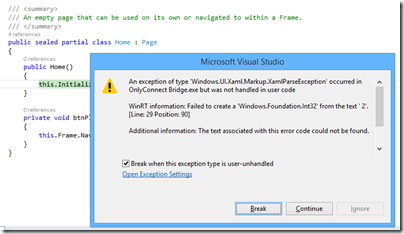
I am working on a Windows Store app, of which more soon. I am writing the app in XAML and C#. I was tweaking the page design when I hit a problem. Everything was fine in the designer in Visual Studio, but running the app raised an exception:

image

WinRT information: Failed to create a ‘Windows.Foundation.Int32’ from the text ‘ 2’.

along with the ever-helpful:

Additional information: The text associated with this error code could not be found.

The annoying this about this error is that debugging is not that easy. The exception is in Framework code, not your own code, and Microsoft does not supply the source. Once again, everything is fine in the designer and there are no compiler errors.

Puzzling. I resorted to undoing bits of my changes until I found what triggered the problem.

This was it. In the XAML, I had somehow typed a leading space before a number:

Grid.Row=" 2"

The designer parses this OK (it would be better if it did not) but the runtime does not like it.

Actually, I know why this happens. If you are typing in the XAML code editor (which I find myself doing a lot), then auto completion inserts the blank space for you:

image

I wish all bugs were this easy to solve, though I regard it as a bug in the Visual Studio editor. Posted here mainly in case others hit this problem; but I also observe that Windows Store development still seems less solid in Visual Studio than the tools for desktop or web apps.

Other problems I have hit include the visual designer changing to read-only of its own accord; and a highly irritating issue where the editor for a XAML code-behind class sometimes forgets the existence of all the controls you have declared in XAML, covering your valid code with red squiggly lines and reporting numerous errors, which disappear as soon as you compile. Once this starts happening, the problem persists for the rest of the editing session.

It is not all bad. I am pleased with the way I have been able to put together a touch-friendly game UI relatively easily. Now comes the fun part: writing the logic for the AI (Artificial Intelligence).

Amazon AWS and the continuing trend towards cloud services. Desktops next?

It was a lightbulb moment. The problem:  how to migrate a document store from one Office 365 (hosted SharePoint) instance to another. Copy it all out and copy it back in, obviously, but that is painful over ADSL (which is all I had at my disposal) since the “asynchronous” part of ADSL means slow uploads; and download from Office 365 was not that fast either.

Solution: use an Azure virtual machine. VM hosted by Microsoft, SharePoint hosted by Microsoft, result – a fast connection between the two. I ran up the VM in a few minutes using Microsoft’s nice Azure portal, used Remote Desktop to connect, and copied the documents out and back in no time.

There is a general point here. If you are contemplating cloud-hosted VDI (Virtual Desktop Infrastructure), there is huge advantage in having the server applications and data close to the VDI instances. All you then need is a connection good enough to work on that remote desktop, which is relatively lightweight. If the cloud vendor is doing its job, the internal connections in that cloud should be fast. In addition, from the client’s perspective, most of the data is download, transferring the screen image to the client, rather than upload, transmitting mouse and keyboard interactions, so that is a good use case for ADSL.

The further implication is that the more you use cloud services, the more attractive hosted desktops become. Desktops are expensive to manage, which is why I would expect a service like Amazon Workspaces, hosted Windows desktops as a service, to find a ready market – even at $600 per year for a desktop with Office Professional 2010 preinstalled, or $420 per year if you install and license Office yourself, or use Open Office or some other alternative.

Workspaces are currently in limited preview, which means a closed beta, but there are hints that a public beta is coming soon.

Adopting this kind of setup means a massive dependency on Amazon of course, which is a concern if you worry about that kind of thing (and I think you should); but how much business is now dependent on one of the major cloud providers (I tend to think of Amazon, Microsoft and Google as the top three) already?

Thinking back to my Office 365 example, it also seems to me that Microsoft will make a serious play for cloud VDI in the not too distant future, since it makes so much sense. The problem for Microsoft is further cannibalisation of its on-premise business, and further disruption for Microsoft partners, but if the alternative is giving away business to Amazon, it has little choice.

I was at an Amazon Web Services briefing today and asked whether we might see an Office 365-like package from AWS in future. Unlikely, I was told; but many customers do use AWS for hosting the likes of Exchange and SharePoint.

The really clever thing for Amazon would be a package that looked like Office 365, but using either open source or internally developed applications that removed the need to pay license fees to Microsoft.

What else is new from AWS? I have no exclusives to share, since Amazon has a policy of never pre-announcing new features or services. There were a few statistics, one of which is that Redshift, hosted data warehousing, is Amazon’s fastest-growing product.

Amazon also talked about Kinesis, which lets you analyse streams of data in a 24-hour window. For example, if you wanted to analyse the output from thousands of sensors (say,weather) but do not need to store the data, you can use Kinesis. If you do want to store the data, you can integrate with Redshift or DynamoDb, two of Amazon’s database services.

The company also talked up its Relational Database Service (RDS), where you purchase a managed database service which can currently be MySQL, PostgreSQL, Oracle or Microsoft SQL Server. Amazon handles all the infrastructure management so you only need worry about your data and applications.

RSD pricing ranges start from $25 a month for MySQL, to $514 a month for SQL Server Standard (which is actually more expensive than Oracle at $223 per month for the same instance size). Higher capacity instances cost more of course. SQL Server Web edition comes down below Oracle at $194 per month, but I was surprised to see how high the SQL Server costs are. Note that these prices include all the CALs (Client Access Licenses). The prices are actually per hour, eg $0.715 for SQL Server Standard, so you could save money if your business can turn off or reduce the service out of working hours, for example.

How much premium does Amazon charge for its managed RDS versus what you would pay for equivalent capacity in a VM that you manage yourself? I asked this question but did not receive a meaningful reply; you need to do your own homework.

My reflection on this is that just as supermarkets make more money from pre-packaged ready meals than from basic groceries, so too the cloud providers can profit by bundling management and applications into their products rather than offering only basic infrastructure services. You still have the choice; but database admin costs money too.

Finally, we took a quick look at AppStream, which is a proprietary protocol, SDK and service for multimedia applications. You write applications such as games that render video on the server and stream it efficiently to the client, which could be a smartphone or low-power tablet. In this case again, you are taking a total dependency on Amazon to enable your application to run.

If you are interested in AWS, look out for a summit near you. There is one in London on 30th April. Or go to the Reinvent conference in Las Vegas in November.

My overall reflection is that the momentum behind AWS and its pace of innovation is impressive; yet it also seems to me that rivals like Microsoft and Google are becoming more effective. The cloud computing market is such that there is room for all to grow.

SQL Server 2014 is done: Hekaton, Azure integration

Microsoft has released SQL Server 2014 to manufacturing (an odd phrase in these diskless days) but which signifies that it is code complete for the initial release. General availability is April 1st.

What do you do if hardware trends enable you to stuff vast amounts of RAM into your server, along with many CPU cores? The answer is that you optimize applications to work mostly in RAM, with disk important as a persistence layer. This contrasts to the approach when you have large amounts of disk space and little RAM, when you focus on loading only as much data into memory as you absolutely need.

The implications for a database server are profound. Instead of a logic that goes something like “read from disk, do something, write to disk” you can address the data directly; it is just a memory pointer.

Now combine that with stored procedures compiled to native code. Performance leaps up, and by much more than you get simply by caching data in RAM, or using fast SSD storage, but still using the old disk-based approach in the database engine.

This is the reasoning behind “Hekaton”, properly known as In-Memory OLTP (online transaction processing), which is a new in-memory database engine that comes with SQL Server 2014.

It is fully integrated. You just have to add a filegroup to a a SQL Server database with the keyword CONTAINS MEMORY_OPTIMIZED_DATA and then create a table with the keyword WITH (MEMORY_OPTIMIZED=ON). And for the stored procedures, use WITH NATIVE_COMPILATION.

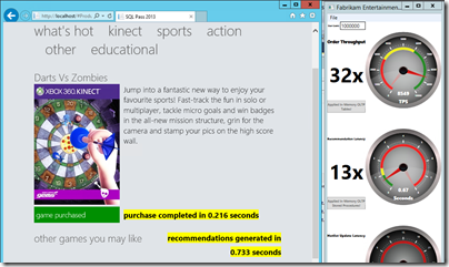
The speed-up is as great as you would expect. I have seen demonstrations of 30x or more performance increases, like this one in a demo based on one from the SQL Pass conference, but which I did for myself in one of Microsoft’s “Hands On Labs”:

image

In another demo, on an Azure VM, I got a speed up of 7x. Only seven times faster! Still, hard to complain about those sorts of numbers.

Unfortunately, in-memory OLTP is spoilt by some rather severe limitations in this release. The first problem is that a combination of the need to support native compilation of stored procedures, and other limitations, means that only a subset of T-SQL (the query and management language of SQL Server) is supported. You can see the list of what is not supported here; and it is depressing reading, with lots of keywords that you likely do use at the moment; even IDENTITY is on the list of what does not work.

Another issue is that the ability of In-Memory OLTP to take advantage of hardware is not as extensive as you might hope. Lead program manager Kevin Liu told me at a recent press workshop that the team recommends restricting total data size to 256GB, and that the recommended number of CPU sockets is two. You can get servers today with much more memory and more sockets. It gets complicated though: in a multi-socket server memory has processor affinity and there is a thing called NUMA (Non-Uniform Nemory Access) that describes the way memory is shared between processors.

According to Liu, Microsoft expects to lift these limitations in future releases, as well as improving T-SQL support, but things like this remind you that it is a version one release.

What else is in SQL Server 2014? There is some neat Azure integration, including a managed backup tool that is almost one click to have your data backed up to Azure storage; a brilliant facility for small businesses. You can also use Azure for high availability, creating always-on replicas in Azure VMs.

Data warehouse users will like the new clustered columnstore indexes, which allow you do use a column-oriented table structure for much faster processing of typical report and analysis queries. Columnstore indexes first appeared in SQL Server 2012 but were not updateable. Now they are.

SQL Server is well liked, licensing hassles aside; and even on licensing, Microsoft can always point at Oracle and claim, rightly, to be cheaper and less complex. It has earned a reputation for solid performance. SQL Server 2014 looks as good as ever, even if the management tools now look rather dated – the shell for SQL Server Management Studio uses an old version of Visual Studio, which is one of the reasons. I also suspect the SQL Server team lacks a dialog designer, but doubt that the average database admin cares one jot.

That said, it is difficult to describe this as a must-have upgrade, unless you can make good use of “Hekaton” in-memory OLTP. The porting effort will be worth it presuming you can get it to work. One of the good fits for the technology is managing web app session data, or, as in the example above, rapid processing to display recommendations or customisations on a web site.

I can imaging though that many users will look at Hekaton and decide that it is too much work or too immature for immediate use. What is left for them, apart from some nice Azure integration?

Not a huge amount, it seems to me, making this to my mind a transitional release.

Are you planning to upgrade? I would be interested to know your reasons why or why not.

Neil Young’s Pono: an advance in digital music?

Thanks to the just-launched Kickstarter project, there are now firm technical details for Neil Young’s curious Pono project, which aims to solve what the musician sees as the loss of audio quality caused by the transition to digital music:

“Pono” is Hawaiian for righteous. What righteous means to our founder Neil Young is honoring the artist’s intention, and the soul of music. That’s why he’s been on a quest, for a few years now, to revive the magic that has been squeezed out of digital music. In the process of making music more convenient – easier to download, and more portable – we have sacrificed the emotional impact that only higher quality music can deliver.

There is a lot about emotion and the spirit of music in the pitch; but ultimately while music is art, audio is technology. What is the technology in Pono and can it deliver something markedly better than we have already?

Pono has several components. The first is a portable player:

  • 64GB on-board storage and 64GB SD card
  • 8 hour rechargeable battery
  • Software for PC and Mac to transfer songs
  • Two stereo output jack sockets, one for headphones, and one a line-out for connection to a home hi-fi system
  • Ability to play FLAC, ALAC, WAV, MP3, AIFF and AAC at resolutions (at least for FLAC) of up to 192Khz/24-bit. 

The Pono player will cost around $400.00, though early Kickstarter backers can pre-order for $200 (all sold now) or $300.00.

There will also be a Pono music store “supported by all major labels and their growing catalogues of high quality digital music”. The record companies will set their own prices, but high-res (24/96 and higher) music is expected to cost between $14.99 and $24.99 per album. Individual songs will also be available.

Here is the key question: will you hear the difference. Here is what the pitch says:

Yes. We are confident that you will hear the difference. We’re even more confident you will feel it. Everyone who’s ever heard PonoMusic will tell you that the difference is surprising and dramatic. Especially when they listen to music that they know well – their favorite music. They’re amazed by how much better the music sounds – and astonished at how much detail they didn’t realize was missing compared to the original. They tell us that not only do they hear the difference; they feel it in their body, in their soul.

Count me sceptical. There are two ways in which Pono can sound better than what you use at the moment to play music – which for many of us is a smartphone, a CD ripped to a hard drive and played from a PC, Mac or iPod, or streamed to a device like a Sonos or Squeezebox.

One is though superior electronics. Pono is designed by Ayre Acoustics, a high end audio company, and you can expect a Pono to sound good; but there is no reason to think it will sound better than many other DACs and pre-amplifiers available today. As a dedicated audio device it should sound better than the average smartphone; but Apple for one has always cared about audio quality so I would not count on a dramatic improvement.

The second is through higher resolution sources. This is a controversial area, and the Kickstarter pitch is misleading:

On the “low end” of higher resolution music (CD lossless, 16 bit/44.1kHz), PonoMusic files have about 6 times more musical information than a typical mp3. With ultra-high quality resolution recordings (24 bit/192kHz), the difference between a PonoMusic digital file and an mp3 is about 30 times more data from which your player reconstructs the “song”.

We need to examine what is meant by “musical information” in the above. The Pono blurb makes the assumption that more data must mean better sound. However, just because a CD “lossless” file is six times the size of an MP3 file does not mean it sounds six times better. Listening tests show that by the time you get to say 320kbps MP3, most people find it hard to hear the difference, because the lossy formats like MP3 and AAC are designed to discard data that we cannot hear.

What about 24/96 or 24/192 versus CD format (16/44)? Advocates will tell you that they hear a big difference, but the science of this is obscure; see 24/192 downloads and why they make no sense for an explanation, complete with accompanying videos that spell this out. Most listening tests that I am aware of have failed to detect an audible difference from resolutions above CD format. Even so, audio is subtle and complex enough that it would be brave to say there is never any audible improvement above 16/44; but if it exists, it is subtle and not the obvious difference that the Pono folk claim.

The irritation here is that digital music often does sound bad, but not because of limitations in the audio format. Rather, it is the modern engineering trend of whacking up the loudness so that the dynamic range and sense of space in the music is lost – which seems close to what Neil Young is complaining about. The solution to this is not primarily in high resolution formats, but in doing a better job in mastering.

Why then do so many well known names in music praise the Pono sound so highly?

While I would like to think that this is because of a technical breakthough, I suspect it is more to do with comparing excellent mastering from a good source to a typical over-loud CD or MP3 file, than anything revolutionary in Pono itself. If you have a high-resolution track that sounds great, try downsampling it to 16/44 and comparing it to that, before concluding that it is the format itself that provides the superior sound.

The highest distortion in the audio chain is in the transducers, speakers and microphones, and not in the digital storage, conversion and amplification.

The Pono Kickstarter has already raised $550,000 of its $800,000 goal which looks promising. Even if the high resolution aspect makes little sense, it is likely that the Pono music store will offer some great sounding digital music so the project will not be a complete dead loss.

That said, who is going to want Pono when a tiny music player, or just using your smartphone, is so much more convenient? Only a dedicated few. This, combined with the lack of any real technical breakthrough, means that Pono will likely stumble in the market, despite its good intentions.

Within the crazy audiophile world we are also going to hear voices saying, “you should have used DSD”, a alternative way of encoding high-resolution audio, as found in SACD disks.

Running WordPress on Windows Azure

I am investigating hosting this site on Windows Azure, partly as a learning exercise, and possibly to enable easier scaling.

I discovered that any web site short of Standard is worthless other than for experimentation and prototyping. I set up a Small Standard Web Site (£48 per month). But what database? I recalled that you can run WordPress with SQL Server and tried using a 1GB SQL Server Web Edition hosted on Azure (£6.35 per month).

In order to use this, I used the Brandoo WordPress configuration which is set up for SQL Server. I later discovered that it uses the WP Db Abstraction plug-in which according to its home page has not been updated for two years. The installation worked, but some plug-ins reported database errors. I imported some posts and found that search was not working; all searches failed with nothing found.

My conclusion is that running WordPress with SQL Server is unwise unless you have no choice. I looked for another solution.

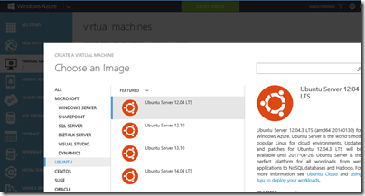
Azure has a Web Site template which uses WordPress and a MySQL database hosted by ClearDB. I would rather not involve another hosting company, so considered other options. One is to run a VM on Azure and to install MySQL on it. If you are doing that, you might as well put WordPress on the same VM at least until the traffic justifies scaling out. So I have created a new Medium Linux VM – two virtual cores, 3.5GB RAM – at £57 per month, with Ubuntu, and installed the LAMP stack and WordPress on that. The cost is similar to the Windows/SQL Server setup, but the VM is a higher specification, since a Small Web Site is 1 virtual core and 1.75GB RAM. You also get full access to the VM, as opposed to the limited access that a Web Site offers. The installation is a bit more effort but performance is better and it looks like this might work.

image

Fun with amplifiers: classic Naim versus modern Yamaha integrated

Every year in an English country hotel near Melton Mowbray a strange but endearing event takes place.

Called variously the HiFi Wigwam Show (after the forum that runs it) or the Scalford HiFi Show (after the hotel where it takes place), this is a show where most of the exhibitors are enthusiasts rather than dealers, and the kit on show includes much that is old, unavailable or home-made – like these stacked Quad 57s from the Sixties.

image

I turned up at Scalford with a simple experiment in mind. Take a classic pre-power amplifier from thirty years ago and compare it to a modern, budget, integrated amplifier. What kind of differences will be heard?

image

The classic amplifier is a Naim 32.5 preamp powered by a Hi-Cap power supply, and a 250 power amplifier. Price back in 1984 in the region of £3500. The Naim was serviced around five years ago to replace old or failing electrolytic and tantalum capacitors.

The integrated is a Yamaha AS500 80w+80w amplifier currently on sale for around £230.

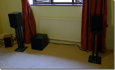
The source is a Logitech Media Server (Squeezebox Server) with a Squeezebox Touch modified to work with high resolution audio up to 24/192, and a Teac UD-H01 DAC. Speakers were Quad 11L, occasionally substituted with Linn Kans for a traditional Linn/Naim combination. A BK Electronics sub-woofer was on at a low level to supplement the bass.

image

A QED MA19 switchbox was used to switch instantly between the two amplifiers. Naim NAC A4 cable was used throughout.

Disclaimer: this was not intended as a scientific investigation. Level matching was done by ear, and there were several aspects of the setup that were sub-optimal. The system was in a small hotel bedroom (as you can see by the headrest which forms the backdrop to the system) and thrown together quickly.

Still, the Naim amplifier is both highly regarded by many audiophiles, and also considered somewhat coloured, this failing more than mitigated by its pace and drive. The Yamaha won awards as a good budget amplifier but is not really anything special; however it has the benefit of modern electronics. These two amplifiers are very different both in age and (you would think) character.

A benefit of the setup was that both amplifiers were always on. Unless you knew the position of the switches and how they were wired, you could not tell which was playing. It was irresistible; when visitors asked which was playing I switched between them and said, you tell me.

Again, this was not science, and I have no tally of the results. Some visitors confidently identified the Naim and were correct, and an approximately equal number were incorrect. Some said they simply could not hear a difference, and two or three times I had to prove that the switchbox was working by twiddling the controls. A small boy who probably had the best hearing of all the visitors declared that there was no difference.

Note that I did reveal the identity of the amplifiers at regular intervals, so listeners typically listened sighted after listening blind.

Of those who expressed a preference, the Yamaha and Naim were each preferred equally often. Some said the Yamaha was slightly brighter (I agree with this).

There were two or three who expressed a strong preference for the Naim, but the consensus view was that the amplifiers sounded more alike than had been expected.

The sound was also pretty good. “I would be happy with either” was a common remark. I would have preferred to use high-end speakers, but the Quads proved delightfully transparent. Most visitors who heard both preferred the Quads to the Kans, which sounded thin and boxy in comparison, though I do wonder if after thirty years the crossover electronics in the Kans may need attention. It was easy to hear the difference between high quality and low quality sources. I used some of the high-resolution files which Linn kindly gave away as samples for Christmas 2013, along with other material.

A few reactions:

Tony L: The most amusing room for me was the Naim 32.5 / HiCap / 250 blind-test vs. the Yamaha AS500. That was great fun, and yes, I picked the AS500 as better. Twice. As did another ex-32.5/Hicap/250 owning friend. Ok it was through a nice easy to drive pair of Quad 11Ls, but you’d be amazed by how close they sounded!

YNWOAN: I heard the Yamaha/Naim demo and had no difficulty hearing a difference between the two with the Yamaha sounding rather ‘thin’ – even at the low levels used.

Pete the Feet: How cruel can a man be? Pitching a recently serviced Naim 32.5, Hicap and NAP250 against a paltry Yamaha £250 integrated. Not much difference but the Yamaha had the edge.

Some felt that the Naim was compromised by the stacking of the power supply and pre-amp on the power amp. There was no hum and I am sceptical of the difference moving them apart, or using acoustic tables, might have made; but of course it is possible. Another interesting thing to test would be the impact of the switchbox itself, though again I would be surprised if this is significant.

How much should you spend on an amplifier? Should all competent amplifiers sound the same? These are questions that interest me. I set up this experiment with no particular expectations, but the experience does make me wonder whether we worry too much about amplification, given that other parts of the audio chain introduce far more distortion (particularly transducers: microphones and loudspeakers).

A more rigorous experiment than mine came to similar conclusions:

How can it be possible that a basic system with such a price difference against the  reference” one, poorly placed, using the cheapest signal cables found, couldn’t be distinguished from the more expensive one?

And, most of it all, how come the cheap system was chosen by so many people as the best sounding of the two?

Shouldn’t the differences be so evident that it’d be a child’s game to pick the best?

Well, we think that each can reach to its own conclusion…

One further comment though. I love that Naim amplifier, and do not personally find something like the AS500 a satisfactory replacement, despite the convenience of a remote control. Is it just that the classic retro looks, high quality workmanship and solid construction convince my brain into hearing more convincing music reproduction, provided I know that it is playing? Or are there audio subtleties that cannot easily be recognised by quick switching?

Unfortunately the audio industry has such fear of blind testing that these questions are not investigated as often or as thoroughly as some of us would like.