Review: Turtle Beach z300 headset. Super flexible, shame about the sound

The Turtle Beach Z300 is a super flexible gaming headset, with wired and wireless connections, Dolby 7.1 virtual surround sound, and extra features like switchable dynamic range compression. It is primarily for PC gaming, but also works with Mac (no Dolby surround) and with any Bluetooth-compatible device – which means almost any smartphone or tablet. You can also use the wire to plug it into any device with a 3.5mm audio jack.

image

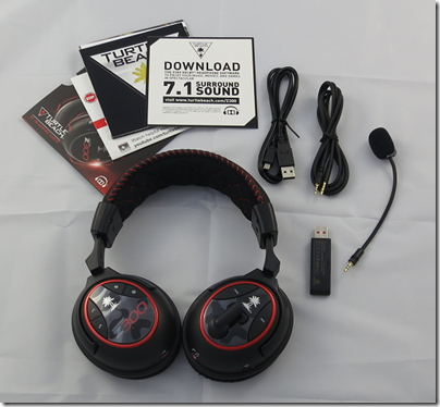
In the box you get the headset, detachable microphone, USB cable, jack cable, USB transceiver, and some documents including a note about having to download the Dolby 7.1 drivers. I still recommend downloading the online manual, which is more detailed than anything in the box.

image

A few more details on the three ways to connect:

Wireless via a USB transceiver. This is the preferred method for a PC. The USB transceiver is pre-paired and indicates via an LED whether or not the headset is connected.

Traditional wire. A jack cable is supplied which connects to the left earcup and has a standard four-way 3.5mm jack on the other end, suitable for a phone or tablet. In wired mode you still need to charge the headset and have it powered on.

Bluetooth. You can pair with up to two devices. The right earcup has Bluetooth volume controls, and a Bluetooth button for answering, rejecting and ending calls.

The actual headset seems sturdily made and features a fabric-covered headband and earpads. The material feels slightly coarse at first, and the earcups are slightly on the small side, but in practice I found the comfort reasonable.

The microphone is on a flexible boom and is detachable. You can also swing it up above the left earcup to get it out of the way.

You charge the Z300 via a mini USB port on the right earcup, which annoyingly is the old type, not the slightly smaller one now found on most phones and tablets. A cable is supplied, though it is too short to reach from the floor to your headset if you are wearing it, and in my case too short even to reach from the front panel of my PC. You might want to get a longer cable if you expect to charge while wearing. Play time is specified at 15 hours.

An annoyance: there is no indication of remaining charge.

How about the other controls? There are several:

Power on/off on the left earcup and easy to find by feel. The headset automatically powers off after 5 minutes of inactivity.

Master volume on left earcup.

Mic monitor volume on left earcup. This controls how much sound from the mic is fed back to your. It does not affect the volume heard on the other side.

Tone on left earcup: cycles through 4 “game modes”. These are Flat, Bass boost, Treble boost, and Bass and Treble boost. I generally used the Flat mode for this review.

Dynamic Range Compression on left earcup: raises the volume of quiet sounds. The effect seems minimal to me.

Bluetooth controls on right earcup: as mentioned above.

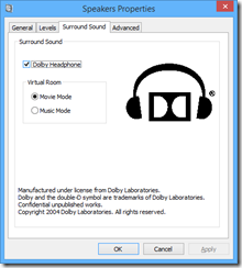
If you use the USB transceiver and a Windows PC you can insteall a Dolby 7.1 driver. Note: these are stereo headphones, but when used with this driver they support Dolby’s virtual surround system. You enable this by going into the Windows sound properties dialog (eg right-click the speaker icon and choose Playback Devices), then showing the properties dialog for the Turtle Beach speakers. A surround sound tab then lets you enable “Dolby Headphone”. You can also choose between two modes: Music or Movie.

image

Enabling Dolby Headphone makes a substantial difference to the sound. It is distinctly louder, and the sound seems to fill out more. On games with true surround sound, the virtual sound should mean that you get spatial clues about the source of an explosion or footstep, for example, though you need to make sure the game is set to output in surround sound.

I tried this and reckon it works a bit. It is not as good as a headset I tried that really did have multiple speakers. My big gripe though is that if you enable Dolby Headphone, it messes up true stereo, for example on music. You no longer hear the mix as intended.

This would not matter too much if it were easy to switch Dolby Headphone on and off, but it is a hassle to go into Windows sound controls every time. I would like to see more effort go into usability.

How about the sound quality? Here is my second big gripe about this headset. The sound is not great, with anaemic bass and a nothing special in the mid-range or treble. For gaming it is not too bad, and I did find the audio atmospheric if you can live without much bass thunder, but for music they are not good enough.

The microphone quality is fine. I tried the headset with Dragon Dictate, just to check the quality, and got high accuracy of transcription which is a good sign.

In summary, the flexibility is exceptional, the build quality is fine, but the sound is lacking. Personally I would not use these as my main headset because I do both gaming and music listening; but if your main use is gaming they would be OK.

Price is around $170 or £170 (better value in the USA it seems).

Privacy, Google Now, Scroogled, and the connected world

2013 saw the launch of Google Now, a service which aspires to alert you to information you care about at just the right time. Rather than mechanical reminders of events 15 minutes before start time, Google Now promises to take into account location, when you are likely to have to leave to arrive where you want to be, and personal preferences. Much of its intelligence is inferred from what Google knows about you through your browsing patterns, searches, location, social media connections and interactions, and (following Google’s acquisition of Nest, which makes home monitoring kit) who knows what other data that might be gathered.

It is obvious that users are being invited to make a deal. Broadly, the offer is that if you hand over as much of your personal data to Google as you can bear, then in return you will get services that will make your life easier. The price you pay, loss of privacy aside, is more targeted advertising.

There could be other hidden costs. Insurance is one that intrigues me. If insurance companies know everything about you, they may be able to predict more accurately what bad things are likely to happen to you and make insuring against them prohibitively expensive.

Another issue is that the more you use Google Now, the more benefit there is in using Google services versus their competitors. This is another example of the winner-takes-all effect which is commonplace in computing, though it is a different mechanism. It is similar to the competitive advantage Google has already won in search: it has more data, therefore it can more easily refine and personalise search results, therefore it gets more data. However this advantage is now extended to calendar, smartphone, social media, online shopping and other functions. I would expect more future debate on whether it is fair for one company to hold all these data. I have argued before about Google and the case for regulation.

This is all relatively new, and there may be – probably are – other downsides that we have not thought of.

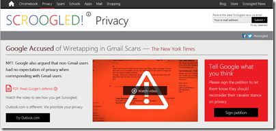
Microsoft in 2013 chose to highlight the privacy risks (among other claimed deficiencies) of engaging with Google through its Scroogled campaign.

image

Some of the concerns raised are valid; but Microsoft is the wrong entity to do this, and the campaign betrays its concern over more mundane risks like losing business: Windows to Android or Chrome OS, Office to Google Docs, and so on. Negative advertising rarely impresses, and I doubt that Scroogled will do much either to promote Microsoft’s services or to disrupt Google. It is also rather an embarrassment.

The red box above suits my theme though. What comes to mind is what in hindsight is one of the most amusing examples of wrong-headed legislation in history. In 1865 the British Parliament passed the first of three Locomotive Acts regulating “road locomotives” or horseless carriages. It limited speed to 4 mph in the country and 2 mph in the town, and required a man carrying a red flag to walk in front of certain types of vehicles.

red-flag

The reason this is so amusing is that having someone walk in front of a motorised vehicle limits the speed of the vehicle to that of the pedestrian, negating its chief benefit.

How could legislators be so stupid? The answer is that they were not stupid and they correctly identified real risks. Motor vehicles can and do cause death and mayhem. They have changed our landscape, in many ways for the worse, and caused untold pollution.

At the same time, the motor vehicle has been a huge advance in civilisation, enabling social interaction, trade and leisure opportunities that we could not now bear to lose. The legislators saw the risks, but had insufficient vision to see the benefits – except that over time, and inevitably, speed limits and other restrictions were relaxed so that motor vehicles were able to deliver the benefits of which they were capable.

My reflection is whether the fears into which the Scroogled campaign attempts to tap are similar to those of the Red Flag legislators. The debate around privacy and data sharing should not be driven by fear, but rather about how to enable the benefits while figuring out what is necessary in terms of regulation. And there is undoubtedly a need for some regulation, just as there is today for motor vehicles – speed limits, safety belts, parking restrictions and all the rest.

Returning for a moment to Microsoft: it seems to me that another risk of its Scroogling efforts is that it positions itself as the red flag rather than the horseless carriage. How is that going to look ten years from now?

Frank comments from Microsoft Product Manager on the Visual Studio 2012 user interface mess. “Secrecy is bad – it lets problems fester”

When Visual Studio 2012 was first previewed, it presented a new IDE style which featured all-caps menus and a mainly monochrome icon set which most developers disliked; the icons were too hard to distinguish. Microsoft has tweaked the design, restored more colour, and I hear fewer complaints today, but that essential design approach remains in Visual Studio 2013.

image

Microsoft product manager Brian Harry has made some frank comments on what happened, in a series of comments beginning here. The comments were made last month, but I had not seen them until today and consider them worth highlighting.

“The implementation of the new UI in 2012 was a mess” says Harry, explaining that the team assigned to create the new look was too small. Worse, it was too secret. “To aggravate this folly, there was a bit of a "cone of secrecy" around the new UI because we didn’t want it "leaking".  Even I didn’t get to see it until months into it,” he writes.

After a strong negative reaction to the preview, “we eventually came to realize we had a crisis on our hands,” says Harry:

Could we have reversed direction, of course.  We debated it vigorously – and for a while, I have to admit, I wasn’t sure.  Ultimately, I concluded that the only way was forward (not that it was actually my decision but I’m just stating my position).  I know some people will disagree with me emphatically and I respect that.  I am in the camp of people who generally like the new UI style.  I know some people think there aren’t any people in that camp but I’ve seen the survey’s and there actually are quite a lot of them.  I do believe there is continued room for improvement and we made some improvements over the past year (the Blue theme, for instance, is very popular – actually Dark is too; Light, not so much).  I’ve gotten completely used to all CAPS menus.  They never bothered me much and now, it just looks normal to me.  Contrast has gotten better.  Icon color has gotten better.  Icon shapes have gotten better.  I’d, personally, still like to see more liberal use of color (Team Explorer is mine and you can see we are a bit more liberal with color than much of VS :))  But all in all, I like the new UI and generally, people internally are happy with it too.

It was a journey and we made mistakes a long the way.  I think the biggest learning was – Don’t kid yourself into thinking you can do a ripple effect feature like that "on the cheap".  Another learning, for me at least, is secrecy is bad – it lets problems fester until they become crises.  Share, share, share.  The feedback is critical to course correction.

Now some observations of my own. My sense is that the flaws in the design stem from over-application of the content-first, “immersive UI” concept which is also seen in Windows 8 “Metro” or “Modern” apps. This concept makes perfect sense if you are browsing the web or reading a document: you want the screen furniture and tools to get out of the way as far as possible. If you are creating content though, the tools become more important. Arguably they become part of the “content”, if you define that as what you are focusing on.

I see the same design error in Microsoft Office 2013, which has a washed-out UI similar in many ways to that in Visual Studio 2012. If you are using Office mainly to consume content, it makes sense, but Office is a content creation tool, and the icons should be more prominent.

I am not sure of the logic behind all-caps menus except that they look vaguely modern and industrial; everybody knows that ALL CAPS is harder to read than lower case or mixed case, so this makes little sense to me.

In neither case is it that big a deal: I can still work productively and you get used to the UI.

Finally, you can tell from Harry’s remarks that the development team at Microsoft went all-out to try and please developers while also satisfying whatever corporate goals (misguided or not) were behind the new style. Kudos to them.

Platform Wars: Google injects Chrome OS into Windows, never mind the poor users

Google announced its Chrome browser in September 2008. Its stated goal was to run web applications better:

What we really needed was not just a browser, but also a modern platform for web pages and applications, and that’s what we set out to build.

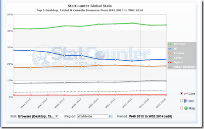
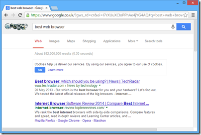
Chrome was a hit, thanks to easy install, fast performance, and Google’s ability to advertise it on its own search pages and web applications (as well as some deals with OEM Windows vendors). Today, Chrome is the most popular browser worldwide, according to figures from Statcounter covering desktop, tablet and console browsers:

image

That’s 43.64% versus 22.76% for Microsoft Internet Explorer in second place and 18.9% for Firefox in third.

Most of those users are on Windows. Statcounter also reports that Windows worldwide has a 79.1% market share worldwide – not quite dead – though Windows 8 has a measly 7.29% share, just behind OS X.

Note that these figures are for usage, not current sales, which is one reason why Google’s Chrome S is lost somewhere in “other”.

Today though we are seeing the force of Google’s intention to introduce a “modern platform for web pages and applications”. Chrome version 32, which comes as an automatic update for most users, no longer has the look and feel of Windows. It has thin scroll bars that lack the standard single-step arrows:

image

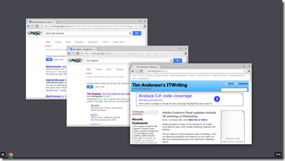
If you choose the new “Windows 8 mode” which you will find on the Chrome menu, you get something which is neither like desktop Windows, nor like Windows 8. Instead, it is ChromeOS, injected into Windows.

image

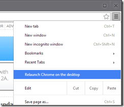
Chrome’s “Windows 8” mode only works if you set it as the default browser, and if you choose the Windows 8 mode you lose the desktop version until you select “Relaunch Chrome on the desktop” from its menu.

image

What is the effect of “Windows 8 mode”? It has several advantages for Google:

  • It serves as an introduction to Chrome OS, increasing the chance of selling a Chrome OS device (Chromebook) that does not run Windows at all
  • It hides the desktop, making it more likely that you will choose a Google web app rather than a desktop or Windows 8 app for your next task

However, considered as a “modern” style Windows 8 app, it is poor. It is not touch friendly, it is multi-window, and it ignores the conventions of Windows 8 apps – this is really Chrome OS, remember.

Users are not impressed. The thing they hate most is losing the paging arrows on the scroll bars. Check the long comment thread here. For example:

This is ridiculous, and the "just deal with it" from some developers is really grating. I am -terrified- of when my Chrome will update because even using this page now I’ve used the sidebar & steppers. I have vision problems and I fear this update will make Chrome unusable for me. I’m using Windows and should have my scrollbar harmonised with Windows instead of an operating system I do not use.

This is a strategic move though and unlikely to change. Here are the key official statements in that thread. Here:

This is because we’re switching to the chromeos style. Passing to review-ui to make sure they are ok with this.

and here:

There is no easy way to go back to the previous scrollbars. There was a big change in the graphics stack from chrome 31 to chrome 32 which meant to unify 3 platforms: windows, chromeos and linux and that includes a shared widget theme.

Chrome may lose a few users to IE or Firefox, but it takes lot to get people to switch browsers.

The purpose of this post is to highlight Google’s strategy, rather than to pass judgement on whether or not it is a bad thing. It is part of a strategy to kill the Windows ecosystem, oddly echoing Microsoft’s own strategy of “Embrace, Extend, Extinguish”:

"Embrace, extend, and extinguish", also known as "Embrace, extend, and exterminate", is a phrase that the U.S. Department of Justice found was used internally by Microsoft o describe its strategy for entering product categories involving widely used standards, extending those standards with proprietary capabilities, and then using those differences to disadvantage its competitors.

says Wikipedia.

Speaking personally though, if I am running Windows then I want to take full advantage of Windows, not to have it morph into another OS to suit the goals of a competitor.

Adobe Creative Cloud updates include 3D printing in Photoshop

Adobe has added a number of new features for its Creative Cloud software suite, which includes Photoshop, Illustrator and InDesign.

The new features include Perspective Warp in Photoshop, which can adjust the perspective of an object so you can match it to that of an existing background; a new Pencil tool in Illustrator; and for InDesign, simplified hyperlinks and the ability to automatically install fonts from Typekit (another Creative Cloud service) if they are missing from the document.

The most intriguing new feature though is 3D printing support in Photoshop.

3D printing is not new; it has been around for many years in industry and medicine. More recently though, 3D printers that are affordable for hobbyists or small businesses have become available. There are also services like Shapeways which let you upload 3D designs and have the model delivered to you. Picking up on this new momentum, Adobe has added to Photoshop the ability to import a 3D design from a modelling tool or perhaps a 3D scanner, and print to a local printer or to a file for upload to Shapeways. Photoshop, according to Adobe, will do a good job of ensuring that models are truly print-ready.

image

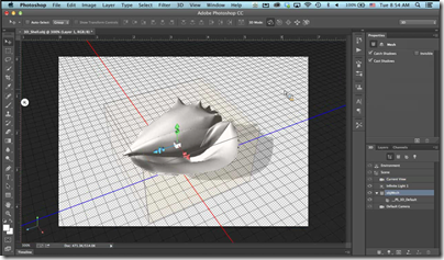
After opening the design and applying any changes needed, such as altering the shape or adding colour, you can use the new 3D Print Settings to print the model.

image

Photoshop is intended primarily as a finishing tool, rather than for creating 3D models from scratch.

Here are some actual results:

image

3D printing support is now built into Windows 8.1, but Photoshop does not use this. Apparently the Windows feature arrived too late, but will be supported in a future release.

Adobe says it is bringing 3D printing to the creative mainstream; but to what extent is this a mainstream technology? The hobbyist printers I have seen are impressive, but tend to be too fiddly and temperamental for non-technical users. Still, there are many uses for 3D printing, including product prototypes, ornaments, arts and craft, and creating parts for repairs.

Visual Studio 2013 update 1: avoid the RC if you use C++

Microsoft has released Visual Studio 2013 Update 1 RC which I installed for a look. It has a “go-live” license, which means you can use it in production, and when the final version comes out you will be able to install it over the top, so it sounded safe enough.

Update 1 is only a bug-fix release – the fixes are listed in the link above. “When you edit multiple resources in Resource Editor, Visual Studio crashes randomly,” is one, so if that affects you, you might want to install it.

Unfortunately the RC introduces a new problem. The syntax highlighting in the C++ editor is broken. Here is a snippet of code before the update:

image

and after

image

Microsoft is aware of the issue and apparently the RTM update will be OK.

While investigating this, I discovered another issue. Visual Studio 2013 was crashing whenever I tried to open a C++ project. If I tried to debug Visual Studio with a new instance, the new instance would crash too. I uninstalled Update 1 RC but that did not fix it. This post on StackOverflow does not describe exactly the same issue, but did lead me to suspect Xamarin, an add-on for Android and iOS development with C#. I uninstalled Xamarin and the problem disappeared; Visual Studio seems to start up more quickly too. A shame as I like the product.

Update: the final Update 1 is now available. What’s in Update 1: http://support.microsoft.com/kb/2911573

Download: http://go.microsoft.com/fwlink/?LinkId=301714

CES 2014 report: robots, smart home, wearables, bendy TV, tablets, health gadgets, tubes and horns

CES in Las Vegas is an amazing event, partly through sheer scale. It is the largest trade show in Vegas, America’s trade show city. Apparently it was also the largest CES ever: two million square feet of exhibition space, 3,200 exhibitors, 150,000 industry attendees, of whom 35,000 were from outside the USA.

image

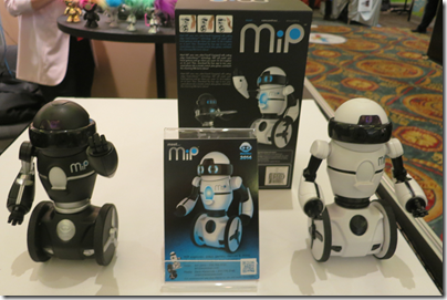
It follows that CES is beyond the ability of any one person to see in its entirety. Further, it is far from an even representation of the consumer tech industry. Notable absentees include Apple, Google and Microsoft – though Microsoft for one booked a rather large space in the Venetian hotel which was used for private meetings.  The primary purpose of CES, as another journalist explained to me, is for Asian companies to do deals with US and international buyers. The success of WowWee’s stand for app-controllable MiP robots, for example, probably determines how many of the things you will see in the shops in the 2014/15 winter season.

image

The kingmakers at CES are the people going round with badges marked Buyer. The press events are a side-show.

CES is also among the world’s biggest trade shows for consumer audio and high-end audio, which is a bonus for me as I have an interest in such things.

Now some observations. First, a reminder that CEA (the organisation behind CES) kicked off the event with a somewhat downbeat presentation showing that global consumer tech spending is essentially flat. Smartphones and tablets are growing, but prices are falling, and most other categories are contracting. Converged devices are reducing overall spend. One you had a camera, a phone and a music player; now the phone does all three.

Second, if there is one dominant presence at CES, it is Samsung. Press counted themselves lucky even to get into the press conference. A showy presentation convinced us that we really want not only UHD (4K UHD is 3840 x 2160 resolution) video, but also a curved screen, for a more immersive experience; or even the best of both worlds, an 85” bendable UHD TV which transforms from flat to curved.

image

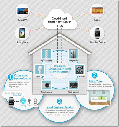
We already knew that 4K video will go mainstream, but there is more uncertainty about the future connected home. Samsung had a lot to say about this too, unveiling its Smart Home service. A Smart Home Protocol (SHP) will connect devices and home appliances, and an app will let you manage them. Home View will let you view your home remotely. Third parties will be invited to participate. More on the Smart Home is here.

image

The technology is there; but there are several stumbling blocks. One is political. Will Apple want to participate in Samsung’s Smart Home? will Google? will Microsoft? What about competitors making home appliances? The answer is that nobody will want to cede control of the Smart Home specifications to Samsung, so it can only succeed through sheer muscle, or by making some alliances.

The other question is around value for money. If you are buying a fridge freezer, how high on your list of requirements is SHP compatibility? How much extra will you spend? If the answer is that old-fashioned attributes like capacity, reliability and running cost are all more important, then the Smart Home cannot happen until there are agreed standards and a low cost of implementation. It will come, but not necessarily from Samsung.

Samsung did not say that much about its mobile devices. No Galaxy S5 yet; maybe at Mobile World Congress next month. It did announce the Galaxy Note Pro and Galaxy Tab Pro series in three sizes; the “Pro” designation intrigues me as it suggests the intention that these be business devices, part of the “death of the PC” theme which was also present at CES.

Samsung did not need to say much about mobile because it knows it is winning. Huawei proudly announced that it it is 3rd in smartphones after Samsung and Apple, with a … 4.8% market share, which says all you need to know.

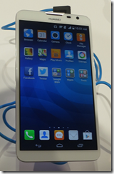
That said, Huawei made a rather good presentation, showing off its forthcoming AscendMate2 4G smartphone, with 6.1” display, long battery life (more than double that of iPhone 5S is claimed, with more than 2 days in normal use), 5MP front camera for selfies, 13MP rear camera, full specs here. No price yet, but expect it to be competitive.

image

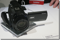
Sony also had a good CES, with indications that PlayStation 4 is besting Xbox One in the early days of the next-gen console wars, and a stylish stand reminding us that Sony knows how to design good-looking kit. Sony’s theme was 4K becoming more affordable, with its FDR-AX100 camcorder offering 4K support in a device no larger than most camcorders; unfortunately the sample video we saw did not look particularly good.

image

Sony also showed the Xperia Z1 compact smartphone, which went down well, and teased us with an introduction for Sony SmartWear wearable entertainment and “life log” capture. We saw the unremarkable “core” gadget which will capture the data but await more details.

image

Another Sony theme was high resolution audio, on which I am writing a detailed piece (not just about Sony) to follow.

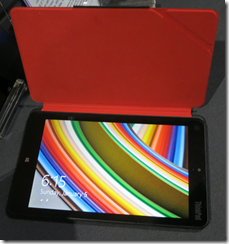
As for Microsoft Windows, it was mostly lost behind a sea of Android and other devices, though I will note that Lenovo impressed with its new range of Windows 8 tablets and hybrids – like the 8” Thinkpad with Windows 8.1 Pro and full HD 1920×1200 display – more details here.

image

There is an optional USB 3.0 dock for the Thinkpad 8 but I commented to the Lenovo folk that the device really needs a keyboard cover. I mentioned this again at the Kensington stand during the Mobile Focus Digital Experience event, and they told me they would go over and have a look then and there; so if a nice Kensington keyboard cover appears for the Thinkpad 8 you have me to thank.

Whereas Lenovo strikes me as a company which is striving to get the best from Windows 8, I was less impressed by the Asus press event, mainly because I doubt the Windows/Android dual boot concept will take off. Asus showed the TD300 Transformer Book Duet which runs both. I understand why OEMs are trying to bolt together the main business operating system with the most popular tablet OS, but I dislike dual boot systems, and if the Windows 8 dual personality with Metro and desktop is difficult, then a Windows/Android hybrid is more so. I’d guess there is more future in Android emulation on Windows. Run Android apps in a window? Asus did also announce its own 8” Windows 8.1 tablet, but did not think it worth attention in its CES press conference.

Wearables was a theme at CES, especially in the health area, and there was a substantial iHealth section to browse around.

image

I am not sure where this is going, but it seems to me inevitable that self-monitoring of how well or badly our bodies are functioning will become commonplace. The result will be fodder for hypochondriacs, but I think there will be real benefits too, in terms of motivation for exercise and healthy diets, and better warning and reaction for critical problems like heart attacks. The worry is that all that data will somehow find its way to Google or health insurance companies, raising premiums for those who need it most. As to which of the many companies jostling for position in this space will survive, that is another matter.

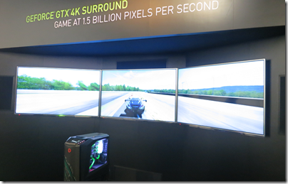
What else? It is a matter of where to stop. I was impressed by NVidia’s demo rig showing three 4K displays driven by a GTX-equipped PC; my snap absolutely does not capture the impact of the driving game being shown.

image

I was also impressed by NVidia’s ability to befuddle the press at its launch of the Tegra K1 chipset, confusing 192 CUDA cores with CPU cores. Having said that, the CUDA support does mean you can use those cores for general-purpose programming and I see huge potential in this for more powerful image processing on the device, for example. Tegra 4 on the Surface 2 is an excellent experience, and I hope Microsoft follows up with a K1 model in due course even though that looks doubtful.

There were of course many intriguing devices on show at CES, on some of which I will report over at the Gadget Writing blog, and much wild and wonderful high-end audio.

On audio I will note this. Bang & Olufsen showed a stylish home system, largely wireless, but the sound was disappointing (it also struck me as significant that Android or iOS is required to use it). The audiophiles over in the Venetian tower may have loopy ideas, but they had the best sounds.

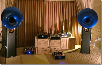
CES can do retro as well as next gen; the last pinball machine manufacturer displayed at Digital Experience, while vinyl, tubes and horns were on display over in the tower.

image

Naim’s Statement: no compromise home audio

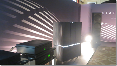
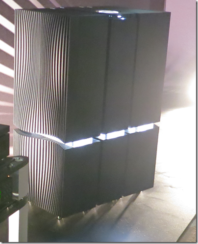
I was fortunate to hear Naim’s Statement amplifier, currently a prototype subject to final tuning before release in July, at the CES exhibition in Las Vegas.

image

Statement is actually two amplifiers, the NAC S1 pre-amplifer and the NAP S1 mono power amplifiers. In the above picture you can see them standing together as three large vertical boxes, the slimmer pre-amp and the power amps on either side. Each amplifier is also divided horizontally, with the power supply below and the amplifier electronics above.

image

I do not have confirmation of the price but believe it will be around £150,000 for a set.

My quick comment is this. The sound is huge and has the qualities Naim aficionados love: muscular, etched, authoritative. Naim is often considered to have a house sound dating back to its earliest electronics in the eighties, and the Statement continues that tradition.

I did not think the sound was flawless though. Rhythm and percussion was stunning, but whether it is the most natural sound I am not so sure. Can Statement do sweet and delicate? Bear in mind though that I only had a short listen and that some fine-tuning remains.

Naim says the sound is without compromise, and Statement will only appeal to those who are not only wealthy, but share that attitude, building their living space, or at least their music listening space, around the electronics, rather than having it blend into the furniture Bang & Olufsen style.

Bang & Olufsen Essence simplifies home audio – as long as you have the right smartphone

image

Bang & Olufsen’s Tue Mantoni shows the new Essence controller

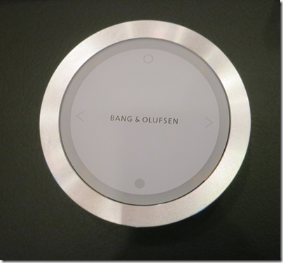
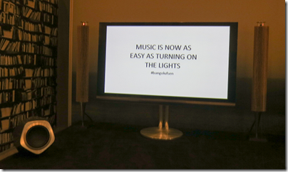
By how much can you simplify home audio? Long-established Danish company Bang & Olufsen reckons that the essentials are play, pause, volume, next and previous. The Essence controller is designed for wall mounting, or there is a tabletop version, and has just these functions. The goal is to make listening to music as easy as turning on the light. The company demonstrated the new system at the 2014 CES in Las Vegas.

image 

Other functions, such as choosing what music to play, are considered “Advanced.”

The brains of the system are in the controller box, which supports Apple AirPlay streaming, DLNA streaming, Spotify, QPlay, and internet radio. DLNA support means you could use it with other systems such as Logitech Media Server (formerly Squeezebox server) .

image

The rear view shows the connections:

image

You control the box via an app BeoMusic, which runs on Apple iOS or Google Android. I asked whether you could use a web browser if you happened not to have an iOS or Android device, and was told no. Windows Phone users, this is not for you. Box and remote together cost $995.

image

Another part of B&O’s drive for simplicity is wireless speaker connections. The company is supporting a standard called WiSA which delivers up to 24/96 digital audio for up to 8 channels. Naturally this only works with powered speakers, so each one still needs a mains cable. You can use speakers that lack WiSA support by purchasing a receiver ($265 or £165) for each one.

The demo system we heard at CES included Beolab 18 active loudspeakers and a Beolab 19 subwoofer, both running wireless with WiSA. At $6,590 for the main pair and $3,395 for the subwoofer, this was not a cheap system.

I thought it looked lovely, but my face fell when the music started playing. The sound was decent but not the most natural I have heard, and I felt there was a trace of harshness at loud volume.

I doubt the sound quality is a limitation of WiSA: I visited the WiSA demonstration later on at CES and it sounded fine. I will add that the demonstration was brief and it is possible that in another room or with some tweaking the system would sound as good as it looks; but first impressions were disappointing.

High end earbuds impress at CES 2014–especially Audiofly’s top model

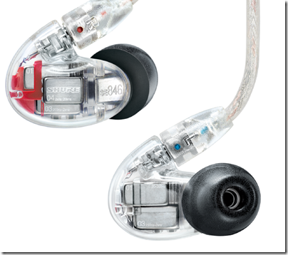
I have heard a couple of high-end earbuds here at CES 2014 in Las Vegas. One was Shure’s SE 846. Great sound, but then you would expect that at $999.

image

I was impressed by the extended bass and clarity of the 846’s and they should be on your shortlist if you are looking for the very best in earbuds. They sport four microdrivers including what Shure calls a “true subwoofer.” Frequency range 15Hz-20kHz.

On the other hand, when I heard Audiofly’s AF180 at a mere $549 I thought, hmm, I wonder if I could afford these?

image

In other words, the AF180 struck me as exceptional rather than merely excellent. Part of the secret, I suspect, is their close fit into the ear. It is hard to explain, but you fit them with the cable dropping behind your head and over the ear, and the shaped housing fills more of your ear than the average earbud.

The AF180 includes four armature drivers in each earbud. Frequency range 15Hz-25kHz.

I listened briefly to both recent and older recordings. Even the Beach Boys California Girls, which I would not describe as a hi-fi recording, sounded as clear as I have heard it – and I mean clear, not artificially boosted in the treble.

I am researching hi-res audio here at CES, and these earbuds reminded me that for all the fuss about audio resolution and formats, the speaker is the source of most distortion in the audio chain.

Every ear is different and earbuds are a particularly personal area of audio. I head the AF180s the day after the SE 846 so was not able to compare them side by side or on the same musical material; perhaps if I did, I would change my preference.

Nevertheless, I like to post about products that particularly impress me, and the AF180 is one such.