Hands on with Microsoft’s Azure Cloud Rights Management: not ready yet

If you could describe the perfect document security system, it might go something like this. “I’d like to share this document with X, Y, and Z, but I’d like control over whether they can modify it, I’d like to forbid them to share it with anyone else, and I’d like to be able to destroy their copy at a time I specify”.

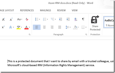
This is pretty much what Microsoft’s new Azure Rights Management system promises, kind-of:

ITPros have the flexibility in their choice of storage locale for their data and Security Officers have the flexibility of maintaining policies across these various storage classes. It can be kept on premise, placed in an business cloud data store such as SharePoint, or it can placed pretty much anywhere and remain safe (e.g. thumb drive, personal consumer-grade cloud drives).

says the blog post.

There is a crucial distinction to be made though. Does Rights Management truly enforce document security, so that it cannot be bypassed without deep hacking; or is it more of an aide-memoire, helping users to do the right thing but not really enforcing it?

I tried the preview of Azure Rights Management, available here. Currently it seems more the latter, rather than any sort of deep protection, but see what you think. It is in preview, and a number of features are missing, so expect improvements.

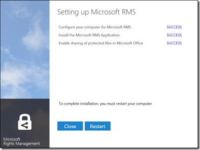
I signed up and installed the software into my Windows 8 PC.

image

The way this works is that “enlightened” applications (currently Microsoft Office and Foxit PDF, though even they are not fully enlightened as far as I can tell) get enhancements to their user interface so you can protect documents. You can also protect *any* document by right-click in Explorer:

image

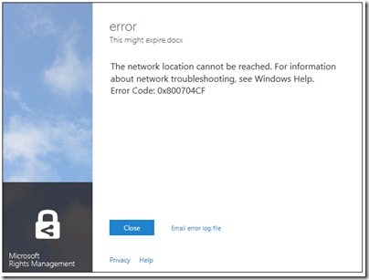
I typed a document in Word and hit Share Protected in the ribbon. Unfortunately I immediately got an error, that the network location cannot be reached:

image

I contacted the team about this, who asked for the log file and then gave me a quick response. The reason for the error was that Rights Management was looking for a server on my network that I sent to the skip long ago.

Many years ago I must have tried Microsoft IRM (Information Rights Management) though I barely remember. The new software was finding the old information in my Active Directory, and not trying to contact Azure at all.

This is unlikely to be a common problem, but illustrates that Microsoft is extending its existing rights management system, not creating a new one.

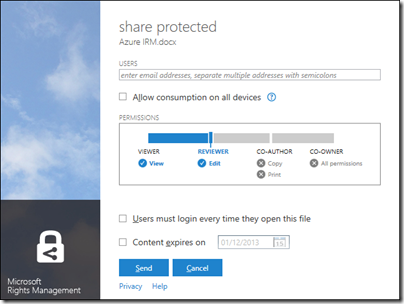
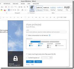
With that fixed, I was able to protect and share a document. This is the dialog:

image

It is not a Word dialog, but rather part of the Rights Management application that you install. You get the same dialog if you right-click any file in Explorer and choose Share Protected.

I entered a Gmail email address and sent the protected document, which was now wrapped in a file with a .pfile (Protected File) extension.

Next, I got my Gmail on another machine.

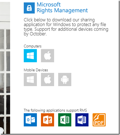
First, I tried to open the file on Android. Unfortunately only x86 Windows is supported at the moment:

image

There is an SDK for Android, but that is all.

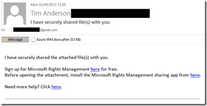
I tried again on a Windows machine. Here is the email:

image

There is also note in the email:

[Note: This Preview build has some limitations at this time. For example, sharing protected files with users external to your organization will result in access control without additional usage restrictions. Learn More about the Preview]

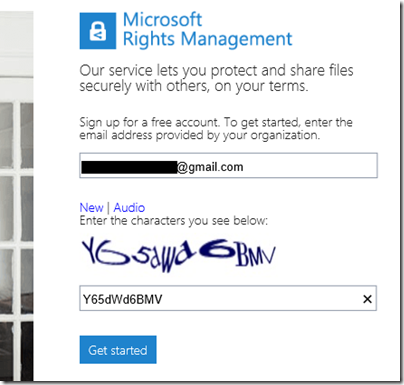
I was about to discover some more of these limitations. I attempted to sign up using the Gmail address. Registration involves solving a vile CAPTCHA

image

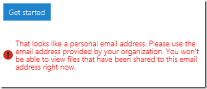
but got this message:

image

In other words, you cannot yet use the service with Gmail addresses. I tried it with a Hotmail address; but Microsoft is being even-handed; that did not work either.

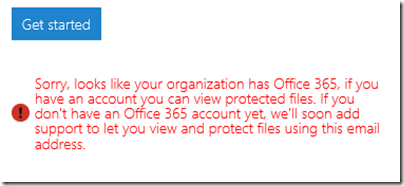
Next, I tried another email address at a different, private email domain (yes, I have lots of email addresses). No go:

image

The message said that the address I used was from an organisation that has Office 365 (this is correct). It then remarked, bewilderingly:

If you have an account you can view protected files. If you don’t have an Office 365 account yet, we’ll soon add support…

This email address does have an Office 365 account. I am not sure what the message means; whether it means the Office 365 account needs to sign up for rights management at £2 per user per month, or what, but it was clearly not suitable for my test.

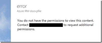
I tried yet another email address that is not in any way linked to Office 365 and I was up and running. Of course I had to resend the protected file, otherwise this message appears:

image

Incidentally, I think the UI for this dialog is wrong. It is not an error, it is working as designed, so it should not be titled “error”. I see little mistakes like this frequently and they do contribute to user frustration.

Finally, I received a document to an enabled email address and was able to open it:

image

For some reason, the packaging results in a document called “Azure IRM docx.docx” which is odd, but never mind.

My question though: to what extent is this document protected? I took the screen grab using the Snipping Tool and pasted it into my blog for all to read, for example. The clipboard also works:

image

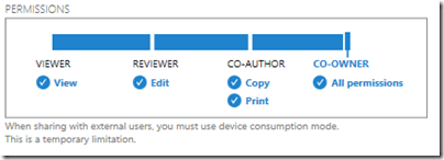
That said, the plan is for tighter protection to be offered in due course, at lease in “enlightened” applications. The problem with the preview is that if you share to someone in a different email domain, you are forced to give full access. Note the warning in the dialog:

image

Inherently though, the client application has to have decrypted access to the file in order to open it. All the rights management service does, really, is to decrypt the file for users logged into the Azure system and identified by their email address. What happens after that is a matter of implementation.

The consequences of documents getting into the wrong hands are a hot topic today, after Wikileaks et al. Is Microsoft’s IRM a solution?

Making this Azure-based and open to any recipient (once the limitation on “public” email addresses is lifted”) makes sense to me. However I note the following:

  • As currently implemented, this provides limited security. It does encrypt the document, so an intercepted email cannot easily be read, but once opened by the recipient, anything could happen.
  • The usability of the preview is horrid. Do you really want your trusted recipient to struggle with a CAPTCHA?
  • Support beyond Windows is essential, and I am surprised that this even went into preview without it.

I should add that I am sceptical whether this can ever work. Would it not be easier, and just as effective (or ineffective), simply to have data on a web site with secure log-in? The idea of securely emailing documents to external recipients is great, but it seems to add immense complexity for little added value. I may be missing something here and would welcome comments.


had to sign in twice since I didn’t check “Remember password!"

image

If you try recursion, it will package the already packaged file.
A great big phone: Samsung Galaxy Mega review

How big can a phone go? Samsung seems to be testing the limits with the 6.3″ Samsung Galaxy Mega. How big is that? Here it is laid over a paperback book:

image

In fact, open the book, and the Galaxy Mega proves to be almost exactly the size of the printed area on the page, suggesting that this would make an excellent e-reader. I installed Amazon Kindle and so it does, though the screen is a little too glossy and the battery life too short for perfection.

Hold it to your ear though, and the Mega is big enough to feel faintly ridiculous, outside of places like San Francisco where daft-looking gadgets are the norm. That said, it is slim and smooth in the hands – maybe a bit too silky, it would be easy for it to slip out of your hands – so carries its bulk with good grace.

If you are constantly on the phone, and do not use a headset, the Mega is unlikely to be for you. Still, for many of us voice calls are a long way down the list of reasons for carrying a smartphone. Internet, games, email, text messaging and photography may well be higher.

What about writing and spreadsheeting? I got out my favourite Logitech Bluetooth keyboard, installed OfficeSuite Pro from Mobile Systems Inc, and started to type.

image

I can get real work done on this; but I am unlikely to choose to do so. In fact, the screen size is not the problem. There are other issues. One is that the Galaxy Mega should be supplied with a prop-up cover or stand, since for functions like word processing with a keyboard, or watching YouTube or BBC iPlayer, it is best stood up on its side. Another is that the Android OS and its applications seem primarily designed for touch. The on-screen keyboard seems to pop-up even when not required, though ESC usually dismisses it, and getting at the formatting controls is just a bit awkward.

I also found that I could easily out-type OfficeSuite Pro on the Mega. I thought this might be an OS issue, but Infraware’s Polaris Office (which comes free for download with the Mega) is better in this respect, though less good overall than OfficeSuite Pro.

As a productivity device then, the Mega is not quite there and I will still want to take a Surface RT or some other suitable device on the road. It does work though, which has some appeal, and note that these Office suites also work well as viewers for Microsoft Office formats.

The hardware

Open the box, and you will see that, other than size, there is little else notable. Mine came with a 4GB SD card included.

image

The device feels solid and well-made. The audio and headset jack is on the top edge, volume rocker on the left, and power on the right. On the front, at the base, is the home button. There are also soft buttons to its right and left for Menu and Back. These are backlit, but the backlight is usually off, which means you have to remind yourself at first that they really are there. I am not sure why Samsung does not put a little etching to indicate their presence.

The screen is great, though I would prefer less gloss, but it is bright and responsive so no real complaint.

The camera is decent but unspectacular. Good enough that most users will be happy, but not good enough to attract photo enthusiasts.

Battery life is decent, though not outstanding. 24 hours of normal usage will be fine, but over two days you will likely need a charge.

One thing worth emphasising: the Galaxy Mega may be bigger than the S4, but it is less powerful. The S4 has a quad-core 1.9GHz chipset, 13MP rear camera, 16GB memory, 1920×1080 resolution, and so it goes on. You are going to buy the Mega over the S4 for only two reasons: price, or because you really want that big screen.

Software

The Galaxy Mega runs Android 4.2 Jelly Bean with Samsung’s TouchWiz interface. I doubt anyone will have trouble with basic navigation, but it fails to delight.

One of its notable features is called Multi-Window. This runs as a pull-out application launcher, by default docked to the left of the screen. Here is the tab, which annoyingly obscures some text:

image

and here it is pulled out:

image

If you perform the right gestures with the right apps (not all of them work) you can get two apps running side by side by pulling them out from the bar:

image

The vertical bar lets you resize the apps freely.

I think this whole thing is a mistake. While having two apps to view seems useful, even the Mega’s screen is not large enough to make it work with desktop-style convenience, and Android apps are designed for full-screen use. Nor do I like the bar as an alternative app launcher; it is unnecessary and gets in the way. This is another example of an OEM trying to improve an OS and making it worse. It is not too bad though, as you can easily disable it (drag down from the top and tap Multi-Window so it fades).

Incidentally, I had trouble getting a screenshot of the multi-window bar. The normal approach failed as touching any button makes it retreat. I used the deprecated DDMS in the ADK (Android Developer Kit). This required finding the Developer Options on the device. Bizarrely, you enable Developer Options by repeatedly tapping Build number in About Device. Odd.

Samsung store and apps

In its effort to make its devices distinct from other Android devices, Samsung is building its own ecosystem, including the Samsung app store which is prominent in the default configuration.

 image

What is the value for the user in this, given that the official Google Play store is also available? None, other than that it is good that Google has some competition. That said, this is where you can get Polaris Office for free, which is worth having.

Similar examples of duplication versus Google’s ecosystem are evident elsewhere, for example Samsung’s ChatOn versus Google Talk (now Google+ Hangout), though ChatOn does not do voice or video; and Samsung cloud backup versus Google’s cloud backup. For example, photo backup to Samsung’s cloud (once you register) is on by default; but this feature is also available in Google+, for Google’s cloud.

Overall this is confusing for the user and I am not sure how this game ends. It contributes to a sense that Android remains messy and disorganised versus Apple iOS or even Windows Phone, though in compensation it has wonderful functionality.

Samsung Air View is an attempt to bring the benefits of mouse hover to a touch interface by detecting the finger over the screen. For example, you can preview an email message.

image

Plenty of potential here; though I found it unreliable. I still have not got magnification in web pages to work, despite turning this on in settings.

WatchOn lets you control your TV via an app that shows what is on. This worked for me though it feels like solving a problem I do not have.

The Music app isupports DLNA; but while it detected my Logitech Media Server I had trouble playing anything without stuttering.

Summary

There is a lot packed into the Mega and I have not done it justice above, but picked out some highlights. It is highly capable; but I hesitate to recommend it unless the combination of a large screen and a smartphone is perfect for you; if you do lots of web browsing, email and YouTube, but not many phone calls, or if your eyesight is such that having everything a bit larger is an advantage, it could be just the thing.

The disappointment is that Samsung has not made more sense of the large screen. The Multi-Window feature is not good, and in the end it just feels like a big phone. The fact that its spec is well behind that of the Galaxy S4 is another disadvantage.

The Galaxy Mega also exhibits the Samsung/Android problem of duplicated functionality, contributing to a user experience that is less tidy and more confusing than it needs to be.

Personally I am hopeful for the day when a single device will simplify my life and I will no longer have to carry phone, camera and tablet or laptop. This one does not get me there; but maybe with a bit more refinement a future iteration will.

Technical summary

  • Android 4.2.2 (Jelly Bean)
  • 6.3″ 1280 x 720 LCD screen
  • USB 2.0
  • MicroSD slot
  • MHL support (enables HDMI out from USB port)
  • GPS and GLONASS
  • 720p video supports MPEG4, H.263, H.264, VC1, WMV7 etc.
  • Cameras: 8 megapixel rear, 1.9 megapixel front, LED Flash
  • Video recording up to 30fps
  • Audio support including MP3,AAC,WMA,FLAC,OGG etc.
  • Qualcomm Snapdragon 400 with Krait 1.7GHz dual core CPU and Adreno 305 GPU
  • Comms: FDD LTE, HSPA-PLUS,HSDPA,HSUPA,EDGE,GPRS,FDD LTE,802.11 a/b/g/n/ac,Bluetooth 4.0 LE,NFC
  • RAM: 1.5GB
  • Storage: 8GB on board
  • 3200mAh battery
  • Size: 167.6 x 88 x 8mm
  • Weight: 199g

Acknowledgement: thanks to Phones4u for loan of the review sample.