Microsoft completes Windows 8.1, it says, but developers are unable to test their apps

Microsoft has released Windows 8.1 to its hardware partners according to VP Antoine Leblond; but developers will be unable to test whether or not their apps work on the updated operating system until it is also in the hands of users:

While our partners are preparing these exciting new devices we will continue to work closely with them as we put the finishing touches on Windows 8.1 to ensure a quality experience at general availability on October 18th. This is the date when Windows 8.1 will be broadly available for commercial customers with or without volume licensing agreements, our broad partner ecosystem, subscribers to MSDN and TechNet, as well as consumers.

One reason for subscribing to MSDN is to get early access to new versions of Windows for test and development, so this is a surprising and disappointing move.

We pay thousands for MSDN access so we can test our software/apps properly, early testing, before GA, is an important part of that process! We don’t care about a couple of bugs in your OS, we about bug in our software. Most of us actually want to support Windows 8.1, a lot of us want to get apps ready for the awesome 8.1 features, but we can’t properly do that unless we get the RTM bits before the public gets the Windows 8.1 update!

says one comment to Leblond’s post.

It is hard to make sense of Microsoft’s reasoning here, though Microsoft’s Brandon LeBlanc comments that despite the RTM (Release to Manufacturing), Windows 8.1 is not altogether finished:

We are continuing to put the finishing touches on Windows 8.1 to ensure a quality experience at general availability

he says.

Windows 8 needs more high quality apps in order to win users over to its new tablet-friendly user interface, so it is unfortunate that Microsoft is not doing more to help developers support it.

On Steve Ballmer and Microsoft’s future

The announcement that Microsoft CEO Steve Ballmer will retire “within the next 12 months” prompts some quick reflections on Ballmer and the state of his company.

Ballmer suffers from lack of charisma on stage, and this combined with missteps like failing to compete effectively in mobile devices, nearly buying Yahoo at a ludicrous price, the Kin debacle, making far too many Surface RT devices, and the poor reception overall for Windows 8, means that Ballmer’s time as CEO may be judged harshly.

image

Many commentators seemingly forget that Microsoft’s financial results under Ballmer have been generally excellent. Further, if we blame Ballmer for the various blunders that occurred during his time as CEO, we should also credit him for the successes, like Windows 7, the steady improvements in Windows server, and the market success of Xbox versus Sony PlayStation (though not forgetting the red ring of death nor the numerous loss-making quarters for entertainment and devices).

Nor would it be correct to portray the Ballmer years as conservative turn-the-handle profit making from Windows and Office. Under Ballmer, Microsoft is transitioning towards the cloud with Office 365 and Windows Azure (with considerable success), and he was willing to take bold steps with both Windows (“reimagined” in Windows 8) and Office (moving towards a subscription model).

It is worth noting too that by all accounts Microsoft is not an easy company to direct. From my perception, its overly bureaucratic and somewhat dysfunctional management style was allowed to develop under former CEO Bill Gates, and while you can blame Ballmer for failing to fix it, the last reshuffle shows his effort to pull the company towards a more collaborative and efficient way of working:

We are rallying behind a single strategy as one company — not a collection of divisional strategies. Although we will deliver multiple devices and services to execute and monetize the strategy, the single core strategy will drive us to set shared goals for everything we do. We will see our product line holistically, not as a set of islands. We will allocate resources and build devices and services that provide compelling, integrated experiences across the many screens in our lives, with maximum return to shareholders. All parts of the company will share and contribute to the success of core offerings, like Windows, Windows Phone, Xbox, Surface, Office 365 and our EA offer, Bing, Skype, Dynamics, Azure and our servers.

What should the new CEO, and Ballmer in his final months, do now? I will refer to you to this interview with Scott Guthrie about what happened when he was reshuffled, along with several other Microsoft execs, to take on Windows Azure. Just to remind you, Azure was not a success when first launched, being both difficult to use and poorly presented by Microsoft.

We did an app building exercise about a year ago, my second or third week in the job, where we took all the 65 top leaders in the organisation and we went to a hotel and spent all day building on Azure," said Guthrie. "We split up everyone into teams, bought a credit card for each team, and we said: ‘You need to sign up for a new account on Azure and build an app today. It was an eye-opening experience. About a third of the people weren’t able to actually sign up successfully, which was kind of embarrassing. We had billing problems, the SMS channel didn’t always work, the documentation was hard, it was hard to install stuff.

“We used that [experience] to catalyze and said: ‘OK, how do we turn this into an awesome experience?’ We came up with a plan in about four to five weeks and then executed.”

Azure was based on decent technology, but prior to the changes Guthrie describes, it was a relatively hostile platform for developers. Put another way, it was not so much the strategy that was wrong, as the way it was executed.

I recall similar comments from the former Windows chief Steven Sinofsky about how Windows 7 was designed, based on what users found annoying in Windows Vista.

Something I see frequently at Microsoft is good ideas poorly executed or spoilt by errors of detail, and Ballmer could have done more to insist on higher standards. Recently I have been working with Office 365, and while the underlying platform is strong, working with it can be infuriating. It needs Guthrie’s approach: get people to try the product, watch what goes wrong, and fix it.

Microsoft’s devices and services strategy makes a lot of sense but the company needs more attention to detail to make it work.

Lenovo’s bundled Start menu: more OEM trouble for Microsoft

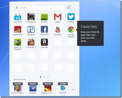
Lenovo and SweetLabs announced a deal yesterday whereby the Pokki app store and Start menu replacement will be pre-installed on Windows PCs.

This has been widely interpreted as a response to user dissatisfaction with the Windows 8 Start screen, which replaces with the hierarchical Windows 7 Start menu with a full-screen tiled view of application shortcuts. The press release, though, focuses more on the app store element:

Apps are dynamically recommended in the Pokki Start menu, app store, and game arcade to users by SweetLabs’ real-time app recommendation system, which matches the right apps with the right users. This system has already served one billion app recommendations this year, and the addition of Lenovo substantially extends the reach of this distribution opportunity for app developers looking to be promoted on brand new Windows 8 devices.

image

In other words, this is not just an app launcher but also a form of adware or if you prefer a third-party app store; the apps it installs will not be Windows Store apps running in the tablet-friendly Windows 8 environment, but desktop apps.

Microsoft could benefit I suppose if users concerned about missing the Start menu buy Windows 8, but in every other respect this is a retrograde step. Users who do want a Start menu would be better off with something like Start8 which will not nag them to install apps, which makes you wonder if Lenovo’s motivation is more to do with a lucrative deal than with pleasing its users. Microsoft’s strategy of building momentum for its own Windows 8 app store and platform will be undermined by this third-party effort.

Once again this illustrates how the relationship between Microsoft and its OEM partners can work to the detriment of both. The poor out of the box experience with Windows has been one of the factors driving users to the Mac or iPad over the years, and this is in large part due to trialware bundled by partner vendors.

Windows 8 is a special case, and there is no doubting the difficulty long-term Windows users have in getting used to the new Start screen. The new Start button in Windows 8.1 will help orient new users, but Microsoft is not backing away from Live Tiles or the Start screen. Lenovo’s efforts will make it harder for users to adjust, since they would be better off learning how to use Windows 8 as designed, rather than relying on a third-party utility.

Microsoft has Surface of course, which despite huge writedowns is well made and elegant, though too expensive; and this has not pleased the OEMs who previously had Windows to themselves.

It all makes you wonder if the famous gun-wielding cartoon of Microsoft’s organization chart should now be redrawn with the guns pointing between Microsoft and its hardware partners. After all, Windows Phone might also have gone better if the likes of Samsung and HTC had not been so focused on Android.

Review: Innergie PocketCell pocket battery charger: elegant design though limited capacity

Smartphone battery life has marched backwards, or so it seems: my ancient HTC Desire still lasts longer on a full charge than my newer Nokia Lumia 620 or Sony Xperia T. Another problem is tablets: battery life is decent compared to a laptop, but it is easy to get caught towards the end of the day or on a plane with an exhausted battery.

The solution, if you cannot get to a charger, is one of those pocket chargers for topping up your device. These are popular promotional giveaways, which means I have a drawer full of them (or would if I had kept them); but many are rubbish: bulky, fiddly with lots of assorted adapters to cope with different phones, and some with pointless adornments like solar panels.

I make a partial exception for a PowerTrip charger I received recently, which has an impressive 5700mAh battery, but it is still ugly, comes with three cables, and has silly extras like a solar panel and ability to work as a memory stick.

By contrast, the Innergie PocketCell is the first charger I have seen which has immediately impressed me with its design.

image

There are only two pieces you need to carry with you, the small battery pack itself and a clever three-in-one cable in which the adapters snap together, so you can charge a device with Mini-B or Micro-B USB (the two popular types), or an Apple 30-pin dock connector (if you have an iPhone 5 or another device with the new Lightning Connector you are out of luck unless you have an adaptor).

image

The same connector also serves to charge the PocketCell, using one of the many USB mains chargers you almost certainly already possess, or by plugging into a PC or Mac. The PocketCell has a USB Type A socket for output, and a Micro-B for input, so you cannot easily get it wrong.

On the side of the PocketCell is a button which you press to discover the current charge. It lights up to four LEDs, to indicate the level of charge remaining.

Battery capacity is 3000 mAh; not as good as a PowerTrip, but decent considering that it is less than one-third the size and much lighter (72g/ 2.5oz).

I tried the PowerCell on an iPhone 4 with a fully expired battery (at least, expired to the point where it would not switch on).

image

The phone charged successfully, during which time the PocketCell got somewhat warm, but with impressive speed of charge. After the charge the PocketCell was pretty much exhausted.

The PocketCell supports 2.1 amp fast charge, which means it is fine for charging an iPad or other tablets with USB power.

The small size, nice design, and effective charging of the Innergie PocketCell means this device might actually find its way into your bag. The downside is that it is more expensive (especially in the UK) than some other portable chargers with equal or greater capacity, but its elegance and usability is worth a bit extra.

While I recommend the device, check that 3000 mAh is sufficient for you before purchase. I have also heard that the three in one cable is a little delicate, though you can get replacements if necessary or use a standard USB cable.


Expanding the Raspberry Pi with PiFace and Pi Rack

The marvellous Raspberry Pi, essentially a cheap, small PC, is a great device for education or home projects like media streaming. Out of the box though, it is not ideal for controlling other devices other than by USB or ethernet. What if you wanted to to use it to operate a switch under program control? You can use the GPIO (General Purpose IO) header, but it is a considerable step up in terms of the electronics knowledge needed for success (and to avoid damaging your Pi).

Element14 has an answer to this in the form of the PiFace, which connects to the GPIO header and provides a range of inputs and outputs. To be precise:

  • 2 changeover relays. These switch a link between a central common pin and two other pins.
  • 8 open-collector outputs. You can use these as switches for an externally powered device.
  • 8 digital inputs. These detect whether a contact is open or closed.
  • 4 switches. These close the first four inputs when depressed.

Element14 kindly supplied a PiFace to me for review, along with another accessory, the Pi Rack, of which more in a moment.

The PiFace comes in a small cardboard box with a regulatory compliance leaflet and no other documentation.

image

Here is a closer view:

image

You can see the inputs at bottom left, the outputs at top right, and the relays on the right. The following diagram from the Element14 site shows the details:

image

The PiFace fits on top of the Raspberry Pi. A rubber foot on the underside rests on the HDMI port relieving the strain on the GPIO connector. If you have a standard size Raspberry Pi case, it will no longer fit once the PiFace is attached, though you can still use the base of the case as I did for my tests. Note that by default the PiFace takes power from the Pi, though this has implications for the power supply you use, which must be 850-1400 mA for the model B Pi.

image

On the software side, installation is either by downloading a pre-built Raspbian image with the software already in place, or by modifying your existing installation. I am using the soft-float Debian Wheezy build and chose the latter route. It is not difficult; just enable the SPI (Serial Peripheral Interface) driver by removing it from the modprobe blacklist, run an install script, and reboot. The scripts come from a github repository here.

The PiFace software includes a nice emulator which lets you operate the switches. I am not sure that emulator is quite the right description because it really does operate the switches.

image

Being more of a software person than an electronics engineer, I set myself a simple task: to operate a light switch under program control. I used a child’s electronics kit to provide the light. First I tried using the relay, which was very simple: it is just a switch. Next I used one of the open-collector outputs which also worked once I had found out that the negative connection from my external 3V power supply connects to GND on the PiFace. Here is my light in action:

image

Note the LED is lit on the output terminal indicating that the switch is ON. Rather than the external supply, I could have taken 5v from the PiFace. A very simple test, but if you can switch a bulb on and off you can switch any number of other things as well, provided the voltage is not too great. Above 5v requires changing some jumper settings and even the relays should not be used for voltages over 20v or currents greater than 5A.

What about programmatic control? Libraries are supplied for Python, C and Scratch (a visual programming language primarily for education). I adapted the example Python script as follows:

from time import sleep
import piface.pfio as pfio
pfio.init()

while (not pfio.digital_read(1)):
if (pfio.digital_read(0)):
  pfio.digital_write(2,1)
else:
  pfio.digital_write(2,0)
sleep(1)

print "Bye"

This script loops until you depress (or otherwise close) the second physical switch or input on the PiFace. It reads the value of the first input, and if it is ON it turns on the output which lights the bulb. Rather pointless, but shows how easy it is to turn a physical device on and off under program control, and to respond to the value on an input.

I like the PiFace though it is in competition with the slightly more expensive Gertboard which has a motor controller, Digital to analogue and analogue to digital converters, and an on-board programmable MCU (Microcontroller). You might not need those features though, making PiFace a better choice.

A snag with the PiFace is that it uses the GPIO port and therefore prevents you using that port for anything else. In order to fix this and to increase the expandability of the Raspberry Pi, Element14 also supply the Pi Rack. This is a simple affair that give you four connections to the GPIO port. You can use this to operate more than one PiFace (each must have a different jumper-set address) or to use other GPIO devices such as the Pi Camera Module. The Pi Rack has its own 5v power input though no power supply comes in the box. Jumpers let you select which power supply to use on a connector-by-connector basis, and to swap the SPI CE (chip enable) lines if needed.

image

Here is the Pi Rack in use with a PiFace. In practice you would want additional support for the PiFace rather than just relying on the connector.

image

Currently the PiFace Digital is £20.30 and the Pi Rack £6.99.

Email hassles with Android and Exchange: couldn’t open connection to server

I have an Asus/Google Nexus 7 which is set up to receive mail from Exchange 2010.

At least, it was. Some time ago it stopped receiving mail. When the mail client tried to sync, I got this message:

image

“Couldn’t open connection to server due to security error”.

The message is not particularly clear. I went back into the account settings and verified everything (including Accept all SSL certificates, since mine is self-signed) and it was all fine – as I knew it would be, since it used to work.

The error, it turns out, is to do with ActiveSync policies. Exchange is detecting that the device is not in conformance, and refusing to sync. Odd, since my ActiveSync policies are relaxed and allow anything.

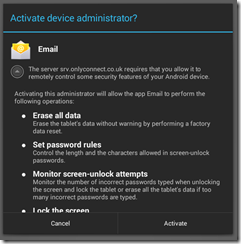
I removed the account and added it back. Ah, now I have this dialog:

image

I tapped Activate and everything was fine. Mail now syncs again.

I am still not sure how you find this dialog if it does not pop up automatically.

Microsoft’s MSDN changes: too much marketing

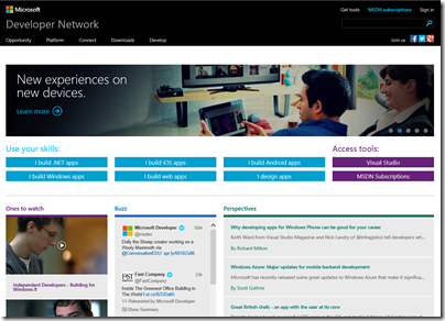
Microsoft has updated its developer site, MSDN (Microsoft Developer Network). Simple, relevant and community driven, says Product Manager Brian Harry in a post introducing the new site.

image

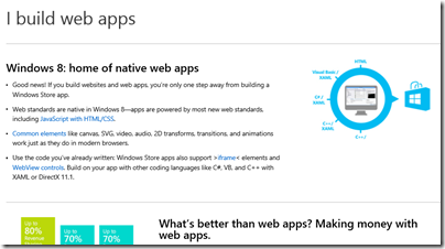
Developers are not convinced that it is an improvement. The comments to Harry’s post are pretty damning, in fact. The core complaint is that the new MSDN home page is not a developer site, but a marketing site. Click on those “Use your skills” buttons and you get not technical references, but marketing pitches. They are misleading too. Click on “I build web apps” and you get a pitch for Windows Store apps build with HTML and JavaScript – and no mention of ASP.NET or Windows Azure.

image

What do developers want? Here’s a good suggestion:

Why don’t you have your team work on changes to MSDN that people would actually want? Like editable blog comments with formatting and code snippet options? Or Connect/UserVoice sites that aren’t horrific and disjointed? Or adding the TypeScript blog to the Dev Tools blog feed (something I’ve mentioned a half dozen times already to various people at MS, you’d think this 5 second update might make it into someone’s queue after TypeScript being out for almost a year now)?

I just cannot fathom how you guys are so adamant that listening to developers is important to you when 99% of feedback is ignored in lieu of changes that no one asked for and no one wants.

Most people come to MSDN in search of technical information. I suspect the strong marketing pitch for Windows Store apps will be counter-productive.

On the other hand, present developers with a fast, coherent, logically organised technical resource so that you can easily find both the API reference for the platform you are targeting, and comments and help with using it, and this will attract them and make them want to use the platform more often.

Review: Bayan Audio Soundbook Bluetooth dock

The Bayan Audio Soundbook is a portable wireless speaker system for your smartphone, MP3 player, tablet or laptop. Oh yes, and an FM radio too.

image

It measures 160 x 88 x 38 mm –  chunky for a portable unit, and at 530g not that light, though heavy is often good when it comes to audio. Not something for a pocket or small handbag, but fine to tuck in your case.

image

The unit feels solid and has an unusual design. The front flaps down and folds back to make a stand, and the action of opening it also switches the device on. Hence the Soundbook name: open and play.

image

This is a Bluetooth 4.0 device, and supports A2DP and aptX for high quality audio. Pairing your smartphone is a snap, with no codes involved. It also supports NFC (Near Field Communications), which worked well using a couple of Android devices I tried, a Nexus 7 tablet and a Sony Xperia phone. Just tap against the NFC logo on the underside of the flap, and a dialog appears to confirm the connection.

The Soundbook, in combination with your mobile, is also a speakerphone. There is a built-in microphone, and it behaves like a Bluetooth headset, pausing the music to let you take a call and resuming afterwards.

image

You can also connect without Bluetooth, using an input on the rear. Finally, there is an output jack socket so you can use the Soundbook as a wireless input to your hi-fi.

Battery life is up to 10 hours for radio or wired connections, shorter if you are using Bluetooth.

The USB power connector is the Mini-B type. A shame that Bayan did not choose the Micro-B standard which is now more common.

So how is it? It seems a lot of thought has gone into the design and the flexibility is impressive. The actual sound quality though is only so-so, thanks to the small 1″ internal speakers, and lacking in bass despite a 2″ passive bass radiator. It is stereo, though you will not notice unless you are very close and I wonder if Bayan should have borrowed an idea from Logitech’s excellent Squeezebox or UE Radio, and gone for mono. At maximum volume it is pretty loud though rather strident.

Still, this is all a matter of expectations. It is miles better than the tinny speaker built into your smartphone or tablet, and the speakerphone feature is useful.

The FM radio is not too good unless, perhaps, you are particularly close to the transmitter. Bayan says there is “an advanced integrated FM antenna” but in practice I found it difficult to get decent reception other than for a couple of local stations, and even then only after careful placement. There are no presets; you have to press and hold tune up and tune down buttons to scan for channels, which is inconvenient.

You cannot switch between Bluetooth sources other than by disconnecting the current source in order to connect another. However, it will remember up to 4 pairings at a time.

Pros and cons

The Bayan Soundbook is nicely designed and supremely flexible. I particularly like the speakerphone capability, which means you can stick this on your desk, enjoy the music, but still take hands-free calls.

That said, if this is a device for a desk, Bayan should have made it a bit larger and bumped up the sound quality.

This is best for portable use then, for which it is not bad, though a little bulky and heavy. I could more easily forgive that if the sound quality were just a bit better.