A new old song from david bowie: where are we now?

Why is the arrival of a new song from David Bowie so moving? Several reasons.

image

First, the surprise of it. A decade in reclusive retirement, the inevitable rumours of ill health, little prospect of anything new, and then this, not only a song, but an entire album is in the can.

Second, the song itself. Cover designer Johnathan Barnbrook writes:

The song Where are we now? is a comparison between Berlin when the wall fell and Berlin today.

which has some authority since he worked with Bowie, but of course it is more than that, it is about Bowie then and now, and for those of us who grew up with this music, about ourselves then and now.

It is not a happy song, mournful and uncertain about the future (the song title ends with a question mark) but it is not an unhappy song; Bowie seems more at peace with himself than in the past.

I love the song and expect to play it frequently for a while.

Never forget though that this is art and comes from one skilled at hiding in plain sight.

Much respect for Bowie that is able to be his age (like Leonard Cohen) rather than re-enacting his youth (like Mick Jagger).

The cover of the album is also striking.

image

Do read Barnbrook’s questions and answers from the link above for some insight into why it is as it is, for example:

Obscuring Bowie’s image is also reference to his identity, not only in the past when he changed endlessly but that he has been absent from the music scene for the past ten years. Was this an act to hide his identity or that he has simply become more comfortable with it?

Another question!

I can’t wait for the album.

Extraordinary: the FTC says it is OK for Google to bias search results in its own favour

The most remarkable statement in the report from the US Federal Trade Commission’s investigation of Google is this one:

The FTC concluded that the introduction of Universal Search, as well as additional changes made to Google’s search algorithms – even those that may have had the effect of harming individual competitors – could be plausibly justified as innovations that improved Google’s product and the experience of its users. It therefore has chosen to close the investigation

In other words, the FTC did not find that there was no bias in Google’s search results. It found that bias is OK if it “improves Google’s product and the experience of its users”, a phrase which is something I would expect to hear from a company’s own public relations team, not from a government report.

It is an extraordinary conclusion and runs counter to normal expectations of what a government body investigating anticompetitive business practices would be likely to support. It does make me wonder if the FTC appreciates the power of Google over which web sites are visited; given the use of the search engine by people such as students and journalists the company has remarkable potential influence over a wide range of human knowledge, as well as the power to make or break a company for which the web is critical either for direct sales or for marketing.

I also wonder what precedent it sets. In other words, can any company justify activities that harm competitors unfairly by claiming that they “improve the experience” of customers?

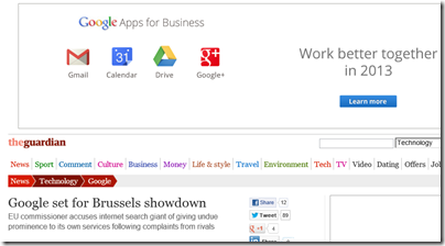
Update: It looks like the EU may take a stronger line, according to this article in the Guardian. From which I cannot resist posting a screenshot.

image

Hacking Windows RT and Surface RT to run desktop apps

A developer on the XDA Developers forum, known as clrokr, has figured out how to run unsigned applications on Windows RT (Windows on ARM), including Microsoft’s own-brand Surface RT device.

The technique is described here and involves patching the Windows kernel. Currently it is not possible to jailbreak Windows RT completely, because Secure Boot prevents tampering with the system files, but it can be done after booting by using the remote debugger:

The minimum signing level determines how good an executable’s signature is on a scale like this: Unsigned(0), Authenticode(4), Microsoft(8), Windows(12). The default value on x86 machines is of course 0 because you can run anything you like on your computer. On ARM machines, it defaults to 8.
That means that even if you sign your apps using your Authenticode certificate, the Surface or any other Windows RT device (at this moment) will not run them. This is not a user setting, but a hardcoded global value in the kernel itself. It cannot be changed permanently on devices with UEFI’s Secure Boot enabled. It can, however, be changed in memory.

There is further discussion on the forum here. The technique is not practical for most users yet.

According to clrokr:

The decision to ban traditional desktop applications was not a technical one, but a bad marketing decision. Windows RT needs the Win32 ecosystem to strengthen its position as a productivity tool. There are enough “consumption” tablets already.

Personally I have mixed feelings about this. If I understand the concept correctly, Windows RT is meant to have iPad-like ease of use as well as excellent security. Configuring the operating system so that only code signed by Microsoft or Windows Store apps will run is a key part of the implementation. Surface RT is not as good as it should be, in part because there is too much old-style Windows, not too little.

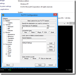
On the other hand, the usefulness of Windows RT is limited by the absence of key apps. There are certain things missing, like the ability to play FLAC files, and until recently, an SSH terminal client (there is one now). Looking at the thread on XDA Developers, note that among the first things users are keen to port are putty (open source SSH client) and VLC (open source multimedia player).

image

That said, personally I would rather see suitable apps come to the Windows Store, rather than introduce all the problems and complexities of desktop Windows to Windows RT.

NVIDIA Tegra 4 chipset: faster performance, longer battery life

NVIDIA has announced the Tegra 4 chipset, which combines an NVIDIA GPU with a quad-core ARM Cortex-A15 CPU.

According to ARM, the Cortex-A15 delivers around twice the performance of the Cortex-A9, used in Tegra 3, and is able to address up to 1TB of RAM.

The Tegra 4 GPU has 72 cores, compared to 12 cores on Tegra 3.

In addition, NVIDIA is including what it calls “Computational Photography Architecture” which uses both CPU and GPU to improve photographic capability.

The part of the announcement that most caught my eye though is the claim of “up to 45 percent less power than its predecessor, Tegra 3, in common use cases”.

Tegra 4 will enable high-performance smartphones, but I am more interested in what this and other next-generation chipsets will offer for tablets. Microsoft’s Surface RT would be more compelling with Tegra 4, rather than its current Tegra 3, since it suffers from poor performance in some cases (Excel, for example) and longer battery life would do no harm either.

There will be even less reason to want a laptop.

NVIDIA’s newly announced Project SHIELD gaming portable also uses a Tegra 4 chipset.

image

Google the new Microsoft, goes to war on Windows Phone users (updated)

Google has fired a one – two – three salvo at Microsoft and Windows Phone users. Consider the following.

First, we learn that Google, under the guise of Winter cleaning, is removing Google Sync from its Mail, Calendar and Contacts online products, for consumers only. This is the Exchange ActiveSync protocol used by Windows Phone and other mobile devices:

Starting January 30, 2013, consumers won’t be able to set up new devices using Google Sync; however, existing Google Sync connections will continue to function

Next, Microsoft reveals that Google is blocking the creation of a YouTube app for Windows Phone:

Microsoft is ready to release a high quality YouTube app for Windows Phone. We just need permission to access YouTube in the way that other phones already do, permission Google has refused to provide.

Now Google is blocking Windows Phone users from accessing Google Maps in the mobile browser. Google says:

The mobile web version of Google Maps is optimized for WebKit browsers such as Chrome and Safari. However, since Internet Explorer is not a WebKit browser, Windows Phone devices are not able to access Google Maps for the mobile web.

but Microsoft observes that Google Maps works fine in IE on Windows and:

Internet Explorer in Windows Phone 8 and Windows 8 use the same rendering engine.

This last is of most concern. It is one thing to “optimize” for WebKit, another specifically to block non-WebKit browsers. If WebKit is in Google’s eyes the de facto standard for mobile devices – which are more significant than desktop browsers – then what is the function of the W3C, and what is to prevent a repetition of the IE6 effect where one company (Microsoft) in controlled what was implemented for most users?

We can conclude that Google has decided its interests are better served by inconveniencing Windows Phone users in the hope of stifling the platform, rather than trying to persuade Windows Phone users to use its services as it does on Apple’s iOS platform (with considerable success).

Sympathy for Microsoft will be limited because of its history. The company has never been a friend of cross-platform support, preferring to keep its customers on Windows. That said, it is difficult to find exact analogies for what is happening now. Nor is it clear what is and is not reasonable. Google Mail, YouTube and Maps are all Google properties. Is it reasonable to expect Google to make the extra effort required to support additional platforms? It is a matter for debate with no easy and clear cut answer.

This does not mean you have to like it. If it is Windows Phone today, what platform might it be tomorrow? Google’s willingness to lock out users of other platforms is a warning, and one that should give pause for thought to any individual, business or government entity who depends or is considering depending on the Google platform. If history tells us anything, it is that monopoly and lock-in always works out badly for users. Check the price of inkjet cartridges for a simple example, or the price of Microsoft Office for business users for another.

What will be the effect on Windows Phone of Google’s campaign? That again is hard to judge. Microsoft is better off than RIM, for example, because it does have something like a complete stack of what it takes to be a mobile platform, especially in conjunction with Nokia: search, maps, email, web-based documents, cloud storage, music streaming and so on. That said, “doesn’t work properly with YouTube, Gmail, Google Maps” is hardly a selling point.

Update: Google now says:

We periodically test Google Maps compatibility with mobile browsers to make sure we deliver the best experience for those users.

In our last test, IE mobile still did not offer a good maps experience with no ability to pan or zoom and perform basic map functionality. As a result, we chose to continue to redirect IE mobile users to Google.com where they could at least make local searches. The Firefox mobile browser did offer a somewhat better user experience and that’s why there is no redirect for those users.

Recent improvements to IE mobile and Google Maps now deliver a better experience and we are currently working to remove the redirect. We will continue to test Google Maps compatibility with other mobile browsers to ensure the best possible experience for users.

Is Google being straight with us? Why has the statement changed overnight?

One user discovered that certain URLs work for Google maps on Windows Phone and posted a video to prove it.

The video shows Google Maps working on a Lumia 800 (not the latest version of Windows Phone). I tried this URL:

ms-gl=au&ie=UTF8&t=m&source=embed&oe=UTF8&msa=0&msid=202255975001106586432.0004bb17c01b36a71a644

on my own Lumia 800 and it does indeed work. You can search for places, they show up on the map, and you can zoom with the + and – controls. However, it is not perfect. The search box is slightly corrupted and I am unable to pinch to zoom or swipe to pan. Better than nothing? Certainly.

Still, the experience is sufficiently degraded to lend some credence to Google’s statements; and there is undoubtedly extra work in supporting additional browsers as any web developer will confirm. 

Is Google at war with Windows Phone, or just not going out of its way to support a rival platform? Watch this space.

Google fights Android fragmentation with new SDK terms

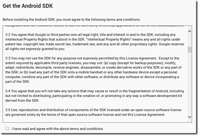
Google has revised the terms of the Android SDK license agreement so that users must now agree not to fragment Android by deriving other SDKs from Google’s official offering. In fact, you now have to agree not to fragment Android in any way as a condition of using the Android SDK.

image

The key clauses seem to be these (I write as a non-lawyer):

3.2 You agree that Google or third parties own all legal right, title and interest in and to the SDK, including any Intellectual Property Rights that subsist in the SDK. "Intellectual Property Rights" means any and all rights under patent law, copyright law, trade secret law, trademark law, and any and all other proprietary rights. Google reserves all rights not expressly granted to you.

3.3 You may not use the SDK for any purpose not expressly permitted by this License Agreement. Except to the extent required by applicable third party licenses, you may not: (a) copy (except for backup purposes), modify, adapt, redistribute, decompile, reverse engineer, disassemble, or create derivative works of the SDK or any part of the SDK; or (b) load any part of the SDK onto a mobile handset or any other hardware device except a personal computer, combine any part of the SDK with other software, or distribute any software or device incorporating a part of the SDK.

3.4 You agree that you will not take any actions that may cause or result in the fragmentation of Android, including but not limited to distributing, participating in the creation of, or promoting in any way a software development kit derived from the SDK.

How much of this is new? Here are the terms as stored on my hard drive:

3.2 You agree that Google or third parties own all legal right, title and interest in and to the SDK, including any Intellectual Property Rights that subsist in the SDK. "Intellectual Property Rights" means any and all rights under patent law, copyright law, trade secret law, trademark law, and any and all other proprietary rights. Google reserves all rights not expressly granted to you.

3.3 Except to the extent required by applicable third party licenses, you may not copy (except for backup purposes), modify, adapt, redistribute, decompile, reverse engineer, disassemble, or create derivative works of the SDK or any part of the SDK. Except to the extent required by applicable third party licenses, you may not load any part of the SDK onto a mobile handset or any other hardware device except a personal computer, combine any part of the SDK with other software, or distribute any software or device incorporating a part of the SDK.

The clause 3.4 specifically concerning fragmentation is new, but the clause 3.3 forbidding the creation of derivative works is not new. When this was first added is an interesting question and please comment if you know.

Note that the Android SDK depends on the Java Development Kit, and that Google’s use of Java in Android was the subject of unsuccessful litigation from Oracle.

Free software advocate Torsten Grote has posted about the move here and says:

This situation is far from perfect for software freedom. Developing Android Apps in freedom is only possible as soon as the Replicant developers catch up. Looks like Android stops being a Free Software friendly platform.

Replicant is a free version of the Android software stack including an SDK, though of course it will not be possible to include new parts of the SDK only available under the non-free license.

I am done with laptops

2012 was the year I lost interest in laptops. It happened in February, when I was in Seattle and purchased a Samsung Windows 7 Slate for the purpose of testing Windows 8.

This Slate has an Intel Core i5 CPU and is a flawed device. With Windows 7 it was particularly bad, since Windows 7 is not much fun for touch control. Windows 8 is much better, though now and again the screen will not respond to touch after being woken from sleep, and a cold reboot is needed.

That said, performance is fine, and the Slate has a couple of characteristics which I like. One is small size. It fits easily in almost any bag. In fact, I can put this Slate, an iPad and a Surface RT in a bag and they take up no more room that with a typical 15.6” laptop.

The second is convenience. If you are travelling, a laptop is an awkward and unsocial thing. I have come to dislike the clamshell design, which has to be unfolded before it will work, and positioned so that you can type on the keyboard and see the screen.

I do not pretend that desktop Windows has a great user interface for touch control, but I have become more adept at hitting small targets in the likes of Outlook. In addition, many tasks like browsing the web or viewing photos work fine in the touch-friendly “Metro” personality of Windows 8.

What about when you need to sit down and do some serious typing, coding, or intricate image manipulation? This is when I pull out a keyboard and mouse and get something similar to a laptop experience.

image

The above shows my instant coffee-shop office, with wireless keyboard and mouse, and internet connection through mobile phone. Though I have abandoned the keyboard and mouse shown, preferring a Bluetooth set I picked up late last year which leaves does not require a free USB port.

I am not sure why I would ever want another laptop. When in the office, I prefer a PC under the desk to a laptop on the desk. A tablet, whether Windows, Android or iOS, works better for mobility, even if mobility means watching iPlayer in the living room rather than travelling around the world.

Nor do I like hybrid tablets with twisty screens and keyboards, which lose the simplicity and instant usability of the tablet concept. I make an exception for Microsoft’s Surface RT, particularly with the touch keyboard cover, which does not get in the way or take up significant space, but does form a usable keyboard and trackpad when needed. There will always be an advantage to using a physical keyboard, since even if you get on fine with a soft keyboard there is no escaping the large slice of screen it occupies. Well, until we can type with detected thought processes I guess.

I am told that an iPad with a Logitech Ultrathin keyboard is also a nice combination, though I have not tried this yet.

Review: Logitech t620 Touch Mouse for Windows 8

Slowly but surely, the humble mouse has been getting more sophisticated. The first examples had just one button. Then came two buttons, then two buttons and a scroll wheel (which is also a third button), and of course wireless so you get a tidier desk at the expense of regular battery replacement.

The touch mouse takes the concept further, with a surface that detects gestures as well as clicks. Logitech’s t620 has an unblemished smooth polished surface and works by detecting where and how you stroke or tap it. It also has a physical click which functions as right, left or middle click depending where and how you click it. Middle click is the trickiest: click the lower 2/3 of the mouse with 2 fingers.

image

The “scroll wheel” on the t620 is a matter of stroking the mouse vertically pretty much anywhere on its surface. It takes some adjustment, but has an elegance that a mouse with physical controls lacks. The downside is occasional lack of precision, on which I have more to say below.

This is a smart mouse, and comes with a small bag, a USB wireless receiver, and a printed setup guide. It runs on 2 AA batteries, though you can use just one if you prefer and it will still work. I found it a lightweight mouse even with both installed.

When you connect the mouse for the first time, Windows 8 will prompt to download the SetPoint control software, or you can download this from Logitech if the automatic download fails for some reason.

image

Windows 7 is also supported, though some of the gestures, like Show Charms, are specific to Windows 8. The mouse works fine on a Mac though without any gesture support as far as I can tell; you do get right and left click, scrolling and so on.

I also tried the mouse on Surface RT, with puzzling results. A driver seemed to be installed, but no SetPoint software, and some gestures work but not others. My favourite, Show Charms, does not work on the Surface RT.

The SetPoint software is rather good, and shows a mini video demonstration of each gesture. You can also enable or disable each gesture, and in some cases set options. For example, you can have a double-tap show the Windows start screen either when executed anywhere on the mouse, or only when carried out on the lower 2/3. The trade-off is convenience versus the risk of triggering the action accidentally.

image

Another important setting sets the pointer speed. I found the speed too fast on the default setting, which means the pointer shoots across the screen and is hard to control. Reducing the speed a couple of notches fixes this.

Windows has its own pointer speed setting too, and I guess it depends whether you want to set this globally for any mouse, or specifically for the t620. One thing I noticed using SetPoint is that the mouse speed is faster immediately after booting, until the SetPoint software starts running.

The USB wireless receiver is a Logitech Unifying Receiver, which means you can connect other Logitech devices such as a wireless keyboard through this single receiver. This could be important if you have something like a Slate with only a single USB port. For the same reason, I prefer Bluetooth devices on a Slate, though connection can be more troublesome. It is time the hardware manufacturers got together with Microsoft to improve wireless device connectivity without needed USB dongles.

The gestures

How about the gestures then? You get the following special actions:

  • Middle click (click lower 2/3 of mouse with 2 fingers)
  • Start Screen (double-tap lower 2/3 with 1 finger)
  • Show desktop (double-tap lower 2/3 with 2 fingers)
  • Switch applications (swipe from left edge)
  • Show Charms (swipe from right edge)
  • Vertical scrolling (swipe up and down)
  • Horizontal scrolling (swipe left and right)
  • Back/Forward (swipe left and right with two fingers)

You can also set scroll options. I tried with and without inertia, which lets you flick for an iPad-like continuous decelerating scroll, and decided that I like the feature.

image

How well do the gestures work? Fairly well, but the problem with any touch device is that you can sometimes trigger actions by accident. I found this a problem in the browser, which has gestures for Back and Forward, with pages disappearing unbidden. The solution is to disable any features that do not work for you.

There is also a problem with horizontal scrolling versus the actions that swipe from left or right. It is easy to trigger a swipe action when trying to scroll.

Sometimes the mouse seems inexplicably fussy about what will or will not trigger an action. I like the Show Charms gesture, because this is otherwise awkward to do using the mouse. It does normally work, but sometimes I swipe in and nothing happens. This may improve with practice, or maybe it is a bug somewhere, I am not sure.

In general, practice does make a difference. For example, I discovered that a very light double-tap is best for the Start Screen gesture. In general, this device responds well to a light touch; trying to force a gesture to work with firmness seems counter-productive.

These issues illustrate the point that a touch device introduces an element of imprecision which some will find infuriating. If you play games with fast action and where any mis-click could be fatal, this mouse is not suitable.

The gain is significant too. The ability to do more with the mouse means less switching between mouse and keyboard. The quick flick to Show Charms makes Windows 8 more user-friendly, if you are using it without a touch screen.

Overall I like it, but be prepared for some time learning to get the best from this mouse, and expect to change some of the settings from the default.

 

Visual Studio LightSwitch HTML: mainly for mobile

Microsoft’s Visual Studio LightSwitch is an innovative development tool that lets you build multi-tier database applications without ever designing the user interface directly. Instead, you work with defining the database and the the features you want on your screens. LightSwitch generates the user interface for you. You can also add code snippets, and advanced developers can create custom controls and extensions.

The thinking behind LightSwitch was to make it easy for non-developers to create database applications, though it is not the most intuitive of tools and in reality it is developers looking for rapid application development who are most likely to use it. There is a lot to like in the way it is designed, like the data-first approach and the easy to use database designer, but this is spoilt by some odd decisions. One is that the LightSwitch team are seemingly averse to reference documentation, preferring to deliver various how-to walkthroughs, which is frustrating if you want to find out in detail how it is meant to work.

The initial release of LightSwitch, as well as the new edition in Visual Studio 2012, generates only a Silverlight client, making it useless for mobile devices and somewhat annoying on desktop PCs since you have to install the Silverlight runtime. Microsoft has addressed this by creating an HTML client update, which lets you generate an HTML user interface. This is now at Preview two, and I downloaded it to have a look.

Since LightSwitch generates the user interface from metadata, you might hope that the HTML version would let you take a project created for Silverlight, and simply generate a functionally equivalent HTML application instead. Even if some touching up was needed, such as rewriting C# snippets in JavaScript, this would be a nice option. However that is not the approach Microsoft has taken. It has added an option to create an HTML client for a LightSwitch project, but you have to redo all the screens. In addition, the HTML client is intended mainly for mobile, and is designed for touch control, as explained by Microsoft’s Joe Binder here:

We are not expanding the HTML client’s scenario target to include desktop in our first formal release.  The first release will be based exclusively on JQueryMobile and be optimized for building touch-oriented apps.  We’ll stay tuned to your feedback to sort out where/when we go after that, but we still have some issues to sort out for our mobile story and we’ll remained focused until we feel confident that we have a viable mobile offering.

Of course it is still HTML, and will run on modern desktop browsers, though the generated user interface uses JQuery Mobile extensively. Another of the issues here is that HTML 5 may be better supported on smartphones running WebKit-based browsers than on desktops such as Windows XP running Internet Explorer 8, creating problems for LightSwitch. It is also hard to create a user interface that is equally well suited to touch control as to keyboard/mouse interaction; this issue is a common complaint about Windows Store apps on Windows 8.

The HTML client is still interesting, more so than the original LightSwitch with its Silverlight web or desktop clients. Rapid database app development for mobile devices is an key area, as businesses work to enable their mobile users to access company data.

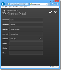
After installing the preview, I built a quick HTML client app, based on a contact database.

image

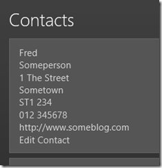
It did not take long to build a working application, though there are some puzzles. My first effort at creating a contact list only displayed the firstname of each record. Apparently that is the “summary” layout, and I cannot see any quick way to change the summary definition to something more useful. Instead, I changed it to a Rows Layout which shows all the fields, but lets you delete those which are not required. Then I added an Edit contact button, though it appears as plain text without even an underline to show that it is a hyperlink, and I cannot see quickly how to change this:

image

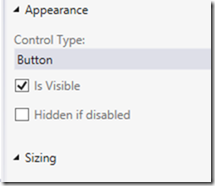
The button’s “Appearance” properties are not helpful:

image

I also found an annoyance that may be a bug. I created several new contacts via a Contact details form (the first illustration above). I saved each contact with the tick button, whereupon they appear in the contact list. However they are not yet really saved. To save the contact to the database, you have to execute the save action, which is a built-in button on the BrowseContacts form. When I tried to save, the phone number fields (defined as Phone Number fields) failed validation, even though they would be valid phone numbers in the UK, and the records were not saved. Fair enough I suppose, but why did they pass validation in the Contact Detail form?

I am sure there are easy fixes for all these niggles, but I mention them to illustrate the point about this not being the most intuitive of tools.

The general approach also takes some mental adjustment. Here is a tool that makes web apps, but you cannot use a web design tool to customise the user interface.

As a tool for building mobile web apps, LightSwitch does show promise and I look forward to the final release. That said, it would be good if Microsoft could adapt the HTML output so you can make it suitable for desktop browsers as well.