Infragistics building cross-platform development strategy on XAML says CEO

I spoke to Dean Guida, CEO at Infragistics, maker of components for Windows, web and mobile development platforms. Windows developers with long memories will remember Sheridan software, who created products including Data Widgets and VBAssist. Infragistics was formed in 2000 when Sheridan merged with another company, ProtoView.

In other words, this is a company with roots in the Microsoft developer platform, though for a few years now it has been madly diversifying in order to survive in the new world of mobile. Guida particularly wanted to talk about IgniteUI, a set of JQuery controls which developers use either for web applications or for mobile web applications wrapped as native with PhoneGap/Cordova.

“The majority of the market is looking at doing hybrid apps because it is so expensive to do native,” Guida told me.

Infragistics has also moved into the business iOS market, with SharePlus for SharePoint access on an iPad, and ReportPlus for reporting from SQL Server or SharePoint to iPad clients. Infragistics is building on what appears to be a growing trend: businesses which run Microsoft on the server, but are buying in iPads as mobile clients.

image

Other products include Nuclios, a set of native iOS components for developers, and IguanaUI for Android.

I asked Guida how the new mobile markets compared to the traditional Windows platform, for Infragistics as a component vendor.

“The whole market’s in transition,” he says. “People are looking at mobility strategy and how to support BYOD [Bring Your Own Device], all these different platforms, and a lot of our conversations are around IgniteUI. We need to reach the iPad, and more than the iPad as well.”

“There’s still a huge market doing ASP.NET, Windows Forms, WPF. It’s still a bigger market, but the next phase is around mobility.”

What about Windows 8, does he think Microsoft has got it right? Guida’s first reaction to my question is to state that the traditional Windows platform is by no means dead. “[Microsoft] may have shifted the focus away from Silverlight and WPF, but the enterprise hasn’t, in terms of WPF. The enterprise has not shifted aware from WPF. We’ve brought some of our enterprise customers to Microsoft to show them that, some of the largest banks in the world, the insurance industry, the retail industry. These companies are making a multi-year investment decision on WPF, where the life of the application if 5 years plus.

“Silverlight, nobody was really happy about that, but Microsoft made that decision. We’re going to continue to support Silverlight, because it makes sense for us. We have a codebase of XAML that covers both WPF and Silverlight.”

Guida adds that Windows 8 and Windows Phone 8 are “great innovation”, mentioning features like Live Tiles and people hub social media aggregation, which has application in business as well. “They’re against a lot of headwind of momentum and popularity, but because Microsoft is such an enterprise company, they are going to be successful.”

How well does the XAML in Infragistics components, built for WPF and Silverlight, translate to XAML on the Windows Runtime, for Windows 8 store apps?

“It translates well now, it did not translate well in the beginning,” Guida says, referring to the early previews. “We’re moving hundreds of our HTML and XAML components to WinJS and WinRT XAML. We’re able to reuse our code. We have to do more work with touch, and we want to maintain performance. We’re in beta now with a handful of components, but we’ll get up to 100s of components available.”

It turns out that XAML is critical to the Infragistics development strategy for iOS as well as Windows. “We wrote a translator that translates XAML code to iOS and XAML code to HTML and JavaScript. We can code in XAML, add new features, fix bugs, and then it moves over to these other platforms. It’s helped us move as quickly as we’ve moved.”

What about Windows on ARM, as in Surface RT? “We fully support it,” says Guida, though “with a straight port, you lose performance. That’s what we’re working on.”
Will you buy a Surface Pro? Here is why and why not

Microsoft has announced pricing for Surface Pro, its own-brand tablet running Windows 8. Quick summary:

  • 64GB is $899
  • 128GB is $999

image

UK pricing has not been announced, but if it follows the pattern of Surface RT we can expect around £720 and £799.

These prices include a free Surface pen, but not a Touch or Type keyboard cover. Since this is one of the best features of Surface, you can add around $120 or £100 (a little more for the Type cover) to the price.

Here’s why you don’t want a Surface Pro:

  • Unlike Surface RT, this tablet runs any Windows application, most of which do not work well with touch control. So you will need that keyboard and trackpad or mouse, making it an awkward thing versus an iPad or, in some ways, a traditional laptop.
  • The spec is a long way from cutting-edge. Screen is 1920×1080 pixels, versus 2048-by-1536  on a cheaper Apple iPad. Core i5 has been around a while. Storage spec is poor – even 128GB is small by current standards, my Samsung Slate from February had a 256GB SSD – and the cameras seem no better than the basic ones in Surface RT. 4GB RAM is also minimal for a new Windows machine.
  • This thing is not cheap. With the keyboard, it is nearly double the cost of a Surface RT, and you don’t get Office 2013 thrown in – Home and Student is around $100 or £85.
  • Microsoft is including a pen. Why? It does not clip into the Surface so you will lose it, and a pen, while fantastic for taking notes or sketching in tablet mode, is less good than a mouse or trackpad for most other operations.
  • Battery life half that of Surface RT: ouch.
  • Do not compare this with an iPad. It only makes sense if you want or need to run Windows. It is even less like an iPad than Surface RT.

A failure? Not necessarily. Here is why you do want a Surface Pro:

  • It is a little bigger than Surface RT, but much smaller than the average laptop, even with the keyboard cover, and it is all you need on your trip. I find laptops bulky and awkward now.
  • Performance will be much better than Surface RT. I presume it better my existing Samsung Slate, which has an older Core i5, and that is already a zippy performer.
  • The Surface is well made and designed. The only problem I am aware of with Surface RT is fraying keyboard seams, which I hope will be fixed in later production runs. The flip-out stand works well and the keyboard covers are excellent.
  • That USB 3.0 port is a big asset.  Of course Surface RT should have had this as well. You can attach as much storage as you need with great performance, or other devices.

The question is this: what other laptop or Windows 8 slate will be better than a Surface Pro, all things considered? You will easily find a better spec for the money, but when you evaluate the complete package Surface Pro may still be a winner.

That said, we have not yet seen Surface Pro and my judgment is based on combining what I know about Surface RT with my experience of the Samsung Core i5 slate.

The internal storage limitation is my biggest concern. 64GB is hopeless and 128GB still too small. There is a microSDXC card slot, and a sizeable card will be pretty much essential, again increasing the real-world price.

Visual Studio 2012 gets Windows XP targeting, Team Foundation Server fixes

Microsoft has released Update 1 for Visual Studio 2012. New in this update is the ability to target Windows XP with C++ applications. Brian Harry has a list of what has changed here, based on the preview from a month ago.

image

There are many updates and fixes for Team Foundation Server (TFS), including support for the Kanban development methodology in TFS Web Access. You can now do load testing, unit testing and coded UI tests for SharePoint apps. Another notable fix is that you can do mixed managed/native debugging in Windows Store (that is, Metro) apps.

The TFS update is not seamless, as Harry explains:

It’s actually a full new install (though it will silently uninstall the older version and install the update so it feels like a “patch”).  However, we still have some work to do to make this as seamless as possible.  If you’ve done any customization of your TFS install (enabling https, changing ports, etc) you will need to reapply those customizations after installing the update.

Harry also says there will not be an SP1, except that there might be:

As we are currently thinking about it, there will be no SP1.  We have changed the model from a single Service Pack between major releases to a sequence of “Updates”.  So you can, kind of, think of Update 1 as SP1.  I suppose it’s possible that, at some point, we will decide to name one of the Updates as an “SP” but that won’t really change anything.

Confused? Surely not.

You can get the update here or an offline (complete) installer is here.

Finally, I was interested to see some of the issues which developers find annoying highlighted in the comments to Soma Somasegar’s blog:

  • XAML 2009 is not supported in the editor
  • Expression Blend is still in preview
  • The need for a developer license to build Windows Store apps is a constant irritation. The complaint is not about needing a license to deploy to the Store, but about Visual Studio refusing to build Windows Store apps unless you obtain a free online license, which installs some sort of key on your machine, and which expires after a few months.

No complaints about monochrome icons though, so I guess the new look has been accepted if not actually loved by developers.

Kingston DataTraveler Workspace and Hands On with Windows to Go

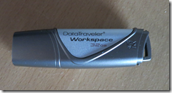
I received a Kingston DataTraveler Workspace for review, one of the few devices supported for use as a Windows to Go drive. Windows to Go is a way of running Windows 8 from a USB drive. If you need to take work home and continue on a home PC, Windows to Go lets you do so in an isolated environment. It is also a useful way to protect sensitive data, since there is an option to encrypt the drive with Bitlocker, the encryption method built into recent versions of Windows.

image

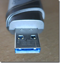
The DataTraveler Workspace is a 32GB USB 3.0 drive. It follows the usual convention of having a blue connector to indicate USB 3.0 support.

image

USB 3.0 is recommended but not required for Windows to Go. If you run from USB 3.0, the performance should be equal or better than running from a hard drive. It will work with USB 2.0, but will be slower.

Microsoft’s documentation for Windows to Go is not that great. Still, it is easy to get started. All you need is a supported USB drive and Windows 8 Enterprise (or any x86 version if you do not mind using the command line).

First, mount the Windows 8 Enterprise install DVD. Identify install.wim from the Sources folder on the DVD and make sure it is accessible.

Next, connect the USB drive to a USB 3.0 port if possible.

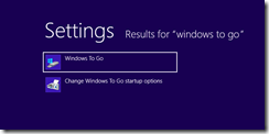
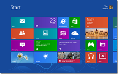
Then start the Windows To Go wizard – to find it search Settings and not Apps on the Start screen. [If you do not have Windows 8 Enterprise, check the scripting guide as well as the licensing requirements.]

image

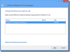
Run the wizard and select the target USB drive

image

The wizard will find install.wim automatically, or you can help it out if necessary.

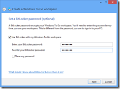
Optionally set a BitLocker password. Recommended, or why do you need Windows to Go? Do not forget it though.

image

Finish the wizard and after a few minutes you have a Windows to Go device ready.

I stuck it into a Dell laptop running Windows 7 and booted. This is essentially a new install of Windows 8, so it did all the detecting devices and welcome stuff. I signed in with a Microsoft account and despite only having USB 2.0 on this laptop, was pleased with the performance.

image

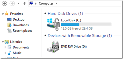
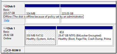
I noticed that the normal SSD drive on the laptop was invisible in Explorer.

image

On further investigation, I found it had been marked offline by my system policy – I don’t recall setting this, so it is a default.

image

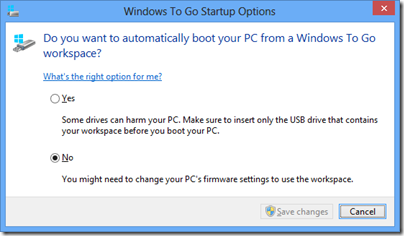
For my next experiment, I shut down, stuck the USB drive into a Samsung Slate, and rebooted. The slate did not boot from USB by default, but I did find Windows To Go startup options, which I believe are in all versions of Windows 8, which let you set an option to use it.

image

That worked. Then – disaster. The slate has no keyboard, and only one USB port. I was prompted for the Bitlocker password, but no matter where I tapped, the on-screen keyboard did not pop up for me to enter it. I had to find the dock for the slate, which has an additional USB port, plug in a USB keyboard, and retry. I can see this being a showstopper in some scenarios.

That worked though, and although I am not yet clear from the documentation how free and easy you can be moving Windows To Go between different hardware, I was impressed by how quickly and easily it started. The only inconvenience is that I had to re-enter the wifi key, presumably because the wifi adaptor on the slate is detected as a different device from the one on the Dell.

Pretty good, but this being a new install of Windows 8 I have considerable work ahead of me to make it useful by installing Office and other applications. How does this work in a business where you need stuff pre-installed?

The answer is here, if you can make sense of it: Microsoft’s instructions on creating a custom Windows image that you can use for multiple Windows To Go drives. It is not trivial; you start by downloading and install the Windows ADK (Windows Assessment and Deployment Kit) for Windows 8.

Another day maybe. For now, I am impressed. The main snag is that few of my PCs have USB 3.0.

Windows To Go does not work on Microsoft’s Surface RT tablet, but will work on Surface Pro when that is released.

Update: another issue with Windows To Go turned up when I tried running it on a netbook. I was impressed with the performance and that it worked, after a few minutes “detecting devices”. However when I launched Word 2013 it said Office needs activation because of changed hardware. Presumably this will be a real problem if you regularly use your Windows To Go device on different PCs, which as I understand it is how it is meant to be used.

Office activation is part of Microsoft’s copyright protection for Office and I presume that after a certain number of activations it will no longer activate.


Review: Edifier Spinnaker e30 Multimedia Speakers

Now these are smart. A pair of three-way active speakers shaped like spinnakers, with Bluetooth 2.1 support so you can use them without wires. I think wireless is the future of home audio, so high quality devices like this catch my interest. You come home, pull out your smartphone, press play and sweet music fills the living room.

The e30s have a wireless controller too, a bulbous device which gives out an other-worldly red glow from its base. Twist to set the volume, tap the top to turn on or switch input. Is this all you need?

image

Here is a closer look. Each speaker stands around just over 400mm high. At the base they are about the size of a CD (remember them?), tapering to a point at the top. The speaker units are of plastic construction, mostly covered with acoustically transparent cloth, and with an aluminium protrusion at the base to give additional stability and a way of tidying the cables.

The right-hand speaker is the master, and has four connections:

  • Power in
  • Combined analogue/digital input
  • Subwoofer out
  • Connector for left-hand speaker

Internally, there are three drivers in each speaker, comprising a silk-dome tweeter, a 70mm mid-range unit, and a 116mm woofer. There appear to be six channels of amplification, one for each driver, rated at 10w RMS for the tweeter, 10w for the mid-range, and 25w for the bass, quoted per channel. Frequency response is quoted at 68Hz-20KHz +/- 3dB; good for speakers of this size, though for faithful low-frequency reproduction you will need to use that subwoofer connection.

Modes of operation

The Spinnakers are pretty flexible when it comes to connections. The analogue input is a standard 3.5mm jack which you can connect to any external player, such as a computer, an iPod, an Airport Express, or a CD player. This input doubles as an optical digital input, which I tested at 16/44 (standard CD resolution) without any issues. Alternatively you can use Bluetooth, with support for A2DP (Advanced Audio Distribution Profile), which means that most modern tablets or smartphones will be able to play audio to the speakers. No worries about dock connector types or Apple’s proprietary AirPlay wireless system.

A possible scenario then is to have the speakers permanently wired to a computer or another source such as a Squeezebox or Sonos unit. Then you can use Bluetooth for convenience, and the wired source for best quality.

An obvious position for the speakers is either side of a desktop computer, but they are good enough to sit in the living room too, particularly when boosted with a subwoofer.

Setup

After unpacking the speakers, the first task is to charge the wireless controller using the supplied USB cable. Next, connect the power, connect the speakers to each other, and optionally connect to a wired source.

image

This task is more awkward than it should be, since there is limited space in the base of the speaker and you have the bend the cable back firmly in order to align each plug with its socket. Next, you have to feed the cables through channels in the base of the unit in order to stand the speaker up without it rocking.

image

I found the cable tended to come away from the channels easily if you move the speaker so it is all a bit fiddly.

image

Next, find the controller and turn the speakers on by holding down its central button. The controller works as follows:

  • Press and hold top button to turn on, cycle between inputs, or turn off.
  • Tap top button to mute/unmute audio
  • Rotate controller to change volume
  • Hold down button and rotate controller to skip track back or next

The current status is shown by a light at the top of the right-hand speaker, which shows off for off, blue for Bluetooth, green for analogue wired input, and red for optical digital input.

Bluetooth pairing is rather simple. Switch to the Bluetooth input, then search for a Bluetooth device on the unit you want to connect. Select the Edifier and you are done. To connect a different device, repeat.

Sound quality

The sound is impressive, especially if you listen in the sweet spot in the centre with the speakers in front of you. The quality is rich and refined, especially with a wired connection, but also enjoyable via Bluetooth. They also go loud, not enough for parties or to annoy the neighbours perhaps, but plenty loud enough for most listening. To put some numbers on that, I measured over 85 dB without any obvious distortion. Bass is a little lightweight, but not so much as to spoil enjoyment.

I tried attaching a subwoofer which rounded out the sound nicely. The subwoofer output covers the range 20Hz – 100Hz and is pre-filtered. One note of caution is that the the output socket has a narrow entrance and I had to try a couple of different cables before finding one that fitted properly; the ill-fitting cable rewarded me with a horrible noise.

If I put on an audiophile hat I can find fault with the sound. It is slightly sibilant, especially via Bluetooth. There is some smearing of detail compared to a high-end system, and a slight boxiness to the sound. Vocals are not quite as natural. But here I am comparing to a system that is many times the size and price. In context, the e30’s sound fine and I doubt any purchaser will be unhappy with the sound.

Annoyances

There are a few issues with the Spinnakers. The worst flaw is the way the cabling is handled, awkward to fit, and tricky to press firmly enough into the holders to prevent a slight rockiness in the right-hand speaker which cannot be good for the sound.

Next, I don’t much like the way the status light works. It is not that easy to see from a distance. A status light on the controller rather than on the speaker would be welcome.

Another factor, not an annoyance exactly, is that the speakers are on the large side for a desktop – and the manual recommends having them 1 meter away from a monitor or TV set – but they are on the small side when placed on the floor.

Conclusion

Despite a few nits, I like these speakers for their stylish appearance, high sound quality, and flexible connections. The price may seem high, but bear in mind that you are getting amplification as well as loudspeakers, and sound that is well beyond most powered speakers. Set these up on a table, place a tablet in between, and you have a rich audio and video experience. I also like the idea of using these for a living room system, if they suit your decor.

A subwoofer is not essential but takes the sound to another level, provided of course that the sub is of equal or better quality than the Spinnakers.

Recommended.


Information density in Metro apps on Windows 8

A common complaint about apps written for the Windows Runtime, also known as Metro by those outside Microsoft, is that they tend to show only a small amount of data per screen. The most information-dense Metro app I have found is a game, Wordament, which shows a fair amount of data in its results screen.

image

The word lists scroll, and so does the list of players. Which proves that you can create an information-dense screen in a Metro app; though it is all custom-drawn.

Apps sell better with Live Tiles, says Nokia, with other tips for phone developers

I attended an online seminar by Nokia’s Jure Sustersic on Windows Phone 8 development. It was a high level session so not much new, though Sustersic says the 7.8 update for existing 7.x Windows Phones  is coming very soon; he would not announce a date though.

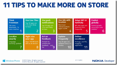
The slide that caught my eye was one on how to make more profitable apps, including some intriguing statistics. In particular, according to Sustersic:

  • Freemium apps (free to download but with paid upgrades or in-app purchases) achieve 70 times as many downloads and 7 times more revenue
  • The top 50 apps are 3.7 times more likely to have Live Tiles
  • The top 50 apps are 3.2 times more likely to use Push Notifications
  • The top 50 apps are updated every 2-3 months
  • The fastest growth is in new markets, so localize


image

Of course what Windows Phone developers want most is a larger market, so for Nokia to sell more phones. Random reboots aside, Windows Phone 8 has been well received, but it an uphill task.

I covered the Windows Phone 8 development platform in summary here.

Microsoft’s Design Language – Tiles and Chromelessness – Prospects for Windows 8

Among the most illuminating sessions at Microsoft’s BUILD conference earlier this month was Will Tschumy’s presentation on the Microsoft Design Language.

Tschumy says that Microsoft began a new focus on design back in 2003 (think Office Ribbon). Then came Windows Phone and Metro (only he did not call it that), and now:

Microsoft is the only organization with a single, consistent design language across each screen we touch

he explained., noting that Xbox as well as the phone uses this same design language.

So what is it? The core idea, he says, is “content before chrome”. This is an old idea, which Google drew attention to with its 2008 web browser called Chrome – a playful title for something which properly should have been called Chromeless. Chrome sported a minimal user interface, putting the focus on the web content, and laying the foundations for web applications where the browser disappears and you forget that you are looking at a web page.

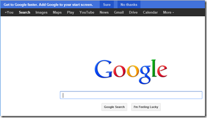
This is actually consistent with Google’s approach from its earliest days, when the Google home page was just a search box and a couple of buttons – a purity of design now spoilt by a menu bar and nagging ads, but you can still see it.

image

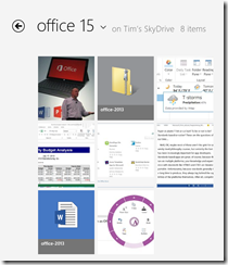
But I digress. What has Microsoft done with the concept? A good example is to compare the SkyDrive “Metro” app with the same folder in Windows File Explorer. Here is Skydrive:

image

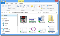
and here is Windows File Explorer:

image

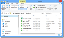
Or possibly:

image

if you are like me and prefer the “Details” view.

The point here is that the “Modern” SkyDrive app has a high ratio of content to chrome, and large icons which preview the content where possible make the content stand out, whereas in File Explorer there is more UI. Of course this is the Windows 8 File Explorer which is also influenced by the same design language. My Details view, which I like because I get higher information density, is closer to an old-style computer approach where the focus is on the number of bytes in the file above what the image happens to look like.

Mixed feelings them, but I do understand what Microsoft is driving at. Spend some time with Microsoft’s Surface RT – no, not on the desktop, on the Metro side – while using some of the better new apps and you begin to appreciate the idea.

Tschumy spelt out five design principles, though only three of these seem to be substantial:

  • Pride in Craftsmanship: fluff
  • Be fast and fluid: Performance matters
  • Authentically digital: not skeuomorphic
  • Do more with less: minimalism
  • Win as one: fluff

No mention then of the “signposting” inherent in the metro transport signs which gave Metro its now-forsaken name, and in fact discoverability is a weakness of Microsoft’s design language; it seems hard to create a UI that is both “content before chrome” and highly discoverable. The common functionality encapsulated in the Windows 8 Charms bar, where features like Search are handled by a UI that is the same in every app, is one attempt to fix this, though first you have to learn how to use the Charms bar. Note the number of users who thought the Wikipedia app had no search function.

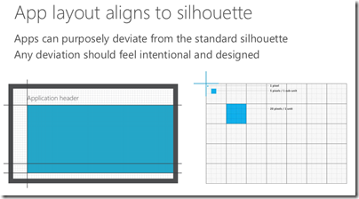
There is also a visual aspect to Microsoft’s design language, which Tschumy does a good job of explaining. Align to a standard grid, he said, unless you need to deviate from it for good reasons.

image

From here we get the tiled look which characterises Metro and which certainly has merits; it tends to be clear though not always beautiful.

Understanding the rationale behind these design principles helps to make sense of new Microsoft products such as Office 2013 and Visual Studio 2012, both of which have been met with mixed reactions on the grounds that they look a bit washed-out, the user interface is hard to focus on. The thinking is that this helps the content, which is what you care about, to stand out more.

image 

That said, I am not convinced by this approach in the context of a productivity tool like Office or Visual Studio. You may care more about the content; but if you want to change the content, then you also care about the tools and want to find them quickly. Scroll bars that fade into the background are great, until you need to scroll the document.

It is also interesting to browse the sample templates in Excel 2013. I grabbed the above screen from there, which seemed to illustrate the design principle of content before chrome, but in other cases I notice that the designers have gone for a washed-out look in the content as well.

image

This makes no sense to me, other than that the designer, observing the fade-into-the-background theme in the chrome, decided to match the content to it in order to get a consistent appearance. Now you cannot see the content or the chrome – uggh! This is what happens when you try to get a very large company working together on a common but somewhat counter-intuitive vision; not everybody gets it.

Which brings me neatly back to Windows 8. I mentioned the Surface RT above; I will be writing more about this, but I do find it a delightful device and one which expresses the Windows 8 and Microsoft Design Language vision better than any other aside from perhaps a Windows phone – unfortunately I have not yet got my hands on a Windows 8 phone to review but hope to do so eventually. It is also a flawed device of course, partly because the performance is less than “fast and fluid” in some cases (like Excel), but mainly because the apps are lacking.

It does seem to me though that Windows 8 has great potential and brings something new to the tablet world. Unfortunately there is uncertainty about whether either Microsoft or its OEM and retail partners have the will and the vision to get past the current hump of unfamiliarity and immaturity for that potential to be fulfilled. Microsoft has spent eye-wateringly huge amounts of money marketing Windows 8 and Surface RT; but I do not think that money has been spent strategically, it has just been thrown at the usual agencies. Many are still flummoxed by what Windows 8 is for, and that is apparent even amongst the OEMs that are manufacturing and selling it.

What will now happen post-Sinofsky, the man whose balls of steel brought Windows 8 to market? In his memo noting the appointment of Julie Larson-Green as head of Windows engineering, Ballmer says:

Her unique product and innovation perspective and proven ability to effectively collaborate and drive a cross company agenda will serve us well as she takes on this new leadership role.

The highlighting is mine. A cross company agenda is exactly what Microsoft needs; but if the new Windows leadership is less determined than the old, it could equally easily pull apart rather than together.

BlackBerry 10: key dates for developers announced, $10,000 incentive dangled

RIM has announced key dates for developers in the run up to launch on January 30 2013.

The schedule looks like this:

  • November 29: SDK update
  • December 11: Gold SDK available
  • January 21: Deadline for app submission to qualify for the $10,000 giveaway
  • January 30: BlackBerry 10 Launch

Following the release of Microsoft’s Windows Phone 8 this month, RIM’s BlackBerry 10 is next up in the category of smartphone platforms trying not to drown in the Android and iOS tide (more Android than iOS of late).

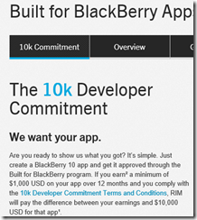
RIM’s strategy includes an element of “if you can’t beat ‘em, buy ‘em”. The company is offering a $10,000 guarantee to developers who achieve at least $1000 revenue from their BlackBerry 10 app in the first year.

image

There are terms of conditions, of course, including the performance, design, security and usefulness of the app.

It will be fascinating to see if RIM is successful in this attempt to fill its store at launch with high quality apps – something Microsoft failed to do for the Windows 8 App Store.

The offer is a no-brainer for developers who already intended to make a commercial app for BlackBerry 10. For others it is a nice incentive but perhaps not the easy money that it first appears, presuming no cheating of course. The majority of apps do not achieve even $1000 revenue. Creating an app that is good enough to do so, without that costing so much that the $10,000 loses its significance, is not trivial.

Adobe AIR for Metro promised for first half of 2013

Adobe Game Developer Evangelist Lee Brimelow has stated on Twitter that AIR for Metro is coming next year.

we’re working on Air for Metro. It should be available first half of next year.

AIR is a way of compiling Flash applications to run outside the browser.

[Microsoft no longer uses the term Metro. We are meant to say Windows Store Apps; but that is even more confusing.]