Embarcadero preparing Delphi, C++ Builder XE3 release

Embarcadero has announced a world tour to promote its forthcoming XE3 development suite.

image

But what is in it? No details yet, but a few clues:

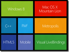
  • Windows 8 “look and functionality” for VCL and FireMonkey apps
  • A new edition of the FireMonkey cross-platform framework, called FM2
  • A new tool called HTML5 Builder.

There are a few more clues in a leaked PDF document on what is new in Delphi and C++ Builder XE3. This refers to “full support of the Windows 8 Metro user interface” and describes new project wizards for “VCL Metro Desktop Application” and “FireMonkey Metro Desktop Application”.

Since “Desktop” normally means non-Metro in a Windows 8 context, this phrase is puzzling, making me wonder if the tool will build apps that look and feel like Windows Runtime apps, but really are not. That would be unsatisfactory, because features like Contracts and Live Tiles only work with real Windows Runtime apps. Or is Embarcadero is planning full Metro support and is distinguishing from mobile apps.

There are also changes in FireMonkey to add support for Actions, Anchors, and Layout managers. Sensor and gesture support will be important for Windows 8 apps.

Finally there will be a SQLite database driver in XE3.

All the above, save the tour announcement, is unofficial and may be wrong or subject to change. I doubt the Metro name will feature so prominently in the eventual release, for example. And Metropolis?

Update

Looking at the wording here seems to confirm suspicions that Delphi and C++ Builder are not getting true Windows Runtime support:

  • Create Delphi, C++Builder and Prism applications with Windows 8 styling and functionality
  • Create HTML5 web apps and mobile apps for Android, iOS and more with new HTML5 Builder
  • Build Windows 8 apps with WinRT using Prism XE3 in RAD Studio

Otherwise, why would Embarcadero state “WinRT” for Prism but not for Delphi and C++ Builder?

Windows 8 release now available; you should install it

Windows 8 is now available for download on MSDN and TechNet, which means the final code is in the hands of a large number of Microsoft-platform professionals. I have been trying out the release, which I installed both as an upgrade over the Release Preview (it does not really upgrade it, but does keep a few settings and documents), and as a clean install on a virtual machine.

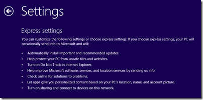
The first thing I noticed was the default settings:

image

You can click Customize to get more information and control over these settings, and I recommend that you do. The one that troubles me most is:

Let apps give you personalized content based on your PC’s location, name, and account picture.

I am not sure how the picture helps with that, but presume it is code for giving apps permission to use it and potentially to share it. The matter of sharing location is difficult; it certainly makes sense for numerous apps from Weather to TripAdvisor; but allowing third-parties to track your physical location is a big ask. Still, if you want the full experience you have to compromise your privacy; that is the choice.

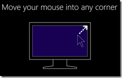
Next I was interested to see what guidance Microsoft would give to new users. This appeared just after setup and before the Start screen is shown for the first time, and takes the form of one or two short but insistent animations:

image

When I installed on a tablet, I got a second animation about swiping in from the sides.

It seems to me that Microsoft is trusting too much that users will enjoy “discovering” the Windows 8 user interface. Perhaps some will; but I was expecting to be offered something like a video and an introductory manual. I think users will click past this and still get stuck.

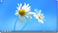
Next, I noticed the new aero-less desktop theme.

image

I do not have strong feelings about this, but admit to some puzzlement about why Aero translucency has gone. Power consumption is a possibility, but why not offer it as an option for desktop users, for example? Still, this is a small detail as far as I am concerned.

Microsoft has chosen a flower for the default desktop background, not unpleasant though a bold choice in some ways. A flower is a strong, evocative image that some will therefore react against, given that a desktop background can be a sort of personal statement.

image

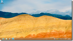
Not many desktop backgrounds are supplied on the install DVD. There is a Flowers theme and another called Earth, which I found rather bleak.

image

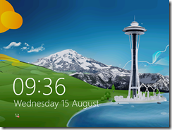
The default lock screen is a painting based, I think, on the Seattle Space Needle.

image

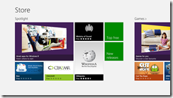
Disappointments? My biggest disappointment is with the RTM Store. I was hoping for a host of new applications, but in fact the Store, while containing a few new apps, is still sparsely populated.

image

This is a problem for Microsoft because Windows 8 badly needs a few compelling apps to persuade doubters that Metro, sorry Modern UI, is not worthless. I love Wordament, yes, but in general we still await great Windows 8 apps.

The best news, I guess, is that I have little to say about the install process. It was smooth, quick, and it worked. No unknown devices in Device Manager on the Samsung Slate; but I realise that this is the one device that everyone has been using to test Windows 8, so I guess this is not surprising. Not all PCs will fare so well.

Businesses should of course be cautious about rolling out a new version of Windows (and will be); and anyone installing this on a machine they use for real work will naturally take a backup first, in case of disaster or just some essential application not working.

If you can though, you should install this new release. Performance is good, it is a decent upgrade from Windows 7 even if you do not use a tablet, and it is only by using it for a while that you will get a feel for the strengths and weaknesses of Microsoft’s new operating system.

Windows 8 RTM: it’s better than you may have heard

Poor old Microsoft. Windows 8, the reimagining of Windows, is getting a mixed reception. There is a kind of alliance, with those who you would expect to oppose Microsoft (open source advocates, Apple enthusiasts and so on) lining up with Windows diehards who dislike too much change. Like Windows stalwart Woody Leonhard (remember those endless Office tips?) who says, under the headline Windows 8 review: Yes it’s that bad:

From the user’s standpoint, Windows 8 is a failure — an awkward mishmash that pulls the user in two directions at once. Users attracted to the new touch-friendly Metro GUI will dislike the old touch-hostile desktop underneath. By the same token, users who rely on the traditional Windows desktop will dislike having to navigate Metro to find settings and apps they intuitively locate in Windows 7.

He adds:

I can confirm after months in the trenches and talking with many hundreds of testers that anyone who defines "real work" as typing and mousing won’t like Windows 8 one little bit.

I disagree. In fact, I had the opposite experience. I installed Windows 8 Release Preview for a non-technical friend, on an old laptop with no touch capability, and was so sure that she would dislike it that I kept the backup image of her Windows 7 install ready to zap it back on.

It did not happen. She was flummoxed at first of course, but after pinning a few applications to the taskbar and learning how to navigate Start, she was fine. All her old desktop apps still work and she cannot see what the fuss is about. Now and again she pops into Modern UI land and plays a game or uses the Facebook/Twitter integration in the People app and it is not a problem.

This has made more impression on me that my own experience, which I tend to discount being used to the bleeding edge. I should mention though that I have no desire to go back to Windows 7, even on my desktop. I like the speed of Windows 8; I like having Hyper-V; I like having the taskbar on both my displays, and it works fine.

I also have Windows 8 on the Samsung Slate which I bought last year, and words cannot describe how much better it is than Windows 7 on the same device. That said, I cannot really recommend the Samsung; its battery life is too short, its design falls short in several places, and it is too expensive to be a mainstream hit. However, it has given me a feel for how well the Windows 8 UI works on a tablet.

My view is this. Windows 8 has plenty of failings, but they are the failings of transition to a better place, not the failings of something that will never work properly. Most of the problems which rile people so much can be fixed with a small amount of effort and perhaps a read of a survival guide. I did one, and there are others just as good or better.

It seems to me to be simply dishonest to portray Windows 8 as this horrible thing that is a nightmare to use. I do not have any evidence for that, beyond the initial painful moments that I have seen at first hand. I do realise that someone might be so much put off by those initial moments that they never want to touch it again, and will declare the same to anyone who will listen, but regard it as my job, as a technical communicator, to help users get past that towards a fairer judgment.

image

Windows 8 is ready, but many of its users are not.

Why I want a Windows RT (ARM) tablet

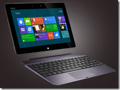
Microsoft has now announced that the first Windows RT tablets will come from Asus, Dell, Lenovo, Samsung, and from Microsoft itself with Surface.

image

Windows 8 on ARM is a different thing to Windows 8 on Intel. On Intel, most Windows applications will run. On Windows RT, the ARM version, only Windows Runtime apps (also known at Metro-style, Modern and Windows Store) will run. There is still a desktop mode, but it is reserved for a special version of Office along with a few utilities like Explorer.

On the face of it, the Intel version is a better deal, because “you get it all.” However, there are times when less is more; in fact, that phrase practically defines the success of Apple’s iOS, which does not run applications coded for Mac OS X.

The problem is this. On a tablet, the Windows desktop is a horrid experience, unless you get out not only your tablet, but also your keyboard and your mouse or stylus. Even the stylus can be a problem, and having lived with Windows 8 on a Samsung Slate tablet for some months, I find a mouse works best.

We have seen this before, with the old Windows tablets starting with Windows XP. OEMs came up with clever designs with twist screens and styluses which clip into the side. These machines certainly have their uses, but they were not mainstream and they were not cheap. Intel Windows 8 tablets will have all the same problems. The poor experience offered by the Windows desktop user interface with touch was a key reason why Microsoft came up with the radical WinRT alternative.

Windows RT on the other hand promises a better tablet experience. with the additional bonus of longer battery life and a lighter, more efficient device. You cannot install desktop apps, but if the Windows 8 ecosystem fails to come up with WinRT apps to cover the essential computing activities, then the Windows 8 project will have failed in its goals.

There is also Microsoft Office of course, which makes some effort to support touch control though it could be better. Still, I would rather have Office which at least has been designed with the knowledge that some users will be controlling it with touch, than all those other desktop applications which presume keyboard and mouse.

The importance of having Office there is that it makes the difference between having to have a laptop with you as well while on the road, and being able to get all your work done on the tablet alone.

This issue does not seem to be well understood either by Microsoft’s OEM partners nor by the general public. I do not blame the latter. On the high street or at the airport, there will be rows of Windows 8 tablets with similar Start screens, and the difference between Windows RT and Windows Intel will be hard to convey. I can imagine salespeople saying, “You should get this one, it is the full Windows,” and steering customers towards the awkward, confusing experience that is Windows 8 on an Intel tablet.

One disappointing remark buried in the announcement:

Over 90% of the RTM applications in the Windows Store support Windows RT

That means 10% of WinRT apps currently do not support ARM, presumably because there is some native x86 code in there.

Microsoft really, really wants developers to build Windows Runtime apps

Or should that be Metro-style apps? or Modern UI apps? or Windows Store apps?

I am not sure; but one thing jumps out at me as I look at the Windows 8 development platform. Microsoft is doing all it can to push developers towards Windows Runtime (WinRT) rather than desktop development.

Here is a small piece of evidence. The contentious new Start screen uses tiles for application shortcuts. These can be static images and text, or live tiles that update with current information. There is only one Start screen though, so desktop apps also have tiles which you click or tap to launch the app in question.

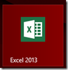
However, there is no documented way for desktop apps to have good-looking tiles. Here is the tile for Excel 2013, for example:

image

It is mostly wasted space. A WinRT app on the other hand can fill that space:

image

or display a picture

image

or take up a double space

image

The question: how difficult would it have been for Microsoft to allow desktop apps to have pretty tiles? I can understand why desktop apps cannot have live tiles, but there is no technical reason I can think of why desktop apps could not have a resource used for a decent tile.

Here is the official answer though, from Microsoft’s Rob Caplan:

Desktop apps cannot customize their tiles and will always use the icon and name from their shortcut.

I guess Microsoft can argue that it wants users to know whether they are about to launch a desktop app or a WinRT app. This could easily be done with a little overlay signifying the desktop. There was no need to ensure that all tiles for desktop apps look ugly.

Except that Microsoft wants these tiles to look ugly. Because it wants you to develop WinRT apps, not desktop apps, and is even willing to have its own Office tiles look bad for the sake of the cause.

Update

This post was picked up by Reddit and of course there are some interesting comments. First, the desktop tiles are improved in the RTM build of Windows 8 (my screenshot above is from the Release Preview):

image

Second, here is a comment apparently from a Microsoft employee:

Wow, what a flimsy argument. The funniest thing about it, though, is that the desktop tiles look MUCH better in the RTM build (though customization is still left to Modern apps). Can’t seem to find a screenshot though.

But on the other hand, of course we want people to develop Modern apps. That’s why we built the platform. But the desktop tiles aren’t a part of that at all.

If I were the author, I’d bring up Contracts as a much better example. Desktop apps can’t support the Share Contract, or Search, or whatever; only Modern apps can. Of course, there’s no telling if this is simply a v1 limitation or a longer strategy; even I have no idea (I’ve only been at the company a little over a year). If we waited to release Windows until we had implemented everything we wanted to do, it wouldn’t come out for years. We have to draw the line somewhere.

Disclaimer: these are my thoughts, not the company’s.

In defence, I presented this only as a “small piece of evidence”.

Note the use of the term “Modern apps”.

Microsoft toughens logo requirements for Windows 8, forbids startup apps

Today I came across the certification requirements for Windows 8 desktop apps. This is the successor to the Windows 7 Logo program, and represents a set of best practices required for software to display the official Windows logo.

In practice, I am not sure how many buyers check that software is certified before buying, though it might make sense for businesses to do this as a matter of policy if they want keep Windows desktops running smoothly and safely.

The requirements are also interesting as a guide to what Microsoft considers to be well-behaved applications.

The new requirements are tougher than before. Some guidelines that were in the “Beyond Windows 7” section in the previous logo program have now moved to become full requirements. Others seem to be completely new.

Here are some highlights:

  • Your app must not depend on any Windows compatibility feature, nor the VB6 runtime.
  • Apps may not start automatically on startup. You may not set the “run” registry keys nor install a shortcut into a startup folder.
  • Apps must use “strong and appropriate ACLs” to secure executables, directories and registry keys.
  • Apps must be compiled with /SafeSEH (safe exception handling), /NXCOMPAT (no data execution) and /DYNAMICBASE (random address space layout).
  • All executables must be signed with an Authenticode certificate – this was the same in Windows 7 but worth repeating.

The automatic startup prohibition is particularly intriguing. It could not be clearer:

10.2 Your app must avoid starting automatically on startup

I hate unnecessary startup applications too; but I do not object to all of them. My password manager runs on startup and sits in the notification area. Some of Microsoft’s own applications do this, for example Lync, Skype and SkyDrive. I would have thought auto-startup is acceptable if it is under the user’s control.

One factor may be that Windows 8 desktop apps do not auto-start on log-in even if you set them to do so. Instead, they start when the user clicks or taps into the Desktop. Therefore, in a sense none of the normal auto-start techniques are reliable.

There is a way round this, which is to install an autorun service.

In general, tough certification requirements are a good idea, though if they are too demanding the risk is that vendors will simply ignore them.

Review: Roxy Music Complete Studio Recordings

We are getting some fine boxed sets in these last days of the CD, the latest being this complete set of Roxy Music studio recordings. What you get is 10 CDs in a smart black slipcase. Eight of the CDs are the original Roxy Music studio albums, while the last two are a double CD of singles, B-sides and alternative mixes. You will have heard many but not all of these if you have the box set The Thrill of it All, but for most people this is now the box to have.

Roxy Music was that stylish, inventive band from the seventies and eighties which combined the distinctive crooning of Bryan Ferry, the quirky electronics of Brian Eno (in the first two albums that is), and the musical excellence of band members such as guitarist Phil Manzanera, saxophonist Andy Mackay and drummer Paul Thompson, though the group members varied from album to album.

The notable thing for me is the progression of the band and how well it survived Eno’s departure. Stranded, the third album and the first without Eno, is perhaps the best and still has traces of experimentalism. By the time you get to the sumptuous melodies of Avalon this is a band that is less interesting but so rich and polished that I still love it.

image

Now the boxed set … there are good things and bad things, but mostly good.

First and foremost, the sound is good, the best yet on CD for Roxy Music. There is a bit of history to this. When first announced, this set was to have high resolution DVDs included, which were to be a flat transfer from the master tapes in a similar manner to the SHM SACDs which have come out of Japan in recent years.

The term “flat transfer” means no additional equalisation or compression is applied. The sound is as close as possible to what is on the tape. It is the opposite of what is known as the “loudness wars”, where perceived volume is maximised at the expense of dynamic range. It also means that the mastering engineers have resisted the temptation to boost the bass and treble to add some artificial sizzle; this can sound good for a brief listen but tends to be fatiguing over time.

A flat transfer is not always the right thing to do. According to mastering engineers such as Steve Hoffman, a specialist in this type of work, some master tapes really do not sound good without further equalisation, though it should be subtly applied. For that matter, I am not 100% sure that these are all pure flat transfers as this is not stated anywhere on the box, but if you read through fan discussions out there including some involved in this reissue, that is the strong rumour. The description repeated on several online retail sites such as Amazon, and therefore probably supplied by the record company, does say “New 2012 flat transfers from the original analogue master tapes ensure the audio sounds truer to its original LP sound.”

What you can hear though is the high quality of the sound. The overall volume is lower than on the 1999 Roxy Music remasters, but that is easily fixed with the volume control on your player. The sound is clean, the frequency response extended, and you can play the CDs loud or quiet and they still sound good.

For example, listen to the bass guitar on Love is the Drug which is what propels the song. I compared the three masters I have, from an early CD on EG, to the 1999 remaster, to this edition. The new mastering is easily the best. The bass guitar sounds deeper and more precise, and the song sounds funkier than ever.

The lack of high-resolution DVDs does not bother me, as I doubt there would be any audible improvement. A new mix for surround sound would be nice to hear, but as far I know that was never planned.

How about the packaging? On the plus side, the CDs are in glossy gatefolds with coloured inner sleeves, a touch of luxury that bring out the glamour of Roxy Music.

On the minus side, this set is really sparse in terms of information. The plain coloured inner sleeves are a waste when you consider that some of the albums had printed inner sleeves which could have been included here. No lyrics, no booklet with photos or biography, no information on the recordings or new mastering.

The quality of the printing varies. The first album, for example, is poorly reproduced compared to the original LP, but some of the later ones are excellent. This may be to do with what original artwork could be found.

Another oddity is that even the albums that were originally in single sleeves are presented here as gatefolds. In these cases, the inner gatefold of albums that were originally in single sleeves has an alternate shot from the cover sessions. This applies to Country Life (a new photo of the two ladies), Siren, Manifesto (I think I have seen this picture before, on the picture disc vinyl release), Flesh and Blood and Avalon. These new pictures are the only new images you will find in this set.

image

Disappointing then that the compilers of this set did not even include all the information that comes with the original albums, let alone new material, but I forgive them, because I have that information anyway, and the trouble taken with the sound counts for far more.

Postscript:

A regular complaint of mine is that reissues take too little care over the artwork. That is apparent on some of the cover reproductions here, with the first album a particularly poor example. Here is my snap of an original Island Records sleeve (left) alongside the new CD cover. Of course you have to make allowance for the smaller size of the CD, but even so this is poor. Look at the blusher on the model’s cheek: a lovely touch on the original, but looks like sunburn on the new CD.

Maybe the artwork is lost, but if I can do better with a snap of a record sleeve on my Canon compact camera, there is no excuse for the professionals.

image


Review: X-mini KAI, a Bluetooth audio dock you can put in your pocket

X-mini makes a popular range of what it calls Capsule Speakers, the latest of which doubles as a wireless speakerphone for your mobile, thanks to Bluetooth connectivity. Essentially, your smartphone sees it as a Bluetooth headset.

image

First though, a word or two about the distinctive design. In the box you get the X-mini KAI, a USB charging cable that also has an audio cable for play-as-you-charge, a handy soft drawstring bag, and a tiny instruction manual.

image

The X-mini KAI measures around 6cm in diameter and 8cm high when expanded. However, you can also push down the concertina and twist left to lock, whereupon it is just 5cm high. You can play it in this mode, but it sounds pretty bad. Still, easily small enough to put in your pocket.

Fit and finish is OK but could be better. Locking the unit shut takes some force and is slightly awkward because of all the switches. The multiple switches and ports do slightly spoil the appearance of the device and are somewhat fiddly to use.

image

So how does it work? First, charge it via any USB connection. It takes at least 2.5 hours to charge fully, for which you get up to 8 hours of playback.

Once charged, you can use the KAI in several different modes. There is a three-position switch. Centre is off, or push left for wired audio, or push right for Bluetooth.

In wired mode, you can use the short 3.5mm jack connector which is coiled neatly in the base to connect to a SmartPhone, iPod, MP3 player or any audio device, and play your music. There is no volume control on the KAI in this mode, just control it from the audio device.

image

The sound is mono of course, but not bad at all. You have to be realistic about what you can get from such a small speaker, but it is far better than the tinny sound you will hear from built-in speakers on phones and tablets.

I used it with the Google Nexus tablet with success. The Nexus is excellent for portable entertainment, particularly if you hack it a little to support Adobe Flash. Combine it with the KAI and you get much better sound from Google Music, BBC iPlayer, YouTube and the like.

X-mini quotes speaker power of 2.5w, frequency response of 100 Hz – 18 kHz, and distortion of less than 0.3%. Unfortunately these figures are meaningless without qualification; frequency response for example should be quoted as plus or minus 3dB or some such.

Still, with devices like this it is the experience that counts, since we are not talking hi-fi exactly. The KAI is a lot of fun, punchy and clear, you can hear a little bit of bass, and transforms the sound on your mobile device into something you can actually enjoy without earphones.

I compared the KAI to my trusty Creative Labs TravelSound. I give the nod to the TravelSound on sound quality, though the KAI was not embarrassed. However, bear in mind that the TravelSound has two speakers, is too big for the average pocket, and eats batteries unless you also carry a mains adaptor with you. KAI wins on convenience.

You can also wire two or more KAIs together for better sound, though I was not able to try this.

Wireless sound

The KAI also works over Bluetooth as mentioned above. To get this working, you slide the Audio key to the right. Then go to your mobile device, enable Bluetooth, and search for available devices. All going well, it will find the KAI and connect. This worked fine for me on the Nexus and on a Nokia Lumia 800 Smartphone.

Once connected, audio plays back through the KAI. It is as simple as that, and although there is some theoretical loss of quality, I did not find this audible on a casual comparison. Your battery will run down a little faster on both devices, but other than that it works just the same.

What’s nice about the wireless connection is that you can move your mobile device around the room and playback is not interrupted. The range is given as up to 10 metres, by which time you will hardly hear the KAI whether or not it is maintaining the connection. I tested this by walking around and the results were good.

In wireless mode an additional control on the KAI comes into play. Press down to play or pause. Move briefly right or left for previous or next track. Move and hold right or left for volume adjustment.

image

You can also use the KAI as a speakerphone, and I tested this with an incoming call. When you hear the ring, press down the control above to answer. The music will pause, and you will hear your caller through the KAI. You can end the call by pressing the same control.

The snag with the call though was that my caller said I was hard to hear. I could fix this by holding the KAI close to my mouth but this was disappointing.

There is a mute button on the device, but note that this does not mute your voice when in a call. Rather, it mutes the speaker in the same way as during any audio playback.

Summing up

This is a great little device, ideal if you want a very small and portable travel speaker that still sounds decent. Bear in mind though that the X-mini capsule speaker is also available in a wired-only form for around a quarter of the price, so you are paying a lot for the Bluetooth and speakerphone features.

The wireless audio works really well, but the microphone seems insufficiently sensitive when used as a speakerphone and I would not want to use it for conference calling. That is a shame since this is otherwise a compelling feature, unless I was unlucky with my sample.

The review unit was supplied by Phone4U and you can find it here, price at the time of writing £79.99.
Using Windows Runtime (WinRT) APIs from desktop applications

After trying out Windows 8 notifications from a Windows Forms application, I did a bit of research into using the Windows Runtime (WinRT) API from desktop applications.

It turns out that this is something Microsoft planned for:

Desktop apps should for the most part be able to use WinRT. This is an area where we should have more information moving forward.

says Microsoft’s David Lamb, in Developer Support. He was answering a question about the Proximity APIs.

How do you do it? In C/C++, according to Steve Harne:

For this to build, you’ll need to set the following compiler switches in the the C++ Win32 Console wizard generated project:

C/C++ / General Settings
    Enable Windows Runtime Extensions (/ZX)
    Additional #Using Directories (/AI) -> set this to "C:\Program Files (x86)\Windows Kits\8.0\Windows Metadata" (modify as per your installation)

C/C++ / Code Generation
    Disable Minimal Rebuild (/Gm-)  -> this is not compatible with /ZX

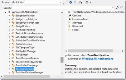
In .NET applications you can set a reference to Windows.winmd. This is a WinRT metadata file, which you can browse in the Visual Studio object browser.

image

You even get a short summary describing each class and class member.

Note that as Microsoft’s Larry Osterman explains here:

there is absolutely no (zero) il in the windows.winmd file – it’s a metadata-only assembly. This is important because winmd files only describe structure, they don’t contain code (note that the C# compiler can produce hybrid winmd files that also contain some code, this was to support certain C# scenarios)

While a lot of stuff works, there will be WinRT API calls that make no sense other than for real WinRT apps. It is also worth noting that all of this is specific to Windows 8 (and higher, I presume). Since most desktop apps will need to be compatible at least with Windows 7, this requires some care. Lamb also says:

WinRT APIs may be tied to Metro style apps, Desktop apps or potentially available to both. The documentation will list which environments (Desktop, Metro style or both) a given API works in.

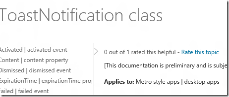
and in fact you can see this in the documentation. For example, the docs for the ToastNotification class states:

Applies to: Metro style apps | desktop apps

image

whereas if you look at the ContactPickerUI class, it says:

Applies to: Metro style apps only

For those APIs where desktop use is supported, you can go right ahead.

Notifications in Windows 8: how to display new-style toast from a desktop app

This post was prompted by the discussion over the fact that Windows 8 boots into the Start screen, and cannot apparently be modified to boot into the Desktop (though no doubt someone will find a way).

What if, I wondered, you put a desktop app into your startup folder so it runs automatically on boot? The answer: it runs on the desktop, but you will not see it until you click or tap into the desktop from the start screen. This is different behaviour from actually starting a desktop app from the start screen, which switches you to the desktop.

So what if that desktop app has something important to tell you? The answer: you will not see it until you switch to the desktop.

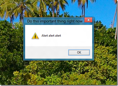
To demonstrate this, I wrote a Windows Forms app that displays a MessageBox alert after a 5 second delay. I ran the app, activated the alert, and switched to a Windows Runtime Metro app. When the alert fired, I heard a little ding, but saw no message. Only after switching to the desktop did I see the message.

image

To be fair, you might not see this even if you were working in the desktop, since Windows has complex (and sometimes unpredictable) rules about when apps are allowed to come to the foreground. Even calling the Activate method, which gives your window the focus, may do no more than flash the icon on the taskbar.

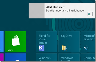
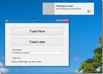
Windows 8 has a new-style “toast” notification mechanism that works across both desktop and Windows runtime. I got this working in my Windows Forms app.

image

So how do you do this? For some background, see Jim O’Neil’s series of posts which start here. However, I mostly used code from the sample Sending toast notifications from desktop apps. This is a WPF application, but I got the code to work in my Windows Forms application. Note that to reference Windows.UI.Notifications you have to add a reference to:

C:\Program Files (x86)\Windows Kits\8.0\References\CommonConfiguration\Neutral\Windows.winmd

Update: in the release version of Visual Studio 2012 the way you reference winmd has changed. See this MSDN article and the section called Core Subgroup; however at the time of writing the method described there does not quite work. Instead, proceed as follows. First right-click the project in the Solution Explorer and choose Unload Project. Then right-click the project again and choose Edit [project].csproj. Add the following to the project file after the other Reference elements:

<Reference Include="Windows" />

then save and close the editor. Finally, right-click the project name again and choose Reload project. Do not add the suggested TargetPlatformVersion element, since if you do the project will not compile.

You also need the Windows 7 API code pack which is here.

Here is a quick summary though. In order to display a toast notification, you first need a shortcut to your app on the Start menu. In addition, the shortcut has to have an AppUserModeId, which you can set in code.

Once that is sorted, you can use the ToastNotificationManager class – for which you need that reference to Windows.UI.Notifications – and retrieve a standard XML template for the notification. You can add event handlers to the notification, so you can respond if the user clicks it. Then call:

ToastNotificationManager.CreateToastNotifier(APP_ID).Show(toast);

to actually show the notification.

Note that your event handlers will not fire on the UI thread, so you need to use thread-safe methods if you want to interact with controls on your form.

It is all somewhat laborious, but on the plus side you get notifications which are better than the old notification area toast, and much better than MessageBox.

Note that this is one bit of code applications will only have if they are modified to work on Windows 8. That is worth noting if you have an application in which notifications play an important role.

image