The one thing missing from Windows 8 tablets announced so far: simplicity

This week at IFA in Berlin PC manufacturers have been showing off their shiny new Windows 8 tablets. Vendors are competing for who has the cleverest way of combining touch-screen, tablet, trackpad and keyboard into a single portable device. Here is the HP Envy:

image

or take a look at this PC Pro preview of the Toshiba Satellite U920T:

Ratchets stretch up and down the panel’s rear, with a central puck keeping the action light and smooth, and the screen flips up and back with a fluid action.

Sony has a Surf Slider, Dell XPS Duo slots into a keyboard dock.

I do understand the reason for all these gimmicks. Sometimes you want a tablet, sometimes you want a laptop, and the idea is to combine them into a hybrid device, just as Windows 8 itself lets you flip between Modern UI (formerly known as Metro) and Desktop.

At the same time though, there is a risk that these vendors are not learning from the past. Two things in particular:

  • The failure of Microsoft’s first Tablet PC. Most models had twist screens and keyboards and styluses. The styluses were prone to getting lost, the twist screens and keyboards were expensive, and tablets became premium-priced devices that were inconvenient to use. Faced with the choice between Tablet PCs and cheaper, simpler laptops, most customers chose laptops.
  • The success of Apple’s iPad. A keyboard is an optional extra, but most manage without it. The screen has a single button, there are a couple of switches and a volume control on the side, it has a dock connector, and that is it. Nor is it premium-priced, at least, not in the context of Apple’s range.

Looking at the effort Microsoft has put into the touch-friendly Modern UI it is obvious that Microsoft has made provision for tablet-only users. Start screen, big icons, easy install and removal of apps, most of the frequently used settings available without going to the Desktop. It is also obvious that Microsoft intends Windows to go further in this direction. Office 2013 just has OneNote MX in the Modern UI, but more is coming.

Where then are the devices that focus on the simplicity of a single slate, with a wireless keyboard on offer if needed, priced to compete sensibly with Apple and Android tablets?

Maybe there will be some of these; but the messaging coming out of IFA is all wrong and I predict that once again many customers will opt for “just a laptop” once again and for the same reasons as before.

This of course will do nothing to disrupt the tablet/iPad market.

One other thing. The IFA unveilings make Microsoft’s forthcoming Surface look better than ever. This does have an optional keyboard, but it is built into a touch cover, and from what I can tell Microsoft has successfully avoided rachets and gears.

If Surface succeeds and flipping hybrids fail, you can be sure there will be a ton of Surface-a-likes at the 2013 IFA.

Free competition: Win a Kingston DataTraveler Locker+ secure USB Flash Drive

Ever worry about exposing confidential data by losing a USB Flash drive? Easy to do; but worry no more. A DataTraveler Locker+ secure drive is password protected, and after 10 failed attempts the data is wiped.

image

Read our full review here. Then get one for free by entering our competition. Just answer the question and fill in your details below. One entry only per person or address please. Competition open to UK residents only. One winner will be chosen at random from those who answer correctly. Winner will be announced here and informed by email.

Closing date 14 September 2012

Note on privacy: Your details will NOT be retained after the close of the competition. You will not be added to any mailing list, nor will your details be shared with any third party.


Understanding Windows 8 Storage Spaces: confusing but powerful

Early users have been running into trouble with Windows 8 Storage Spaces. The same technology is used in Server 2012. I posted about the issues here.

Storage Spaces is a way of virtualising disk drives. You manage physical drives in a pool of storage, and allocate virtual drives from that pool. The virtual drives can be bigger than the actual space available; this is called “thin provisioning”. When you are running out of physical space, you can add additional drives.

It sounds great and it probably is (I am reserving judgement to some extent depending on long-term reports from the field) but it can be confusing, especially if you use Parity for resilience. This user setup a Parity space with three drives, 1TB, 2TB and 320GB. Storage Spaces told him that 2TB would be available (less than the total capacity because it is resilient against drive failure). However the space was exhausted at less than 1TB. Worse still, at this point the drive vanished from his system.

This is all working as designed, though it seems to me that there is plenty of potential for confusion. Here is how I understand it.

1. A Parity space writes data over three or more drives. Therefore, if you only have three drives available, it will be unable to add more data once the smallest drive is full. One small and two large drives is a bad case for a Parity space. It is better either to have four or more drives, or else drives of equal size.

An alternative is to use a mirrored space. This works by duplicating data on two drives. In the example, that should yield 1TB + 320GB of space by mirroring the data on the 2TB drive – more than was available with Parity. With a larger number of drives though, or equally sized drives, Parity is more efficient.

2. When the storage space is full, Windows takes it offline. This is to protect your data. Once you have fixed the problem by adding more drives, you can bring the space online again.

What if you have no drives handy and you NEED access to your data? You try bringing the space online, but Windows immediately takes it back offline because the error condition still exists (and Windows or its applications can be chatty about writing data).

The solution is to mark the space as read-only which you do with PowerShell. Then you can bring it back online and access your files.

Why so confusing?

Storage spaces comes from the server team and is also available in Windows 8. It is possible that the management interface is less helpful than it could be because of that, on the grounds that IT admins are more willing to plough through documentation.

For example, it would be helpful if the spaces manager would calculate the actual capacity available with the currently attached drives and the selected resilience, and tell you that, rather than giving a nominal figure which means “this is the space which these drives can provide though you might have to add more drives to make use of it all”.

Next, there is the question of alerts. The Windows Action Center should alert you if the space is nearly full. However the value of the notification area in Windows was reduced when the Windows 7 team decided to hide most notifications by default, thanks to abuse of the system by third-party software.

Incidentally I always set the notification area to Always show all icons and notifications. If I don’t like a third-party notification, I remove the application or prevent it from running automatically. Right-click the notification area and choose Customize notification icons to make this change.

image

Returning to storage spaces, I have seen several users say they did not see alerts which suggests they are not tuned quite correctly; or maybe users are just in the habit of ignoring notifications.

Third, why doesn’t Windows mark full spaces as read-only when full, instead of taking them offline? Vanishing drives are unsettling for users. Make them read-only would be easier to understand. My space is full – I cannot add more data.

Further reading

Detailed MSDN article about Storage Spaces

Post by Darren Moss with PowerShell examples for taking a space read-only or offline/online. Darren Moss is a Senior Program Manager at Microsoft.

Delphi XE3 Professional downgraded to local databases only

There is a bit of a stir in the Embarcadero community following the leaking of a document which appears to be an email to partners concerning a major change in the EULA (End User Licence Agreement) for the Professional edition of Delphi, the RAD development tool for Windows (with lately some cross-platform capability).

This email is to let Embarcadero Technology partners know about some changes being made to the EULA changes in our XE3 release.

In particular, the use of data access technologies for client/server connectivity will no longer be allowed in the Professional edition.
This includes both Embarcadero and 3rd party solutions. Professional users may only, legally, access local databases with their applications.

Users who want to use client/server database access can purchase a Client/Server Add-On Pack for their Professional edition or purchase
an Enterprise, Ultimate or Architect edition product.

This restriction if for new licenses only.  Users upgrading to XE3 will be "grandfathered" in that they will be able to continue to use 3rd party data access technologies for client/server database access in version XE3. Additionally, Starter Edition has been restricted to use of MyBase (.CDS or .XML file formats) only for "database access."

While this has not been officially confirmed I believe the email, at least,is authentic. Embarcadero’s David Intersimone implicitly confirms it with comments in the lengthy discussion on the Embarcadero forums.

It sounds complex and, like many software licences, based essentially on trust rather than technical limitation.

In the past, Professional has been the edition of Delphi to get if you want to do real work but do not need fancy stuff like modeling tools, advanced database frameworks and so on.

A “Professional” edition with local database access only does not deserve the name. This kind of restriction is usually reserved for tools aimed at hobbyists or intended mainly for trial purposes.

The news has not gone down well. Some of the most vocal on the Embarcadero forums are partners whose add-ons will no longer be legal to use with the Professional edition.

As a loyal Delphi developer since 1995… and as an Embarcadero Technology Partner… I cannot simply sit by and say nothing. This EULA change is WRONG. There’s no moral ambiguity here! It doesn’t tow a line, fall into a "grey area" or wobble on the tightrope… it is simply wrong. It crosses every line: ethically, morally, and progressively. Not only that, but as an idea it is patently stupid! The condition is financially and logistically unenforcable, and the only thing it does is serve to deter new customers.

says Simon Stuart, creator of the Lua4Delphi library.

The core problem here? It is hard to make money on development tools, given the competition that is either free or provided by platform vendors (meaning Microsoft or Apple) who have every advantage in terms of finance and inside knowledge.

Delphi is a fantastic tool; but Embarcadero still struggles with quality issues. The answer is greater investment, but where does that come from? Upping the price is one strategy, though it is no sure-fire solution as the above debate demonstrates.

Update: It appears that Embarcadero has backed down. The “finalized” EULA states that the local database restriction only applies to dbExpress, a specific Embarcadero database framework:

Licensee may not use that portion of the Product identified as “dbExpress” in association with a database located on a different machine other than the machine on which the Works are installed.

Guest post with a view from the enterprise: Microsoft is getting it right with Windows 8

The following is a guest post from a contact who holds a senior IT role in the finance industry.

image

I think Microsoft is getting it right. I don’t recall saying this about anything they have done before, which makes this a matter of some significance to me. My view on W8 is that it is a purely transitional state to a brave new world and that a number of strategic concerns are driving W8’s capabilities. Here’s what I think is going on:

1. MS thinks the the PC is over.

Well, that may be a bit extreme, perhaps it would be better to say that given MS’s dominant position, the PC will be over before anyone can take it away from them, so now is the time to maximise the cash being extracted from this cow by minimizing the investment.

The implication is that computing is heading in 2 directions – ‘down’ to phones and tablets and ‘up’ to the cloud. MS is trying in the cloud space, if not perhaps succeeding brilliantly. In the phone/tablet space

W8 is (at least potentially) a serious contender to iOS.

2. MS loves enterprises (and people who sometimes look like them, e.g. educational organizations)

Office is where MS’s money is coming from. Office is the (only?) reason the W8 has a legacy desktop. This enables corporates (many of whom won’t take W8, but there had to be a story for them) and educational users to upgrade while staying with Office.

Also, notably, Apple is conspicuous for sticking to the mass retail market. This is making a number of tricky issues for enterprises such as mine when it comes to developing corporate mobile applications on iOS.

3. MS is taking good UI chances

This is a big one. Apple has always had good old WIMP GUI right. In the new world they have opened in iOS, the UI, while easy to use, is fundamentally application-centric. In fact the iOS home view of app icons is scarily reminiscent of the Windows 3.x Program Manager.

The W8 ‘modern’ UI with its active tile concept provides something that opens up the possibility of a task-oriented UI. This could be a huge benefit to enterprises and is, at least, a good marketing angle for MS.

4. Corporate users could be excellent gateway users

What if every corporate BlackBerry user wanted to get rid of Blackberry Enterprise Server? oh – they do :-). What’s the alternative? Nothing from Apple (and no sign of anything coming). a huge slice of those corporates already use Exchange (must be 99+%). What if MS was able to offer secure mobile device management with a modern UI platform? Looks like a good way of capturing a lot of that market. Think of all those corporate mobile users with a W8 phone – MS gets to bypass head-to-head competition with Apple for this slice of the market. How many people bought Windows PCs because they had to learn Windows at the office? ok, maybe not a huge number, but it’s not a bad (affluent) group to use as the basis of chipping away at Apple mind-share.

5. What if those corporates were looking to replace PCs both real and virtualized) with tablets?

It’s already the case that an iPad can do anything that the vast majority of enterprise users do with their PC (once you include VPN desktop access). Put office on the device (with cloud storage) and an enterprise can be shown a way to make massive reduction in desktop PC costs. The only compelling reasons for another type of device are software development and large UI footprint (multi-monitor). The MS Surface offers the possibility of a device that:

  • looks like your new corporate mobile device
  • can do everything (including Office) that your PC can do
  • is at a much lower price point

so that’s my view in the crystal ball. If MS were thinking that the PC was dead and wanted to avoid a (probably losing) head-on fight with Apple, their entrenched position in the enterprise looks like their best starting point. Offering enterprises a possible post-PC future with unified mobile and desktop UX based on Windows phones and tablets with Azure or private cloud back-end looks like it might be a strategy. the coming (already started) implosion of RIM looks like an opportunity for Windows phone to kick-start the adoption process.

What would W8 look like if this was what MS was thinking?

  • it would have a modern UI, distinctly different from Apple’s, not being WIMP-like
  • it would be NOW, to help point to a future enterprise based on W phones and tablets to help capture the RIM refugees.
  • it must contain Office, at all costs to sustain the enterprise story

oh look, that’s what W8 is like. So, for all the noise around how nasty W8 is, I think it’s indistinguishable from what it would be like if MS really had a plan that might work. The inelegant dual-UI can be thought of as a consequence of the need for a migration path for existing apps, a recognition that all those office users are starting out on PCs and (possibly) that they couldn’t engineer a real modern UI office in time.

The final irony is that Vista may turn out to be the biggest boost for this strategy. Major enterprises that I have seen have generally moved their desktop fleet onto every second (or more) big Windows release.

Nobody moved to Vista, those who were due to move held off because it was so awful. Everybody went (and most are still in the process of going to) Windows 7. As a result, none of the enterprise customers have to actually implement W8 for their desktop fleet – they just have to drink MS’s Kool-Aid for the future and be able to use W8 phones and tablets, where most of the ugliness disappears.

IE10 and Do Not Track: ineffective with Amazon ads

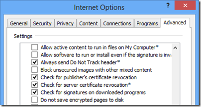
I set up Windows 8 on my desktop PC, accepting the default Do Not Track setting. This is still set:

image

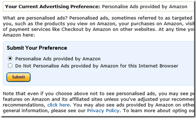
However I noticed Amazon ads served by Google/DoubleClick on a third-party site that reflected my recent activity on Amazon. I clicked the Privacy link on the ad (which links to Amazon rather than Google) and found this:

image

Note that this is not an Amazon account setting. The wording makes it clear that it is a browser setting, which you have to make for every browser you use.

Because your selection above is managed through HTTP cookies, if you delete these cookies or use a different browser, you will have to make this same selection again.

Clearly it also defaults to “personalisation” despite IE 10 being set to request “Do not track”.

Kudos to Amazon for offering an opt-out; but no kudos for ignoring that I have already made a choice by sending a Do Not Track header.

Note there is no legal requirement to respect the Do Not Track header.

Uh-oh, here come the OEM improvements to Windows 8

Reports from a Samsung event today indicate that the company is implementing its own version of the Windows 7 Start menu, which it calls the S Launcher.

The all-in-one PCs Samsung unveiled this morning are the first Windows machines to sport the S Launcher, a simple widget that acts just like the old start button: Click, start typing (say “keyboard”) and it instantly shows you the settings and apps that relate to your term. There’s also a separate settings icon for quick access to the most commonly needed controls.

On the face of it that sounds like a good move. The general reaction to the removal of the Start button in Windows 8 has been mixed at best. Why not put something like it back?

It is hard for Microsoft to object to this. The official line is the Microsoft’s partners add value to Windows with customization and software unique to each vendor, enabling them to differentiate. There is also the matter of fees paid by third-parties such as browser or security software vendors, to pre-install their stuff and win lucrative traffic or subscriptions.

This is a big one though. Microsoft must care about its new Start menu, to have resisted all pleas from its customers to reinstate the old-style version as an option.

It is also obvious that this is not just about usability. The Start screen is the gateway to the new Windows: Modern UI, Windows Store, tie-in with Windows Phone, Windows Tablets and Xbox, and more.

Here it gets interesting. Although Microsoft and Samsung are both selling Windows, the objectives of the two companies are not altogether aligned. Samsung is a big Android vendor; and even within the Android world, it is promoting Galaxy as a brand and links to its televisions. Samsung also sells Windows Phone, but you would hardly know it.

You can think of it as two separate ecosystems, one based around Windows and Microsoft, the other based around Samsung, which happen to intersect in the area of desktop operating systems.

Samsung then does not care whether the Modern UI, Windows Store and Windows Phone are hits. In fact, when it comes to Windows Store and Windows Phone, it may prefer that they fail.

It is not even that simple. If the Microsoft and Windows ecosystem continues to decline, who can take on Apple? It is in Samsung’s interests as an OEM Windows vendor for Microsoft to succeed, as the same time as other parts of its business would prefer that it fails. Complex.

If nothing else, the S-launcher show how little Microsoft and its hardware partners are aligned when it comes to Windows marketing strategy.

What about the users though? Will they not benefit from having a more familiar way to launch their applications? Personally I doubt it. The problem I have with utilities like this is that they break the design work Microsoft puts into Windows, introducing inconsistency and often working less well than what is baked into the operating system.

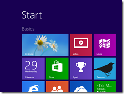
I will add too that the Windows 8 Start screen is actually not the monster it is made out to be. It is richer than the old one, with its Live Tiles and large icons, and once you have learned how to organise it in the way you want, it is an effective launch manager. The fast incremental search in the Start screen works brilliantly.

It would benefit Samsung’s users more if the company focused on helping them learn how to get the best from Windows 8 and its new user interface, rather than encouraging them to avoid some of its key features.

Now you know why Microsoft is doing Surface and the Microsoft Store with its Signature PCs, tweaked (or untweaked) to run as designed.

Windows 8 compatibility issues: speech input, secure Flash drives

Two items I have reviewed recently over on the gadget blog have given me pause for thought concerning Windows 8 compatibility. This is good in my experience when it comes to desktop applications, but sometimes that is not enough.

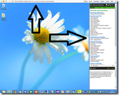
The first was Dragon NaturallySpeaking 12, Nuance’s excellent voice recognition system. It works fine on Windows 8, on the desktop that is. Dragon works by intercepting voice input across the whole of Windows. When it runs, it puts a bar across the top of your desktop and a sidebar with helpful tips and shortcuts.

image

Dragon appears not to work at all in the Windows 8 “Modern UI”. Whatever hooks it has in place to accept input and control mouse and keyboard do not apply outside the desktop environment.

Microsoft says Windows 8 is great for accessibility and ran a sessions at last year’s BUILD conference on developing accessible apps. Here is one on assistive technologies for Windows 8. However on my quick look I did not see much on speech input. Assuming though that Microsoft has worked out a way of making this happen in the Modern UI, it is obvious that Nuance will have some work to do adapting Dragon. Neither the bar across the top, nor the sidebar will work in the “immersive” Modern UI which is mostly full-screen apps.

The second product was a Kingston secure USB Flash Drive. This thing works by means of a utility that you have to run, which lets you enter a password to unlock the encrypted drive. The utility is a desktop app, so will not work as-is on Windows RT (ARM) devices, on which you cannot install desktop applications. Kingston could create a Modern UI app, but I am not sure how easy it would be to have an app that unlocked an encrypted drive to make it available across the whole of Windows. Let’s assume though that Microsoft has made provision for this scenario in Windows 8. Kingston still has work to do adapting its firmware.

Just to be clear, both these items work perfectly in the Windows 8 desktop environment on Intel.

I have asked Nuance and Kingston for comment.

Review: Kingston DataTraveler Locker+G2 secure USB Flash drive

Ever lost a USB Flash drive? Do you even know? There are so many around now that it would be easy to drop one and not to notice.

Most of the time that does not matter; but what if there is confidential data on there? This can be hard to avoid. Perhaps you want the drive for backup of your most important stuff, or to exchange data with a business partner.

The obvious solution is to encrypt the data. There are a variety of approaches, but the advantage of the Kingston DataTraveler Locker+ G2 is that you (or your staff) have no choice: if you do not set a password, you cannot use the drive.

image

The actual drive is a smart metal affair which is surprisingly weighty for its size. You can attach it to a key ring with a supplied loop. Stick it into a Mac or PC (no Linux support sadly) and two drives are detected, one a tiny 10MB drive and the other apparently empty. In order to setup the drive or access the data, you have to run Kingston’s DTLocker utility.

image

The password requirements are a minimum of 6 characters with at least three of upper case, lower case, numeric and special characters.

While 6 characters seems weak it is not too bad considering that after 10 wrong attempts the device will block access and require a password reset. When the password is reset the device is automatically reformatted. In other words, if a bad guy gets your Flash drive, he will be able to reset the password and use the device, but will not see your data.

If a good guy finds your device, he can read your contact details and get in touch to return it to you.

image

The general approach seems reasonable, and is a great improvement over sticking confidential data on a Flash drive and hoping for the best. However I did encounter an issue where the utility refused to run. Another drive which also appears as two drives was already connected, and somehow this tripped up the DTLocker utility. When I disconnecte the other drive, all was well. It is something to do with available drive letters, even though I still had plenty free.

Once set up, the DTLocker stays resident and offers a context menu in the Windows notification area.

image

The device formats as FAT32 but I successfully reformatted it as NTFS, just to see if it would work. It did. I also had success using the DataTraveler on a Mac.

With five year warranty and an inexpensive price, the DataTraveler Locker+ is easy to recommend. There are a couple of caveats. Kingston’s firmware could do with a bit of work to overcome occasional drive letter problems. Second, I would like to see more information about the type of drive encryption used. What if a determined data thief stripped down the drive and read the data? The absence of more information suggests that Kingston is aiming this at those who want casual data protection, not the highest level of security. In normal circumstances though, it is more than enough.

Want a free Data Traveler Locker? Look out for our competition coming soon.


Review: Dragon NaturallySpeaking 12. Stunning accuracy, a few annoyances

I am writing this review, or should I say dictating, in Nuance’s Dragon NaturallySpeaking 12, the latest version of what is in my experience the most accurate speech recognition system out there. Accuracy has got to the point where the great majority of words are recognised perfectly. There are a few intractable problems though. How is a dictation system meant to distinguish between nuances and Nuance’s, for example? The answer is generally that it cannot, but in mitigation Dragon has an excellent correction box. You speak a command to select the intransigent word, and either select the correct spelling from a list or in the worst case spell it out. After a bit of practice you can progress quickly and easily.

image

First, a few quick facts about the system. Your first task after running setup is to set levels and check the quality of your microphone. Nuance supplies a microphone in the box, which is worth it because the average user is unlikely to have a suitable microphone of good enough quality. That said, I was unhappy with the quality of the microphone supplied this time around and will return to this issue later. There is a handy fold-out reference card supplied, a nice touch.

Once set up, Dragon walks you through a quick training exercise during which it sets up a profile with some knowledge about your particular voice. I remember spending ages training early voice recognition systems and it was a tedious procedure. This is no longer the case and Dragon can be set up effectively in just a few minutes.

Dragon runs by default with a menu bar across the top of the screen and a contextual sidebar which lists common commands for the particular application you are using. The sidebar also gives a quick reference to global commands such as those to wake or sleep the microphone, move the mouse, or even post to Twitter or Facebook. Once you have learned all the commands, you can close the sidebar to get your screen space back.

image

Dragon works best in applications which are supported, which includes the obvious ones like Word and OpenOffice. In other applications you can use a dictation box which lets you dictate into a Dragon window and then transfer your text in either plain or Rich Text Format. Microsoft Office support depends on an add-In. Unfortunately I am currently running the Office 2013 preview and the add-in currently causes Word to crash. No doubt this will be fixed when the final version of Office is released. As an alternative I used OpenOffice which worked fine. I was also able to use Word 2013 with the dictation box.

While the accuracy is impressive, I did find that recognition slows down on occasion for no obvious reason, which is annoying and slows down your work.

Dragon is not limited to text input. You can run your entire Windows session with speech, using it to switch between windows, move and click the mouse. I found that Dragon works well in dialogs, using the Tab command to switch between fields, and Click … to click buttons and checkboxes.

If you have the Premium edition, you can also use Dragon to transcribe recordings and to read back editable text. Do not get your hopes up too much. If you create a recording of your own voice using a high quality recorder, you can get good results. I tried transcribing a telephone call though, and got gibberish.

So what is new in Dragon 12? It has to be said that version 11.5 was already very good. Accuracy is perhaps slightly improved, but not as much as 11.5 improved over 11. You do get the Dictation Box. You also get browser extensions for the Web-based Gmail and Hotmail provided you use a supported browser, which includes IE9, Firefox 12 or higher, and Google Chrome 16 or higher. I tested this with Gmail in Chrome and it does make a big difference to usability. Go to a Google Doc though, and it is back to the Dictation Box.

Also new in version 12 is the ability to disable voice commands that you do not use to boost performance. The full list of new features is available on the Nuance website.

Now about that microphone. The headset that came in my box is called the HS-GEN-C, and include an adaptor so it can be used with the combined earbud/microphone inputs now common, especially on tablets and laptops. However I had difficulty getting this to work well. It failed Dragon’s built in microphone test at first, though with some effort and speaking more loudly than usual I managed to get it reported as “acceptable. This could be because of a poor microphone preamp on the PC, though I got the same results with another machine. I did not want to test the software with doubtful microphone input, so I used a the Plantronics Bluetooth headset that came with Dragon 11.5 instead. This passed the microphone check first time.

image

I also tried Dragon NaturallySpeaking with Windows 8. The news is mixed. On the plus side, Dragon worked fine in the Windows desktop and with applications like Google Chrome and OpenOffice Writer. When I switched to the Modern UI (formerly known as Metro) though, I could not get Dragon to work at all. This does not surprise me since the Windows Runtime environment is different from the desktop. I do not see how the Dragon sidebar will ever work, for example, since all apps run full-screen. Nor is the Dragon bar available in the Modern UI. Microsoft does claim an accessibility story for Windows 8, and I am asking Nuance what if anything  is planned for Dragon NaturallySpeaking in this respect.

Do not try to use Dragon with Microsoft’s Office 2013 preview; wait for the final version and proper support.

Conclusion

Dragon NaturallySpeaking combines a high standard of accuracy with strong correction tools. If you are wondering whether speech recognition is a viable and productive technique for text input, have no doubt that it is.

There is still scope for improvement. If I can make sense of my recorded telephone call, then in principle voice recognition should be able to do so as well. It will get there.

Is Dragon now more productive than keyboard and mouse, if you have the choice? It may be in some scenarios, but probably not for expert typists. If you are in the habit of frequently switching applications, for example to research an article you are typing, Dragon can get in the way.

Is Dragon 12 worth the upgrade? From 11.5, that is doubtful unless one of the new features matters a lot to you, perhaps because you use Gmail frequently, for example. From older versions, it probably is.

I am puzzled why Nuance supplies what in my experience was a poor headset for the purpose, though you may be luckier (and the box says “actual model may vary”). I preferred the Plantronics headsets that used to be bundled, but guess that the cost was higher. If you do serious amounts of dictation, do not skimp on the headset as it soon pays for itself.