RIM announces Java and Android runtimes for the Playbook, beta of native SDK

RIM has announced several new options for developing apps for its PlayBook tablet.

RIM will launch two optional “app players” that provide an application run-time environment for BlackBerry Java® apps and Android v2.3 apps. These new app players will allow users to download BlackBerry Java apps and Android apps from BlackBerry App World and run them on their BlackBerry PlayBook.

In addition, RIM will shortly release the native SDK for the BlackBerry PlayBook enabling C/C++ application development on the BlackBerry® Tablet OS. For game-specific developers, RIM is also announcing that it has gained support from two leading game development tooling companies, allowing developers to use the cross-platform game engines from Ideaworks Labs and Unity Technologies to bring their games to the BlackBerry PlayBook.

It sounds as if the Android runtime will not be perfectly compatible with real Android:

Developers currently building for the BlackBerry or Android platforms will be able to quickly and easily port their apps to run on the BlackBerry Tablet OS thanks to a high degree of API compatibility.

Nevertheless, this will be an attractive route for Android developers looking for a quick way to port to the Blackberry.

The native SDK is currently in “limited alpha release” but RIM is promising an open beta for this summer.

The BlackBerry Tablet OS NDK will allow developers to build high-performance, multi-threaded, native C/C++ applications with industry standard GNU toolchains. Developers can create advanced 2D and 3D applications and special effects by leveraging programmable shaders available in hardware-accelerated OpenGL ES 2.0.

The deal with Unity is important too. Unity is an increasingly popular toolkit for game development and adding the Blackberry to the list of supported platforms will boost its appeal. Ideaworks Labs makes the Airplay SDK, a cross-platform toolkit which already supports Apple iOS, Android, Symbian, Samsung Bada, HP webOS and Windows Mobile.

Note that the primary SDK for the Playbook has until now been Adobe AIR; and since the UI itself uses the Flash runtime this likely still makes sense for many applications.

RIM is doing a good job of opening up its platform. It is an interesting contrast to Microsoft’s “Silverlight, XNA or nothing” approach for Windows Phone.

15 minutes with the Nintendo 3DS

Today I got to try a Nintendo 3DS for the first time. A few first impressions.

It is a neat unit though it feels a little flimsy compared to the original DS or the DS Lite. I like the charging dock that comes in the box. Here it is, complete with genuine user fingerprints. The joystick (or circle pad) on the left is beautifully responsive.

image

My first question was: what is the 3D like? The answer is that it really works.

I spent some time playing with the Augmented Reality game, where you lay cards on a table, point the 3DS rear cameras at them, and see magic happen as three dimensional creatures emerge, intermingled with the real world around them.

Photographing this takes more skill than I possess, but to give you the idea, here are four Augmented Reality cards (all in the box as standard) that I have laid on the desk:

image

and here is a snap of the 3DS top screen viewing those cards in the AR game:

image

You cannot see it from this image, but the 3D effect is vivid, and the background is the desk on which the cards are placed. A gimmick, but an engaging one.

The built-in AR game is a lot of fun and makes use of the AR background in that you have to pan the camera around the targets to shoot successfully, something which cannot be reproduced in a purely screen-based game.

What about eye strain? I am not sure; but the 3D screen did seem to strain my eyes slightly. There is a slider which lets you reduce or disable the 3D effect easily, so the eye strain possibility should not deter you, except that since you are paying for a 3D device it is a shame not to use it.

There is a lot more packed into the 3Ds though. It has an accelerometer and gyroscope, one front and two rear (for 3D) cameras, and wireless LAN that supports WPA/WPA2 at last – this was an annoyance with the older WEP-only models.

The software has the usual Nintendo quality, complete with the ability to create Mii avatars similar to those on the Wii, but this time they can be based on a snapshot of someone’s face taken with the built-in camera.

The downside versus the original DS is the battery life – just 3-5 hours.

Still, DS fans will love the 3DS. But will it grow its market? I’m doubtful. A lot of the market for casual gaming has passed to smartphones now; and for someone with a modern smartphone, the 3DS duplicates a lot of functionality. Few smartphones have 3D of course, though I did see the LG Optimus 3D at Mobile World Congress last month.

But how important a feature is 3D? That is an open question, and I guess depends on how much difference it makes to gameplay. My quick impression is that while it is truly impressive when first encountered, it is something you soon feel you could manage without – but that is only a quick impression and I could be proved wrong.

Review: Plantronics Voyager Pro UC v2 – go hands free everywhere

Today’s gadget is a Bluetooth headset, the Plantronics Voyager Pro UC v2. This little guy fits snugly in your ear and provides hands-free calls with your mobile or PC softphone. The UC stands for Unified Communications; and indeed, once I had plugged in the supplied Bluetooth adapter, which is pre-paired with the headset, my Microsoft Lync client automatically picked it up. It also works well with Skype.

image

While that sounds simple, there are actually a fair number of features packed into this device. Some are more successful than others, but it is high quality and thoughtfully put together, right down to the unobtrusive magnetic closure on the padded case.

image

Not shown in the picture above, the set also includes a few foam ear tip covers, which are comfortable but tricky to fit, and a mains adapter for charging when there is no suitable PC or laptop to hand.

I have to say that the fit of this headset is excellent: once in place you soon forget about it, and it feels secure and stable. Having wrestled with numerous more awkward headset designs over the years, this is not something I take for granted.

Now a few details. The headset has several controls: volume up and down on the top of the ear clip, power button near the bottom of the ear clip (above the micro USB charging port), and a call button at the ear end of the microphone stalk, in effect on top of the ear pad. These buttons have multiple functions depending on the state of the device and how you press them, so there is a bit of a learning process. For example, pressing and holding both volume buttons when music is playing pauses or resumes the music. Pressing and holding both volume buttons during a call mutes or unmutes the microphone.

image

Much of the time you will be pressing these buttons while the headset is on, so you need to feel your way, as it were. How easy you find this will vary from one person to another. I found the volume buttons natural and easy to use, partly because if you rest your thumb on the bottom of the unit, you can easily squeeze the buttons at the top. The power button is a bit harder to find and use, but that does not matter too much because you would most likely take the headset off to use it, though it does speak the remaining talk time if you tap it and this can be handy.

I was less happy with the call button. If you are wearing the headset, and a call comes in, you have to tap this to answer. You can also use two taps to call back the last number, and tap and hold to use voice dialling on your mobile. I found the call button awkward to press and insufficiently tactile, though I am sure this improves with practice.

By way of mitigation, the Voyager has an auto-answer feature. A sensor in the device detects whether or not you are wearing it, and if you put the headset on when a call comes in, it will auto-answer.

The sensor also pauses music automatically when you remove the headset, and restarts when you put them back on.

If you pair the Voyager with an iPhone, you get a useful battery meter at the top right of the screen.

I found the Voyager rather good for listening to music. The quality is fine considering that it is mono. Of course it lacks the immersive sound and quality of stereo headphones; but that is the point – you would use the Voyager when you want private background music while still being in touch with what is going on around you. It is easy to carry on a conversation, for example, while music is playing.

I tried the voice dialling. This is a great idea in principle, since you can initiate a call without ever touching your mobile. First you have to press and hold the call button for two seconds, which is a little awkward as mentioned above. After a pause the Voyager beeps, and you can then speak a name to call. If you are lucky and it is found successfully, the Voyager reads the name to you, and if there are multiple numbers you can specify which one to call. If you are unlucky and your mobile starts calling the wrong person, a single tap on the call button ends the call.

I had some success with this, though it is a bit of an adventure. The key is patience. Once you have spoken the name, there is a wait of several seconds, at least with the iPhone, before anything happens.

PC Software

If you have a PC, you can install the Plantronics software to control your Voyager. The software is downloaded from the Plantronics site. You get a battery monitor that sits in the notification area:

image

and a control panel that reports the detail of your device model and firmware, and offers a number of settings.

image

Once again, the Voyager earns its UC designation by letting you automatically set your presence status when the device is worn or removed, though I struggled to find a setting for this that made sense for me personally.

One nice feature is that the Voyager integrates with PC media players as well as softphones, though some of my favourite media players are missing from the list.

image

If you are a Mac user it seems you are less well served by software, though Bluetooth audio still works, and note that the Voyager integrates well with the Apple iPhone.

The Voyager Pro UC copes with both a PC and a mobile connected simultaneously – that is one of the things you are paying extra for – but I found that some details could get confused. For example, the iPhone got into an state where it could not play music though the Voyager until I disconnected the PC.

Extras

The Voyager is expensive for a Bluetooth headset, but is particularly well equipped. The case is well made and has a belt clip as well as a little pocket for the USB Bluetooth adapter. The mains adapter has an LED to indicate the charging state. The Bluetooth adapter has an LED to show whether the headset is connected, and flashes while data is being transmitted.

Conclusion

Overall I am impressed with both the quality and the range of features in the Voyager Pro. It works well alongside Microsoft Lync, for which it is optimized, and in my view it works even better as a headset for an iPhone or other smartphone.

Note though that if you do not need the Unified Communications features or the USB Bluetooth adapter, then the older Voyager Pro + model is less than half the price. However this model lacks the Smart Sensor of the Pro UC v2.

My main gripe is with the awkward call button. Personally I’d like to see this repositioned next to the volume buttons for easier access.

It is also worth noting that even six hours talk time, which you get from a full charge, soon disappears if you play background music, so charging can be a bit of a nuisance.

Nevertheless, using a device like this shows that it really is not necessary to juggle with a handset just to take a phone call; and if you can get voice dialling to work, you can keep the mobile out of sight until you need it for something important like browsing the web or, well, playing a game.


Silverlight in Microsoft products – Silverlight the new Windows runtime, HTML 5 the new Silverlight?

Is Microsoft ditching Silverlight and embracing HTML 5? Or is Silverlight the future of desktop and browser-based development on Microsoft’s platform?

Good question; and I am not sure that Microsoft itself can answer. There is evidence for both cases.

One thing I have noticed though is that Silverlight is turning up in numerous Microsoft products. This is in contrast to the early years of the original .NET Framework, which Microsoft used rather little in its own stuff, though the context is different today because of the growth in web-based development.

I guess we cannot really count Visual Studio LightSwitch, which is a tool that builds Silverlight applications, though it is interesting insofar as the target market is not expert developers, but smart general users who want to build database applications.

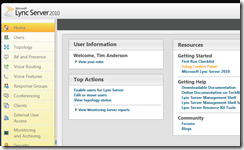
Lync Server 2010 is a better example. Silverlight is used for the control panel.

image

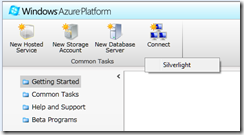
Windows Azure, a strategic product for Microsoft, uses Silverlight for its control panel

image

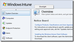
Windows Intune, for maintaining networks online

image

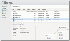
System Center for managing Microsoft servers. I’m not actually sure how much Silverlight is used in System Center, but I understand the newly announced “Concero”, a new feature for managing public and private clouds, uses a Silverlight control panel and I suspect it is used elsewhere as well.

image

These are a few that I am aware of; I would be interested in other examples.

Now, you can make sense of this to some extent by distinguishing “Windows platform” from “broad reach” applications. It is curious, but Silverlight which started out as a broad reach plugin is gradually moving towards a Windows platform runtime, though it still runs on a Mac with some limitations, mainly lack of COM interop. There has been speculation that Silverlight could merge with the desktop Windows Presentation Foundation and become a commonly used application runtime for desktop Windows as well as web apps, and of course Windows Phone.

When Microsoft wants broad reach, it uses HTML, an example being Office Web Apps which make hardly any use of Silverlight.

Nevertheless, using Silverlight for products like Windows Intune could be annoying for administrators who might otherwise use an Apple iPad when out and about; but I guess Microsoft figures that if you are deep enough into Windows to use Intune, you probably will not be using an iPad.

Let me add that Silverlight seems to me to be working well in the examples above, to the extent that I have tried it. Could they be done equally well in HTML and JavaScript? Probably, if users have IE9, but probably not if it is IE8 or earlier.

Silverlight the new Windows, HTML 5 the new Silverlight?

Browser wars heat up as Firefox 4 arrives

Just one week after the final release of Microsoft’s Internet Explorer 9, and here comes another major browser, Mozilla Firefox 4.

What’s new in Firefox? Performance, for one thing. There is a new JavaScript engine called JägerMonkey which is more effective than the old TraceMonkey – though TraceMonkey is still there – and there is hardware-accelerated graphics on Windows Vista and Windows 7 using Direct2D, and on Windows and Mac Direct3D or OpenGL are used to speed page composition.

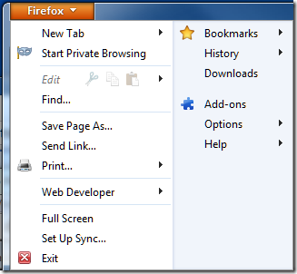
On the appearance side, Mozilla has streamlined the user interface with tabs above the address bar, sorry Awesome Bar, and reduced the number of buttons. By default there are no menus visible, and you are meant to use the Firefox button at top left:

image

I was disconcerted not to find the Tools menu here and one of the first things I did was to show the menu bar, though it does spoil the new UI design.

Firefox is also coming to Android and Maemo devices, and a great feature called Sync will synchronize bookmarks, tabs, passwords and history across all the devices you use.

There is also a new privacy feature called Do not track. This is a way of telling websites that you do not wish to be tracked. Tracking is used by web advertisers to send ads based on your browsing history as seen by that advertiser. Since many websites have scripts served by the same ad agency, this can be considerable. The feature does not block tracking, but only requests not to be tracked. It is off by default and buried in Advanced options, so will probably not be very effective.

image

Firefox is an excellent browser, with many more features than I have mentioned above. A few observations though.

The new features in Firefox 4 echo many of the few features in Internet Explorer 9, which in turn echoes some of the themes in Chrome. However on my system IE9 seems to be a little faster than Firefox 4, the user interface is more polished in my opinion, and the tracking protection in IE9 is more effective since it does actually block tracking.

Then again, there are Firefox add-ons that also block tracking; and in general Firefox seems to have the best range of available add-ons, which could well be the deciding factor for many users.

Firefox 4 still has a separate search box, and in principle I like this. I find it annoying that IE9 and Chrome intermingle searches and URLs in one box. I suspect though that I am in a minority of users. If you switch between browsers, you can find yourself typing searches in the Awesome Bar anyway, though habit, so I am guessing Mozilla will cave in and combine them eventually.

Mozilla is a non-profit organisation with a strong open source and community ethos and that also may be enough reason to use Firefox.

It does face intense competition now though, and it must be a concern that its income comes largely from:

search functionality included in our Firefox product through all major search partners including Google, Yahoo, Yandex, Amazon, Ebay and others.

which in practice is mostly from Google, which has a competing browser.

Personally I think Mozilla will struggle to maintain market share for Firefox; though version 4 is having a good launch complete with a delightful Twitter party

image

and a pretty download stats counter which is currently on 2.75 million and climbing fast.

image

Adobe AIR 2.6, MonoMac 1.0, cross-platform is not dead yet

It is a busy time for cross-platform toolkits. Adobe has released AIR 2.6, and reading the list of what’s new you would think it was mainly for mobile, since the notes focus on new features for Apple iOS, though AIR is also a runtime for Windows, Linux and desktop Mac. New features for iOS include GPU rendering – a form of hardware accelerated graphics – access to the camera, microphone, and camera roll, and embedded Webkit for apps that use web content. On Google Android, you can now debug on devices connected via USB.

There is also a new feature called “owned native windows” which lets you have a group of windows that remain together in the Z order – this lets you have things like floating toolbars without odd results where toolbars get hidden underneath other applications.

Asynchronous decoding of bitmaps is another new feature, allowing images to be processed in the background. This seems like a stopgap solution to overcome the lack of mullti-threading in AIR, but useful nonetheless.

Since the Flash runtime does not run on iOS, Adobe has a packager that compiles an AIR application into a native app. This is now called the AIR Developer Tool or ADT. You can use the ADT to target Windows, Linux or Android as well; however platforms other than iOS still need the AIR runtime installed.

Adobe is dropping support for the original iPhone and the iPhone 3G. iPhone 3GS or higher is needed.

If you want to build a cross-platform app but prefer .NET to Adobe’s Flash and ActionScript, the Mono folk have what you need. I’d guess that the Mono team has a small fraction of the resources of Adobe; but nevertheless it has delivered MonoTouch for iOS and is working on MonoDroid for Android. Just completed in its 1.0 version is MonoMac, for building Cocoa applications on Apple OSX. Mono is not fully cross-platform, since the GUI framework is different on the various platforms, but you do get to use C# throughout.

I am happy to agree that true native code is usually a better solution for any one platform; but at a time when the number of viable platforms is increasing the attraction of cross-platform has never been greater.

Disappearing items in Outlook and Exchange

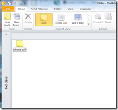
I came across what looks to me like an unusual bug, most likely in Microsoft Outlook. Background: I have used the Notes folder in my Exchange mailbox for all sorts of information going back several years. This morning, I looked at the folder and found it empty, except for one solitary item. Normally there are over 1000. The surviving item was the result of my last search in that folder.

image

Now, the Exchange database is robust in my experience; and most often when items disappear it is not a bug but a result of Outlook working as designed but catching the user out in some way. Here are some common reasons:

  1. The items got auto-archived. Archives can be present on any machine on which you run Outlook. The default location for the archive folder is in a hidden location such as C:\Users\[USERNAME]\AppData\Local\Microsoft\Outlook\archive1.pst, where [USERNAME] is your Windows username. It really is hard for users to find this without expert help. How can the popular corporate mail client have usability like this? But I digress. The solution is to open the archive in Outlook and drag items back where they are wanted.
  2. The items are present, but filtered out by the view. Views in Outlook can be filtered to restrict the items on display, for example to unread items only. The user set the filter by clicking something in Outlook’s labyrinthine user interface, but does not realise it is still set. The effect is that items disappear. The solution is to reset the filter.
  3. The user accidentally dragged a folder inside another folder. This is easily done, as Outlook does not prompt you when you do this; it just moves the folder. The symptom is that a little expand symbol appears in the target folder, if it does not already have subfolders. The solution is to drag it back.
  4. The user accidentally deleted the items or folder. Outlook does not prompt when you delete items. In this case, however, the items end up in the Deleted Items folder. The solution is to drag them back where you want them.

Even if the user has subsequently emptied the deleted items folder, there is hope. Outlook has a little-known feature called Recover Deleted Items. Items go into a kind of hidden deleted items folder for a period after they get removed from the visible deleted items folder, or if they are removed with Shift-Delete. Recover Deleted Items, which is on the Folder tab in Outlook 2010 and on the Tools menu in earlier versions, will let you get them back.

My disappeared notes were nowhere to be found. Further, the evidence is that I had not deleted them, since the surviving item was the result of a search. There is no command that I know of to delete all items in a folder other than the result of a search.

Still, I wanted to get them back if possible; and preferably without restoring Exchange to an earlier date, this being a fairly slow and painful operation. I checked my laptop without connecting it to the network, to see if this had an offline copy. My laptop runs Outlook 2007. There was no offline copy, since it had synchronised subsequent to the items disappearing.

Incidentally, this is why synchronisation and redundancy are not the same as backup.

I had one more go at Recover Deleted Items. Curiously, Outlook 2007 does have a Recover Deleted Items option for the Notes folder, whereas Outlook 2010 does not. Note though that the deleted items live not in the local offline store, but in Exchange.

To my surprise, all my old notes were there. I selected them all in the Recover Deleted Items window and clicked to undelete. Now I am back where I was, except that all my old notes now have a “Created” date of today. A nuisance, but a good outcome nonetheless.

But what happened? I have two questions about this. One is how the items got deleted in the first place. The second is how they ended up in Recover Deleted Items. The documentation for Recover Deleted Items will make your head spin. It is an Exchange feature, but apparently controlled by Outlook. This knowledgebase article says it only works on the Deleted items folder, unless you are using Outlook 2007 when it works on all the folders.

Does that suggest that is was Outlook 2007 that deleted my items? But how could Outlook 2007 on one machine delete all the items except the result of a search in Outlook 2010 on another machine? It does not make sense.

My view is that Outlook has become so obscure and intricate in its inner workings that anything is possible. I think Microsoft should build a new Exchange client.

Review: Plantronics Calisto 825: a speakerphone for Microsoft Lync, iPhone or other mobiles

When I was at the Mobile World Congress in Barcelona this month I came across the Plantronics Calisto 825, a speakerphone for Microsoft Lync (formerly known as Office Communications Server) or for any mobile over Bluetooth.

image

The device is USB powered and seems particularly well designed and built. The sound quality is excellent, the touchscreen buttons clear and nicely spaced, and there are some neat extras.

But what does this thing do? When I received it I did not have Lync installed, so I tried it with an Apple iPhone. You pair the mobile with the Calisto, and once done, the device picks up the iPhone whenever it is within range.

image

Answer yes, and calls to and from the mobile are routed through Calisto. I am a big fan of hands-free devices, and this one works really well.

If you get one of these, I recommend that you also get the optional PA50 wireless mic.

image

This little guy docks and charges on the Calisto when not in use. When you are at your desk, you clip it to your collar. Speakerphones work better with an external mic, as otherwise the mic is in the same box as the speaker, making it hard to avoid feedback or echo. The PA50 has good audio quality. It also has a mute button on the sides – essentially you squeeze the unit to mute the mic – and a big button to answer or end the current call.

The PA50 has what Plantronics calls 360 degree sound. This means you can lay it on the middle of a table and use it as a mic for an entire meeting.

This is an effective iPhone speakerphone then; but it is also designed to work with Microsoft Lync Server, which I have just installed on my test network.

image 

Setting up Lync Server is not trivial, but that will be subject of a separate post. Once installed up though, integration with Calisto was simple: plug it in, and it works. I did have to set Calisto as the default audio and microphone for the Lync client:

image

The beauty of this system is that now both your mobile and Lync calls arrive on the same device; and for dialling out you can choose between them. Note though that Calisto is not a full Lync client, in that it does not offer a pick-list of Lync contacts or show their availability: to get that, you have to use the client on the PC.

Some Calisto models can link to a landline as well, giving you three ways to connect.

I am impressed with Calisto, which is a nicely designed unit, particularly in conjunction with the PA50 wireless mic.

The future of Google Apps: social features, high performance spreadsheets, working offline

Yesterday I spoke to Google’s Global Product Management Director for Google Enterprise (whew!) Matthew Glotzbach, at a press briefing for Google Apps which included the announcement of Google Docs Discussions, as covered here.

image_thumb

One of the issues discussed in the briefing was Cloud Connect, which I reported on here. Cloud Connect automatically copies and synchronises Microsoft Office documents with Google’s cloud storage. There are some performance and usability issues, but the biggest problem is that you cannot edit the documents in the browser; or rather, if you do, Google makes a second copy leading to versioning issues.

Google says this is a file format issue. The online Google Docs applications cannot edit documents in Microsoft Office formats – “the document models are completely different” says Glotzbach – though it can import and export those formats. Could Google develop the ability to edit Office documents online? “It is a technical challenge, something we haven’t built yet,” he added.

It is an interesting point. Microsoft’s Office Web Apps have flaws, but they do let you maintain the same document whether edited in the browser or in the Office desktop applications. It is an example of friction if you try to live partly in Microsoft Office, and partly in Google’s cloud. It may be better to stick with one or the other.

What about offline capability, something I hear a lot as counting against Google Docs. Google had a solution for this based on its Gears add-on, but then withdrew it.

We are actively working on offline. It is extremely important. Gears was a precursor. A lot of the ideas embedded in Gears have become part of HTML5.

says Glotzbach. I asked whether this will extend to the Chrome OS netbook operating system, and he said that it will:

Chrome, as the most modern browser based on HTML 5, has the capabilities built into its core. Chrome OS as a derivative of that has those offline capabilities baked into it, so it is a matter of having applications take advantage of that.

We also talked about the new discussions feature. I observed that it seems to be just one part of a bigger story. What about discussions spanning multiple documents? What about discussions without documents? Is there any way of doing that?

“Yes, email,” he said, chuckling. Clearly Google has taken to heart that email remains the de facto mechanism for most corporate collaboration. “We’ve also got Google groups. Obviously the manifestation of a group for many users is email, that’s how they interact with it, but there is also a destination site or page for that group.”

Might Google develop its own equivalent to Salesforce.com Chatter, for Twitter-like enterprise messaging?

The idea of eventually being able to pull in other streams, the idea of social media inside the enterprise Is a powerful idea. I think Chatter is a good example of that, and others such as Yammer. I think those ideas will likely find their way into businesses. It is not clear to me that social will be a destination within an Enterprise. Rather I see it as, features will emerge in various products that leverage those social capabilities. Discussions is influenced heavily by a lot of those social media ideas, and so you can see that evolving into more integrated social capabilities across the app suite.

What about Google spreadsheets, which seem great for simple tasks and collaboration, but suffer performance and scalability issues when used with large data collections that work fine in Excel?

There’s always work to do. We have today some limitations in terms of spreadsheet size. Those are things we are actively working on. With browser technologies I actually think we have an advantage over desktop applications. If I told you I had a spreadsheet that had 5 million columns and a billion rows, there’s no desktop spreadsheet in the world that can handle that kind of volume, but because we have in essence supercomputers on the back end processing that, what you display is just a window of that large data. So we’re using clever technologies like pre-fetching the rows and columns that are just off the edge of the page, similar to some of the technologies we use with Google Maps.

But it’s an example where we have some artificial limitations that we are working to remove. Imagine doing really sophisticated non-linear calculations in a spreadsheet. We’ve got a supercomputer on the back end that can do that for you in seconds.

Google opens up discussions on docs

I attended a briefing today on Google Apps. Google is celebrating over 1 million business customers in EMEA (Europe, Middle East and Africa) since the launch of Google Apps just over 4 years ago, and over 3 million worldwide. An unknown proportion of those customers are small businesses using the free edition; but there are some well-known names which have signed up, including Rentokil Initial, Virgin America, Motorola, The Guardian, The Telegraph, and Jaguar Landrover.

The big announcement today is called Discussions in Google Docs, and I have had a quick try with a short document that I opened for discussion. One thing I learned is that if you want to allow public discussion on a document, you have to make it world-editable (like a wiki). It should be possible to have the document locked but still enable comments, but I cannot see how to do that; it seems that leaving a comment requires the same rights as editing the document.

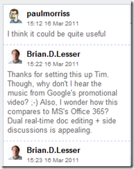
Another oddity is that there are two comment panels, a narrow column on the right

image

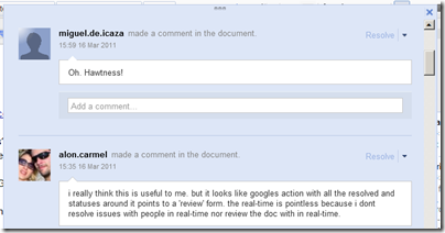
and a big blue panel that appears if you select Show Discussions from the top menu.

image

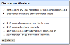
If you are logged in, you can request notifications by email and even add comments by replying to email notifications.

image

There is also a per-comment feature mysteriously called Resolve. A resolved comment is semi-deleted; it is removed from the comment stream (narrow panel) but still appears in the full discussion (big blue panel).

My snap judgment is that these comments/discussions will be useful for document collaboration, which is already among the strongest features of Google Apps.