What happens when you click a Windows 7 taskbar icon?

While working on a Windows 7 piece recently, I tried to write a description of what happens when you click on an icon in the Windows 7 taskbar. Trouble is, there are so many contextual variations that it is hard to describe concisely. Here’s what I’ve got so far; I may have missed a few things.

Left click or primary mouse button:

If the app to which the icon points is not running, it runs and comes to the front.

If the app is running and there is only one instance, it comes to the front.

If the app is running and there are two or more instances (might not be real instances; could be several Word documents or tabs in IE), then preview windows appear  – provided that Aero is enabled. Neither comes to the front until you take further action. If you move the mouse over a preview window, the associated app window comes to the front temporarily and other windows go transparent; if you move the mouse away from the preview without clicking it reverts to the background.

This can be counter-intuitive – if you move your mouse over the seemingly activated window without clicking the preview first, it disappears because it does not really have the focus.

Previews can contain their own controls such as buttons – so strictly, clicking a preview will only bring its main app window to the front if the click is not overridden by a button or other control on the preview.

Hovering the mouse

Hovering the mouse over an icon is almost the same as clicking: it raises the previews, though it will do so even if there is only one instance. The exception is when previews are already locked to another icon. Clicking an icon locks its previews into view, and they remain until you click somewhere else.

Other variations:

A right-click (or secondary mouse button) raises the jump list – a contextual menu that app developers can customize.

Click, hold and drag up also raises the jump list. This is really aimed at touch users.

A middle-click (or mouse wheel click) or SHIFT+click, starts a new instance of the application. Users may have trouble with this. It is not obvious how to start a new instance. There is also a link on the jump list, but again it is not really intuitive.

SHIFT+CTRL+Click starts a new instance with elevated permissons, subject to an elevation prompt if UAC is enabled.

The Show Desktop icon is special. If you hover the mouse there, app windows go transparent so you can see the desktop. If you click there, all apps minimize. If you click again without activating any app, all the apps which minimized are restored; however if you restore an individual app first, the Show Desktop icon loses its memory and reverts to minimizing all apps.

Confusing or intuitive?

Describing all the variations makes it sound confusing, but in practice you soon learn what to do. I can see the reasoning behind the behaviour. I do find it odd that left-clicking an icon doesn’t necessarily bring the application to the front – but Windows doesn’t know which instance you want. The full-window preview could do with a special outline or a degree of opacity to show that it is not fully activated. You can turn both features off from taskbar properties if you prefer. Overall the behaviour is OK and a step up from Vista.

Another useless Microsoft search experience

I do not make posts like this just to needle Microsoft. I’d like to see it compete better with Google, not because I have anything against Google, but because competition is good. So I’m explaining why I can’t use Microsoft’s search product as currently implemented, in the hope that it will help to improve it.

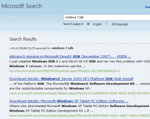
I am aware that the Windows 7 beta SDK is now available, and wanted to download it. I tried the search on Microsoft’s site:

Top hit is from November 2007 and is a forum discussion of dxtrans.h. Correct result nowhere to be seen.

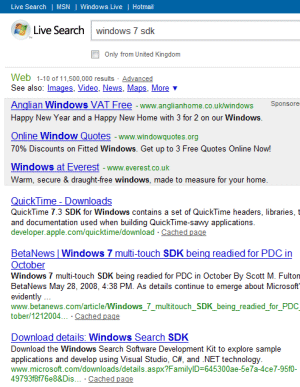
So I tried Live Search:

I get ads for double-glazing and a top hit for the QuickTime 7.3 SDK from Apple. Correct result nowhere to be seen.

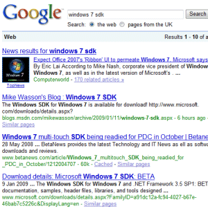
So I tried Google:

Top hit is relevant but wrong. Second hit is a blog post which has the URL I’m looking for, not bad. Fourth hit is the exact URL. By the way, the Windows 7 SDK beta is here.

It is no use Microsoft doing search bundling deals with Dell. If it cannot fix the product, users will run back to Google.

Incidentally, I believe US searchers get better results from Live Search than I do, because of faulty regionalisation. Live Search seems to have a heavier bias than Google towards what it thinks are (in my case) UK results. That doesn’t explain why it gives an Apple QuickTime site as its top hit for “Windows 7 SDK”.

Windows 7 beta 1 performance observations

There are various reasons why someone might be impressed with the performance of the Windows 7 beta. One is that the beta is a clean, plain Microsoft install – no anti-virus, no cruft and clutter, no OEM foistware. The only fair comparison is with an equally clean install of Windows XP or Vista on the same hardware.

That can be arduous to arrange, but I was given an opportunity perforce. I installed Windows 7 beta 1 on a laptop using an old hard drive, from which I upgraded last year. I have a second hard drive bay in this laptop, making it particularly suitable for multi-boot. However, in order to install Windows 7 I wanted to boot from CD, which means removing the hard drive bay, so I took out the main internal drive temporarily and replaced it with a spare drive for Windows 7.

Everything went fine until I replaced the old drive. I’m still not sure exactly what went wrong; suspects include the storage controller BIOS possibly detecting the drive as RAID rather than JBOD, or vice versa, or a resume failure. The outcome though was a thoroughly scrambled Vista installation – file corruption and then refusal to boot – that “missing winload.exe” message.

This was going nowhere so I reformatted the drive and did a clean Vista install (with SP1). It struck me that this gave me a good opportunity to run PassMark on the two relatively clean systems (just Office 2007 is installed, on both). Note that you are not meant to publish benchmarks for beta versions of Windows, so treat this as for anecdotal interest only. I am not going to give the exact figures.

The test was not quite fair, since the newer hard drive is faster than the old one, and the graphics driver is a different version. The drive difference probably accounts for why overall Windows 7 result was slightly below that for Vista – the “disk mark” was over 40% worse. Windows 7 was also slightly worse for 2D and 3D graphics, by 5-10%. The result was not all bad for the beta though. The CPU score was around 4.5% better, and the memory score was over 9% better. On the memory allocation tests Windows 7 came out nearly 25% faster.

One final observation: performance is not just about raw speed in tests. I believe some of the most annoying Windows slow-downs are to do with synchronous API calls that time-out before they return, or inefficient Windows utilities. I hate seeing the progress bar that Explorer shows sometimes, when trying to enumerate files in the current directory. If Microsoft simply manages to speed up Explorer and reduce the number of mysterious Windows pauses, users might perceive Windows 7 as faster even if benchmark tests showed otherwise. Some of the changes in Vista since its first release have improved performance by addressing specific defects. Zip extraction and file copying are examples.

Talking of file copying, I can’t resist posting this Vista dialog which I saw when copying a CD image to my new laptop install (note the time remaining). Fortunately for me, it was pessimistic, and the copy completed a few minutes later.

File copy shows 10627 days and 22 hours remaining

Technorati tags: , , ,

I’m looking for comments on Windows 7 beta vs XP or Vista

Tried Windows 7 beta 1? I’m looking for comments to quote in an article. I’m interested to know what you think of it so fare in comparison to either XP, or Vista, or both; and whether you expect to upgrade as soon as you can, or will put off the upgrade, or not bother with it at all. With reasons of course.

By all means comment anyway, but in order to be quoted I’d need (along with your presumed consent if you comment here or by email):

1. You have actually tried the Windows 7 beta

2. You do not work in PR or for Microsoft or for a PC vendor (or have other obvious reason for non-objectivity)

3. You give your full real name, company and job

Comment here or by email to tim(at)itwriting.com.

Technorati tags: , , ,

The computer desktop is a faulty abstraction

In Windows 7, Microsoft has made further efforts to make the desktop more usable. There is a "peek" feature that makes all running applications temporarily transparent when you hover over the Show Desktop button. If you click the button the apps all minimize, so you can interact with the desktop, and if you click again they come back. Nice feature; but it cannot disguise the desktop’s inherent problems. Or should I say problem. The issue is that the desktop cannot easily be both the place where you launch applications, and the place where they run, simply because the running application makes the desktop partly or wholly inaccessible.

The Show Desktop button (sans Peek) is in XP and Vista too, and there is also the handy Desktop toolbar which makes desktop shortcuts into a Taskbar menu. All worthy efforts, which are workarounds for  the fact that having shortcuts and gadgets behind your running applications is a silly idea. The desktop is generally useful only once per session – when you start up your PC.

In this respect, the computer desktop differs from real desktops. Cue jokes about desks so cluttered that you cannot see the surface. Fair enough, but on my real desktop I have a telephone, I have drawers, I have an in-tray and out-tray, I have pen and paper, and all of these things remain accessible even though I’m typing. The on-screen desktop is a faulty abstraction.

The inadequacy of the desktop is the reason that the notification area (incorrectly known as the system tray) get so abused by app developers – it’s the only place you can put something that you want always available and visible. In Windows 7 the taskbar is taking on more characteristics of the notification area, with icons that you can overlay with activity indicators like the IE8 download progress bar.

It’s true that if you don’t run applications full-screen, then you can move them around to get desktop stuff into view. I find this rarely works well, because I have more than one application visible, and behind one application is another one.

Why then do OS designers persist with the desktop idea? It’s possibly because it makes users feel more comfortable. I suspect it is a Skeuomorph (thanks to Phil Thane for the word) – “a derivative object which retains ornamental design cues to structure that was necessary in the original”. An example is that early electric kettles retained a squat shape with a large base, even though the logical shape for an electric kettle is a slim jug, enabling small quantities of water to cover the element. The reason for the squat shape was to spread the heat when boiling water on a stove. It took years before “jug” kettles caught on.

It is better to call the computer desktop a workspace, and to forget the idea of putting shortcuts and gadgets onto it. Which reminds me: why does Windows still not surface multiple desktops (or workspaces) as is common on Linux, and also implemented in Mac OS X Leopard as Spaces?  Windows does have multiple desktops – you see one every time UAC kicks in with its permission dialog on Vista, or when using the Switch User feature – but they are not otheriwse available.

I’m also realising that sidebar gadgets were a missed opportunity in Vista. Microsoft made two big mistakes with the sidebar. The first was to have it stay in the background by default. Right-click the sidebar and check “Sidebar is always on top of other windows”. Then it makes sense; it behaves like the taskbar and stays visible. Not so good for users with small screens; but they could uncheck the box. I know; you don’t like losing the screen space. But what if the gadgets there were actually useful?

The other mistake was to release the sidebar with zero compelling gadgets. Users took a look, decided it was useless, and ignored or disabled it. That’s a shame, since it is a more suitable space for a lot of the stuff that ends up in the notification area. If Microsoft had put a few essentials there, like the recycle bin, volume control, and wi-fi signal strength meter; and if the Office team had installed stuff like quick access to Outlook inbox, calendar and alerts, then users would get the idea: this stays visible for a good reason.

In Windows 7, gadgets persist but the sidebar does not. Possibly a wrong decision, though apparently there is a hack to restore it. It’s not too late – Microsoft, how about an option to have the old sidebar behaviour back?

I’d also like a “concentrate” button. This would hide everything except the current application. Maximized applications would respond by filling the entire screen (no taskbar or sidebar), save for an “unconcentrate” button which would appear at bottom right. This would be like hanging “Do not disturb” outside your hotel room, and would suppress all but the highest priority notifications (like “your battery has seconds to live”).

My suggestion for Windows 8 and OS 11 – ditch the desktop, make it a workspace only. Implement multiple workspaces in Windows. And stop encouraging us to clutter our screens with desktop shortcuts which, in practice, are very little use.

OpenID embedded into Windows 7?

While reviewing Windows 7 I noticed an interesting new option when sharing files or folders in a homegroup – the ad-hoc network intended for home users, equivalent to the old peer-to-peer workgroup. In this scenario there is no central user directory, so it is difficult to set fine-grained permissions, such as when you want Sally to have read-write access to a document, but Joe read-only access. The messy workaround is to create user accounts for each user on each computer.

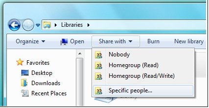
At least, that’s how it used to be. In Windows 7 there is a new option, though it is not fully enabled in Beta 1 (what was that about feature complete?). Users in a homegroup can be identified by an “online ID” instead of a Windows username. In effect, this makes the internet-based ID provider into the central directory for your homegroup, and enables sharing with “specific people” rather than entire homegroups:

The further advantage is that this identity persists across different networks, as the documentation makes clear:

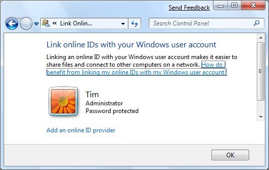
If you have an online account, such as an e‑mail account, you can link that account with your Windows user account. Linking these accounts lets other people share files with you on a homegroup using your online account name (or ID) instead of your Windows user name. This makes it easier for people to share files with you, because they can use the online ID they are familiar with instead of adding your Windows user account to their computer. For example, if you have an e‑mail account that your friends and family use to communicate with you, such as molly_clark@example.com, they can use that online ID to share files with you on a network. You can also use that online ID to access your information on other computers on a network, such as accessing files on a home computer from your work computer.

Linking your account is a two-part process. First, you need to add your online ID provider, and then you need to link your online ID with your Windows user account.

So what is this online ID provider? My immediate assumption was that it meant a Live ID. You have always been able to link a Windows account with a Live ID (formerly Passport), which gives you instant sign-in to Windows Live properties. However, the language here is different, suggesting a variety of ID providers rather than just Microsoft.

Here is another snippet of documentation:

To add an online ID provider

1. Click to open User Accounts.

2. Click Link online ID.

3. Click Add an online ID provider.

4. Select your online ID provider from the list and follow the instructions.

To link your online ID with your Windows user account

1. Click to open User Accounts.

2. Click Link online IDs.

3. Next to the online ID that you want to link your user account with, click Add linked ID.

4. Type your user name and password for the online ID and then click OK.


Unfortunately if you attempt to do this in the beta the list of providers redirects to the Windows home page. I was intrigued though – what technology is this, and who can be an online ID provider for Windows 7?

I asked Microsoft and got this answer:

Any service can choose to be an OpenID provider or a relying party. Customers of web sites that support OpenID can sign in with any OpenID provider.

Note that I did not ask about OpenID, only about online ID providers for Windows 7. Is Microsoft really hooking Windows 7 user identities to OpenID?

I was sceptical so I asked again. Here’s what I was told:

Regarding your Windows 7 question around Online ID in the beta, the online providers are an ISV opportunity and are not currently enabled in the beta. With regard to Windows Live, please find the link here <http://dev.live.com/blogs/devlive/archive/2008/10/27/421.aspx> that discusses Windows Live becoming an OpenID provider with its recent release.

Something less than a clear-cut answer; but again directing me to OpenID and to last year’s announcement that Windows Live will be an OpenID provider.

Still a few unanswered questions then; but I like the idea of linking local network sharing and online directories, which makes a lot of sense for home users that have no Active Directory. Actually it makes sense beyond that as well. I also like the idea of being able to select an OpenID provider as my preferred online identity provider, rather than having to choose Windows Live. It opens up the possibility of smooth integration across the local network and across a number of internet properties.

Do note though the lack of clarity in the answers I received, and that all the documentation is headed:

This content is preliminary and subject to change.

SharePoint – the good, the bad and the ugly

I’ve been messing around with SharePoint. When it works, it is a beautiful product. It is a smart file system with versioning, check-in and check-out, point-and-click workflow (eg document approval), offline support via Outlook, direct open and save from Office 2007, and more. It is an instant intranet with blogs, wikis, discussion forums, surveys, presence information, easy page authoring, and more. It is an application platform with all the features of ASP.NET combined with those of SharePoint. It is a content management system capable of supporting a public web site as well as an intranet. It is a search server capable of crawling the network, with a good-looking and sophisticated web UI. And in the high-end Enterprise version you get a server-side Excel engine and all sorts of Business Intelligence features. Fantastic.

Even better, the base product – Windows SharePoint Services 3.0 – comes free with Windows server. Search Server Express is also free and delivers all the search capability a small organization is likely to need.

What’s wrong with this picture? Here’s a few things:

  • Gets very expensive once you move to MOSS (Microsoft Office SharePoint Server) rather than the free WSS.
  • Deeply confusing. Working out the difference between WSS and MOSS is just the start. If you want to deploy it, you had better learn about site collections, applications, operations, farm topologies, web parts, workspaces, and the rest.
  • Complex to deploy. Make sure you read Planning and Architecture for Office SharePoint 2007 Part 1 (616pp); the good news is that part 2 is only 52pp. SharePoint is all that is bad about Microsoft deployments: a massive product with many dependencies, including IIS, ASP.NET and the .NET Framework, SQL Server in particular configurations, and of course hooks with Office 2007, Exchange and Active Directory.
  • Generates horrible source code. Try opening a page in SharePoint designer and viewing the source. Ugh.
  • Challenging to back up and restore, thanks to being spread across IIS and SQL Server.

I am out of sorts with SharePoint right now, after a difficult time with Search Server Express (SSX). I have a working WSS 3.0 installation, and I tried to install SSX on the same server. My setup is just slightly unusual, since I have both SharePoint and a default web site on port 80, using the host headers feature in IIS to direct traffic. The SSX install seemed to proceed reasonably well, expect for two things.

First, I puzzled for some time over what account to use as the default account for services. Setup asks you to specify this; and the documentation is a classic case of unhelpful help:

In the Default Account For Services section, type the user name and password for the default services account.

In the Search Center Account section, type the user name and password for the account for the application pool identity of the default Search Center site

Well, thanks, but I could have figured out that I have to type a user name where it says “User name”. But I would like help on how to create or select a suitable account. What permissions does it need? What are the security implications? The temptation is to use an administrator account just because it will most likely work.

Then there was the problem of creating the search site application manually. I had a go at this, helped by these notes from Ian Morrish. I set up a crawl rule and successfully indexed some content. Then I made a search, to be greeted by this error:

Your license for Microsoft Search Server has expired.

Well hang on, this is Search Server Express and meant to be free! A quick Google turns up this depressing recommendation from Microsoft:

To solve your immediate problem, however, it is suggested you uninstall WSS, MSS Express, repave your machine with a clean OS, and reinstall only MSS Express (WSS is installed with it).

Thanks but no thanks. See this thread for a more informative analysis. The user yanniemx reckons, after 10 reinstalls, that he has worked it out:

I realized it was due to using the Express version of Search and then not using the SQL install that is included in the install.  From what I can tell if you use another SQL instance it thinks you are using multiple servers and that is not allowed for the Express version.

I think I’ll just uninstall. I did another install of the full MOSS on its own server, and that one works fine. Running on a virtual machine is another good idea.

I hate the way certain Microsoft server products like to be installed on their own dedicated server. That makes sense in an Enterprise, but what about small organizations? I don’t see any inherent reason why something like SSX shouldn’t install neatly and in a reasonably isolated manner alongside other products and web applications. Equally, I am sure it can be done, just as I used the host headers trick to get WSS installed alongside another web site on port 80; but working out how to do it can be a considerable effort.

Performance: Windows 7 fast than Vista, Vista faster than XP

The second part of that statement interests me as much as the first. ZDNet’s Adrian Kingsley-Hughes ran some informal tests on XP vs Vista vs Windows 7 beta 1 (as leaked, I presume), ranking them in order for a number of tasks. The results show that in general XP is slower than either Vista or XP on an AMD Phenom system with 4GB. Even on a Pentium dual core with just 1GB, which should favour XP, Vista was neck-and-neck with XP for speed (score of 57 vs 56, where less is better). Windows 7 came top in most of the tests.

I’ve done enough of these kinds of tests myself to know some of the pitfalls. Kingsley doesn’t mention whether UAC was on or off in Vista, or whether Aero is enabled, or how many background processes were running on each machine, or how many times the tests were repeated and whether there was much variation. It would also be interesting to know timings, rather than simple ranking. Finally, Kingsley’s tests seem overly weighted towards file I/O.

I’d also be intrigued to see a comparison of Vista as on first release vs a fully patched system.

Still, this does suggest (as I’ve argued before) that Vista is better than its reputation; and it is wrong to assume that XP will generally out-perform it.

That said, let’s not forget the dire performance of those early Vista laptops with 1GB RAM, a full helping of third-party foistware, and Outlook 2007. Even today, Outlook 2007 can kill the performance of a high-end system, as this recent comment shows:

Technorati tags: , ,

Five things right, five things wrong from Microsoft in 2008

Just saw this Network World article on four things Microsoft got right in 2008. It says: Windows 7, Hiring Yahoo talent, Windows Azure and Server 2008.

I partly agree (I am not sure about Azure, or the significance of Yahoo hires). Here’s my own five right moves, with my usual developer bias.

1. Not buying Yahoo at what now seems a ludicrously inflated price.

2. Windows 7 preview. It was kept reasonably well under wraps, smoothly delivered, and looks promising though not revolutionary from a technical perspective.

3. Windows Server 2008. Same kernel as Vista SP1, and broadly a delight to work with. Hyper-V virtualization is great too.

4. Silverlight. It is probably too late for Microsoft to out-flank Adobe’s Flash, particularly as the cross-platform story is confused. Nevertheless, the Silverlight browser plug-in is well done and evolving rapidly. It gives a significant boost to the .NET platform.

5. SQL Server 2008. The last of the big Server 2008 products to ship; and I respect the SQL team for taking its time and delivering a high quality release.

In other ways, Microsoft has stuttered. Here are five Microflops:

1. Online presence. Live Search continues to stutter. As a whole, Microsoft’s web sites are confusing to navigate, inconsistent and slow. There are many broken links. Like many others, I use Google to search Microsoft. See Danny Sullivan’s brilliant post for more analysis.

2. Live Mesh as an application platform. Sorry, the more I think about this, the more I think Microsoft’s strategy is all wrong. See my Reg article for more. I am sorry as I had high hopes for this.

3. Database APIs. Microsoft’s old bugbear. Infinite flavours of LINQ, ADO.NET Data Services, Entity Framework, SQL Data Services, Windows Azure storage service, Mesh data feeds, what have I missed? There is no shortage of good technology and ideas; but there is lack of strategic discipline.

4. Community forums. There are the old MSDN forums; the new MSDN forums; strange escapees like the Silverlight forums; the old TechNet forums; the new TechNet forums; no doubt others too. Is it so difficult to have a single jump-off point for Microsoft forums, or to do smooth migrations that preserve old messages, or to prioritize fast response times above pretty formatting?

5. Windows Mobile. There are a number of things I like about Microsoft’s mobile platform, including the ease of programming with the .NET Framework. Still, Apple’s iPhone and the rise of Netbooks like the Asus Eee PC show separately the extent to which Microsoft’s mobile team has got it wrong. Remember Origami?