JavaFX – just for Java guys?

JavaFX is Sun’s answer to Flash and Silverlight, and it’s partially open source under the GPL. I’ve just downloaded the bundle of NetBeans plus JavaFX SDK. JavaFX Script is a new language for creating rich multimedia effects. I’ve also downloaded “Project Nile”, which includes “a set of Adobe PhotoShop and Adobe Illustrator plug-ins that allow graphics assets to be easily exported to JavaFX applications”. Unlike Microsoft, Sun is choosing to work with the designer’s existing favourite tools rather than trying to wrench them away to a brand new set (Expression).

According to Sun JavaFX is happening quickly: it is promising “Version 1.0 of JavaFX desktop runtime by the fall of 2008”.

The bit that makes me sceptical, aside from the speed of events, is that if I’m reading the following diagram right, users will require both the Java Runtime Environment (could be Java ME) and the JavaFX runtime in order to enjoy the results:
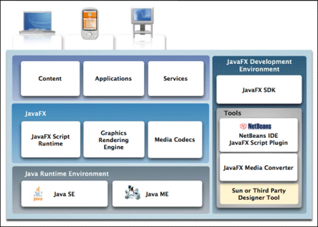
By contrast, Microsoft’s Silverlight does not require the full .NET runtime to be present, making it a much smaller download; and Flash has always been small.

The win for JavaFX is access to all the services of Java:

…JavaFX applications can leverage the power of Java by easily including any Java library within a JavaFX application to add advanced capabilities. This way application developers leverage their investments in Java.

On the other hand, it means a more complex and heavyweight install for users who do not have the right version of Java itself already installed. The Windows JRE is currently around 15MB for the offline version – there’s a 7MB “online” version but my guess is that it downloads more stuff during the install. I suspect that Adobe’s Flash would never have taken off if it had been that large a download.

When I spoke to Sun’s Rich Green earlier this year I recall that he agreed that a small download was important. Maybe I have this wrong, or a smaller runtime is planned for some future date.

It’s interesting that in his official blog post today, Josh Marinacci takes a Java-centric view:

So why am I excited about JavaFX? Because it gives us the freedom to create beautiful and responsive interfaces like never before. This isn’t to say you can’t do it in plain Java. If you’ve been to any of the last 4 JavaOne’s then you’ve seen great interfaces we’ve built. But these demos were a ton of work.

Right; but you could easily build these “beautiful and responsive interfaces” in Flash, both then and now. It’s a question of positioning. Is JavaFX just a new GUI library for Java – which will be welcome, but limited in appeal to the Java crowd? Or a serious alternative to Flash? At the moment, it looks more like the former.

Technorati tags: , , ,

The trouble with Knol

Is that that it’s going to be full of rubbish. Wikipedia, which arguably has less authority because contributions can be anonymous, will likely have more authority, since it is more-or-less restricted by its community to one entry per topic.

Another way of looking at this is that on Wikipedia, if you want to contribute to a topic that already has an article, you have no choice but to (try and) improve the existing one. On Google Knol, there’s every incentive to start a new one, never mind if it duplicates existing content, or is worse than an existing one.

Take Search Engine Optimization, for example. Wikipedia has an article that looks decent. Knol has thirty articles; or if you search for SEO, more like seventy. And that’s after just a few days.

Google is good at ranking, and users can rate pages, but Knol is still a mess. You can be sure that many articles will be written primarily to drive traffic to the author’s web site, or to attract Adsense clicks. Wikipedia is not immune to spam; but at least contributors can delete it. All you can do on Knol is to give a spammy article a low rating.

Thinking aloud, what might work is some kind of Slashdot-style filtering. For example, you could have it so that by default Knol searches only show articles which have:

  • More than 10 ratings
  • An average rating of at least 4
  • or are the only article on the subject

or some such; vary the constants according to taste.

Then again, you could have a team of editors (and become Britannica); or enforce one article per topic and become more like Wikipedia.

Technorati tags: , , , ,

Eee 901 problems – does Asus still care about Linux?

I am reviewing the Asus Eee PC 901, the one with the Intel Atom processor. Of course I asked to see the Linux version. In my view Linux is better suited than Windows for a device with limited storage; and it is more interesting to me since the original Eee PC 701 was something of a breakthrough for desktop Linux.

No problem with the hardware; but the OS is a bit of a mess. The first problem is that the wireless card does not work properly for me. Asus have used a less common Ralink card – maybe it saved a few pennies over the Atheros it used to have – but out of the box it is not set up right. When I try to connect with WPA encryption I get:

Error for wireless request “Set Frequency” (8B04)
SET failed on device ra0; network is down
ioctl[SIOCSCIWAUTH]: Operation not supported

Looks like an update is needed. Here’s where the big problems start. With the 701 I had no problems updating, whether using the Synaptic GUI, or apt-get in a console. The new Eee currently offers me two updates in its “Updates and New Software” applet, one for “StarOffice Mime Types” which installs fine, and the other for “Webstorage Update”, which fails. Click Details and it is blank; no error message.

Trying apt-get instead is equally frustrating. Thanks to dependencies, updating almost any package results in a huge download – taking over an hour over broadband. Then the update fails because it runs out of disk space. That, and some packages are returning a 404; I also got size mismatch errors. Note: use apt-get clean after one of these exercises as that will free disk space.

The fact is, update is broken. One solution is not to update – though security is always a concern – but that still leaves the wireless problem unsolved.

This is careless of Asus. Part of the idea with the Eee is that it is an appliance, it just works, it hides all that Linux gunk. Except it is failing to do so, because of errors in the package management. Here’s what one user says:

This is sad. The thing that really helped launch the original 701 into reality is gone, and that’s Linux…I know my way around computers, and I know where to look to fix stuff, but this would leave a horrible taste in anyone’s mouth that wasn’t accustomed to finessing Linux (that’s the nice way of saying it)…I can’t say I see much of a future for Linux on the Eee.

It’s early days for the 901; maybe it will all be fixed soon. Still, at the very least it is being pushed out before the software is ready; which is a shame because there is a lot to like as well.

The best advice for those who don’t mind tweaking may be to install Ubuntu or some other distribution.

Update: I fixed the wi-fi issue eventually – see here.

Technorati tags: , ,

Analysing Mojave: is Vista really that good?

Microsoft’s Mojave Experiment is now online. As I understand it, a group of people with negative perceptions of Windows Vista were shown a forthcoming version of OS code-named Mojave. In the cases Microsoft is choosing to present, they liked it much better – one woman scored Vista 0, and Mojave 10. Finally, it was revealed that Mojave was in fact Vista.

It’s a fun promotion and strikes me as a good effort in persuading people to take another look. Still, a few things puzzle me. The web page is somewhat frustrating, since to get all the content you have to click all of the little boxes – there are 55, but some repeat – but we still never see a complete video of what one of these subjects saw demonstrated.

I’ll describe one of them. Early on in her session (I presume), a woman is asked:

“Have you heard of Windows Vista?”

“Based on all the negative comments and frustrations I’ve seen my husband having to deal with I wouldn’t touch the thing,” she replies.

Now we get a snippet from the end of her session:

“Windows Mojave is actually Windows Vista”

“Oh is it [laughs] … Maybe it has more to do with the user than the application.”

I am going to defend her husband. Sure, users can be unpredictable and frustrating to deal with, but consumer software is meant to be “user-friendly” which means that if someone – and in Vista’s case, many people – have a negative and frustrating experience, then something is wrong with the software. That’s not necessarily Microsoft’s software; it could be third-party drivers, or lack of drivers, or the ugly stuff that gets bundled with a new computer.

Personally I moved to Vista back in 2006 and have never wanted to return to Windows XP. Then again, I did my own clean installs. I’ve also had problems including buggy display drivers flashing the screen, Windows Search causing painful delays in Explorer, stuttering sound with supposedly high-end audio cards, hours spent getting a new laptop ready for use,  Explorer wrongly displaying files as music, Media Center corrupting itself, and network weirdness (today) which knocked me off the Internet. Finally, when I compared Vista and XP performance, XP came out noticeably faster.

Few computers operate entirely without problems. Even so, I’ve seen enough to understand why someone might get frustrated; and that’s with clean installs of the OS.

There’s not much wrong with the core of Vista, as demonstrated by the generally solid performance of Server 2008, and now by Mojave. That doesn’t excuse the numerous problems that have spoilt the release. Let’s hope lessons have been learned.

Technorati tags: , , , ,

Vista Network weirdness

My Vista laptop could no longer connect to the Internet, when I plugged it directly into my router (to bypass my ISA firewall, to test some stuff).

Checked the IP settings, all fine – except that I had two Default Gateways, one of which was 0.0.0.0, the other of which was correct. Tried fixed IP with hard-coded default gateway, same result.

Booted into Linux, all fine.

Studied the Network and Sharing center. I had two active networks. One was called Network 5, the other Unidentified. Both were using the same connection – Local Area Connection 6.

Aside: I presume that when I first installed Vista this was Local Area Connection 1. Somehow, over time, Windows decided it should delete it and re-detect it, with a new name, 5 times over.

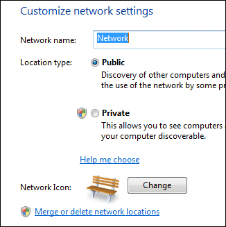
That didn’t look right. I noticed that if you click Customize, to the right of a network in the Network and Sharing Center, you get an option to “Merge or delete network locations”. Worth a try. Clicking this option gets you an ugly functional dialog that lets you select a network and, umm, merge or delete it. All the networks I have ever joined in hotels, conferences and hotspots round the world were listed.

My first thought was to merge. However, you can’t merge networks that are in use. I disabled the network card (in Manage Network Connections) and tried again. But, “Unidentified” was not listed. Forget that – I selected the lot and clicked Delete.

Re-enabled the card, and I’m back on the Internet. One default gateway. All fine.

I’d be interested to know what went wrong. And the network UI in Vista seems over-complex to me.

FluorineFx and Weborb bring fast web services to .NET and Flex

Adobe’s Andrew Shorten contacted me following my piece on consuming .NET SOAP with Flex.

He mentioned two free products which integrate Flex with .NET.

Fluorine “provides an implementation of Flex/Flash Remoting, Flex Data Services and real-time messaging functionality for the .NET framework.”

WebORB from Midnight Coders “supports Action Message Format (AMF) version 0 and 3 and can be used to process Flex and Flash Remoting requests. Additionally, WebORB provides an implementation of the RTMP protocol and supports the following real-time messaging and streaming features: Flash Video streaming, video recording, data push, server-to-client invocation and remote shared objects.” There are also implementations of WebORB for Java, PHP and Ruby.

These look useful if you want to take advantage of the faster AMF protocol or use other features like RTMP. The disadvantage: more server-side gunk.

Technorati tags: , , ,

MobileMe losing mail

My enthusiasm for Apple’s MobileMe is waning rapidly. A few early outages are nothing unusual for a new service; but on Friday Apple admitted losing email:

One issue we encountered was a mail outage affecting 1% of our members . . . We particularly regret to report the loss in the affected accounts of approximately 10% of the messages received between July 16 and July 18.

Losing email is truly aggravating. The worst of it is not knowing what emails you have lost. It has not happened to me for a few years; but I recall sending desperate emails to my most significant contacts along the lines of “if you sent me an email yesterday please send it again.” That never looks good; and of course the email you really wanted might have been from the one person you didn’t think of, or had never heard from before.

It wouldn’t be so bad, except that people still tend to assume that emails are delivered. Usually they are; but it has never been a guaranteed service, and with all that spam sloshing about messages get missed with or without Apple’s efforts.

I expect Apple will fix it and MobileMe will be fine shortly; but with this and the recent security blunder the company’s cloud efforts have been rocky recently. Perhaps I’ll stick to Exchange after all.

Technorati tags: ,

Nearly three years on, what’s the verdict on the Office 2007 ribbon?

Mitch Barnett has had enough:

I can’t take it anymore. I am re-installing Office 2003 and forgetting about Office 2007. Why? It’s the ribbon man! For all of the usability design, I find it unusable. No offense to Jensen Harris or Microsoft, but for me, the consumer of the product, and after trying it for over a year, I just can’t get used to it.

It is a thoughtful post, mainly about Word, and worth a read if you are interested either in Office or in usability design. His main point is that there are too many features:

Honestly, Word should have been “refactored” into perhaps multiple products or features split into a desktop publishing application or a whole other suite of applications. But instead, the UX team went through an honorable and noble design process of solving the wrong problem.

Trouble is, users are conservative. Lotus tried to re-invent the spreadsheet with Improv, but despite good reviews it failed to compete with 1-2-3, let alone Excel. Another noble failure which comes to mind is OpenDoc:

OpenDoc is a revolutionary cross-platform technology that replaces conventional applications with user-assembled groups of software components. With OpenDoc, users can create virtually any kind of custom software solution.

Wikipedia also describes OpenDoc and why it failed. Evolution, or doing the same thing as before but slightly better, is easier to sell than revolution.

That brings me back to the ribbon. I recorded my first impressions just after the public announcement of the ribbon at PDC 2005:

It’s a bold move for Microsoft. Most people here seem to like the new look, but will the average office worker appreciate or resent these major changes? There is no "classic mode"; you have to use the new interface. If it catches on, it will make near-clones like Open Office look dated; if it’s just too different, it could boost the competition.

My reflection nearly three years later is that – despite Barnett’s comments – the ribbon has proved both less controversial and less revolutionary than I had expected. I’ve had the experience of introducing users to Office 2007, and generally they take a day or two to work out where their favourite features are hidden, and then carry on much as before. Only a minority seem to dislike it as much as Barnett, and Office 2007 seems to have been a success for Microsoft. The ribbon is good marketing, because users can easily tell the difference between this and earlier Office releases.

On the other hand, Microsoft has not convinced the world that the ribbon concept is the future of UI design; and I’ve not detected any great pressure on the developers of Open Office or other popular applications to change to the ribbon style. Here I am typing into Live Writer, which has conventional menus, and it is perfectly comfortable; I’d rather the Writer team worked on features other than a ribbon UI. Sorry, I mean other than an Office Fluent User Interface.

Personally I get on OK with the Office 2007 ribbon, thanks to the Quick Access Toolbar. I also like the way the ribbon is somewhat protected from customisation, so that it is the same from one profile to another. That said, I agree with Barnett that there is too much UI on display, though I am not sure of the solution, and some of the UI decisions seem strange.

I still believe that while the effort to improve usability was genuine, Microsoft was also determined to make Office 2007 distinctive from its rivals in some way that could be patented. The key question: did that constraint weaken the outcome?

Note that Microsoft has hinted at plans for the ribbon that go beyond Office. It may be a core part of the UI in Windows 7.

Hey, I know plenty of developers read this blog. Are you being pressed to implement a ribbon UI for your applications? Or is this top-down initiative passing you by?

Microsoft Office is ludicrously expensive

What’s a reasonable price for Microsoft Office? An impossible question, of course. It’s mostly decent software (with the exception of Outlook 2007 and its disgraceful performance problems). It has its foibles, but is the best office suite in my opinion; and given the importance of office software to most of us, having the best is arguably worth it almost irrespective of price. No doubt gazillions of investment has gone into Office; but then again, gazillions have been sold.

In reality, Microsoft practices variable pricing. Just like travel companies, it aims to charge what the market will bear at any level. It also ensures that influencers – like software developers, partners or indeed journalists – get it for next to nothing. For example, registered Microsoft partners can get the Action Pack with mountains of software, including Exchange 2007 and 10 licenses for Microsoft Office Enterprise 2007, restricted to “internal-use software for internal business purposes, application development and testing”. The cost varies around the world: in the UK it is £199.00 plus VAT. A bargain.

Home users get a break too. I’ll quote prices from ebuyer.com, a UK retailer with generally keen prices. Office Home and Student 2007 comes with 3 licences for £64.59 plus VAT – that’s just £21.53 each before tax. Now let’s ride the escalator. Business prices start with Office Basic 2007 (just Excel, Word and Outlook) OEM edition. £96.09. OEM means you are only meant to buy it with a new PC, and the license is only valid for the PC on which it is installed; it dies with the PC. Office Small Business 2007 OEM is perhaps reasonable at £122.70 plus VAT – you get Excel, Powerpoint, Publisher, Word and Outlook.

How about an upgrade package? Office Standard 2007 Upgrade (no Access) is £175.41 plus VAT. Getting pricey; but then again Office Standard 2007 complete package (legal in any scenario) is £269.01. You want Access too? Your best unrestricted deal is Office Ultimate 2007 – Access, Excel, InfoPath, Powerpoint, Publisher, Word, Outlook, OneNote, Groove – at £314.39 plus VAT.

Curiously that costs less than what the customer probably asks for – Office Professional 2007 – Access, Excel, Powerpoint, Publisher, Word, Outlook but no OneNote or Groove, which comes in at an eye-watering £397.50 plus VAT.

Ah, but you should get a site license or even Software Assurance. Believe me, it is not much less – unless you are a megacorp or government department and negotiate a special deal.

Just to put this into context, I can get a basic PC with Linux for just £119.14 plus VAT – pic below in case you don’t believe me – and an HP office-ready PC with XP Pro for £204.24 plus VAT.

If Office were specialist software with a niche market, I could understand the high prices. But this is commodity software; everyone uses it. In what universe it is worth £397.50 – and I’m sure you could pay more if you worked at it – more then three times the price of a PC which (after adding Windows) would happily run it?

You’d be an idiot to pay that, of course. Except – what choice do you have? If you accept the terms of Microsoft’s strange OEM license, which means that the software is not applicable to an existing PC – and that of the Home and Student license which forbids “commercial use” – then you are stuck with prices from £269.01 and up. Though given the popularity of the OEM editions I suspect that many people take a liberal attitude, or consider that they are “refurbishing” their PCs (which is allowed).

What this means is that the most conscientious or financially careless buyers are paying a price which strikes me as unreasonable. I can understand Microsoft’s reluctance to change this situation; but in time it will have no choice.

Technorati tags: ,