Category Archives: windows

Microsoft’s broken Windows Store: an unconvincing official response and the wider questions

Microsoft’s Todd Brix has posted about misleading apps in Windows Store:

Every app store finds its own balance between app quality and choice, which in turn opens the door to people trying to game the system with misleading titles or descriptions. Our approach has long been to create and enforce strong but transparent policies to govern our certification and store experience. Earlier this year we heard loud and clear that people were finding it more difficult to find the apps they were searching for; often having to sort through lists of apps with confusing or misleading titles. We took the feedback seriously and modified the Windows Store app certification requirements as a first step toward better ensuring that apps are named and described in a way that doesn’t misrepresent their purpose.

Although it is not mentioned, the post is likely in response to this article which describes the Windows Store as “a cesspool of scams”:

Microsoft’s Windows Store is a mess. It’s full of apps that exist only to scam people and take their money. Why doesn’t Microsoft care that their flagship app store is such a cesspool?

That is a good question and one which Brix does not answer. Nor are the complaints new. I posted in November 2012 about Rubbish apps in Windows Store – encouraged by Microsoft? with the extraordinary rumour that Microsoft employees were encouraging trivial and broken apps to be uploaded multiple times under different names.

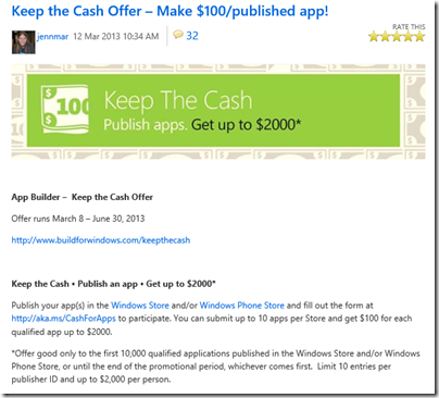
The facts in that case are somewhat obscure; but there was no obscurity about the idiotic (if your goal is to improve the availability of compelling Windows Store apps) Keep the Cash campaign in March 2013:

Publish your app(s) in the Windows Store and/or Windows Phone Store and fill out the form at http://aka.ms/CashForApps to participate. You can submit up to 10 apps per Store and get $100 for each qualified app up to $2000.

image

Microsoft decided to reward mediocrity – no, even that is not strong enough – rather, to reward the distribution of meaningless trivial apps in order to pad out its store with junk and make the actual high quality apps (yes there are some) harder to find.

I agree with the commenters to Brix’s post who call him out on his claim that “Our approach has long been to create and enforce strong but transparent policies to govern our certification and store experience”. How do you reconcile this claim with the torrent of rubbish that was allowed, and even encouraged, to appear in the store?

Every public app store is full of junk, of course, and it is hard to see how that can be completely avoided; if Apple, Google or Microsoft declined apps for subjective reasons there would be accusations of exerting too much control over these closed platforms.

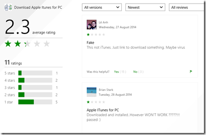
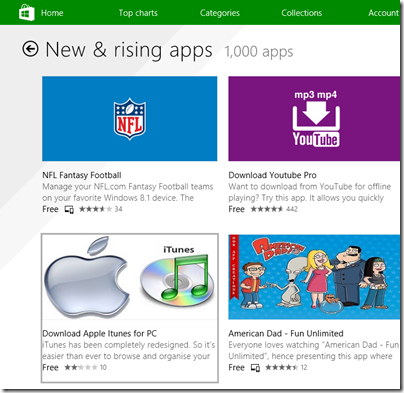
That does not excuse the appearance of apps like Download Apple Itunes (sic) for PC, listed today under New & rising apps:

image

The app is nothing to do with Apple; it is a third-party downloader of the kind I analysed here. The idea is to persuade people to run an application that installs all sorts of adware or even malware before directing them to a download that is freely available.

It seems that users do not think much of this example, which apparently does not even do what it claims.

image

While apps like this are making in into the store, I do not see how Brix can justify his claim of enforcing “strong but transparent policies to govern our certification and store experience”.

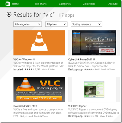
Even VLC, where scammy apps have been largely cleaned up following many complaints, is still being targeted. Apparently Microsoft’s store curators are happy to let through an app called “Download VLC Letest” (sic).

image

How much does this matter or has this mattered? Well, Microsoft launched Windows 8 at huge risk, trading the cost of unpopular and disruptive changes to the OS and user interface for the benefit of a new more secure and touch-friendly future. That benefit depended and depends completely on the availability of compelling apps which use the new model. The store, as the vehicle of distribution for those apps, is of critical importance.

Another benefit, that of protecting users from the kind of junk that has afflicted and diminished the Windows experience for many years, has been scandalously thrown away by Microsoft itself. It is a self-inflicted wound.

What could Microsoft do? It is too late for Windows 8 of course, but the correct approach to this problem, aside from not approving harmful and deceitful apps in the first place, is to take a strongly editorial approach. For less cost than was spend actually undermining the store by paying for rubbish, Microsoft could have appointed an editorial team to seek out strong apps and include within the store features that describe their benefits and tell their story, making the green store icon one that users would actually enjoy tapping or clicking. Currently there is too much reliance on automated rankings that are frequently gamed.

There are some excellent apps in the store, and teams that have worked hard to make them what they are. Apps to mention, for example, include Adobe’s Photoshop Express; Microsoft’s Fresh Paint; or Calculator Free. Those developers deserve better.
Hands on with Surface Pro 3

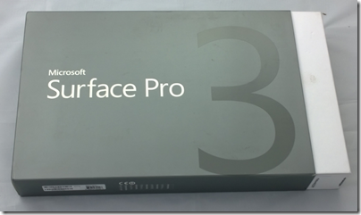
I am about to hand back my Surface Pro 3 after a week or so of use – how is it?

image

I reviewed the Surface on The Register, where I tried to bring out the changed focus of the device, compared to the first two iterations. Surface RT (the first to be released) was released simultaneously with Windows 8 and represented Microsoft’s best effort at creating a device that made Windows 8 work in both its roles, as a tablet controlled by touch and as a laptop replacement. Surface RT runs on ARM and does not allow installation of desktop applications, though with Office pre-installed the desktop is still useful. The first Surface Pro came later and uses the same 10.6" screen and form factor, though because of its more powerful x86 (Core i5) CPU it is thicker and more power-hungry (short battery life). I use both Surface 2 (the second iteration of Surface RT) and Surface Pro regularly so I know the products well.

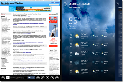
Surface Pro 3 was designed to be a better laptop replacement. It has a larger 12” display and a 3:2 screen ratio, in place of 16:9. The new size feels far more spacious and comfortable for applications like Word, Excel, Photoshop or Visual Studio. It is less obviously suited if you use a horizontally split view, part of the original Windows 8 design concept, but in practice it is such a high resolution screen (2160 x 1440) that it still works OK.

image

The new display is superb; the only two things I have against it are first, that it is glossy which is a slight annoyance in most environments and a disaster out of doors; and second, that it makes the device larger and therefore less convenient in space-constrained environments like crowded trains if you don’t have a table seat.

There is no one perfect size for a computing device, but Surface 3 is large enough that you will may want to have a smaller tablet with you, such as an iPad Mini or a Google Nexus 7. That said, phones are getting larger, so perhaps a phablet-sized phone and a Surface 3 is a good compromise.

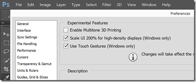
I had to turn on “Experimental features” in Adobe Photoshop to get high-density display scaling and full touch support:

image

Performance-wise, I have no complaints about Surface Pro 3; it exceeded my expectations. Although the review unit is only a Core i5, it is among the most responsive Windows PCs I have used; of course it helps that the OS is a fresh install. Considering that the Surface will in some circumstances throttle performance anyway, and that heat may be a problem with a higher spec CPU, it seems to me that there is no necessity to get the Core i7 variants for most purposes.

I have not done comprehensive performance tests but did run 3DMark RT on which the Surface Pro 3 scored about 9% better than my old Surface Pro, and the JavaScript SunSpider test on which it was 44% faster. Of course it is a faster Core i5 (1.9 GHz vs 1.7 GHz).
image

Thanks to Intel’s Haswell design, this performance comes alongside good battery life. The advertised 9 hours is optimistic, but 6 hours plus is realistic. I also noticed that Surface Pro 3 is much better at holding its charge on standby, a common annoyance with older models.

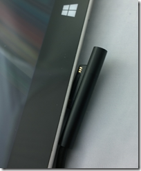
The power connector has been improved to make it both easier and firmer to connect.

image

The power supply still has that handy USB power supply built-in; I am often grateful for this.

image

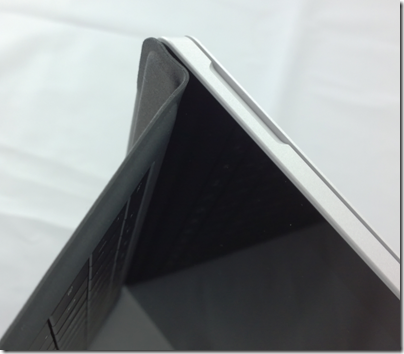
What about the new fold-up keyboard, where the keyboard cover attaches across the bottom of the device to form a stronger hinge?

image

I am not sure about this one. The benefit is real; it is a firmer attachment and better when you use the Surface on your lap (though I have never really found this hard). It is a compromise though. Support for this feature has pushed the Windows key to the right hand of the screen, where you can easily hit it by accident if using Surface as a tablet in landscape mode. It also makes the taskbar hard to tap. A more subtle disadvantage is that the keyboard cover now has two hinges; you can think of it as a flap with two panels, a large one for the keyboard itself, and a thin one for the fold-up section. When you fold the keyboard to the back of the device for tablet use, this two-panel arrangement means it tends to move about more, it does not fit so snugly. I also prefer the keyboard to be flat on the desk when in tabletop mode, but find that it goes into the fold-up position by default and I have to unfold it.

The infinitely variable kickstand is also a mixed blessing. I like the flexibility it offers, but it means you now have to think about where to set it every time, it no longer clicks into place. Since I was happy with the choice of two in the 2nd edition models, the new hinge is little benefit to me, but I do appreciate that for some users it makes all the difference. The hinge does look strong, and hopefully will prove to be enduring.

image

These are fine details, and even the complaints do not detract from a positive experience overall. That said, whereas the old Surface is truly distinctive, with the new one I find myself asking whether a conventional Ultrabook with a better keyboard and more USB 3.0 ports is a more attractive purchase. It depends, I guess, how much you think you will use Surface Pro 3 in tablet mode.

Talking of tablet mode, the pen that comes with Surface Pro 3.0 is the best tablet pen I have used. It is capable of natural strokes and precise control. If you like inking word documents, for example, this is ideal.

image

I recognise this; but after years of experimentation have concluded that pen computing is not for me. I find them too easy to lose, and too awkward to use. Tablet in one hand, pen in the other: you are losing the freedom that tablet computing offers.

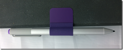
Note also the most clunky aspect of Surface Pro 3.0, which is how you park the pen. The magnetic attachment to the power connector port is hopeless; it falls off in no time. The keyboard loop is better, but my loop has already come off twice, and this will get worse. Time for some superglue? Microsoft should at a minimum make the loop sewn in to the keyboard. Everybody gets a pen, after all, though I also wish it were optional so I could save some money.

image

Another annoyance is only one USB 3.0 port; if Microsoft could squeeze another one in I would find that useful.

The camera is pretty good but no better than the one on Surface 2 (which is also pretty good); both are 5MP. However it easily beats the 720p camera on the Surface Pro 2. The Surface Pro 3 has a better front-facing camera than Surface 2.

The speakers are better than earlier models too. I am not sure how much this matters, since most of the time you will use a headset or external powered speakers, but sometimes the built-in ones are all you have to hand.

As a long-term Surface user I must not neglect to mention the best feature of the device, which is great portability combined with the ability (in the Pro versions) to run most PC applications. I travel enough to appreciate this greatly; it slips into a small bag and is far more convenient to carry than most laptops. I will never go back to a traditional laptop, though I might be tempted by a conventional Ultrabook; some of these are also relatively slim and light, though not so much as a Surface.

I like the Surface Pro 3 and regard it as decent value for money, given the all-round high quality. There are compromises though, and personally I would like to see Microsoft retain a smaller 10.6" screen model in the range as in some ways that works better for me.

When Windows 8 will not boot: the Automatic Repair disaster

“My PC won’t boot” – never good news, but even worse when there is no backup.

The system was Windows 8. One day, the user restarted his PC and instead of rebooting, it went into Automatic Repair.

Automatic Repair would chug for a bit and then say:

Automatic Repair couldn’t repair your PC. Press “Advanced options” to try other options to repair your PC, or “Shut down” to turn off your PC.

Log file: D:\Windows\System32\Logfiles\Srt\SrtTrail.txt

image

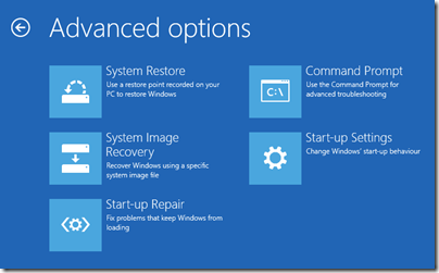
Advanced options includes the recovery console, a command-line for troubleshooting with a few useful commands and access to files. There is also an option to Refresh or reset your PC, and access to System Restore which lets you return to a configuration restore point.

System Restore can be a lifesaver but in this case had been mysteriously disabled. Advanced start-up options like Safe Mode simply triggered Automatic Repair again.

Choosing Exit and continue to Windows 8.1 triggers a reboot, and you can guess what happens next … Automatic Repair.

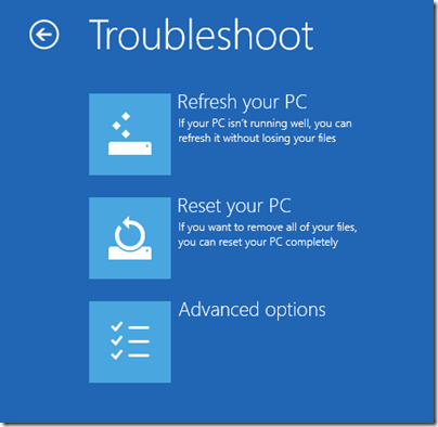
You also have options to Refresh or Reset your PC.

image

Refresh your PC is largely a disaster. It preserves data but zaps applications and other settings. You will have to spend ages updating Windows to get it current, including the update to Windows 8.1 if you originally had Windows 8. You may need to find your installation media if you have any, in cases where there is no recovery partition. You then have the task of trying to get your applications reinstalled, which means finding setup files, convincing vendors that you should be allowed to re-activate and so on. At best it is time-consuming, at worst you will never get all your applications back.

Reset your PC is worse. It aims to restore your PC to factory settings. Your data will be zapped as well as the applications.

You can also reinstall Windows from setup media. Unfortunately Windows can no longer do a repair install, preserving settings, unless you start it from within the operating system you are repairing. If Windows will not boot, that is impossible.

Summary: it is much better to persuade Windows to boot one more time. However if every reboot simply cycles back to Automatic Repair and another failure, it is frustrating. What next?

The answer, it turned out in this case, was to look at the logfile. There was only one problem listed in SrtTrail.txt:

Root cause found:
—————————
Boot critical file d:\windows\system32\drivers\vsock.sys is corrupt.

Repair action: File repair
Result: Failed. Error code =  0x2
Time taken = 12218 ms

I looked up vsock.sys. It is a VMware file, not even part of the operating system. How can this be so critical that Windows refuses to boot?

I deleted vsock.sys using the recovery console. Windows started perfectly, without even an error message, other than rolling back a failed Windows update.

Next, I uninstalled an old vmware player, using control panel. Everything was fine.

The Automatic Repair problem

If your PC is trapped in the Automatic Repair loop, and you have no working backup, you are in trouble. Why, then, is the wizard so limited? In this case, for example, the “boot critical file” was from a third-party; the wizard just needed to have some logic that says, maybe it is worth trying to boot without it, at least one time.

Finally, if this happens to you, I recommend looking at the logs. It is the only way to get real information about what it going wrong. In some cases you may need to boot into the recovery console from installation media, but if your hard drive is working at all, it should be possible to view those files.

Asus bets on everything with new UK product launches for Android, Google Chromebook and Microsoft Windows

Asus unveiled its Winter 2014 UK range at an event in London yesterday. It is an extensive range covering most bases, including Android tablets, Windows 8 hybrids, Google Chromebooks, and Android smartphones.

image

Asus never fails to impress with its innovative ideas – like the Padfone, a phone which docks into a tablet – though not all the ideas win over the public, and we did not hear about any new Padfones yesterday.

The company’s other strength though is to crank out well-made products at a competitive price, and this aspect remains prominent. There was nothing cutting-edge on show last night, but plenty of designs that score favourably in terms of what you get for the money.

At a glance:

  • Chromebook C200 dual-proc Intel N2830 laptop 12″ display £199.99 and C300 13″ display £239.99
  • MeMO Pad Android tablets ME176C 7″ £119 and 8″ ME181 (with faster Z3580 2.3 GHz quad-core processor) £169
  • Transformer Pad TF103C Android tablet with mobile keyboard dock (ie a tear-off keyboard) £239
  • Two FonePad 7″ Android phablets: tablets with phone functionality, LTE in the ME372CL at £129.99  and 3G in the ME175CG at £199.99.
  • Three Zenfone 3G Android phones, 4″ at £99.99, 5″ at £149.99 and 6″ at £249.99.
  • Transformer Book T200 and T300 joining the T100 (10.1″ display) as Windows 8 hybrids with tear-off keyboards. The T200 has an 11.6″ display and the T300 a 13.3″ display and processors from Core i3 to Core i7 – no longer just a budget range. The T200 starts at £349.
  • Transformer Book Flip Windows 8.1 laptops with fold-back touch screens so you can use them as fat tablets. 13.3″ or 15.6″ screens, various prices according to configuration starting with a Core 13 at £449.
  • G750 gaming laptops from £999.99 to £1799.99 with Core i7 processors and NVIDIA GeForce GTX 800M GPUs.
  • G550JK Gaming Notebook with Core i7 and GTX 850M GPU from £899.99.

Unfortunately the press event was held in a darkened room useless for photography or close inspection of the devices. A few points to note though.

The T100 is, according to Asus, the world’s bestselling Windows hybrid. This does not surprise me since with 11 hr battery life and full Windows 8 with Office pre-installed it ticks a lot of boxes. I prefer the tear-off keyboard concept to complex flip designs that never make satisfactory tablets. The T100 now seems to be the base model in a full range of Windows hybrids.

On the phone side, it is odd that Asus did not announce any operator deals and seems to be focused on the sim-free market.

How good are the Zenfones? This is not a review, but I had a quick play with the models on display. They are not high-end devices, but nor do they feel cheap. IPS+ (in-plane switching) displays give a wide viewing angle. Gorilla Glass 3 protects the screen; the promo video talks about a 30m drop test which I do not believe for a moment*. The touch screens are meant to be responsive when wearing gloves. The camera has a five-element lens with F/2.0 aperture, a low-light mode, and “time rewind” which records images before you tap. A “Smart remove” feature removes moving objects from your picture. You also get “Zen UI” on top of Android; I generally prefer stock Android but the vendors want to differentiate and it seems not to get in the way too much.

Just another phone then; but looks good value.

As it happens, I saw another Asus display as I arrived in London, at St Pancras station.

image

The stand, devoted mainly to the T100, was far from bustling. This might be related to the profile of Windows these days; or it might reflect the fact that the Asus brand, for all the company’s efforts, is associated more with good honest value than something you stop to look at on the way to work.

For more details see the Asus site or have a look in the likes of John Lewis or Currys/ PC World.

*On the drop test, Asus says: “This is a drop test for the Gorilla glass, and is dropping a metal ball on to a pane of it that is clamped down, not actually a drop of the phone itself.”

Microsoft CEO Satya Nadella promises “One Windows” in place of three, but should that be two?

Microsoft released its latest financial results yesterday, on which I will post separately. However, this remark from the earnings call transcript (Q&A with financial analysts) caught my eye:

In the year ahead, we are investing in ways that will ensure our Device OS and first party hardware align to our core. We will streamline the next version of Windows from three Operating Systems into one, single converged Operating System for screens of all sizes. We will unify our stores, commerce and developer platforms to drive a more coherent user experiences and a broader developer opportunity. We look forward to sharing more about our next major wave of Windows enhancements in the coming months.

What are the three versions of Windows today? I guess, Windows x86, Windows RT (Windows on ARM), and Windows Phone. On the other hand, there is little difference between Windows x86 and Windows RT other than that Windows RT runs on ARM and is locked down so that you cannot install desktop apps. The latter is a configuration decision, which does not make it a different operating system; and if you count running on ARM as being a different OS, then Windows Phone will always be a different OS unless Microsoft makes the unlikely decision to standardise on x86 on the phone (a longstanding relationship with Qualcomm makes this a stretch).

Might Nadella have meant PC Windows, Windows Phone and Xbox? It is possible, but the vibes from yesterday are that Xbox will be refocused on gaming, making it more distinct from PC and phone:

We made the decision to manage Xbox to maximize enterprise value with a focus on gaming. Gaming is the largest digital life category in a mobile first, cloud first world. It’s also the place where our past success, revered brand and passionate fan base present us a special opportunity.

With our decision to specifically focus on gaming we expect to close Xbox Entertainment Studios and streamline our investments in Music and Video. We will invest in our core console gaming and Xbox Live with a view towards the broader PC and mobile opportunity.

said Nadella.

As a further aside, what does it mean to “manage Xbox to maximize enterprise value”? It is not a misprint, but perhaps Nadella meant to say entertainment? Or perhaps the enterprise he has in mind is Microsoft?

Never mind; the real issue issue is about the development platform and making it easier to build applications for PC, phone and tablets without rewriting all your code. That is the promise of the Universal App announced earlier this year at the Build conference.

That sounds good; but remember that Windows 8.x is two operating systems in one. There is the desktop side which is what most of us use most of the time, and the tablet side (“Metro”) which is struggling. Universal Apps run on the tablet side. The desktop side has different frameworks and different capabilities, making it in effect a separate platform for developers.

“One Windows” then is not coming soon. But we might be settling on two.

Developing an ASP.NET MVC app with Azure Active Directory: an ordeal

Regular readers will know that I am working on a simple (I thought) ASP.NET MVC application which is hosted on Azure and uses Azure Blob Storage.

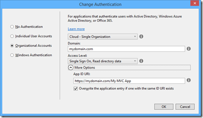
So far so good; but since this business uses Office 365 it seemed to me logical to have users log in using Azure Active Directory (AD). Visual Studio 2013, with the latest update, has a nice wizard to set this up. Just complete the following dialog when starting your new project:

image

This worked fairly well, and users can log in successfully using Azure AD and their normal Office 365 credentials.

I love this level of integration and it seems to me key and strategic for the Microsoft platform. If an employee leaves, or changes role, just update Active Directory and all application access comes into line automatically, whether on premise or in the cloud.

The next stage though was to define some user types; to keep things simple, let us say we have an AppAdmin role for users with full access to the application, and an AppUser role for users with limited access. Other users in the organisation do not need access at all and should not be able to log in.

The obvious way to do this is with AD groups, but I was surprised to discover that there is no easy way to discover to which groups an AD user belongs. The Azure AD integration which the wizard generates is only half done. Users can log in, and you can programmatically retrieve basic information including the firstname, lastname, User Principal Name and object ID, but nothing further.

Fair enough, I thought, there will be some libraries out there that fill the gap; and this is how the nightmare begins. The problem is that this is the cutting edge of .NET cloud development and is an area of rapid change. Yes there are samples out there, but each one (including the official ones on MSDN) seems to be written at a different time, with a different approach, with different .NET assembly dependencies, and varying levels of alpha/beta/experimental status.

The one common thread is that to get the AD group information you need to use the Graph API, a REST API for querying and even writing to Azure Active Directory. In January 2013, Microsoft identity expert Vittorio Bertocci (Principal Program Manager in the Windows Azure Active Directory team at Microsoft) wrote a helpful post about how to restore IsInRole() and [Authorize] in ASP.NET apps using Azure AD – exactly what I wanted to do. He describes essentially a manual approach, though he does make use of a library called Azure Authentication Library (AAL) which you can find on Nuget (the package manager for .NET libraries used by Visual Studio) described as a Beta.

That would probably work, but AAL is last year’s thing and you are meant to use ADAL (Active Directory Authentication Library) instead. ADAL is available in various versions ranging from 1.0.3 which is a finished release, to 2.6.2 which is an alpha release. Of course Bertocci has not updated his post so you can use the obsolete AAL beta if you dare, or use ADAL if you can figure out how to amend the code and which version is the best/safest to employ. Or you can write your own wrapper for the Graph API and bypass all the Nuget packages.

I searched for a better sample, but it gets worse. If you browse around MSDN you will probably come across this article along with this sample which is a Task Tracker application using Azure AD, though note the warnings:

NOTE: This sample is outdated. Its technology, methods, and/or user interface instructions have been replaced by newer features. To see an updated sample that builds a similar application, see WebApp-GraphAPI-DotNet.

Despite the warnings, the older sample is widely referenced in Microsoft posts like this one by Rick Anderson.

OK then, let’s look at at the shiny new sample, even though it is less well documented. It is called WebApp-GraphAPI-DotNet and includes code to get the user profile, roles, contacts and groups from Azure AD using the latest Graph API client: Microsoft.Azure.ActiveDirectory.GraphClient. This replaces an older effort called the GraphHelper which you will find widely used elsewhere.

If you dig into this new sample though, you will find a ton of dependencies on pre-release assemblies. You are not just dealing the Graph API, but also with OWIN (Open Web Interface for .NET), which seems to be Microsoft’s current direction for communication between web applications.

After messing around with Nuget packages and trying to get WebApp-GraphAPI-DotNet working I realised that I was not happy with all this preview code which is likely to break as further updates come along. Further, it does far more than I want. All I need is actually contained in Bertocci’s January 2013 post about getting back IsInRole.

I ended up patching together some code using the older GraphHelper (as found in the obsolete Task Tracker application) and it is working. I can now use IsInRole based on AD groups.

This is a mess. It is a simple requirement and it should not be necessary to plough through all these complicated and conflicting documents and samples to achieve it.

Google I/O 2014: impressive momentum, no wow moments

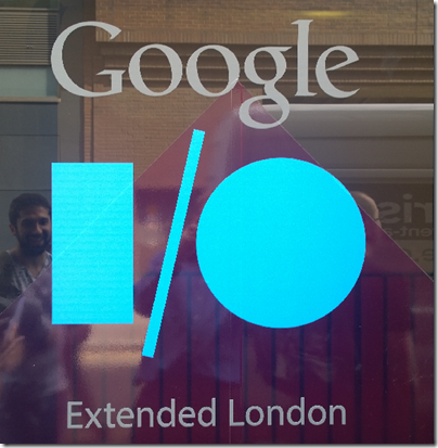
I am not in San Francisco but attended Google I/O Extended in London yesterday, to hear the keynote and a couple of sessions from Google’s annual developer conference.

image

I found the demographics different than most IT events I attend: a younger crowd, and plenty of start-ups and very small businesses, not at all enterprisey (is that a word?)

image

The main announcements:

A new version of Android, known as Android L (I don’t know if this will expand eventually to Lollipop or Liquorice or some such). Big release  with over 5,000 new APIs, we were told (when does Android start being called bloated, I wonder?). Themes include a new visual style called Material Design (which extends also to the Web and to Chrome), and suitability for more device types including Android TV, Android Wear (smart watches) and Android Auto. A new hardware accelerated graphics API called Android Extension Pack which implements OpenGL ES for better game performance, with support from NVIDIA Tegra. Android graphics performance will be good enough for a considerable subset of the gaming community and we saw Unreal Engine demoed.

Android L does not use Dalvik, the virtual machine that runs Java code. In its place is ART (Android Runtime). This is 64-bit, so while Java code will run fine, native code will need updating.

Google is working hard to keep Android under its control, putting more features into its Play Services, the closed part of Android available only from Google and which is updated every 6 weeks, bypassing the operator obstacle to OS updates. There is also a new reference design including both hardware and software which is designed for affordable smartphones in the developing world: third parties can take this and build a decent Android mobile which should sell for under $100 as I understood it. I imagine this is designed to ward off fractured Android efforts like Microsoft’s Nokia X, aimed at the same kind of market but without Play Services.

There are new Android smart watches on the way, and we saw the inevitable demonstration of a user using voice control to the watch for ordering taxis or pizzas, getting notifications, and sending simple messages.

Voice control demos always seem to be nervous moments for presenters – will they be understood? Unfortunately that uncertainty remains for real users too, as evidenced by Xbox One Kinect which is amazing in that it often works, but fails often enough to be irritating. Voice recognition is a hard problem, not only in respect of correctly translating the command, but also in correctly detecting what is a command (if the person standing next to me shouts “Taxi please” I do not want my watch to order one for me).

The smart watch problem also parallels the TV problem. The appeal of the watch is that it is a simple glanceable device for telling the time. The appeal of the TV is that it is a simple sit-back screen where you only have to select a channel. Putting more smarts into these devices seems to make sense, but at the same time damages that core feature, unless done with extreme care.

Android TV puts the OS into your television, though Google’s messaging here is somewhat confusing in that, on the one hand, Chromecast (also known as Googlecast) means that you can use your Google device (Android or Chromebook) as the computer and the TV as the display and audio system, while on the other hand you can use Android on the TV itself as an all-in-one.

We are inching towards unified home entertainment, but with Google, Microsoft (Xbox One), Sony (PlayStation) and Apple all jostling for position it is too early to call a winner.

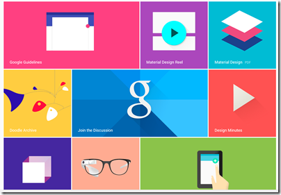
Material Design – Metro for Android?

We heard a lot about Material Design, which is Google’s new design style. Google borrowed plenty of buzzwords form Microsoft’s “Metro” playbook, and I heard expressions like “fast and fluid”, clean typography, signposting, and content-first. Like Metro, it also seems to have a blocky theme (we will know when the next design wave kicks in as it will have rounded corners).

image

Material Design is not just for Android. You can also implement the concept in Polymer, which is a web presentation framework built on Web Components, a standard in draft at the W3C. Support for Web Components (and therefore Polymer) is already in Chrome, advancing rapidly in Mozilla Firefox, probably coming in Apple Safari, and maybe coming in Microsoft IE. However, a JavaScript library called Polyfill means that Polymer will run to some extent in any modern browser.

Whenever IE was mentioned by a presenter at Google I/O there was an awkward/knowing laugh from the audience. Think about what that means.

One of the ideas here is that with a common design concept across Android and web, developers can make web apps (and therefore Chrome apps) look and behave more like Android apps (or vice versa). Again, there is a similar concept at Microsoft, where the WinJS library lets you implement a Metro look and feel in a web app.

Microsoft may have been ahead of Google in this, but it has done the company little good in that adoption for Metro has been weak, for well-rehearsed reasons connected with the smartphone wars, legacy Windows desktop and so on. Google has less legacy weighing it down.

How good is Material Design though? Apple’s Steve Jobs once said of a new OS X design update that it was so good you want to lick it. Metro lacks that kind of appeal, and judging from yesterday’s brief samples, so does Material Design, whatever its other merits in terms of clarity and usability. It is early days though.

Business features: Samsung Knox, Office support, unlimited storage

Google announced a couple of  features aimed at business users. One is that Samsung Knox, app sandboxing and data security for business users, has been donated to Google for integration into Android. Another is that Google Docs will get the ability to edit Microsoft Office documents in their native format, removing an annoyance for users who previously had to convert documents to and from Google’s own format when exchanging them with Microsoft Office users.

This seems to be an admission that Microsoft Office is the business standard for documents, and you can take it either way – good for Google because compatibility is better, or good for Microsoft because it cements Office as the standard. There will be ifs and buts of course.

Google is also offering unlimited online storage for business users, called Drive for Work, at $10 per user per month, upping the ante for everyone in the online storage game – Microsoft, Dropbox, Box and so on.

Google’s Cloud Platform

Google showed new features in its cloud platform, with a focus on big data analytics using an approach called Cloud Dataflow. “We don’t use MapReduce any more”, said the presenter, explaining that Cloud Dataflow enables all of us to use the same technology Google uses to analyse big data.

Greg DeMichille, a director of product management for the cloud platform, appeared on stage to show features for in-browser tracing and debugging of cloud applications. I recall DeMichille being much involved in Microsoft’s version of Java back in the days of the battle with Sun; he also had a spell at Adobe getting behind Flash and Flex for developers.

No Wow moments

The Google I/O 2014 keynote impressed in terms of numbers – Android growth continues unabated – and in terms of partners lining up behind initiatives like Android TV and Android Auto. The momentum seems unstoppable and the mass market for mobile and embedded devices is Google’s to lose.

On the other hand, I did not notice any game-changing moments such as I experienced when first seeing the Chromebook, or the Google Now personalisation service. Both of those still exist, of course, but if Android will really change our lives for the better, Google could have done a better job of conveying that message.

Review: Nokia Lumia 630 – a lot of smartphone for the money

Microsoft/Nokia has released the Lumia 630 Windows Phone in the UK. It is notable for two reasons:

  • The first phone on sale with Windows Phone 8.1 installed
  • A budget contender with a full range of features at around £100. For example, o2.co.uk offer it for £99.99 with a “Pay & Go” tariff from £10.00 monthly. Amazon.co.uk is currently offering it sim-free for £128.29.

The quick summary:

  • 4.5″ 854×480 LCD screen
  • 5MP rear camera
  • 512MB RAM
  • 8GB storage
  • MicroSD slot supporting up to 128GB
  • Qualcomm Snapdragon 400 quad-core 1.2 GHz processor
  • Bluetooth 4.0, wi-fi, WCDMA,GSM,A-GPS etc
  • 1830 mAh removable battery

What is missing? Among the compromises here, there is no front-facing camera, the only sensor is an accelerometer, the screen resolution is poor compared to a high-end smartphone, and there is no dedicated camera button.

The older Lumia 625 has some features missing on the 630, including a camera button, LED Flash, ambient light sensor and proximity sensor, Nokia’s “super sensitive touch” screen, and LTE. The 625 is a similar price, so if those features matter to you it might be a better buy, though you have to put up with the older and slower S4 processor.

The Lumia 630 does support Nokia’s SensorCore feature, which lets apps like Health & Fitness (pre-installed) track movement through an API without consuming much power.

The lack of a camera button or Flash is disappointing, considering Nokia’s reputation as a brand good for photography.

Out of the box

image

The Lumia 630 is a basic package. No headset is included, presumably on the grounds that you likely have one already, though buying one separately is inexpensive. There is a mains charger; you probably have one of these already too, but it might not be optimal for this particular device, which may be why Nokia chose to prioritise this over the headset.

In order to fit the SIM, you pop the phone out of its shell; it feels if anything a bit too easy, though the phone shows no sign of falling apart accidentally so far.

image

The software of course is Windows Phone 8.1, with several nice improvements including a notification screen accessed by swiping down from the top. This works even from the lock screen, and gives immediate access to the camera, which may explain why the button is missing. I still miss the button though.

image

Cortana, the virtual personal assistant currently in beta, is not yet present in the UK. You can enable Cortana with a bit of effort by changing your language and region, but it is not recommended other than for temporary experimentation.

I hit one problem in setup. The automatic date and time setting does not work, at least not with my carrier (Three). This in turn broke some other features including SkyDrive and Exchange/Office 365 email, until I set it manually. The manual setting is not brilliant though, since when I turned the set off and on again, it came up with a setting from several days ago. This looks like a software bug so I hope it will be fixed soon.

Here is the home screen pretty much out of the box, though I have connected it to Exchange:

image

This is NOT how I prefer to set up my home screen on a Windows phone. Normally I reduce all the tiles to the smallest size other than the phone icon, which I have large so I can hit it as easily as possible. This fits more icons on the screen and gets rid of the annoying People live tile animations. This is, of course, a matter of personal preference.

The apps prominent above the fold include PhotoBeamer, which lets you show pictures on a friend’s Windows Phone (a cool app), LINE which is a messaging app, and the excellent HERE maps and Nokia Camera.

Scroll down and you get Facebook, Skype, HERE Drive, Nokia Mix Radio, OneDrive, calendar and several more.

A word about apps

I do not intend this to be another reviews of a Windows Phone which say, “great phone but the apps are lacking.” It is true to the extent that Windows Phone lacks the great support with iOS and Android get in terms of apps. Windows Phone owners have to put up with seeing “available for iOS and Android” for apps which they might  otherwise like to install, and with apps that are less well maintained or up to date than those for the two more popular platforms.

Clearly, the way to fix this is for lots more people to buy Windows Phones. Therefore, not to buy a Windows Phone because of the app shortage merely perpetuates the problem.

But how bad is it? The answer will be different depending which apps matter to you; but there are a couple of reasons why it is not, in my opinion, all that bad.

One is that Microsoft has its own platform, putting it in a stronger position than say, Blackberry or even Apple (if iOS were not already popular). The Microsoft platform includes maps and driving (Nokia), search (Bing), messaging (Skype), email and cloud documents (Office 365) and online storage (OneDrive).

Second, the Windows app store is not as moribund as the Windows 8 app store. There are decent apps in most categories and support from third parties like Spotify, WhatsApp, Instagram or the BBC is improving.

If you love Google, this is unlikely to be the phone for you, since it seems almost to go out of its way not to support Windows Phone.

On the other hand, there are Windows Phone apps which I miss on other platforms, including Nokia Camera, HERE Drive, and the built-in email and calendar apps.

It is a factor, but not a showstopper.

Lumia 630 in use

My experience of using the 630 is mainly positive. Performance is great; the phone is fast and responsive. Battery life is good too:

image

Note that the Battery Saver is off by default, but I prefer having it come on automatically as needed.

Battery life is nothing special if you use the phone intensively, such as to watch a video or play a game, but when it on standby it is better than previous Windows phones I have tried.

The camera is better than I had expected, given the annoyances mentioned above. For casual snaps it is up to the mark you would expect from a budget smartphone.

This is not PureView though; do not expect the same quality as on Nokia’s high-end phones. See here for some comparative snaps.

Audio on the Lumia 630 sounds fine when played with a high quality headset. I played the same track on the 630, the Lumia 1020, and from a PC via a dedicated headphone amplifer. Possibly the 630 sounds slightly thin compared to the more expensive setups, but the earbuds or headphones you use will likely make the most difference.

image

Health and Fitness tracking, using the Bing app, is fun and saves having to manage a separate device like a Fitbit.

image

I have yet to catch out the 630 on performance. Youtube videos and BBC iPlayer played smoothly.

The display is on the dull side but no enough to spoil the experience. However I did notice grey marks (presumably shadows of the glue that holds the screen on) at the top of the screen, visible on light backgrounds, which is a slight annoyance.

Conclusion

The Lumia 630 is a budget smartphone with a lot to offer. There are just a few annoyances: features missing that were present on the 625, slightly dull screen, and some signs of cost-cutting. These are small blemishes though when you consider what you do get for a modest outlay.

&nbr;

Having it both ways: can Microsoft equally back Windows Phone and “Any device”?

I attended an event in London which was a kind-of UK launch for Windows Phone 8.1. The first Lumia device running 8.1, the Lumia 630, is now on sale, though this was not the main focus. It was more about asking businesses to take another look at Windows Phone (and Windows tablets), following improvements Microsoft has made. The company is particularly pleased with a new white paper from MobileIron, a well-known company in mobile device management, praising the new security and manageability features:

Windows Phone 8 did not meet the stringent policies some enterprises required for protecting corporate data and resources. The release of Windows Phone 8.1 changes the game. Microsoft is delivering a rich new feature-set for business users, and providing IT departments with the compliance and security they require. These new security and management features, called the Enterprise Feature Pack, are included as a core component of Windows Phone 8.1. When combined with an enterprise mobility management (EMM) platform, these capabilities make it much easier for enterprises to adopt the Windows Phone platform.

Fair enough, though from what I can tell Windows Phone is still struggling to get the momentum it needs. Too many companies perceive that if they support iOS and Android then that is it, job done, as evidenced by this advertisement I saw recently. This in turn dampens sales. It is an unfortunate position to be in, particularly given the good work Microsoft (and Nokia) has done on the phone OS itself. I prefer the Windows Phone user interface to that in Android, but still need an Android device in order to try out new apps.

This could change if Microsoft can continue gradually bumping up its market share, but it is tough. The wider company is now side-stepping the problem by focusing on its strengths in Office, Active Directory and Office 365, and offering first-class support for these on iOS and Android, as evidenced by the excellent Office for iPad launched earlier this year.

There is a dilemma here though. Some Windows Phone users choose the phone because they feel it will work best with Microsoft’s business platform. Could the “any device” policy end up undermining Microsoft’s efforts to promote Windows Phone?

I put this to Chris Weber, Microsoft’s Corporate Vice President of Mobile Device Sales, who has come to the company from Nokia (before which he was at Microsoft, so a true Windows veteran).

image

From a business perspective, providing cloud services, management, security, it is a multi-platform world. It is a great business decision for Microsoft to be multi-platform. Customers demand it as well.  That doesn’t mean we don’t want to create the most compelling platform and set of devices that bring Windows to life. I think the cross-platform thing is a great story … but the benefit of us [Nokia and Microsoft] coming together is now we have hardware, software and services that can be integrated in a totally different way, and we’re one of the few players that have all those components. The level of integration is much greater on the Windows platform. For example, Office is built in, you don’t have to go to a store and download it. The Linq client is built into the calendar. The email client, being able to have rights protection. The mail client itself is the best of any of them. The ability to access a SharePoint site across the firewall without a VPN connection, unique to Windows Phone.

Then we also have to win the end user. We have to win IT and those requirements, but you also have to get end users excited. Things that you see in 8.1, like Cortana, there’s a huge benefit there. And we’re bringing that across every price point.

Fair points; yet currently the iPad has a better touch-friendly Office than Windows tablets or Windows Phone; and Windows phone users have frustrations where the integration falls short. One remarkable thing, for example, is that there is no way to use a shared Exchange or SharePoint calendar on Windows Phone other than in the browser, so no integration with the built-in calendar or offline support.

What Weber describes, near-perfect integration between Windows mobile devices and Microsoft’s server applications, should be the case though; making this even better should be a high priority for CEO Satya Nadella’s new Microsoft.

Weber makes the bold claim that he can convert any user to Windows Phone, but says the challenge is to make this happen at retail level, when the customer wanders in looking for a smartphone:

If you give me fifteen minutes, I think I can convince any iPhone or Android user to move to Windows Phone. We have to do this not in fifteen minutes but in probably a minute and a half, at retail, with people who are selling multiple devices and are used to selling the competitor platform more than us.

Focusing on enterprise integration is in my view long overdue, and a few large enterprise adoptions would give Windows Phone a significant boost. At retail though, my guess is that Microsoft’s main hope is what Nokia did so well: delivering a good smartphone experience in budget devices – the “every price point” to which Weber refers.

Review: Sonocent Audio Notetaker, making sense of recorded interviews and meetings

Why bother taking written notes, when you can simply record the audio of a meeting or interview and listen to it later? I do this a lot, but it is problematic. You end up with an MP3 which has all the info within it, but with no quick way to find a half-remembered statement. Of course you can transcribe everything, or get it transcribed, but that is not quick; it will likely take longer than the original event if you want to transcribe it all, and even selective transcription is a slow process. You can get better at this, and I have formed a habit of noting times when I hear something which I am likely to refer to later, but standard audio players (such as Foobar 2000 or iTunes) are designed for music and not great for this kind of work.

There is also an annoying problem with application focus if you want to transcribe a recording. You have Word open, you have your recording open in Foobar, but to control Foobar you have to switch focus away from Word, which means you cannot type until you focus back. There are utilities around to overcome this – my solution was to write my own Word macro which can pause and rewind a recording with keyboard shortcuts – but it is another issue to fix.

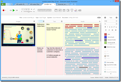
Sonocent Audio Notetaker is an application for Windows or Mac dedicated to making sense of speech recordings. Audio Notetaker lets you create documents which include audio, text and images. If you have an existing audio recording, you can import it into a new Audio Notetaker documnent and start to work with it. The audio is copied into the document, rather than being added as a reference, so these documents tend to be large, a little larger than the original.

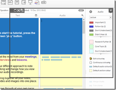
The primary feature is the the way recordings are visualised and navigated. When you import a recording, it shows as a series of bars in a large panel, rather than the single horizontal scrolling view that most audio players present. Each bar represents a phrase, determined by Audio Notetaker according to pauses in the speech. This is not altogether reliable since speakers may pause mid-phrase, but you can split or merge bars if needed. The length of each bar varies according to the content, but typically seems to be around 3-15 seconds. You navigate the recording by clicking on the bars, and annotate it by assigning colours to bars according to your own scheme, such as blue for a potential quote, or brown for “boring, skip this”.

If you are transcribing, you can type into either to two text panes, one of which is called Reference and the other just Text. When you are typing in one of these panes, you can use keyboard shortcuts to control the audio, such as Ctrl+Space for play/pause, Ctrl+\ to skip back, and Ctrl+/ to skip forward. The Reference and Text panes are functionally identical, but let you keep two different types of notes with one recording. There is also an image pane, which can include images, PDFs or PowerPoint presentations.

image

How do you synchronise your notes or transcription with the audio to which it relates? Audio Notetaker does not do this automatically, but does allow you to insert section breaks which split the document into vertical sections. You can create these breaks with keyboard shortcuts. I would prefer it if Audio Notetaker automatically set hotlinks so that I could tell exactly what audio was playing when I made a note, but sections are nevertheless useful.

For example, if you have an interview, a logical approach would be to make each question and each answer a section. Then you can easily navigate to the answer you want.

You can use background colouring to further distinguish between sections.

A common problem with audio recordings is that they are at too low a level. Audio Notetaker has its own volume control which can boost the volume beyond what is possible with the Windows volume control.

There is also a noise cancellation button, to remove the dreaded hiss.

image

Advanced features

Those are the basics; but Audio Notetaker has a few other capabilities.

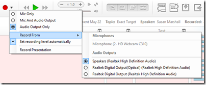
One idea is that you might want to record the content of an online conference. For this purpose, you can record from any of your input or output devices (it might seem strange to record from an output device, but this is the equivalent of a “what you hear” setting).

image

This approach is further supported by the ability to capture a screen and insert it into the document. When you choose the screen capture tool, you get a moveable, resizeable frame that you position over the area you want to capture.

image

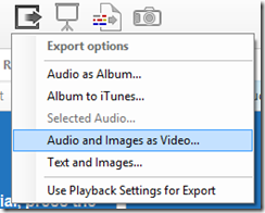
Another scenario is that you want to create a simple video with a PowerPoint slide show and an audio voiceover. You can do this by importing the PowerPoint and recording your speech, then choosing Export Audio and Images as Video (MP4 or WMV).

image

You can also export the text and images in RTF format (suitable for most word processors).

Internally, Audio Notetaker uses Opus Audio Encoding which is an internet standard.

You can also have Audio Notetaker read back text to you using the Windows text to speech engine (I am not sure how this works on a Mac).

Final words

The best feature of Audio Notetaker is the way it lets you navigate an audio file. It is quicker to click on a bar in the panel than using a horizontal scroller or noting the time and going to that point.

The sections work OK but I would personally like some way of embedding notes that are hotlinked to points in the audio with a finer granularity than sections.

I am not sure of the value of features like importing PowerPoint slides, adding audio, and exporting as a video, when PowerPoint itself has support for narrations and export to video. I would prefer it if the developers focused on the core proposition in Audio Notetaker: making it easy to index, annotate and navigate speech recordings.

I would also like to see integration with a transcription service. Automated transcription would be great but does not usually work well with typical field recordings; more realistically, perhaps Sonocent could integrate with Amazon’s Mechanical Turk or another service where humans will transcribe your recording for a fee.

Nevertheless, Audio Notetaker is nicely designed software that addresses a poorly-served niche; well worth consideration for journalists, students, secretaries, takers of minutes, or anyone who uses audio recordings as part of their workflow.

You can find Audio Notetaker on the Sonocent site, and obtain it as a free trial, or by subscription for a period, or with a perpetual licence. For example, six months for an individual license is £29.99; a perpetual licence is £95.99 (including VAT).

It is available for PC or Mac.