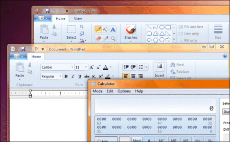
In Windows 7, Microsoft has made further efforts to make the desktop more usable. There is a "peek" feature that makes all running applications temporarily transparent when you hover over the Show Desktop button. If you click the button the apps all minimize, so you can interact with the desktop, and if you click again they come back. Nice feature; but it cannot disguise the desktop’s inherent problems. Or should I say problem. The issue is that the desktop cannot easily be both the place where you launch applications, and the place where they run, simply because the running application makes the desktop partly or wholly inaccessible.
The Show Desktop button (sans Peek) is in XP and Vista too, and there is also the handy Desktop toolbar which makes desktop shortcuts into a Taskbar menu. All worthy efforts, which are workarounds for the fact that having shortcuts and gadgets behind your running applications is a silly idea. The desktop is generally useful only once per session – when you start up your PC.
In this respect, the computer desktop differs from real desktops. Cue jokes about desks so cluttered that you cannot see the surface. Fair enough, but on my real desktop I have a telephone, I have drawers, I have an in-tray and out-tray, I have pen and paper, and all of these things remain accessible even though I’m typing. The on-screen desktop is a faulty abstraction.
The inadequacy of the desktop is the reason that the notification area (incorrectly known as the system tray) get so abused by app developers – it’s the only place you can put something that you want always available and visible. In Windows 7 the taskbar is taking on more characteristics of the notification area, with icons that you can overlay with activity indicators like the IE8 download progress bar.
It’s true that if you don’t run applications full-screen, then you can move them around to get desktop stuff into view. I find this rarely works well, because I have more than one application visible, and behind one application is another one.
Why then do OS designers persist with the desktop idea? It’s possibly because it makes users feel more comfortable. I suspect it is a Skeuomorph (thanks to Phil Thane for the word) – “a derivative object which retains ornamental design cues to structure that was necessary in the original”. An example is that early electric kettles retained a squat shape with a large base, even though the logical shape for an electric kettle is a slim jug, enabling small quantities of water to cover the element. The reason for the squat shape was to spread the heat when boiling water on a stove. It took years before “jug” kettles caught on.
It is better to call the computer desktop a workspace, and to forget the idea of putting shortcuts and gadgets onto it. Which reminds me: why does Windows still not surface multiple desktops (or workspaces) as is common on Linux, and also implemented in Mac OS X Leopard as Spaces? Windows does have multiple desktops – you see one every time UAC kicks in with its permission dialog on Vista, or when using the Switch User feature – but they are not otheriwse available.
I’m also realising that sidebar gadgets were a missed opportunity in Vista. Microsoft made two big mistakes with the sidebar. The first was to have it stay in the background by default. Right-click the sidebar and check “Sidebar is always on top of other windows”. Then it makes sense; it behaves like the taskbar and stays visible. Not so good for users with small screens; but they could uncheck the box. I know; you don’t like losing the screen space. But what if the gadgets there were actually useful?
The other mistake was to release the sidebar with zero compelling gadgets. Users took a look, decided it was useless, and ignored or disabled it. That’s a shame, since it is a more suitable space for a lot of the stuff that ends up in the notification area. If Microsoft had put a few essentials there, like the recycle bin, volume control, and wi-fi signal strength meter; and if the Office team had installed stuff like quick access to Outlook inbox, calendar and alerts, then users would get the idea: this stays visible for a good reason.
In Windows 7, gadgets persist but the sidebar does not. Possibly a wrong decision, though apparently there is a hack to restore it. It’s not too late – Microsoft, how about an option to have the old sidebar behaviour back?
I’d also like a “concentrate” button. This would hide everything except the current application. Maximized applications would respond by filling the entire screen (no taskbar or sidebar), save for an “unconcentrate” button which would appear at bottom right. This would be like hanging “Do not disturb” outside your hotel room, and would suppress all but the highest priority notifications (like “your battery has seconds to live”).
My suggestion for Windows 8 and OS 11 – ditch the desktop, make it a workspace only. Implement multiple workspaces in Windows. And stop encouraging us to clutter our screens with desktop shortcuts which, in practice, are very little use.
