Category Archives: Uncategorized

Windows 8 Consumer Preview tip: use compatibility mode for driver installation

I have a Kodak ESP 725o network printer, and was trying to set it up on Windows 8 Consumer Preview. The setup software detected the printer OK, then gave a strange error:

image

“The application called an interface that was marshalled for a different thread.” Hmm.

The solution is to run the installer in Windows 7 compatibility mode. Doing this in Windows 8 takes a few steps. First, find the setup app in the Start menu:

image

then right-click to show the options menu, or if using touch, drag the shortcut up slightly and release for the same result. Then click or tap Open file location.

image

This shows the application in Explorer on the desktop. If you prefer to get there by another route, that is fine too. Right-click the executable, choose Properties, and then Compatibility. Select Windows 7 and click OK.

image

Run the printer setup utility, and if you are lucky (as I was in this case) it will install the driver for you perfectly.

image

Nokia Lumia 800 review: beautiful phone, some annoyances

I have been trying Nokia’s Lumia 800 for the last week or so, the first Windows Phone from the company. It is a significant device, since Microsoft is relying on Nokia to revive its Windows Phone 7 platform which has won only a tiny market share since its launch in late 2010, while Nokia is betting its business on Windows Phone after selecting it in preference to Google Android or its own MeeGo operating system. No pressure then.

The phone is nicely packaged and comes with a free protective skin as well as a fake railway ticket stating “Your one way ticket to amazing.” This is a UK ticket so I presume it is suitably regionalised elsewhere. A small detail, but it formed part of my impression that Nokia has thought carefully about the unwrapping experience, whereas previous HTC Windows Phones have felt like just another phone in a box.

image

The Lumia takes a micro-SIM, as used in the iPhone 4.x, and the only one I had available was in my iPhone, so I removed it and popped it in the Lumia. Everything worked, the switch-on and initial setup was good, and I was soon up and running with Exchange email. I did have to install my self-signed certificates for Exchange, but this is not an issue that will affect most users.

This phone has a polycarbonate body and a Gorilla Glass front and feels solid and well-made. The 480×800 screen is bright, clear and responsive to touch. I have not had any issues of laggy or uncertain response to taps.

What counts here is that the Lumia feels like a high quality device; the design has something extra that sets it apart from most smartphones out there.

In terms of hardware features, the Lumia is unexceptional, with volume, on-off and camera buttons on its right edge, speaker at the bottom, standard headset socket on top, and rear-facing camera lens and flash.

I rate the sound through the supplied ear buds as decent, but the speaker is tinny, much worse than that on the iPhone 4. Fortunately you rarely want to play music through the built-in speaker.

The USB connector (also used for charging) is behind a flap. You have to push a small protrusion to swing it open. It is a little awkward at first and a slight annoyance, but I can also see how it improves the appearance and protects the socket.

Although I like the hardware overall, there are a few issues. One is battery life; it is barely adequate, though Nokia says a future update will improve it:

A software update in early December will include improvements to power efficiency, while a second update in early January introduces further enhancements to battery life and battery charging.

How bad is it? Here is a screenshot:

image

Do the maths … if 23% is 1 hour then 100% is just over 4.5 hours, not good. Of course this is with active use, mostly email and web browsing. Do not panic about the “Time since last charge” – it was not a full charge!

The Lumia does have a neat feature whereby it goes into a “battery saver” mode which turns off non-essential services to prolong battery life when it is low. Curiously this was off by default, but I enabled it and it works.

Lumia Software

Physically the phone is above average; but what about the software? This bit is mostly Microsoft’s responsibility, though Nokia has done what it takes to make it run sweetly on the Lumia; the user interface flows smoothly and the chunky tiles are easy to tap.

image

On an iPhone you get four favourite shortcuts at the bottom of the screen and page through the others by swiping through pages (or you can create groups). On Windows Phone you get eight favourites above the fold, scroll down for more favourites or tap the arrow at top right for the complete alphabetical list which scrolls vertically. It is different but equally easy to use.

You have to tap at the top to see network and battery status; I would prefer to have this always visible but it is a minor point once you know how.

Nokia does supply several apps. Nokia Music is radio without the ads or commentary; you choose a genre and it plays continuous tracks. A decent app.

image

Nokia Maps is an alternative to the standard Bing Maps, which is also installed, and seems redundant to me, since it has fewer features. I also noticed several cafes wrongly positioned in my local area, which does not inspire confidence.

Nokia Drive though is worthwhile, offering turn by turn directions and its own set of road maps – though I am not sure how practical it is if you are driving on your own.

The Lumia comes with a mobile build of Internet Explorer 9, and I have found it pretty good in general though of course neither Adobe Flash nor even Silverlight is supported.

Office Hub

The Office Hub is one good reason to get a Windows Phone – provided you use Exchange and SharePoint (though note the annoyance below), or the free SkyDrive, or Office 365. I like the way Outlook on the phone easily handles multiple Exchange accounts, which appear as separate instances.

The Office Hub gives you read-write access to Word, Excel, PowerPoint and OneNote documents, which I personally find useful, even though the editing features are limited.

Me and People Hubs

The Windows Phone 7 OS aggregates a number of social media accounts: Windows Live, Twitter, Facebook, LinkedIn though not Google+. I find this works fairly well, though I found the slightly different roles of the Me tile and the People tile confusing at first. Personally I use Twitter more than Facebook; and I find tweets of people I follow listed in the People app, while my own recent tweets and notifications of tweets mentioning me are in the Me app. I wonder if these two apps could usefully be merged?

That said, Windows Phone does a great job of surfacing your social network interactions and I would guess that this is one of its foremost attractions in the consumer market.

Annoyances

I found a few bugs and annoyances, though I suspect for most of these Microsoft is more to blame than Nokia.

First, there seems to be a bug in the interaction between the maps, the GPS and the direction finding and “Local Scout”, which is meant to find local attractions and facilities.

I saw this today. I was in London and the GPS was working fine, I could tap the “me” button and it correctly located me on the map. But when I asked for directions to a street nearby I got this:

image

“No location information”. Something not right there – and yes, I tried again. I also get this sometimes with Local Scout.

Second annoyance: on my Android phone I can connect to my laptop and use the mobile as a 3G modem. Windows Phone has a Mobile Hotspot feature, though it does not work on my O2 connection; I assume that is a carrier issue, but I miss the feature and the direct USB connection works well for me on Android.

Third annoyance: Zune. I do not know why Microsoft persists with the tarnished Zune brand, and it is a mistake to build in this dependency on Windows only desktop software – yes, I know there is also Windows Phone 7 Connector for the Mac. I would prefer to be able to connect the phone to any PC or Mac and have the ability to copy documents and music to and from device storage.

Zune is not too bad when everything is working, though I had a specific issue on the train recently. I had written some notes in a Word document on my laptop and wanted to transfer them to the phone. Zune only syncs music. The only way to get the document from the laptop to the phone would have been via the internet, and that was impossible because the laptop was offline.

Fourth annoyance: SharePoint. I run my own SharePoint server, and while I can easily access it on the internal network, if I try using it from Office Hub over the Internet I get the message “SharePoint doesn’t support this authentication scheme.”

This turns out to be documented:

Unless your organization uses a Microsoft Forefront Unified Access Gateway (UAG) server, you can only access a SharePoint 2010 site if you’re in the office and connected to your organization’s Wi-Fi network.

That is not what I consider a detailed technical explanation and maybe there is a workaround; but it is annoying when Microsoft cannot get its own products to work together properly. Note though that SharePoint in Office 365 works fine.

Fifth, I had to sign up for a paid developer account in order to install a screen capture application. This is why many Windows Phone reviews have no screenshots. How difficult would this be for Microsoft to build in?

Sixth, I have found Local Scout near-useless. This is mainly because of lack of momentum; it needs more data and user reviews to be useful. However I have also noticed that a restaurant near me which closed a while back is still listed even though I have twice reported it closed through the “Tell us this place is closed” link, the first time two months ago. It makes me wonder to what extent this database is actively maintained; inaccurate information can be worse than useless.

Windows Phone Apps: still a disappointment

The biggest disappointment deserves its own heading. This is the apps available in the marketplace. When I go to the Apple or Android stores I see dozens of apps that look interesting; in the Windows Phone store on the other hand I struggle to find excellent apps. The number of apps in the marketplace is less important than the quality, and here Windows Phone 7 still seems to fall short.

If I go to the marketplace, choose the category of All apps, and then select Top (which I presume ranks according to popularity and rating) it is interesting that they are all games and mostly from Microsoft Studios:

image

Games are important, but that does not look like a healthy ecosystem to me.

Could this be an opportunity for developers? Since Nokia World in London at the end of October I have seen a dramatic increase in profile for Windows Phone; it is what Microsoft should have achieved at the original launch a year earlier. We will not know numbers for a while, but there must be more of these things going out, with new users looking for apps.

The Camera

I am not reviewing the camera in detail here. The quality is good though the images seem a little “cold” to me, which means I suppose that the colours are not as vibrant as they should be. I will not press the point though; it is a decent camera and good enough.

Summary

This is a beautiful phone and the only showstopper problem is the poor battery life. If Nokia fixes this, we are left with what seems to me the best Windows Phone 7 implementation yet, despite a few annoyances which are mostly in the Windows Phone 7 OS and its core apps rather than being the fault of Nokia.

There are a number of things to like: social network integration, the Office Hub, Mix Radio

Nokia’s Windows Phone launch has made more impact than I had expected. Microsoft and its partners need to follow through with faster updates, and to work on quality rather than quantity in populating the app Marketplace.

How not to ship a hard drive

I ordered a hard drive from play.com and was taken aback by the way it was shipped to me – in a flimsy padded envelope with no additional protection.

image

In case you are wondering how to ship a hard drive, this is the illustration from the Western Digital support site:

image

which adds:

Place in sturdy cardboard box. Do not use chipboard, as it is not strong enough to withstand the rigors of transit. Please make sure the corrugated carton is free from defects and is structurally sound. Note: Returning a WD hard drive in an envelope, will void the warranty.

I protested and play.com offered to take the drive back but gave me no explanation for the incorrect packaging. Surprisingly the drive checks out OK, although hidden damage is a concern.

Review: JetBrains AppCode for Objective C

I have been trying out JetBrains AppCode, a new IDE for Apple’s Objective C. The company is best known for its IntelliJ IDE for Java, and AppCode essentially takes the same core IDE and reworks it for Objective C. AppCode is itself a Java application, but unless you have a religious objection to this I doubt you will find it a problem: I found it perfectly snappy and responsive on my machine, a 2.3 Ghz Core i5 with 8GB RAM.

Installation was a snap, as Mac users expect.

image

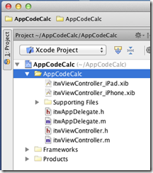
One thing I discovered immediately is that AppCode is not a replacement for Xcode, the official Apple IDE. The Apple SDKs are delivered with Xcode, and AppCode requires it. An AppCode project is also an Xcode project.

image

This is particularly important if you want to use Interface Builder, the Xcode visual designer, since AppCode has no equivalent. Double-click the .xib file and it opens in Xcode. This is a disorientating at first, but in practice I found it convenient to be able to switch between the two IDEs.

So why bother with AppCode, when Xcode is free? It is certainly not essential, but my view is that tools which save time or improve quality are worth the investment. Whether AppCode will do this for you will depend on how you work and whether you have any frustrations with Xcode, which improved considerably in version 4. Out of the box, Xcode has integrated Git or Subversion source code control, unit test integration, refactoring including Rename, Extract, and Encapsulate, the aforementioned Interface Builder, and a ton of other features. Sticking with Xcode is a safe choice.

That said, AppCode feels leaner and less cluttered than Xcode. It also has many additional productivity features in the editor. JetBrains’ IDEs are well known for refactoring, and while AppCode is not as rich as IntelliJ IDEA in this respect, it does have a more than Xcode.

Another strong feature is code generation. Press Command + n in the editor, and a context-sensitive Generate menu offers various time-saving options. I like the way I can type a new method in an implementation file, press Alt + Enter, and select Declare method in the interface to add it automatically to the interface file; or type it first in the interface and have it implemented automatically. It pays to learn the keyboard shortcuts

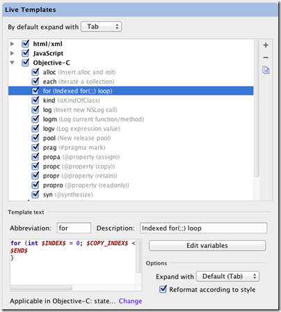
Live templates let you type an abbreviation and expand it to a block of code, which you then tab through to edit. Type for, select the template, press tab, and AppCode will create a for loop; press tab again to edit the variable name and the number of iterations. You can customise and create your own Live templates in the AppCode Preferences dialog.

image

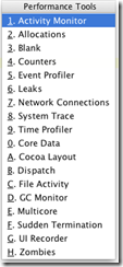
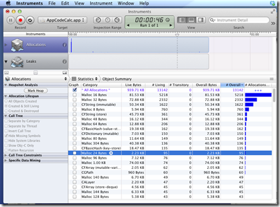
There are also a ton of performance tools in AppCode [update: note these are links to Xcode tools].  Choose Profile from the Run menu and choose what you want to analyse:

image

then run your app

image

You can also do static analysis according to customisable rules.

There is a debugger which works as you would expect including stack trace and variable inspection.

The best thing I can say about AppCode is that it is a pleasure to use. It does not throw up unnecessary dialogs, it works logically, and the tools are easy to use and configure. I have not always found this to be the case with Xcode, and if you spend a significant amount of your time on Objective C development then I recommend grabbing the trial download to discover if it will speed your work.

Post sponsored by Monster for the best in IT Jobs.

Adobe MAX 2011 and the future of Flash

The unstated theme of Adobe MAX 2011 last week was this: what is the future of Flash? The issue being that with HTML 5 ascendant and Apple wrecking the idea of Flash as an ubiquitous web plug-in, should Adobe be frantically retooling its design tools for HTML and apps, or does Flash still have a future?

image

The answer is a little of both; but let’s be clear: there was more Flash than HTML at MAX. What was the most eye-catching demo? It was Flash running Unreal Tournament with the claim of better graphical performance than on Microsoft Xbox 360 or Sony Playstation 3.

It is also worth noting that the touch apps demonstrated at the day one keynote were created in Flash and compiled into apps using the new Captive Runtime feature in AIR 3.

At the same time there was a substantial amount of HTML effort on show. There was the announced acquisition of Nitobi, makers of PhoneGap – though note that PhoneGap itself is heading to the Apache Foundation – and demos of the Edge motion and interaction tool for HTML5. Adobe also told us about its work on CSS Regions and CSS  Shaders. I also saw how HTML export, including partial ActionScript to JavaScript conversion, is coming in a future version of Flash Professional.

My perception is that while Adobe is serious about stepping up a gear with its HTML tools, its heart is still with Flash. That said, there is a shift of emphasis away from Flash as a web plug-in, other than when it is the “Games console of the Web”, and towards Flash and Flex as a cross-platform development platform. Adobe is using Flash and AIR for its own Touch apps, previewed at MAX.

Let me add that the new features in AIR are huge, in particular the ability to package the Flash runtime as part of your app, called Captive Runtime, and the ability to extend your AIR app with native code. Cross-platform mobile tools are a particular interest of mine, and Adobe’s offering is strong in this field, though it will never be the most efficient. Adobe is also pressing ahead with something like web workers for ActionScript, providing a form of concurrency, though this is not in AIR 3 but planned for a future release. Another big new feature in the Flash runtime is Stage 3D, accelerated 3D graphics which enabled the Unreal demo mentioned above.

Nitobi’s Andre Charland was at MAX and I could not shake off the thought that he will find joining the Flash company difficult.

image

It will be near-impossible for Adobe to be equally enthusiastic about both PhoneGap and AIR, and given that Flash and AIR are so deeply woven into the company’s products I suggest that PhoneGap is more likely to be neglected.

Take a look at Adobe’s agenda for the Back from MAX event in London next month. It is 100% Flash and Flex.

What about the MAX attendees? I have contradictory evidence here. I noticed that a session on Building mobile apps with HTML, CSS and JavaScript (ie PhoneGap) was packed out, while the session running at the same time on What’s new in AIR – and what’s next was sparsely attended. This session was repeated, which means Adobe thought it would be a popular one. I was also surprised by how few went along to hear about Flash Professional Sneak Peek: a glimpse at the future which was a fascinating session if you are interested in the future of this tool. Adobe must have been surprised too, as it was in a large room.

image

That said, a session on native extensions for AIR was moved from one of the smallest rooms to one of the biggest and was still full. There was also great interest in concurrency in the Flash runtime. Many of the attendees I spoke to saw themselves as Flash and Flex developers and there was more talk about how to fight off the perception that the tech world is moving to HTML, than of how to encourage it.

Getting rid of Flash may seem like obvious progress to someone annoyed by the Adobe updater, or who is an Apple iOS enthusiast, or who does not like the idea of proprietary plugins. It does not feel like that though if you have a browser-hosted app to maintain and enjoy targeting a single runtime rather than testing in every browser, as well as using features of Flash that are hard to replicate in HTML.

Adobe’s design and development platform is still Flash-centric, which is either good or bad news depending on your perspective.

See also Down but not out: Flash in an HTML5 world.

Battle of the portables: Netbook vs Apple iPad 2

A semi-serious comparison

The popularity of tablets has seriously undermined the market for netbooks, according to many reports. But to what extent are the two comparable, and if they are, is a tablet unequivocally superior? I’m asking the question as much as answering, because I am trying out an iPad 2 and intrigued to see to what extent it can replace the netbook with which I normally travel. I have found I prefer the netbook to a laptop when out and about: the lightness and long battery life is worth the performance limitations for me.

The comparison is not straightforward. An iPad is a thing of beauty, whereas a typical netbook is an obvious compromise, nearly a laptop but limited in memory and performance. For some people that is enough; they will say, it is not about features, it is about the experience, and it is night and day.

Even so there are things that the netbook does better. What follows are some notes on the subject, based on the iPad vs a Toshiba NB 300 netbook with which I am familiar. I may add or amend the entries, so check back for updates.

1. Price

iPad2: £399 (wi-fi with 16GB)

Toshiba netbook: £230.00 (based on typical current price of NB305)

Winner: netbook

the netbook comes with Windows 7 starter, a crippled version of Windows, and only 1MB RAM. You probably want to add 1GB RAM (£17.00). If you want to join your netbook to a business domain you’ll need to upgrade Windows 7 to the Professional version; if you want to get rid of the annoying ads in Office Starter you’ll need to upgrade Office too.

2. Ease of setup:

iPad2: Switch on, and it asks you to connect to a computer running iTunes. This actually has its annoyances. iTunes is rather slow and bloated especially on Windows. When you connect, the default is auto-sync, which means iTunes will attempt to copy its music library to your iPad, likely not have enough room, and copy a random selection. If you have an iPhone, you will also get all your iPhone apps copied across, like it or not, which means you have to delete the ones you do not want.

Toshiba netbook: I recounted the “fairly dismal” experience of setting up a Toshiba netbook here. The main problem is all the trialware that is pre-installed, plus a bunch of Toshiba utilities of varying quality. Rather than repeat it all here, I will show show the screenshot a few minutes after first power-on:

Winner by a mile: iPad 2

3. Boot time

iPad 2: instant

Toshiba: ages. Better from hibernation, though still much slower than iPad 2. Better from sleep, but I am not a big fan of sleep because it drains the battery and occasionally crashes on resume.

Winner by a mile: iPad 2

4. Multi-tasking, or the ability to do several things at once

iPad 2: does multi-task but the experience is not great. Only one app is visible at a time, and to switch you have to double-click the big button, swipe through a list of apps, and tap the one you want.

Toshiba: It’s Windows. Fortunately Microsoft changed its mind about having a limit of three apps you can run at once. You can run lots of apps, switch between them with alt-tab or by clicking a taskbar icon, and size them small so you can see more than one on-screen at one time.

The simplicity of one app to view is meant to be an advantage of iOS; but while the Windows model can be troublesome – see the above screenshot for proof- I’d like to see some improvement in this part of iOS. It is not a matter of screen size: the screen size on the netbook is similar to that of the iPad.

Winner: netbook

5. Keyboard

iPad 2: soft keyboard that obscures half the screen, or add-on physical keyboard.

Toshiba netbook: traditional clamshell design with integrated keyboard.

I do a lot of typing, and my speed is substantially better on a physical keyboard. However I do not like carrying lots of accessories, and while the iPad add-on  keyboard is fine at a desk, if you are in a confined space such as an aeroplane the clamshell design works better than a loose keyboard.

That said, I recall hearing how a school that issued all its pupils and staff with iPads was surprised by how few wanted keyboards. Some kids apparently prefer the soft keyboard to “all those buttons”, so it may depend what you are used to. However, even if you replaced the “Keyboard” heading with “Text input”, my vote would still go to the netbook.

Winner: netbook

6. Touch control

iPad 2: yes

Toshiba netbook: no

I’m putting this in just to make the point. Even a Windows tablet, with a stylus, is less convenient to use with touch than an iPad.

Winner by a mile: iPad 2

7. Applications

iPad 2: A bazillion apps available in the app store, cheap or free to purchase, a snap to install. Not so many for iPad as for iPhone, but still a good number.

Toshiba netbook: It’s Windows. They are a bit slow to load, but I run Microsoft Office, Outlook, several web browsers, music apps, games, network utilities and all sorts of other stuff.

Winner: I am going to call this a tie. There are some beautiful apps for the iPad 2, but I miss the features of Windows apps like Office. With the netbook my experience is that I can do almost anything that I can do with a desktop PC, although more slowly, but that is not the case with the iPad 2. On the other hand, the way apps can be installed and removed in a blink on the iPad 2 is a delight compared to Windows setup.

8. File system and storage

iPad 2: There is a file system, but it is hidden from the user.

Toshiba netbook: Yes. I can save a document from one app, and open it in another. I can connect to it over a network and copy files from one folder to another. Not possible on the iPad 2 without workarounds like iTunes and DropBox; and even then some things are difficult. For example, you cannot save a document from Pages on the iPad directly to your DropBox. Let me add that the netbook has a 250GB hard drive, whereas the iPad gets by with a maximum of 32GB solid state storage – though also note that solid state storage is faster to access, and that because the iPad is designed to work like that it does not feel particularly space-constrained.

Winner by a mile: netbook

9. Connectivity

iPad 2: Wireless network, or devices that accept Apple’s proprietary connector. You can attach the iPad to a PC with USB, but only iTunes really understands it, unless you just want to copy photos and videos. Apple offers an add-on camera connectivity kit for downloading photos from a camera, and AirPrint for printing over a network. It is annoying that you have to buy add-ons to do what a netbook does out of the box.

Toshiba netbook: Three standard USB ports, you can attach external hard drives or most USB devices such as printers.

Winner: netbook

10. Battery life

iPad 2: Apple says up to 10 hours, but I have never managed as much as that. Maybe 7 or 8 hours.

Toshiba netbook: I get about 6 hours on wifi, more than that without.

In practice, I have no quibble with either machine – though I am envious of Amazon Kindle owners with their one month charge.

Winner by a whisker: iPad 2.

11. Portability

iPad 2: no bigger than a pad of paper. It is not exactly pocketable, but slips easily into any kind of bag or briefcase. It perhaps needs the protection of a case, but even in a case it is not bulky.

Toshiba netbook: fatter and uglier than an iPad, but still very portable. The worst thing is the power supply, if you need it: the Apple mains adaptor is much smaller than Toshiba’s effort.

Winner by a whisker: iPad 2

12. Watching videos

iPad 2: Great. It is like a portable TV or DVD player, but better – as long as you have a strong wifi connection and BBC iPlayer or the like. Just prop it up on its stand (most cases have one) and enjoy.

Toshiba netbook: it works but the graphics capabilities are inferior and it feels like you are looking at a netbook.

Winner by a mile: iPad 2

13. Built in cameras and microphone

iPad 2: two cameras, front and back, and a microphone that works.

Toshiba netbook: webcam and microphone, but they are junk; I have not seen a netbook with anything decent.

Winner by a mile: iPad 2

14. Reading eBooks

iPad 2: iBooks app and Amazon Kindle app. I prefer the Kindle app, though whether it will survive Apple’s assault on alternative readers I am not sure.

Toshiba netbook: Kindle app, as well as Adobe Reader etc.

A tablet is great for reading, much better than a netbook. However despite its humble appearance Amazon’s Kindle device really is better for reading, thanks to a screen you can read in sunlight, much longer battery life, and free internet access to download books everywhere.

Winner: iPad 2, though a Kindle is better

15. Attract admiring glances

iPad 2: Yes

Toshiba netbook: No

Winner: I did say “semi-serious”.

Fixing iPhone 4 not detected on a Mac

Today I noticed, while checking to see if iOS 4.3 was avaialble yet, that the iPhone was not detected by the Mac. No detection, no updates.

I checked in About this Mac -> More info -> USB and the iPhone was listed. So what went wrong?

I do not know the full answer, but it may well be caused by installing the iPhone SDK, which I updated recently. Fortunately the fix is simple. Download and install the iPhone Configuration Utility. You do not even have to run it; it fixes up whatever outdated or corrupt files caused the problem.

Fixing a slow Windows XP PC

Yesterday I investigated a Windows XP machine that had become so slow it was unusable. It was a Dell Dimension 2350 with 1GB RAM and a 2.00 Ghz Celeron CPU – not too bad a spec for XP – that had been out of use for a while and was being brought back into service for a specific and undemanding task. At first it had performed fine, but after applying Service Pack 3 and installing Microsoft Security Essentials it had ground almost to a halt. The machine performed so badly that trying to troubleshoot it was like wading through glue. You could get task manager up and see plenty of RAM free, but the CPU was stuck on 100%.

After trying a few futile things like updating the BIOS, I installed Process Explorer and Process Monitor from Sysinternals. Looking at the activity summary in Proccess Monitor it was obvious which process was to blame: an instance of svchost.exe started with the command line: c:\windows\system32\svchost.exe –k netsvcs

However, netsvcs is responsible for many different services. I did a bit more poking around with Process Explorer and found the culprit: Windows Automatic Updates. Typing:

net stop wuauserv

at a command prompt fixed the problem temporarily.

It appears that the Windows Update database, which you can find in %windir%\Software Distribution\DataStore, can get corrupted. The Windows Update service goes into a spin and consumes all your computing resources. You can turn Automatic Updates off by right-clicking My Computer, Properties, and Automatic Updates tab; or you can fix it the brute-force way by deleting the DataStore folder and letting Windows recreate it, though you lose your update history; or you can try to repair the database.

Of course there are many reasons why Windows XP might run slowly, and often it is not easy to troubleshoot. There is abundant well-meaning advice on the internet, much of it based on the assumption that malware is involved, but finding the right answer to a particular problem is a matter of luck. In a professional context, it is hardly worth the time and corporates will just re-image the machine.

I do find it interesting that when Windows XP first appeared in 2001 it specified a minimum of 64MB RAM and ran OK in 128MB. Once fully patched with Service Pack 3, automatic updates, Internet Explorer 8 and anti-virus, it needs at least 512MB and in my experience 1GB to be comfortable. Unfortunately you have little choice; if you want to connect to the Internet or run recent applications, you have to update it. Automatic updates is a also a near-essential security feature.

Finally, kudos to the Sysinternals team whose tools are invaluable for solving this kind of problem.

HTML 5 Canvas: the only plugin you need?

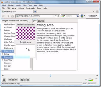
The answer is no, of course. And Canvas is not a plugin. That said, here is an interesting proof of concept blog and video from Alexander Larsson: a GTK3 application running in Firefox without any plugin.

image

GTK is an open source cross-platform GUI framework written in C but with bindings to other languages including Python and C#.

So how does C native code run the browser without a plugin? The answer is that the HTML 5 Canvas element, already widely implemented and coming to Internet Explorer in version 9, has a rich drawing API that goes right down to pixel manipulation if you need it. In Larsson’s example, the native code is actually running on a remote server. His code receives the latest image of the application from the server and transmits mouse and keyboard operations back, creating the illusion that the application is running in the browser. The client only needs to know what is different in the image as it changes, so although sending screen images sounds heavyweight, it is amenable to optimisation and compression.

It is the same concept as Windows remote desktop and terminal services, or remote access using vnc, but translated to a browser application that requires no additional client or setup.

There are downsides to this approach. First, it puts a heavy burden on the server, which is executing the application code as well as supplying the images, especially when there are many simultaneous users. Second, there are tricky issues when the user expects the application to interact with the local machine, such as playing sounds, copying to the clipboard or printing. Everything is an image, and not character-by-character text, for example. Third, it is not well suited to graphics that change rapidly, as in a game with fast-paced action.

On the other hand, it solves an immense problem: getting your application running on platforms which do not support the runtime you are using. Native applications, Flash and Silverlight on Apple’s iPad and iPhone, for example. I recall seeing a proof of concept for Flash at an Adobe MAX conference (not the most recent one) as part of the company’s research on how to break into Apple’s walled garden.

It is not as good as a true local application in most cases, but it is better than nothing.

Now, if Microsoft were to do something like this for Silverlight, enabling users to run Silverlight apps on their Apple and Linux devices, I suspect attitudes to the viability of Silverlight in the browser would change considerably.

25 years of Windows: triumph and tragedy

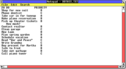
I wrote a (very) short history of Windows for the Register, focusing on the launch of Windows 1.0 25 years ago.

image

I used Oracle VirtualBox to run Windows 1.0 under emulation since it more or less works. I found an old floppy with DOS 3.3 since Windows 1.0 does not run on DOS 6.2, the only version offered by MSDN. In the course of my experimentation I discovered that Virtual PC still supports floppy drives but no longer surfaces this in the UI. You have to use a script. Program Manager Ben Armstrong says:

Most users of Windows Virtual PC do not need to use floppy disks with their virtual machines, as general usage of floppy disks has become rarer and rarer.

An odd remark in the context of an application designed for legacy software.

What of Windows itself? Its huge success is a matter of record, but it is hard to review its history without thinking how much better it could have been. Even in version 1.0 you can see the intermingling of applications, data and system files that proved so costly later on. It is also depressing to see how mistakes in the DOS/Windows era went on to infect the NT range.

Another observation. It took Microsoft 8 years to release a replacement for DOS/Windows – Windows NT in 1993 – and another 8 years to bring Windows NT to the mainstream on desktop and server with Windows XP in 2001. It is now 9 years later; will there ever be another ground-up rewrite, or do just get gradual improvements/bloat from now on?

I don’t count 64-bit Windows as a ground-up rewrite since it is really a port of the 32-bit version.

Finally, lest I be accused of being overly negative, it is also amazing to look at Windows 1.0, implemented in fewer than 100 files in a single directory, and Windows 7/Server 2008 R2, a platform on which you can run your entire business.