Category Archives: tech

Facebook vs Reddit as discussion forums: why is Facebook so poor?

Facebook’s user interface for discussions is terrible. Here are some of the top annoyances for me:

  • Slow. Quite often I get those blank rectangles which seems to be a React thing when content is pending.
  • UI shift. When you go a post it shows the number of comments with some algorithmically selected comments below the post. When you click on “View more answers” or the comments link, the UI changes to show the comments in a new panel.
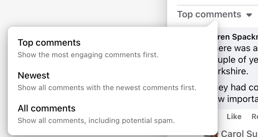
  • Difficult navigation. Everything defaults to the algorithm’s idea of what it calculates you want to see (or what Facebook wants me to see). So we get “Most relevant” and “Top comments.” I always want to see all the comments (spam aside) with the most recent comment threads at the top. So to get to something approaching that view I have to click first, View more answers, and then drop-down “Top comments” to select one of the other options.
  • Even “All comments” does not show all comments, but only the top level without the replies.

Facebook is also a horrible experience for me thanks to the news feed concept, which pushes all manner of things at me which I do not want to see or which waste time. I have learned that the only way I can get a sane experience is to ignore the news feed and click the search icon at top left, then I get a list of groups or pages I have visited showing which have new posts.

Do not use Facebook then? The problem is that if the content one wants to see is only on Facebook it presents a bad choice: use Facebook, or do not see the content.

Reddit by contrast is pretty good. You can navigate directly to a subreddit. Tabs for “hot” and “new” work as advertised and you can go directly to “new” by the logical url for example:

https://www.reddit.com/r/running/new/

Selecting a post shows the post with comments below and includes comment threads (replies to comments) and the threads can be expanded or hidden with +/- links.

The site is not ad-laden and the user experience generally nice in my experience. The way a subreddit is moderated makes a big difference of course.

The above is why, I presume, reddit is the best destination for many topics including running, a current interest of mine.

Why is Facebook so poor in this respect? I do not know whether it is accident or design, but the more I think about it, the more I suspect it is design. Facebook is designed to distract you, to show you ads, and to keep you flitting between topics. These characteristics prevent it from being any use for discussions.

If I view the HTML for a reddit page I also notice that it is more human-readable, and clicking a random topic I see in the Network tab of the Safari debugger that 30.7 KB was transferred in 767ms.

Navigate back to Facebook and I see 6.96 MB transferred in 1.52s.

These figures will of course vary according to the page you are viewing, the size of the comment thread, the quality of your connection, and so on. Reddit though is much quicker and more responsive for me.

Of course I am on “Old reddit.” New reddit, the revamped user interface (since 2017!) that you get by default if not logged in with an account that has opted for old reddit, is bigger and slower and with no discernible advantages. Even new reddit though is smaller and faster than Facebook.

Tip: If you are on new reddit you can get the superior old version from https://old.reddit.com/

Fixing a .NET P/Invoke issue on Apple Silicon – including a tangle with Xcode

I have a bridge platform (yes the game) written in C# which I am gradually improving. Like many bridge applications it makes use of the open source double dummy solver (DDS) by Bo Haglund and Soren Hein.

My own project started out on Windows and is deployed to Linux (on Azure) but I now develop it mostly on a Mac with Visual Studio Code. The DDS library is cross-platform and I have compiled it for Windows, Linux and Mac – I had some issues with a dependency, described here, which taught me a lot about the Linux app service on Azure, among other things.

Unfortunately though the library has never worked with C# on the Mac – until today that is. I could compile it successfully with Xcode, it worked with its own test application dtest, but not from C#. This weekend I decided to investigate and see if I could fix it.

I have an Xcode project which includes both dtest and the DDS library, which is configured as a dynamic library. What I wanted to do was to debug the C++ code from my .NET application. For this purpose I did not use the ASP.Net bridge platform but a simple command line wrapper for DDS which I wrote some time back as a utility. It uses the same .NET wrapper DLL for DDS as the bridge platform. The problem I had was that when the application called a function from the DDS native library, it printed: Memory::GetPtr 0 vs. 0 and then quit.

The error from my .NET wrapper

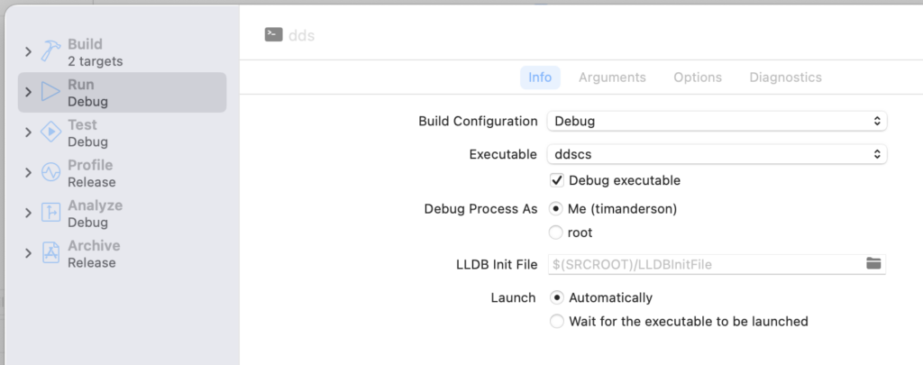
I am not all that familiar with Xcode and do not often code in C++ so debugging this was a bit of an adventure. In Xcode, I went to Product – Scheme – Edit Scheme, checked Debug executable under Info, and then selected the .NET application which is called ddscs.

Adding the .NET application as the executable for debugging.

I also had to add an argument under Arguments passed on Launch, so that my application would exercise the library.

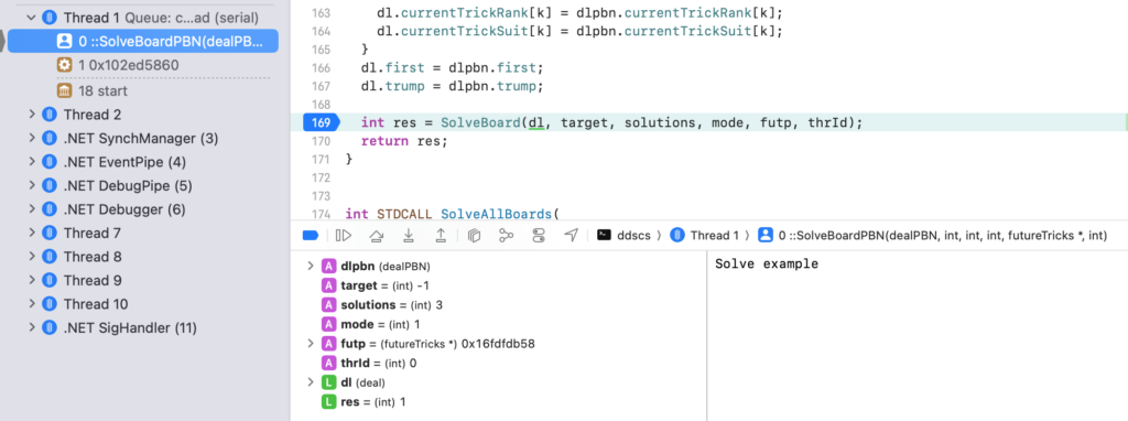
Then I could go to Product – Run and success, I could step through the C++ code called by my .NET application. I could see that the marshalling was working fine.

Stepping through the C++ code in Xcode

Now I could see where my error message came from:

The source of my error message.

So how to fix it? The problem was that DDS sets how much memory it allows itself to use and it was set to zero. I looked at the dtest application and noticed this line of code:

SetResources(options.memoryMB, options.numThreads);

This is closely related to another DDS function called SetMaxThreads. I looked at the docs for DDS and found this remark:

The number of threads is automatically configured by DDS on Windows, taking into account the number of processor cores and available memory. The number of threads can be influenced using by calling SetMaxThreads. This function should probably always be called on Linux/Mac, with a zero argument for auto­ configuration.

“Probably” huh! So I added this to my C# wrapper, using something I have not used before, a static constructor. It just called SetMaxThreads(0) via P/Invoke.

Everything started working. Like so many programming issues, simple when one has figured out the problem!

Amazon Linux 2023: designed to be disposable

Amazon Linux 2023 is the default for Linux VMs on AWS EC2 (Elastic Compute Cloud). Should you use it? It is a DevOps choice; the main reason why you might use it is that it feels like playing safe. AWS support will understand it, it should be performance-optimised for EC2; it should work smoothly with AWS services.

Amazon Linux 2 was released in June 2018 and was the latest production version until March 2023, by which time it was very out of date. Based on CentOS 7, it was pretty standard and you could easily use additional repositories such as EPEL (Extra Packages for Enterprise Linux). It is easy to keep up to date with sudo yum update. However there is no in-place upgrade.

Amazon Linux 2023 is different in character. It was released in March 2023 and the idea is to have a major release every 2 years, and to support each release for 5 years. It does not support EPEL or repositories other than Amazon’s own. The docs say:

At this time, there are no additional repositories that can be added to AL2023. This might change in the future.

The docs also document how to add an external repository so it is a bit confusing. You can also compile your own rpms and install that way; but if you do, keeping them up to date is down to you.

The key to why this is though is in a thing AWS calls deterministic upgrades. Each version, including minor versions, is locked to a specific repository. You can upgrade to a new release but it has to be specified. This is what I got today from my installation on Hyper-V:

Amazon Linux 2023 offering a new release

The command dnf check-release-update looks for a new release and tells you how to upgrade to it, but does not do so by default.

The reason, the docs explain, is that:

With AL2023, you can ensure consistency between package versions and updates across your environment. You can also ensure consistency for multiple instances of the same Amazon Machine Image (AMI). With the deterministic upgrades through versioned repositories feature, which is turned on by default, you can apply updates based on a schedule that meets your specific needs.

The idea is that if you have a fleet of Amazon Linux 2023 instances they all work the same. This is ideal for automation. The environment is predictable.

It is not ideal though if you have, say, one server, or a few servers doing different things, and you want to run them for a long time and keep them up to date. This will work, but the operating system is designed to be disposable. In fact, the docs say:

To apply both security and bug fixes to an AL2023 instance, update the DNF configuration. Alternatively, launch a newer AL2023 instance.

The bolding is mine; but if you have automation so that a new instance can be fired up configured as you want it, launching a new instance is just as logical as updating an existing one, and arguably safer.

Amazon Linux 2023 on Hyper-V

Amazon Linux 2023 came out in March 2023, somewhat late as it was originally called Amazon Linux 2022. It took even longer to provide images for running it outside AWS, but these did eventually arrive – but only for VMWare and KVM, even though old Amazon Linux 2 does have a Hyper-V image.

Update: Hyper-V is now officially supported making this post obsolete but it may be of interest!

I wanted to try out AL 2023 and it makes sense to do that locally rather than spend money on EC2; but my server runs Windows Hyper-V. Migrating images between hypervisors is nothing new so I gave it a try.

  • I used the KVM image here (or the version that was available at the time).
  • I used the qemu disk image utility to convert the .qcow2 KVM disk image to .vhdx format. I installed qemu-img by installing QUEMU for Windows but not enabling the hypervisor itself.
  • I used the seed.iso technique to initialise the VM with an ssh key and a user with sudo rights. I found it helpful to consult the cloud-init documentation linked from that page for this.
  • In Hyper-V I created a new Generation 1 VM with 4GB RAM and set it to boot from converted drive, plus seed.iso in the virtual DVD drive. Started it up and it worked.
Amazon Linux 2023 running on Hyper-V

I guess I should add the warning that installing on Hyper-V is not supported by AWS; on the other hand, installing locally has official limitations anyway. Even if you install on KVM the notes state that the KVM guest agent is not packaged or supported, VM hibernation is not supports, VM migration is not supported, passthrough of any device is not supported and so on.

What about the Hyper-V integration drivers? Note that “Linux Integration Services has been added to the Linux kernel and is updated for new releases.” Running lsmod shows that the essentials are there:

The Hyper-V modules are in the kernel in Amazon Linux 2023

Networking worked for me without resorting to a legacy network card emulation.

This exercise also taught me about the different philosophy in Amazon Linux 2023 versus Amazon Linux 2. That will be the subject of another post.

New Outlook confusion as connection to Exchange Online or Business Basic mailboxes blocked “due to the license provided by your work or school”

What Microsoft gives with one hand, it removes with the other; or so it seemed for users of paid Exchange Online accounts when the company said that “for years, Windows has offered the Mail and Calendar apps for all to use. Now Windows is bringing innovative features and configurations of the Microsoft Outlook app and Outlook.com to all consumers using Windows – at no extra cost, with more to come”.

That post in September 2023 does not mention a significant difference that was introduced with this new Outlook. It is all to do with licensing. Historically, Outlook was always the email client for Exchange, and this is now true for Exchange Online, the email component of Microsoft 365. Microsoft’s various 365 plans for business are differentiated in part by whether or not users purchase a subscription to the desktop Office applications. Presuming though that the user had some sort of license for Outlook, whether from a 365 plan, or from a standalone purchase of Office, they could add their Exchange Online email account to Outlook, even if that particular account was part of a plan that did not include desktop Outlook.

Some executive at Microsoft must have thought about this and decided that with Outlook becoming free for everyone, this would not do. Therefore a special check was added to Outlook: if an account is a business account that does not come with a desktop license for Outlook, block it. The consequence was that users upgrading or trying to add such an account saw the message:

“This account is not supported in Outlook for Windows due to the license provided by your work or school. Try to login with another account or go to Outlook on the web.”

The official solution was to upgrade those accounts to one that includes desktop Outlook. That means at least Microsoft 365 Business Standard at $12.50 per month. By contract, Microsoft 365 Business Basic is $6.00 per month and Exchange Online Plan 1 just $4.00 per month.

Just occasionally Microsoft makes arbitrary and shockingly bad decisons and this was one of them. What was wrong with it? A few things:

  • Administrators of 365 business tenancies were given no warning of the change
  • Exchange Online is supposedly still an email server. Email is an internet standard – though there are already standards issues with Exchange Online such as the requirement for OAuth authentication and SMTP disabled by default. See Mozilla’s support note for Thunderbird, for example. However, Exchange Online accounts still worked with other mail clients such as Apple Mail and eM Client; only Outlook now added this licensing requirement.
  • The new Outlook connected OK to free accounts such as Microsoft’s Outlook.com and to other email services. It was bewildering that a Microsoft email client would connect fine to other services both free and paid, but not to Microsoft’s own paid email service.
  • The description of the Exchange Online service states that “Integration with Outlook means they’ll enjoy a rich, familiar email experience with offline access.” This functionality was removed, meaning a significant downgrade of the service without notification or price reduction.
  • Some organisations have large numbers of Exchange Online accounts – expecting them suddenly to change all the plans to another costing triple the amount, to retain functionality they had before, is not reasonable.
Image from Exchange Online product description showing how it highlights Outlook integration as one of its features
The product description for Exchange Online highlights Outlook integration as one of its features

Users did the only thing they can do in these circumstances and made a public fuss. This long and confusing thread was the result, with comments such as:

The takeaway is: You can no longer add a mail account in the new Outlook if said mail account doesn’t come with its OWN Outlook (apps) license. This is ridiculous beyond understanding. Unacceptable to the point that if they don’t fix this, I’ll cancel BOTH Exchange licenses and move over to Google Business with my domains.

There was also a well reasoned post in Microsoft Feedback observing, among other things, that “At no point is Business Basic singled out as a web-only product in any of the Microsoft Terms or Licensing documents.” 

The somewhat good news is that Microsoft has backtracked, a bit. This month, over 4 months after the problem appeared, the company posted its statement on “How licensing works for work and school accounts in the new Outlook for Windows.” The company now says that there will be a “capability change in the new Outlook for Windows”, rolled out from the start of this month, following which a licensed version of Outlook will work with Exchange Online, Business Basic and similar accounts, provided that an account with a desktop license is set as the primary account. This includes consumer accounts:

“If you have a Business Standard account (which includes a license for desktop apps) added as your primary account, that license will apply, and you can now add any secondary email accounts regardless of licensing status (e.g. Business Basic). This also applies to personal accounts with a Microsoft 365 Personal or Family, as these plans include the license rights to the Microsoft 365 applications for desktop. Once one of these accounts is set as the primary account, you can add Business Basic, E1 or similar accounts as secondary accounts.”

This is a substantial improvement and removes most but not all of the sting of these changes.

What is an operating system for? A friend’s Windows 11 rant shows disconnect between vendors and users

What is an operating system? The traditional definition is something like, the system software that manages computer hardware and provides services for applications.

This definition does not describe what you get though when you install an “operating system” such as macOS, Windows, Android or ChromeOS – or more likely, receive hardware with it pre-installed. What you get is an operating system (OS) plus a ton of stuff that can only be described as applications. In practice, the reach of what we call an operating system has extended over the years. Even in the early days, an OS would come with utilities, including a command line, a command line editor, perhaps a C compiler, file management tools and so on. Then there was a change when pre-installed graphical user interfaces arrived. Windows came with Notepad, Calculator, Write and Paint.

What is a commercial operating system today? We can add to the traditional definition at least the following:

  • A vehicle for advertising
  • A means of lock-in
  • A vehicle for data collection

On Windows, advertising is everything from the pre-installed trials, to the nagging to upgrade OneDrive, to the mysterious appearance of Candy Crush on the Start menu.

The lock-in comes via the ecosystem. Apple is worse than Windows for this in that more of its applications work only on Apple operating systems. On Windows though Microsoft hardly has to bother since a huge legacy of Windows-only applications keeps users from changing, especially in business.

Data collection is via near-enforced login and telemetry. An Apple ID is not required for macOS but it is strongly encouraged and necessary for the App Store. A Microsoft or Entra ID account is not required to use Windows, but the setup points you strongly in that direction.

Is any of this good for the user? A friend is disappointed with Windows 11 – mainly because it is less familiar than Windows 10. His central points are that Microsoft makes irritating changes that disrespect the learning users have invested in Windows, and has left behind the notion of the operating system as a blank canvas waiting for applications to make it useful.

Personally I put up with Windows 11; it is not that different, though there are a few things that I particularly dislike:

  • The taskbar icons in the centre. I routinely move them to the left. Settings – Personalisation – Taskbar – Taskbar behaviors – Taskbar alignment, no registry editing required. This single change makes Windows 11 feel much more familiar, and it is better since left-aligned icons are easier to target.
  • The Start menu. This was great in Windows 95 and improved up until Windows 7. Windows 8 replaced it for … reasons. Windows 10 reinvented it but badly. I have trained myself always to click All apps as a second step after clicking Start. Click on a letter for the letter menu, select a letter, start the app. It works reliably, unlike Search which is a usability disaster when what you want is to start an application.
  • The File Explorer. You right click a file, and instead of a single menu of options, there are three sets of options, one in a row of icons, one in a mysterious subset of options, and one under Show more options. A poor user interface for a common task.

There are other things, of course. I always turn off the distracting Widgets on the taskbar. I always show as many of the “additional System tray icons” as I can, with the exception of consumer Teams. I always open Edge, reflect on the cheap ugly mess that is the default home page, and set about disabling it.

These annoyances are mainly design errors by Microsoft rather than an a direct consequence of the changing role of the operating system; yet they would be impossible without that change.

Imagine for a moment if Windows were optimised for installing and running applications. Oddly, Windows 8 (which most hated for more or less the same reasons my friend cites for disliking Windows 11) did have that vision. Install from the Store, with clean setup and easy removal. Run full-screen with no distractions. Before you say it, yes there were issues, the UI was not good enough, the apps were not there, we missed multiple overlapping windows, and more. There was a good concept in there though.

Windows 11 rant: “I replaced Win 11 with Win 10. It was like walking back into my house”

A friend purchased a Windows 11 laptop and this was his reaction, slightly edited. It caused me some reflection on what is an operating system, which I have posted separately. I also note: Windows 10 goes out of support in October 2025.


“I recently bought a Win 11 laptop. I was stunned. I must apologise for what follows, but it actually made me quite angry to realise that the Chief Product Manager at Microsoft clearly has NO understanding of ‘opportunity costs’, thus wasting millions of our ‘person-hours’ worldwide.

“For many years I worked in health research, where we realised a decade or two ago that something doesn’t just have to give better results to be worth implementing. It’s got to be SUFFICIENTLY better to offset the cost of implementing the change. If you start something new that ‘works better’ but in doing so, fail to consider the additional costs involved in everyone changing how they do things, professional and patient, to not just know but understand how & why the new thing is better it is very easy to end up with everything working worse than before. NEW must be > (OLD + Opportunity Costs). Ideally a lot greater, if you want to bring people with you. This isn’t rocket science, not anymore.

“I get that most IT correspondents are professionals used to having to plough through new Operating Manuals (pdf, sure) every two years, but out here in Userland I am far too busy doing interesting stuff with my computer & applications. Over a few years I learnt where the main knobs & levers of Win 10 are. And haven’t thought about it since. So, for Microsoft to carelessly move everything, just because they believe the new setup will be quicker/easier/more efficient for me is not only staggeringly rude, but stupid.

“Consider: It probably only took me a few hundred hours of use of Win 10 to learn where all the OS stuff was to the point where it was automatic. Since then the OS stuff has usually required no conscious input at all, like riding a bike. Some things might not be easy to find, but once you know, you know. Then along comes Win 11, and all this stuff is a pain in the arse again, nothing is where it used to be. So I don’t CARE if, in theory, the new arrangements are easier to use ONCE YOU KNOW THEM, my point is, why should I, and (hundreds of) millions of other Windows users, have to re-learn all that sh*t?

“IT’S JUST AN OPERATING SYSTEM! (Can someone at Microsoft put up posters?)

“I’m not interested in it! It’s the environment in which the things I AM interested in – applications – video editors, DAWs, office apps etc.- live. Don’t f*ck with it. How would you feel if suddenly you had to learn to speak & walk again, just because someone thought they knew a better way to do these things?

“And consider the hundreds of hundreds of millions of person hours you are WASTING, as we have to re-learn where things are? Double-click when before we had to single click. Settings moved somewhere completely different. Even where on the screen to look: Does Microsoft not employ a single behavioural psychologist who could tell them how much time (and attention) is wasted when you move something that was always bottom left to top middle?

“And then, the final straw: I found that most of these maddening ‘I’m bored, let’s change grass from to green to blue’ ‘improvements’ can be reversed, just by editing the registry. It was only on my fifth edit, I realised what was going on. The old ways of doing things, that I’d invested serious time in learning about to the point where they were automatic, were STILL THERE! It’s just that someone Microsoft couldn’t even raise their eyes from Tiktok (or whatever was distracting them), to add a few lines of code, to make the previous ways of operating, accessible via a menu. Remember them? You put the user in charge? Of their own computer? The very thought…

“At that point I realised that Microsoft’s institutional memory had, ironically, forgotten why Bill Gates got so rich in the first place. Let’s recall – IBM agreed to let him licence rather than sell his OS for their new, pathetically under-powered ‘Personal Computer’, because they thought it would be a small market. I mean, who would want to use a desktop PC , when they could use a terminal to access a mainframe with a brain the size of a planet (sorry, Doug)? History tells us they then discovered, too late, that the Mk.1 Human Being prefers under-powered personal computers over high-powered mainframes, for the same reason we all prefer living in small chaotic houses to living in large, well-organised institutions.

“So I replaced Win 11 with Win 10. It was like walking back into my house. Subsequently, in a typical working day I no longer had to expend any further conscious thought on operating the Operating System – because I learnt how to do that years ago. And then got back to the interesting stuff.”

Garmin vs Apple Watch: why I switched

I was a smartwatch holdout for many years, on the basis that the short battery life would be annoying (my previous watch had a 10 year battery) and that the utility of a smartwatch is limited; mainly I just need to know the time. The big feature of a smartwatch of course is health tracking but that was not something I felt I needed.

Two and half years ago I succumbed and bought an Apple Watch 7, partly to see what I had been missing, but it also nearly coincided with taking up running.

Apple Watch during a run

I used the Apple Watch from mid-2022 until January this year, to track my runs and monitor my fitness. If you are a runner you will know that you want to track your pace and distance as part of training, and if you have any interest in the data and science of running, then other things like heart rate zones, V̇O2 max and so on.

There is also the matter of listening to music while running. I enjoy this, though earbuds are controversial because of the need to pay attention to your surroundings especially on roads with traffic. I am a fan of bone conduction headphones which let you listen without blocking your ears at all; and UK Athletics, the official body for running, permits bone conduction headphones in races at the event organiser’s discretion.

The integration between the Apple Watch and iPhone is not as smooth as you might expect when it comes to music, or perhaps it is just a hard problem. If you have headphones paired to the iPhone you can control the music from the watch, but you will not get announcements about your pace and distance progress. The solution is to pair the headphones to the watch and not to the iPhone. Then you get both music and announcements, by default every km or mile (depending on preference) you are told your pace. There is also a buried setting that lets you set a playlist for workouts, that starts automatically when you start the workout and can play in random order. In case you have not found this setting, it is in the Watch app on the iPhone under Workout – Workout Playlist.

That all sounds good, but I gradually got frustrated with the Apple Watch for running. Here are the specific issues:

Starting a run (or other workout) is a matter of pressing the side button, selecting workout, scrolling to the workout you want (usually Outdoor Run for me), and tapping. Depending where you tap, you may be asked what type of run you want, open, goal-based, route, or all. Or it may just do a brief countdown and start. All sounds reasonable; but imagine that it is a cold wet day, you are wearing gloves, and about to start a race. Scrolling and tapping successfully is difficult with gloves and worse in the rain. All the above is fiddly, when what you want to do is just start the workout and get on with the race.

GPS accuracy I found not very good, especially early on when I had an iPhone SE. It would consistently under-report the distance so that a 5K race showed as 4.8K, for example. Apple Watch has GPS on board but version 7 and earlier use the GPS on the iPhone to save battery, when available. I replaced the iPhone and accuracy improved, so perhaps I was unlucky, but I still noticed anomalies from time to time. In fairness, it can be difficult with things like trail running under trees and so on.

Annoying bugs include the watch starting and ending run segments for no reason I could see, music volume resetting after a pace announcement, music playback occasionally not starting, and worst of all, the workout ending before the end of a race despite turning off the auto workout start and stop features (which never work reliably). Most of the time it worked but I never felt I could completely trust it.

Battery life is an issue. If you leave the default of the display being always on, the Watch 7 will barely last a day, and less than that if you run with music. It will do a half marathon if you start with a good charge but not a full marathon (not that I have done one); but I did find it running out of charge when training towards the end of the day. I gave up on sleep tracking because it was easiest just to stick the watch on the charger all night; with a bit of discipline you can charge it before heading to bed but of course that will mean it is not fully charged the next morning. I set the display to be off by default which improves matters a lot.

Most runners wear other types of watch, the most common being a Garmin. In January this year I decided to try a Garmin and got a Forerunner 265, a mid-range model.

Garmin differences and advantages

Garmin Forerunner 265

The Garmin has a button top right labelled Run. Press it and it searches for GPS; when found it goes green. Press it again and the run starts. Press it again and the run stops. It is easy to operate even with gloves and in rain; and touch control is disabled during workouts so there is no risk of inadvertent taps – which are a possible cause of some of the Apple Watch issues.

The second big improvement with the Garmin is the battery life, which is around a week. That means I can track my sleep and the watch is ready for a marathon (even though I am not). Battery life does reduce if used intensively, for example with GPS and music, but still a vast gain over Apple Watch.

Music is a bit of an issue on the Garmin if you use Apple Music, since it is not supported. The only solution is the old-school method of copying MP3s to the device. On Apple Garmin makes this difficult by insisting you use Garmin Express, which only recognizes the “iTunes” library, now Apple Music. I still have a ton of CDs ripped to FLAC and my solution is to select some FLAC files, copy them to a temporary location, convert them to MP3 (I used ffmpeg), add them to the Apple Music library, copy them across with Garmin Express, then remove them from the Apple Music library. There is probably an easier way.

On the plus side, music playback works really well and I do not get the volume issues I had with Apple Watch. Tracks are shuffled by default though the algorithm seems not quite as good as on Apple Watch, and tracks can repeat too soon. There is no auto-start. Controlling music is easy: just hold down the bottom left button and the music screen appears. As with Apple Watch, you get pace and distance announcements as well as music.

Fitness statistics are better on the Garmin. V̇O2 max and heart rate zones is an interesting one. V̇O2 max is an interesting statistic but not essential to know, but heart rate zones are important to training. All these figures depend on the “Maximum heart rate” (MHR) which is traditionally calculated as 220 minus age. However this formula is a crude way of calculating MHR as it assumes everyone is roughly the same, which is not the case.

Apple Watch gives you the option to enter your own MHR rather than use the formula. However it’s not that easy to find out and will change over time so that is not ideal.

The Garmin though will auto-detect your MHR which strikes me as a better approach. According to the docs:

Auto Detection can calculate your maximum heart rate value using performance data recorded by the watch during an activity. This value may differ from an observed lower value recorded by your watch as the feature can determine a different value based on a proprietary algorithm.

In my case I seem to have a higher than average MHR and as a result the Garmin is giving me more plausible data for heart rate zones and V̇O2 max. Note though that smartwatches are not reliable for this and as the Garmin docs also say “the most accurate method to measure your maximum heart rate is a graded maximum exercise test in a laboratory setting.” There is also a suggestion for calculating it with a running test.

I still think the Garmin auto detection is preferable to the Apple Watch approach. In practice the Garmin has given me a higher figure for both V̇O2 max and MHR.

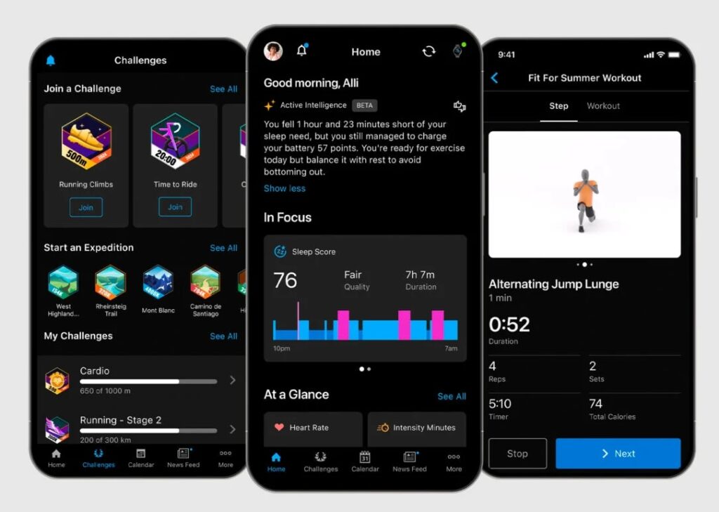
The Garmin is more pro-active than Apple Watch in assessing your fitness and making recommendations. There are features like Training Readiness, Stress measurement, Body battery, and more. When you start a run, the Garmin will recommend a training run or recommend that you rest instead (you can disable this feature if you prefer). The Garmin will also assess the Training Effect of a run, divided into aerobic and anaerobic impact scores. Another interesting metric is recovery time which assesses how long you need to rest before another high intensity training effort. It is hard to say how reliable these various indicators are (and there are more that I have not mentioned) but I feel they have some value, and should improve in accuracy over time.

Apple Watch advantages

The Apple Watch is a general-purpose smartwatch, whereas the Garmin is a fitness watch and the Forerunner series designed specifically for running – so it is not surprising that the Garmin has advantages for runners.

The Apple Watch looks nicer and less geeky, and as you would expect integrates better with an iPhone. Features like Camera Remote are handy, as is turn by turn directions. You can dictate a message into the watch, which is not possible with the Garmin. I miss the integration with Apple Music.

Apple Watch workouts appear on the paired iPhone under Fitness. If you integrate with Strava you can choose which workouts to import from the Strava app. If you integrate the Garmin with Strava it either imports all, or none of your workouts. This is a nuisance as it clutters Strava to import every single little workout or repetition. The best workaround I have found is to import none, and then import the ones you want manually via export from the Garmin Connect web application. Another idea is to import all, and immediately delete the ones you do not want. Either way, Apple Watch is preferable in this respect.

Price-wise, a Forerunner 265 costs £429.99 which is more than a basic Apple Watch 9 at £399 and much more than Apple Watch SE at £219. The Apple Watch Ultra though, which I understand is better for fitness tracking, is much more expensive at £799. Even the high end Garmin Forerunner 965 is less, at £599.99. There are cheaper Garmins as well: the Forerunner 255 is apparently a decent choice at £299.99, with most of the features of the 265 but an inferior screen and no touch control.

Some reflections

I am writing from the perspective of a runner. I do not think you should consider a Garmin over an Apple Watch if you are not looking for a sports watch. Then again, I still feel that smartwatches have disappointing utility if you exclude the fitness/health tracking features.

That said, the Garmin does illustrate the advantages of physical buttons over touch control, and the greater efficiency of a custom embedded operating system over iOS (or strictly, Watch OS).

What is the Garmin OS? There are some clues in this 2020 interview with one of the developers, Brad Larson, who said it is “a full custom OS … OS is almost stretching it. It doesn’t support multiple processes, it does threading and memory management but it doesn’t multi-process, but that’s what’s necessary. Most of our codebase is still in C … we’ve been pushing for the UI framework which sits on top of everything to be C++.”

I do not know how much has changed since then but suspect it would be a disaster if Garmin were to adopt Android Wear OS, for example, with the inevitable bloat that would come with it.

It also seems to me that Apple could significantly improve its watch from a running perspective with a little effort, applying its corporate mind to simple things like the challenge of starting a workout in typical running conditions.

As of now, I recommend Garmin over Apple Watch for running, based on my experience.

The era of tiny PCs: 400g and smaller than a paperback book

My work PC for the last few years has been a 2018 HP Omen gaming PC which has been brilliant; I have replaced the GPU and added storage but everything still works fine. That is, it used to be, until I reviewed a mini PC which has surprised me with its capability – not because it is exceptional, but because everyday technology is at the point where having something bigger is unnecessary for everyday purposes other than gaming.

Mini PC with paperback book and CD to show the size

The new PC is a Trigkey S5 with an AMD Ryzen 5560 CPU, 500GB NVMe SSD and 16GB DDR4 RAM, and currently costs around £320. Its Geekbench CPU score is better than my 5-year old HP with a Core i7.

GPU score is way less than the old HP.

Still, there is support for three displays via HDMI, DisplayPort and USB-C and 4K/60Hz is no problem.

Inside we find branded RAM and it does not look as if the components are shoe-horned in, there is plenty of space.

The power supply is external and rated at 19v and 64.98w.

Expansion is via 4 USB-A ports, one USB-C, and the aforementioned HDMI and DisplayPort sockets. There is also an Ethernet port, and of course Bluetooth and Wi-Fi.

Operating system? Interesting. It is not mentioned in the blurb but Windows 11 happens to be installed, but with one of those volume MAK (Multiple Activation Key) licenses that is not suitable for this kind of distribution (but costs the vendor hardly anything). When first run Windows setup states that “you may not use this software if you have not validly acquired a license for the software from Microsoft or its licensed distributors,” which you likely have not, but Trigkey may presume that most of its customers will not care. I recommend installing your own licensed copy of Windows as I have done, or your preferred Linux distribution.

Windows does run well however and 16GB RAM is enough for Hyper-V and Windows Subsystem for Linux (WSL) 2.0 to run well. Visual Studio 2022, VS Code, Microsoft Office, all run fine.

I am not suggesting that this particular model is the one to get, but I do think that something like this, small, light, and power-sipping, is now the sane choice for most desktop PC users.

The AWS re:Invent 5K run 2023

Sunrise over Las Vegas – at the re:Invent 5K run 2023

It happens that, a little later in life than most, I have taken up running, and during the recent AWS re:Invent in Las Vegas I was one of 978 attendees to take part in the official event 5K run.

If there were around 50,000 at the conference that would be nearly 2% of us which is not bad considering the first coaches to the venue left our hotel at 5.15am. The idea was that you could do the run and still make the keynote I guess – which I did.

I would not call myself an experienced runner but I have taken part in a few races and this one seemed to have all the trimmings. The run was up and down Frank Sinatra Drive, which was closed for the event, and the start and finish was at the Michelob ULTRA Arena at Mandalay Bay. Snacks and drinks were available; there was a warm-up; there was a bag drop; there was a guy who kept up an enthusiastic commentary both for the start and the finish. The race was chip timed.

We started in three waves, being fast-ish, medium, and run/walk. I started perhaps optimistically in the fast-ish group and did what for me was a decent time; it was a quick course with the only real impediments being two u-turns at the ends of the loop.

Overall a lot of fun and I am grateful to the organisers for arranging it (it does seem to be a regular re:Invent feature).

Here is where it gets a bit odd though. The event is pushed quite hard; it is a big focus at the community stand outside the registration/swag hall and elsewhere at the other official re:Invent hotels. It is also a charity event, supporting the Fred Hutchinson Cancer Center. All good; but I was surprised never to be officially told my result.

I was curious about it and eventually tracked down the results – I figured that with chip timing they were probably posted somewhere – and yes, here they are. You will notice though that no names are included, only the bib numbers. If you know your bib number you can look up your time. This was mine.

It seems that AWS do not really publish the results which would have disappointed me if I had been the first finisher who achieved an excellent time of 16:23 – well done 1116!

I can’t pretend to understand why one would organise a chip-timed race but then not publish the results. Perhaps in the interests of inclusivity one could give people an option to be anonymous but for most runners the time achieved is part of the fun. I think we were meant to be emailed our results but mine never came; but even if I had received an email, I would like to browse through the full table and see how I did overall.