Category Archives: smartphones

Foobar2000 goes mobile: funding secured for iOS, Android and Windows Phone versions

Popular free music player foobar2000 is coming to mobile platforms, following a successful community fundraising campaign.

image

Curiously this is not a Kickstarter campaign even though it looks similar.

The project is the outcome of collaboration between Steve Elkins (known as “Spoon”) who is the creator of dBpoweramp, an excellent audio converter and CD ripper for Windows, and foobar2000’s originator Peter Pawlowski.

The mobile version of foobar2000 will run on iOS 6 or later, on iPhone, iPod and iPad; Android v4 or later on phones and tablets; and Windows Phone 8 and Windows 8.1 tablets, ARM and Intel.

There will be both free and “fully featured premium” versions.

Additional projects for cloud synchronization and backup, and for social interaction built into foobar2000, have not yet received enough funding to proceed, and look unlikely to do so.

Foobar2000 is loved for its speed and efficiency, easy extensibility with plug-ins, and advanced functionality. Its user interface is functional rather than beautiful, though it is also easily customised. I use foobar2000 with a large collection, mostly Flac files ripped from CD, and foobar2000 manages the database transparently and with instant results.

Exactly what features mobile foobar2000 will have is not clear. The best source of public information I can find is this thread which includes input from Spoon. There may or may not be ads in the free versions; the cost of the premium versions is unannounced.

The Microsoft Screen Sharing for Lumia Phones HD10: silly name, nice product

How many committees does it take to come up with a name like Microsoft Screen Sharing for Lumia Phones HD10? Who knows, but the product is a nice one. It lets you project from your phone to any TV with an HDMI input, using the Miracast standard.

image

Data is transferred to the device via Wi-Fi. You make the connection by tapping your phone on the separate coaster-like plate, which triggers the connection using NFC (Near Field Communication). The coaster talks to the device using Bluetooth.

The neat thing about this arrangement is that the main HD10 device will be close to your TV; it might even plug in at the back, out of sight. The coaster on the other hand can be on a table near your sitting position. You can come into the room, tap the coaster, and then view your photos and videos on the big screen in 1080p HD video quality.

At least, that is the idea as I understand it. Usability is key with this type of gadget, otherwise they do not get used, and this might just have it right.

The coaster thing can also be stacked on the main device as you can see from my blurry picture:

image

Concerning the name, all your worst fears about Microsoft taking over Nokia have been confirmed. Concerning the device though, all is well. I suppose that is the right way round, but it is really so hard?

Price is $79 / 79€ with availability promised for later this month.

Microsoft’s glowing Lumia wireless charge pad can show alerts, but we get too many

Today Microsoft/Nokia made a number of announcements alongside the IFA show in Berlin, including a new wireless charging pad for its Lumia phones. Here is the new Lumia 830 while wireless charging.

image

The new pad glows, with the cool feature being that the phone can send alerts to the pad which cause it to flash. This means that if your phone is charging on a table at home, you can see when there is an alert and pick up the phone to check it out.

What can send an alert? I was told that anything which can appear in the slide-down notification area in Windows Phone 8.1 can also send an alert to the pad, though the user can customise which ones are enabled.

The concept is good, but the difficulty is that we receive so many alerts (most of little real importance) that the pad will be constantly flashing, unless you manage to filter it down things that actually matter; maybe missed calls, voice messages and texts?

Asus bets on everything with new UK product launches for Android, Google Chromebook and Microsoft Windows

Asus unveiled its Winter 2014 UK range at an event in London yesterday. It is an extensive range covering most bases, including Android tablets, Windows 8 hybrids, Google Chromebooks, and Android smartphones.

image

Asus never fails to impress with its innovative ideas – like the Padfone, a phone which docks into a tablet – though not all the ideas win over the public, and we did not hear about any new Padfones yesterday.

The company’s other strength though is to crank out well-made products at a competitive price, and this aspect remains prominent. There was nothing cutting-edge on show last night, but plenty of designs that score favourably in terms of what you get for the money.

At a glance:

  • Chromebook C200 dual-proc Intel N2830 laptop 12″ display £199.99 and C300 13″ display £239.99
  • MeMO Pad Android tablets ME176C 7″ £119 and 8″ ME181 (with faster Z3580 2.3 GHz quad-core processor) £169
  • Transformer Pad TF103C Android tablet with mobile keyboard dock (ie a tear-off keyboard) £239
  • Two FonePad 7″ Android phablets: tablets with phone functionality, LTE in the ME372CL at £129.99  and 3G in the ME175CG at £199.99.
  • Three Zenfone 3G Android phones, 4″ at £99.99, 5″ at £149.99 and 6″ at £249.99.
  • Transformer Book T200 and T300 joining the T100 (10.1″ display) as Windows 8 hybrids with tear-off keyboards. The T200 has an 11.6″ display and the T300 a 13.3″ display and processors from Core i3 to Core i7 – no longer just a budget range. The T200 starts at £349.
  • Transformer Book Flip Windows 8.1 laptops with fold-back touch screens so you can use them as fat tablets. 13.3″ or 15.6″ screens, various prices according to configuration starting with a Core 13 at £449.
  • G750 gaming laptops from £999.99 to £1799.99 with Core i7 processors and NVIDIA GeForce GTX 800M GPUs.
  • G550JK Gaming Notebook with Core i7 and GTX 850M GPU from £899.99.

Unfortunately the press event was held in a darkened room useless for photography or close inspection of the devices. A few points to note though.

The T100 is, according to Asus, the world’s bestselling Windows hybrid. This does not surprise me since with 11 hr battery life and full Windows 8 with Office pre-installed it ticks a lot of boxes. I prefer the tear-off keyboard concept to complex flip designs that never make satisfactory tablets. The T100 now seems to be the base model in a full range of Windows hybrids.

On the phone side, it is odd that Asus did not announce any operator deals and seems to be focused on the sim-free market.

How good are the Zenfones? This is not a review, but I had a quick play with the models on display. They are not high-end devices, but nor do they feel cheap. IPS+ (in-plane switching) displays give a wide viewing angle. Gorilla Glass 3 protects the screen; the promo video talks about a 30m drop test which I do not believe for a moment*. The touch screens are meant to be responsive when wearing gloves. The camera has a five-element lens with F/2.0 aperture, a low-light mode, and “time rewind” which records images before you tap. A “Smart remove” feature removes moving objects from your picture. You also get “Zen UI” on top of Android; I generally prefer stock Android but the vendors want to differentiate and it seems not to get in the way too much.

Just another phone then; but looks good value.

As it happens, I saw another Asus display as I arrived in London, at St Pancras station.

image

The stand, devoted mainly to the T100, was far from bustling. This might be related to the profile of Windows these days; or it might reflect the fact that the Asus brand, for all the company’s efforts, is associated more with good honest value than something you stop to look at on the way to work.

For more details see the Asus site or have a look in the likes of John Lewis or Currys/ PC World.

*On the drop test, Asus says: “This is a drop test for the Gorilla glass, and is dropping a metal ball on to a pane of it that is clamped down, not actually a drop of the phone itself.”

Review: Kingston HyperX Cloud headset, excellent sound and comfort

Beautifully packaged and presented (strong inner box with outer sleeve) this gaming headset has a real premium feel to it, further enhanced by a high-quality drawstring bag which includes an outer pocket to store the heap of supplied cables and adaptors.

image

What is a “gaming headset”? Essentially, simply including a microphone is enough for some, though you might expect a gaming headset to be tilted towards a more exciting presentation with deep bass and sharp treble. Personally I favour a neutral presentation since getting an exciting sound is the job of those producing and mastering the audio for the game, not the headset, though an extended frequency response is needed. Fortunately the HyperX Cloud gets this mostly right, which is why it is decent for music as well as games.

“You are now on the way to the ultimate gaming experience,” proclaims the letter on the inner box (though that is all the documentation I could find, save what is printed on the outside of the box itself – you can download a manual from the HyperX site if you want).

image

But is the claim justified?

Despite the futuristic brand name, this is a traditional over-ear closed-back headset with analogue-only connections. This means you have a jack plug for the headphones and a second jack plug for the microphone. There is also an adapter that combines them to form the four-way jack used by smartphones, tablets, and PlayStation 4. A further cable lets you add an in-line control box with passive volume control, call/answer button and microphone mute. The closed back design means good noise isolation and less disturbance for others in the same room.

Analogue connections are essential for smartphone use, but on a PC it means you are reliant on the quality of the audio out and mic in on the soundcard. The microphone input is often a weak point. You can avoid this by using a USB headset, so don’t get this unless you are confident of the quality of your soundcard. Further, with an analogue headset there are no whizzy virtual effects, no great loss in my opinion.

Here is what you get in the box:

image

  • Adapter for smartphones and tablets
  • 1m extension cable with inline control box
  • 2m extension cable
  • Aeroplane adapter (for old-style aeroplane seats)
  • Detachable microphone
  • Generous drawstring bag
  • A pair of spare earpads, with a fabric finish in place of the smooth finish on the pre-fitted earpads. Both are comfortable.

The main cable is braided, as is the control box extension, but the other cables are not braided, which is odd.

If you use all the cables you end up with a 4m cable. If you want to use the control box, you end up with a 2m cable. Too long is better than too short, but you might find it getting in the way.

It is a tiny detail, but I would have liked colour coding on the floating jack sockets, to match the colour coding on the plugs. The sockets are marked if you look closely but it is easy to connect them wrong.

Another slight nit is that the socket for the detachable microphone has a small cover that I will probably lose. I would prefer this to be a hinged flap.

The control box is OK but not up to the standard of the rest of the kit.

image

The microphone mute button is stiff and awkward, and the volume control feels cheap. Both worked fine though.

The good news is that sound quality is exceptional. There is a real three-dimensionality to the sound, which together with extended frequency response (15Hz to 25,000 Hz is claimed) makes for a great experience.

Compared to the very best (and generally more expensive) headphones the HyperX is slightly coarse, and the tone is slightly weighted towards the bass, but I find the headset fine for music (especially pop/rock; they are less suitable for classical) as well as gaming, and for the money this is one of the best I have heard.

The headset is comfortable enough that I can happily wear them for a long session, whether gaming or music.

The microphone is also reasonable quality, with a high enough output for my PC soundcard to get decent volume though with some hiss. It is good enough for uses like Skype, dictation software and so on as well as gaming.

Overall I recommend this headset, if you are looking for an analogue rather than a USB connection. It is well made, well presented, and ticks the two most important boxes: comfort and sound quality.

More details on the HyperX site here.

Review: Sony SRS-X9 high-resolution network music player

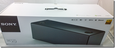
Sony’s top of the range wireless speaker grabbed my attention because it is not just a Bluetooth and Apple AirPlay speaker, but also the entry-level device in Sony’s push for high resolution audio, billed as better than CD quality. Get all the ducks in line, and you can play DSD (the format of SACD) downloads directly through this device, or high-resolution PCM at up to 32-bit/192kHz. It has the speaker technology to go with it too: sub-woofer for deep bass (within the limitations of a small box), and super tweeters for extended high frequencies up to a rumoured 40kHz, though I cannot find detailed specification from Sony. Note that this is well beyond what humans can hear.
image

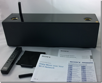
In the box you get the wireless speaker, remote, polishing cloth, mains cable, two odd little sticks which, it turns out, are tools for removing the front grille, and a couple of short leaflets in multiple languages.
image

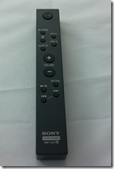
The remote has functions for power, input selection (Network, Bluetooth, USB-A, USB-B or analogue audio in), volume, mute, play/pause and skip.
image

This unit is flexible to the point of confusion. Here are the ways you can play back music:

  • Apple AirPlay: play from iTunes over an wired or wireless network using Apple’s proprietary protocol.
  • Bluetooth from Bluetooth-enabled devices such as smartphones or tablets. Uses A2DP (Advanced Audio Distribution Protocol) for best quality.
  • From a DLNA-compliant music server on your network. Sony’s free Media Go will do, but there are quite a few of these around.
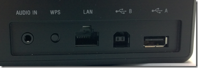
  • Audio in using an old-fashioned 3.5mm jack cable.
  • Direct attached USB storage. I had limited success with this, but did manage to play some FLAC files from a USB stick. It is designed for just a few files.
  • Direct USB connection to a PC or Mac. In this mode the unit is a USB DAC. This is how you get the very best quality.
image

Supported formats are MP3, AAC, WMA, WAV, FLAC, and DSD via USB after firmware update. ALAC (Apple lossless) is not listed, but an Apple lossless file I created played fine from a USB stick, from which I conclude that it supports that too.

So how is the out of box experience? The first thing you notice is that this thing is heavy – 4.6kg. Despite its relatively small size (about 430 x 133 x 125mm) it is not all that portable; I mean, you can move it about if you like, but as well as the weight there is no handle and it should be moved with care; it is also mains-only.

The introductory manual gives you several ways to get started. It covers only wi-fi connection; if you want to use a wired network, Bluetooth or USB connection, you are referred to the online manual here. Otherwise, you are offered instructions for iOS, Android, PC or Mac. I have a Sony Xperia (Android) smartphone so I took that option; possibly a mistake.

I tried to follow the setup guide. I have a Sony Xperia (Android) smartphone. I downloaded the recommended SongPal app and successfully paired the phone with the speaker with NFC (tap to connect). The app prompted me to enter my home wifi password, but I was not successful; it just did not want to connect and kept on prompting me. I got hold of an iPhone, tried SongPal on that and was able to connect. Odd.

Once up and running it was time to play some music. I was able to play direct from the phone (Bluetooth streaming) without any problem. My results with DLNA were mixed. I have Logitech Media Server on the network which supports DLNA. Bizarrely, this usually shows up as a source when using the Android SongPal, but not when using the iOS SongPal. It worked at first, but then I started getting “Playback failed”. I had better luck with Windows Media Player over DLNA, and also Sony’s own Media Go.

That said, even when it is working I don’t much like the DLNA option. There is no search option and if you have a lot of music you do endless scrolling. This seems to be a feature of DLNA rather than the fault of SongPal, and a reason why it will never catch up with iTunes/AirPlay or Sonos.

SongPal also supports various apps such as Tunein (internet radio), Music Unlimited and Deezer. You can also add apps such as Google Play. This is a tad confusing though. Tunein seems to be built-in; you can select a radio station, play, turn off your smartphone and it keeps going. Choose Google Play though and it plays over Bluetooth from your phone; disconnect the phone and the music stops.
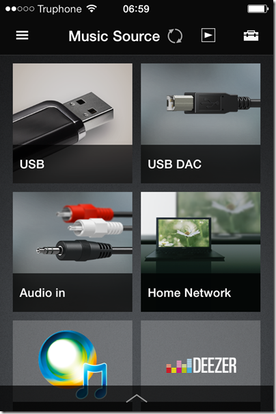
image

Since Tunein appears to be baked it, it is a shame that you cannot use the radio from the remote without needing SongPal.

If SongPal is not working for you, or if you have a non-supported phone such as Windows Phone, you can connect over the network. The manual suggests that you do a direct connection to a PC using an Ethernet cable, in which case the unit will likely show up in a web browser on 169.254.1.1. However if you connect the Ethernet cable to a switch (such as a socket on the back of your broadband router) it will show up on whatever IP number is allocated by the router; you can find it by looking at DHCP allocations, a bit tricky. There is also a WPS button for instant connection if your wireless router supports it (mine is disabled for security reasons).

Wireless configuration through a web browser, once you get there, is really easy. You can even set a fixed IP address if you want. However, the browser configuration does NOT give access to all the features of the unit; it is mainly for network configuration. The SongPal app has additional settings, including EQ, a setting called ClearAudio+ which does who knows what, and DSEE HX which is meant to enhance lossy audio files such as MP3. That’s unfortunate; not everyone uses iOS or Android. That said, SongPal is not much fun to use anyway so you are not missing too much.
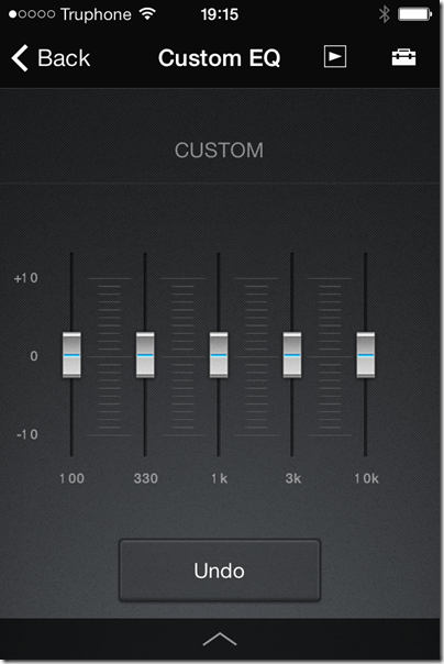
image

Once the unit was up and running I tried a few other modes. I ran up Apple iTunes and tried AirPlay, which works great, though with the usual AirPlay annoyance of a pause when connecting. When using AirPlay, you can use the pause, next and back buttons on the supplied remote. These don’t work in all modes, another point of confusion.

What about playing high resolution music or DSD? I was excited about this possibility so keen to get it working. I even have some DSD downloads to try. Discovering how was a bit of an adventure. You need to do two things.

First, update the firmware, by connecting over wifi and using the otherwise undocumented update button on top of the unit (check Sony’s site for full instructions). You need at least firmware 2.05.2.01.

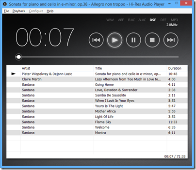
Second, find and install the Hi-Res Audio Player for PC or Mac on Sony’s site. Third, get a USB cable (not supplied) and connect it to a PC.

The downloads to get this working are here.
image

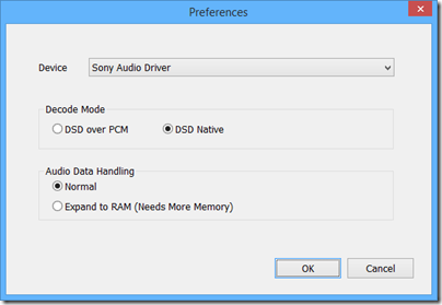
I was rewarded with excellent sound quality, though the audio player software is basic. On my DSD downloads I could see, for example, 2.8MHzs DSF indicated, and the configuration offered “DSD Native”, so I believe this thing really is a DSD DAC (though who knows, it may convert to PCM internally).
image

Once connected in this way, you can also set it as the output for other audio software such as Foobar 2000 or iTunes.

The sound

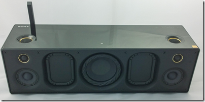
What of the sound though? The SRS-X9 has seven speakers: 1 sub-woofer, two midrange, two tweeters and two super-tweeters. This means you get mono for the lowest frequencies, but that it not really a disadvantage as low frequencies are not directional and you don’t get much stereo image with this box anyway.

In addition, there are two passive bass radiators.
image

As you would expect from a unit at this price (nearly £600 in the UK) and with some audiophile pretensions, the sound is very good. In its class – as a single box wireless speaker – it may be the best I’ve heard. It easily beat a Squeezebox Boom, sounding both bigger and cleaner. I also thought it had the edge over an Audyssey Lower East Side Audio Dock Air, which is another AirPlay speaker with good sound, though the Audyssey offers deeper bass.

The SRS-X9 does go relatively deep though, and the bass is clean whereas the Audyssey tends to boom a little.

The sound is not faultless though. It is a touch bright and can get a little strident at higher volumes. Vocals can have slightly exaggerated sibilance. Stereo imaging, as mentioned above, is poor, thanks to the close proximity of left and right speakers. The sound is exceptionally clean, which is hardly a fault, but worth noting if you like to get down and boogie; you might find the SRS-09 overly clinical.

These are reasons why the SRS-09 will not replace a traditional home stereo for me. I also like having separate speakers either side of my PC screen, so this is not perfect for that role.

HOWEVER as a minimalist and good-looking single box speaker this is excellent; perfect for a sitting room if you do not want the clutter of a traditional home stereo, or for somewhere else round the house where you want high quality music.

The sound over USB is best, and ideally I would suggest parking a Mac Mini or similar small computer next to it and using it that way. On the other hand, AirPlay also works well and in conjunction with Apple’s Remote app this is a convenient solution. Bluetooth can be handy too.

A few other notes. Sony has gone for an understated design, and the buttons on top of the unit are completely flat and in fact mostly invisible unless you hover your hand close by – it uses a proximity sensor. Clever, but easy to hit a button by accident if you are repositioning the device.

The appearance is glossy black, looks nice but gets dusty easily. Sony supplies a little black cloth for polishing. Unfortunately the super tweeters on top are surrounded with a slightly sticky area which attracts dust and is hard to clean; this might bother you if you are meticulous about such things.

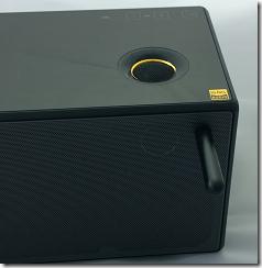
The front grille can be removed with two supplied magnetic tools; Sony says this give a “more dynamic sound” though the difference is not great.
image

It is a shame that there is no audio output port, neither for headphones, nor for external speakers. You cannot use this as a DAC for another stereo system, for example.

An S/PDIF optical digital input would also be handy, as this is more universally compatible than USB for wired digital input.

Other weak points are the fiddly setup, reliance on a mobile app for some settings, general unreliability of DLNA, and some problems which mysteriously disappear when you turn off and on again (with so many input options it is not surprising that the Sony gets confused sometimes).

Conclusion? There is a ton of technology packed into this box and it does sound good. I like the option to play back native DSD even though it is all a bit mad; it is doubtful that the inaudible higher frequencies really make any difference, and there are compromises elsewhere such as the mono sub-woofer and limited stereo image that more than outweigh any benefit from high-resolution (a controversial subject). Never mind though; Sony has taken trouble over the sound and it shows.

Good points

  • Flexible streaming options
  • High quality sound, exceptionally clean
  • Compact, minimalist design
  • Smooth AirPlay support
  • Support for hi-res PCM and DSD audio files when connected via USB

Bad points

  • Dependence on iOS or Android apps for some features, no support for Windows Phone
  • No headphone socket
  • No audio output for connection to other hi-fi kit
  • No S/PDIF optical digital input
  • Limited stereo image and sound too bright on some material

Specifications

  • Size: 430x133x125mm
  • Weight: 4.6Kg
  • Power consumption: 50w
  • Power output: unknown though Amazon quotes “154w”
  • Frequency response: Sony quotes “45Hz to 40kHz”.
  • Drive units: 1 sub-woofer, 2 passive bass radiators, 2 midrange units, 2 tweeters, 2 super-tweeters
  • Streaming support: Bluetooth audio, AirPlay, DLNA

A tale of two Lumias: snaps on a Lumia 630 versus a Lumia 1020

I spent a morning in Oxford taking some snaps and thought it would be fun to compare what a budget Windows Smartphone – the new Nokia Lumia 630 – can do versus the king of photography smartphones, the Nokia Lumia 1020.

Note this is not intended as a fair comparison; the 1020 costs around four times as much as the 630. It does show what you are giving up if you use a budget smartphone for all your snaps. In each case, you can click the image to see the full resolution.

Here is the Bodleian Library on the 630:

WP_20140614_09_36_07_Pro

and on the 1020, using the 5MP version (the 1020 also stores a high res version of each image):

WP_20140614_09_34_35_Pro

Next, Pembroke College on the 630:

WP_20140614_10_43_47_Pro

and on the 1020:


WP_20140614_10_42_32_Pro

Some flowers at the corner of Pembroke’s Chapel Quad, on the 630:

WP_20140614_10_44_21_Pro

and on the 1020:

WP_20140614_10_44_18_Pro

The difference is more telling if you zoom in. Here is a detail taken from a picture of Broad Street on the 630:

image

and on the 1020:

image

What about the high-res versions of the Lumia 1020 snaps? Here is a picture of Oxford’s “Bridge of Sighs”:

WP_20140614_09_37_21_Pro

Let’s zoom in to look at the sculpture on the bridge. This is from the 5MP version, which I’ve enlarged slightly:

image

Here is the same section taken from the high-res 34MP image:

image

I consider the improvement well worthwhile; it does pay to hang on to those high-res images for the pictures you most value.

I snapped this on the 630 too; here is the same zoomed-in and enlarged section:

image

Ouch!

Conclusion? The camera on the Lumia 630 is not too bad – for a cheap smartphone. The Lumia 1020 is something special and I am grateful to Nokia for delivering a smartphone with a camera good enough that I can leave a standalone camera out of my bag – noting that I am not a photographer, just a traveller who takes pictures. I have not used a tripod on any of the above; from my perspective, coping with camera shake is one of the characteristics I need in whatever camera I use.

Review: Nokia Lumia 630 – a lot of smartphone for the money

Microsoft/Nokia has released the Lumia 630 Windows Phone in the UK. It is notable for two reasons:

  • The first phone on sale with Windows Phone 8.1 installed
  • A budget contender with a full range of features at around £100. For example, o2.co.uk offer it for £99.99 with a “Pay & Go” tariff from £10.00 monthly. Amazon.co.uk is currently offering it sim-free for £128.29.

The quick summary:

  • 4.5″ 854×480 LCD screen
  • 5MP rear camera
  • 512MB RAM
  • 8GB storage
  • MicroSD slot supporting up to 128GB
  • Qualcomm Snapdragon 400 quad-core 1.2 GHz processor
  • Bluetooth 4.0, wi-fi, WCDMA,GSM,A-GPS etc
  • 1830 mAh removable battery

What is missing? Among the compromises here, there is no front-facing camera, the only sensor is an accelerometer, the screen resolution is poor compared to a high-end smartphone, and there is no dedicated camera button.

The older Lumia 625 has some features missing on the 630, including a camera button, LED Flash, ambient light sensor and proximity sensor, Nokia’s “super sensitive touch” screen, and LTE. The 625 is a similar price, so if those features matter to you it might be a better buy, though you have to put up with the older and slower S4 processor.

The Lumia 630 does support Nokia’s SensorCore feature, which lets apps like Health & Fitness (pre-installed) track movement through an API without consuming much power.

The lack of a camera button or Flash is disappointing, considering Nokia’s reputation as a brand good for photography.

Out of the box

image

The Lumia 630 is a basic package. No headset is included, presumably on the grounds that you likely have one already, though buying one separately is inexpensive. There is a mains charger; you probably have one of these already too, but it might not be optimal for this particular device, which may be why Nokia chose to prioritise this over the headset.

In order to fit the SIM, you pop the phone out of its shell; it feels if anything a bit too easy, though the phone shows no sign of falling apart accidentally so far.

image

The software of course is Windows Phone 8.1, with several nice improvements including a notification screen accessed by swiping down from the top. This works even from the lock screen, and gives immediate access to the camera, which may explain why the button is missing. I still miss the button though.

image

Cortana, the virtual personal assistant currently in beta, is not yet present in the UK. You can enable Cortana with a bit of effort by changing your language and region, but it is not recommended other than for temporary experimentation.

I hit one problem in setup. The automatic date and time setting does not work, at least not with my carrier (Three). This in turn broke some other features including SkyDrive and Exchange/Office 365 email, until I set it manually. The manual setting is not brilliant though, since when I turned the set off and on again, it came up with a setting from several days ago. This looks like a software bug so I hope it will be fixed soon.

Here is the home screen pretty much out of the box, though I have connected it to Exchange:

image

This is NOT how I prefer to set up my home screen on a Windows phone. Normally I reduce all the tiles to the smallest size other than the phone icon, which I have large so I can hit it as easily as possible. This fits more icons on the screen and gets rid of the annoying People live tile animations. This is, of course, a matter of personal preference.

The apps prominent above the fold include PhotoBeamer, which lets you show pictures on a friend’s Windows Phone (a cool app), LINE which is a messaging app, and the excellent HERE maps and Nokia Camera.

Scroll down and you get Facebook, Skype, HERE Drive, Nokia Mix Radio, OneDrive, calendar and several more.

A word about apps

I do not intend this to be another reviews of a Windows Phone which say, “great phone but the apps are lacking.” It is true to the extent that Windows Phone lacks the great support with iOS and Android get in terms of apps. Windows Phone owners have to put up with seeing “available for iOS and Android” for apps which they might  otherwise like to install, and with apps that are less well maintained or up to date than those for the two more popular platforms.

Clearly, the way to fix this is for lots more people to buy Windows Phones. Therefore, not to buy a Windows Phone because of the app shortage merely perpetuates the problem.

But how bad is it? The answer will be different depending which apps matter to you; but there are a couple of reasons why it is not, in my opinion, all that bad.

One is that Microsoft has its own platform, putting it in a stronger position than say, Blackberry or even Apple (if iOS were not already popular). The Microsoft platform includes maps and driving (Nokia), search (Bing), messaging (Skype), email and cloud documents (Office 365) and online storage (OneDrive).

Second, the Windows app store is not as moribund as the Windows 8 app store. There are decent apps in most categories and support from third parties like Spotify, WhatsApp, Instagram or the BBC is improving.

If you love Google, this is unlikely to be the phone for you, since it seems almost to go out of its way not to support Windows Phone.

On the other hand, there are Windows Phone apps which I miss on other platforms, including Nokia Camera, HERE Drive, and the built-in email and calendar apps.

It is a factor, but not a showstopper.

Lumia 630 in use

My experience of using the 630 is mainly positive. Performance is great; the phone is fast and responsive. Battery life is good too:

image

Note that the Battery Saver is off by default, but I prefer having it come on automatically as needed.

Battery life is nothing special if you use the phone intensively, such as to watch a video or play a game, but when it on standby it is better than previous Windows phones I have tried.

The camera is better than I had expected, given the annoyances mentioned above. For casual snaps it is up to the mark you would expect from a budget smartphone.

This is not PureView though; do not expect the same quality as on Nokia’s high-end phones. See here for some comparative snaps.

Audio on the Lumia 630 sounds fine when played with a high quality headset. I played the same track on the 630, the Lumia 1020, and from a PC via a dedicated headphone amplifer. Possibly the 630 sounds slightly thin compared to the more expensive setups, but the earbuds or headphones you use will likely make the most difference.

image

Health and Fitness tracking, using the Bing app, is fun and saves having to manage a separate device like a Fitbit.

image

I have yet to catch out the 630 on performance. Youtube videos and BBC iPlayer played smoothly.

The display is on the dull side but no enough to spoil the experience. However I did notice grey marks (presumably shadows of the glue that holds the screen on) at the top of the screen, visible on light backgrounds, which is a slight annoyance.

Conclusion

The Lumia 630 is a budget smartphone with a lot to offer. There are just a few annoyances: features missing that were present on the 625, slightly dull screen, and some signs of cost-cutting. These are small blemishes though when you consider what you do get for a modest outlay.

&nbr;