Category Archives: reviews

Review: Sony SRS-X9 high-resolution network music player

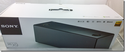
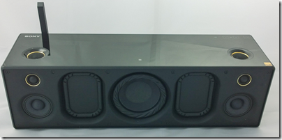
Sony’s top of the range wireless speaker grabbed my attention because it is not just a Bluetooth and Apple AirPlay speaker, but also the entry-level device in Sony’s push for high resolution audio, billed as better than CD quality. Get all the ducks in line, and you can play DSD (the format of SACD) downloads directly through this device, or high-resolution PCM at up to 32-bit/192kHz. It has the speaker technology to go with it too: sub-woofer for deep bass (within the limitations of a small box), and super tweeters for extended high frequencies up to a rumoured 40kHz, though I cannot find detailed specification from Sony. Note that this is well beyond what humans can hear.

image

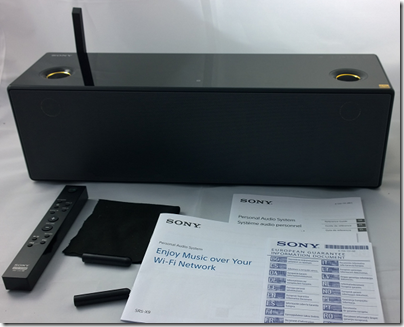
In the box you get the wireless speaker, remote, polishing cloth, mains cable, two odd little sticks which, it turns out, are tools for removing the front grille, and a couple of short leaflets in multiple languages.

image

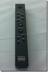
The remote has functions for power, input selection (Network, Bluetooth, USB-A, USB-B or analogue audio in), volume, mute, play/pause and skip.

image

This unit is flexible to the point of confusion. Here are the ways you can play back music:

  • Apple AirPlay: play from iTunes over an wired or wireless network using Apple’s proprietary protocol.
  • Bluetooth from Bluetooth-enabled devices such as smartphones or tablets. Uses A2DP (Advanced Audio Distribution Protocol) for best quality.
  • From a DLNA-compliant music server on your network. Sony’s free Media Go will do, but there are quite a few of these around.
  • Audio in using an old-fashioned 3.5mm jack cable.
  • Direct attached USB storage. I had limited success with this, but did manage to play some FLAC files from a USB stick. It is designed for just a few files.
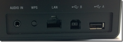
  • Direct USB connection to a PC or Mac. In this mode the unit is a USB DAC. This is how you get the very best quality.

image

Supported formats are MP3, AAC, WMA, WAV, FLAC, and DSD via USB after firmware update. ALAC (Apple lossless) is not listed, but an Apple lossless file I created played fine from a USB stick, from which I conclude that it supports that too.

So how is the out of box experience? The first thing you notice is that this thing is heavy – 4.6kg. Despite its relatively small size (about 430 x 133 x 125mm) it is not all that portable; I mean, you can move it about if you like, but as well as the weight there is no handle and it should be moved with care; it is also mains-only.

The introductory manual gives you several ways to get started. It covers only wi-fi connection; if you want to use a wired network, Bluetooth or USB connection, you are referred to the online manual here. Otherwise, you are offered instructions for iOS, Android, PC or Mac. I have a Sony Xperia (Android) smartphone so I took that option; possibly a mistake.

I tried to follow the setup guide. I have a Sony Xperia (Android) smartphone. I downloaded the recommended SongPal app and successfully paired the phone with the speaker with NFC (tap to connect). The app prompted me to enter my home wifi password, but I was not successful; it just did not want to connect and kept on prompting me. I got hold of an iPhone, tried SongPal on that and was able to connect. Odd.

Once up and running it was time to play some music. I was able to play direct from the phone (Bluetooth streaming) without any problem. My results with DLNA were mixed. I have Logitech Media Server on the network which supports DLNA. Bizarrely, this usually shows up as a source when using the Android SongPal, but not when using the iOS SongPal. It worked at first, but then I started getting “Playback failed”. I had better luck with Windows Media Player over DLNA, and also Sony’s own Media Go.

That said, even when it is working I don’t much like the DLNA option. There is no search option and if you have a lot of music you do endless scrolling. This seems to be a feature of DLNA rather than the fault of SongPal, and a reason why it will never catch up with iTunes/AirPlay or Sonos.

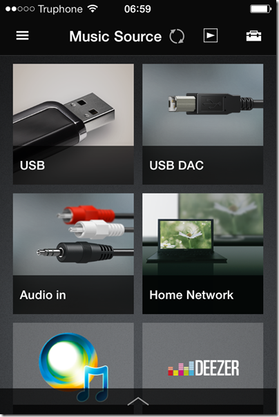
SongPal also supports various apps such as Tunein (internet radio), Music Unlimited and Deezer. You can also add apps such as Google Play. This is a tad confusing though. Tunein seems to be built-in; you can select a radio station, play, turn off your smartphone and it keeps going. Choose Google Play though and it plays over Bluetooth from your phone; disconnect the phone and the music stops.

image

Since Tunein appears to be baked it, it is a shame that you cannot use the radio from the remote without needing SongPal.

If SongPal is not working for you, or if you have a non-supported phone such as Windows Phone, you can connect over the network. The manual suggests that you do a direct connection to a PC using an Ethernet cable, in which case the unit will likely show up in a web browser on 169.254.1.1. However if you connect the Ethernet cable to a switch (such as a socket on the back of your broadband router) it will show up on whatever IP number is allocated by the router; you can find it by looking at DHCP allocations, a bit tricky. There is also a WPS button for instant connection if your wireless router supports it (mine is disabled for security reasons).

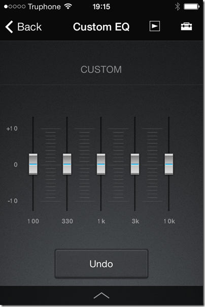
Wireless configuration through a web browser, once you get there, is really easy. You can even set a fixed IP address if you want. However, the browser configuration does NOT give access to all the features of the unit; it is mainly for network configuration. The SongPal app has additional settings, including EQ, a setting called ClearAudio+ which does who knows what, and DSEE HX which is meant to enhance lossy audio files such as MP3. That’s unfortunate; not everyone uses iOS or Android. That said, SongPal is not much fun to use anyway so you are not missing too much.

image

Once the unit was up and running I tried a few other modes. I ran up Apple iTunes and tried AirPlay, which works great, though with the usual AirPlay annoyance of a pause when connecting. When using AirPlay, you can use the pause, next and back buttons on the supplied remote. These don’t work in all modes, another point of confusion.

What about playing high resolution music or DSD? I was excited about this possibility so keen to get it working. I even have some DSD downloads to try. Discovering how was a bit of an adventure. You need to do two things.

First, update the firmware, by connecting over wifi and using the otherwise undocumented update button on top of the unit (check Sony’s site for full instructions). You need at least firmware 2.05.2.01.

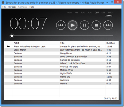
Second, find and install the Hi-Res Audio Player for PC or Mac on Sony’s site. Third, get a USB cable (not supplied) and connect it to a PC.

The downloads to get this working are here.

image

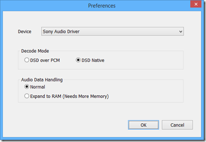
I was rewarded with excellent sound quality, though the audio player software is basic. On my DSD downloads I could see, for example, 2.8MHzs DSF indicated, and the configuration offered “DSD Native”, so I believe this thing really is a DSD DAC (though who knows, it may convert to PCM internally).

image

Once connected in this way, you can also set it as the output for other audio software such as Foobar 2000 or iTunes.

The sound

What of the sound though? The SRS-X9 has seven speakers: 1 sub-woofer, two midrange, two tweeters and two super-tweeters. This means you get mono for the lowest frequencies, but that it not really a disadvantage as low frequencies are not directional and you don’t get much stereo image with this box anyway.

In addition, there are two passive bass radiators.

image

As you would expect from a unit at this price (nearly £600 in the UK) and with some audiophile pretensions, the sound is very good. In its class – as a single box wireless speaker – it may be the best I’ve heard. It easily beat a Squeezebox Boom, sounding both bigger and cleaner. I also thought it had the edge over an Audyssey Lower East Side Audio Dock Air, which is another AirPlay speaker with good sound, though the Audyssey offers deeper bass.

The SRS-X9 does go relatively deep though, and the bass is clean whereas the Audyssey tends to boom a little.

The sound is not faultless though. It is a touch bright and can get a little strident at higher volumes. Vocals can have slightly exaggerated sibilance. Stereo imaging, as mentioned above, is poor, thanks to the close proximity of left and right speakers. The sound is exceptionally clean, which is hardly a fault, but worth noting if you like to get down and boogie; you might find the SRS-09 overly clinical.

These are reasons why the SRS-09 will not replace a traditional home stereo for me. I also like having separate speakers either side of my PC screen, so this is not perfect for that role.

HOWEVER as a minimalist and good-looking single box speaker this is excellent; perfect for a sitting room if you do not want the clutter of a traditional home stereo, or for somewhere else round the house where you want high quality music.

The sound over USB is best, and ideally I would suggest parking a Mac Mini or similar small computer next to it and using it that way. On the other hand, AirPlay also works well and in conjunction with Apple’s Remote app this is a convenient solution. Bluetooth can be handy too.

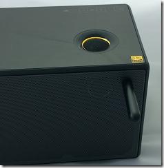
A few other notes. Sony has gone for an understated design, and the buttons on top of the unit are completely flat and in fact mostly invisible unless you hover your hand close by – it uses a proximity sensor. Clever, but easy to hit a button by accident if you are repositioning the device.

The appearance is glossy black, looks nice but gets dusty easily. Sony supplies a little black cloth for polishing. Unfortunately the super tweeters on top are surrounded with a slightly sticky area which attracts dust and is hard to clean; this might bother you if you are meticulous about such things.

The front grille can be removed with two supplied magnetic tools; Sony says this give a “more dynamic sound” though the difference is not great.

image

It is a shame that there is no audio output port, neither for headphones, nor for external speakers. You cannot use this as a DAC for another stereo system, for example.

An S/PDIF optical digital input would also be handy, as this is more universally compatible than USB for wired digital input.

Other weak points are the fiddly setup, reliance on a mobile app for some settings, general unreliability of DLNA, and some problems which mysteriously disappear when you turn off and on again (with so many input options it is not surprising that the Sony gets confused sometimes).

Conclusion? There is a ton of technology packed into this box and it does sound good. I like the option to play back native DSD even though it is all a bit mad; it is doubtful that the inaudible higher frequencies really make any difference, and there are compromises elsewhere such as the mono sub-woofer and limited stereo image that more than outweigh any benefit from high-resolution (a controversial subject). Never mind though; Sony has taken trouble over the sound and it shows.

Good points

  • Flexible streaming options
  • High quality sound, exceptionally clean
  • Compact, minimalist design
  • Smooth AirPlay support
  • Support for hi-res PCM and DSD audio files when connected via USB

Bad points

  • Dependence on iOS or Android apps for some features, no support for Windows Phone
  • No headphone socket
  • No audio output for connection to other hi-fi kit
  • No S/PDIF optical digital input
  • Limited stereo image and sound too bright on some material

Specifications

  • Size: 430x133x125mm
  • Weight: 4.6Kg
  • Power consumption: 50w
  • Power output: unknown though Amazon quotes “154w”
  • Frequency response: Sony quotes “45Hz to 40kHz”.
  • Drive units: 1 sub-woofer, 2 passive bass radiators, 2 midrange units, 2 tweeters, 2 super-tweeters
  • Streaming support: Bluetooth audio, AirPlay, DLNA

Review: Nokia Lumia 630 – a lot of smartphone for the money

Microsoft/Nokia has released the Lumia 630 Windows Phone in the UK. It is notable for two reasons:

  • The first phone on sale with Windows Phone 8.1 installed
  • A budget contender with a full range of features at around £100. For example, o2.co.uk offer it for £99.99 with a “Pay & Go” tariff from £10.00 monthly. Amazon.co.uk is currently offering it sim-free for £128.29.

The quick summary:

  • 4.5″ 854×480 LCD screen
  • 5MP rear camera
  • 512MB RAM
  • 8GB storage
  • MicroSD slot supporting up to 128GB
  • Qualcomm Snapdragon 400 quad-core 1.2 GHz processor
  • Bluetooth 4.0, wi-fi, WCDMA,GSM,A-GPS etc
  • 1830 mAh removable battery

What is missing? Among the compromises here, there is no front-facing camera, the only sensor is an accelerometer, the screen resolution is poor compared to a high-end smartphone, and there is no dedicated camera button.

The older Lumia 625 has some features missing on the 630, including a camera button, LED Flash, ambient light sensor and proximity sensor, Nokia’s “super sensitive touch” screen, and LTE. The 625 is a similar price, so if those features matter to you it might be a better buy, though you have to put up with the older and slower S4 processor.

The Lumia 630 does support Nokia’s SensorCore feature, which lets apps like Health & Fitness (pre-installed) track movement through an API without consuming much power.

The lack of a camera button or Flash is disappointing, considering Nokia’s reputation as a brand good for photography.

Out of the box

image

The Lumia 630 is a basic package. No headset is included, presumably on the grounds that you likely have one already, though buying one separately is inexpensive. There is a mains charger; you probably have one of these already too, but it might not be optimal for this particular device, which may be why Nokia chose to prioritise this over the headset.

In order to fit the SIM, you pop the phone out of its shell; it feels if anything a bit too easy, though the phone shows no sign of falling apart accidentally so far.

image

The software of course is Windows Phone 8.1, with several nice improvements including a notification screen accessed by swiping down from the top. This works even from the lock screen, and gives immediate access to the camera, which may explain why the button is missing. I still miss the button though.

image

Cortana, the virtual personal assistant currently in beta, is not yet present in the UK. You can enable Cortana with a bit of effort by changing your language and region, but it is not recommended other than for temporary experimentation.

I hit one problem in setup. The automatic date and time setting does not work, at least not with my carrier (Three). This in turn broke some other features including SkyDrive and Exchange/Office 365 email, until I set it manually. The manual setting is not brilliant though, since when I turned the set off and on again, it came up with a setting from several days ago. This looks like a software bug so I hope it will be fixed soon.

Here is the home screen pretty much out of the box, though I have connected it to Exchange:

image

This is NOT how I prefer to set up my home screen on a Windows phone. Normally I reduce all the tiles to the smallest size other than the phone icon, which I have large so I can hit it as easily as possible. This fits more icons on the screen and gets rid of the annoying People live tile animations. This is, of course, a matter of personal preference.

The apps prominent above the fold include PhotoBeamer, which lets you show pictures on a friend’s Windows Phone (a cool app), LINE which is a messaging app, and the excellent HERE maps and Nokia Camera.

Scroll down and you get Facebook, Skype, HERE Drive, Nokia Mix Radio, OneDrive, calendar and several more.

A word about apps

I do not intend this to be another reviews of a Windows Phone which say, “great phone but the apps are lacking.” It is true to the extent that Windows Phone lacks the great support with iOS and Android get in terms of apps. Windows Phone owners have to put up with seeing “available for iOS and Android” for apps which they might  otherwise like to install, and with apps that are less well maintained or up to date than those for the two more popular platforms.

Clearly, the way to fix this is for lots more people to buy Windows Phones. Therefore, not to buy a Windows Phone because of the app shortage merely perpetuates the problem.

But how bad is it? The answer will be different depending which apps matter to you; but there are a couple of reasons why it is not, in my opinion, all that bad.

One is that Microsoft has its own platform, putting it in a stronger position than say, Blackberry or even Apple (if iOS were not already popular). The Microsoft platform includes maps and driving (Nokia), search (Bing), messaging (Skype), email and cloud documents (Office 365) and online storage (OneDrive).

Second, the Windows app store is not as moribund as the Windows 8 app store. There are decent apps in most categories and support from third parties like Spotify, WhatsApp, Instagram or the BBC is improving.

If you love Google, this is unlikely to be the phone for you, since it seems almost to go out of its way not to support Windows Phone.

On the other hand, there are Windows Phone apps which I miss on other platforms, including Nokia Camera, HERE Drive, and the built-in email and calendar apps.

It is a factor, but not a showstopper.

Lumia 630 in use

My experience of using the 630 is mainly positive. Performance is great; the phone is fast and responsive. Battery life is good too:

image

Note that the Battery Saver is off by default, but I prefer having it come on automatically as needed.

Battery life is nothing special if you use the phone intensively, such as to watch a video or play a game, but when it on standby it is better than previous Windows phones I have tried.

The camera is better than I had expected, given the annoyances mentioned above. For casual snaps it is up to the mark you would expect from a budget smartphone.

This is not PureView though; do not expect the same quality as on Nokia’s high-end phones. See here for some comparative snaps.

Audio on the Lumia 630 sounds fine when played with a high quality headset. I played the same track on the 630, the Lumia 1020, and from a PC via a dedicated headphone amplifer. Possibly the 630 sounds slightly thin compared to the more expensive setups, but the earbuds or headphones you use will likely make the most difference.

image

Health and Fitness tracking, using the Bing app, is fun and saves having to manage a separate device like a Fitbit.

image

I have yet to catch out the 630 on performance. Youtube videos and BBC iPlayer played smoothly.

The display is on the dull side but no enough to spoil the experience. However I did notice grey marks (presumably shadows of the glue that holds the screen on) at the top of the screen, visible on light backgrounds, which is a slight annoyance.

Conclusion

The Lumia 630 is a budget smartphone with a lot to offer. There are just a few annoyances: features missing that were present on the 625, slightly dull screen, and some signs of cost-cutting. These are small blemishes though when you consider what you do get for a modest outlay.

&nbr;

Review: Sonocent Audio Notetaker, making sense of recorded interviews and meetings

Why bother taking written notes, when you can simply record the audio of a meeting or interview and listen to it later? I do this a lot, but it is problematic. You end up with an MP3 which has all the info within it, but with no quick way to find a half-remembered statement. Of course you can transcribe everything, or get it transcribed, but that is not quick; it will likely take longer than the original event if you want to transcribe it all, and even selective transcription is a slow process. You can get better at this, and I have formed a habit of noting times when I hear something which I am likely to refer to later, but standard audio players (such as Foobar 2000 or iTunes) are designed for music and not great for this kind of work.

There is also an annoying problem with application focus if you want to transcribe a recording. You have Word open, you have your recording open in Foobar, but to control Foobar you have to switch focus away from Word, which means you cannot type until you focus back. There are utilities around to overcome this – my solution was to write my own Word macro which can pause and rewind a recording with keyboard shortcuts – but it is another issue to fix.

Sonocent Audio Notetaker is an application for Windows or Mac dedicated to making sense of speech recordings. Audio Notetaker lets you create documents which include audio, text and images. If you have an existing audio recording, you can import it into a new Audio Notetaker documnent and start to work with it. The audio is copied into the document, rather than being added as a reference, so these documents tend to be large, a little larger than the original.

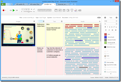
The primary feature is the the way recordings are visualised and navigated. When you import a recording, it shows as a series of bars in a large panel, rather than the single horizontal scrolling view that most audio players present. Each bar represents a phrase, determined by Audio Notetaker according to pauses in the speech. This is not altogether reliable since speakers may pause mid-phrase, but you can split or merge bars if needed. The length of each bar varies according to the content, but typically seems to be around 3-15 seconds. You navigate the recording by clicking on the bars, and annotate it by assigning colours to bars according to your own scheme, such as blue for a potential quote, or brown for “boring, skip this”.

If you are transcribing, you can type into either to two text panes, one of which is called Reference and the other just Text. When you are typing in one of these panes, you can use keyboard shortcuts to control the audio, such as Ctrl+Space for play/pause, Ctrl+\ to skip back, and Ctrl+/ to skip forward. The Reference and Text panes are functionally identical, but let you keep two different types of notes with one recording. There is also an image pane, which can include images, PDFs or PowerPoint presentations.

image

How do you synchronise your notes or transcription with the audio to which it relates? Audio Notetaker does not do this automatically, but does allow you to insert section breaks which split the document into vertical sections. You can create these breaks with keyboard shortcuts. I would prefer it if Audio Notetaker automatically set hotlinks so that I could tell exactly what audio was playing when I made a note, but sections are nevertheless useful.

For example, if you have an interview, a logical approach would be to make each question and each answer a section. Then you can easily navigate to the answer you want.

You can use background colouring to further distinguish between sections.

A common problem with audio recordings is that they are at too low a level. Audio Notetaker has its own volume control which can boost the volume beyond what is possible with the Windows volume control.

There is also a noise cancellation button, to remove the dreaded hiss.

image

Advanced features

Those are the basics; but Audio Notetaker has a few other capabilities.

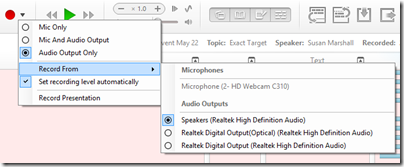
One idea is that you might want to record the content of an online conference. For this purpose, you can record from any of your input or output devices (it might seem strange to record from an output device, but this is the equivalent of a “what you hear” setting).

image

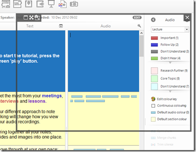
This approach is further supported by the ability to capture a screen and insert it into the document. When you choose the screen capture tool, you get a moveable, resizeable frame that you position over the area you want to capture.

image

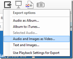
Another scenario is that you want to create a simple video with a PowerPoint slide show and an audio voiceover. You can do this by importing the PowerPoint and recording your speech, then choosing Export Audio and Images as Video (MP4 or WMV).

image

You can also export the text and images in RTF format (suitable for most word processors).

Internally, Audio Notetaker uses Opus Audio Encoding which is an internet standard.

You can also have Audio Notetaker read back text to you using the Windows text to speech engine (I am not sure how this works on a Mac).

Final words

The best feature of Audio Notetaker is the way it lets you navigate an audio file. It is quicker to click on a bar in the panel than using a horizontal scroller or noting the time and going to that point.

The sections work OK but I would personally like some way of embedding notes that are hotlinked to points in the audio with a finer granularity than sections.

I am not sure of the value of features like importing PowerPoint slides, adding audio, and exporting as a video, when PowerPoint itself has support for narrations and export to video. I would prefer it if the developers focused on the core proposition in Audio Notetaker: making it easy to index, annotate and navigate speech recordings.

I would also like to see integration with a transcription service. Automated transcription would be great but does not usually work well with typical field recordings; more realistically, perhaps Sonocent could integrate with Amazon’s Mechanical Turk or another service where humans will transcribe your recording for a fee.

Nevertheless, Audio Notetaker is nicely designed software that addresses a poorly-served niche; well worth consideration for journalists, students, secretaries, takers of minutes, or anyone who uses audio recordings as part of their workflow.

You can find Audio Notetaker on the Sonocent site, and obtain it as a free trial, or by subscription for a period, or with a perpetual licence. For example, six months for an individual license is £29.99; a perpetual licence is £95.99 (including VAT).

It is available for PC or Mac.

Review: Velodyne vFree wireless headphones

Last month I took a look at Velodyne’s vLeve headphones. Now it is time to look at the similarly-styled vFree, a wireless model which sits a bit higher in the Velodyne range. The range, incidentally, looks like this, though the prices (taken from the Velodyne site) are the most you can pay and you will likely do quite a bit better.

  • vLeve on-ear headphones $199
  • vFree on-ear Bluetooth headphones $299
  • vQuiet over-ear noise cancelling Headphones $299
  • vBold over-ear Bluetooth headphones $349
  • vTrue Studio over-ear headphones $399

image

In the smart glossy box you get the headphones, soft bag, cables for USB charging and for a wired audio connection (no microphone when wired), and a leaflet with a guide to pairing.

image

There is no charger; you can use the USB port on a PC or one of the many USB chargers you likely have already.

image

The headphones fold for portability and have various ports, LEDs and buttons. Under the left cup, you will find a battery status LED, the USB charging port, and a socket for wired audio.

The right cup sports most of the functions. There is volume up/down on the edge, and an LED function indicator and microphone on the bottom. The back of the cup is split to form three large buttons, one for Next/Previous, one for power and pairing, and one for play/pause/answer/end call.

Controls on on-ear devices always tend to be awkward, because you cannot see what you are doing. I like the generous size of the vFree controls, but finding which button to press is still tricky at first.

Pairing is a matter of holding down power until the device enters pairing mode. Fairly straightforward, though in my experience some devices pair more easily than others, and there is no clarity about whether you can pair to multiple devices. I believe you can, because the Nexus was able to reconnect after I paired to the Surface, but I had trouble the other way around and had to re-pair. The function LED is rather dim and hard to see.

The sound

You could say that the vFree is “like the vLeve but wireless”, but although the looks are similar they do not sound the same. Further, bear in mind that a wireless headset contains its own amplifier whereas with a wired set you are dependent on whatever comes with your device.

Perhaps for this reason, I found that the vFree sounded substantially different in the various configurations I tried. The best sound I got was when wired (there is a wired option using the supplied cable) and using a dedicated headphone amplifier: this gave rich bass, clean, clear and spacious sound.

Yet on the two mobile devices I tried, a Surface tablet and a Google Nexus tablet, the vFree sounded better wireless than wired. In fact, the wired option sounded bad in comparison, thinner and slightly distorted.

There is a logic behind this. Mobile devices often have poor audio amplifiers, and when you listen wired, that is what you get. In addition, I found with both these and with the vLeve that they are more than usually sensitive to amplifier quality. With the wireless option though, you are using the built-in amplifier that is specifically designed for the speakers in the vFree. Against that though, wired is a better electrical connection than Bluetooth, so it is a trade-off. Another factor is whether your mobile device supports the higher quality apt-x codec over Bluetooth; many do not, though the vFree does support it.

All of this makes it hard to state definitively how the vFree sounds; it will depend on your set-up. At their best they sound very good, though I doubt wired use with a dedicated amplifier will form typical usage for most. In the other configurations, I found them decent but not outstanding. The bass is particularly clean and tuneful, as you might expect from a supplier of sub-woofers, and the sound in general is refined, never brash or harsh, but lacking the spaciousness that characterises the very best audio.

Comfort is a personal thing; I found the vFree fine for an hour or two but would not want to wear them for longer; but they are soft and lightweight.

These are high quality headphones, though not good value at the full price listed on the Velodyne site. Fortunately you can get them elsewhere for considerably less, making them worth consideration.

Specifications

  • Frequency response: 20Hz – 20kHz
  • Impedance: 32 Ω
  • Range: Up to 10m
  • Sensitivity: 98 dB/1 kHz/1mW
  • Codecs: SBC, AAC, apt-X
  • Battery life: 100 hours standby, 10 hours talk and music, 1.5 hours recharge time

Review: Power Cover for Microsoft Surface tablets

I took advantage of a recent US trip to purchase a Surface Power Cover, at the Microsoft Store in Bellevue, near Seattle.

The concept is simple: you get an external battery integrated into a Surface keyboard cover. The keyboard is similar to the second version of the Type Cover, though curiously without backlighting other than a caps lock indicator. The keys are mechanical which for most people means you can type faster than on the alternative Touch cover, though it is less elegant when considered as a cover rather than as a keyboard.

image

The trackpad is the same on all three second edition covers, which is to say, not good. The problem is not the trackpad itself, but the mouse buttons, which are NOT mechanical keys (they were on the first edition Type Cove). Given that you need to press and hold a mouse key for some operations, having a physical click on the trackpad buttons is particularly useful and much missed. Another annoyance is that you cannot disable tap to click, which means some mis-clicks are inevitable, though on the flip side it is easier to tap to click than to use the fiddly mouse buttons.

Having said that it is the same, I have noticed that the trackpad on the Power Cover seems a bit smoother and better behaved than the one on the Type Cover 2. This could be sample variation, or that it is new, or that Microsoft has slightly tweaked the internal design.

As you would expect, the Power Cover is heavier and more substantial than the Type Cover, though I find you notice the weight more than the bulk. Even with the Power Cover, it is still smaller and neater than a laptop. The extra rigidity is a benefit in some scenarios, such as when the keyboard protrudes over the edge of a table. The fabric hinge, which is a weak point in the design of all the Surface covers, seems to be the same on the Power Cover and I fear this may cause problems as the device wears, since the extra weight will put more strain on this hinge.

As with the other keyboard covers, if you fold it back under the tablet, the keys are disabled. In this mode the Power Cover is purely an external battery.

I used the cover with the original Surface Pro (it is compatible with all the models other than the original Surface RT). I understand that a firmware update is needed for the power cover to work; if so, it installed seamlessly though I did need to restart after connecting the keyboard for the first time. Everything worked as expected. If you click the battery icon in the notification area you can see the status of both batteries and which is charging, if you are plugged in; generally one one charges at a time.

image

I boarded my flight and noticed that the Surface is smart enough to use the external battery first, and then the internal, presumably on the basis that you might want to remove the keyboard and use the Surface in pure tablet mode.

image

It is impossible to be precise about how much extra time you get from the Power Cover, since it depends how you use the machine. It is a big benefit on the original Surface Pro which has rather poor battery life; extended battery life is perhaps the biggest real-world difference between the Surface Pro and the Surface Pro 2. Subjectively I have doubled the battery life on my year-old Surface Pro, which for me makes the difference between running out of battery fairly often, and hardly ever.

The Power Cover costs $199, which is expensive considering that you can get an entire spare Android tablet or Amazon Kindle Fire for less; but put in the context of the equally over-priced Type Cover, which costs $129, you can argue that it is not that much extra to pay. Prices from third-party sites will likely be lower once availability improves.

If you need it, you need it; and this must be the best way to extend the battery life of a Surface tablet.

The Surface keyboard covers are not perfect, and I still sometimes see an annoying fault where the mouse pointer or keys stop responding and you have to jiggle the connection or tap the screen a few times to get it back (I am sure this is a driver issue rather than a poor physical connection). Still, I put up with a few irritations because the Surface gives me full Windows in a more convenient and portable form factor than a laptop, and there is more right than wrong with the overall design.

Summary:

  • If you already have a keyboard and your Surface lasts as long as you need – forget it.
  • If you have a Surface that runs out of power with annoying frequency (probably a Surface Pro 1), this is worth it despite the high price.
  • If you don’t have a keyboard (for example, you are buying a new Surface) then this is worth the extra cost over the Type keyboard.

Review: Velodyne vLeve on-ear headphones

Velodyne is best known for its fine range of sub-woofers, but the company also makes a range of headphones, of which the vLeve is towards the bottom of the range.

image

The headphones are supplied in a smart glossy box with the reassuring words “High performance headphones” on the front. I am not sure what the name signifies though the word Leve means “Live” in some languages so it perhaps hints at enjoying life – what better way than listening to music through high quality cans?

image

Inside the box are the headphones, a handy bag, and a 3.5mm jack cable. There is no adaptor for a 1/4″ jack socket; a shame though these are easily optainable elsewhere. The headphones fold for portability.

image

The vLeve is lightweight and feels even a little flimsy though it seems well made. The design is the on-ear type. I found that careful positioning of the pads on your ears is essential for the best sound; it is surprising how much difference is made by a small change in position.

Velodyne is keen to sell you add-on skins to give a more colourful appearance.

image

Since you may well be out and about wearing these the appearance is important and a matter of taste; personally I am happy without a skin as I care mainly about the sound, but these distinctive skins will appeal to many.

So how is the sound? It seems too obvious: but as you would expect from a sub-woofer company, the bass is exemplary. At first I thought the sound was a little bass-heavy, but comparison with other headphones does not bear this out. Rather, the bass is particularly tight and tuneful so you pay it more attention.

I played the excellent SACD We Get Requests by the Oscar Peterson Trio and the sound of Ray Brown’s double bass is a delight with a clean and natural sound.

The sound is relaxed, even slightly recessed, and may not appeal if you prefer a more analytical or exciting presentation. Swapping to my reference Sennheiser HD600s showed that the vLeve is not the last word in clarity or openness, but it was not disgraced and its compromises are easy to live with.

I did find the sound substantially better when using a headphone amplifier rather than an iPad or Nexus tablet (two that I tried). While this is not surprising in one sense, others are more tolerant of lesser amplification.

One annoyance: the cord at 130mm or just over 4 feet was too short for my liking, but again you can easily get a replacement if needed.

Note that Velodyne also make a similar wireless model, the vFree, which is reviewed separately.

A good choice especially for acoustic music and for use with high quality sources.

Price is $219 though available from around $130 if you scout around. UK prices to follow.

Published specifications:

  • Driver size: 34mm
  • Frequency Response: 20Hz – 20 kHz
  • Sensitivity: 98 dB/1Khz/1mW
  • Impedance: 32 Ω

Review: Acer C720 Chromebook and reflections on Chrome OS

When I saw the first announcement of Chrome OS I was amazed and wrote a breathless post:

I’m watching Google’s press briefing on the forthcoming Chrome OS. It is amazing. What Google is developing is a computer that answers several of the problems that have troubled users since the advent of the personal computer.

That was in November 2009. Unfortunately it has taken me a while to try a Chromebook (the generic name for a computer running Chrome OS) for myself; but I have been trying out an Acer C720 and what follows is in part a review of this machine, and in part some wider reflections on the Chrome OS and Chromebook concept.

image

In terms of hardware, a Chromebook is another take on the netbook idea: a small, light laptop but running Linux rather than Windows. The earliest netbooks also ran Linux but the mass market could not cope with it; Google has done what is necessary to make it work for non-technical people, not least by hiding almost all of the operating system other than the browser.

I have given detailed specifications at the end of this post, but in summary this is an 11.6″ traditional clamshell laptop/netbook with 1.4Ghz Intel Haswell processor, 2GB RAM and 16GB SSD. It weighs just 1.2Kg

It’s cheap. You can pick one up for just under £200 at Amazon; it’s smart looking and does not feel as cheap as it is.

At left we have power input, HDMI out, USB 3.0 port and a standard headset socket.

image

On the right there is an SD card slot, USB 2.0, and a lock attachment point.

image

You can get a touchscreen version for an additional £80 or so but it does not seem worth it to me.

When you turn on for the first time, you have to accept the Google agreement. You won’t read it all, but here is something you should note:

You acknowledge and agree that Google may stop (permanently or temporarily) providing the Services (or any features within the Services) to you or to users generally at Google’s sole discretion, without prior notice to you…

You acknowledge and agree that if Google disables access to your account, you may be prevented from accessing the Services, your account details, or any files or other content which is contained in your account.

More on this later.

You can sign in as guest, and use the device to browse the web, or you can sign in with a Google account. If you sign in as guest, none of your activity (including any files you download) will be preserved when you sign out. This is a nice feature for, literally, guests for whom you want to give internet access while protecting both your privacy and to some extent theirs.

Normally you will sign in with a Google account. If you have used Google’s Chrome browser, much will be familiar. What you get is the browser, which you can run full screen or in a resizable window, and a taskbar along the bottom which shows running apps, date and time, network connection, battery status, and notifications.

Local storage is accessible via a file browser. This gives access to a Downloads folder, Google Drive which is cloud storage but includes offline files that are available locally, and USB storage devices that you attach.

I attached a drive full of media files and was able to play MP4 video and FLAC audio without any problems. Some file types, such as PDF and Microsoft Office, open in the browser. This aspect can be disorienting; there is no Quit option, but you just close the browser tab when you are done.

At the left of the taskbar is an Apps button which you might think of as a Start button since it has the same purpose. Click it, and app shortcuts appear in a window. You can also press the Search key, which sits where you would expect to see Caps Lock.

image

A Chrome OS app is a web app, though it can take advantage of Chrome features like access to local storage or NaCl (Native Client), which lets you run compiled native code in the browser. NaCl is enabled by default.

I actually have a web app in the Chrome Store – apologies it is not very good, but it was a demonstration to support this how-to; it is really not difficult to adapt a web site though as ever, excellence is more challenging.

As an app platform, it would be wrong to think of a Chromebook as “crippled”, though it does require a change of mind-set if you are used to apps on Windows, OSX, iOS or Android. Apps are sandboxed, of course, and run in the browser, but native performance is possible and there are ways to access devices like the camera and local storage. Adobe Flash is also available. This is a physics demo using Native Client:

image

and this is an audio editor:

image

Can you get your work done? Probably, but if you are like me you will miss a few things like Microsoft Office or equivalent, or the Live Writer blog authoring tool (for which I have not found a good replacement on any platform). Of course you have full access to Google Docs, for browser-based document editing.

It also turns out that a Chromebook is a rather good Microsoft SkyDrive or Office 365 client. Perhaps it is just familiarity, but I prefer Office Web Apps to the Google Docs equivalents.

image

I did experience an oddity in Office 365. I clicked a link to a recently opened document, which was an URL to a .docx file. This should have opened the document in Word web app, but instead it opened in a beta of Quickoffice running as a Chrome extension. This is bad, since editing the document and hitting save opened a Save As dialog for the local drive, or Google Drive, not the SharePoint site, and when I tried a document including an image, it was reported as corrupt.

It is possible to do some coding on a Chromebook, for example using the rather good online scripting IDE at script.google.com. This is a debugging session using the example script, which creates a document in Google Apps and emails a link:

image

If you get stuck, there is always remote desktop to a Windows box as a fallback. There are several clients to choose from, of which I used 2X:

image

Although the Linux shell is hidden unless you enable developer mode, you can press Ctrl-Alt-T and open crosh (Chrome OS Shell), enabling simple network testing with ping as well as an ssh client. More features magically appear if you do enable developer mode.

image

Chromebook pros and cons

A Google Chromebook has several big advantages.

One, it’s safe; not entirely safe perhaps, but relatively immune from malware given that most users never get deeper into the operating system than the web browser, and therefore neither does anything else – though the machine is in fact hackable (in a good way) if you switch to Developer mode, and you can do things like getting shell access or installing Ubuntu if you want.

Second, it is good value. You are not paying for Windows or Office, and whatever deal Google makes with OEMs like Acer must be generous enough to allow for low prices.

It would actually make sense for Google to subsidise Chromebooks if it needed to, since they drive users to its services.

Third, a Chromebook is cloud-centric. If you lose it, or upgrade to a new machine, all your data will be there on Google’s cloud and you will hardly notice, with seamless sync of settings when you log in.

Fourth, Google and its hardware partners (in this case Acer) have done a good job. Sleep and resume works reliably – more so than any Windows machine I have known – and boot from cold takes seconds. Performance is fine, provided you have a strong internet connection.

There is no unwanted third-party software here unless you count Google’s own services; but if you did not want them you probably should not have bought a Chromebook. The out of box experience is good.

What are the annoyances? Here are a few.

The user interface is effective and not difficult to learn, though I do find that the screen fills with multiple tabs which is ugly and not that easy to navigate. You can float a browser window by dragging it down, in which case you get something that behaves as a new instance, and you can switch between instances with alt-tab.

Printing is awkward in that you have to set up Google Cloud Print and send your documents to Google and back even if the printer is right next to you.

Working offline is a problem but maybe not as bad as you have heard. The app store has a section devoted to apps that work offline, and you can create and edit documents offline other than spreadsheets, which are read-only. There is no problem with playing some videos or music from the built-in storage or from a USB drive when on the move and offline. If you are going to be offline a lot though, this is probably not the best choice.

Is this machine locked to Google? Maybe not as much as you would expect. There is no alternative web browser, but you can set your search engine to Bing, DuckDuckGo or anotehr if you prefer. Or you can enable developer mode and you install Linux, either in place of, or alongside Chrome OS. The two obvious choices are ChrUbuntu and Crouton, and setup is nicely explained here

http://www.kitware.com/blog/home/post/498

Does this machine breach your privacy? That is tough to answer; but it is worth noting that Chromebook offers, as far as I can tell, the same privacy settings that are in the Chrome browser. If you are happy using the Chrome browser in Windows or elsewhere, there is no reason not to be happy with a Chromebook from this perspective.

That said, this machine is committed to, on the one hand, cloud and web apps, and alongside that, the Google life. The two main objections to the Google life, it seems to me, are that Google’s business model depends on advertising and mining personal data for that purpose; and that it has been known for individuals to get locked out of their Google accounts for what might be arbitrary reasons whereupon comeback is difficult. It may be though that I worry too much, since this is uncommon, and trusting everything to Google is probably not high on the list of the most stupid things to do in IT.

Summing up

This is not a machine for every task. It is not a powerhouse, and in case you had not noticed, will not run apps other than browser apps. Either of those could be deal-breakers and might mean that you need a different device.

It is early days for laptops that run only browser apps, and there are areas of immaturity. Some file types are not supported or badly supported. The app store has limitations, and although there is a browser-based solution to most common tasks, it may not equal what can be done with a conventional app. The user interface is reasonable but utilitarian. Tastes vary, but personally I do not find Google Apps the equal of Microsoft Office yet, and I even miss Outlook, despite its many annoyances.

There are compromises then; but this is still a great little laptop, light and convenient, quick and responsive, and almost immune to PC-style problems and slowdowns.

In business or education, it is easy to see the attraction of a machine that is low maintenance and simple to replace if it breaks, provided that its capabilities match the tasks that are required.

The comparison with Windows RT is interesting and will be the subject of a separate post.

Watch this space. Chromebooks are already making inroads into the market for budget laptops, and in education, and I would expect this momentum to gather force as the platform matures.

Detailed specification:

  • Intel Celeron 2955U 1.4 GHz processor
  • 2GB RAM
  • SD card slot
  • 16GB SSD
  • 11.6″ 1366 x 768 TFT screen
  • Intel GMA HD Graphics
  • Webcam and Microphone
  • 3.5mm headset socket
  • HDMI out, 1USB 3.0, 1 USB 2.0
  • Wireless: 802.11a/b/g/n, Bluetooth 4.0 +HS (High Speed)
  • 3950 mAh battery, quoted 8.5 hr battery life
  • Weight: 1.25 Kg

Review: Audio-Technica SonicFuel ATH-CKX5iS ear buds

At CES Audio-Technica showed off its new range of ear buds, sorry “in-ear headphones”, including this budget SonicFuel ATH-CKX5iS model, at a recommended price of $49.95 and including an in-line mic, answer button and volume control for use with smartphones. While towards the low-end, it is by no means the cheapest in the Audio-Technica range, which starts at just $14.95 for the ATH-CLR100.

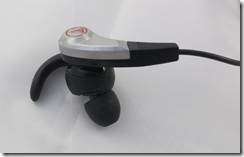
The distinctive feature of the SonicFuel range is the C-tip earpieces which have a short curved arm that fits snugly in the ear. The ear tips also rotate so that they angle themselves to the shape of your ear. The result is an exceptionally snug fit, and ear buds that are less likely to fall out when you are on the go. Three sizes of C-tips and four sizes of ear tips are supplied. It does pay to take some time selecting the right size, and journalists attending CES were fortunate to have assistance from an expert fitter.

image

The truth is that the sound you hear from ear buds does vary substantially according to how snugly they fit, and while not everyone can get a personal fitting at CES, it is essential to fit them correctly to get the best results. Fitting the tips to the ear buds is slightly fiddly, but you only have to do this once.

image

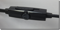
The in-line controller has a sliding volume control (a mixed blessing as you can accidentally slide it down and wonder where the volume has gone), a microphone and an answer button.

image

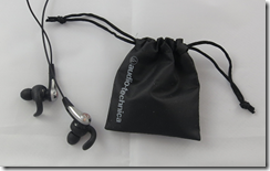
The headset is supplied with a handy bag for your headset and the spare gels.

image

So how do they sound? The biggest problem is that bass is lacking and the sound overall is thin. Slight sibilance can be annoying on some material. Tonally they are bright rather than warm, though not unpleasantly so. The best thing I can say is that they are inoffensive.

The specifications show an amazing frequency response of 15-22,000 Hz which is hard to reconcile with the puny bass, but since no +/- dB range is shown I guess this does not mean much.

Summary: I love the C-tips and the snug, strong fit; but the sound is a let-down. Possibly going a little further up the SonifFuel range would be worthwhile, though these are the only ones I have heard.

Review: Turtle Beach z300 headset. Super flexible, shame about the sound

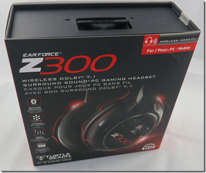
The Turtle Beach Z300 is a super flexible gaming headset, with wired and wireless connections, Dolby 7.1 virtual surround sound, and extra features like switchable dynamic range compression. It is primarily for PC gaming, but also works with Mac (no Dolby surround) and with any Bluetooth-compatible device – which means almost any smartphone or tablet. You can also use the wire to plug it into any device with a 3.5mm audio jack.

image

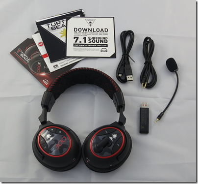
In the box you get the headset, detachable microphone, USB cable, jack cable, USB transceiver, and some documents including a note about having to download the Dolby 7.1 drivers. I still recommend downloading the online manual, which is more detailed than anything in the box.

image

A few more details on the three ways to connect:

Wireless via a USB transceiver. This is the preferred method for a PC. The USB transceiver is pre-paired and indicates via an LED whether or not the headset is connected.

Traditional wire. A jack cable is supplied which connects to the left earcup and has a standard four-way 3.5mm jack on the other end, suitable for a phone or tablet. In wired mode you still need to charge the headset and have it powered on.

Bluetooth. You can pair with up to two devices. The right earcup has Bluetooth volume controls, and a Bluetooth button for answering, rejecting and ending calls.

The actual headset seems sturdily made and features a fabric-covered headband and earpads. The material feels slightly coarse at first, and the earcups are slightly on the small side, but in practice I found the comfort reasonable.

The microphone is on a flexible boom and is detachable. You can also swing it up above the left earcup to get it out of the way.

You charge the Z300 via a mini USB port on the right earcup, which annoyingly is the old type, not the slightly smaller one now found on most phones and tablets. A cable is supplied, though it is too short to reach from the floor to your headset if you are wearing it, and in my case too short even to reach from the front panel of my PC. You might want to get a longer cable if you expect to charge while wearing. Play time is specified at 15 hours.

An annoyance: there is no indication of remaining charge.

How about the other controls? There are several:

Power on/off on the left earcup and easy to find by feel. The headset automatically powers off after 5 minutes of inactivity.

Master volume on left earcup.

Mic monitor volume on left earcup. This controls how much sound from the mic is fed back to your. It does not affect the volume heard on the other side.

Tone on left earcup: cycles through 4 “game modes”. These are Flat, Bass boost, Treble boost, and Bass and Treble boost. I generally used the Flat mode for this review.

Dynamic Range Compression on left earcup: raises the volume of quiet sounds. The effect seems minimal to me.

Bluetooth controls on right earcup: as mentioned above.

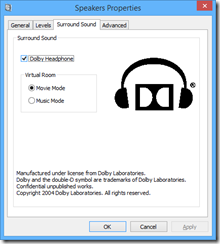
If you use the USB transceiver and a Windows PC you can insteall a Dolby 7.1 driver. Note: these are stereo headphones, but when used with this driver they support Dolby’s virtual surround system. You enable this by going into the Windows sound properties dialog (eg right-click the speaker icon and choose Playback Devices), then showing the properties dialog for the Turtle Beach speakers. A surround sound tab then lets you enable “Dolby Headphone”. You can also choose between two modes: Music or Movie.

image

Enabling Dolby Headphone makes a substantial difference to the sound. It is distinctly louder, and the sound seems to fill out more. On games with true surround sound, the virtual sound should mean that you get spatial clues about the source of an explosion or footstep, for example, though you need to make sure the game is set to output in surround sound.

I tried this and reckon it works a bit. It is not as good as a headset I tried that really did have multiple speakers. My big gripe though is that if you enable Dolby Headphone, it messes up true stereo, for example on music. You no longer hear the mix as intended.

This would not matter too much if it were easy to switch Dolby Headphone on and off, but it is a hassle to go into Windows sound controls every time. I would like to see more effort go into usability.

How about the sound quality? Here is my second big gripe about this headset. The sound is not great, with anaemic bass and a nothing special in the mid-range or treble. For gaming it is not too bad, and I did find the audio atmospheric if you can live without much bass thunder, but for music they are not good enough.

The microphone quality is fine. I tried the headset with Dragon Dictate, just to check the quality, and got high accuracy of transcription which is a good sign.

In summary, the flexibility is exceptional, the build quality is fine, but the sound is lacking. Personally I would not use these as my main headset because I do both gaming and music listening; but if your main use is gaming they would be OK.

Price is around $170 or £170 (better value in the USA it seems).

Review: Tommy Super Deluxe box by the who

I still remember the first time I encountered the Who’s Tommy LP. It was one of the early ones with a high gloss finish; the artwork is spectacular, with a triple fold that opens out with the track listing on the left and the lyrics to Amazing Journey on the right. There is also a booklet insert with the full libretto (it is a Rock Opera after all) and pictures.

image

What then do we expect from the Super Deluxe edition 44 years later? Given that this sells for £82.99 on Amazon.co.uk quite a lot. Here is what comes to mind – note this is NOT what is in the package, just my dreaming:

  • The original album in its original mix
  • The original album as remixed in 1996
  • The alternate version of Eyesight for the Blind, as on some UK editions of the LP
  • Other outtakes from the Tommy sessions
  • Tracks that presage Tommy such as Glow Girl from 1968, included on the Odds and Sods compilation. From Townshend’s notes on the song:
    • The reincarnation ploy comes at the end, where you hear ‘It’s a girl, Mrs. Walker, it’s a girl. When I came to write Tommy, I picked up that phrase and used it as the opening. That’s how Tommy became Tommy Walker, just because in this song which was worked on two years before, we had a little girl.
  • A live concert from the period.
  • Detailed notes on the recording sessions
  • The Tommy concept has had a long life. There is a Broadway version and a film. Would it be too much to expect the Original Cast soundtrack as well as the film here?
  • The original artwork in all its trifold glory

Unfortunately you do NOT get that here. Nothing like. Here is what you get:

  • A new remaster of the original mix of Tommy
  • A CD of Pete Townshend’s demos for the album, supplemented by two Who outtakes, Trying to Get Through and Young Man Blues (Studio version).
  • A “Live Bootleg album” for which we are not even told where the tracks were recorded, just “recorded live at various shows during the autumn of 1969”. It is said to be mostly from Ottawa.
  • A book including an essay by Richard Barnes, pictures from the original artwork and lyrics.
  • A Blu-Ray with a 5.1 DTS mix in 24/96 resolution and stereo PCM also in 24/96.

Now, there are certainly some good things here. In particular, the piece by Richard Barnes is excellent. I learned a lot about Tommy, and how the story ties in with Townshend’s admiration for the teaching of Meher Baba, and his interest in autism. There are also anecdotes like the story of how a fan was injured trying to get to Jim Morrison on stage at a Doors concert, which was apparently the inspiration for Sally Simpson.

It is also good to hear Townshend’s demos, though we have heard a lot of these over the years and there is nothing truly revelatory here; I do wonder if there are more interesting earlier demos in the vaults, as opposed to these which are close to what we hear performed by The Who in the finished album.

I enjoyed the studio version of Young Man Blues, apparently only previously released on a Track compilation LP The House that Track Built.

The Live Bootleg Album is a good listen too, though sound quality is not great and I would rather have a complete concert warts and all than one assembled from parts.

The high-resolution version on Blu-Ray seems to me somewhat superfluous especially given the age of the recording, though nice to have I suppose. There must be plenty of spare space on that Blu-Ray which makes the lack of extras like the original mix of the album even more frustrating.

Tommy in 5.1 surround is good to have though we already have one, on the 2004 SACD. I have not compared this one to the previous surround mix in detail.

image

What of the design of the package, essentially a hardback book in a slipcase, with cut-outs to hold the CDs and Blu-Ray in the back? It is decent quality, but I miss the tri-fold artwork and I do not feel this package does justice to the original.

I would have preferred a reproduction of the original album booklet insert as well as the tri-fold art in full size; as it is we only see it complete printed small on page 35 of the book.

As for the audio, why have the compilers omitted most of the band outtakes that were on the earlier Deluxe edition of Tommy? These included I Was, Cousin Kevin Model Child, Sally Simpson outtakes, Tommy’s Holiday Camp (Band version), and Dogs (Part2).

In summary then, while a nice enough package in itself, this falls short of what I would hope to see in a “super deluxe” Tommy edition and does not strike me as good value. A missed opportunity, sadly.

There is an argument that the earlier (and much cheaper) Deluxe edition is actually more interesting to the Who collector, with its more extensive outtakes as well as high quality stereo and 5.1 versions of the complete album.

That said, it does have Richard Barnes’ excellent long essay, which combined with the new live audio and some previously unheard Townshend demos means it is not a complete write-off.

Update: There are a few more details about the 1969 concert here, together with the offer of a free download:

We found an unreleased concert from Ottawa 1969 in our vaults, when all tapes from that tour were thought to have been destroyed. There was a complete performance of Tommy save for ‘I’m Free’, ‘Tommy’s Holiday Camp’ and ‘We’re Not Gonna Take It’, which were probably lost during tape changeover at the show. On the Box Set these tracks were replaced by 3 tracks from a show at Swansea in 1976, as no further recordings from 1969 were thought to exist. Since the Box Set was completed, two of the missing tracks,’Tommy’s Holiday Camp’ and ‘We’re Not Gonna Take It’,  have turned up. Although we know they are from the 1969 tour we don’t know the specific show, but we are offering them to fans this week as a free download.

Click HERE to download.