Category Archives: reviews

David Bowie: Welcome to the Blackout

The 21st April 2018 was Record Store Day, when the industry comes up with hundreds of special edition vinyl records which are offered for sale only through independent record shops. A helping hand for the independents, or a an attempt to con us into buying overpriced product via the old trick of artificial scarcity? Take your pick; but there’s no doubting that it gets thousands of people into record shops for at least one day in the year.

image

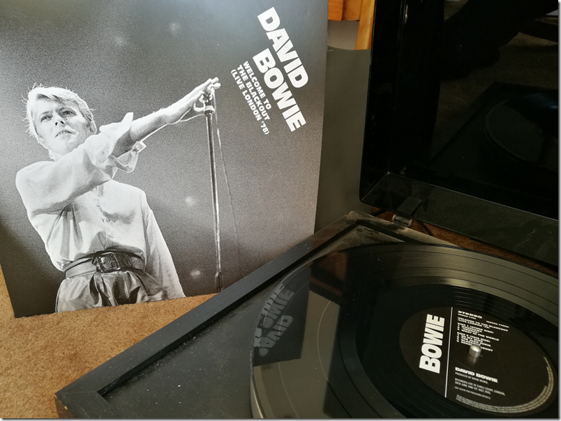
For me, the highlight this year was a 3LP David Bowie live release, called Welcome to the Blackout. Not least because it was recorded at Earls Court London on the evenings of 30 June and 1 July 1978, and well, I was there, at least on one of the nights (I am not sure which). I remember it was an amazing experience, and that the the set visuals including the vertical bars backdrop were stunning – apologies for the poor quality of the picture below, which is taken from here.

image

The Earls Court concerts were filmed by David Hemmings but the film was never released. However this might explain why the concerts were recorded by Tony Visconti and selected songs from the last two concerts were mixed by David Bowie and David Richards at Mountain Studios, Montreux between 17th and 23rd January 1979 (according to the sleevenotes). Two additional songs on Welcome to the Blackout, Sound and Vision and TVC 15, do not use Bowie/Richards mixes, perhaps because they were not selected at the time.

In 1978 David Bowie embarked on the ISOLAR II world tour, building on the release of Low and Heroes. The tour began in San Diego, March 1978, and ended in Tokyo, December 1978. Performances in Philadelphia in late April, and in Boston in early May, were recorded and formed the basis of the album Stage, first released in November 1978. Stage was originally just 17 songs, presented in a different order from that of the performance. In 2005 this was expanded to 20 songs, and the performance running order was restored, so that the opening track is the moody instrumental Warszawa. There was also a surround mix released on DVD Audio for a short time. Then in 2017 Stage was again reissued, now with 22 songs.

Since we already have Stage in so many guises, do we need Welcome to the Blackout? Having enjoyed this release for a couple of days, my answer is an emphatic yes. The Earls Court dates were at the end of the European leg of the tour, which did not resume until November in Australia. Bowie seems to be energised by this being in some sense the last concert of the tour and refers to this several times. He also performs two songs not on any version of Stage: Sound and Vision, and Rebel Rebel.

More important, the character of both the performance and the sound is different. There is simply more energy, and although the crowd noise is still mixed fairly low, it comes over as more of a live performance than the rather bland sound of Stage. We also get a longer Station to Station, under 9 minutes on Stage, and over 11 minutes here.

image

The band, the same one as for Stage, is outstanding:

Carlos Alomar: Rhythm guitar
Adrian Belew: Lead guitar
Dennis Davis: Drums and percussion
Simon House: Electric violin
Sean Mayes: Piano, string ensemble
George Murray: Bass guitar
Roger Powell: Keyboards, Synthesizer

I’ve compared several songs on Stage and Welcome to the Blackout. For example, the song Blackout itself, which is decently performed on Stage, is introduced here by Bowie saying hoarsely “Welcome to the Blackout”; the instrumentation at the beginning of the song is more menacing and engaging on the new release; the vocal is more frenetic and desperate.

In TVC 15, the opening loony voiceovers is louder and more distinct on Welcome to the Blackout; it sounds like the band is having a great time and the song is more fun to listen to.

Jean Genie is stunning on this album; the guitar growls and grinds, Bowie’s vocal is full of drama; it makes the Stage performance (only on the 2017 edition) sound tame.

Despite the occasional flub, I can’t find any instances where I prefer the Stage recording.

Of course the album is meant to be heard as a piece, and seems to me to be an excellent capture of one of Bowie’s best performances.

Having said that, this concert lacks the intensity of Bowie in 1974 or 1976. Bowie is more at ease here.

I was fortunate to catch Bowie in performance in 1978. His next tour was not until 1983, when we got a different kind of performance to support the more mainstream Let’s Dance album; and after that in 1987 with the unsatisfactory Glass Spider tour.

Full track listing:

Warszawa
”Heroes”
What in the World
Be my Wife
The Jean Genie
Blackout
Sense of Doubt
Speed of Life
Sound and Vision
Breaking Glass
Fame
Beauty and the Beast
Five Years
Soul Love
Star
Hang on to yourself
Ziggy Stardust
Suffragette City
Art Decade
Alabama Song
Station to Station
TVC15
Stay
Rebel Rebel

Finally a shout out to Ray Staff who mastered the album. On first listen he did a great job. I love the dynamics and the overall balance of the sound.

Recommended; and if you find the album hard to find at a sensible price, or don’t have a record player, there is no need to panic as it will probably be out on CD and download/streaming in a few months.

Update: Welcome to the Blackout is released on CD on 29 June 2018.

Review: Orbitsound Dock E30 one-box audio system with wireless charging aims to fix the problems of stereo

image

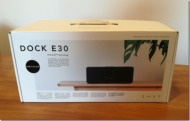
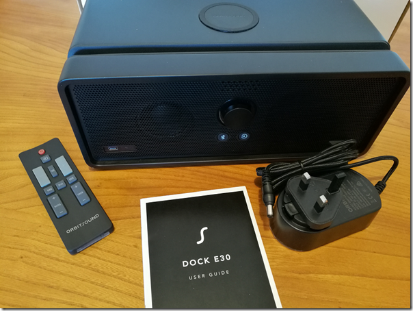
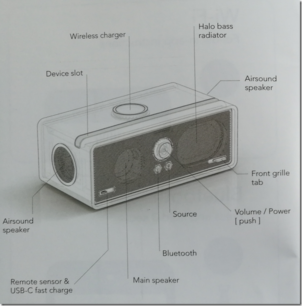
It is simple but appealing: one small box instead of all the clutter of a conventional hi-fi system. Orbtisound’s Dock E30 is also designed for today’s audio ecosystem. It supports wireless playback with Apple AirPlay, Spotify Connect, Android audio streaming over Wi-Fi, and also Bluetooth aptX and wired input via analogue or optical digital signals. There is an app for iOS and Android, and you can even dock your phone either by sitting it in the groove provided, handy for seeing cover art. You can also charge a phone using the built-in Qi wireless charging (as used by Apple), or by connecting a cable (not supplied) to a USB-C charging support. For wireless charging though you should lay the phone flat on the charging plate rather than standing it up.

image

Wireless charging aside, this is all what you expect from a modern audio system; but the Dock E30 has something distinctive. This is the technology called Airsound. Orbitsound says that the problem with conventional stereo is that you have to sit in a sweet spot dead centre between and in front of the speakers to get a true audio image. “We have managed to overcome this inherent limitation in stereo by doing away with the idea of left and right channels,” says Orbitsound. What they have come up with, explained to some extent here and here, is a three-speaker system, where the sound of the main front speaker is modified by two “spatial” side speakers to give, it is claimed, a stereo experience wherever you sit. There is said to be a particular advantage when you have more than one speaker connected.

Orbitsound’s explanation of Airsound is sketchy, to say the least, but it helped me to understand the results of my listening tests. I set up the Dock E30 in my living room and tried it using various types of connection from both iOS and Android. For the main listening test though I settled on wired input for maximum consistency. I compared the E30 with several other speaker systems, including the slightly more expensive Sony SRS-X9 (now replaced by the similar SRS-X99).

First impressions are good, with a powerful bass reinforced by the passive bass radiators on the back of the unit. The power output is not specified, but I got plenty enough volume for my smallish living room. I tried walking round the room and found a good consistency of sound, though frankly the SRS-X9 which uses conventional stereo speakers was also pretty good in this respect.

How does the sound compare to that from the Sony? I found my notes contradictory at first. I felt the sound, while decent, was smoother and better defined on the Sony than on the Dock E30. At the same time, I could sometimes hear details on the Dock E30 more clearly than on the Sony. One example was the delicate guitar in the background during the intro to Steely Dan’s song Peg (which is beautifully recorded). It was more prominent on the Dock E30, even though overall I felt that the Sony had more clarity.

Pondering Orbitsound’s claim of a true stereo image wherever you sit, I pulled out a handy test track, Paul Simon’s Cars. In the middle of the track there is a little stereo effect. “You can drive them on the left” comes out of the left speaker, then “you can drive them on the right” from the right. Then Simon resumes singing in a central position.

I have to say, the Dock E30 made a complete mess of this effect. Bizarrely, the “on the right” vocal projected to the left of the image. On the Sony, everything was as it should be, so no, I had not got the channels reversed anywhere. Bear in mind that the Dock E30 only has one front-facing speaker; the other drive front-facing driver is a passive bass radiator.

image

Audio processing: pros and cons

In the end this is all about processing. Orbitsound is trying to get a sense of room-filling stereo from a small box. It does this by munging the stereo signal into a mono part on the main speaker, supplemented by two spatial effects speakers that fire outwards from the left and right ends of the Dock E30, using some kind of algorithm that is not really designed to give you a true stereo image, but rather to create an illusion of depth.

This I believe explains why I found the sound perplexing at times. Some details might be brought out more prominently, others not.

You can adjust the Airsound effect by holding down mute for three seconds on the remote, then spinning the volume dial. If you adjust it for minimum Airsound, you get something close to mono. This is not a bad thing; I love my mono Squeezebox Radio. If you adjust for maximum Airsound, the sound become echoey and phasey, something which is not to my taste but might be an effect you enjoy.

Setting Airsound to minimum is close, but I would like to see an option to disable it completely and simply have mono, though that would be rather a waste of three speakers.

Don’t worry, just listen?

Listening to the stereo effects in Cars is an edge case. I found the Dock E30 enjoyable to listen to with music from classical to jazz to pop and rock. It has good bass extension, which can be excessive at times, but is easily controlled using the tone controls on the remote. Most people are not going to worry about the processing and can just listen.

Personally though I am more purist. I favour a less processed sound and prefer the clean, honest clarity of a system like the Sony XRS X9.

image

A good buy?

Leaving aside the Airsound debate, the Dock E30 offers good sound quality with exceptional bass for its size.

The design is subjective of course, but while it is not objectionable, there are better-looking speaker systems in my opinion. The groove on top may trap dust, and the controls on the front are not beautiful.

On the other hand, I am very happy with the flexibility of the unit. It has a generous range of inputs, both wired and wireless. The remote with its tone controls and mute button is excellent.

The ability to charge your phone is a nice bonus.

Unfortunately I am not convinced by Airsound or that this is the best use of three speaker drivers; but at the same time it is good to see some innovative thinking. I recommend that you audition before purchase.

Specifications

Frequency response: 70Hz-17.5kHz +/- 3dB

Tone controls: Bass and treble, +/- 8dB

Drivers: 3 x 48mm neodymium drivers, 3 x 90x60mm passive bass radiators

Optional subwoofer

Removable magnetic grille

Remote

Dimensions: 291x150z114mm

Weight: 4kg

Colour: Black, Bamboo or White

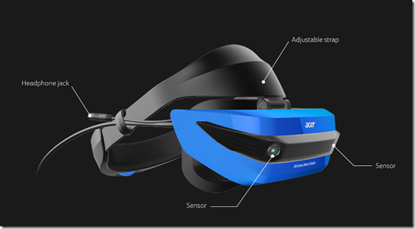
Windows Mixed Reality: Acer headset review and Microsoft’s (lack of) content problem

Acer kindly loaned me a Windows Mixed Reality headset to review, which I have been trying over the holiday period.

First, an aside. I had a couple of sessions with Windows Mixed Reality before doing this review. One was at IFA in Berlin at the end of August 2017, where the hardware and especially the software was described as late preview. The second was at the Future Decoded event in London, early November. On both occasions, I was guided through a session either by the hardware vendor or by Microsoft. Those sessions were useful for getting a hands-on experience; but an extended review at home has given me a different understanding of the strengths and weaknesses of the product. Readers beware: those rushed “reviews” based on hands-on sessions at vendor events are poor guides to what a product is really like.

A second observation: I wandered into a few computer game shops before Christmas and Windows Mixed Reality hardware was nowhere to be seen. That is partly because PC gaming has hardly any bricks and mortar presence now. Retailers focus on console gaming, where there is still some money to be made before all the software becomes download-only. PC game sales are now mainly Steam-powered, with a little bit of competition from other download stores including GOS and Microsoft’s Windows Store. That Steam and download dominance has many implications, one of which is invisibility on the High Street.

What about those people (and there must be some) who did unwrap a Windows Mixed Reality headset on Christmas morning? Well, unless they knew exactly what they were getting and enjoy being on the bleeding edge I’m guessing they will have been a little perplexed and disappointed. The problem is not the hardware, nor even Microsoft’s implementation of virtual reality. The problem is the lack of great games (or other virtual reality experiences).

This may improve, provided Microsoft sustains enough momentum to make Windows Mixed Reality worth supporting. The key here is the relationship with Steam. Microsoft cheerfully told the press that Steam VR is supported. The reality is that Steam VR support comes via preview software which you get via Steam and which states that it “is not complete and may or may not change further.” It will probably all be fine eventually, but that is not reassuring for early adopters.

image

My experience so far is that native Windows MR apps (from the Microsoft Store) work more smoothly, but the best content is on Steam VR. The current Steam preview does work though with a few limitations (no haptic feedback) and other issues depending on how much effort the game developers have put into supporting Windows MR.

I tried Windows MR on a well-specified gaming PC: Core i7 with NVIDIA’s superb GTX 1080 GPU. Games in general run super smoothly on this hardware.

Getting started

A Windows Mixed Reality headset has a wired connection to a PC, broken out into an HDMI and a USB 3.0 connection. You need Windows 10 Fall Creators Update installed, and Setup should be a matter of plugging in your headset, whereupon the hardware is detected, and a setup wizard starts up, downloading additional software as required.

image

In my case it did not go well. Setup started OK but went into a spin, giving me a corrupt screen and never completing. The problem, it turned out, was that my GPU has only one HDMI port, which I was already using for the main display. I had the headset plugged into a DisplayPort socket via an adapter. I switched this around, so that the headset uses the real HDMI port, and the display uses the adapter. Everything then worked perfectly.

The controllers use Bluetooth. I was wary, because in my previous demos the controllers had been problematic, dropping their connection from time to time, but these work fine.

image

They are perhaps a bit bulky, thanks to their illuminated rings which are presumably a key part of the tracking system. They also chew batteries.

The Acer headsets are slightly cheaper than average, but I’ve enjoyed my time with this one. I wear glasses but the headset fits comfortably over them.

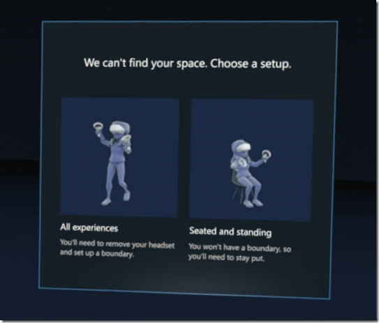
A big selling point of the Windows system is that no external tracking sensors are required. This is called inside-out tracking. It is a great feature and makes it easier just to plug in and go. That said, you have to choose between a stationary position, or free movement; and if you choose free movement, you have to set up a virtual boundary so that you do not walk into physical objects while immersed in a VR experience.

image

The boundary is an important feature but also illustrates an inherent issue with full VR immersion: you really are isolated from the real world. Motion sickness and disorientation can also be a problem, the reason being that the images your brain perceives do not match the physical movement your body feels.

Once set up, you are in Microsoft’s virtual house, which serves as a kind of customizable Start menu for your VR experiences.

image

The house is OK though it seems to me over-elaborate for its function, which is to launch games and apps.

I must state at this point that yes, a virtual reality experience is amazing and a new kind of computing. The ability to look all around is extraordinary when you first encounter it, and adds a level of realism which you cannot otherwise achieve. That said, there is some frustration when you discover that the virtual world is not really as extensive as it first appears, just as you get in an adventure game when you find that not all doors open and there are invisible barriers everywhere. I am pretty sure though that a must-have VR game will come along at some point and drive many new sales – though not necessarily for Windows Mixed Reality of course.

I looked for content in the Windows Store. It is slim pickings. There’s Minecraft, which is stunning in VR, until you realise that the controls do not work quite so well as they do in the conventional version. There is Space Pirate, an old-school arcade game which is a lot of fun. There is Arizona Sunshine, which is fine if you like shooting zombies.

I headed over to Steam. The way this works is that you install the Steam app, then launch Windows Mixed Reality, then launch a VR game from your Steam library. You can access the Windows Desktop from within the Windows MR world, though it is not much fun. Although the VR headset offers two 1440 x 1440 displays I found it impossible to keep everything in sharp focus all the time. This does not matter all that much in the context of a VR game or experience, but makes the desktop and desktop applications difficult to use.

I did find lots of goodies in the Steam VR store though. There is Google Earth VR, which is not marked as supporting Windows MR but works. There is also The Lab, which a Steam VR demo which does a great job of showing what the platform can do, with several mini-games and other experiences – including a fab archery game called Longbow where you defend your castle from approaching hordes. You can even fire flaming arrows.

image
Asteroids! VR, a short, wordless VR film which is nice to watch once. It’s free though!

Mainstream VR?

Irrespective of who provides the hardware, VR has some issues. Even with inside-out tracking, a Windows Mixed Reality setup is somewhat bulky and makes the wearer look silly. The kit will become lighter, as well as integrating audio. HTC’s Vive Pro, just announced at CES, offers built-in headphones and has a wireless option, using Intel’s WiGig technology.

Even so, there are inherent issues with a fully immersive environment. You are vulnerable in various ways. Having people around wearing earbuds and staring at a screen is bad enough, but VR takes anti-social to another level.

The added expense of creating the content is another issue, though the right tools can do an amazing job of simplifying and accelerating the process.

It is worth noting that VR has been around for a long time. Check out the history here. Virtual Reality arcade machines in 1991. Sega VR Glasses in 1993. Why has this stuff taken so long to take off, and remains in its early stages? It is partly about technology catching up to the point of real usability and affordability, but also an open question about how much VR we want and need.

The threat from insecure “security” cameras and how it goes unnoticed by most users

Ars Technica published a piece today about insecure network cameras which reminded me of my intention to post about my own experience.

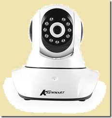
I wanted to experiment with IP cameras and Synology’s Surveillance Station so I bought a cheap one from Amazon to see if I could get it to work. The brand is Knewmart.

image

Most people buying this do not use it with a Synology. The idea is that you connect it to your home network (most will use wifi), install an app on your smartphone, and enjoy the ability to check on how well your child is sleeping, for example, without the trouble of going up to her room. It also works when you are out and about. Users are happy:

So far, so good for this cheap solution for a baby monitor. It was easy to set up, works with various apps (we generally use onvif for android) and means that both my wife and I can monitor our babies while they’re sleeping on our phones. Power lead could be longer but so far very impressed with everything. The quality of both the nightvision and the normal mode is excellent and clear. The audio isn’t great, especially from user to camera, but that’s not what we bought it for so can’t complain. I spent quite a long time looking for an IP cam as a baby monitor, and am glad we chose this route. I’d highly recommend.

My needs are a bit different especially as it did not work out of the box with Surveillance Station and I had to poke around a bit. FIrst I discovered that the Chinese-made camera was apparently identical to a model from a slightly better known manufacturer called Wanscam, which enabled me to find a bit more documentation, but not much. I also played around with a handy utility called Onvif Device Manager (ONVIF being an XML standard for communicating with IP cameras), and used the device’s browser-based management utility.

This gave me access to various settings and the good news is that I did get the camera working to some extent with Surveillance Station. However I also discovered a number of security issues, starting of course with the use of default passwords (I forget what the admin password was but it was something like ‘password’).

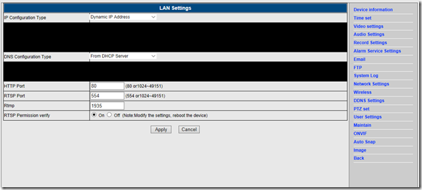
The vendor wants to make it easy for users to view the camera’s video over the internet, for which it uses port forwarding. If you have UPnP enabled on your router, it will set this up automatically. This is on by default. In addition, something strange. There is a setting for UPnP but you will not find it in the browser-based management, not even under Network Settings:

image

Yet, if you happen to navigate to [camera ip no]/web/upnp.html there it is:

image

Why is this setting hidden, even from those users dedicated enough to use the browser settings, which are not even mentioned in the skimpy leaflet that comes with the camera? I don’t like UPnP and I do not recommend port forwarding to a device like this which will never be patched and whose firmware has a thrown-together look. But it may be because even disabling UPnP port forwarding will not secure the device. Following a tip from another user (of a similar camera), I checked the activity of the device in my router logs. It makes regular outbound connections to a variety of servers, with the one I checked being in Beijing. See here for a piece on this, with regard to Foscam cameras (also similar to mine).

I am not suggesting that there is anything sinister in this, and it is probably all about registering the device on a server in order to make the app work through a peer-to-peer network over the internet. But it is impolite to make these connections without informing the user and with no way that I have found to disable them.

Worse still, this peer-to-peer network is not secure. I found this analysis which goes into detail and note this remark:

an attacker can reach a camera only by knowing a serial number. The UDP tunnel between the attacker and the camera is established even if the attacker doesn’t know the credentials. It’s useful to note the tunnel bypasses NAT and firewall, allowing the attacker to reach internal cameras (if they are connected to the Internet) and to bruteforce credentials. Then, the attacker can just try to bruteforce credentials of the camera

I am not sure that this is the exact system used by my camera, but I think it is. I have no intention of installing the P2PIPC Android app which I am meant to use with it.

The result of course is that your “security” camera makes you vulnerable in all sorts of ways, from having strangers peer into your bedroom, to having an intrusion into your home or even business network with unpredictable consequences.

The solution if you want to use these camera reasonably safely is to block all outbound traffic from their IP address and use a different, trusted application to get access to the video feed. As well as, of course, avoiding port forwarding and not using an app like P2PIPC.

There is a coda to this story. I wrote a review on Amazon’s UK site; it wasn’t entirely negative, but included warnings about security and how to use the camera reasonably safely. The way these reviews work on Amazon is that those with the most “helpful votes” float to the top and are seen by more potential purchasers. Over the course of a month or so, my review received half a dozen such votes and was automatically highlighted on the page. Mysteriously, a batch of negative votes suddenly appeared, sinking the review out of sight to all but the most dedicated purchasers. I cannot know the source of these negative votes (now approximately equal to the positives) but observe that Amazon’s system makes it easy for a vendor to make undesirable reviews disappear.

What I find depressing is that despite considerable publicity these cameras remain not only on sale but highly popular, with most purchasers having no idea of the possible harm from installing and using what seems like a cool gadget.

We need, I guess, some kind of kitemark for security along with regulations similar to those for electrical safety. Mothers would not dream of installing an unsafe electrical device next to their sleeping child. Insecure IoT devices are also dangerous, and somehow that needs to be communicated beyond those with technical know-how.

Mio MiVue 688: record your driving

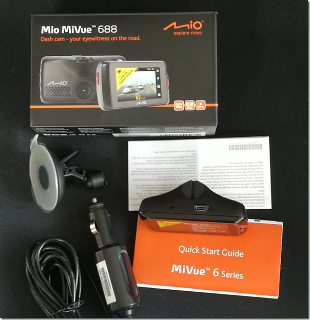
The Mio MiVue 688 is a high quality dashcam which will record your journeys as well as alerting you to lane drift and speed cameras.

image

In the box is the device itself – around 90 x 45 x 37mm – together with a vehicle power adapter and a suction mount. You will need a couple more things to get going: a Micro SD memory card (8GB to 128GB) and a USB Mini-B to type A cable, presuming you want to connect it to a PC. It is always annoying to find that that you have to buy extras, though you may have some spares anyway, and also annoying that MiVue still use the older Mini-B connector which is relatively uncommon now.

The MiVue 688 has a rechargeable battery, though for full use you will want to keep it powered continuously with the adapter.

After charging, the first thing you will want to do is to set the date and time as well as your preferred distance measure. Being in the UK I set it to miles.

In doing so, you will get an idea of how the MiVue’s controls work. There is a nice bright LED colour display, but it is not touch control. Instead, there are 6 buttons:

  • Power button on the left edge
  • Event button (for emergency recording) on the front right
  • Four function buttons on the right edge

The control system is not all that intuitive. By default the unit records when it is on. The function keys come into play when you go into the menu. The top key is the menu key; it displays or exits the current menu. The next key is Enter. The two lower keys are cursor keys. At first you might think that the buttons align with the menu item you want to operate, but they do not. Of course you are not intended to operate this fiddly menu system while driving.

The normal use is that recording starts as soon as the unit receives power, in other words when you start the engine. It then records continuously, creating 3-minute video files. If it runs out of space it overwrites old files.

When you start recording you get a view of what it is recording on the screen. After a short time, this blanks out and you just get the time. However it is still recording.

The device has a Sony Exmor video processor, does 1080p video recording and displays on a 2.7″ screen. It has an F1.8 aperture and a 140⁰ wide angle lens.

The MiVue 688 in use

I tried the MiVue on a 3-hour journey on a rather damp day. The first challenge is mounting the MiVue, the main problem being getting the power cable connected without it hanging dangerously or getting in the way. I found some short lengths of gaffer tape essential, to secure the cable to the edge of the windscreen. The MiVue cable is fortunately fairly long.

I then sited the camera towards the top of the windscreen. Again, care is needed as you do not want it to obscure your view.

I found the way the device works confusing at first. In particular, I thought that when the screen changed from the live recording to the clock, that recording had stopped. It was only when I got back and connected the device to a PC that I realised the entire journey was on video. I do think this is preferable; despite the emergency button, you want the recording to happen without having to think about it.

image

My journey passed without incident, but having a recording, given how simple this is to achieve, does make sense. If you are the innocent party in a collision, it will provide crucial evidence. Note that it records your speed and exact location as it goes, thanks to built-in GPS. A side-effect of having a dashcam may be that you are less inclined to take chances, knowing that there will be evidence.

When we parked, I removed the MiVue, because I did not want the embarrassment of risking theft of my loan gadget. This is a dilemma, as the MiVue has a parking function that will automatically record if it detects a collision when parked. If you think someone might steal the device though, that will not help you.

Annoyances

Wiring up the MiVue all felt a bit DIY and it would be good to see provision for dashcams built into modern vehicles. I also found several nits with the MiVue:

  • Menu system not intuitive
  • Old type of USB connector
  • Getting started leaflet barely adequate (you can download a slightly better manual)
  • Packaging does not make it clear that you need to supply your own memory card and USB cable – as well as Gaffer tape or equivalent

Extras

On the plus side, there are a few extras. The safety camera warnings worked, though if you have SatNav of some kind you probably already have this. There is the parking function mentioned above. The speed always shows, and since this is more accurate than my in-car speedometer this is a benefit.

A camera feature lets you take still images. Could be handy after an incident.

A motion sensor kicks in a recording automatically in the event of sudden movement. This also tends to happen when handling the unit, for example connecting it to a PC!

There are also some Advanced Driver Assistance features. Specifically, this covers Lane Departure Warning (could be a life-saver if you fell asleep), which beeps if you drift out of your lane; and Front Collision Warning System which beeps if it thinks you are driving too close to the vehicle in front.

These are handy features, but require regular calibration to work. You have to tell the MiVue where is the horizon and where is the end of your bonnet (hood). You cannot do this while driving so require a passenger.

I would have thought the AI for this kind of feature could do this calibration automatically as systems like this evolve.

MiVue Manager

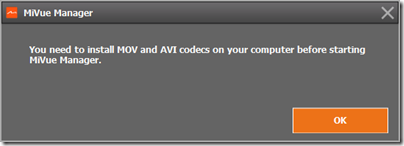
You can download a MiVue Manager app to help you view your videos. I did not get on well with this. The first annoyance was that the MiVue Manager app insists on running with admin rights on Windows. Next, I found it still did not work because of missing codecs.

image

However I can view the videos fine using the Windows 10 built-in app, or VLC. So I gave up on the MiVue Manager.

Conclusion

The MiVue 688 will cost you around £150 and works well. As noted above though, there are some annoyances and you might prefer a touch control unit like the 658, which is a similar price.

I am still impressed. The quality of the video is very good, and this MiVue provides significant benefit at modest cost.

More information here.

A portrait of Bowie by Brian Hiatt

Somewhere I’ve got a book, “David Bowie in his own words.” Sadly Bowie is no longer with us, and we have to make do with David Bowie in other people’s words. Here are some good ones.

image

This book is subtitled “A tribute to Bowie by his artistic collaborators and contemporaries,” which describes it exactly. It’s been put together by Rolling Stone writer Brian Hiatt, who conducted the interviews, and I doff my cap to him: he’s managed to ask the right people the right questions, and assemble the results into a tasteful and compelling portrait.

The first contributor is George Underwood, a schoolfriend who became an a artist and contributed to some of Bowie’s album covers.

Amazingly, George Underwood left a message for Bowie on his answerphone in 1976 or thereabouts, saying “I’m happy, hope your happy too.” The words later turned up on Ashes to Ashes. “But I don’t know if I’m the Action Man,” writes Underwood.

Then there’s Dana Gillespie, an early singer friend for whom Bowie wrote the song Andy Warhol, though it first appeared on Hunky Dory.

And Mike Garson, who is fascinating about the tension of being a classical and jazz pianist and working with a rock musician. “There was a part of me for sure that recognized his genius … but let me tell you for sure, there was another part of me at the time that just thought, this is way below my gift and abilities.”

He later remarks, “I was the longest member in the band, when you put all the hours and tours together.”

Earl Slick writes frankly about his work with Bowie. I was interested in his remarks about recording Station to Station. “He was not as out of control as he was made out to be, in terms of his functionality. When he got his mind into something he could hyper-focus like a _. I don’t care if he was living on milk.”

He also reveals that there was nearly a tour after the Reality tour. “There were about three or four close calls where I did get phone calls, and I was put on hold to tour, but it didn’t happen.”

And later Slick writes, “there were parts of David that you could never get through.”

Carlos Alomar: “The master puppeteer actually did know what he was doing, and not only can you understand that now, but you see it play out constantly on all those albums.”

He also recounts his goodbye. “I saw David at Tony Visconti’s birthday partly last year and he was very very fragile. In hindsight, I can see what was happening … we talked about old times and it was good to talk about things, heal old wounds … now I understand it was that goodbye.”

Artist Derek Bosher tells a story about Bowie being photographed. “As we were chatting the PR person came over and said, David, there’s a photographer here from Paris Match. David, in real life, used to always walk quite slowly and talk quietly, he never shouted, different from the almost narcissistic public persona. … they start shooting and he becomes David Bowie. And then straight after that, he said, “Let’s go sit down again. It was like watching Clark Kent going into the telephone booth and becoming Superman, then turning back.”

And Nile Rodgers, of Chic, says Bowie really did call him up and say, “you do hits, I’d like you to do a record of hits” – it became, of course, Let’s Dance. His account of how it was recorded is incredible, gripping. I won’t spoil it for you by quoting everything.

This isn’t a picture book, but it is illustrated with around 40 photos and artworks most of which I had not seen before. The printing is high quality and this is just a lovely book, you will know Bowie better after reading it.

The only thing I don’t much like is the cover, which looks rather cheap to me, not hinting at the wonders within. And I suppose there are other contributors it would have been nice to see included, Brian Eno, Robert Fripp, Tony Visconti and more; but you never get everyone in a project like this.

The full list of contributors:

George Underwood
Dana Gillespie
Mike Garson
Toni Basil
Earl Slick
Carlos Alomar
Debbie Harry and Chris Stein
Martyn Ware
Derek Boshier
Nile Rodgers
Stephen Finer
Gail Ann Dorsey
Zachary Alford
Cyndi Lauper
Robyn Hitchcock

image

Meizu M3 Max: Android 6.0 phablet, good value if you don’t mind Flyme OS

Meizu, one of the top ten smartphone manufacturers in China, has just brought out the M3 Max, an Android 6.0 phablet currently on offer for $224.99 (around £185), which seems great value for a 6.0″ smartphone complete with dual SIMs slots and fingerprint reader. I have been using it for a while to see how it stacks up against the competition.

image

My M3 Max is a sample, and while I believe it matches the production model in terms of hardware, you may find a few more concessions to non-Chinese users in the version for European and US markets. That said, my sample does include the Google Play Store and a thing called GMS Installer which assists installation of the Google Mobile Services required for Google-flavoured Android, which is what most users in countries like the UK and USA require.

This was my first experience of Meizu’s Flyme OS, a custom version of Android, and the distinctive one-button control. The front button on the M3 Max has multiple functions. Tap lightly and it is a back button. Press and click and it is a home button. Rest your finger and it is a fingerprint reader. And if you are wondering how to switch applications, that is a swipe up from the bottom of the screen.

I like having a hardware button, but I am not convinced that one button improves on the traditional Android three buttons: back, home, and app switcher. I also prefer the fingerprint reader on the back, as on recent Huawei phones. That said, I soon got used to it. You can register more than one fingerprint, and I found it useful to register my right thumb I can pick up the phone and tap my thumb on the front to unlock it.

Setting the phone up was a little more challenging than with Android devices designed primarily for our market. Meizu/Flyme has alternative apps for common requirements such as web browser, maps, music and even app store. I found myself downloading a bunch of apps to get a more familiar experience, including the Google Chrome browser, OneDrive, Outlook, Twitter, Facebook and Spotify. I did have a few issues with the Play store initially – it would open and immediately crash – but things seemed to settle down after I applied a few updates.

There are a few compromises in a phone at this price point. The fingerprint reader is not the equal of the one on the Huawei P9 or Honor 8, for example, taking longer to register my fingerprint and requiring slightly more careful positioning to read it, but it still works satisfactorily. In day to day use I have no complaints about the responsiveness of the OS or the battery life.

Physically the M3 Max has a metal body and a smooth finish. The design is straightforward but pleasant enough. The case is 7.9mm thick, which makes it a relatively thin device if that is important to you. It is somewhat heavy though, about 190g, though in return you get a reassuringly solid feel.

The Flyme skin supports floating windows after a fashion.

image

Even on a 6″ device though, it is not all that useful since you can only really make use of one app at a time.

Swipe down from the top to reveal notifications and the usual array of Android shortcuts.

image

The camera is nothing spectacular but does cover most of the features you are likely to want. Tap the Auto button to reveal popular features like Panorama and Macro. This is also the route to video recording.

image

If you choose Manual on this screen, you can make your own settings for
Exposure time

  • ISO
  • Focus
  • Exposure compensation
  • Saturation
  • Contrast
  • White balance

A decent range of controls.

The Settings button lets you specify photo size as well as other features like grid lines.

image

Benchmarks and specifications

I ran some benchmarks. PC Mark came up with a score of 3156 for its Work 2.0 performance.

image

Geekbench 4.0.1 delivered:

  • 1475 RenderScript Score
  • 683 Single-Core Score
  • 2670 Multi-Core Score

While these results are unexciting, at this price point they are more than reasonable.

Specifications

  • Android 6
  • ARM MT6755M 1 GHz 8 core CPU
  • 6” display, 1080×1920, 480 ppi
  • Capacitive touch screen
  • GPS
  • 3GB RAM
  • 64GB storage
  • Second SIM slot can also be used for up to 128GB SD card
  • Mali-T860 GPU
  • 13MP rear camera
  • 5MP front camera
  • 4100 mAH battery
  • Weight 190g
  • Size 163.4 x 81.6 x 7.9mm

Conclusion

Meizu is not a well-known brand in the UK or USA, but they are a major Chinese vendor, though pitching towards the lower end of the market. This is a good value device and a solid choice if you are looking for a phablet-style phone in this price range and can put up with a slightly less familiar Android experience.

You can purchase from here.

Review: Libratone Zipp Mini

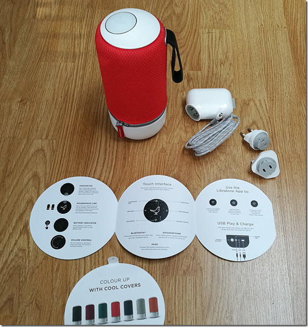
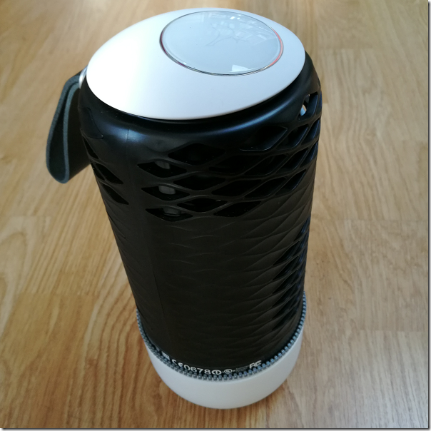
I am quite taken with this Libratone wireless speaker, though I had a few setup hassles. The device comes in a distinctive cylindrical box with a nightingale image on the top. Unpack it and you get a medium-size desktop (or table or shelf) speaker, around 22cm high, with a colourful cover that looks zipped on and a carry strap. There is also a power supply with UK and European adaptors, and a very brief instruction leaflet.

image

Plug in, and the device starts charging. The leaflet says to download the app (for iOS or Android) and “set up and play”. It was not quite so easy for me, using Android. The app is over-designed, by which I mean it looks great but does not always work intuitively. It did not find the speaker automatically, insisted that a wi-fi connection was better than Bluetooth, but gave me no help connecting.

After tinkering for a bit I went to the website and followed the steps for manual wi-fi setup. Essentially you temporarily disconnect https://www.itwriting.com/blog your normal Wi-fi connection, connect your wi-fi directly to the Zipp, go to 192.168.1.1 in the browser, select your home wi-fi network, enter the password, and you are done.

Everything worked perfectly after that. I fired up Spotify, played some music, selected the Zipp under Spotify Connect, and it sounded great. For some Android apps you may need a Bluetooth connection though, or you can use DLNA. The beauty of Spotify Connect is that the connection is direct https://www.itwriting.com/blog the speaker to the internet, it does not depend on the app running, so you can switch off your phone and it still plays. It is actually a better solution than Apple Airplay for internet streaming.

image
The Nightingale button

Control is either via the app, or through the Nightingale button on the top of the speaker. The button works really well. Tap to pause or resume. Slide finger clockwise or anti-clockwise for volume. Skip forward or back by tapping the right or left edge. Then there is a neat “hush” feature: place your hand over the button and it mutes temporarily.

A bit more about the sound. Although this is the smaller Zipp Mini, you can tell that Libratone has taken trouble to make it sound good, and it is impressively rich and full considering the size of the unit. You are getting your money’s worth, despite what seems a high price.

I spent some time comparing the Zipp with Squeezebox Radio, another (but sadly discontinued) wireless audio device I rate highly. Both are mono, both sound good. I did notice that the Zipp has deeper bass and a slightly softer more recessed treble. I cannot decide for sure which sounds better, but I am slightly inclined towards the Libratone, which is actually high praise.

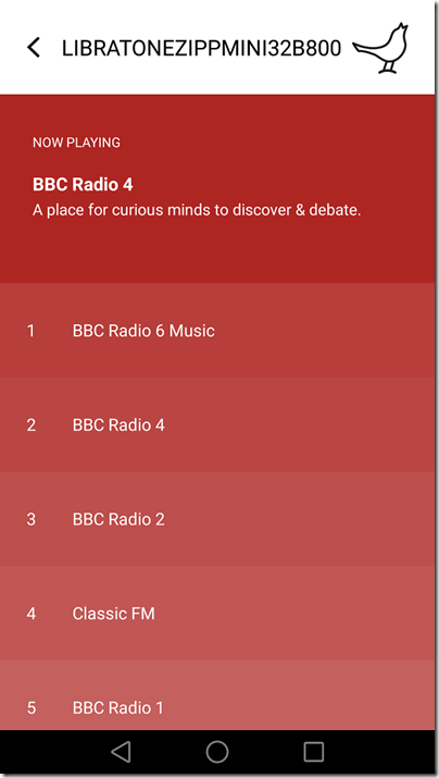
One lovely feature of the Zipp is internet radio, which comes via Vtuner. This is hidden in the feature called Favourites. You select favourite radio stations in the app, with the default being BBC stations and Classic FM. You can change your favourites by tapping the Nightingale icon in the app (another hidden, over-designed feature) and tapping My Radio.

image

Once set up, tap the heart button on the Nightingale button on the device to switch to radio. Tap twice to skip to the next station. Internet radio does not depend on having the app running, it works directly https://www.itwriting.com/blog the Zipp.

The Zipp has a power button, press and hold to power on or off, tap to show remaining battery. It also has an aux jack socket, for wired playback https://www.itwriting.com/blog any source, and a USB socket which you can use either for charging a phone, or for playback https://www.itwriting.com/blog music files on USB storage (I did not try this, but a wide range of formats are supported, including MP3, WAV, FLAC, Ogg Vorbis, WMA, AAC, AIFF and ALAC). You can also use USB for wired playback https://www.itwriting.com/blog iOS, but not https://www.itwriting.com/blog other devices.

Apple Airplay is supported and worked great when I tried it with an iPad. One thing to note: there is currently no iPad app, so you have to search for the iPhone app, which does also work on the iPad.

This very flexible device also supports Bluetooth 4.1 and you can use it as a speaker phone, just tap the Nightingale button to answer a call, so yes it has a microphone too. It also supports DLNA which means you can “play to” the device on some applications, such as Windows Media Player.

If you have more than one Zipp you can connect them for multi-speaker playback. You can select Stereo if you have two speakers or more, but Libratone recommend something they call FullRoom, which means leave it to their digital signal processing (DSP).

Sadly I only have one Zipp, but there are a few options in the app to set DSP optimization for things like Outdoor, Shelf and Floor. I did not notice a huge difference.

You can get different colour covers, and I tried removing mine. It is a bit fiddly, and the current Zipp Mini does not quite match the explanation on the Libratone site. The handle on this Zipp does not come off; you unzip the cover, twist to disconnect the zip, then feed the handle through the hole. Not something you are likely to do often.

image
The device naked

Finally, if you are curious like me, here are some specifications:

  • Class D amplifier
  • 1 x 3” woofer, 1 x 1” tweeter 2 x 3.5” low frequency radiators
  • Frequency response 60-20,000 Hz (no dB range specified)
  • Maximum volume 96 dB SPL/1m
  • 2400 mAhs battery
  • Bluetooth 4.1
  • 10 hours of playback approx.

Conclusion? I really like the Zipp Mini. It sounds great, supports a wide range of standards, and works well for Internet radio. I like the appearance, the Nightingale button is elegant, and you can expand it with more speakers if needed. This or the larger Zipp model might be all the hi-fi you need.

Caveats: many of the features are a bit hidden, initial setup I found fiddly, the supplied instructions are hopelessly inadequate, and with all those choices it can get confusing.

No matter, it is a lovely device.

More information on the vendor’s site here.

Honor 8 smartphone first look

I’m just back from Paris and the European launch of the Honor 8 smartphone.

Honor is wholly owned by Huawei though the relationship between the two businesses is a tad opaque. I’ve been told that Honor is run as a separate business focusing on a young internet-oriented market, though there is shared technology (it would be crazy not to). The Honor 8 represents a significant strategy shift in that it is a relatively high-end phone, whereas previous devices have been mid-range or lower.

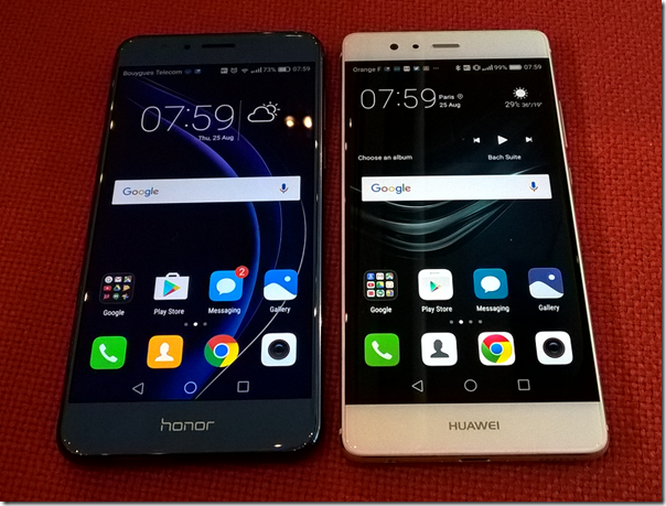
One of the first things you notice about the Honor 8 though is its similarity to the Huawei P9, launched in Europe in April 2016, is obvious. That is no bad thing, since the P9 is excellent and the Honor 8 cheaper,  but the business strategy is a bit of a puzzle. Honor says its phone is targeting a different market, and it is true that the shiny glass body of the Honor 8, in a pleasing blue shade on my review unit, is jauntier than the grey metallic finish of the P9. The P9 is also a fraction slimmer. Yet the devices are far more alike than different, and I would happily pull out the Honor 8 at a business meeting. The Honor 8 also benefits from a few extra features, like the rear smart key.

The P9 has the benefit of Leica branding and shared technology for its camera. An Honor/Huawei PR person told me that this is a software-only distinction and that if you look at the hardware sensors the two phones are very similar. Should photographers therefore get the P9? Possibly, though for a casual snapper like myself I have not noticed a big advantage. See below for some comparative snaps.

image
The Honor 8 (left) and the Huawei P9 (right).

To get a bit of context, the Honor 8 is being launched at €399 with 4GB RAM and 32 GB storage, or €449 with 4GB RAM and 64GB storage (inc VAT). That should equate to around £345 and £390 in the UK. The P9 was launched at £449 for 3GB RAM and 32GB storage, substantially more, though as ever real-world prices vary, and in practice a P9 today will likely cost only a little more than an Honor 8 if you shop around. The 8-core Kirin processor is the same, and the screen is the same resolution at 1920 x 1080. Both models also feature a dual-lens 12MP rear camera, 8MP front lens, and a rear fingerprint reader.

Out of the box

image

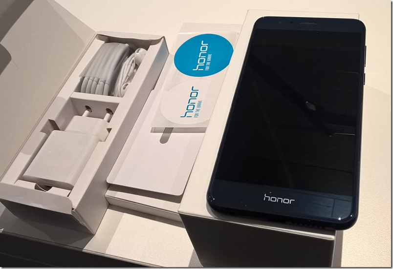
The Honor 8 immediately impressed me as a nicely packaged device. You get headset, charger, USB C cable, SIM removal tool, quick start guide (not much use but does have a diagram showing exactly where to insert dual Nano-SIMs and microSD card) and a couple of stickers for good measure. I am not a fan of the headset which lacks any ear-bud gels so it not secure or comfortable for me, but tastes vary.

The glass body is attractive though shiny and easy to smear. Honor can supply a simple transparent case – more a tray than a case – which will offer a little protection, but most users will want something more.

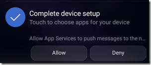
Switch on and there is the usual Android palaver and confusion over permissions. Here I did notice something I dislike. I got a notification saying I should “complete device setup” and “Allow App Services to push messages”:

image

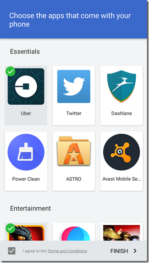
Rather than tapping Allow, I tapped the notification and found an app installer and an invitation to “Choose the apps that come with your phone”. I tapped to see the EULA (End User License Agreement) and found it was a Sweetlabs app that “facilitates the recommendation, download and installation of third party apps.”

image

This is horrible; it is deceptive in that it is presented as part of system setup and performs no useful function since you can easily install apps from the Google Play store; at least one of the apps offered by Sweetlabs (Twitter) was actually already installed. My opinion of which apps are “Essential” differs from that of Sweetlabs:

image

I did not agree the Terms and Conditions. We have seen this kind of thing before, on Windows, and it is damaging to the user experience. History may repeat with Android.

Other than that, setup was straightforward.

Things to like

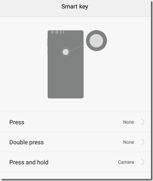
Fortunately, there is plenty to like. As on the P9, the fingerprint reader on the back is excellent; in fact, I like this feature so much that I sometimes absent mindedly tap the back of other phones and expect them to unlock for me. On the Honor 8 though, it is even better, since the fingerprint reader is also a “Smart key” which you can configure to open an app or take an action such as starting a voice recording or opening the camera. You can configure up to three shortcuts, for press, double press, press and hold.

image

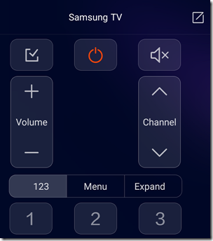
Another neat feature, also not on the P9, is the Smart Controller. This is a universal infra-red controller app and it seems rather good. I pointed it at a Samsung TV and after trying a few functions it declared a “best match” and seems to work fine.

image 

The camera

The camera is a key selling point for the Honor 8. One lens is RGB, the other monochrome, auto-focus is better with two lenses, and the ISP (Image Signal Processor) takes advantage by recording extra detail. There is also a great feature called Wide Aperture which lets you adjust the focus after the event.

When the camera app is open you can swipe from the left to select a mode. There are 16 modes:

Photo
Pro Photo
Beauty
Video
Pro Video
Beauty Video
Good Food
Panorama
HDR (High Dynamic Range)
Night Shot
Light Painting
Time-lapse
Slow-Mo
Watermark
Audio note
Document Scan

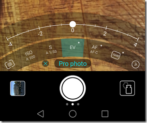
After just one day with the device I have not tried all the modes, but did take a look at Pro Photo which gives you control over the metering mode, ISO sensitivity, shutter speed, exposure compensation, focus mode (automatic or manual), and white balance.

image

These same controls are on the P9 though with a slightly different UI and this causes me to wonder exactly what is the Leica contribution that is on the P9 but not the Honor 8. There are a few extra settings on the P9 if you swipe in from the right, including film mode, RAW mode and a Leica watermark option.

How is the camera in use? I took some snaps and was pleased with the results. I also tried taking a similar picture on the Honor 8 and the P9, and comparing the results:

image
A Paris landmark (P9 left, Honor 8 right)

You can’t tell much from the full view, especially since I’ve resized the images for this post, so here is a detail from the above:

image
Detail view (P9 left, Honor 8 right)

Much difference? Please do not draw conclusions from one snap but these support my impression that the Leica-enhanced P9 takes slightly sharper pictures than the Honor 8, but that a casual user would be happy with either.

Performance

The performance of the Honor 8 seems similar to that of the P9 which I reviewed here. The P9 features a Kirin 955 SoC versus the slightly older Kirin 950 in the Honor 8; the specs are similar. Both have 4 Cortex A72 cores, up to 2.5GHz in the Kirin 255 versus up to 2.3GHz in the Kirin 950. In each case, these are supplemented by 4 Cortex A53 cores at up to 1.8GHz and a quad-core Mali T880 MP4 GPU.

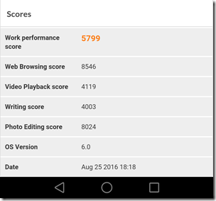
Geekbench 3, for example, reports 1703 single-core score and 6285 multi-core, one figure slightly worse, one slightly better than the P9. A run with PC mark came up with a Work Performance Score of 5799, below the P9 at 6387, with the difference mainly accounted for by a poor “Writing score”; other scores were slightly ahead of the P9, so something may be sub-optimal in the text handling and scrolling.

image

Conclusion

I do like this phone; it looks good, feels responsive, and comes with some distinctive features, including the superb fingerprint reader, dual lens rear camera, smart key and smart controller. It does not seem to me to be a young person’s phone particularly, and I can see some people choosing it over a P9 not only for its lower price but also for a couple of extra features. Photographers may slightly prefer the P9, which also has a fractionally slimmer body and a more elegant, understated appearance. In the general phone market, the Honor 8 is competitively priced and well featured; I expect it to do well.

Mo-Fi headphones from Blue: distinctive design delivers excellent sound

I attend several trade shows during the year, and at one of these Blue was showing off its microphones and headphones. These are the world’s best headphones, said one of the representatives. I expressed some scepticism and she promised to send me a pair to try.

image

The Mo-Fi, which sells for around £249 or $349, is an unusual set of wired headphones in that it includes its own amplifier, powered by a rechargeable 1020mAh battery. It takes 3-4 hours to charge, which gives you around 12 hours of play, though if the battery runs out it is not fatal as you can also use the headphones in passive mode.

The amplifier can also be used in “On+” mode which boosts the bass slightly. Despite this feature, these headphones are designed for those who like a natural sound rather than one which exaggerates the sonics for instant appeal but later fatigue.

First impressions

When you unpack the Mo-Fi headphones from their solid cuboid box you immediately get an impression of a well-built and high quality product. This is an over the ear design with a metal frame and what I would describe as a modernist, industrial look; opinions on this will vary but personally I am more interested in the sound and the comfort. If you are looking for a svelte and elegant headset though, these will not be for you.

image

In order to achieve a good fit whatever the size of your head, Blue has put hinges on the earcups so you can tilt them inwards, reducing their distance from the headband. You can also adjust the tension on the headband to get a looser or tighter grip according to taste. I find the comfort OK though not the best; the problem is that the solidity of the design means greater weight (455g) so you notice them a bit more than a lighter and softer set. That said, I can wear them for an hour or two without strain.

Blue supply two cables, a short 1.2 meter cable for iPad and iPhone which includes volume, pause and microphone, and a 3 meter cable for other sources. There is also an adaptor for headphone amplifiers with a 1/4” jack socket, and another for aeroplane seats with the old dual jack sockets. Finally, you get a well made soft case with a carry strap.

image

There is no mention of Android phones in the short manual, but the iPhone cable works fine for microphone and pause/play. The in-cable volume controls only with Apple devices though, because of annoyingly different hardware standards.

Sound quality

The philosophy behind the Mo-Fi seems to be that most of use compromise our listening experience by using headphones or headsets that do not do justice to the music. In part this is because of inferior headphone amplifiers in many mobile devices, which the Mo-Fi’s built-in amplifier mitigates though cannot fix completely (since it is not bypassed).

I tried the Mo-Fi on a variety of devices, including Android phones, an iPad, and an audiophile headphone amplifier (Graham Slee Solo). I compared them to several other headphones and headsets, using music including classical, jazz, rock and pop. I listened to the Mo-Fi mostly with its amplifier on, but not in the on+ position.

The good news: the sound is excellent. It is clean, precise, extended in frequency response, and generally neutral in tone though with slightly recessed high frequencies.

What is the effect of the built-in amplifier? It depends. Using the external headphone amplifier, the built-in amplifier does little more than increase the volume. You can get the same result by turning up the volume in passive mode. On a phone though, the effect is more marked, and you can hear improvement in quality as well as volume. That is what you would expect.

However, while the Mo-Fi sounds good with a phone, I was surprised how much much the sound improved when using the Graham Slee amplifier. Since a Solo costs more than the Mo-Fi, perhaps that is not surprising, but it does illustrate that unfortunately there are still compromises when using a smartphone for music.

What kind of sound do you get from the Mo-FI? Since it is neutral and clean, the Mo-Fi sounds good with all kinds of music, though they are not bright, to the extent that you should avoid them if you like a bright sound. The bass I found particularly tuneful, for example on My Funny Valentine by Miles Davis, which is a rare quality. Listening to the magical Four Seasons by the Academy of St Martin in the Fields I found the Mo-Fi smooth and engaging but not quite as clear or sweet as on high-end Sennheiser headphones.

Playing By Your Side by Sade, which has deep bass that is difficult to reproduce, the Mo-Fi coped well with all the bass energy, though losing the cymbals on this track sounded slightly muted.

Death of a Bachelor by Panic! at the Disco is always an interesting track to play, thanks to its ridiculous bass extension. The Sennheiser HD 600 (about the same price as the Mo-Fi though an open back design) sounds too polite on this track, failing to reproduce the bass thunder, but in compensation sounds tuneful and clean. The Mo-Fi makes more effort to reproduce the bass but on this very demanding track it does tend to blur (a rare failing with these cans) making the tune harder to follow.

On a modern recording of Beethoven’s 5th Symphony (San Francisco Symphony Orchestra conducted by Michael Tilson Thomas), the Mo-Fi does a fine job reproducing the scale and drama of the opening movement, no trace of blurring here. It is a big sound though again slightly let down by the treble.

No, these are not the best headphones in the world, but they do deliver outstanding quality at what, in audiophile terms, is a moderate cost.

If your preferences veer towards realistic bass and a big, articulate sound you will like the Mo-Fi. If you prefer a sweet, detailed treble with lots of air and space, these might not be for you.

There is one annoyance. One is that the amplifier switch is slightly crackly on my Mo-Fi. I worry that it might get worse over time.

Blue quotes a “15Hz-20kHz” frequency response for both the amplifier and the drivers, but without any indication of how much frequency drops off at the extremes so these figures are meaningless. Impedance is 42 ohms.

Summary

The sound quality is great, but the downside is that the Mo-Fi is relatively heavy and bulky and so some that will be a considerable disadvantage, especially as it does affect the wearing comfort. I can wear the HD 600 all day, whereas after a couple of hours I wanted to remove the Mo-Fi (it might become more comfortable as it wears). The closed back design means you get good sound isolation, which is good or bad depending on how much you want to be able to hear external sounds while listening to music.

If that doesn’t put you off, the Mo-Fi is well worth a listen. It’s well made, thoughtfully packaged, and sounds better than most of its competition.