Among the most illuminating sessions at Microsoft’s BUILD conference earlier this month was Will Tschumy’s presentation on the Microsoft Design Language.
Tschumy says that Microsoft began a new focus on design back in 2003 (think Office Ribbon). Then came Windows Phone and Metro (only he did not call it that), and now:
Microsoft is the only organization with a single, consistent design language across each screen we touch
he explained., noting that Xbox as well as the phone uses this same design language.
So what is it? The core idea, he says, is “content before chrome”. This is an old idea, which Google drew attention to with its 2008 web browser called Chrome – a playful title for something which properly should have been called Chromeless. Chrome sported a minimal user interface, putting the focus on the web content, and laying the foundations for web applications where the browser disappears and you forget that you are looking at a web page.
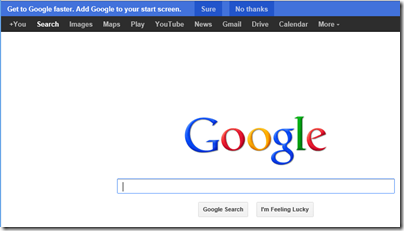
This is actually consistent with Google’s approach from its earliest days, when the Google home page was just a search box and a couple of buttons – a purity of design now spoilt by a menu bar and nagging ads, but you can still see it.

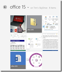
But I digress. What has Microsoft done with the concept? A good example is to compare the SkyDrive “Metro” app with the same folder in Windows File Explorer. Here is Skydrive:

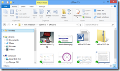
and here is Windows File Explorer:

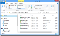
Or possibly:

if you are like me and prefer the “Details” view.
The point here is that the “Modern” SkyDrive app has a high ratio of content to chrome, and large icons which preview the content where possible make the content stand out, whereas in File Explorer there is more UI. Of course this is the Windows 8 File Explorer which is also influenced by the same design language. My Details view, which I like because I get higher information density, is closer to an old-style computer approach where the focus is on the number of bytes in the file above what the image happens to look like.
Mixed feelings them, but I do understand what Microsoft is driving at. Spend some time with Microsoft’s Surface RT – no, not on the desktop, on the Metro side – while using some of the better new apps and you begin to appreciate the idea.
Tschumy spelt out five design principles, though only three of these seem to be substantial:
- Pride in Craftsmanship: fluff
- Be fast and fluid: Performance matters
- Authentically digital: not skeuomorphic
- Do more with less: minimalism
- Win as one: fluff
No mention then of the “signposting” inherent in the metro transport signs which gave Metro its now-forsaken name, and in fact discoverability is a weakness of Microsoft’s design language; it seems hard to create a UI that is both “content before chrome” and highly discoverable. The common functionality encapsulated in the Windows 8 Charms bar, where features like Search are handled by a UI that is the same in every app, is one attempt to fix this, though first you have to learn how to use the Charms bar. Note the number of users who thought the Wikipedia app had no search function.
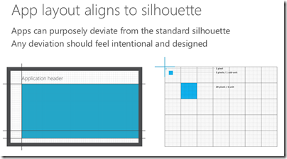
There is also a visual aspect to Microsoft’s design language, which Tschumy does a good job of explaining. Align to a standard grid, he said, unless you need to deviate from it for good reasons.

From here we get the tiled look which characterises Metro and which certainly has merits; it tends to be clear though not always beautiful.
Understanding the rationale behind these design principles helps to make sense of new Microsoft products such as Office 2013 and Visual Studio 2012, both of which have been met with mixed reactions on the grounds that they look a bit washed-out, the user interface is hard to focus on. The thinking is that this helps the content, which is what you care about, to stand out more.

That said, I am not convinced by this approach in the context of a productivity tool like Office or Visual Studio. You may care more about the content; but if you want to change the content, then you also care about the tools and want to find them quickly. Scroll bars that fade into the background are great, until you need to scroll the document.
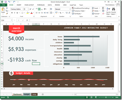
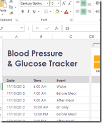
It is also interesting to browse the sample templates in Excel 2013. I grabbed the above screen from there, which seemed to illustrate the design principle of content before chrome, but in other cases I notice that the designers have gone for a washed-out look in the content as well.

This makes no sense to me, other than that the designer, observing the fade-into-the-background theme in the chrome, decided to match the content to it in order to get a consistent appearance. Now you cannot see the content or the chrome – uggh! This is what happens when you try to get a very large company working together on a common but somewhat counter-intuitive vision; not everybody gets it.
Which brings me neatly back to Windows 8. I mentioned the Surface RT above; I will be writing more about this, but I do find it a delightful device and one which expresses the Windows 8 and Microsoft Design Language vision better than any other aside from perhaps a Windows phone – unfortunately I have not yet got my hands on a Windows 8 phone to review but hope to do so eventually. It is also a flawed device of course, partly because the performance is less than “fast and fluid” in some cases (like Excel), but mainly because the apps are lacking.
It does seem to me though that Windows 8 has great potential and brings something new to the tablet world. Unfortunately there is uncertainty about whether either Microsoft or its OEM and retail partners have the will and the vision to get past the current hump of unfamiliarity and immaturity for that potential to be fulfilled. Microsoft has spent eye-wateringly huge amounts of money marketing Windows 8 and Surface RT; but I do not think that money has been spent strategically, it has just been thrown at the usual agencies. Many are still flummoxed by what Windows 8 is for, and that is apparent even amongst the OEMs that are manufacturing and selling it.
What will now happen post-Sinofsky, the man whose balls of steel brought Windows 8 to market? In his memo noting the appointment of Julie Larson-Green as head of Windows engineering, Ballmer says:
Her unique product and innovation perspective and proven ability to effectively collaborate and drive a cross company agenda will serve us well as she takes on this new leadership role.
The highlighting is mine. A cross company agenda is exactly what Microsoft needs; but if the new Windows leadership is less determined than the old, it could equally easily pull apart rather than together.
