Category Archives: mobile

A glimpse into the internal battles that set the future of Windows and .NET

A couple of posts from Hal Berenson give insight into the internal battles at Microsoft as the company worked out its strategy to rescue Windows from irrelevance in the world of mobile and tablets. Berenson is now President of True Mountain Group LLC but was formerly at Microsoft where his roles included SQL Server development and architecture, Mobile Development Tools strategy, and General Manager of Forefront identity and security products.

image

Berenson left Microsoft in October 2010, but by that time the strategy behind Windows 8 and Windows Phone 8 would have been in place.

According to Berenson, there were two core options for evolving Windows. There may have been others, but the heart of it is this: what to do with .NET. One option was to make .NET the app model for Windows, which is what was planned for the original Longhorn, before it was reset and became the less radical update that was Windows Vista. The other was to create a new app model based on native code. Steven Sinofsky, the Windows President, chose the latter, which is why .NET is only one of three options for programming the new tablet personality in Windows 8. This meant going down the opposite path from that of Windows Phone 7, which has an entirely .NET-based programming model.

You may recall from other sources that Steven Sinofsky has never been known to be a .NET fan.  While others within Microsoft, and even senior people in the (pre-Windows 8) Windows organization, wanted to move to an entirely .NET app model for Windows Steven did not.  He (and others fyi) wanted to re-engage the native code C++ developers that Microsoft had been neglecting.  And they wanted to co-opt the huge base of web developers to create apps for the Windows platform.  Well, what had the Windows Phone guys done?  They’d implemented a .NET only app platform.  Could the Windows Phone app platform evolve to address the native and web developers?  Sure.  But with no existing library of apps and a desire not to have .NET-centric platform at the core of Windows Sinofsky apparently felt pretty comfortable ignoring the Windows Phone team’s work.

This goes a long way to explain the puzzlement many of us experienced when it transpired that having created in Windows Phone 7 the basis for a touch-friendly operating system that could easily be extended to larger form factors such as tablets, Microsoft chose instead to do a new thing entirely for its tablet strategy.

One take on this is that Berenson’s account illustrates the chaos at Microsoft. Windows Phone was created in a mad hurry in reaction to the iPhone and the ascendance of touch UIs, reusing pieces of .NET, Silverlight and Zune to bring something to market quickly. Then the company’s next move was not to build on that, but to throw it away, even in the context of a mobile and device revolution that was and is a huge threat to its core business. And where was CEO Steve Ballmer in all of this?

The other take though is how this shows the determination and strategic focus of Windows boss Steven Sinofsky. He did not believe that rebuilding the Windows user interface on .NET would save it, with the Longhorn experiment no doubt a factor in that conviction, so he refused to go down that path again, despite the cost in terms of time and, perhaps more seriously, the impact on the developer ecosystem. Microsoft platform developers were asked first to bet on .NET and Silverlight, and now to bet on this new thing the Windows Runtime, and many are disillusioned or even angry. A hard decision; but putting long term strategy ahead of the immediate demands of your customers may be the right thing, in fact the only right thing.

Berenson also confirms what many of us have always assumed: that the removal of the Start menu on the Windows 8 desktop is all about making the new personality in Windows hard to avoid:

The Start menu, and indeed the entire desktop, are legacies that will have to be removed from Windows over time.  While the desktop itself is probably with us for a couple of additional major Windows releases (though there may be truly desktop-free editions sooner than that) the start menu was something that Steven has bet he could get away with not bringing forward into Windows 8.  By doing so he forces users to start living in the new usage paradigm rather than totally avoiding it.  Yes you can still set up a system to avoid leaving the desktop most of the time.  But you can’t avoid the new world completely.  In doing so he sets people up to eventually accept systems without the desktop at all (or at least Windows RT systems for personal use even if they need the desktop at work, for example).

Personally I no longer miss the Start menu; but its absence is certainly a barrier to adoption for Windows 8, as new users struggle to navigate the operating system.

Note: Berenson has kindly commented below. Note his point that merely working at Microsoft does not give you detailed knowledge of all decisions made there.

AT&T partners with Twilio to offer cloud communication apps

Telecommunications giant AT&T has partnered with Twilio to offer cloud communication apps through a web portal:

Powered by Twilio’s cloud communications services and API platform, ACS offers a Web portal for AT&T business customers to browse from a collection of voice and SMS-enabled apps — such as appointment reminder services, polling & surveying data collection tools, ad-hoc workgroup calling & messaging, business continuity, and geo-smart messaging.

When I read the announcement I was reminded of this talk by Laura Merling at the Redmonk Monki Gras conference last year:

Her final prediction? “Jeff Lawson becomes the CEO of AT&T. Why? Because the model has to change.”

Microsoft’s Azure Mobile Services: node.js and more in beginnings of easy cloud to device development

Microsoft announced Azure Mobile Services last month and it was mentioned by Microsoft Server and Tools boss Satya Nadella at the launch of Visual Studio 2012, as an example of where Microsoft is going with its “Modern app” vision, continuous services and connected devices (but with a Windows 8 or Windows Phone 8 flavour).

Azure Mobile Services is in some ways a reworking of the WCF RIA Services developed to support Silverlight applications, and in fact I swear I saw a reference to RIA Services flash past when I was opening my first Azure Mobile Services project in Visual Studio. It consists of a service type in Microsoft’s Azure cloud combined with a client SDK which is currently for Windows Runtime apps in Windows 8, though the REST protocol used could be called from any client platform.

image

Looking at the dashboard for a Mobile Services project in the Azure portal, you can see what Microsoft is going for here. Mobile Services handles authenticated access to data stored in SQL Server Azure. It is designed to be simple and cost-effective to get started, but can be scaled out by moving from a service on a shared host, to a dedicated VM with multiple instances.

image

It is easy to think of cases where the cloud component of a cloud plus device app need do little more than authenticate users, and retrieve and update data. Azure Mobile Services also provides for server-side scripts which you can modify to handle validation and other tasks.

I was interested to see that the server-side scripts are written in JavaScript and executed by node.js. Node.js is fantastic, and one of the benefits is that if you have an HTML and JavaScript client, you can use JavaScript both on the client and on the server. On the other hand, I wonder if Microsoft’s community would rather work with C# on the server, which is more mature and more familiar. Scott Guthrie’s introductory tutorial does not mention node.js.

I had a quick go at creating my own Azure Mobile Service. I have only been partially successful so far.

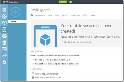
Things started well enough. I created a mobile service and the Quick Start opened.

image

Both Guthrie’s blog and the Quick Start wizard in the Azure portal are based on a todo list app. I went slightly off-piste here, deciding instead to create an app to track my articles on the web. I wanted to see how Azure Mobile Services copes with related tables, as opposed to a single table.

I had a frustrating time trying to create the database tables. I had to add my IP address to a firewall rule, enable popups, and deal with connection failures caused by unknown network issues.

Finally I was able to get into the database designers. I created an Articles table joined to a Publications table, with a very few fields.

Next I downloaded an automatically generated Windows 8 app from the portal. I had hoped this would magically work with my data. Unfortunately though, it seems to be hard-coded for the todo list app. If you do not want a todo list, you have to write your own code; and so far I have not had time to figure out from the reference what to do next. I looked at the Get started with data article, and guess what, it is the todo list again.

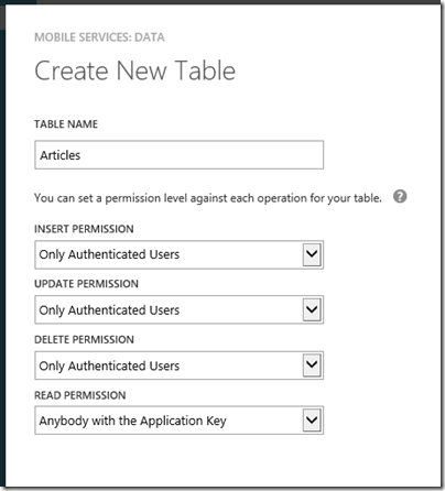
When you create a database, you can specify simple permissions. The todo list example depends on an application key stored in your app and sent over SSL, to grant permission to read and modify data. I selected authenticated user access instead.

image

There is an article explaining how to add authentication, though note that it presumes use of a Microsoft Live ID (the service formerly known as passport). This is perfect in the context of Windows 8 and Windows Store apps, but businesses will want to use Active Directory instead, whether hosted in Azure or Office 365 or on premise. I presume Microsoft will add this at some point though it is not mentioned currently.

My initial conclusion is that Azure Mobile Services shows lots of promise, but that the introductory documentation could be usefully improved, for example not to assume that you want to make a single table todo list app.

In this context the partnership with Xamarin, which is extending the SDK to Apple iOS and Google Android, is excellent news. This makes Azure Mobile Services useful more broadly, and I have a hunch that Xamarin’s support will soon improve the documentation and tutorials. The client SDK is open source and on github.

Note that according to Microsoft’s Kirill Gavrylyuk, in answer to a question from Roger Jennings, Microsoft plans to “roll out full support for iOS and Android including native SDKs soon”, rather than leaving the non-windows support entirely to Xamarin and C#.

Apple looks mortal

This has been a bad week for technical journalism. Everything was going according to script; new iPhone announced on 12th September; not really much new but oh, the design, oh, the performance, oh, the small touches. Then those with early access to devices poured forth their reviews: “probably the most beautiful smartphone anyone has ever made,” said The Telegraph, while Walt Mossberg on the Wall Street Journal said that “Apple has taken an already great product and made it better.”

Mossberg did say that the new Maps app in the iPhone5 was “the biggest drawback” though the faults he found were, in retrospect, minor. He observes the lack of public transport information, and add that “while I found Apple’s maps accurate, they tend to default to a more zoomed-in view than Google’s, making them look emptier until you zoom out.”

When iOS 6 was rolled out generally this week though, the public had a different take on the subject. One factor was that they looked at the maps in their own location, whereas early reviewers tend to be located in major cities. The big issue is not the lack of public transport routing, though that is an issue, but the poor quality of the data. It is simply not of release quality. One small example. Birmingham Airport is a significant destination in the UK, but if I search for it here, I get mysteriously directed to Aldridge Airport, 20 miles north.

image

Note: “Aldridge Airport” closed in the sixties and is “Now an open space used for football, dogwalking and the buzz of radio controlled aircraft.”

Birmingham airport itself seems missing.

image

This search is no challenge for Google Maps.

image

Maps are important on a mobile device, and this was an instance where the technical press, labouring as usual under short deadlines and the unrealistic challenge of perfectly encapsulating the qualities of a complex product with a few days of skimpy research and a few hundred words, let the public down.

More significantly, it is the biggest PR disaster for Apple that I can think of in recent years, certainly since the launch of the iPod in 2001, which was in a sense the beginning of Apple’s mobile adventure. When a tube station puts out a notice mocking Apple’s maps you know that this is a problem that everyone is talking about, not just the Twitterati.

Why has Apple done this? It is paying the price for escaping Google dependence, a real problem, but one that you would have thought could have been better addressed by licensing maps from Microsoft or Nokia, both of which have better maps; or by sticking with Google a little longer while putting its own effort out as an alpha preview while it fixes the data.

Apple will no doubt fix its maps and the decision to break with Google may eventually look good, but it is hard to see how it can fix them quickly.

The big reveal here is how Apple is prioritising its long-term industry strategy ahead of the interests of its users. Apple has done this before; but never with such obvious harm to usability.

It is still, no doubt, a beautiful phone, and the maps issue will be solved, if only by using Google’s web maps instead.

Apple looks mortal though, and the script is not playing back as planned. People who once would only have considered Apple will now be more aware that alternatives are in some respects better. The longer the maps issue continues, the more significant will be the effect.

Apple should withdraw its broken maps, go back to Google at least temporarily and reinstate the old maps app.

BBC replaces Flash with Flash in Android iPlayer

The BBC has announced its solution to the lack of mobile Flash on Android devices, which meant that its iPlayer catch-up service did not work on recent devices like Google’s popular Nexus 7 (though there are hacks to make it work).

However, the BBC is not really replacing Flash, but instead creating a media player that is compiled from Flash into a native Android app. This means that the Flash runtime is compiled into the app.

In the end, Flash was still the best choice of media format for us to use. And the only practical technology for us to play this format back on Android is Adobe Air.

says the BBC’s Chris Yanda.

Yanda points out that using HTTP Live Streaming is impractical since it is not supported on versions of Android prior to Honeycomb; and the majority of Android devices in use are Froyo or Gingerbread.

Judging by the comments, users are glad to have something but disappointed with the BBC’s support for Android. The native iOS app is much better, especially considering that it now supports downloads. On a recent flight I took an iPad with me solely for the ability to watch iPlayer content offline.

Microsoft’s forthcoming Windows RT tablets will support Flash, as I understand it, though only for a limited subset of web sites. Presuming BBC iPlayer is on that list, it should work.

image

Nokia and Windows Phone 8: more questions than answers

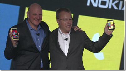
Nokia’s CEO Stephen Elop announced the Lumia 820 and 920 yesterday in New York; new versions of its high-end Windows smartphones and the first to run the forthcoming Windows Phone 8 operating system. Windows Phone 8 runs the same kernel as Windows 8 on PCs and is a significant step towards unification of Microsoft’s development platform.

image

Among the key features announced yesterday:

Wireless charging with the Qi standard and a couple of deals to place charging points in public places. The London Heathrow Virgin Atlantic lounge and the Coffee Bean & Tea Leaf chain will have charging points; not much, but a start. Wireless charging accessories include the JBL PowerUP which combines wireless charging and an audio dock.

PureView imaging technology. This is Nokia’s brand name for a bunch of photo features. Most significant is “floating lens technology” on the larger 920 which, Nokia claims, overcomes camera shake to enable the camera to take in “five times more light”; think of it as a virtual tripod that allows longer exposure without motion blur. If it works it is a huge feature for photo enthusiasts.

City Lens augmented reality which overlays the view through the phone’s camera with data about what to do and where to go; apparently there is data for indoor as well as outdoor locations.

image

Synaptics ClearPad touch which enables gloved finger support. Since Synaptics is a third-party I guess this feature is unlikely to be exclusive to Nokia for long.

Windows Phone 8 operating system shown off by Microsoft’s Joe Belfiore, including more customizable Live Tiles and a “Blink” feature from Microsoft Research which takes multiple shots in quick succession to enable interesting features like avoiding closed eyes and allowing after-the-event editing using alternate shots.

Screenshots are now a built-in feature. Who cares? Journalists of course; non-availability of this trivial feature meant fewer screenshots of Windows Phone 7 on the web.

Lumia 920 has a 4.5 inch screen, 1.5Ghz dual core Snapdragon S4, front and rear cameras, 1GB RAM, 32GB storage.

Lumia 820 has a 4.3 inch screen,  1.5 Ghz dual core Snapdragon S4, front and rear cameras, 1GB RAM, 8GB storage, microSD slot.

The big disappointment yesterday: no announcement concerning price or availability. Here is what the press release says:

Both phones will be available in pentaband LTE and HSPA+ variants and are expected to start shipping in select markets later in the year. Nokia will announce pricing and specific roll-out dates country by country when sales are due to begin.

Worries about a delay were not relieved by Microsoft’s announcement that the Windows Phone SDK preview will be available to select developers from September 12. “Next Wednesday I’ll share detailed instructions on how current Windows Phone developers with published apps can apply. But I do want to set your expectations that program access will be limited,” says Microsoft’s Todd Bix. He adds that, “The full Windows Phone 8 SDK will be made publically available later this year when we unveil Windows Phone 8.”

That suggests a considerable wait before availability. Even if the Lumias go on sale the same day that the SDK is final, it sounds like November at best; and that gives developers no time at all to work with the new SDK before launch. Key developers have early access of course.

image

Overall the event was less than it should have been, at a time when Android looks vulnerable thanks to Apple’s patent win over Samsung last month.

In some ways though, Nokia’s announcements have little to do with the key questions over Nokia’s Lumia range and Windows Phone 8. Quality is one issue; the launch of the Lumia 800 was damaged by the device’s poor battery life and tendency to sulk and become unchargeable; the rumour is that return rates were unusually high. The knock-on effect is to make it hard for retailers to recommend it to their customers, though firmware updates eventually improved matters. How is battery life on the 820 and 920? What has been done to address quality issues?

Another question, and to me the biggest one, is how Windows 8 for PCs will fare in the market and the impact it will have on Windows Phone. The more time I spend with Windows 8 the more I like it, especially on a tablet, but also on the desktop. There is a barrier to adoption though as the new user interface is a demanding transition for some users. If Windows 8 tablets succeed, there will be instant recognition for the phone user interface and users will have a reason to demand it over iPhone or Android, something that has been lacking up to now.

On the other hand, if appreciation for the nice features of Windows 8 is drowned out by a chorus of “give us back the Start menu”, while vendors focus on expensive fiddly hybrids rather than simple, lightweight tablets, then I doubt Windows Phone 8 will take off either.

Currently I use a Lumia as my main smartphone and (battery life aside) get on well with it. Nokia’s experience with the operating system should mean that this new generation is better, and the phones look good. As Elop himself said though, this is all about ecosystems, and the viability of his third ecosystem is still in the balance.

Nokia City Lens: augmented reality on your Lumia 920 Windows 8 phone

Nokia has announced the Lumia 920 with features including Qi wireless charging, PureView camera, and of course Microsoft’s new Windows Phone 8 operating system.

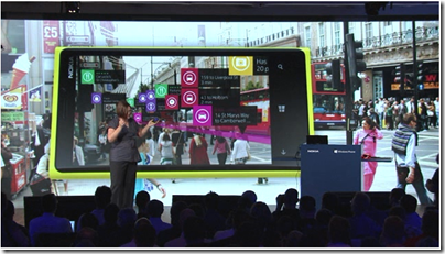
One eye-catching feature presented by Nokia’s Jo Harlow is City Lens, which uses augmented reality to overlay the view through your phone’s camera with tap-able labels showing information about local restaurants, stations, shops and so on.

image

A great feature; I am sceptical though since Local Scout, a feature in Windows Phone 7 that was meant to find local places of interest including restaurants, shops and so on, was worse than useless in my experience. Information was missing, out of date, and lacked the necessary momentum to have user reviews of any consequence. It was a little better in the most central locations, such as central London.

City Lens could be great though, a practical application of augmented reality (historically a solution looking for a problem) which has obvious appeal.

Review: Audyssey Lower East Side Audio Dock Air for Apple AirPlay

Based in Los Angeles, Audyssey specialises in audio processing software. This is used in home theatre equipment such as multi-channel receivers, and also finds its way into TVs, mobile devices and cars. In 2010 Audyssey started making its own audio accessories, with an iPhone/iPod dock which I reviewed here. I was surprised how good they sounded. Since then I have kept a close eye (or ear) on the company’s small range of products. This is a company which cares about sound quality, and whose secret sauce is applying software to solve the problem of getting big, accurate sound from small enclosures.

The Lower East Side Audio Dock Air is an active loudspeaker system for Apple’s AirPlay wireless streaming protocol. It also has a standard 3.5mm input for wired connection to MP3 players or other devices. Using AirPlay, you can play music and control the volume from a Mac or PC running iTunes, or from iOS devices including iPhone, iPad and iPod Touch.

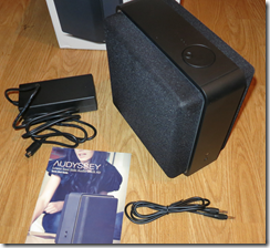
image

What you get in the box is the Audio Dock Air, an external power supply, a 3.5mm jack connector, and a Quick Start Guide that unlike many others is actually rather good.

The styling of the Dock Air is distinctive with its speaker systems firing left and right, though if you check out the internal shots later on you will see that the tweeters are actually directed more forwards than sideways.

Plug in the power and you can get started. For set up, you press and hold a pairing button on back, which lets you connect to the Dock over Wi-Fi. You than browse to a small web application on the Dock, where you complete the set up by connecting to your home Wi-Fi network. You can also rename the device, which could be particularly useful if you have several Dock Airs in different rooms.

Once fully connected, you can go to iTunes and click on the AirPlay button at bottom right of the iTunes window. There you can select the Dock Air, using whatever name you assigned during setup:

image

Even more convenient is to download the Remote app for iOS. This lets you use your iOS device to control iTunes on the Mac or PC.

image

You can also play music directly from iOS.

The sound

The sound quality is excellent as I have come to expect from Audyssey. There are a few points to note though. The first thing you notice is the bass extension, which is remarkable for a unit of this size. Drums have real thump, and bass guitar sounds like bass guitar. If you are used to the anaemic bass of most small speakers, hearing this from a small box is pleasing and unexpected. That said, the sound is not dominated by the bass. The treble is sharp and clear too; and I was struck by how easy it is to follow different strands in the music and to notice small details.

Playing Carly Simon’s You’re So Vain, for example, you can easily hear the whispered “Son of a gun” right at the start of the track. Karajan’s Beethoven’s 9th sounds dramatic and powerful; a little lightweight compared to a full-range home stereo, but superb from a compact dock. Mika’s Billy Brown, a simple arrangement with a forward vocal, is conveyed with drama and deep bass from the accompaniment, with just a trace of confusion at the bottom end compared to my monitor reference speakers.

Given that this is a single box, you should not expect the best stereo image. You do get some limited stereo effect. The unit goes loud enough for most listening at home, but not for parties or neighbour-annoying rock out sessions,

I made a comparison with the Audyssey South of Market dock, which is just a little larger but a similar design. The older dock does not go quite so deep, though the sound is a shade cleaner; the Dock Air is slightly softer in tone though if you had your eyes closed you would guess it is larger, not smaller, than its predecessor. On Sade’s bass-heavy song By Your Side, the South of Market keeps a firmer grip than the Dock Air, though this is a difficult song to reproduce. Some listeners might find the bass in the Dock Air excessive, though it is not to my ears. I doubt anyone would think that of the South of Market dock. Both sound very good.

The not so good

Audyssey has a strong grip on audio technology, but less so with its manufacturing quality. It is not bad but could be better. The rotary volume control is slightly out of true on the review unit, for example. These are products that you have to hear to appreciate, and my guess that a little more investment in fit, finish and design would win more customers, bearing in mind the relatively high prices.

The responsiveness of the Dock Air can be laggy, both from iTunes and even more when used with the iOS Remote app. Some of this is down to the iTunes/AirPlay system, and no doubt some audio buffering in the Dock Air, but it can be annoying.

Switches and ports

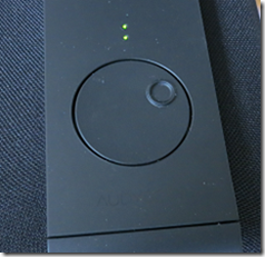
The Dock Air is fairly minimalist when it comes to switches and ports. On the top of the unit is a rotary volume control and status LEDs.

image

You can also control volume remotely, which you will probably do more often. The volume control is also a mute button; press down to mute, and again to unmute.

On the front is a headphone socket along with what looks like an infra-red receptor though if so it is undocumented.

image

At the rear is the power, aux input, and pairing button. No on/off switch. I recommend turning off at the socket, connecting, and then switching on, presuming your mains sockets have switches.

image

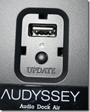
Underneath is a USB port, which Audyssey says is solely for future firmware updates.

image

The technology

Audyssey does not give much away in its specifications for the Dock Air. It does state:

  • 3/4” tweeters
  • 3” woofers
  • 4” Passive bass radiator
  • Audyssey EQ
  • Audyssey BassXT
  • Audyssey Dynamic EQ

Of these, the last are the most interesting. What are they?

Audyssey EQ is not much documented, but in the context of another product I read that it corrects time and frequency response imperfections caused by the loudspeaker and cabinets.

BassXT “dynamically monitors the low frequency signals and constantly pushes the speaker to its maximum capability.” The over-simplification would be that it boosts the bass signal to compensate for the drop off in the frequency response of the woofer.

Dynamic EQ is a more sophisticated form of the “loudness” switch that you see on old hi-fi equipment. As Audyssey says, “It will preserve the and octave-to-octave balance of the content as you turn down the volume to make up for the changes that happen in human hearing at lower listening levels.”

Purists may feel that this is too much tinkering with the signal. My view is that the high quality results successfully validate the approach. With Audyssey products, it is a large part of what you are paying for.

Internals

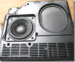
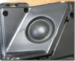
The Dock Air is not designed to have its grilles or panels removed; however we had a quick look inside for this review. This shows one side of the unit with its 3” woofer and passive bass radiator.

image

If you look carefully you can also see the tweeter at top left. Note that this points more towards the front than to the sides, though it is at an angle.

image

Internally Audyssey has taken a lot of trouble with acoustic damping foam so that the sound is clean even at high volume. I was also impressed by the size of the loudspeaker magnets, which are bigger than I have seen on speakers many times larger.

image

Conclusion

With rumours that Apple is redesigning its dock connector, thus threatening the compatibility of products like the South of Market dock, wireless is the future. If you value high sound quality and need an AirPlay speaker system, you will like the Lower East Side Audio Dock Air. Note that there is no Bluetooth support, so if you want to use non-Apple devices this is not suitable. A bit more attention to design and manufacturing quality would be welcome. But I do not know any other company that can get such great wide-range sound out of small boxes.

The one thing missing from Windows 8 tablets announced so far: simplicity

This week at IFA in Berlin PC manufacturers have been showing off their shiny new Windows 8 tablets. Vendors are competing for who has the cleverest way of combining touch-screen, tablet, trackpad and keyboard into a single portable device. Here is the HP Envy:

image

or take a look at this PC Pro preview of the Toshiba Satellite U920T:

Ratchets stretch up and down the panel’s rear, with a central puck keeping the action light and smooth, and the screen flips up and back with a fluid action.

Sony has a Surf Slider, Dell XPS Duo slots into a keyboard dock.

I do understand the reason for all these gimmicks. Sometimes you want a tablet, sometimes you want a laptop, and the idea is to combine them into a hybrid device, just as Windows 8 itself lets you flip between Modern UI (formerly known as Metro) and Desktop.

At the same time though, there is a risk that these vendors are not learning from the past. Two things in particular:

  • The failure of Microsoft’s first Tablet PC. Most models had twist screens and keyboards and styluses. The styluses were prone to getting lost, the twist screens and keyboards were expensive, and tablets became premium-priced devices that were inconvenient to use. Faced with the choice between Tablet PCs and cheaper, simpler laptops, most customers chose laptops.
  • The success of Apple’s iPad. A keyboard is an optional extra, but most manage without it. The screen has a single button, there are a couple of switches and a volume control on the side, it has a dock connector, and that is it. Nor is it premium-priced, at least, not in the context of Apple’s range.

Looking at the effort Microsoft has put into the touch-friendly Modern UI it is obvious that Microsoft has made provision for tablet-only users. Start screen, big icons, easy install and removal of apps, most of the frequently used settings available without going to the Desktop. It is also obvious that Microsoft intends Windows to go further in this direction. Office 2013 just has OneNote MX in the Modern UI, but more is coming.

Where then are the devices that focus on the simplicity of a single slate, with a wireless keyboard on offer if needed, priced to compete sensibly with Apple and Android tablets?

Maybe there will be some of these; but the messaging coming out of IFA is all wrong and I predict that once again many customers will opt for “just a laptop” once again and for the same reasons as before.

This of course will do nothing to disrupt the tablet/iPad market.

One other thing. The IFA unveilings make Microsoft’s forthcoming Surface look better than ever. This does have an optional keyboard, but it is built into a touch cover, and from what I can tell Microsoft has successfully avoided rachets and gears.

If Surface succeeds and flipping hybrids fail, you can be sure there will be a ton of Surface-a-likes at the 2013 IFA.

RIM hints at move to license BlackBerry 10 OS to third parties

RIM chief Thorsten Heins says in an interview that his company may license the forthcoming BlackBerry 10 mobile operating system to third parties. Here is the key quote:

We don’t have the economy of scale to compete against the guys who crank out 60 handsets a year. We have to differentiate and have a focused platform. To deliver BB10 we may need to look at licensing it to someone who can do this at a way better cost proposition than I can do it. There’s different options we could do that we’re currently investigating.

He goes on to talk about:

… us building a reference system, and then basically licensing that reference design, have others build the hardware around it – either it’s a BlackBerry or it’s something else being built on the BlackBerry platform

The big question: would the likes of Samsung and Sony leap to manufacture BlackBerry OS smartphones when they can offer Android for free?

A more nuanced question: even if OEMs were to license BlackBerry OS, to what extent would they really get behind it, as opposed to cranking out a few devices to see how they went? The latter is what happened to Windows Phone 7, with the exception of Nokia late in the day.

Samsung manufactures Windows Phone 7 devices, but you would hardly know it, since it is the Android-based Galaxy range that gets all its attention.

Another problem for RIM is negotiating the tricky waters of both manufacturing devices and licensing the OS to others. Apple did not enjoy having third-party manufacturers like Power Computing, Radius and Motorola release Mac clones. Here is what Walter Isaacson writes in his biography of Steve Jobs:

Apple got an $80 fee for each computer sold, but instead of expanding the market, the cloners cannibalized the sales of Apple’s own high-end computers on which it made up to $500 in profit.

Microsoft is now coming at this from the opposite end, going into hardware manufacturing with the Surface, which is another interesting experiment.

Still, listen carefully to what Heins is saying. “We don’t have the economy of scale to compete against the guys who crank out 60 handsets a year.” It is not just a matter of coming up with a fantastic mobile operating system or even a fantastic device; it is all about ecosystem, as Nokia boss Stephen Elop stated 18 months ago. RIM’s ecosystem is in decline, and the company will explore every avenue in trying to turn that around.