Category Archives: apple

7 types of Windows 8 users and non-users

When I was in Seattle earlier this month I visited the Microsoft Store in Bellevue. I nearly bought a Nokia Lumia 1020, but also observed an enthusiastic salesperson showing off Surface 2 (a pre-launch demo unit) to an older customer. She watched patiently while he showed how it handled pictures, SkyDrive, Office, Email, Facebook and more. At the end she said. “I don’t need any of that. Show me your cheapest laptop.”

image

Yes, it’s tough for Microsoft. The incident got me thinking about computer users today and whether or not they are in the market for Windows 8 (or the forthcoming Windows 8.1).

Here is a light-hearted at some categories of users. And yes, I think I have met all of them. For those that are saying no, what would change their minds?

1. The Apple fan.

Switched to Mac from Windows XP around 2007. Has Mac, iPhone, iPad. So much easier, no anti-virus nags, boots quicker, less annoying, always works smoothly. Occasionally runs a Windows app on Parallels but nothing non-nuclear would persuade them to switch back.

Buying Windows 8? No.

2. The Enterprise admin.

In latter stages of migration from Windows XP to Windows 7. Still a few XP machines running awkward apps or run by awkward people. Last holdouts should be gone by year end. Job done, won’t even think about another migration for 3-5 years. Next focus is on BYOD (Bring your own device); will be mostly iPhones and iPads with the occasional Android or Windows 8 tablet.

Buying Windows 8? Mostly no.

3. The older Windows user

Son thinks a Mac would be better, but Windows works fine, is well understood, and does all that is needed. No desire to upgrade but when PC conks out will look for the most familiar looking machine at a good price. Would prefer Windows 7 but may be forced into Windows 8 if those are the only machines on offer.

Buying Windows 8? Maybe reluctantly.

4. The PC guy

This is the guy who understands PCs back to front. Never saw the point of Macs, overpriced, fewer apps, and little different in functionality. First thing to do with a new PC is either spend 3 hours removing all the crapware, or reinstall Windows from scratch. The Windows 8 user interface took some adjustment at first but fine with it now, likes the slightly better performance, and even uses a few Metro apps on the Surface Pro tablet.

Buying Windows 8? Yes, best Windows yet.

5. The tablet family

Used to update the family PC every few years, but mum got an iPad, son got an Android tablet, then dad went Android too, and now they spend so much time doing email, games, web browsing, YouTube, Facebook and BBC iPlayer on the tablets that the PC gets little use. It’s still handy for household accounts but it won’t be replaced unless it breaks.

Buying Windows 8? Not soon, and maybe not ever.

6. The tried it once never again person

It was embarrassing. Used Windows for years, then a friend brought over a Windows 8 laptop. Clicked on desktop, but with no Start button how do you run anything? Clicked around, right-clicked, pressed ESC, pressed Ctrl-Alt-Del, but nothing doing. Friend was laughing. Now the sight of Windows 8 evokes a chill shudder. Never, just never.

Buying Windows 8? No way.

7. The “Make it like 7” person

Windows 8? No problem, it’s just like 7 really. Installed Start8, got the Start menu back, set it to boot to desktop, set file associations for PDF and images to desktop apps, and never sees the Metro environment.

Buying Windows 8? Kind-of, but will never run a Metro app.

Dear audio industry, fix mastering before bothering with high resolution

The audiophile world (small niche though it is) is buzzing with a renewed interest in high resolution audio, now to be known as HRA.

See, for example, Why the Time is Right for High-Res Audio, or Sony’s new Hi-Res USB DAC System for PC Audio, or Gramophone on At last high-resolution audio is about to go mainstream, or Mark Fleischmann on CD Quality Is Not High-Res Audio:

True HRA is not a subtle improvement. With the best software and hardware, a good recording, and good listening conditions, it is about as subtle as being whacked with a mallet, and I mean that in a good way. It is an eye opener. In lieu of “is that all there is?” you think “wow, listen to what I’ve been missing!” … The Compact Disc format is many good things but high-res it is not. It has a bit depth of 16 and a sampling rate of 44.1 kHz. In other words, it processes a string of 16 zeroes and ones 44,100 times per second. Digitally speaking, this is a case of arrested development dating back to the early 1980s. We can do better now.

As an audio enthusiast, I would love this to be true. But it is not. Fleischmann appears to be ignorant of the Nyquist-Shannon sampling theorem, which suggests that the 16-bit/44.1 kHz CD format can exactly reproduce an analogue sound wave from 20–22,050 Hz and with a dynamic range (difference between quietest and loudest signal) of better than 90Db.

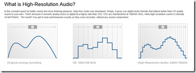
Yes there are some ifs and buts, and if CD had been invented today it would probably have used a higher resolution of say 24-bit/96 Khz which gives more headroom and opportunity for processing the sound without degradation; but nevertheless, CD is more than good enough for human hearing. Anyone who draws graphs of stair steps, or compares CD audio vs HRA to VHS or DVD vs Blu-Ray, is being seriously misleading.

Yes, Sony, you are a disgrace. What is this chart meant to show?

image

If shows that DACs output a bumpy signal it is simply false. If it purports to show that high-res reproduces an analogue original more accurately within the normal audible range of 20-20,000 Hz it is false too.

As an aside, what non-technical reader would guess that those huge stair steps for “CD” are 1/44,100th of a second apart?

The Meyer-Moran test, in which a high-res original was converted to CD quality and then compared with the original under blind conditions (nobody could reliably tell the difference), has never been debunked, nor has anyone conducted a similar experiment with different results as far as I am aware.

You can also conduct your own experiments, as I have. Download some samples from SoundKeeper Recordings or Linn. Take the highest resolution version, and convert it to CD format. Then upsample the CD quality version back to the high-resolution format. You now have two high-res files, but one is no better than CD quality. Can you hear the difference? I’ve yet to find someone who can.

Read this article on 24/192 Music Downloads … and why they make no sense and watch the referenced video for more on this subject.

Still, audio is a mysterious thing, and maybe in the right conditions, with the right equipment, there is some slight difference or improvement.

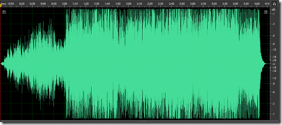
What I am sure of, is that it will be nowhere near as great as the improvement we could get if CDs were sensibly mastered. Thanks to the loudness wars, few CDs come close to the audio quality of which they are capable. Here is a track for a CD from the 80s which sounds wonderful, Tracy Chapman’s debut, viewed as a waveform in Adobe Audition:

image

And here is a track from Elton John’s latest, The Diving Board:

image

This everything louder than everything else effect means that the sound is more fatiguing and yes, lower fidelity, than it should be; and The Diving Board is far from the worst example (in fact, it is fairly good by today’s standards).

It is not really the fault of recording engineers. In many cases they hate it too. Rather, it is the dread of artists and labels that their sales may suffer if a recording is quieter (when the volume control is at the same level) than someone else’s.

Credit to Apple which is addressing this to some extent with its Mastered for iTunes initiative:

Many artists and producers feel that louder is better. The trend for louder music has resulted in both ardent fans of high volumes and backlash from audiophiles, a
controversy known as “the loudness wars.” This is solely an issue with music. Movies, for example, have very detailed standards for the final mastering volume of a film’s
soundtrack. The music world doesn’t have any such standard, and in recent years the de facto process has been to make masters as loud as possible. While some feel that overly
loud mastering ruins music by not giving it room to breathe, others feel that the aesthetic of loudness can be an appropriate artistic choice for particular songs or
albums.

Analog masters traditionally have volume levels set as high as possible, just shy of oversaturation, to improve the signal-to-noise ratio (SNR). With digital masters, the goal
is to achieve the highest gain possible without losing information about the original file due to clipping.

With digital files, there’s a limit to how loud you can make a track: 0dBFS. Trying to increase a track’s overall loudness beyond this point results in distortion caused by
clipping and a loss in dynamic range. The quietest parts of a song increase in volume, yet the louder parts don’t gain loudness due to the upper limits of the digital format.
Although iTunes doesn’t reject files for a specific number of clips, tracks which have audible clipping will not be badged or marketed as Mastered for iTunes.

Back to my original point: what is the point of messing around with the doubtful benefits of HRA, if the obvious and easily audible problem of excessive dynamic compression is not addressed first?

None at all. The audio industry should stop trying to mislead its customers by appealing to the human instinct that bigger numbers must mean better sound, and instead get behind some standards for digital music that will improve the sound we get from all formats.

Review: Innergie PocketCell pocket battery charger: elegant design though limited capacity

Smartphone battery life has marched backwards, or so it seems: my ancient HTC Desire still lasts longer on a full charge than my newer Nokia Lumia 620 or Sony Xperia T. Another problem is tablets: battery life is decent compared to a laptop, but it is easy to get caught towards the end of the day or on a plane with an exhausted battery.

The solution, if you cannot get to a charger, is one of those pocket chargers for topping up your device. These are popular promotional giveaways, which means I have a drawer full of them (or would if I had kept them); but many are rubbish: bulky, fiddly with lots of assorted adapters to cope with different phones, and some with pointless adornments like solar panels.

I make a partial exception for a PowerTrip charger I received recently, which has an impressive 5700mAh battery, but it is still ugly, comes with three cables, and has silly extras like a solar panel and ability to work as a memory stick.

By contrast, the Innergie PocketCell is the first charger I have seen which has immediately impressed me with its design.

image

There are only two pieces you need to carry with you, the small battery pack itself and a clever three-in-one cable in which the adapters snap together, so you can charge a device with Mini-B or Micro-B USB (the two popular types), or an Apple 30-pin dock connector (if you have an iPhone 5 or another device with the new Lightning Connector you are out of luck unless you have an adaptor).

image

The same connector also serves to charge the PocketCell, using one of the many USB mains chargers you almost certainly already possess, or by plugging into a PC or Mac. The PocketCell has a USB Type A socket for output, and a Micro-B for input, so you cannot easily get it wrong.

On the side of the PocketCell is a button which you press to discover the current charge. It lights up to four LEDs, to indicate the level of charge remaining.

Battery capacity is 3000 mAh; not as good as a PowerTrip, but decent considering that it is less than one-third the size and much lighter (72g/ 2.5oz).

I tried the PowerCell on an iPhone 4 with a fully expired battery (at least, expired to the point where it would not switch on).

image

The phone charged successfully, during which time the PocketCell got somewhat warm, but with impressive speed of charge. After the charge the PocketCell was pretty much exhausted.

The PocketCell supports 2.1 amp fast charge, which means it is fine for charging an iPad or other tablets with USB power.

The small size, nice design, and effective charging of the Innergie PocketCell means this device might actually find its way into your bag. The downside is that it is more expensive (especially in the UK) than some other portable chargers with equal or greater capacity, but its elegance and usability is worth a bit extra.

While I recommend the device, check that 3000 mAh is sufficient for you before purchase. I have also heard that the three in one cable is a little delicate, though you can get replacements if necessary or use a standard USB cable.


Not just Windows: even Mac sales are down

Apple has released its third quarter financial results, and they are decent: year on year revenue is up fractionally, from $35.023 billion to $35,323 billion, though profit is down from $8.8 billion to $6.9 billion.

Compared to the third quarter in 2012 though, Mac sales are 7% down though, from 4.02 million units to 3.754 million units. Revenue from the Mac has declined by 1%.

In isolation this is not a dramatic change, but the statistic is more interesting when you put it in context with what is happening with Windows PCs. Windows 8 is nearly a year old, released to manufacturing on August 1 2012 and generally available from October 26 2012.

Windows 8 has received a mixed reception, with many users reluctant to adopt the reinvented operating system, which replaces the Start menu and adds a touch-friendly tablet platform alongside the desktop user interface. So far it has done nothing to stem declining PC sales and may have accelerated the process. Gartner reports a 10.9% decline in worldwide PC sales in the second quarter of 2013  (same as Apple’s third quarter). Gartner’s figures also include Macs, though Gartner estimates only a 4.3% unit decline.

The evidence is that gains in Mac sales at the expense of Windows, which is a long-standing trend, is continuing, insofar as Mac sales have declined by less than the PC market overall. However the figures confirm that the decline in PC sales is due to fundamental changes in personal computing, in favour of tablets and other mobile devices, rather than market response to an unpopular Windows edition.

The twist here is that Windows 8 is designed for exactly that trend; and while there is plenty of scope for argument about how Microsoft has addressed it, there is little doubt that it was right to come up with a version of Windows for tablets – and one that was not a reprise of its previous stylus-based efforts.

My own view is that Windows 8 is a plausible strategy and that Microsoft should stick with it. Earlier comments on Windows RT are relevant here.

Hybrid devices that twist between laptops and tablets are not the answer though. They are transitional machines which end up too heavy and expensive to be good tablets. Many users will buy a cheaper laptop instead.

The question for Microsoft now is how much tablet market will be left by the time the Windows app ecosystem matures to the point when a Windows tablet can really compete with an iPad for usability and utility in pure slate form.

Apple has problems too. iPad sales are down by 27% from the same quarter last year, though iPhone is up 15%. The reason, I suspect, is Android.

DTS Headphone X surround sound from stereo is astonishing though Z+ music app disappoints

I first heard the DTS surround sound from stereo demo at this year’s Mobile World Congress in Barcelona. The technology is called Headphone X. It was astonishing. You went into the Qualcomm Snapdragon 800 theatre – it was in association with Qualcomm become some DTS technology is baked into the latest Snapdragon chipset – sat in a plush armchair, and donned stereo headphones.

image

The next thing you knew, sound was coming from front left. Then front right. Then rear left. The illusion was amazing, and I was not the only one who removed their headphones temporarily to check that they really were the sole source of the sound.

I interviewed the DTS folk about the technology, and also spoke to the guys at Dolby. Nothing new, said the Dolby folk, we’ve had virtual surround sound for years. Yet, the demo at the Dolby stand fell far short of what DTS was showing.

Now you can try it, if you have an Android or iOS device. Download the Z+ app and listen to the demo.

image

I tried this on someone today, and his “Wow!” reaction showed that the demo is still astonishing. You know it is an illusion, but it sounds as if you are seated in the middle of a room with five or more speakers.

If DTS has proved that surround sound from stereo is possible, what are the implications? Surround sound has not failed exactly, but its inconvenience has limited take-up. Many surround mixes of music albums are now hard to find, because they were made for long out of print SACD or DVD-Audio releases. What if you could easily download all these mixes and enjoy them with stereo headphones or earbuds?

An enticing thought, but there are caveats. The Z+ app, for example, is disappointing once you get beyond the demo. The only album it plays is the Hans Zimmer soundtrack to the Superman film, Man of Steel. One track is included for free, and the others are in-app purchases. It sounds good, but the surround effect is less convincing than it is in the demo. I heard better music demos in Barcelona. I also get superior sound on the iPhone than on the iPad (it is an iPhone app), though I might be imagining it, and in both cases I get occasional stuttering, though that may be because I am not testing on the latest generation Apple hardware.

image

An app that only plays one album is not a revolution in sound, and if this is to go mainstream, DTS needs to sell its technology to one of the major music download or streaming services and have it built-in to the client app. It has made a start, with its Qualcomm deal which is meant to be in shipping chipsets from “the second half of 2013” according to the information in Barcelona. My guess is that any problems with stuttering will be removed when there is hardware support.

How does it work? The DTS guys told that it “it’s psychoacoustics. You’re triggering the brain with responses that induce it to say, this is from here. It’s a combination of timing and frequency. That’s traditional virtualisation.” After that, they explained, they apply room acoustics that take the illusion to another level. This could be the room acoustic of the studio, achieving a holy grail for audio engineers, or that of the listener’s own room or a concert hall, for example. The room acoustic can be user-selectable, though this is not a feature of the current Z+ app.

There is a caveat that might upset hi-fi enthusiasts. Think about it. Virtual surround sound is delivered in stereo, which seems impossible, but then again we only have two ears. Our ears are designed to hear sounds more clearly if they are in front of us. Therefore, to simulate a sound coming from behind you, do you need to make it less clear?

I put this point to a guy from DTS, that parts of the music are in a sense deliberately distorted or muffled. “That occurs naturally by our head,” I was told. So is the fidelity of the sound reduced in order to achieve the surround illusion? “No differently than speakers in a surround system would do anyway,” he said.

Another caveat is that, by design, the system only works with headphones. Of course, if you have a full surround system in your room, you can play surround mixes in the normal way, turning to the DTS technology only for headphone listening. Headphones are also unable to recreate the effect of a sub-woofer which you can feel in your chest. “It’s a physical element. We’re not going to be able to replicate it,” said DTS.

Headphones are unbeatable though if you want to recreate the acoustic of a different room, such as the studio where the music was mixed. Further, for a mass market, delivering surround sound through a mobile device and standard earphones is the right approach.

The Z+ app is disappointing, but I would nevertheless encourage anyone with an interest in audio technology to download it and try the demo. Headphone X has huge potential and I shall follow its progress with interest.

Creative Pros prefer iOS says Adobe, explaining lack of Android support in new apps

Adobe has shown a new touch app for Kuler, its web application for creating and choosing colour themes, which will be available in June.

image

I asked Scott Morris, Senior Marketing Director of Creative Cloud, about Android and whether apps like this will also be supported there.

“That is coming out to begin with at least only as an iOS app,” he told me. “For PhotoShop Touch and Adobe Ideas we do have those avaialble both for iOS and Android. What we do know is that there’s very few creative pros using Android tablets. There’s many more who are using Android phones, but more still using iPhones.”

Morris says that no decision has yet been made on porting the Kuler app to iPad or Android, but adds, “we are going to start with iOS as we are with most of our apps now because that is the most popular platform for creative professionals.”

Perhaps not surprising given the popularity of Macs among designers, but disappointing for Android users.

A secondary question is whether Adobe is using its own cross-platform app tools, either Flash or PhoneGap, for Kuler and future apps. The web version of Kuler is being converted from Flash to HTML, making PhoneGap a possibility. If it is, then you would have thought extending support to other platforms would be a no-brainer.

Review: Three-in-one Jabra Revo headphones and headset: wired, wireless and USB

If headphones are judged on versatility, the Jabra Revo wins the prize. It works wired and wireless, it’s a USB audio device, it’s a headset with remote control, and as a final flourish it folds into a moderately compact size that you can slip in the supplied bag.

image

You might think that the result of this flexibility would be a fiddly and complex device, but this is not the case. The Revo has an elegant design and looks modern and sleek. The construction feels high quality as well; these headphones are lovely to handle.

In the solid plastic box you get the headphones, a drawstring bag, a USB cable, an audio cable (with four connectors on each 3.5mm jack, suitable for a headset connection to a mobile phone or tablet. The cables are braided for tangle-free connections, and bright orange so you will not miss them.

image

There is also a “Getting started” leaflet which I recommend you read, since not everything is obvious.

Step one is to charge the headphones. This is done using the USB cable. No charger is supplied, but you probably have a few of these already, or you can plug into any PC or Mac. A red light comes on while charging, and turns off when charging is complete, which takes about two hours from flat.

Step two is to pair the headphones with your mobile device. For this you can put a three-way on/off/pairing switch, tucked under the right-hand earphone, into the pairing position, for pairing in the normal way. Alternatively, just put it to the On position, and touch an NFC-enabled device to the left earphone (as I noted, not everything is obvious). This should then pair automatically, subject to a prompt on your mobile device.

I had mixed success with NFC. A Sony Xperia T smartphone failed twice, with a message “Could not pair Jabra Revo”, but worked on the third attempt. A Nokia Lumia 620 worked on the second attempt.

More than one device can be connected simultaneously, though only one at a time will play. I found this worked; I could play music on one device, then press play on another device and it automatically switched.

The good news is that Bluetooth audio worked well for me, with no skips or stutters, perhaps thanks to Jabra’s long experience with mobile communications. Volume was low to begin with, but note that the back of the right-hand earphone is also a touch volume control, and with a few strokes you can get more than enough volume.

There are also buttons at the centre of each earphone.

The right-hand button is multi-function, and does play/pause, or answer/end call, or reject a call if you hold it down, or redial last number if you double-tap.

The left-hand button is for the Jabra Sound App for iOS or Android. It is meant to launch the app, but this did not work for me with the Sony Xperia.

If you want to use the headphones wired, just plug the audio cable into the headphones. No battery power is required. If you want to use them as a USB device, attach the USB cable to a computer, wait for the drivers to install, and it works. I tried it with Skype and got reasonable results, though the microphone quality is less good than that of the headphones.

Jabra Sound app

If you have an Apple iOS or Google Android device, you can download the Jabra Sound app. This is a music player which claims to optimise sound for the headphones. The app is free but requires a code, supplied with the headphones, to activate it.

Using the app, you specify which Jabra headphones you are using. Next, you can set Dolby Processing, Mobile Surround, and Equalisation. If you turn Dolby Processing off, the other options are disabled as well.

image

I am a sceptic when it comes to this kind of processing, and the Jabra Sound app did nothing to convince me that it is worthwhile. I listened to I.G.Y. by Donald Fagen, which is a well-recorded track, and found that adding “Mobile Surround” made it noticeably worse, less natural and less clear. The equalizer could be useful though, particularly as the Revo are not the most neutral headphones I have heard.

image

Jabra Sound is a music player and only works with local music files. You cannot use it with Spotify or Google Play or other streaming services.

Revo in use

The comfort of these on-ear headphones is good, though tastes vary and I found them just a little stiff. Then again, wireless implies mobility and a firm fit is no bad thing.

How about the sound? There are a couple of points to note. First, all connections are not equal. I found that the wired connection sounds best, followed by the USB connection, followed by the wireless connection. That does not mean that wireless sounds bad, but I did find it slightly grainy in comparison. Only slightly; if you think Bluetooth audio means low quality sound, think again.

Second, the Revo seems to accentuate the bass, a little too much for my taste. This may be good marketing as many people seem to prefer this kind of sound, but if you want to hear what the mastering engineer intended you may prefer a more neutral sound.

These points aside, the sound is sweet, clear and refined. They are not reference quality, being easily bettered by, say, high-end Sennheisers, Judged purely on the basis of sound quality for the price, the Revo is nothing special. On the other hand, this is a bundle of smart technology, considering that it is also a wireless headset with a built-in touch volume control. This makes it hard to make a fair comparison. Given the capabilities of the product overall, the sound quality is decent.

I have mixed feelings about the touch controls. The ability to control volume and skip music tracks using taps and strokes is elegant, but inevitably there is more scope for mis-taps than with conventional buttons, and I found the volume control imprecise. That said, it is great to have volume and play/pause on the headphones themselves.

Conclusion

The Revo has a lot going for it. Elegant design, high quality construction, good wireless performance without any skips or stutters, and unmatched flexibility – remember, this is a headset that you can use for phone calls as well as for enjoying music.

On the negative side, the tonality is a little bass-heavy and the sound quality good but no better than it should be considering the premium price.

If the flexibility is something you can make use of, the Revo is a strong contender.

Specifications:

Driver size 40mm
Impedance 32 Ohm
Frequency response (no tolerance given) 20Hz – 20,000Hz
Sensitivity 119 dB at 1v/1kHz
Weight 240g
Battery life 12 hours playback/10 days standby
Charge time 2 hours
Wireless range 10m


Google forks WebKit into Blink: what are the implications?

Yesterday Google announced that it is forking WebKit to create Blink, a new rendering engine to be used in its Chrome browser:

Chromium uses a different multi-process architecture than other WebKit-based browsers, and supporting multiple architectures over the years has led to increasing complexity for both the WebKit and Chromium projects. This has slowed down the collective pace of innovation – so today, we are introducing Blink, a new open source rendering engine based on WebKit.

Odd that not long ago we were debating the likelihood and merits of WebKit becoming the de facto standard for HTML. Now Google itself is arguing against such a thing:

… we believe that having multiple rendering engines—similar to having multiple browsers—will spur innovation and over time improve the health of the entire open web ecosystem.

Together with the announcement from Mozilla and Samsung of a new Android browser which, one assumes, may become the default browser on Samsung Android phones, there is now significant diversity/competition/fragmentation in the browser market (if you can call it a market when everything is free).

The stated reason for the split concerns multi-process architecture, with claims that Google was unwilling to assist with integrating Chromium’s multi-process code into WebKit:

Before we wrote a single line of what would become WebKit2 we directly asked Google folks if they would be willing to contribute their multiprocess support back to WebKit, so that we could build on it. They said no.

At that point, our choices were to do a hostile fork of Chromium into the WebKit tree, write our own process model, or live with being single-process forever. (At the time, there wasn’t really an API-stable layer of the Chromium stack that packaged the process support.)

Writing our own seemed like the least bad approach.

Or maybe it was the other way around and Apple wanted to increase its control over WebKit and optimize it for the OSX and iOS rather than for multiple platforms (which would be the Apple way).

It matters little. Either way, it is unsurprising that Apple and Google find it difficult to cooperate when Android is the biggest threat to the iPhone and iPad.

The new reality is that WebKit, instead of being a de facto standard for the Web, will now be primarily an Apple rendering engine. Chrome/Chromium will be all Google, making it less attractive for others to adopt.

That said, several third parties have already adopted Chromium, thanks to the attractions of the Chromium Embedded Framework which makes it easy to use the engine in other projects. This includes Opera, which is now a Blink partner, and Adobe, which uses Chromium for its Brackets code editor and associated products in the Adobe Edge family.

The benefit of Blink is that diverse implementations promote the importance of standards. The risk of Blink is that if Google further increases the market share of Chrome, on desktop and mobile, to the point where it dominates, then it is in a strong position to dictate de-facto standards according to its own preferences, as suggested by this cynical take on the news.

The browser wars are back.

Make your iPhone a close-up or wide-angle camera with Olloclip

Here’s a gadget I came across at Mobile World Congress earlier this year. The Olloclip is a clip-on supplementary lens for the iPhone or iPod Touch, giving it three new modes: wide-angle, Fisheye, and Macro.

image

In the box you get the reversible lens with covers for each end, an adapter clip for the slimmer iPod Touch, and a handy bag.

image

The lens clips onto the corner of the iPhone, covering the on/off button. There are different models for the iPhone 4/4S and iPhone 5, which is a drawback. Every time you upgrade to a new iPhone, you will have to buy a new Olloclip, or do without it. You also lose use on the on/off button when the Olloclip is attached.

image

Still, that is a small price to pay if you get amazing new photographic capabilities, and to some extent you do. I was particularly impressed by the macro mode. Here is my snap of a coin getting as close as I could quickly manage with the iPhone 4 alone:

image

Snap on the Olloclip, and I can capture a world of detail that was previously unavailable.

image

I also tried the wide-angle and fisheye modes, both of which work as advertised.

The twist here is that the Olloclip gives your iPhone camera features which your purpose-built compact camera may not have. If you want or need to take the kind of shots which the Olloclip enables, it is a great choice, spoilt a little by the inconvenience of clipping and unclipping the lens.


Review: Logitech K811 Bluetooth Easy-Switch keyboard for iPad, Mac and more

I travel a lot and use a tablet rather than a laptop, and have gone through numerous Bluetooth keyboards. These are a necessity for me, since the tablet I use is either an iPad, which has no USB slot for a wireless transceiver, or a Windows slate that has only one USB slot that is often occupied.

It is surprising how much can go wrong. Some of the issues I have had (NOT with this keyboard let me emphasise) are keyboards turning themselves on in your bag and performing random actions; keys physically coming off the keyboard while in your bag; and tedious reconnection attempts when the Bluetooth pairing somehow breaks.
Another annoyance is that most Bluetooth keyboards can only pair with one device, forcing you to re-pair every time you switch.

image

Not any more. Logitech’s K811 keyboard can be paired with up to three devices simultaneously. The first three function keys across the top of the keyboard select which one you want to use.

image

This keyboard is designed for iPad, iPhone or Mac, but I found it also worked fine with the Windows tablet subject to few annoyances (keys that are incorrectly marked).

Specifically, on Windows all the alphabetic keys work correctly, as do the numbers, and most of the special characters. The main issues are that backslash types # but can be found on the § key, and @ and ” are transposed. No Windows key of course, but Ctrl-Esc works. Really not too bad.

Note that there is a PC version of the keyboard, called the K810, which seems similar but is a little cheaper. So get that if you only have PCs, but if you have a mix of devices, the Apple one is fine.

While the keyboard is probably not a good choice if you only use a non-Apple tablet, if you have a mix then it can still be useful.

image

This is a standard Mac keyboard though too small to have a separate numeric pad. The function keys default to the special functions, like dimming the backlight, and you have to press the Fn key to get the standard functions.

Physically the keyboard feels sturdy and well-made though it can flex just slightly in the middle since it has four small rubber feet. This did not cause me any problems. The keyboard is big enough for typing at speed and in comfort, and small enough that it tucks easily into most bags. It is 29cm on the longest side.

image

There are some little details that I like. The Connect button can be depressed easily with a finger, no need to find a small pointed object, though I have never pressed it accidentally. There is an on-off switch that is unlikely to slide by accident, avoiding those bag-typing problems mentioned above.

The keyboard has a built-in, non-replaceable rechargeable battery, charged via a USB cable. Battery life is said to be 20 hours of typing with the backlight on, or an impressive one year with the backlight off. You can adjust the brightness of the backlight using the function keys, though it resets when you next switch off and on, so you will probably end up with the backlight on most of the time, though it does dim automatically if you do not type for a while.

The coolest feature is a sensor that detects your hands and turns the backlight on, if the keyboard has been idle, before your hands touch the keys. A bit of a gimmick, but you can’t help admiring it.

Bluetooth switching really does work. I tried a test with an iPad and a Windows tablet. Press the key for the 1st device, and typed text appears on the iPad. Press the key for the 2nd device, and typed text appears on the Windows tablet. Reconnection seems quicker than average.

image

Overall I love the keyboard, and recommend it. I would have liked a protective bag to help prevent damage to the keys when loose in a larger bag, and suggest care with this as it is a common problem.

If you just want a keyboard for an iPad, you might be better off with one of the Logitech keyboard covers. If you have several mobile devices though, this is great, with a quality and convenience that justifies its price.