Category Archives: apple

Google seeks to automate the home

Google made a bunch of announcements at its Google I/O keynote today. It showed off the next version of Android, called “Ice Cream Sandwich”; it announced its Music Beta, a service which looks a lot like Amazon’s Cloud Player, in which you upload your music collection to the cloud; it announced movie rentals.

The most intriguing announcements though were about how Android devices will be able to connect to other devices in future. The Open Accessory API lets manufacturers create devices which talk to Android over USB, and in future over Bluetooth, in a standard manner. The idea is that if you have an Android-compatible device – Google demoed an exercise bike – you can attach your smartphone and do some clever stuff, such as controlling it, analysing its data, or whatever is appropriate.

A related idea is called Android@Home. Google has developed a new lightweight wireless protocol which will let manufacturers create household devices that can communicate with Android:

We previewed an initiative called Android@Home, which allows Android apps to discover, connect and communicate with appliances and devices in your home.

image

The automated home is a grand concept where almost any device, from a light to a coffee maker to a fridge or a door becomes available to control and program. However, the examples Google gave were not exciting: playing a CD by waving it at a player, coding an alarm clock to turn the light on gradually. Big deal.

It is not really a new concept. Sun had ideas to develop Java as a universal runtime and language to automate the home. Microsoft has similar thoughts, maybe using the .NET Micro Framework. So far none of these efforts have come to much – will Google’s initiative be different?

Probably not; but there is something else going on here. I travel a bit, and it is now common to find an iPod dock in your hotel room. If you have an Ipod or iPhone you just plug in and go; if you have a non-Apple device, you are out of luck. That is a kind of pressure exerted on every guest, a hint that they might be better off with an Apple device.

Google wants to do the same for a variety of other devices, but with respect to Android. Here is a refrigerator, and by the way, if you have an Android device you can do this other clever stuff like, I don’t know, alerting you if the temperature goes too high, or letting you peek at the contents from your smartphone so you can see if you need to buy milk.

Same with the Open Accessory API. If Google can sign up enough manufacturers, it will be increasingly difficult for non-Android devices to compete.

That said, we did not hear much about Google TV at today’s keynote. Why? Because it has flopped; a reminder that not all Google’s efforts succeed.

Microsoft’s Azure toolkit for Apple iOS and Android is a start, but nothing like enough

Microsoft ‘s Jamin Spitzer has announced toolkits for Apple iOS, Google Android and Windows Phone, to support its Azure cloud computing platform.

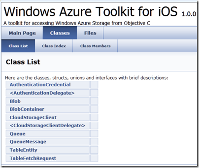
I downloaded the toolkit for iOS and took a look. It is a start, but it is really only a toolkit for Azure storage, excluding SQL Azure.

image

What would I hope for from an iOS toolkit for Azure? Access to SQL Server in Azure would be useful, as would a client for WCF (Windows Communication Foundation). In fact, I would suggest that the WCF RIA Services which Microsoft has built for Silverlight and other .NET clients has a more useful scope than the Azure toolkit; I realise it is not exactly comparing like with like, but most applications built on Azure will be .NET applications and iOS lacks the handy .NET libraries.

A few other observations. The rich documentation for WFC RIA Services is quite a contrast to the Doxyfile docs for the iOS toolkit and its few samples, though Wade Wegner has a walkthrough. One comment asks reasonably enough why the toolkit does not use a two or three letter prefix for its classes, as Apple recommends for third-party developers, in order to avoid naming conflicts caused by Obective C’s lack of namespace support.

The development tool for Azure is Visual Studio, which does not run on a Mac. Microsoft offers a workaround: a Cloud Ready Package which is a pre-baked Azure application; you just have to amend the configuration in a text editor to point to your own storage account, so developers without Visual Studio can get started. That is all very well; but I cannot imagine that many developers will deploy Azure services on this basis.

I never know quite what to make of these little open source projects that Microsoft comes up with from time to time. It looks like a great start, but what is its long-term future? Will it be frozen if its advocate within Microsoft happens to move on?

In other words, this looks like a project, not a strategy.

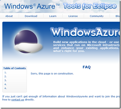
The Windows Azure Tools for Eclipse, developed by Soyatec and funded by Microsoft, is another example. I love the FAQ:

image

This sort of presentation says to developers: Microsoft is not serious about this, avoid.

That is a shame, because a strategy for making Azure useful across a broad range of Windows and non-Windows clients and devices is exactly what Microsoft should be working on, in order to compete effectively with other cloud platforms out there. A strategy means proper resources, a roadmap, and integration into the official Microsoft site rather than quasi-independent sites strewn over the web.

Apple iPad, Pages and Microsoft SharePoint – it works

I’ve been trying out an Apple iPad 2 recently, and one of the topics that interests me is the extent to which it can replace a laptop.

That is a nebulous question of course – it depends what you use a laptop for – but one essential from my perspective is the ability to create and edit documents. Therefore I installed Apple’s iWork apps in their iPad guise: Pages, Numbers and Keynote.

Now, one iPad annoyance is that accessing its storage is more awkward than with a laptop. You cannot simply copy files to and fro over a network. You can copy files to the iPad using a network browser app like Stratospherix FileBrowser, but that works by opening recognised file types.

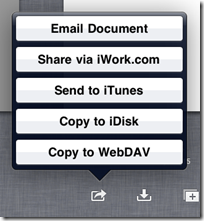
As for Pages, how it stores documents is opaque to the user. They save as you type, and you can manage them in a My Documents view within Pages, but if you want to move them elsewhere you have to use one of five options: email, iWork.com which is cloud storage for iWork apps, send to iTunes for synchronization, copy to iDisk which is cloud storage for MobileMe, or copy to WebDAV.

image

The options for opening a document are similar, but without the email or for some reason iWork.com options.

None of these options appealed greatly, except possibly the last one. I use SharePoint, which supports WebDAV, might this enable me to open and save documents from Pages direct to SharePoint? This is convenient for me, since I have SharePoint as a mapped drive in Windows Explorer, and it works both on the internal network and over the internet.

I typed a document in Pages, then went to My Documents and chose Copy to WebDAV. I chose Word format. Then I entered the URL, username and password for my SharePoint server.

Rather to my surprise, it connected immediately, and performance was good. I then went to my mapped SharePoint drive in Windows Explorer and there it was.

image

It works the other way too. I typed a document in Word 2010 and saved it to SharePoint in the default .docx format. Pages can import .docx, and the document opened smoothly.

image

I appreciate that I am in a small minority of individuals running SharePoint – I do it for test and review – but for business users this is a handy feature. Individuals might want to check out DropDAV, though I’ve not tried the service.

Update: I have tried this successfully with both SharePoint 2010 and SharePoint 2007. If SharePoint is using a port other than 443 for secure access, then you enter the full URL in Pages, for example https://sharepoint.yourdomain.com:444

However I have not yet been able to get this to work with SharePoint in Office 365.

Apple’s iPad 2 Smart Cover: great stand, poor cover

I’ve been trying Apple’s iPad 2 recently, complete with the official Smart Cover.

image

This was shown off at the launch event. It is meant to combine various features:

  • Keep your screen safe from scratches
  • Turn the iPad on and off when opened and closed
  • Clean the iPad screen with its microfiber lining
  • Form a support for the iPad for typing
  • Form a stand for the iPad so you can use it as an expensive digital photo frame

Although a cover seems a simple thing, it seems the results of considerable design effort. It has a magnetic strip which attaches to the left long edge of the unit. The magnet is strong, the fit is perfectly snug, the iPad does turn on and off as advertised.

So what’s wrong? One issue is that unless you detach it completely, the cover is a nuisance when open. You can fold it round the back, but it slips and slides a bit as well as covering the rear camera. So you can detach it, but then you have to put it somewhere, and the magnetic strip is more fiddly to detach and re-attach than a simple slip-on cover.

More seriously, users have complained about several issues:

  • Cover is too flimsy to offer good protection
  • The close fit of the hinge lessens over a few weeks, presumably as the metal bends and stretches slightly
  • The microfiber lining forms the base when used as a stand, so picks up dirt that then gets deposited on your screen

Some users say it it flops over when used as a stand, but I believe this is because they are folding it the wrong way. You must fold it against the grain, so the microfiber is on the outside. Otherwise, yes it flops.

My view: the Smart Cover makes a poor cover, but a great stand. Of course it is a huge price to pay for just a stand, but if you are using the iPad to watch BBC iPlayer, for example, the stand is perfect, much better than trying to prop it up somehow.

image

It is a terrible cover though. Bear that in mind before you buy.

Funbridge: bridge for iPhone and iPad

There are several bridge app for Apple’s iPhone and iPad, but the one I’ve had most fun with is called, appropriately, Funbridge. This is already well-established as a Windows application, where you play against a computer but can compare your performance to other players, making the results much more interesting.

The iOS version is currently a free app, and has just been updated to include Tournaments as well as one-off games, now called Training.

image

In the latest version, you have to log in to play more than a couple of games, though the account is free.

image

Bidding and play is straightforward, with a few caveats. There is no fine-grained control over bidding conventions; you can choose between Beginner, Advanced, Expert, American Standard, Acol, or Polish system. Unless you choose Acol, these are all strong no trump, 5 card major systems. It is worth reading up on the systems used in detail, as otherwise you will get unpleasant surprises.

Note that during both bidding and play, Funbridge will call back to the server before every decision. This means you cannot play offline, and if you are playing where the internet connection is weak, such as on a train, you can expect frustrating delays; games can take so long that you forget what has been played!

image

During play just tap a suit to display all the cards you hold in that suit, then tap a card to play. Take care – there is no undo, and it is all too easy to tap the wrong card and then watch with horror as you see your safe contract sailing down to a penalty.

You can choose to withdraw on a hand, in which case it is not scored, but if you then play it again, you are given a kind of informational score that does not count towards your ranking. It can still be interesting to see how a different line works out.

Once play has completed, you get to compare your score with others and see how many IMPS (International Match Points) you achieved.

image

A really nice feature is that you can click the magnifying glass and get details of each contract, including card-by-card analysis. So if you are amazed at how well or badly someone managed to do, you can see how it happens. Sometimes, I have to say, it happens only because of a baffling misplay. I imagine this happens when the computer is playing on the other side, unless there are serious bugs in the engine.

A Tournament is a sequence of 10 games, at the end of which you can see how you rank among the other players, currently ranging from 150 to 750 or so in number. Scoring in tournaments seems to alternate between IMPs and Pairs scoring – the difference being that Pairs scoring rewards small differences in the score and makes big differences less costly, whereas with IMPs the reverse is true.

Overall it is enjoyable, though as in real bridge there are moments of frustration. The hands seem tilted towards more interesting or better than average holdings, though it is hard to be sure.

One complaint: the server seems to get too busy at times and the software does not cope particularly well; you click Connect and there is no error message, nothing happens.

Enjoy it for nothing while you can – it is “currently free” but I suspect will eventually attract a subscription cost – maybe a similar subscription rate to the desktop version, €74.00 for a year, or maybe something different.

Succeeding in an App Store world: lessons from the Angry Birds story

At Mobile World Congress earlier this year I heard Rovio CEO Mikael Hed address a small group of Apple platform developers on the subject of the changing world of app development. His starting point is that mobile apps and the app store model are transforming the business of software. Of course he has a games industry perspective, but my hunch is that what he says applies more widely. I note that the App Store concept has already come to the Mac, and that Microsoft will follow Apple with something similar in Windows vNext.

What is the effect of an App Store? It combines opportunity and challenge for developers. Opportunity because apps can be found, purchased and installed in a few clicks. Challenge because app stores attract lots of apps, and the barriers to entry are low, much lower than traditional retail channels. This forces prices down and makes it hard to have your particular app stand out.

The App Store model seems to include the idea of single-purpose apps at low prices. Apple still sells iWork, its office suite, for £72.00 as boxed product (UK prices), but on the Mac App Store it is split into three products, Pages, Keynote and Numbers, at £11.99 each. Even if you buy all three it is half the price of the box.

Mac desktop apps are larger and more sophisticated than iPhone apps, so I guess they will always attract higher prices; but I also guess that the factors which have driven down prices on the iPhone App Store will exert the same influence on the desktop store.

So where are prices going? Here is what Hed told us:

On the pricing side, we know now that on the App Store the standard price is fast becoming free, zero. And the premium price is 99 cents. If you go higher than that, then there are higher risks, because you might never reach the top ten, or top 100, and if you do, it will drop off very fast, there’s huge price sensitivity. So this also is a big change for traditional publishers who are used to high prices up front, and that’s the classic business model in gaming. That is changing, so game developers must find additional revenue streams.

This low pricing is the foundation of his thesis. Hed’s view is that software companies, in the games industry at least, have to be ready for it. Further, he thinks that the shift toward mobile is profound and will not reverse:

We are seeing right now a big shift from retail focused, location based games where you have to have your console plugged into your TV. That is slowly slipping away and in its place is coming the digitally downloaded game that you can play anywhere.

How then do you survive and prosper in this new world? Hed’s answer is to build a brand, and find diverse ways to monetize it.

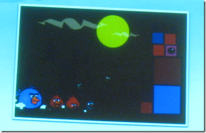
He told us the history of Angry Birds. This, he says, is the first mock screenshot which his game designer made in 2009:
image

The way he explained this game concept to me was that you have these different coloured birds and then you have blocks with similar colours, tap on one of the blocks and the birds will fly and destroy that block. I listened to that description and I felt like, maybe this game concept is not a winner as such, but everybody liked these characters very much and we felt like, hey, we have really here a good starting point.

Rovio at the time was doing what Hed called “work for hire”, such as casual games commissioned by operators or other publishers. “We didn’t have a lot of capital to put into our game,” he said. Rovio kept half its 12-strong team doing the work for hire, and put the other half on Angry Birds. This meant the game took 8 months to develop rather than the usual 3 or 4 months, but he said this slower development time worked out well because the result was more polished.

Hed told us that most app developers push out apps too quickly:

They are concerned about getting their apps quickly out there on the market in order to start generating revenue. Before Angry Birds we did release a couple of other iPhone titles and they didn’t do well at all. We learned a lot from that and one of the things we learned is that never release something that is not completely finished, because it’s so easy for reviewers to just rip your game apart because something about it was not perfect. And that is exactly what is happening. It’s tremendously demanding, the consumer on the app store is tremendously demanding even if they pay only 99 cents, they still expect it to be perfect.

Even more significant was that Rovio consciously planned for Angry Birds to be more than just a game:

Our primary goal with Angry Birds was not to make a lot of money in the app store. Our primary goal was to build a brand.

Angry Birds took off pretty fast. It became the top seller on the iPhone App Store, first in Finland, then in the UK in February 2010, then in the USA in April 2010. Rovio made some decisions. First, it would stick with Angry Birds and build it into a strong franchise, rather than simply investing its profits into new game titles. Second, it would continue to offer free updates for the original app.

Where then are the “additional revenue streams” which Hed says are essential in order to thrive in this new world? In-app purchasing is one, he said, but Rovio decided not to sell additional levels via this channel. Instead it came up with the Mighty Eagle, which he calls a product rather than a feature:

In the Mighty Eagle we offered a way for users to pass levels that they are stuck on, so it gives added value to the users. But we made it into a product, and that is one of the important things of how we act in the marketplace, we make products, we don’t make features. And in this our big role model is Apple. You can see that nobody is that much interested in one “feature”. People want products. That’s why you don’t see Apple coming out with a feature called video calling. You see them coming out with a product called Face Time.

I am not entirely convinced by the distinction between products and features, but I understand the value of this way of marketing software. Hed says Rovio has been rewarded with a 40% conversion rate, much higher than for most in-app upgrades.

Rovio is also doing merchandising. 

image

This helps to sustain the franchise and to make sure that the franchise stays relevant for years to come, and it supports our game sales, and our game sales support our merchandising sales.

he says. It is another example of finding additional revenue streams.

Hed also talked about TV and film projects. Rovio partnered with 20th Century Fox to make a game that ties in with Rio the Movie, hence the game Angry Birds Rio.

He adds that mobile advertising is a key area:

We can see from the amount of time that people spend playing our games and playing everybody else’s games and using those apps, that mobile app advertising will be huge. We will see shifting of advertising towards mobile, because there users will be engaging for long periods of time, they will be exposed to brands repeatedly, they will be closer to the point of purchase.

This has worked for Rovio so far, though personally I am not sure for how long it can prosper if the Angry Birds franchise is all it has. It is a fashion thing and people will get bored of it – or does Rovio now have its own enduring franchise like Disney’s Mickey Mouse?

My main interest though is Hed’s insistence that software world is changing, prices are tumbling, and software developers will have to look for ways to monetize apps that go beyond the purchase price. “It’s the same for everybody. Now the industry is in the midst of transformation so everybody must adapt,” he says.

The mobile app ecosystem before Apple – was it really this bad?

For some time I have been meaning to post about a talk I heard at Mobile World Congress, by Rovio (Angry Birds) CEO Mikael Hed. What interested me about this talk was not so much the Angry Birds app itself – now downloaded over 75 million times – but rather Hed’s thoughtful perspective on what it is like to be a software company in the App era. “It’s been a year of transformation not only for us but for the whole industry,” he told us.

image

Hed started his talk by describing life as a mobile games developer before Apple launched the iPhone in 2007. Rovio was founded in 2003, and did 51 titles before Angry Birds, encompassing “every type of game,” he said.

Before the iPhone came along we were on feature phones only. That market was completely different from the iPhone market today. Looking back on it, it’s a small miracle that there were any game companies in that ecosystem.

Why? Several reasons.

In order to have a game commercially available on a feature phone, you would have to make that game, and make probably nine other strong games in order to be interesting to the carriers. And the carriers would only take your game if you could support all the handsets that their customers had. That meant hundreds of handsets.

Dealing with the carriers was a huge headache.

You would have to make an agreement with each carrier in each country, and you had to have an all-day sales team working for you to do any business at all. It was really expensive.

After all that, the revenue share and payment system was loaded against you.

All operators would take more than half of the revenue that you would make, and then pay you a long time after your game is out. They would report quarterly, and once you get the report you send them an invoice, then they have ninety days to pay. So if by some miracle you manage to get your game onto their devices , the earliest time you would see your money would be six months later.

The system was poor for consumers too.

It was also very difficult for consumers to find these games. It varied a lot across the different carriers, how you find the games. You might have to send an SMS somewhere and get a link back, click on that, download the game, and then hope that the game would actually run on your device; and probably at the end even if you had the latest and greatest phone it was made for the lowest common denominator so it would not use any of the nice features of your phone. So you would get a poor experience, if it worked at all. That was the past ecosystem.

Ouch. Was it really that bad?

The immediate conclusion is that while Apple’s closed and dictatorial iOS ecosystem has drawbacks, it is at least one that works, whereas what existed before was badly broken.

So how are things for app developers now, in the Apple era? Look out for a follow-up post soon. And by the way, it is still by no means easy.

Building a PhoneGap app for iPhone with Adobe Dreamweaver CS5.5

After trying out Adobe’s new Dreamweaver CS5.5 for building a PhoneGap app for Google Android, I was keen to try the same for Apple iOS. In particular, I wanted to see if the performance problems with jQuery Mobile and PhoneGap on Android were also an issue on iOS.

This turned out to be more complex than I had imagined. Bear in mind that I have not done a lot of previous iOS development; but I reckon that makes me a good test case for Adobe’s market here. Ideally you should be able to use Dreamweaver alone to build your app and make a fortune on Apple’s popular app store.

I installed Dreamweaver CS5.5 without any issues and copied my Calculator example from PC to Mac. I am not going to repeat the steps that were the same as for Android; read my earlier post. I will mention that I puzzled over the setting for the IOS Developer Tools Path. After trying various sub-directories I eventually discovered that simply entering /Developer here works. One of the issues I have with this stuff is that clicking Help generally does not help. I resorted to watching one of Adobe’s videos and checking out the screen there.

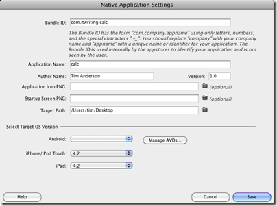
My app worked fine though and I was able to run it up in the iPhone simulator. However I really wanted to test it on the device itself. The problem: this is all you get in Dreamweaver in terms of application settings:

image

I have not yet found any documentation from Adobe concerning what to do once your PhoneGap app is ready for on-device testing, though there may be some somewhere.

My solution was to download a separate install of PhoneGap, picking the latest version which is 0.9.5. Then I downloaded Xcode 4 and the latest iOS SDK; I had not previously installed this as I have only just signed up for Apple’s paid developer program.

I might have been better sticking with Xcode 3.x, as it turns out that PhoneGap’s support for Xcode 4 is still work in progress. I used Shazron Abdullah’s script which creates an Xcode 4 PhoneGap project from the command line. Then I copied my Calc application and the jQuery mobile directory into the project and opened it in Xcode 4.

Nothing worked and I had to do a number of things to get it to build. Most problems were solved using this guide by Cameron Perry and the comments which follow. Here’s what I recall doing:

  • I removed a red link to PhoneGapLib.xcodeproj and added it back from ~Documents/PhoneGapLib
  • I added i386 to the list of Valid architectures in build settings, for both the PhoneGapLib and my Calc project
  • I added an entry for PHONEGAPLIB to the Xcode 4 Source Trees, set to /Users/username/Documents/PhoneGapLib/ using the full path and not the ~Documents abbreviation.
  • I obtained an ID for my app from Apple’s developer portal and pasted into the project as the Bundle identifier (info section).

At this point the project almost built but I still got two Apple Mach-O Linker errors relating to PhoneGapDelegate:

image

I tried a couple of things to fix this. I added the PhoneGapLib project as a target dependency for Calc, which did no harm but was not a fix. Then I went to the Link Binary with Libraries section of Build Phases and added a reference to libPhoneGapLib.a

image

The odd thing is that libPhoneGapLib.a now appears in my project in red, suggesting something missing, but the project now builds fine; I am sure an Xcode 4 guru can advise.

So here is my app running on a real iPhone 4:

image

I slightly modified the design to fit the iPhone 4 screen.

Now for the bad news: performance is still not really good enough. To be clear, the problem is a slight pause between tapping a button and the number being entered. One bad symptom is that if you are in a hurry and tap several numbers quickly, some may not register. The iPhone 4 runs the app slightly better than my HTC Desire, but I would still not be happy releasing it with this performance – leaving aside the fact that a better calculator app comes free with the iPhone.

I tried specifying a release build in Xcode 4 but it made little difference. I suspect performance could be improved either by not using jQuery mobile, or by configuring it to reduce the richness of the buttons it creates.

Leaving that aside, it seems to me that Adobe has some work to do in making it easier to get from a Dreamweaver project running in the emulator, to an app that you can test on a device and deploy to the app store. Although the steps I took seem arduous, it is not really so bad once you get it working. You could create a much more complex app entirely within Dreamweaver, and then the work involved in moving it to Xcode would be pretty much the same as I had to do for my simple calculator. So I am not going to say that the PhoneGap integration is no use, just that it needs better documentation. Maybe in the next version we will get fuller integration that will do device build and deploy as well as building for the simulator.

Photosynth for iPhone: capturing the unphotographable

We are having some unusually fine weather in the UK and I went for a walk in the Derbyshire Peak District yesterday. I was reflecting how hard it is to photograph wide vistas of countryside when I remembered that I installed the Microsoft Photosynth iPhone app a couple of weeks ago.

image

It really is easy to use: you just fire up the app, tap to start a new picture, and turn the iPhone to new positions guided by on-screen markers. When the iPhone beeps, hold it still and a new photo is added.

image

Panoramic photography is not new of course; my old Canon Ixus has a panorama feature. However, you have to navigate several menus to get the mode engaged, manually position the camera, and then use a separate application to stitch the images together.

The Photosynth app by contrast is great to use, and I have taken a landscape picture which I would never have bothered with before. My only complaint is that the beep can be hard to hear, but even if you miss it, the app does a reasonable job, especially in bright sunlight.

There are plenty of interesting images now turning up on the official Photosynth site – check the Mobile Panoramas section.

For more information see the official announcement post and video.

The point to ponder is why the app has come out first for Apple’s iPhone, rather than the company’s own Windows Phone7? Apparently a Windows Phone version is in preparation.

Logitech’s Squeezebox app for iPhone and iPad: nice to have but a missed opportunity

Logitech has released a Squeezebox control app for iPhone and iPad, to match an existing app for Android.

I am a Squeezebox fan. The system is excellent for multi-room – just put a Squeezebox player in any room where you want music, put it on your home network (usually wifi), and it finds your music collection. You can get a player like the Touch, which I reviewed here, or an all-in-one unit like the Boom, which I reviewed here. I rip CDs to FLAC using dbPowerAmp. Squeezebox does multi-room properly, in that each player can play something different, and the sound quality is generally excellent. Internet radio is also available, and there is no need to have a separate tuner.

That said, the appeal of Squeezebox is limited by the techie nature of the product, especially the software. When Logitech acquired Slimdevices in 2006, I thought we might see a new focus on ease of use, but it has not really happened. Apple does this better, making it hard for Squeezebox to compete with iTunes and Airport Express or Apple TV, even though the Squeezebox system is more open and superior in some ways.

There are multiple ways to control a Squeezebox player. You can use a remote to navigate the display on the player, whether the simple but bold display on a Classic, or the graphical colour display on a Touch. You can use touch control on a Touch screen. You can use a web browser on a PC, Mac or any machine on the network. Or you use an app such as SqueezePlay on a PC, or third party apps like iPeng on iOS, or Squeezepad on an iPad.

All these methods work, but in general the web browser is the most feature-rich and good if you are sitting at a desk, while the apps are better if you have a suitable device like an iPhone, iPad, or Android smartphone. The remotes work, but you need to be close enough to read the display and navigation can be fiddly.

An iPhone app is ideal though, so it is great news that Logitech has now released an official app for the iPhone. It is free, and unless you already have iPeng a must-have for Squeezebox users who have an iPhone. Apps are better than a remote for all sorts of reasons:

  • No need to point at an infra-red receptor
  • No need to read a distant display
  • Album artwork on the remote
  • More features conveniently available

I downloaded the new app and ran it. The first thing you have to do is to log into Mysqueezebox.com, Logitech’s internet service. In fact, the impression you get is that you cannot use the app without logging on. I am not sure if there is any way round this, but it seems odd to me. Presuming you are using a local Squeezebox server, why require log-on to an internet service?

I already have a Mysqueezebox account though, so I logged on, whereupon the various players we have around the house appeared for selection. Once selected, I get a menu similar to that on a physical player or on SqueezePlay:

image

If I click My Music, I can navigate using the usual range of options, including Artists, Albums, Genres, New Music (which means recently added) or my favourite, Random Mix. Just selected an album is not enough to play it, but shows the tracks; tapping the first track starts it playing. Eventually you will get the Now Playing screen, which you can also access by pressing the musical note icon on the Home screen.

image

Perhaps I am fussy, but I am not happy with this screen. As you can see, the album artwork is overlaid with text and controls, and although a progress bar can be shown or hidden by tapping, the other controls seem immoveable, which means you cannot see the full artwork.

My other complaint is that the user interface, while familiar to those who already know Squeezebox, lacks the usability you expect from an iPhone app. Operating it takes too many taps. Take search, for example. You want to find a different song, so you tap Back to get the Home screen, then Search. Type something in, then click Search. The next screen then asks whether you want to search in My Music or Internet Radio. You tap My Music, and still get no results, just a list that says Artists, Albums, Songs, Playlists. You tap Songs, and now you finally get a results list. Tap a song to play.

Personally I think search is such a critical function that it should be available directly from the Now Playing screen; and that it should be smart enough to look for matches anywhere it can and present some top matches immediately.

Another annoyance is that you cannot actually play a song through the iPhone itself. This is such an obvious feature that I cannot understand why Logitech has not implemented it; it would enable your Squeezebox music collection for personal listening on a device. Perhaps Logitech imagines that it is protecting sales of its players, when in fact it is just undermining the appeal of the system.

Well, it is free, I like the Squeezebox system, and the app is useful, so perhaps I am complaining too much. It is frustrating though, because with a little investment in software Logitech could bring its excellent features to a broader group of users.