Category Archives: apple

ITWriting.com awards 2011: ten key happenings, from Nokia’s burning platform to HP’s nightmare year

2011 felt like a pivotal year in technology. What was pivoting? Well, users are pivoting away from networks and PCs and towards cloud and devices. The obvious loser is Microsoft, which owns PCs and networks but is a distant follower in devices and has mixed prospects in the cloud. Winners include Apple, Google, Amazon, and Android vendors. These trends have been obvious for some time, but in 2011 we saw dramatic evidence of their outcome. As 2011 draws to a close, here is my take on ten happenings, presented as the first ever ITWriting.com annual awards.

1. Most dramatic moment award: Nokia’s burning platform and alliance with Microsoft

In February Nokia’s Stephen Elop announced an alliance with Microsoft and commitment to Windows Phone 7. In October we saw the first results in terms of product: the launch of the Lumia smartphone. It is a lovely phone though with some launch imperfections like too short battery life. We also saw greatly improved marketing, following the dismal original Windows Phone 7 launch a year earlier. Enough? Early indications are not too good. Simply put, most users want iOS or Android, and the app ecosystem, which Elop stated as a primary reason for adoption Windows Phone, is not there yet. Both companies will need to make some smart moves in 2012 to fix these issues, if it is possible. But how much time does Nokia have?

2. Riskiest technology bet: Microsoft unveils Windows 8

In September 2011 Microsoft showed a preview of Windows 8 to developers at its BUILD conference in California. It represents a change of direction for the company, driven by competition from Apple and Android. On the plus side, the new runtime in Windows 8 is superb and this may prove to be the best mobile platform from a developer and technical perspective, though whether it can succeed in the market as a late entrant alongside iOS and Android is an open question. On the minus side, Windows 8 will not drive upgrades in the same way as Windows 7, since the company has chosen to invest mainly in creating a new platform. I expect much debate about the wisdom of this in 2012.

Incidentally, amidst all the debate about Windows 8 and Microsoft generally, it is worth noting that the other Windows 8, the server product, looks like being Microsoft’s best release for years.

3. Best cloud launch: Office 365

June 2011 saw the launch of Office 365, Microsoft’s hosted collaboration platform based on Exchange and SharePoint. It was not altogether new, since it is essentially an upgrade of the older BPOS suite. Microsoft is more obviously committed to this approach now though, and has built a product that has both the features and the price to appeal to a wide range of businesses, who want to move to the cloud but prefer the familiarity of Office and Exchange to the browser-based world of Google Apps. Bad news though for Microsoft partners who make lots of money nursing Small Business Server and the like.

4. Most interesting new cross-platform tool: Embarcadero Delphi for Windows, Mac and iOS
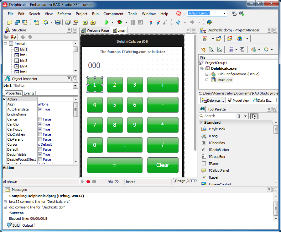
Developers, at least those who have still heard of Embarcadero’s rapid application development tool, were amazed by the new Delphi XE2 which lets you develop for Mac and Apple iOS as well as for Windows. This good news was tempered by the discovery that the tool was seemingly patched together in a bit of a hurry, and that most existing application would need extensive rewriting. Nevertheless, an interesting new entrant in the world of cross-platform mobile tools.

5. Biggest tech surprise: Adobe shifts away from its Flash Platform

image

This one caught me by surprise. In November Adobe announced a shift in its business model away from Flash and away from enterprise development, in favour of HTML5, digital media and digital marketing. It also stated that Flash for mobile would no longer be developed once existing commitments were completed. The shift is not driven by poor financial results, but rather reflects the company’s belief that this will prove a better direction in the new world of cloud and device. Too soon and too sudden? Maybe 2012 will show the impact.

6. Intriguing new battle award: NVIDIA versus Intel as GPU computing catches on

In 2011 NVIDIA announced a number of wins in the supercomputing world as many of these huge machines adopted GPU Computing, and I picked up something of a war of words with Intel over the merits of what NVIDIA calls heterogeneous computing. Intel is right to be worried, in that NVIDIA is seeing a future based on its GPUs combined with ARM CPUs. NVIDIA should worry too though, not only as Intel readies its “Knight’s Corner” MIC (Many Integrated Core) chips, but also as ARM advances its own Mali GPU; there is also strong competition in mobile GPUs from Imagination, used by Apple and others. The GPU wars will be interesting to watch in 2012.

7. Things that got worse award: Spotify. Runners up: Twitter, Google search

Sometimes internet services come along that are so good within their niche that they can only get worse. Spotify is an example, a music player that for a while let you play almost anything almost instantly with its simple, intuitive player. It is still pretty good, but Spotify got worse in 2011, with limited plays on free account, more intrusive ads, and sign-up now requires a Facebook login. Twitter is another example, with URLS now transformed to t.co shortcuts whether you like it not and annoying promoted posts and recommended follows. Both services are desperately trying to build a viable business model on their popularity, so I have some sympathy. I have less sympathy for Google. I am not sure when it started making all its search results into Google links that record your click before redirecting you, but it is both annoying and slow, and I am having another go with Bing as a result.

8. Biggest threat to innovation: Crazy litigation from Lodsys, Microsoft, Apple

There has always been plenty of litigation in the IT world. Apple vs Microsoft regarding graphical user interfaces 1994; Sun vs Microsoft regarding Java in 1997; SCO vs IBM regarding UNIX in 2003; and countless others. However many of us thought that the biggest companies exercised restraint on the grounds that all have significant patent banks and trench warfare over patent breaches helps nobody but lawyers. But what if patent litigation is your business model? The name Lodsys sends a chill though any developer’s spine, since if you have an app that supports in-app purchases you may receive a letter from them, and your best option may be to settle though others disagree. Along with Lodsys and the like, 2011 also brought Microsoft vs several OEMs over Android, Apple vs Samsung over Android, and much more.

9. Most horrible year award: HP

If any company had an Annus Horribilis it was HP. It invested big in WebOS, acquired with Palm; launched the TouchPad in July 2011; announced in August that it was ceasing WebOS development and considering selling off its Personal Systems Group; and fired its CEO Leo Apotheker in September 2011.

10. Product that deserves better award: Microsoft LightSwitch
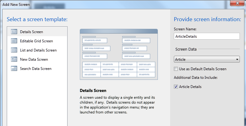
On reflection maybe this award should go to Silverlight; but it is all part of the same story. Visual Studio LightSwitch, released in July 2011, is a model-driven development tool that generates Silverlight applications. It is nearly brilliant, and does a great job of making it relatively easy to construct business database applications, locally or on Windows Azure, complete with cross-platform Mac and Windows clients, and without having to write much code. Several things are unfortunate though. First, usual version 1.0 problems like poor documentation and odd limitations. Second, it is Silverlight, when Microsoft has made it clear that its future focus is HTML 5. Third, it is Windows and (with limitations) Mac, at a time when something which addresses the growing interest in mobile devices would be a great deal more interesting. Typical Microsoft own-goal: Windows Phone 7 runs Silverlight, LightSwitch generates Silverlight, but no, your app will not run on Windows Phone 7.  Last year I observed that Microsoft’s track-record on modelling in Visual Studio is to embrace in one release and extinguish in the next. History repeats?

An Apple iPad Christmas

The Apple iPad had a stunning Christmas – at least, it did in my part of the world.

A key factor was that EA Games decided to offer a range of classic board games adapted as iPad apps for 69p ($0.90)  each. So for less than the cost of a takeaway pizza I downloaded Scrabble, Monopoly, Trivial Pursuit and Risk.

imageimage

The games are not perfect – Scrabble accepts all sorts of odd words and US spellings, for example – but they are official licensed versions, nicely implemented, and a lot of nostalgic fun, which is the idea after all.

imageimage

Trivial Pursuit supports in-game purchases for extra questions, so that could work out more expensive eventually, but nobody could complain about the value.

It is not quite the full board game experience, with wine spilt on the pieces, junior tipping over the board in disgust, and game abandoned early because it is time to visit grandma, but the changes are mostly for the better.

One thought: this is another example of how well a tablet substitutes for physical things. A book, a board game, a photo album: the iPad is a better replacement than a PC or laptop, easily passed round, long battery life, no flapping screen, and a more natural user interface.

I am not sure what are the economics of selling games at 69p, but no doubt EA has drawn the graphs. Currently EA 69p games occupy four of the “Top Paid iPad Apps” category slots in the UK store.

Of course I am interested in the big picture. Looking at user reviews of Android equivalents like Monopoly I get the impression that there are more bugs, partly because EA has a dedicated iPad verson for these games whereas the Android versions are universal across multiple screen sizes, and partly because there are more OS versions and hardware differences to accommodate.

What about other tablets or new entrants to the market like Windows 8 in 2012? Prising users away from their Apple devices will not be easy, though I still think Microsoft has chances if it plays to its strengths in business applications.

Running Windows on an Apple iPad

I love the convenience of the iPad but there are times when I miss Windows apps. It is not just for work; there is nothing on the iPad to rival Jack Bridge, for example.

The solution is to run Windows on the iPad via remote desktop.

image

Most versions of Windows have remote desktop built-in, though you do need to install a client on the iPad. I have tried several and settled for the moment on Mocha RDP. If you tap the up arrow at bottom right, you get a toolbar which controls the on-screen keyboard, extra keys useful for Windows, and a menu with options including a macro of pre-defined keystrokes. It even works with my cheap iPad keyboard.

The downside of this approach is that Windows needs to be running somewhere on your network. However Mocha RDP supports wake on lan, so you can turn it on remotely; note that this normally needs to be activated in the PC BIOS.

In my case I already run a Hyper-V server, a free download. I have installed Windows 7 on a VM (virtual machine), so it is always available.

The iPad also supports VPN (Virtual Private Network), so given a decent broadband connection I could connect to Windows while out and about. Alternatively there are systems like LogMeIn which do not require a VPN, though you have to install the LogMeIn agent on the target PC.

The general approach makes a lot of sense to me. Technically it is a hybrid thin/thick client approach. An iPad or other tablet is smart and has its own local apps and storage, but does not attempt to provide the full capabilities of a PC or Mac. When you need that, you can log into a remote desktop.

It is another example of how the mobile revolution is making us rethink how we do computing. The thin client concept is nothing new, but it is only now that it is becoming compelling for users as well as administrators, giving them the convenience of a tablet as well as access to rich applications like Microsoft Office.

Microsoft no doubt has its own plans for combining tablets with desktop-as-a-service. I would guess that it involves Windows 8 on ARM; but it will take some effort to tempt users away from their iPads.

Review: my bargain iPad Bluetooth keyboard from a Chinese market

During my recent visit to Beijing I went along to the Hong Qiao market. It was quite an experience, with lots of fun gadgets on display, mostly fake but with plenty of good deals to be had.

image

I did not buy much but could not resist an iPad Bluetooth keyboard. I have been meaning to try one of these for a while. The one I picked is integrated into a “leather” case.

image

The packaging is well future-proofed:

image

Of course I had to haggle over the price, and we eventually settled on ¥150, about £15.00 or $24.00.

It comes with a smart 12-page manual, which you will enjoy if you like slightly mangled English, though there are some small differences between the product and the manual. A power LED is described in the manual but seems not to exist. The manual makes a couple of references to Windows and in fact the keyboard does also work with Windows, but there is nothing silly like a Windows key and this really is designed for the iPad.

No manufacturer is named, which is odd as the vendor insisted that it is “original”, though the box does say “Made in China”.

The design is straightforward. The iPad slots in to what becomes the top flap of the case. Open the case, and you can set the iPad into an upright position for typing. The lower flap of the case has a magnetic clasp, which works fine. It is a bit of a nuisance though as it gets a little in the way when you are in typing mode. You cannot fold it back to tuck it out of the way.

image image

I noticed a few blemishes in the case; possibly I had a second-grade example.

image

But I have not found any technical problems.

The unit is supplied with a micro USB cable for charging. It did not take long to charge and I think was already half-charged when I purchased.

Here is a closer look at the keyboard itself.

image

Once charged, you turn on the power and pair it to your iPad by pressing the Connect button. I had a little difficulty with this until I discovered that you must press down until you feel a distinct click, then it goes into pairing mode. If you then go into the iPad’s Bluetooth settings you will see the keyboard as an available device. Connect, and you are prompted with a code. Type this code on the keyboard to complete the pairing.

The power switch on the keyboard is impossibly small and fiddly to use. If you know how small is a standard micro USB socket you will get the scale in this picture:

image

So can you just leave the keyboard on? The keyboard claims a standby time of 100 days, so maybe that will be OK, though the manual warns:

When you are finished using your keyboard or you will be required after the keyboard to carry, so don’t forget to set aside the keyboard to switch the source OFF, turn off the keyboard’s power to extend battery life.

Note: When you normally using the keyboard, or if you are not using the keyboard and didn’t turn off the power switch, please don’t fold or curly, so you will have been working at the keyboard, it will greatly decrease you using the keyboard.

I think this means that turning it off is recommended.

Now the big question: how is it in use? It is actually pretty good. I can achieve much faster text input with the keyboard than using the on-screen option, and it is great to see your document without a virtual keyboard obscuring half the screen.

The keyboard is the squishy type and claims to be waterproof. In fact:

It is waterproof, dustproof, anti-pollution, anti-acid, waterproof for silicone part

according to the manual, as well as having:

Silence design, it will not affect other people’s rest.

which is good to know.

The keyboard has a US layout, but shift-3 gets me a £ sign and alt-2 a € symbol so I am well covered.

There are a number of handy shortcut keys along the top which cover brightness, on-screen keyboard display, search, iTunes control, and a few other functions. There is a globe key that I have not figured out; it looks as if it should open Safari but it does not. There are also Fn, Control, Alt and Command keys, cursor keys, and Shift keys at left and right. Most of the keyboard shortcuts I have seen listed for iPad keyboards in general seem to work here as well.

Learning keyboard shortcuts is one of things you need to do in order to get the best from this. For example, press alt+e and then any vowel to get an acute accent, press alt+backtick and then any vowel to get a grave accent, and so on. Finding the right shortcuts is a bit of an adventure and I have more to discover. Not everything is covered; I have not found any way to apply bold from the keyboard in Pages, for example. I would also love to find an equivalent to alt-tab on Windows, which switches through running apps. There is a Home key which you can double-tap, but then you have to tap the screen to select an app (unless you know better).

I am pleased with the keyboard, though given the defects in the case and irritations like the tiny power switch it is not really a huge bargain. I find it thought-provoking though. Is iPad + keyboard all I need when on the road, or have I just recreated an inferior netbook? The size and weight is not much different.

image

Unlike some, I do still see value in the netbook, which has a better keyboard, a battery life that is nearly as good (at least it was when new), handy features like USB, ethernet and VGA ports, and the ability to run Microsoft Office and other Windows apps.

I am also finding that while I like the iPad keyboard for typing, the integrated case has a downside. If you just want to use the iPad as a tablet, the keyboard gets in the way. Maybe a freestanding Bluetooth keyboard is better, like the official Apple item, though that means another item kicking around in your bag.

In the end, the concept needs a little more design work. Having a keyboard in the case is a good idea, but it needs to be so slim that it does not bulk up the package much and gets out of the way when not needed. Perhaps some sort of fabric keyboard is the answer.

Incidentally, if you hanker after one of these but cannot get to the Hong Qiao market, try eBay or Amazon for a number of keyboard cases that look similar to me. Look carefully though; I noticed one by “LuvMac” which lacks a right Shift key, causing some complaints. Mine does have a right Shift key; perhaps it is a later revision.

Hmm, I have just realised that the lady on the stall forgot to give me a receipt or warranty …

Why developers need a Mac

I am by no means an Apple fan. For one thing, I find Windows (and Linux) stable and fast, so you are not going to hear me argue that my computing life was transformed once I made that Switch (with a capital letter). Admittedly that is partly because I am familiar with how to fix and tune Windows and remove foistware, but it is not that hard. For another, I am not an admirer of Apple’s secretive approach, or the fact that most requests for comment from journalists are responded to with silence. For a third, I dislike the notion that all apps for its popular mobile platform must be distributed through the Apple store and subject to a fee, now extended to in-app upgrades and subscriptions as well as initial sales. There is also much that I admire about Apple’s platform, but I hope I have convinced you that I am not so bedazzled by the company that I am unable to think coherently about its products.

Nevertheless, I have run a Mac alongside Windows for years now, and I find myself needing it increasingly. Here are four reasons.

The first is that sooner or later you will need to build or test an app for the Mac or, more likely, for iOS. You can only do so using a Mac (leaving aside the exciting world of the hackintosh). This is because Apple only provides the iOS SDK and simulators for its own operating system.

As an aside, I recently spoke to Keith Varty who is evangelising Windows Phone development at Nokia. I asked about the issue of Visual Studio only running on Windows, was that an obstacle for developers using a Mac? He pointed out that it is the same in reverse with Apple, you need a Mac to develop for the iPhone. In fact, it is easier to develop for Windows using a Mac, thanks to the existence of excellent PC emulators, than it is to develop for a Mac using Windows. In any case, special rules apply for Apple.

Second, other than in the most closed internal environments, some of your users will have a Mac or at least an iPad or iPhone. A few years back both developers and system administrators could get away with a deliberate ignorance of Apple computers, saying they are “not supported” or “untested” or just “I have no idea.” That is no longer acceptable (if it ever was) and it is important to test apps on a Mac where that is appropriate, as with web or cross-platform Java or Adobe AIR applications, and more generally to get a feel for how things work on a Mac so that you can respond intelligently to users.

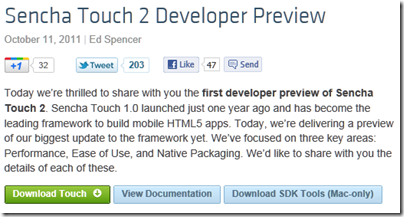
Third, in many areas of development Macs are now dominant. This means that Windows-only developers may be disadvantaged. Today, for example, I was researching Sencha products and came across this:

image

Yes, to get the preview developer tools for Sencha Touch 2, you need a Mac. No doubt Windows versions will follow, but there are times when you need a Mac just to keep up with the latest technology.

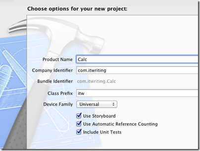
Fourth, and this is the most difficult point to make, it is valuable to spend some time on a Mac to avoid bad assumptions about usability. One example that comes to mind is version control. On Windows there is no problem using Git, or Subversion, or any number of systems including Microsoft’s Team Foundation Server installed either locally or on its own server. There is some setup involved though. On a Mac with the latest Xcode, you will find a checkbox in the new project wizard:

image

It is built-in. There is nothing more to do other than check this box. And yes, I know it is pretty easy to use Subversion or Git on Windows – though I would never describe a Team Foundation setup as trivial – but I am talking about the usability of a single checkbox. If you are thinking about the design of your own UI then spending some time on a Mac is though-provoking and likely to be beneficial.

By the way, some other parts of Xcode are less usable than Visual Studio so do not read too much into this example!

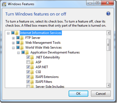
Another example which comes to mind is installing a web server. Windows has IIS, which is a good web server, and you can enable it on Windows 7 by going to Control Panel, Programs, Turn Windows Features on and off, and then waiting while the dialog populates, and then checking which bits of IIS you want to install:

image

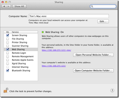
Not difficult, though the intricacies of which Application Development Features you need may require some research. But here is how you set up Apache on a Mac. Go to System Preferences, and check Web Sharing. Apache is now up and running, and on my Mac Mini it started instantly:

image

I am sure there are many more examples, and even examples where Windows has better usability than then Mac (I miss the thumbnail previews in the task bar) but my point is this: it pays to have experience beyond Windows from which to evolve your own user interface ideas.

Post sponsored by Monster for the best in IT Jobs.

HTML5 scorecard: Amazon Kindle Fire weak, iOS 5 great, IE10 preview one of the best

The Sencha blog has a great series of posts on HTML5 support on various devices. This is of direct interest to Sencha because its products are JavaScript and CSS application frameworks, Sencha Touch for mobile and ExtJS for any browser. The latest post is on the Amazon Kindle Fire – and it is weak:

The Amazon Kindle Fire doesn’t seem designed to run HTML5 apps as a primary goal. It does a good job of displaying ordinary web pages and its resolution and rendering capabilities meet that need well. But there are too many sharp edges, performance issues, and missing HTML5 features for us to recommend that any developer create web apps primarily for the Kindle Fire. The iPad 2 running iOS 5 continues to be the tablet to beat, with the PlayBook a respectable runner-up in HTML5 capabilities.

Part of the problem is that the Fire runs Android 2.3.4 (Gingerbread) which has a weaker browser than later versions. That is not the only source of disappointment though. According to Sencha’s Michael Mullany, the GPU is not used for hardware acceleration of browser content, the JavaScript timer is laggy, there is no embedded HTML5 video (videos launch in a separate player), and CSS corners are not properly anti-aliased.

But what about the Kindle’s cloud-accelerated browsing that we heard so much about when it was announced? This is the biggest disappointment:

One of the main selling points of the Kindle browser is supposed to be its cloud-caching and pipelined HTTP connection that uses the SPDY protocol. This does seem to speed up normal page browsing a little, but it’s not very noticeable and we didn’t test this rigorously. But for HTML5 web apps, where code is downloaded and executed, there doesn’t seem to be any performance difference when we tested with acceleration on and off. It doesn’t appear as if client JavaScript is executed on the server-side at all, so the Kindle does not seem to have Opera Mini-style server-side execution. And SunSpider scores were essentially the same when accelerated browsing was turned on or off.

Moving on from Kindle, it is interesting but not surprising to see a great report for HTML5 in Apple’s iOS 5. Less expected though is a big thumbs-up for HTML5 in Microsoft’s IE10 preview on Windows 8:

Simply put, (and with the caveat that we were running on the notably overpowered developer preview hardware) the IE10 HTML5 experience is one of the best we’ve seen on any platform to date. After a decade of web neglect, Microsoft is back with a vengeance.

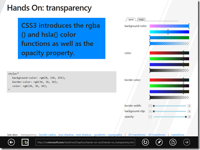
image

The main caveat is the absence of WebGL. Microsoft is supporting its own 3D graphics library.

Another worry for Microsoft is simply the level of hostility towards the company and IE in particular, among the developer and designer community it so much wants to reach. You can get a flavour of this from some of the comments to Mullany’s post, for example:

I never really like Windows and I absolutely despise Internet Explorer. There are so many exceptions in code to be made for Internet Explorer that i stopped trying so hard to make it look the same as other browsers. Hopefully, IE 10 will stop all of these exceptions and weird additions that are made to websites that make everything instantly awful so I can actually go back to trying to make things look nice in IE. It’s really sad though that so many people use Windows and IE that we cannot ditch it for a better system and better browser.

What about Android? The most recent offering covered in the Sencha series is Motorola Xoom which is a disaster:

We were excited about the first true Android operating system for tablets and had high hopes for a mobile browser that was as powerful as the platform. Sadly, the Xoom and Honeycomb are a real disappointment. We found consistent and reproducible issues in CSS3 Animations and CSS3 Transitions among other things. We had issues where the browser either hung or crashed. Regular scrolling was slow or below full framerate. We had issues where media playback failed or performed incorrectly. At times it felt like we were using a preproduction device, but we bought our test device from a Verizon Wireless store.

I have a hunch that the latest Galaxy Tab might fare better. Sencha did like the HTML5 support in the BlackBerry PlayBook though.

With Adobe Flash now in decline on mobile devices (Adobe is no longer working on the mobile Flash player) HTML5 support is all-important for rich browser-hosted apps; I will be watching with interest for future Sencha reports.

Quick thoughts on Xcode and Objective C versus Microsoft’s tools

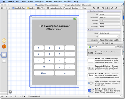
I have been trying out JetBrains’ AppCode which meant working in an Apple development environment for a time. I took the opportunity to implement my simple calculator app in iOS native code.

image

Objective C is a distinctive language with a mixed reputation, but I enjoy coding with it. I used Automatic Reference Counting (ARC), a feature introduced in Xcode 4.2 and OSX 10.7, iOS 5; ARC now also works with 10.6 and iOS 4. This means objects are automatically disposed, and I did not have to worry about memory management at all in my simple app. This is not a complete memory management solution (if there is such a thing) – if you use malloc you must use free – but it meant that the code in my app is not particularly verbose or complex compared to other languages. Apple’s libraries seem to favour plain English method names like StringByAppendingString which makes for readable code.

I was impressed by how easy it is to make an app that looks good, because the controls are beautifully designed. I understand the attraction of developing solely for Apple’s platform.

I also love the integrated source control in Xcode. You find yourself using a local Git repository almost without thinking about it. Microsoft could learn from that; no need for Team Foundation Server for a solo developer.

I did miss namespaces. In Objective C, if you want to remove the risk of name collision with a library, you have to use your own class prefix (and hope that nobody else picked the same one).

image

Interface Builder, the visual UI designer, is great but many developers do not use it, because coding the UI without it is more flexible. It is a shame that you have to make this choice, unlike IDE’s with “two way tools” that let you edit in code or visually and seamlessly keep the two in synch. I found myself constantly having to re-display windows like the Attributes Inspector though it is not too bad once you learn the keyboard shortcuts. The latest Interface Builder has a storyboard feature which lets you define several screens and link them. It looks useful, though when I played with this I found it difficult to follow all the linking lines the designer drew for me.

It is interesting to compare the Mac and iOS development platform with that for Windows. Microsoft promotes the idea of language choice, though most professional development is either C# or C++, whereas on Apple’s platform it is Objective C and Cocoa or you are on your own. Although Mac and Windows are of a similar age, Microsoft’s platform gives a GUI developer more choices: Win32, MFC, WTL, Windows Forms, Windows Presentation Foundation and Silverlight, and in Windows 8 the new WinRT.

I get the impression that Microsoft is envious of this single-minded approach and trying to bring it to Metro-style Windows 8, where you still have a choice of languages but really only one GUI framework.

That said, Visual Studio is an impressive tool and both C# and C++ have important features which are lacking in Objective C. I would judge that Visual Studio is the more productive tool overall, but Apple’s developer platform has its own attractions.

Review: JetBrains AppCode for Objective C

I have been trying out JetBrains AppCode, a new IDE for Apple’s Objective C. The company is best known for its IntelliJ IDE for Java, and AppCode essentially takes the same core IDE and reworks it for Objective C. AppCode is itself a Java application, but unless you have a religious objection to this I doubt you will find it a problem: I found it perfectly snappy and responsive on my machine, a 2.3 Ghz Core i5 with 8GB RAM.

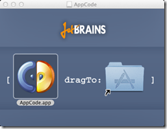
Installation was a snap, as Mac users expect.

image

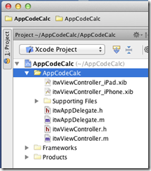
One thing I discovered immediately is that AppCode is not a replacement for Xcode, the official Apple IDE. The Apple SDKs are delivered with Xcode, and AppCode requires it. An AppCode project is also an Xcode project.

image

This is particularly important if you want to use Interface Builder, the Xcode visual designer, since AppCode has no equivalent. Double-click the .xib file and it opens in Xcode. This is a disorientating at first, but in practice I found it convenient to be able to switch between the two IDEs.

So why bother with AppCode, when Xcode is free? It is certainly not essential, but my view is that tools which save time or improve quality are worth the investment. Whether AppCode will do this for you will depend on how you work and whether you have any frustrations with Xcode, which improved considerably in version 4. Out of the box, Xcode has integrated Git or Subversion source code control, unit test integration, refactoring including Rename, Extract, and Encapsulate, the aforementioned Interface Builder, and a ton of other features. Sticking with Xcode is a safe choice.

That said, AppCode feels leaner and less cluttered than Xcode. It also has many additional productivity features in the editor. JetBrains’ IDEs are well known for refactoring, and while AppCode is not as rich as IntelliJ IDEA in this respect, it does have a more than Xcode.

Another strong feature is code generation. Press Command + n in the editor, and a context-sensitive Generate menu offers various time-saving options. I like the way I can type a new method in an implementation file, press Alt + Enter, and select Declare method in the interface to add it automatically to the interface file; or type it first in the interface and have it implemented automatically. It pays to learn the keyboard shortcuts

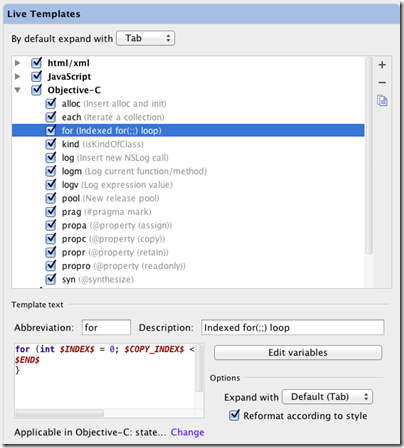
Live templates let you type an abbreviation and expand it to a block of code, which you then tab through to edit. Type for, select the template, press tab, and AppCode will create a for loop; press tab again to edit the variable name and the number of iterations. You can customise and create your own Live templates in the AppCode Preferences dialog.

image

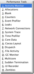
There are also a ton of performance tools in AppCode [update: note these are links to Xcode tools].  Choose Profile from the Run menu and choose what you want to analyse:

image

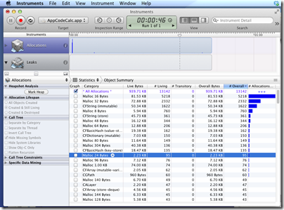
then run your app

image

You can also do static analysis according to customisable rules.

There is a debugger which works as you would expect including stack trace and variable inspection.

The best thing I can say about AppCode is that it is a pleasure to use. It does not throw up unnecessary dialogs, it works logically, and the tools are easy to use and configure. I have not always found this to be the case with Xcode, and if you spend a significant amount of your time on Objective C development then I recommend grabbing the trial download to discover if it will speed your work.

Post sponsored by Monster for the best in IT Jobs.

Delphi XE2 FireMonkey for Windows, Mac, iOS: great idea, but is it usable?

I am sure all readers of this blog will know by now that Delphi XE2 (and RAD Studio XE2) has been released, and that to the astonishment of Delphi-watchers it supports not only 64-bit compilation on Windows, but also cross-platform apps for Windows, Mac OS X and even iOS for iPhone and iPad (with Android promised).

I tried this early on and was broadly impressed – my app worked and ran on all three platforms.

image

However it is an exceedingly simple app, pretty much Hello World, and there are some worrying aspects to this Delphi release. FireMonkey is based on technology from KSDev, which was acquired by Embarcadero in January this year. To go from acquisition to full Delphi integration and release in a few months is extraordinary, and makes you wonder what corners were cut.

It seems that corners were cut: you only have to read this post by developer and Delphi enthusiast Chris Rolliston:

To put it bluntly, FireMonkey in its current state isn’t good enough even for writing a Notepad clone (I know, because I’ve been trying). You can check out Herbert Sauro’s blog for various details (here, also a follow up post here). For my part, here’s a highish-level list of missing features and dubious coding practices, written from the POV of FireMonkey being a VCL substitute on the Mac (since on OS X, that is what it is).

Fortunately I did not write a Notepad clone, I wrote a Calculator clone, which explains why I did not run into as many problems.

Update: See also A look at the 3D side of FireMonkey by Eric Grange:

…if you want to achieve anything beyond a few poorly texture objects, you’ll need to design and write a lot of custom code rather than rely on the framework… with obvious implications of obsolescence and compatibility issues whenever FMX finally gets the features in standard.

There has already been an update for Delphi XE2 which is said to fix over 120 bugs as well as an open source licensing issue. I also noticed better performance for my simple iOS calculator after the update.

Still, FireMonkey early adopters face some significant issues if they are trying to make VCL-like applications, which I am guessing is a common scenario. There is a mismatch here, in that FireMonkey is based on VGScene and DXScene from KSDev, and the focus of those libraries was rich 2D and 3D graphics. Some Delphi developers undoubtedly develop rich graphical applications, but a great many do not, and I would judge that if Embarcadero had been able to deliver something more like a cross-platform VCL that just worked, the average Delphi developer would have been happier.

The company must be aware of this, and one reading of the journey from VSCene/DXScene to FireMonkey is that Embarcadero has been madly stuffing bits of VCL into the framework. Eventually, once the bugs are shaken out and missing features implemented, we may have something close to the ideal.

In the meantime, you can make a good case for Adobe Flash and Flex if what you really want is cross-platform 2D and 3D graphics; while VCL-style developers may be best off using the current FireMonkey more for trying out ideas and learning the new Framework than for real work, pending further improvements.

On the positive side, even though FireMonkey is a bit rough, Embarcadero has delivered a development environment for Windows and Mac that works. You can work in the familiar Delphi IDE and code around any problems. The Delphi community is not short of able developers who will share their workarounds.

I have some other questions about Delphi. Why are there so many editions, and who uses the middleware framework DataSnap, or other enterprisey features like UML modeling?

There appear to be five editions of Delphi XE2: Starter, Professional, Enterprise, Ultimate and Architect, where Architect has features missing in Ultimate – should the Ultimate be called the Penultimate? It breaks down like this:

  • Starter: low cost, restrictive license that is mainly non-commercial (you are allowed revenue up to $1000 per year). No 64-bit, no Mac or iOS. $199.00
  • Professional: The basic Delphi product. Missing a few features like UML diagramming, no DataSnap. Limited IntraWeb. $899.00.
  • Enterprise: For more than double the price, you get DataSnap and dbExpress server drivers. $1,999.00
  • Ultimate: Adds a developer edition of Embarcadero’s DBPowerStudio. $2999.00
  • Architect: Adds more UML modeling, and a developer edition of Embarcadero’s ER/Studio database modeling tool. $3499.00

The RAD Studio range is similar, but adds C++ Builder, PHP and .NET development. No Starter version. Prices from $1399.00 for Professional to $4299.00 for Architect. The non-Ultimate Ultimate is $3799.00.

All prices discounted by around 40% for upgraders.

The problem for Embarcadero is that Delphi is such a great and flexible tool that you can easily use it for database or multi-tier applications with just the Professional edition. See here, for example, for REST client and server suggestions. Third parties like devart do a good job of providing alternative data access components and dbExpress drivers. I would be interested to know, therefore, what proportion of Delphi developers buy into the official middleware options.

As an aside, I wondered about DataSnap licensing. I looked at the DataSnap page which says for licensing information look here – which is a MIDAS article from 2000, yes Embarcadero, that is 11 years ago. Which proves if nothing else what a ramshackle web site has evolved over the years.

Personally I would prefer to see Embarcadero focus on the Professional edition and improve humdrum things like FireMonkey documentation and bugs, and go easy on enterprise middleware which is a market that is well served elsewhere.

I have seen huge interest in Delphi as a productive, flexible, high-performance tool for Windows, Mac and mobile, but the momentum is endangered by quality issues.

Kingston Wi-Drive extends iOS storage, but not hassle-free

I have been trying out the Kingston Wi-Drive, which expands the storage of an iOS device using a pocketable wireless solid-state drive.

image

The unit is about the size of a mobile phone, but smoother and lighter, and available with capacity of 16GB or 32GB.

The drive comes with a minimalist instruction leaflet which tells you to charge it by attaching the USB cable to a PC or Mac, add content by accessing it as an external drive, and then when charged, download and run the free Wi-Drive app on your iPad or iPhone.

I got this working without too much trouble. I added a movie to the drive and was able to watch it on an iPad, which is handy given that there is no DVD drive, though if it was sourced from a DVD you have to work out how to rip the DVD to a file first. I also added some documents and pictures, and was able to view these on iOS without any issues.

image

The app seems to be designed primarily for iPhone, which means it looks a little odd on an iPad, though it does run full-screen. There is a thumbnail view, for images, and for documents there is an option to open them in apps that understand the file format. For example, I could open a Word 2010 document in Pages.

So far so good; but I found some annoyances. The first is that when you connect to the Wi-Drive, you are no longer connected to the Internet unless you also have 3G. The solution is to go into the Wi-Drive settings and configure your normal wi-fi connection as a bridge. The leaflet does not mention this, but it is explained here.

The bridge did not work at first. I had to change my Netgear router so that it is WPA 2 only, rather than supporting both WPA and WPA 2. This is mentioned in the FAQ:

Wi-Drive’s bridge function supports a single security protocol only: WEP, WPA, or WPA2. These may also appear as WPA ONLY, WPA2 ONLY, etc. Wi-Drive does NOT support mixed mode.

I also configured security on the Wi-Drive wi-fi connection. By default, it is wide open to your neighbours; and if you have the bridge enabled, bypasses the security of your home wi-fi connection as well. On the other hand, the fact that up to three users can connect is a good thing if, for example, you wanted to share some files with friends or colleagues at a meeting.

If you are using the device on the road, in a cafe or airport for example, it would be difficult to connect to the internet as well as to the drive. If you are flying, the airline will probably not allow you to use the Wi-Drive.

Most annoying is that when the device is connected to a computer, the contents become inaccessible. Even connecting to a USB charger seems to be enough to disable it. When it is not connected to a computer, the battery starts running down; it only lasts 4 hours.

This means that you should not think of the Wi-Drive as permanently attached storage. Rather, think of it as something you can switch on when needed.

Poking around on the drive, I noticed that it has the Apache web server installed. When the bridge is operating, you can browse to the device from a web browser on your computer and access the contents or change the settings.

image

This is a handy device; but it could be better. I would like to see a memory card slot – and Kingston would benefit as it sells memory cards – as well as a longer battery life. Kingston also needs to fix it so you can use it on iOS while it is connected to a computer and charging. The Wi-Drive app could do with a bit more polish too, particularly the iPad version.

As it is, the Wi-Drive is great if it exactly fits your need, but make sure you can live with it before parting with your money.