All posts by Tim Anderson

Brief hands on with new Asus Windows 8.1 T100 tablet – or should that be netbook?

Asus has launched two new tablets in the UK.

This one is the 10.1″ T100 has an Intel Atom “Bay Trail” Z3740 quad-core processor. The display is 1366 x 768 and supports capacitive multi-touch.

image

You press a release button under the display to detach it from the keyboard, whereupon it becomes a tablet. This approach, it is now generally agreed, is better than a screen which twists over, since it gives you a reasonably thin and lightweight (550g) tablet rather one that is bulky and odd to hold. However, there is still the question of what you are going to do with the keyboard once detached, and I have a suspicion that these machines are likely to be almost permanently attached to the keyboard making them similar to netbooks.

image

Microsoft’s Surface overcomes this to some extent, especially with the Touch keyboard cover that folds underneath and adds little weight or bulk.

On the other hand, the T100 strikes me as good value at £349.99 (which includes the keyboard dock), especially bearing in mind that Office Home and Student is bundled (Word, Excel, PowerPoint, but no Outlook).

The T100 comes with 2GB RAM and 32GB eMMC storage. Connectivity includes Bluetooth 4.0, Micro-USB, Micro-HDMI, MicroSD slot, and a USB 3.0 port in the docking keyboard.

I tried the T100 briefly. I was impressed with the performance; Word and Excel opened quickly and overall it feels quick and responsive. I did not like the keyboard much; it felt slightly spongy, but at this price a few weaknesses can be forgiven.

The tablet Windows key is not under the screen as with most Windows 8 tablets, but a button on the side. What looks like the Windows key in the above snap is inactive, and that logo will not show on the production units.

Microsoft’s Xbox One almost invisible at Gadget Show Live

I looked in on London’s Gadget Show Live this morning. It was the usual frustrating experience: the things that were interesting were surrounded by hordes of visitors so you could barely get a look.

image

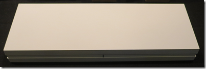
Here is what I found curious. Microsoft is the lead sponsor, but the Xbox One was shown only on a tiny stand near the back of the hall. Here it is – all of it.

image

By contrast, Sony had a huge stand for PlayStation 4. Apologies; my snap does not show the scale well.

image

That said, Microsoft had its own massive stand, but for Windows, with a strong push for Surface tablets and a reasonable presence for Windows Phone.

However, if you look at the demographic of the show, with lots of kids even on a Friday, it is better suited to gaming consoles than to relatively expensive tablets – though to be fair, the Windows tablets seemed to be attracting a fair amount of attention.

I had a chat with a guy from Sonos at its stand. Will Sonos support high resolution formats (better then CD quality)? This is almost a trick question as I’m not sure you can hear the difference; but there is nevertheless strong demand for it in the slightly crazy world of high-end audio. Apparently there are ways to do it now, but the Sonos engineers are working at bringing full support into the range.

Sonos has apps for iOS and Android; what if I have a Windows Phone? No support yet but again I got the impression that this is being looked at. There is a public API so third-party support is also possible. They appear also to be considering a Windows 8 store app though nothing is confirmed.

Panasonic had a rather lovely 4K display running full resolution video – only £5,499 – as well as a 3D display which looked great though it requires glasses. Don’t bother with 4K unless you have a 42″ or bigger screen, I was told by a Panasonic guy.

image

I also watched a bit of Gadget Show Live in the Super Theatre. Sorry, but I thought it was dreadful. Little innovation on show, slightly risqué humour despite the presence of many kids in the audience – “I’ve got a new girlfriend, you should see her Nokias” said a robot comedian, for example. I may be in a minority as the show overall seemed to go down OK.

Talking of the robot comedian, it was controlled by a Windows 8 tablet strapped to its back. After three or four jokes something went wrong and it had to be controlled manually, reducing the robot to little more than a fancy powered loudspeaker. Never mind.

High end home entertainment with a Cornflake flavour

Tucked away on a side street off London’s Tottenham Court Road is The Cornflake Shop, which appeared back in the Eighties to sell high-end audio equipment with a more considered service than was available from the multitude of hi-fi shops which, at the time, thronged the main road.

Since that time the audio industry has changed and many dealers have struggled or closed. Hi-fi today, for most people, means an iPhone dock or a set of powered speakers. Despite those challenges, on a recent visit to London I was interested to see that the Cornflake Shop lives on; in fact, they have just opened a new showroom called the Art of Technology, Realised and whose window declares “The Smart App-artment”.

image

I could not resist a visit. Inside it has a striking animated graphic projected on the wall and framed artefacts – a typewriter, an old tape recorder.

image

I chatted with them about the state of the audio industry and was told that the their business had transitioned to something more like automating the home, but still with a strong element of home entertainment; they aim to have every installation include a fine music system. However they will still sell you just a CD player or a pair of loudspeakers if you ask, and now intend to renew their focus on high-end audio alongside the other things they do.

Go downstairs and a series of subterranean showrooms demonstrate various home environments.

image

The back room, if that is the right word, is amazing; racks of networking gear, home entertainment controllers, music and video servers. They use Sonos for multi-room audio and Kaleidoscope, which lets you legally rip Blu-Ray to a server, for video.

image

Would someone really have something like this in their home, I asked? Oh yes was the answer.

Then it was time to listen to some music. These striking Martin Logan loudspeakers from the Reserve ESL series combine electrostatic drivers for the mid-range and treble with a conventional sub-woofer.

image

Spot the valve amplifier. What on earth are valves doing in an ultra-modern home entertainment setup? The answer is simply that they like the sound. There is an element of retro here.

image

We played a couple of tracks, selected from an iPad app, and a music video, for which a large screen slid elegantly into view. It sounded good but I did not stay long enough to be able to comment in detail.

The Cornflake Shop always had its own individualistic and slightly quirky approach and it is great to see that this continues. You will get something stylish for your money that will deliver high quality home entertainment. But how much back-end kit do you need in the modern home? If you are looking for the minimum amount of wires and the smallest amount of equipment, this might not be the place for you.

What to do if SkyDrive disappears from Windows 8.1 Explorer?

Here is the scenario. You are working away in Windows 8.1 and want to save a document to SkyDrive. You look for the SkyDrive link in Windows Explorer but it is not there.

image

Don’t panic; your documents are most likely fine and you can get to them in the web browser via http://skydrive.live.com

Still, that is inconvenient. How can you restore the Explorer link, other than by rebooting and hoping it reappears?

The solution is to open a command prompt (press Start button and type command) and then type:

%systemdrive%\windows\system32\skydrive.exe

and press Enter. You don’t need to run the command prompt with administrator rights.

All going well, SkyDrive will reappear:

image

What if it doesn’t? Now you have to check the logs or event viewer and look for specific errors. But the simple technique described first has always worked for me.

Surface 2 has a decent camera, unlike Surface RT

Who cares about cameras on a tablet? Not many perhaps, though I regularly see iPads held aloft. Microsoft’s Surface RT has two cameras, both 720p (1280 x 720 or about 0.9MP). Surface 2 also has two cameras, the rear 5MP and the front 3.5MP.

I found the Surface RT rear camera so disappointing that I never used it, but the one on Surface 2 is rather good. Here is a quick snap of a similar scene taken with each device.

Surface RT:

image

Surface 2:

image

or zooming in for some detail

Surface RT:

image

Surface 2:

image

First thoughts on Surface 2

After a day or two with Surface 2 and the Touch 2 keyboard, a few thoughts.

image

First, I am typing this on my desktop PC. I would have used the Surface 2, as I like to match the tool to the review, but no Live Writer on Surface (my favoured blog authoring tool) and no, Word is not as good for this.

That neatly demonstrates the app issue on Windows RT; but despite that I expect to use Surface 2 frequently in the coming months. It is an excellent tablet, with its chief advantages over the older Surface being performance and Windows 8.1, which includes Outlook.

Performance on Surface 2 is around 4 times faster for graphics – see previous post – and more than twice as fast in general.

The touch keyboard, now with backlighting, is also much improved.

I know I am in a minority here, but to me the Windows RT concept makes good sense. A locked-down version of Windows that is almost legacy-free, though it is still Windows and capable of throwing up mystifying dialogs and hiding settings in strange places.

It seems to me that if there is any hope for the Windows 8 app ecosystem, then it will be driven by tablets like this one, and Nokia’s new Lumia 2520 which also runs Windows RT. Desktop users are mostly ignoring the app platform. There are a few signs of life, like the new Facebook app, and things like Xbox Music are now decent. MediaMonkey, which I like for its Flac support, runs nicely on Surface 2.

Isn’t an iPad Air better? In some ways for sure. Usability, performance, size and weight, and rich app availability are all in the iPad’s favour, and price is similar. The reason you might get a Surface though is for Office, USB 3.0, HDMI out, SD card, and the clever keyboard cover. I also like having more than one app to view, whether that is Word and Excel on the desktop, or Word and Caculator, or the split view that works in the new app world.

I’ve hit a few snags with Surface 2. Sound is less good than on Surface RT, tending to be thin and reedy, unless you use headphones or external speakers. The Touch 2 keyboard sometimes stops responding, which I hope is a driver issue (perhaps the update downloaded this morning will fix it).

I also suspect that build quality on Surface 2 falls short of Surface RT. It is still “Vapor Mg” but I already have a slight dent in the bezel on mine whereas on my old RT it is still perfect and I wonder if it is thinner.

The extra price for the 64GB vs 32GB SSD is absurd. Why not make them all 64GB and increase the price by a fraction?

Is Microsoft serious about selling Surface 2? There does not seem to be much stock around, and it is not yet listed on Amazon.co.uk, although it has been on sale since yesterday.

Those that do discover it will like it, provided they understand the difference between Windows RT and Windows x86, something which – bizarrely – Microsoft still seems keen to disguise.

FutureMark graphics benchmark: Surface RT vs Surface 2

We know that the new Surface 2 (Nvidia Tegra 4) is faster than the old Surface RT (Tegra 3) but by how much?

I came across the FutureMark 3D Benchmark for Windows RT in the Windows Store and tried it on both.

I could see this was going to be a wipeout from the off. The first test saw a frame rate of 12.9 FPS on RT versus 59.9 on Surface 2. Surface RT first:

image

Then Surface 2:

image

Surface 2 reported “Maxed out” on the scores. However, on the next test, Ice Storm Extreme, I got a result.

Surface RT: 2065

image

Surface 2: 8577

image

3D Mark RT says my score is “low for this device” on Surface RT, but “a great score for this device” on Surface 2. Maybe the impact of Windows RT 8.1?

Bottom line: on these tests Surface 2 is around 4 times faster. No wonder it feels snappier to use.

Nokia Lumia 2520 Windows RT tablet announced

Nokia’s former CEO Stephen Elop has announced the Lumia 2520 tablet ($499) running Windows RT, at an event in Abu Dhabi.

image

The 10.1″ tablet comes with Qualcomm Snapdragon 800 (quad-core 2.2 Ghz) chipset and LTE connectivity – unlike Microsoft’s Surface, which is wifi only. It will ship this year.

The screen has high brightness and low reflectivity, which apparently enables reading or videos in bright sunlight as well as in low light.

The camera hardware includes Zeiss optics, 6.7MP rear camera, 2MP front camera.

Fast charging gets it to 80% charged in one hour, according to Nokia.

The Nokia Power Keyboard accessory offers up to 5 hours added battery life and two USB ports. It forms a cover as well as a keyboard, and includes a trackpad.

As with other Windows RT devices, Microsoft Office is included.

On the app side, Nokia showed two of the same apps just announced for its Lumia Windows Phones, the Nokia Camera app and the Storyteller app.

image

The Storyteller app integrates photos and mapping so you can see where your photos were taken.

image

Nokia also announced that a Flipboard app is coming to Windows RT.

Now there are two new Windows RT devices: Microsoft’s Surface and Nokia’s Lumia. However Nokia is being acquired by Microsoft and it will be interesting to see how the different product lines are managed by the combined company.

Nokia announces huge Windows Phones, new apps, new Asha models, Instagram, Twitter Vine apps

Nokia’s former CEO Stephen Elop has announced the Lumia 1520 at an event in Abu Dhabi.

The 1520 ($749) has a 6” screen which takes it into “phablet” territory. The larger size enables a 3rd column of live tiles, enabled by Microsoft with an update to the Windows Phone 8 operating system.

image

Camera-wise the 1520 lacks the 41MP of the 1020 but does have a 20MP PureView camera.

A new app called Nokia Camera has three camera modes including Still, Video, and Smart Mode which takes a burst of pictures.

The app has a night mode optimised for low-light, and a sports mode for quick action shots. There is also a Pro Camera UI with all available settings and manual focus.

A new Storyteller app integrates photos, images and maps.

image

The killer feature here is that you can zoom out of a photop to see where it was taken on a Nokia Here map:

image

The 1520 also sports four microphones for “directional stereo”.

Also announced is the 4G Lumia 1320 ($339):

image

This is also a large-screen model but with a 5MP camera and a more affordable price.

An update to the OS called Lumia Black is coming to all Windows.

With Windows Phones getting bigger, how is the OS differentiated from Windows RT? Well, one is a Phone OS and the other a tablet OS, but convergence cannot come soon enough.

Elop also announced improvements to the Asha range of budget phones aimed mainly at emerging markets.

The new models are the Asha 500 ($69, dual sim available, 2MP camera), 502 ($89, dual sim available, 5MP camera with flash) and 3G 503 ($99, dual sim available, 5MP camera with flash).

image

You can share photos to social media including newly announced WhatsApp Messenger support from next month.

Of course there was also the 2520 tablet, but that is the subject of a separate post.

Review: Surface Touch Cover 2

Windows tablets present a design challenge because they include desktop applications which are designed for keyboard and mouse, rather than touch – not least Microsoft Office, which for some of us accounts for a significant proportion of the time spent using the device. So far there has been consensus therefore that Windows tablets need some easy way of using a keyboard and mouse or trackpad. How to achieve this without losing the benefits of a tablet  is not easy. Bluetooth is one solution, but means three devices rather than one in your bag. Screens that twist over to form tablets are another, but the devices tend to be heavy and the twisting action inconvenient. Detachable keyboard/trackpads are the favoured solution, but leave you the problem of a loose keyboard to look after once you have detached it. If it stays always attached, perhaps you should have bought a laptop.

Microsoft’s Surface tablet has the most elegant solution I have seen. When it was launched a year ago, it included two optional keyboard covers. The Type cover is a thin keyboard with real clacky keys.  The touch keyboard is almost flat, though the keys are slightly raised. You can detach them, but they fold back behind the device, automatically disabling the keys, at which point they are unobtrusive.

Many people liked the idea of the touch keyboard, but found typing frustrating with more errors than they normally make. For this reason, the Type keyboard is more popular among Surface users. It is possible that more Touch keyboards were sold, since they are slightly cheaper and more often bundled with the device, but in actual use I see more Type keyboards.

That is a shame, because the Touch keyboard is design-wise a better solution. It adds very little bulk to the Surface, and when folded back under the device for tablet use, it feels perfectly natural, whereas the Type keyboard feels odd because of the keys that are then on the underside.

When Microsoft announced the Touch Cover 2, it said that by adding more sensors (14 times as many apparently) and more intelligence to the cover and its drivers, it had improved the typing accuracy. As a Surface user I was excited to try the Touch Cover 2 and see if it lives up to these claims. If it does, I will happily ditch the Type cover.

image

The Touch Cover 2 is the same price as before, £99 in the UK or $120 in the US. It is compatible with every Surface, including the original Surface RT. It is also fractionally thinner, 2.5mm as opposed to 3mm. Third, it is now backlit, which makes a big difference on those odd occasions when you are typing in dim light, such as on an aircraft when the cabin lights are dim.

Looking at old and new side by side though, you would be forgiven for thinking not much has changed – the new one is the lower of the two, and note that my original is a US layout and the new one UK:

image

Here are a few more points of detail:

  • The new keyboard has function key labelling F1-F12. As is now common, the default is the non-Fn meaning, and you have to press Fn first to get the function key. The old keyboard also has an Fn key, but you have to work out which top key to press. The right Alt key is now labelled Alt Gr.
  • The purpose of two of the special keys has changed. The new keyboard no longer has volume keys, though it does have a volume mute. In their place are two keys controlling the brightness of the backlight.
  • The design of the trackpad has changed slightly. On the old touch cover, the left and right “buttons” are on the edge of the keyboard outside the etched area that represents the trackpad. On the new cover, these buttons are within the etched area, which means that the trackpad seems slightly bigger, but in reality is not.
  • The underside of the touch cover used to have a fabric finish. On Touch Cover 2 it is now smooth plastic. This is one detail where I prefer the older cover, though maybe it helps to get it that 0.5mm thinner.

The following picture shows the backs of the old and new keyboard covers side by side, with the new one on the left:

image


Touch cover 2 in use

Now for what really matters. How is the Touch Cover 2 in use?

My first thought was to try a speed test. I went along to this online test and tried it several times with the old touch cover, then with the new one. The results favoured the new cover, perhaps by around 20%, though how you evaluate it depends on the weighting you give to errors versus speed.

Then I sat down to write this review. This is where my opinion of the new Touch Cover began to swing in its favour. I find real-world typing on the Touch Cover 2 substantially more pleasant than with the earlier version. Measuring words per minute does not fully represent the improved experience. Of course this is a personal thing and your experience may vary.

The backlighting is low key (ha!) but improves usability. The way this works is that the white lettering on the keys is illuminated so it stands out more.

image

Note that if you think it is not working, you probably just need to increase the brightness using the special keys.

Is it as good as a real keyboard, or even a Type Cover? I doubt it ever will be, especially if you are someone who does not look at the keyboard while you type. The problem is that the slight etching round the keys makes it harder for your fingers to know where they are, though typing with audible key clicks helps.

Another factor is that if you are not at a desk, the lightness and thinness of the touch cover counts against it, since it flexes slightly on your lap.

That said, with practice you can get good speed and accuracy. As a cover, it is so much more elegant than the Type Cover that overall I might just prefer it, even though I still rate the Type Cover slightly better for typing.

One caveat though: I used the Touch Cover 2 with both Surface RT and Surface Pro, and had an annoying problem. If I stay typing in one app everything is fine, but if I switch apps than sometimes the keyboard stops responding. Oddly, opening Device Manager and pressing the up and down arrows a few times seems to fix it. Perhaps my Touch Cover 2 is faulty, but I suspect a driver issue, which means hope for a fix soon. I will be trying it soon with a Surface 2 and will be interested to see if the problem remains.

The keyboard also seems to mark easily. I have only had it for a day, but can already see slight fading of the black finish on the keys I type most often.

Mobility always involves compromise. If you want the very best keyboard for typing, it won’t be a touch cover. In fact, for best productivity I prefer a high quality Bluetooth or USB keyboard to either of the Type or Touch covers.

That does not detract from what Microsoft’s engineers have achieved with the Touch Cover 2. Flip it back, and you have a tablet; flip it forward, and you protect your screen; place it on a desk and you have a productive typing machine.

Glitch aside, I recommend the Touch Cover 2 as a good option with a new Surface and a worthwhile upgrade from the first Touch cover.