All posts by Tim Anderson

Email hassles with migration to Windows 10 – if you use Windows Live Mail

Scenario: you are using Windows 7 and for email, Windows Live Mail, Microsoft’s free email application. You PC is getting old though, so you buy a new PC running Windows 10, and want to transfer your email account, contacts and old messages to the new PC.

Operating systems generally come with a built-in mail client, and Windows Live Mail is in effect the official free email client for Windows 7. It was first released in 2007, replacing Windows Mail which was released with Vista in 2006. This replaced Outlook Express, and that evolved from Microsoft Mail and News, which was bundled with Internet Explorer 3 in 1996. Although the underlying code has changed over the years, the user interface of all these products has a family resemblance. It is not perfect, but quite usable.

Windows 8 introduced a new built-in email client called Mail. Unlike Windows Live Mail, this is a “Modern” app with a chunky touch-friendly user interface. Microsoft declared it the successor to Windows Live Mail. However it lacks any import or export facility.

The Mail app in Windows 10 is (by the looks of it) evolved from the Windows 8 app. It is more intuitive for new users because it no longer relies on a “Charms bar” to modify accounts or other settings. It still has no import or export feature.

The Mail app is also not very good. I use it regularly now myself, because there is an account I use which works in Mail but not in Outlook. I don’t like it. It is hard to articulate exactly what is wrong with it, but it is not a pleasure to use. One of the annoyances, for example, is that the folders I want to see are always buried under a More button. More fundamentally, it is a UWP (Universal Windows Platform) app and doesn’t quite integrate with the Windows desktop as it should. For example, pasting text from the clipboard is hilariously slow and flashes up a “Pasting” message in an attempt to disguise this fact. Sometimes it behaves oddly, an open message closes unexpectedly. It is like the UWP Calculator app, another pet hate of mine – I press the Calculator key on my Windows keyboard, up comes the Calculator, then I type a number and it doesn’t work, I have to click on it with the mouse before it accepts input. Just not quite right.

I am getting a little-off topic. Back to my scenario: how are you meant to transition from Windows Live Mail, the official mail client for Windows 7, to the Mail app in Windows 10, if there is no import feature?

In one way I can explain this. First, Microsoft does not really care about the Mail app. Everyone at Microsoft uses Outlook for email, which is a desktop application. This is important, because it means there is no internal pressure to make the Mail app better.

Second, Microsoft figures that most people now have a cloud-centric approach to email. Your email archive is in the cloud, so why worry about old emails in your Mail client?

This isn’t always the case though. A contact of mine has just been through this exact scenario. He has happily used Windows Live Mail (and before that Outlook Express) for many years. He has an archive of old messages which are valuable to him, and they are only in Windows Live Mail.

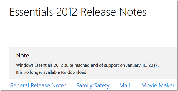
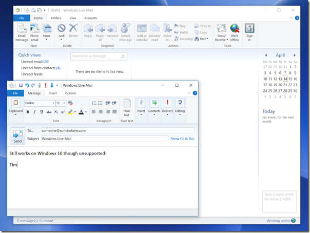
Unfortunately Microsoft does not currently have any solution for this. The answer used to be that Windows Live Mail actually works fine on Windows 10, so you can just install it. However Microsoft has declared Windows Live Essentials, of which Live Mail is a component, out of support and it is no longer available for download.

image

Incidentally I am writing this post in Windows Live Writer, another component of Essentials, but which fortunately has been published as open source.

If you can find the Windows Live installation files though, it still runs fine on Windows 10. You do need the full setup, called wlsetup-all.exe, rather than the web version which downloads components on demand. Here it is, installed and connected on Windows 10:

image

This application is no longer being maintained though, and there are some compatibility issues with some email services. This will get worse. The better answer then is to migrate to full Outlook. However, Microsoft makes Outlook expensive for home users, presumably to protect its business sales. Office Home and Student does not include Outlook, and to buy it separately costs more, currently £109 in the UK. Another option is to subscribe to Office 365 and pay a monthly fee.

Even if you intend to migrate to Outlook eventually, it may make sense to use Live Mail for a while on Windows 10. There is an export option to “Exchange” format which means you can migrate messages from Live Mail to Outlook.

This is all more work than it should be, for what must be a common scenario. You would think that migrating from the official mail client for Windows 7, to the official mail client for Windows 10, would not be so difficult.

More on MQA and Tidal: a few observations

I have signed up for a trial of the Tidal subscription service and have been listening to a few of the MQA-encoded albums that are available. You can find a list here. Most of the albums are from Warner, which is in the process of MQA-encoding all of its catalogue.

From my point of view, having familiar material available to test is a huge advantage. Previous MQA samples have all sounded good, but with no point of reference it is hard to draw conclusions about the value of the technology.

I have used both the software decoding available in the Tidal desktop app (running on Windows), and the external Meridian Explorer 2 DAC which is an affordable solution if you want something approaching the full MQA experience.

image

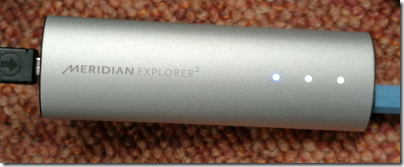
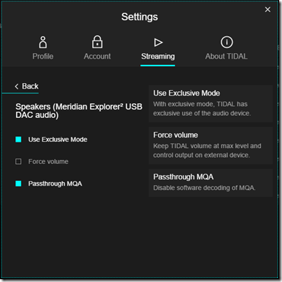
Note that on Windows you have to set Exclusive mode for MQA to work correctly. When using an MQA-capable DAC, you should also set Passthrough MQA. The Explorer 2 has a blue light which shows when MQA is on and working.

image

For these tests, I used the Talking Heads album Remain in Light, which I know well.

The Tidal master is different from any of my CDs. Here is the song Born under Punches in Adobe Audition (after analogue capture):

image

Here is my remastered CD:

image

This is pretty ugly; it’s compressed for extra loudness at the expense of dynamic range.

Here is my older CD:

image

This is nicely done in terms of dynamic range, which is why some seek out older masterings, despite perhaps using inferior source tapes or ADC.

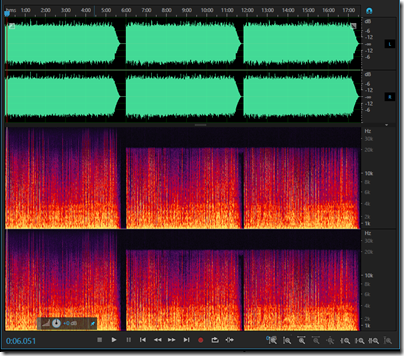
This image shows three variants of the track streamed by Tidal and captured via ADC into a digital recorder at 24-bit/96 kHz.

image

The first is the track with full MQA enabled and decoded by the Explorer 2. The second is the “Hi-Fi” version as delivered by Tidal, essentially CD quality. The third is the “Master” version, in other words the same source as the first, but with Exclusive mode turned off in Tidal, which prevents MQA from working.

You can see at a glance that MQA is doing what it says it does and extending the frequency response. The CD quality output has a maximum frequency response of 22 kHz whereas the MQA output extends this to 48 kHz at least as captured by my 24-bit / 96 kHz (the theoretical maximum frequency response is half the sampling rate).

Do they sound different though, bearing in mind that we cannot hear much above 20 kHz at best, and less than that as we age? I have been round this hi-res loop many times and concluded that for most of us there is not much benefit to hi-res as a delivery format. See here for some tests, for example.

MQA is not just extended frequency response though; it also claims to fix timing issues. However my captured samples are not really MQA; they are the output from MQA after a further ADC step. Of course this is not optimal but the alternative is to capture the digital output, which I am not set up to do.

An interesting question is whether the captured MQA output, after a second ADC/DAC conversion, can easily be distinguished from the direct MQA output. My subjective impression is, maybe. The first 30 seconds of Born Under Punches is a sort of collage of sounds including some vocal whoops, before David Byrne starts singing. What I notice listening to the Tidal stream with MQA enabled is that the different instruments sound more distinct from each other making the music more three-dimensional and dramatic. The vocals sound more natural. It is the best I have heard this track.

That said, I have not yet been able to set up any sort of blind test between the true MQA stream and my copy, which would be interesting, since what I have captured is plain old PCM.

There is a key point to note though, which is that mastering offered by Tidal is better than any of the CD versions I have heard; the old Eighties mastering is more dynamic but sounds harsher to my ears.

With or without MQA; you might want to subscribe to Tidal just to get these superior digital transfers.

Update: it seems that the Tidal stream for Remain in Light (both MQA and Hi-Fi) is a different mix, possibly a fold-down from the 5.1 release. So it is not surprising that it sounds different from the CD. The question of whether the MQA decoded version sounds different still applies though.

The MQA enigma: audio breakthrough or another false dawn?

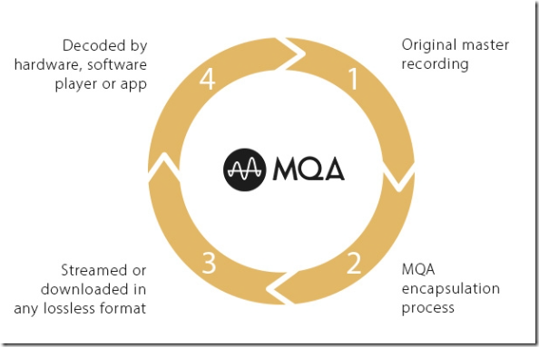
The big news in the audio world currently, announced at CES in Las Vegas, is that music streaming service Tidal has signed up to use MQA (Master Quality Authenticated), under the brand name Tidal Masters. MQA is a technology developed by Bob Stuart of Meridian Audio, based in Cambridge in the UK, though MQA seems to have its own identity despite sharing the same address as Meridian.

image

What is MQA? The question is easy but the answer is not. Here is the official short description:

Conventional audio formats discard parts of the sound to keep file size down, but part of this lost detail is the subtle timing information that allows us to build a realistic 3D soundscape in our minds. … With MQA, we go all the way back to the original master recording and capture the missing timing detail. We then use advanced digital processing to deliver it in a form that’s small enough to download or stream.

At first sight it looks like another format for lossless audio, and the description on MQA’s site confuses matters by making a comparison with MP3:

MP3 brings you just 10% of what was recorded in the studio. Everything else is lost to fit the music into a conveniently small file. MQA brings you the missing 90%.

There are two problems with this statement. One is that MP3 (or its successor AAC) actually sounds very close to the original, such that in tests most cannot tell the difference; and the other is that audiophiles tend not to use MP3 anyway, preferring formats like FLAC or ALAC (Apple’s version) which are lossless.

There is more to it than that though. There are three core aspects to MQA:

1. “Audio origami”: MQA achieves higher resolution than CD (16-bit/44.1MHz) by storing extra information in audio files that is otherwise wasted, as it stores audio that is below the noise floor (ie normally inaudible). There is a bit of double-think here as removing unnecessary parts of audio files is the sort of thing that MP3 and AAC do, which the MQA folk have told us is bad because we are not getting 100%.

This is also similar in concept to HDCD (High Definition Compatible Digital), a technology developed by Pacific Microsonics in the Eighties and acquired by Microsoft. Of course MQA says its technology is quite different!

Note that you need an MQA decoder to benefit from this extra resolution, and there is a nagging worry that without it the music will actually sound worse (HDCD has the same issue).

2. Authentication. MQA verifies that the digital stream is not tampered with, for example by audio features that convert or enhance the sound with digital processing. This can be an issue particularly with PCs or Macs where the built-in audio processing will do this by default, unless configured otherwise.

3. Audio “de-blurring”. According to MQA’s team:

There’s a problem with digital – it’s called blurring. Unlike analogue transmission, digital is non-degrading. So we don’t have pops and crackles, but we do have another problem – pre- and post-ringing. When a sound is processed back and forth through a digital converter the time resolution is impaired – causing ‘ringing’ before and after the event. This blurs the sound so we can’t tell exactly where it is in 3D space. MQA reduces this ringing by over 10 times compared to a 24/192 recording.

If this is an issue, it is not a well-known one, at least, not outside the niche of audiophiles and hi-fi vendors who historically have come up with all sorts of theories about improving audio which do not always stand up to scientific scrutiny.

So is MQA solving a non-problem? That’s certainly possible; but I do find it interesting that MQA has received a generally warm reception from listeners.

Here’s one audiophile’s reaction:

Have never really “done” digital before. 16/44 has always sounded ghastly to my ears right from the start and still now. MQA did indeed “fix” the various forms of distortion that I could hear present in everything where the sampling rate was taken down to just 44. … My findings – those of an improved sense of solidity in the stereo image and the lack of that horrendous crystalline glassy edge to things, especially on the fade, seem to be being mirrored in what people are hearing. It doesn’t have that thing I describe as a “choppy sense of truncation” which I suspect others mean by “transients”.
Basically, per the post above, it’s a bit like “good analogue”. Digital can finally hold its head up high against an analog from master-to vinyl performance. And not only that, hopefully, walk all over it and give us something genuinely new.

If this history of audio has shown us anything, it is that subjective judgements about what makes something sound better (and whether it is better) are desperately unreliable. Further, it is often hard to make true comparisons because to do requires so much careful preparation: identical source material, exactly matched volume, and the ability to switch between sources without knowing which is which, to avoid our clever brains from intervening and telling us we are hearing differences which our ears alone cannot detect.

We should be sceptical then; and even possibly depressed at the prospect of a proprietary format spoiling the freedom we have enjoyed since the removal of DRM from most downloadable audio files.

Still … is it possible that MQA has come up with a technology that really does make digital audio better? Of course we should allow for that possibility too.

I have signed up for Tidal’s trial and will report back shortly.

Ripping vinyl with the Plato home entertainment system

I am a tad conflicted when it comes to vinyl records. On the one hand, I have not seen convincing scientific evidence, or a properly conducted blind test, that demonstrates any reason why record replay is superior to digital, while there is plenty of evidence for the reverse. On the other hand, I put on a well-mastered record, and it is like magic, I am transported into the music in a way that my digital sources rarely achieve. Plus the sleeves are beautiful, and in the case of older recordings, a sense that this is the real thing and subsequent formats mere copies (even if they do sound better). Finally, sometimes missing or damaged master tapes, or the bad habits of the recording industry in compressing CD audio so that it is uniformly LOUD, mean that records sometimes really do sound better, despite the limitations of the format.

If you like the sound of records but the convenience and security against damage that digital offers, you might want to rip them. I have done this but would not describe it as easy. You have to play the record in the closest to ideal conditions you can manage – clean record, no dust accumulated on the stylus, high quality turntable and phono stage – while also recording the output through an analogue to digital converter (ADC). Then when done, you have to break the result into separate tracks and tag it correctly. There is software to assist this whole process, like Channel D’s Pure Vinyl, but it is never that quick and easy. There is also the question of how much to tinker with the results in the hope of improving it, via click removal and the like. Personally I tend to the view that most things risk making the sound worse, but there is certainly a case for it, especially with particularly intrusive scratches.

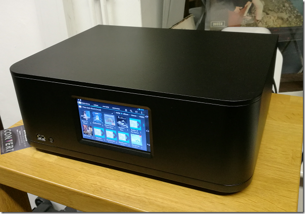
Last week I went to a demo of Plato, a system for ripping vinyl combined with an all-in-one home media playback solution. It comes from the Derby-based company Convert Technologies, formerly known as Entotem. The company has also launched the Red Dot recording service, through which you can get them to rip vinyl or even CDs on your behalf.
image

The company showed me its top of the range unit, which is an all-in-one box for storing digital media as well as playing it, and includes a power amplifier which delivers, they say, 25W Class A amplification or 50W Class B. The idea of Class A/B amplification is not new so I am not sure whether there is any secret sauce in the Plato design; however the company also offers a Class B version at a considerably lower price.

The system runs Android customised for the purpose, with a touch screen. There is also a controller app which works best on Android but is also available for Apple iOS with “approx 70% of the functionality”. It includes an ESS Sabre 32 DAC and ADC. Inside is a beefy toroidal tranformer powering the various boards. Around the back is a generous set of inputs and outputs, including MM/MC phono input, 3 additional line inputs, 1 coax and 3 optical digital inputs, 2 optical digital outputs, 1 HDMI output, and 3 USB 2.0 ports.

The digital format can be set up to 24-bit/192 kHz.
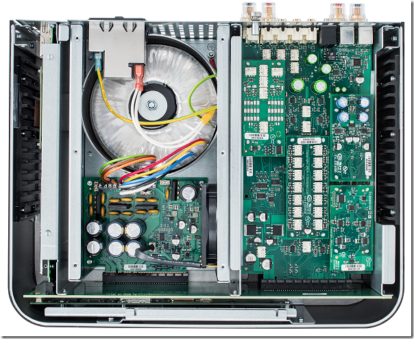
image

You can pay extra for SSD storage which is pretty pointless from a technical point of view (SSD is much faster, but a conventional hard drive easily fast enough for audio recordign and playback) but would lower the noise level slightly, though the fan is likely to be louder in any case.

Having all the controls functions driven by software enables plenty of features. You can change the phono input from moving coil to moving magnet, vary the capacitance and resistance,  and apply a rumble filter, for example.

Ripping vinyl is a matter of pressing a red button (hence the name of the ripping service). When the audio is played, there is an analogue chain for listening, I was told, but also a “parallel digital path” which captures a sample of the audio and sends it to Gracenote, an online tagging service, for recognition. If you are lucky, you will get the metadata and album artwork automatically retrieved. The system will also separate the tracks for you, taking most of the drudgery out of the ripping process. 

The system does not attempt any click or noise reduction. “We have looked at it, because we write all the software, but most people said ‘don’t do it’,” said Pete Eason, Customer Experience Manager. “It’s not a priority”.

You can export the files to USB storage, so you could do your own additional processing if you wanted. However there is an annoyance: the agreement with Gracenote prohibits the export of the album art. So if you export your files for playback on a phone, for example, you don’t get the art. That’s irritating and there is talk of switching to another metadata supplier to fix it.

The system will stream music from attached USB storage, or over the network using UPnP. I am not a fan of UPnP because it seems less amenable to search, and less reliable, than other systems such as Logitech Media Server, but it should work OK. Internet radio is also provided, via the TuneIn service.

However you cannot access Plato’s storage directly over the network. This makes me wonder if Plato’s engineers would have been better off using Linux rather than Android for their embedded OS, as that would make this trivial to implement.

There is no support for Spotify Connect, which is a shame. You can of course stream to the unit from a phone or laptop using a device such as Google ChromeCast but that is not the same thing, since the quality and consistency of the signal is limited by your phone.

The Red Dot ripping service sounds good for those with plenty of money and little time, especially as it includes a cleaning service, but it is expensive at £10.00 per album and a minimum quantity of 25. Note you could buy the CD for less in many cases.

There is also a limitation in terms of the playback equipment used. It would be too expensive to use a true high-end cartridge and stylus. Red Dot uses “a really decent Pro-Ject Debut Carbon turntable and Ortofon stylus,” according to the FAQ, though they talked about other possible turntables, but always mid-range. That may not equal the equipment you have at home.

I got to ask some awkward questions. Why would anyone want to rip their vinyl, when with Spotify or Apple Music you could just play it from internet?

“There’s a quality issue there,” said marketing guy Ben Timberley. Eason added, “and also you can backup your vinyl. It’s always going to be a pristine original.”

Well, it will not always be a pristine original, but it will always be the same as when it was ripped.

I asked a hypothetical question. Let’s say I submit my rather beaten-up copy of David Bowie’s Ziggy Stardust, and as it happens Red Dot had just ripped someone else’s pristine copy of exactly the same album. Would they rip my scratched copy, or simply give me their existing rip? I would get my crackly one back, I was told. The other copy “belongs to someone else. We are sticking firmly on the side of the law on this one.”

I am not personally convinced that the law is so clear-cut. My records all say “unauthorised … copying of this record prohibited” and “all rights reserved”. On the one hand, there is the question of whether even personal format conversion of a record is strictly legal (though I cannot imagine anyone being pursued for it). On the other hand, since the record represents a personal license to enjoy that particular recording, I am not sure that whether you get back a copy of your record or someone else’s makes any difference.

Red Dot also offers to rip CDs, and here the argument seems even more ridiculous. Since ripping a CD with identical mastering results in an identical file, it would be absurd to re-rip when you already have the file in question. Are LPs any different, even though the imperfections of the format mean that every rip will vary slightly?

Next question: is there a paradox at the heart of this operation, which is that people who love records believe that the analogue chain sounds better than digital, so they are unlikely to want a digital copy? And if they do, why not just buy the digital version?

I got a somewhat garbled response. “That’s one argument but then this is essentially lossless, isn’t it?” said Eason. “You’re getting all the pops, the clicks, the whistles.”

“We’ve got the best DAC in the industry, which is the Sabre DAC,” added Timberley. “If you are going to convert it we’ve got the best piece of kit to do it.” Though I think he meant ADC rather than DAC.

I also suggested that retailers might prefer to buy their own Plato and offer a ripping service, rather than resell Red Dot. Dealers are “too busy” said Timberley, though they might look a a licensing restriction if it became an issue.

What I think

This is not a review and I have not had a chance to try this at home. If you seriously want to rip your vinyl (and I do think there could be good reasons, as I stated above, though hearing pristine pops and clicks is not one of them), then Plato looks like a convenient though expensive choice.

As an all-in-one hi-fi (just add speakers) Plato might also be good, though it looks expensive compared to, say, a NAS, a Raspberry Pi with a DAC, and a decent amplifier. It is hard to value these things without trying them out though.

In the end though, my instinct is that the best way to play records is to play records. I haven’t found record wear much of a problem, especially when you have a large collection.

So I am not sure that Plato is for me, though it does look nice and easy to use.

Table of recommended retail prices (including VAT)

  Vinyl ripping Phono Stage Pre Amp Power Amp
Class B
Power Amp
Class A
Price with
1TB HDD
Price with
2TB HDD
Price with
1TB SSD
Plato Lite Yes (with external
Phono stage)
No Yes No No £1899 £1999 £2539
Plato Pre Yes Yes Yes No No   £2400 £2940
Plato
Class B
Yes Yes Yes Yes No   £2999 £3539
Plato Class A Yes Yes Yes Yes Yes   £3999 £4539

Mio MiVue 688: record your driving

The Mio MiVue 688 is a high quality dashcam which will record your journeys as well as alerting you to lane drift and speed cameras.

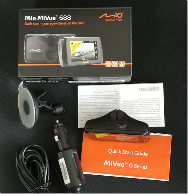
image

In the box is the device itself – around 90 x 45 x 37mm – together with a vehicle power adapter and a suction mount. You will need a couple more things to get going: a Micro SD memory card (8GB to 128GB) and a USB Mini-B to type A cable, presuming you want to connect it to a PC. It is always annoying to find that that you have to buy extras, though you may have some spares anyway, and also annoying that MiVue still use the older Mini-B connector which is relatively uncommon now.

The MiVue 688 has a rechargeable battery, though for full use you will want to keep it powered continuously with the adapter.

After charging, the first thing you will want to do is to set the date and time as well as your preferred distance measure. Being in the UK I set it to miles.

In doing so, you will get an idea of how the MiVue’s controls work. There is a nice bright LED colour display, but it is not touch control. Instead, there are 6 buttons:

  • Power button on the left edge
  • Event button (for emergency recording) on the front right
  • Four function buttons on the right edge

The control system is not all that intuitive. By default the unit records when it is on. The function keys come into play when you go into the menu. The top key is the menu key; it displays or exits the current menu. The next key is Enter. The two lower keys are cursor keys. At first you might think that the buttons align with the menu item you want to operate, but they do not. Of course you are not intended to operate this fiddly menu system while driving.

The normal use is that recording starts as soon as the unit receives power, in other words when you start the engine. It then records continuously, creating 3-minute video files. If it runs out of space it overwrites old files.

When you start recording you get a view of what it is recording on the screen. After a short time, this blanks out and you just get the time. However it is still recording.

The device has a Sony Exmor video processor, does 1080p video recording and displays on a 2.7″ screen. It has an F1.8 aperture and a 140⁰ wide angle lens.

The MiVue 688 in use

I tried the MiVue on a 3-hour journey on a rather damp day. The first challenge is mounting the MiVue, the main problem being getting the power cable connected without it hanging dangerously or getting in the way. I found some short lengths of gaffer tape essential, to secure the cable to the edge of the windscreen. The MiVue cable is fortunately fairly long.

I then sited the camera towards the top of the windscreen. Again, care is needed as you do not want it to obscure your view.

I found the way the device works confusing at first. In particular, I thought that when the screen changed from the live recording to the clock, that recording had stopped. It was only when I got back and connected the device to a PC that I realised the entire journey was on video. I do think this is preferable; despite the emergency button, you want the recording to happen without having to think about it.

image

My journey passed without incident, but having a recording, given how simple this is to achieve, does make sense. If you are the innocent party in a collision, it will provide crucial evidence. Note that it records your speed and exact location as it goes, thanks to built-in GPS. A side-effect of having a dashcam may be that you are less inclined to take chances, knowing that there will be evidence.

When we parked, I removed the MiVue, because I did not want the embarrassment of risking theft of my loan gadget. This is a dilemma, as the MiVue has a parking function that will automatically record if it detects a collision when parked. If you think someone might steal the device though, that will not help you.

Annoyances

Wiring up the MiVue all felt a bit DIY and it would be good to see provision for dashcams built into modern vehicles. I also found several nits with the MiVue:

  • Menu system not intuitive
  • Old type of USB connector
  • Getting started leaflet barely adequate (you can download a slightly better manual)
  • Packaging does not make it clear that you need to supply your own memory card and USB cable – as well as Gaffer tape or equivalent

Extras

On the plus side, there are a few extras. The safety camera warnings worked, though if you have SatNav of some kind you probably already have this. There is the parking function mentioned above. The speed always shows, and since this is more accurate than my in-car speedometer this is a benefit.

A camera feature lets you take still images. Could be handy after an incident.

A motion sensor kicks in a recording automatically in the event of sudden movement. This also tends to happen when handling the unit, for example connecting it to a PC!

There are also some Advanced Driver Assistance features. Specifically, this covers Lane Departure Warning (could be a life-saver if you fell asleep), which beeps if you drift out of your lane; and Front Collision Warning System which beeps if it thinks you are driving too close to the vehicle in front.

These are handy features, but require regular calibration to work. You have to tell the MiVue where is the horizon and where is the end of your bonnet (hood). You cannot do this while driving so require a passenger.

I would have thought the AI for this kind of feature could do this calibration automatically as systems like this evolve.

MiVue Manager

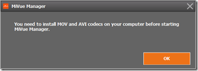
You can download a MiVue Manager app to help you view your videos. I did not get on well with this. The first annoyance was that the MiVue Manager app insists on running with admin rights on Windows. Next, I found it still did not work because of missing codecs.

image

However I can view the videos fine using the Windows 10 built-in app, or VLC. So I gave up on the MiVue Manager.

Conclusion

The MiVue 688 will cost you around £150 and works well. As noted above though, there are some annoyances and you might prefer a touch control unit like the 658, which is a similar price.

I am still impressed. The quality of the video is very good, and this MiVue provides significant benefit at modest cost.

More information here.

Meizu M3 Max: Android 6.0 phablet, good value if you don’t mind Flyme OS

Meizu, one of the top ten smartphone manufacturers in China, has just brought out the M3 Max, an Android 6.0 phablet currently on offer for $224.99 (around £185), which seems great value for a 6.0″ smartphone complete with dual SIMs slots and fingerprint reader. I have been using it for a while to see how it stacks up against the competition.

image

My M3 Max is a sample, and while I believe it matches the production model in terms of hardware, you may find a few more concessions to non-Chinese users in the version for European and US markets. That said, my sample does include the Google Play Store and a thing called GMS Installer which assists installation of the Google Mobile Services required for Google-flavoured Android, which is what most users in countries like the UK and USA require.

This was my first experience of Meizu’s Flyme OS, a custom version of Android, and the distinctive one-button control. The front button on the M3 Max has multiple functions. Tap lightly and it is a back button. Press and click and it is a home button. Rest your finger and it is a fingerprint reader. And if you are wondering how to switch applications, that is a swipe up from the bottom of the screen.

I like having a hardware button, but I am not convinced that one button improves on the traditional Android three buttons: back, home, and app switcher. I also prefer the fingerprint reader on the back, as on recent Huawei phones. That said, I soon got used to it. You can register more than one fingerprint, and I found it useful to register my right thumb I can pick up the phone and tap my thumb on the front to unlock it.

Setting the phone up was a little more challenging than with Android devices designed primarily for our market. Meizu/Flyme has alternative apps for common requirements such as web browser, maps, music and even app store. I found myself downloading a bunch of apps to get a more familiar experience, including the Google Chrome browser, OneDrive, Outlook, Twitter, Facebook and Spotify. I did have a few issues with the Play store initially – it would open and immediately crash – but things seemed to settle down after I applied a few updates.

There are a few compromises in a phone at this price point. The fingerprint reader is not the equal of the one on the Huawei P9 or Honor 8, for example, taking longer to register my fingerprint and requiring slightly more careful positioning to read it, but it still works satisfactorily. In day to day use I have no complaints about the responsiveness of the OS or the battery life.

Physically the M3 Max has a metal body and a smooth finish. The design is straightforward but pleasant enough. The case is 7.9mm thick, which makes it a relatively thin device if that is important to you. It is somewhat heavy though, about 190g, though in return you get a reassuringly solid feel.

The Flyme skin supports floating windows after a fashion.

image

Even on a 6″ device though, it is not all that useful since you can only really make use of one app at a time.

Swipe down from the top to reveal notifications and the usual array of Android shortcuts.

image

The camera is nothing spectacular but does cover most of the features you are likely to want. Tap the Auto button to reveal popular features like Panorama and Macro. This is also the route to video recording.

image

If you choose Manual on this screen, you can make your own settings for
Exposure time

  • ISO
  • Focus
  • Exposure compensation
  • Saturation
  • Contrast
  • White balance

A decent range of controls.

The Settings button lets you specify photo size as well as other features like grid lines.

image

Benchmarks and specifications

I ran some benchmarks. PC Mark came up with a score of 3156 for its Work 2.0 performance.

image

Geekbench 4.0.1 delivered:

  • 1475 RenderScript Score
  • 683 Single-Core Score
  • 2670 Multi-Core Score

While these results are unexciting, at this price point they are more than reasonable.

Specifications

  • Android 6
  • ARM MT6755M 1 GHz 8 core CPU
  • 6” display, 1080×1920, 480 ppi
  • Capacitive touch screen
  • GPS
  • 3GB RAM
  • 64GB storage
  • Second SIM slot can also be used for up to 128GB SD card
  • Mali-T860 GPU
  • 13MP rear camera
  • 5MP front camera
  • 4100 mAH battery
  • Weight 190g
  • Size 163.4 x 81.6 x 7.9mm

Conclusion

Meizu is not a well-known brand in the UK or USA, but they are a major Chinese vendor, though pitching towards the lower end of the market. This is a good value device and a solid choice if you are looking for a phablet-style phone in this price range and can put up with a slightly less familiar Android experience.

You can purchase from here.

Review: Libratone Zipp Mini

I am quite taken with this Libratone wireless speaker, though I had a few setup hassles. The device comes in a distinctive cylindrical box with a nightingale image on the top. Unpack it and you get a medium-size desktop (or table or shelf) speaker, around 22cm high, with a colourful cover that looks zipped on and a carry strap. There is also a power supply with UK and European adaptors, and a very brief instruction leaflet.

image

Plug in, and the device starts charging. The leaflet says to download the app (for iOS or Android) and “set up and play”. It was not quite so easy for me, using Android. The app is over-designed, by which I mean it looks great but does not always work intuitively. It did not find the speaker automatically, insisted that a wi-fi connection was better than Bluetooth, but gave me no help connecting.

After tinkering for a bit I went to the website and followed the steps for manual wi-fi setup. Essentially you temporarily disconnect https://www.itwriting.com/blog your normal Wi-fi connection, connect your wi-fi directly to the Zipp, go to 192.168.1.1 in the browser, select your home wi-fi network, enter the password, and you are done.

Everything worked perfectly after that. I fired up Spotify, played some music, selected the Zipp under Spotify Connect, and it sounded great. For some Android apps you may need a Bluetooth connection though, or you can use DLNA. The beauty of Spotify Connect is that the connection is direct https://www.itwriting.com/blog the speaker to the internet, it does not depend on the app running, so you can switch off your phone and it still plays. It is actually a better solution than Apple Airplay for internet streaming.

image
The Nightingale button

Control is either via the app, or through the Nightingale button on the top of the speaker. The button works really well. Tap to pause or resume. Slide finger clockwise or anti-clockwise for volume. Skip forward or back by tapping the right or left edge. Then there is a neat “hush” feature: place your hand over the button and it mutes temporarily.

A bit more about the sound. Although this is the smaller Zipp Mini, you can tell that Libratone has taken trouble to make it sound good, and it is impressively rich and full considering the size of the unit. You are getting your money’s worth, despite what seems a high price.

I spent some time comparing the Zipp with Squeezebox Radio, another (but sadly discontinued) wireless audio device I rate highly. Both are mono, both sound good. I did notice that the Zipp has deeper bass and a slightly softer more recessed treble. I cannot decide for sure which sounds better, but I am slightly inclined towards the Libratone, which is actually high praise.

One lovely feature of the Zipp is internet radio, which comes via Vtuner. This is hidden in the feature called Favourites. You select favourite radio stations in the app, with the default being BBC stations and Classic FM. You can change your favourites by tapping the Nightingale icon in the app (another hidden, over-designed feature) and tapping My Radio.

image

Once set up, tap the heart button on the Nightingale button on the device to switch to radio. Tap twice to skip to the next station. Internet radio does not depend on having the app running, it works directly https://www.itwriting.com/blog the Zipp.

The Zipp has a power button, press and hold to power on or off, tap to show remaining battery. It also has an aux jack socket, for wired playback https://www.itwriting.com/blog any source, and a USB socket which you can use either for charging a phone, or for playback https://www.itwriting.com/blog music files on USB storage (I did not try this, but a wide range of formats are supported, including MP3, WAV, FLAC, Ogg Vorbis, WMA, AAC, AIFF and ALAC). You can also use USB for wired playback https://www.itwriting.com/blog iOS, but not https://www.itwriting.com/blog other devices.

Apple Airplay is supported and worked great when I tried it with an iPad. One thing to note: there is currently no iPad app, so you have to search for the iPhone app, which does also work on the iPad.

This very flexible device also supports Bluetooth 4.1 and you can use it as a speaker phone, just tap the Nightingale button to answer a call, so yes it has a microphone too. It also supports DLNA which means you can “play to” the device on some applications, such as Windows Media Player.

If you have more than one Zipp you can connect them for multi-speaker playback. You can select Stereo if you have two speakers or more, but Libratone recommend something they call FullRoom, which means leave it to their digital signal processing (DSP).

Sadly I only have one Zipp, but there are a few options in the app to set DSP optimization for things like Outdoor, Shelf and Floor. I did not notice a huge difference.

You can get different colour covers, and I tried removing mine. It is a bit fiddly, and the current Zipp Mini does not quite match the explanation on the Libratone site. The handle on this Zipp does not come off; you unzip the cover, twist to disconnect the zip, then feed the handle through the hole. Not something you are likely to do often.

image
The device naked

Finally, if you are curious like me, here are some specifications:

  • Class D amplifier
  • 1 x 3” woofer, 1 x 1” tweeter 2 x 3.5” low frequency radiators
  • Frequency response 60-20,000 Hz (no dB range specified)
  • Maximum volume 96 dB SPL/1m
  • 2400 mAhs battery
  • Bluetooth 4.1
  • 10 hours of playback approx.

Conclusion? I really like the Zipp Mini. It sounds great, supports a wide range of standards, and works well for Internet radio. I like the appearance, the Nightingale button is elegant, and you can expand it with more speakers if needed. This or the larger Zipp model might be all the hi-fi you need.

Caveats: many of the features are a bit hidden, initial setup I found fiddly, the supplied instructions are hopelessly inadequate, and with all those choices it can get confusing.

No matter, it is a lovely device.

More information on the vendor’s site here.

HP’s Elite Slice and the problem with modular PCs

“HP reinvents the desktop” says the press release announcing the Elite Slice, a small modular PC, composed of square sections which you stack together.

image

“It is the first modular commercial desktop with cable-less connectivity” adds the release, which caused me to pause. I was sure I had seen something like it before; and certainly it looks not unlike Acer’s Revo Build:

image

Acer’s Revo Build

Nevertheless, I have a high regard for HP’s PC products, and often recommend them, so I was interested in the Elite Slice.

The base unit is 6.5″ (16.51cm) square and 1.38″ (3.5cm) deep and can be powered from a display using a USB Type-C cable to minimise cables. Various specifications are available, with 6th gen Intel Core i3, i5 or i7, and up to 32GB RAM. HDMI and DisplayPort video output is included. Storage is SSD from 128GB to 512GB. Availability is from the end of September 2016, and price is “from £500”.

In practice you are likely to spend more than that. On HP’s US site, you can order an Elite Slice G1 with Windows 10 Pro, Core i5, 8GB RAM, 256GB SSD, USB mouse, 65 watt power supply for $1235.00 (around £950).

So what modules can you get? On offer currently is an optical disk drive and a Bang & Olufsen audio module. There is also a mounting plate that lets you fix the unit to the wall.

There are other options that are not actual modules, but can be specified when you purchase. These include a wireless charging plate (so you can charge your phone by placing it on top of the Slice) and a fingerprint reader.

There is also a HP Collaboration Cover which once again has to be specified with your original purchase. This is for conferencing and adds the functionality of a Skype for Business (Lync) phone. You can buy this bundled with the audio module as the “Elite Slice for Meeting Rooms”, priced from £649.

I looked at the Elite Slice at the Showstoppers press event just before the IFA show in Berlin last week. It is a good looking unit and will likely be fine as a small business PC.

That said, I am a sceptic when it comes to the modular concept. For a start, the HP Elite is not all that modular, with several options only available on initial purchase (fingerprint reader, wireless charging, conferencing cover). “Covers … require factory configuration and cannot be combined with other Slice covers” says the small print; so if you want wireless charging as well as conferencing, bad luck.

Second, the HP Elite Slice is actually less modular than a traditional PC. While I was looking at the PC, another visitor asked whether a more powerful GPU is available. “We are looking at doing a GPU module” was the answer. However, buy a standard PC with a PCI Express slot and you can choose from a wide range of GPUs, though you might need to upgrade the power supply to run it; that is also easily done.

The downside of a traditional PC is that it is bulky and clunky compared to a neat thing like the Elite; but it sits under the desk so who cares?

Be warned too that if you buy a HP Elite in the hope of a regular flow of exciting modules over the next year or two, you may well be disappointed. Another bright idea will come along and the Elite will be forgotten – just as we heard nothing from Acer about the Revo Build at this year’s IFA.

More details on the Elite Slice are here.

Asus ZenWatch 3 prompts the question: is it time yet for smartwatches?

Today Asus launched the ZenWatch 3, an Android Wear smartwatch set for release towards the end of this year. Price was announced as €229.

image

Powered by Qualcomm Snapdragon Wear 2100, ZenWatch 3 is a chunky affair, 9.95mm thick. “Mainly for the male market?” I enquired of an Asus PR person; “well, yes” was the response. 1.39-inch AMOLED display with 400 by 400 resolution and 287ppi pixel density, three buttons, one programmable for quick app launch, customisable watch face.

Forget all that though; the big issue with these gadgets is the battery life, which is “up to two days”. Whenever I have tried a wearable, the battery life problem is always why I abandon it. I realise you just have to get into the habit of charging it every night, but I am not used to this in a watch. A further problem with the ZenWatch is that you need the special charger with you at all times, since it has an unique charging connector:

image

What about smartphones though, these took off despite their short battery life. The reason was that they added a lot of value. Email, maps, then Facebook and Twitter on the go. And if it ran out of power, at least you still had a watch.

The battery life question then is bound up with the question about how much value the smartwatch adds. There is fitness tracking, there is the convenience of glancing at your wrist rather than pulling out a smartphone to check an email or text message, there is turn by turn directions. Enough?

For me, not yet. At the same time, technology always gets smaller and more convenient. No doubt today’s smartphones will look bulky and inconvenient in 10 years time, and it may well be that the future personal communications device looks more like a smartwatch than a smartphone. You can’t beat the convenience of of something on your wrist, rather than something you carry in a bag or pocket.

That presumes, though, that either smartwatches get smart enough to replace rather than complement your phone, or that some other compelling feature turns up that will make them a must-have.

I’m typing this as the Samsung Gear 3 event is about to begin. Vendors are keen to make this work. Come on Samsung, wow me.

The battery life question then is really another question. Are smartwatches sufficiently compelling that

Sweetlabs Android App Services: what is it?

Margins on smartphones are thin, which is why we regularly hear commentary about how only Apple and Samsung are making any money from them. Vendors therefore look for other ways to monetize their business, though it is never easy, and there are plenty of examples of failed music stores and other premium services. Google can always make money, through Play Store revenue, ads served via Search, and monetizing the data it collects. But what of the smartphone vendors?

One obvious strategy is to pre-install applications, for which the app developer may pay. I say may because without inside knowledge its impossible to tell whether the Facebook app, for example, is pre-installed as a benefit to customers or because Facebook has paid something. Most users would probably install the Facebook app anyway; but fewer would install the Opera web browser, to take another example, so common sense says that if you find Opera pre-installed, it is more likely than Facebook to have paid for the privilege.

On Windows PCs, which also suffer from low margins, the pressure on manufacturers to make money from pre-installed applications has had a dire affect, significantly reducing the appeal of the product. At worst, you can pay good money for a PC, turn it on for the first time, and be greeted by a flurry of dialogs inviting you to install this or subscribe to that, along with warnings that your new purchase is “not protected”. Apple has never allowed this of course, which is one of the attractions of Macs. Another consequence was that Microsoft introduced its own brand of PC, Surface, and opened stores selling “signature” editions of PCs on which most of the foistware is absent.

The situation on Android should never be as bad. The operating system has a modern design, which means that applications are isolated and cannot cause as much damage as on Windows. If an application that you do not want is installed, it is easy to remove.

Even so, pre-installed apps on Android do introduce clutter and confusion, especially when combined with the constant requests for various types of permission which characterise the initial setup experience. I imagine that many users simply agree to everything, since the consequences of denying permission are rarely clear, and most want their new device to “just work.”

Sweetlabs is a company which specialises in monetizing app installs on Windows as well as Android. On Windows it is best known for the Pokki app store. Sweetlabs does not always present its brand overtly to users. Users are not its customers after all; its customers are app developers and smartphone vendors.

I reviewed a smartphone recently, and soon after switching on for the first time, I saw a notification inviting me to “Complete device setup” and to “Allow App Services to push messages to the n…” (I am still not sure what is the cut-off word):

If you tap this notification an app installer opens, presenting a small selection of apps categorised as either “Essentials” or “Entertainment”. You are meant to select the apps you want and then tap Finish to have those apps install, agreeing the terms and conditions as you do. Once you tap Finish, the notification disappears, though I noticed that the Sweetlabs service continues to run in the background:

image

My understanding is that the service continues to run because at some future date more apps may become available. The Sweetlabs site talks about promoting apps through “multiple customer-facing touchpoints, including white-label apps and widgets that integrate into the out-of-box experience and persist through the lifetime of the device.” This can include a Featured Apps widget on the home screen that recommends apps “over the lifetime of the device.”

Is this a good or bad thing? The answer is nuanced. I dislike the way the notification implies that these optional app install are part of device setup; it is not, it is a marketing app. You can get all these apps through the official Play Store and App Services is consuming unnecessary system resources.

On the other hand, if you accept that pre-installing apps is inevitable given the low margins in this business, the Sweetlabs approach has advantages. Instead of simply dumping a bunch of unwanted apps on your device, you can choose which ones you want, if any. Therefore the company promotes itself as a better approach, even presenting itself as a fix for crapware. My review device had pre-installed apps on it as well, though, so it is more a case of putting up with both.

From the perspective of app developers, any service that helps get your app noticed in a beyond-crowded market is a significant benefit. Sweetlabs also offers an app analytics service focused on who is installing your app.

I wrote this post because I did not find much information about App Services when I searched for it after seeing the notification on my review device. If you are wondering whether you need it on your device, the answer is no; it does nothing essential, it is a vehicle for promoting apps, and you can safely disable or remove it. I recommend installing apps from the Play Store instead, where you can see user reviews and other information. It is not really evil though; it may have reduced the price of your smartphone as well as providing app developers another way to get their products noticed.