This week has seen multiple leaks of early builds of the next version of Windows – sometimes called Windows 9 or “Threshold” – showing Microsoft’s continuing inability to persuade all of its partners to keep secrets.
It seems to me that the leaks are likely to be genuine, though the usual health warnings apply. I also expect that Microsoft is deliberately holding back from releasing final UI designs, in part because they are likely to leak, so you should not read too much into the appearance.
The headline new features are a revamped Start menu which appears in the old position on the desktop, rather than on a separate screen; and the ability to run several desktops at once, as a way of organising your work.
No doubt the new Start menu will feel more comfortable for Windows 7 users, though for myself I am now used to the full-screen version and it is no big deal.
I am more interested in what is happening with Windows Store apps (also known as Metro or Windows Runtime apps). These are significant because it is this kind of app that you can easily port to Windows Phone using a Visual Studio Universal App project.
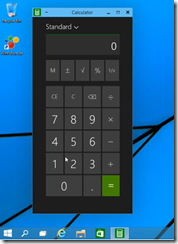
We saw these apps running in desktop windows, in a preview at the Build developer conference earlier this year. The leaked build seems also to have this feature. Check out the video here. Here is Calculator running on the desktop:
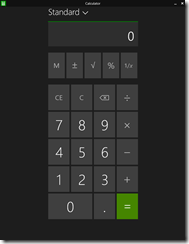
This is the Metro app, not the old desktop calculator. Here it is in Windows 8.1:
Note a big difference though: in Windows 8.1 you can get a window bar to appear along the top, but in Windows 9 there is also a maximize widget at top right of the window (in Windows, this doubles as a “restore down” button when the windows is already maximized).
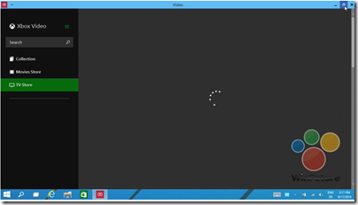
Later in the video, we see this in operation. The user starts the Xbox Video app full screen:
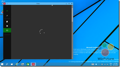
and then hits the “restore down” button:
This is therefore the bridge between the “Metro” and desktop environments. Hit that button, and the full-screen experience becomes a windowed app on the desktop.
In another leaked image, the Charms menu options (a right-edge menu in Windows 8.x) becomes a drop-down window menu, summoned by clicking in the right-hand upper corner. Users often find the Charms menu awkward with mouse and keyboard (I still do) so this will be a more convenient alternative.
Now, although Windows experts can easily see the difference between a Metro app and a desktop app, I doubt that the average user will care. All they will note is that this kind of app requires Windows 8 or 9 to run.
Although this is a diminished target for developers, who may still prefer to write desktop apps that target Windows 7 (or XP) and higher, my guess is that this new UI will make Windows Runtime apps more visible and acceptable for users who live primarily in the desktop – which is most Windows users.
If Microsoft can increase the momentum behind this style of apps, then their benefits will be more apparent too: easy install and uninstall via the Store, low malware risk, and a UI that works well on tablets as well as with mouse and keyboard. This in turn would make more sense of the small Windows tablets from the likes of Toshiba, HP and Lenovo which we recently saw at IFA in Berlin.
There would be a knock-on benefit for Windows Phone, too, thanks to relatively easy porting between the two platforms.
What do you think – is desktop integration enough to rescue the Windows 8 app platform?


I don’t know. I don’t think it needs rescue right now (even if it is Windows 7 (and not 8) the one that is replacing XP.)
On an unrelated note, I don’t miss the Start menu a bit, so I’m glad they have an option for that.