Microsoft is having trouble convincing developers that its new Metro-influenced Visual Studio user interface, in the forthcoming version now in beta, is a good idea.
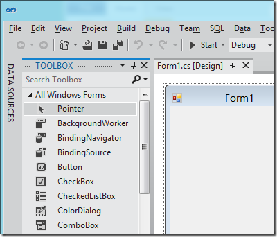
To be more precise, it is not so much Metro, but the way Microsoft has chosen to use it, with toolbox icons now black and white. The change also affects menus such as IntelliSense in the code editor. Here is the new design:
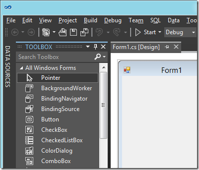
or you can choose a “Dark” colour scheme:
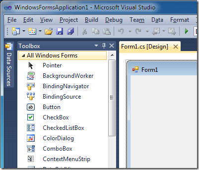
and the old 2010 design for comparison:
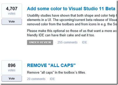
Developers voting on this over at UserVoice, the official feedback site, have made this the single biggest issue, with 4707 votes.
They do not much like the All Caps in the toolbox names either.
Microsoft has marked this as “Under review” so maybe there could yet be a more colourful future for Visual Studio 11.


Thank god it’s not only me. The look sucks.
Luckily we will not get this version, because we ‘just’ started with VS 2010 🙂
I think the whole point of reducing developer distractions has gone way too far. Color and lower/upper-case text actually *HELP* usability – they shouldn’t be considered “distractions”. I this VS11 looks (and feels) AWFUL. Bring back the VS2010 theme!! So those who like the depressing gray themes can have those – and others like me pick the “traditional” distractingly colorful VS2010 theme……
Maybe it’s worth pointing out that this not an April’s fools joke, VS 11 really looks like that. 🙂
I think the stylized look is not unattractive but there’s no reason to completely remove all colors. Icons in particular are much more recognizable with a dash of color.
The button icon inside the TOOLBOX now looks like a textbox! And, the most funny thing about this is that the icon for ColorDialog comes without colors!!!
VS should go for Matrix theme, green with black background lol!
LOL. I thought this was Tim’s April Fool’s post and congratulated myself on realizing it before commenting about the outrageous schemes. Still better than ‘ribbon’s IMO – but what isn’t?
I wouldn’t bash MS for ‘ALL CAPS’ titles, because I strongly feel that this will turn out to be an ‘honest mistake’. (Otherwise I will be very sorry for MS).
::::: MAYBE THIS WAS THE APRIL FOOLS PRANK FROM MS VS FOLKS BUT SOMEHOW THE BETA GOT RELEASED FEW DAYS EARLY :::::::::::::
I’ve gotten used to the new look of VS. I hardly remember all that color again, VS 11 is graceful, fast, fluid and full of functionalities … Color hardly matters now.
The clean look is OK as far as it goes but I keep losing functions because there is no differentiation of the icons and the contrast of icons in the light theme sucks. However, from certain blogs that I read from guys who work for the Beast, it seems that colour will be coming back to the next release of VS11. Thankfully.