How important is the Azure portal, the web-based user interface for managing Microsoft’s cloud computing platform? You can argue that it is not all that important. Developers and users care more about the performance and reliability of the services themselves. You can also control Azure services through PowerShell scripts.
My view is the opposite though. The portal is the entry point for Azure and a good experience makes developers more likely to continue. It is also a dashboard, with an overview of everything you have running (or not running) on Azure, the health of your services, and how much they are costing you. I also think of the portal as an index of resources. Can you do this on Azure? Browsing through the portal gives you a quick answer.
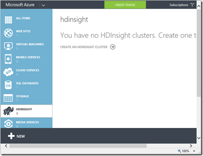
The original Azure portal was pretty bad. I wish I had more screenshots; this 2009 post comparing getting started on Google App Engine with Azure may bring back some memories. In 2011 there were some big management changes at Microsoft, and Scott Guthrie moved over to Azure along with various other executives. Usability and capability improved fast, and one of the notable changes was the appearance of a new portal. Written in HTML 5, it was excellent, showing all the service categories in a left-hand column. Select a category, and all your services in that category are listed. Select a service and you get a detailed dashboard. This portal has evolved somewhat since it was introduced, notably through the addition of many more services, but the design is essentially the same.
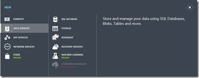
The New button lets you create a new service:
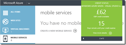
The portal also shows credit status right there – no need to hunt through links to account management pages:
It is an excellent portal, in other words, logically laid out, easy to use, and effective.
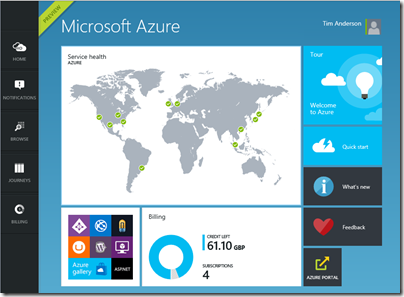
That is the old portal though. Microsoft has introduced a new portal, first demonstrated at the Build conference in April. The new portal is at http://portal.azure.com, versus http://manage.windowsazure.com for the old one.
The new portal is different in look and feel:
Why a new portal and how does it work? Microsoft’s Justin Beckwith, a program manager, has a detailed explanatory post. He says that the old portal worked well at first but became difficult to manage:
As we started ramping up the number of services in Azure, it became infeasible for one team to write all of the UI. The teams which owned the service were now responsible (mostly) for writing their own UI, inside of the portal source repository. This had the benefit of allowing individual teams to control their own destiny. However – it now mean that we had hundreds of developers all writing code in the same repository. A change made to the SQL Server management experience could break the Azure Web Sites experience. A change to a CSS file by a developer working on virtual machines could break the experience in storage. Coordinating the 3 week ship schedule became really hard. The team was tracking dependencies across multiple organizations, the underlying REST APIs that powered the experiences, and the release cadence of ~40 teams across the company that were delivering cloud services.
The new portal is the outcome of some deep thinking about the future. It is architected, according to Beckwith, more like an operating system than like a web application.
The new portal is designed like an operating system. It provides a set of UI widgets, a navigation framework, data management APIs, and other various services one would expect to find with any UI framework. The portal team is responsible for building the operating system (or the shell, as we like to call it), and for the overall health of the portal.
Each service has its own extension, or “application”, which runs in an iframe (inline frame) and is isolated from other extensions. Unusually, the iframes are not used to render content, but only to run scripts. These scripts communicate with the main frame using the window.postMessage API call – familiar territory for Windows developers, since messages also drive the Windows desktop operating system.
Microsoft is also using TypeScript, a high-level language that compiles to JavaScript, and open source resources including Less and Knockout.
Beckwith’s post is good reading, but the crunch question is this: how does the new portal compare to the old one?
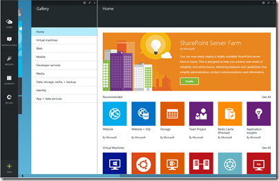
I get the sense that Microsoft has put a lot of effort into the new portal (which is still in preview) and that it is responsive to feedback. I expect that the new portal will in time be excellent. Currently though I have mixed feeling about it, and often prefer to use the old portal. The new portal is busier, slower and more confusing. Here is the equivalent to the previous New screen shown above:
The icons are prettier, but there is something suspiciously like an ad at top right; I would rather see more services, with bigger text and smaller icons; the text conveys more information.
Let’s look at scaling a website. In the old portal, you select a website, then click Scale in the top menu to get to a nice scaling screen where you can set up autoscaling, define the number of instances and so on.
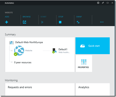
How do you find this in the new portal? You get this screen when you select a website (I have blanked out the name of the site).
This screen scrolls vertically and if you scroll down you can find a small Scale panel. Click it and you get to the scaling panel, which has a nicely done UI though the way panels constantly appear and disappear is something you have to get used to.
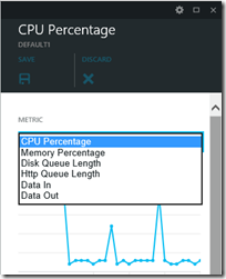
There are also additional scaling options in the preview portal (the old one only offers scaling based on CPU usage):
The preview portal also integrates with Visual Studio online for cloud-based devops.
The challenge for Microsoft is that the old portal set a high bar for clarity and usability. The preview portal does more than the old, and is more fit for purpose as the number and capability of Azure services increases, but its designers need to resist the temptation to let prettiness obstruct performance and efficiency.
Developers can give feedback on the portal here.
Strikes me as a bit architecture astronaut-y.
They appear to be layering on things such as “Journeys” (?!) – where the web already has a solution: URLs, history, etc … Oh look, my back button doesn’t work.
You would have thought they’d used WinJS, digging around with F12 dev tools – doesn’t appear they are.
Thanks, good comment. I don’t get “Journeys” either.
Great link, nails the problems!
Tim
Hey Tim – thanks for the write up and the feedback! We’re still in preview mode – and there are a lot of things we still need to polish up (like journeys, the back button, performance, more services, etc). To Duncan – I assure you many of us spent countless hours digging around in our F12 tools 🙂 If you’re interested in helping us nail some of these things down – would you mind shooting me an email? We’d love to have some conversations on how we make it better.
Thanks for keeping us honest 🙂