I am about to hand back my Surface Pro 3 after a week or so of use – how is it?
I reviewed the Surface on The Register, where I tried to bring out the changed focus of the device, compared to the first two iterations. Surface RT (the first to be released) was released simultaneously with Windows 8 and represented Microsoft’s best effort at creating a device that made Windows 8 work in both its roles, as a tablet controlled by touch and as a laptop replacement. Surface RT runs on ARM and does not allow installation of desktop applications, though with Office pre-installed the desktop is still useful. The first Surface Pro came later and uses the same 10.6" screen and form factor, though because of its more powerful x86 (Core i5) CPU it is thicker and more power-hungry (short battery life). I use both Surface 2 (the second iteration of Surface RT) and Surface Pro regularly so I know the products well.
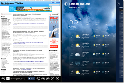
Surface Pro 3 was designed to be a better laptop replacement. It has a larger 12” display and a 3:2 screen ratio, in place of 16:9. The new size feels far more spacious and comfortable for applications like Word, Excel, Photoshop or Visual Studio. It is less obviously suited if you use a horizontally split view, part of the original Windows 8 design concept, but in practice it is such a high resolution screen (2160 x 1440) that it still works OK.
The new display is superb; the only two things I have against it are first, that it is glossy which is a slight annoyance in most environments and a disaster out of doors; and second, that it makes the device larger and therefore less convenient in space-constrained environments like crowded trains if you don’t have a table seat.
There is no one perfect size for a computing device, but Surface 3 is large enough that you will may want to have a smaller tablet with you, such as an iPad Mini or a Google Nexus 7. That said, phones are getting larger, so perhaps a phablet-sized phone and a Surface 3 is a good compromise.
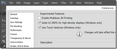
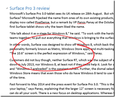
I had to turn on “Experimental features” in Adobe Photoshop to get high-density display scaling and full touch support:
Performance-wise, I have no complaints about Surface Pro 3; it exceeded my expectations. Although the review unit is only a Core i5, it is among the most responsive Windows PCs I have used; of course it helps that the OS is a fresh install. Considering that the Surface will in some circumstances throttle performance anyway, and that heat may be a problem with a higher spec CPU, it seems to me that there is no necessity to get the Core i7 variants for most purposes.
I have not done comprehensive performance tests but did run 3DMark RT on which the Surface Pro 3 scored about 9% better than my old Surface Pro, and the JavaScript SunSpider test on which it was 44% faster. Of course it is a faster Core i5 (1.9 GHz vs 1.7 GHz).
Thanks to Intel’s Haswell design, this performance comes alongside good battery life. The advertised 9 hours is optimistic, but 6 hours plus is realistic. I also noticed that Surface Pro 3 is much better at holding its charge on standby, a common annoyance with older models.
The power connector has been improved to make it both easier and firmer to connect.
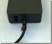
The power supply still has that handy USB power supply built-in; I am often grateful for this.
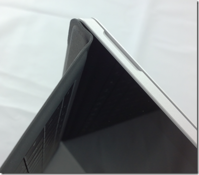
What about the new fold-up keyboard, where the keyboard cover attaches across the bottom of the device to form a stronger hinge?
I am not sure about this one. The benefit is real; it is a firmer attachment and better when you use the Surface on your lap (though I have never really found this hard). It is a compromise though. Support for this feature has pushed the Windows key to the right hand of the screen, where you can easily hit it by accident if using Surface as a tablet in landscape mode. It also makes the taskbar hard to tap. A more subtle disadvantage is that the keyboard cover now has two hinges; you can think of it as a flap with two panels, a large one for the keyboard itself, and a thin one for the fold-up section. When you fold the keyboard to the back of the device for tablet use, this two-panel arrangement means it tends to move about more, it does not fit so snugly. I also prefer the keyboard to be flat on the desk when in tabletop mode, but find that it goes into the fold-up position by default and I have to unfold it.
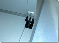
The infinitely variable kickstand is also a mixed blessing. I like the flexibility it offers, but it means you now have to think about where to set it every time, it no longer clicks into place. Since I was happy with the choice of two in the 2nd edition models, the new hinge is little benefit to me, but I do appreciate that for some users it makes all the difference. The hinge does look strong, and hopefully will prove to be enduring.
These are fine details, and even the complaints do not detract from a positive experience overall. That said, whereas the old Surface is truly distinctive, with the new one I find myself asking whether a conventional Ultrabook with a better keyboard and more USB 3.0 ports is a more attractive purchase. It depends, I guess, how much you think you will use Surface Pro 3 in tablet mode.
Talking of tablet mode, the pen that comes with Surface Pro 3.0 is the best tablet pen I have used. It is capable of natural strokes and precise control. If you like inking word documents, for example, this is ideal.
I recognise this; but after years of experimentation have concluded that pen computing is not for me. I find them too easy to lose, and too awkward to use. Tablet in one hand, pen in the other: you are losing the freedom that tablet computing offers.
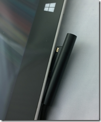
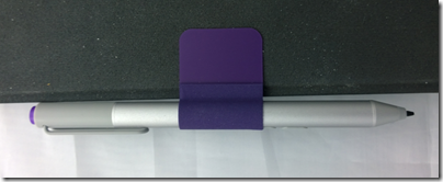
Note also the most clunky aspect of Surface Pro 3.0, which is how you park the pen. The magnetic attachment to the power connector port is hopeless; it falls off in no time. The keyboard loop is better, but my loop has already come off twice, and this will get worse. Time for some superglue? Microsoft should at a minimum make the loop sewn in to the keyboard. Everybody gets a pen, after all, though I also wish it were optional so I could save some money.
Another annoyance is only one USB 3.0 port; if Microsoft could squeeze another one in I would find that useful.
The camera is pretty good but no better than the one on Surface 2 (which is also pretty good); both are 5MP. However it easily beats the 720p camera on the Surface Pro 2. The Surface Pro 3 has a better front-facing camera than Surface 2.
The speakers are better than earlier models too. I am not sure how much this matters, since most of the time you will use a headset or external powered speakers, but sometimes the built-in ones are all you have to hand.
As a long-term Surface user I must not neglect to mention the best feature of the device, which is great portability combined with the ability (in the Pro versions) to run most PC applications. I travel enough to appreciate this greatly; it slips into a small bag and is far more convenient to carry than most laptops. I will never go back to a traditional laptop, though I might be tempted by a conventional Ultrabook; some of these are also relatively slim and light, though not so much as a Surface.
I like the Surface Pro 3 and regard it as decent value for money, given the all-round high quality. There are compromises though, and personally I would like to see Microsoft retain a smaller 10.6" screen model in the range as in some ways that works better for me.
