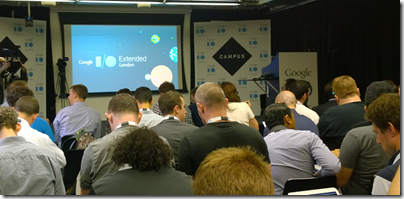
I am not in San Francisco but attended Google I/O Extended in London yesterday, to hear the keynote and a couple of sessions from Google’s annual developer conference.
I found the demographics different than most IT events I attend: a younger crowd, and plenty of start-ups and very small businesses, not at all enterprisey (is that a word?)
The main announcements:
A new version of Android, known as Android L (I don’t know if this will expand eventually to Lollipop or Liquorice or some such). Big release with over 5,000 new APIs, we were told (when does Android start being called bloated, I wonder?). Themes include a new visual style called Material Design (which extends also to the Web and to Chrome), and suitability for more device types including Android TV, Android Wear (smart watches) and Android Auto. A new hardware accelerated graphics API called Android Extension Pack which implements OpenGL ES for better game performance, with support from NVIDIA Tegra. Android graphics performance will be good enough for a considerable subset of the gaming community and we saw Unreal Engine demoed.
Android L does not use Dalvik, the virtual machine that runs Java code. In its place is ART (Android Runtime). This is 64-bit, so while Java code will run fine, native code will need updating.
Google is working hard to keep Android under its control, putting more features into its Play Services, the closed part of Android available only from Google and which is updated every 6 weeks, bypassing the operator obstacle to OS updates. There is also a new reference design including both hardware and software which is designed for affordable smartphones in the developing world: third parties can take this and build a decent Android mobile which should sell for under $100 as I understood it. I imagine this is designed to ward off fractured Android efforts like Microsoft’s Nokia X, aimed at the same kind of market but without Play Services.
There are new Android smart watches on the way, and we saw the inevitable demonstration of a user using voice control to the watch for ordering taxis or pizzas, getting notifications, and sending simple messages.
Voice control demos always seem to be nervous moments for presenters – will they be understood? Unfortunately that uncertainty remains for real users too, as evidenced by Xbox One Kinect which is amazing in that it often works, but fails often enough to be irritating. Voice recognition is a hard problem, not only in respect of correctly translating the command, but also in correctly detecting what is a command (if the person standing next to me shouts “Taxi please” I do not want my watch to order one for me).
The smart watch problem also parallels the TV problem. The appeal of the watch is that it is a simple glanceable device for telling the time. The appeal of the TV is that it is a simple sit-back screen where you only have to select a channel. Putting more smarts into these devices seems to make sense, but at the same time damages that core feature, unless done with extreme care.
Android TV puts the OS into your television, though Google’s messaging here is somewhat confusing in that, on the one hand, Chromecast (also known as Googlecast) means that you can use your Google device (Android or Chromebook) as the computer and the TV as the display and audio system, while on the other hand you can use Android on the TV itself as an all-in-one.
We are inching towards unified home entertainment, but with Google, Microsoft (Xbox One), Sony (PlayStation) and Apple all jostling for position it is too early to call a winner.
Material Design – Metro for Android?
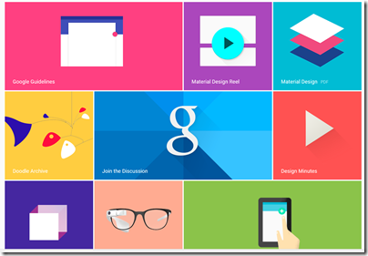
We heard a lot about Material Design, which is Google’s new design style. Google borrowed plenty of buzzwords form Microsoft’s “Metro” playbook, and I heard expressions like “fast and fluid”, clean typography, signposting, and content-first. Like Metro, it also seems to have a blocky theme (we will know when the next design wave kicks in as it will have rounded corners).
Material Design is not just for Android. You can also implement the concept in Polymer, which is a web presentation framework built on Web Components, a standard in draft at the W3C. Support for Web Components (and therefore Polymer) is already in Chrome, advancing rapidly in Mozilla Firefox, probably coming in Apple Safari, and maybe coming in Microsoft IE. However, a JavaScript library called Polyfill means that Polymer will run to some extent in any modern browser.
Whenever IE was mentioned by a presenter at Google I/O there was an awkward/knowing laugh from the audience. Think about what that means.
One of the ideas here is that with a common design concept across Android and web, developers can make web apps (and therefore Chrome apps) look and behave more like Android apps (or vice versa). Again, there is a similar concept at Microsoft, where the WinJS library lets you implement a Metro look and feel in a web app.
Microsoft may have been ahead of Google in this, but it has done the company little good in that adoption for Metro has been weak, for well-rehearsed reasons connected with the smartphone wars, legacy Windows desktop and so on. Google has less legacy weighing it down.
How good is Material Design though? Apple’s Steve Jobs once said of a new OS X design update that it was so good you want to lick it. Metro lacks that kind of appeal, and judging from yesterday’s brief samples, so does Material Design, whatever its other merits in terms of clarity and usability. It is early days though.
Business features: Samsung Knox, Office support, unlimited storage
Google announced a couple of features aimed at business users. One is that Samsung Knox, app sandboxing and data security for business users, has been donated to Google for integration into Android. Another is that Google Docs will get the ability to edit Microsoft Office documents in their native format, removing an annoyance for users who previously had to convert documents to and from Google’s own format when exchanging them with Microsoft Office users.
This seems to be an admission that Microsoft Office is the business standard for documents, and you can take it either way – good for Google because compatibility is better, or good for Microsoft because it cements Office as the standard. There will be ifs and buts of course.
Google is also offering unlimited online storage for business users, called Drive for Work, at $10 per user per month, upping the ante for everyone in the online storage game – Microsoft, Dropbox, Box and so on.
Google’s Cloud Platform
Google showed new features in its cloud platform, with a focus on big data analytics using an approach called Cloud Dataflow. “We don’t use MapReduce any more”, said the presenter, explaining that Cloud Dataflow enables all of us to use the same technology Google uses to analyse big data.
Greg DeMichille, a director of product management for the cloud platform, appeared on stage to show features for in-browser tracing and debugging of cloud applications. I recall DeMichille being much involved in Microsoft’s version of Java back in the days of the battle with Sun; he also had a spell at Adobe getting behind Flash and Flex for developers.
No Wow moments
The Google I/O 2014 keynote impressed in terms of numbers – Android growth continues unabated – and in terms of partners lining up behind initiatives like Android TV and Android Auto. The momentum seems unstoppable and the mass market for mobile and embedded devices is Google’s to lose.
On the other hand, I did not notice any game-changing moments such as I experienced when first seeing the Chromebook, or the Google Now personalisation service. Both of those still exist, of course, but if Android will really change our lives for the better, Google could have done a better job of conveying that message.


I think momentum is a great description. Google is working hard on moving forward. If only that fruit company could put all it’s cash into creating stuff, instead of focusing on squeezing more bucks out of the same old.
If that picture is an example of Material Design then its even MORE ugly than Metro.
I hope Android is not starting to inherit UI ideas from Metro because I absolutely hate the darn thing.
“Whenever IE was mentioned by a presenter at Google I/O there was an awkward/knowing laugh from the audience. Think about what that means.”
Chris Wilson was at one time an Architect on the IE team at Microsoft. He has since moved to Google. While he was at Microsoft working on IE the title of his blog was “Albatross” (http://blogs.msdn.com/b/cwilso/). Presumably “Albatross” was used metaphorically, meaning something like “a psychological burden that feels like a curse”.
With all the grief MS has gotten over the years related to IE, perhaps they aren’t too concerned about IE’s shrinking market share.