The iPhone, or maybe the iPod, was the beginning of the era of usability. Make something nice to use, reasoned Apple, and users will come flocking.
After the iPhone came the iPad; and then Android which while lacking the polish of iOS, mostly has the same characteristics of appliance rather than computer in its user interface.
What about Microsoft? It has learned to some extent. Windows Phone is a user-friendly operating system. The touch interface in Windows 8, although a shock to existing Windows users, shows obvious effort towards usability and sometimes succeeds. Navigating the weather app, for example, is a pleasure.
There are times though when Microsoft seems to have learned nothing. Take the new SkyDrive integration in Windows 8.1 for example. It is foundational in Microsoft’s effort to wrest Windows into being a cloud-centric operating system, where you could lose your device, buy a new one, log in, and find all your stuff. I’ve posted about its progress here.
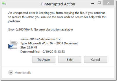
But then you are on a train, say, with a poor internet connection, and you double-click a file in SkyDrive that has not been downloaded to your PC. This is the dialog you see (at least, it is the one I just saw):
There is so much wrong with this dialog that I don’t know where to start. But I will have a go.
First, I doubt the error is really unexpected. If my internet connection is poor, problems downloading stuff from SkyDrive are expected, not unexpected. You would think that the client could figure out, “It looks like I have a poor connection to SkyDrive” and inform the user accordingly.
Second, the error number. The dialog invites me to search for help using this number; however to do so I would have to copy it manually as it is unselectable. The number of course is in hexadecimal, so there is a high chance of copying an O instead of a zero as the difference is not obvious other than to programmers. Nor is it clear where I should search. Should I bang the number into Bing and hope for the best? Such searches can be fruitful, but they can also go badly wrong when you hit sites that tell you to download their utility to clean your registry, or some such nonsense.
Third, there is space for a human-understandable description of the error, but it is says “No error description available”. Lazy programming somewhere. Maybe in a code base the size of Windows it is too much to expect helpful messages for every error but this is not something users should normally see.
Fourth, there are three choices: Try Again, Skip and Cancel. Bearing in mind that I double-clicked only one document, what is the difference between Skip and Cancel?
Fifth, there is a More details button but it is disabled. Why, if no more details are available, does this More details button appear at all? Though I’d suggest that Error 0x80040A41 is a great candidate for “More details” rather than being something non-technical users are expected to make sense of.
What should happen? First, SkyDrive and/or its client should work better. This is a critical feature; but users are complaining (yes, I found this by searching for the error code) and it seems that problems persist in Windows 8.1 RTM. Microsoft has been working on file sync for decades, yet upstarts like Dropbox work more smoothly.
Second, when bad things happen, I am all in favour of plain English. I don’t see any reason ever to confront users with error numbers in hex. Put it in a technical details option by all means. In this particular case, why not something like, “Windows is having problems downloading from SkyDrive. You may have a poor internet connection; please try again later, and if the problem persists, contact support.”
Getting this right is not easy; but for as long as ordinary users see this kind of dialog in day to day use of Windows, the flight to iPad and Android will continue.
Update: the error fixed itself when I found a better connection

This is what happens when you have lazy technical people developing apps (developers, managers, leads, program managers, QA testers) It would have took 2 secs to write code that says:
if (!internetconnection)
MessageBox.Show(“You cannot copy the file at this time. Once an internet connection is available , try again. Thank you.”);
Instead some MIT grad, MS developer wrote:
try
{
CopyFile();
}
catch(Exception e)
{
MessageBox.Show(e.message);
throw e;
}
To be fair, I think the problem here was that a connection existed, but it was too poor to work well (suggesting, though, that whatever protocol SkyDrive is using is not as robust as it should be).
Amen! Please, post a link to your article in a Microsoft forum that gets read by the SkyDrive development team. No, better yet, email it to Steve Ballmer while he’s still there. While you’re at it, you might as well post this link http://mashable.com/2008/06/25/bill-gates-email/ just to remind them. I agree with you that they’ve improved but these types of oversights are incomprehensible, specially after all these years. Good article!
Thanks for explaining the error code
I’m an ordinary user who installed 8.1 Preview and now have to reinstall almost everything from scratch.
Microsoft makes healthcare.gov look good.