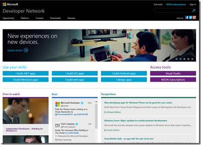
Microsoft has updated its developer site, MSDN (Microsoft Developer Network). Simple, relevant and community driven, says Product Manager Brian Harry in a post introducing the new site.
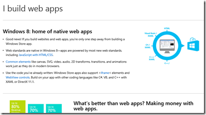
Developers are not convinced that it is an improvement. The comments to Harry’s post are pretty damning, in fact. The core complaint is that the new MSDN home page is not a developer site, but a marketing site. Click on those “Use your skills” buttons and you get not technical references, but marketing pitches. They are misleading too. Click on “I build web apps” and you get a pitch for Windows Store apps build with HTML and JavaScript – and no mention of ASP.NET or Windows Azure.
What do developers want? Here’s a good suggestion:
Why don’t you have your team work on changes to MSDN that people would actually want? Like editable blog comments with formatting and code snippet options? Or Connect/UserVoice sites that aren’t horrific and disjointed? Or adding the TypeScript blog to the Dev Tools blog feed (something I’ve mentioned a half dozen times already to various people at MS, you’d think this 5 second update might make it into someone’s queue after TypeScript being out for almost a year now)?
I just cannot fathom how you guys are so adamant that listening to developers is important to you when 99% of feedback is ignored in lieu of changes that no one asked for and no one wants.
Most people come to MSDN in search of technical information. I suspect the strong marketing pitch for Windows Store apps will be counter-productive.
On the other hand, present developers with a fast, coherent, logically organised technical resource so that you can easily find both the API reference for the platform you are targeting, and comments and help with using it, and this will attract them and make them want to use the platform more often.


Yeah, when I go to MSDN I want either (1) “the downloads” or (2) “the documentation”. Either way I’ve committed $$ to Microsoft at this point and don’t need further convincing, thanks.
I end up on (1) “the downloads” by fumbling around for “subscriptions” or “benefits” links for a while because they keep moving it around, and I usually end up on (2) “the documentation” via a link from “the Google” because I’ve never found a more direct path.
I suspect that what you’re seeing here is the end result of the recent DPE (the division that focuses on developer content and marketing) leadership shuffle with the usual need to make fast changes to be seen to be effective.
Also strongly suspect that we’re seeing the result of the strict focus DPE has on driving out apps, rather than supporting the broader developer community. Shame.
Actually when you go to ‘I build web apps’ it does give you the asp.net reference.
I liked the new MSDN, it’s not perfect but it’s better then before.
Ignore the marketing thing and click on the Develop tab right away.
People are always complain whenever there’s a change, remember the noise when the new vs2012 came out? people were whining that the monochrome skin is useless, the button’s font is too large, etc., 6 month later every body likes the vs2012 and complain about the vs2013 preview.
It does now, it didn’t when I wrote this piece 🙂
Tim
> 6 month later every body likes the vs2012
Except for the ones who stopped using Visual Studio and don’t care anymore.
Change is not always for the better. Look at what Windows has become? Colored tiles.
How about Windows 9 having ‘monochrome’ tiles with all caps text? Yummy.