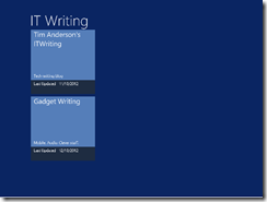
A while back I adapted a sample application in order to create an app for Windows 8. I am mulling over putting it in the Windows Store, but it needed some work. In particular, I wanted to add a Twitter feed to the front page. There is plenty of space:
Sounds easy; but inspecting the layout code I realised that I did not understand it all that well at first.
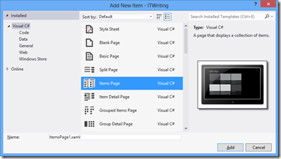
It is based on the Items Page template in Visual Studio 2012, and there is a fair amount going on in that template:
- The contents are data-bound, which is great at runtime but inconvenient at design time as the page is empty.
- The contents are layout-aware which means that they account for the four views possible in a Windows Runtime app: landscape, portrait, snapped, and filled. The “filled” name is a little misleading; this is an app which occupies most (but not all) of the screen when another app is snapped to one side.
- The page uses resources and templates for its element styling, which are defined either in the page itself, or in StandardStyles.xaml which resides in the Common folder in your project (added automatically in projects which use the ItemsPage template).
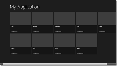
It’s worth adding some dummy data early on so you can see what the page really looks like:
For example, imagine that you want to use a smaller item size that the default 250 x 250 size. Proceed as follows:
- Copy the DataTemplate called Standard250x250ItemTemplate from StandardStyles.xaml. Place it in the Page.Resources section of ItemsPage1.xaml (or whatever you called your ItemsPage). Rename it to, say, “MyItemTemplate”.
- Modify it to use a smaller size. You will probably want to adjust the bound elements as well, plus change the references to the standard Brush elements like ListViewItemPlaceholderBackgroundThemeBrush as well.
Here is how the page looks with the space for the image removed, the DataTemplate height set to 50, and the height of the bound Title field set to 20:
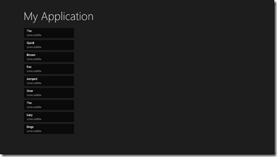
Note that this template is not used by the Snapped view. For that, you will need to copy and modify the Standard80ItemTemplate, or make your own template suitable for an item in the Snapped view.
The code that determines which templates are used in which state is in the VisualStateManager.VisualStateGroups element. This has a Storyboard animation for the Portrait and Snapped views. The way this works:
- The default view is landscape. This is why in the XAML there is a GridView called itemGridView which is visible, and a ListView called itemListView which is hidden (Visibility="Collapsed").
- In the Snapped view there is only room for a single-column list, not the grid. Therefore the Storyboard for the Snapped view sets the itemListView to visible and the itemGridView to hidden.
- When you change back to a non-Snapped landscape view, the layout reverts to the default. Code for this in in LayoutAwarePage.cs, also in the Common folder.
After working this out I was better able to adapt my own page. More on that another time!


