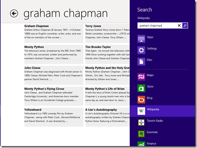
I have been poking around in the Windows Store as the public launch of Windows 8 approaches, and was intrigued by the reviews for the Wikipedia app, which is nicely done. Several users complain about the lack of a search function:
In fact the Wikipedia app has excellent fast search, on the Charms bar:
The problem: when you open the Wikipedia app there is no visual clue of where to find Search. Even if you have figured out that you need to right-click, or swipe up, to show the menu bar, it does not show a Search option.
The Wikipedia app developers have done the design correctly, in terms of Microsoft’s guidelines. This is the “Immersive user interface” which shows content rather than distracting UI furniture.
Another advantage of having Search on the Charms bar is that you are just a tap away from performing the same search in other apps, such as Internet Explorer.
The concept fails though if users simply do not discover key functions. What is the use of an encyclopaedia without search?
It does not help that the Charms bar, which is where Search lives, is hard to summon with the mouse. It is OK on a tablet (swipe from the right) or with the keyboard (Windows Key + Q). With the mouse, you have to position the pointer vaguely in the top or bottom corner and wait for Charms to fade into view if you have done it correctly. It is a vague movement with no feedback that you have initiated an action, like a button that does not click.
I presume though that as users live with Windows 8, Windows Key + Q will become natural when looking for a Search function (hah!). It is fair to say though that the UI does not score highly for discoverability.


I had this same problem with the Mail app initially, staring dumbfounded at a blank white screen. Even though I know that the Charms bar exists, I keep assuming that it is for system-level functions only, and am surprised when things like Search or Settings work on the application level.
Win+F should focus the app that you are currently in – for some reason it still focuses on files.
Clarification: Win+F for “Find” brings up the same search as the charm tools do.
@Lars WIn+F is Find in Files. Win+W is Find in Settings. Win+Q is Find in Apps (default is the current app).
“shows content rather than distracting UI furniture”.
It’s like the living room of someone obsessed with preventing “clutter”. Hardly anything is visible. It makes it easy to move around in the overall space, but when you need to find item X quickly, but it is buried in a closet, it might take several tries to figure out which closet.
“With the mouse, you have to position the pointer vaguely in the top or bottom corner and wait for Charms to fade into view if you have done it correctly. It is a vague movement with no feedback that you have initiated an action, like a button that does not click.”
To quibble, you don’t actually have to wait for the charms to fade (or rather slide) into view (or “hover” in the corner while they do). It works much better if instead you “swoop around the corner” in one continuous motion. This is not only faster, but also feels nicer and is more reliable because the momentum from moving to the corner will continue and prevent you from falling out of the edge.
Thanks, good tip, though I fell off the edge a couple of times 🙂
I use two computers that share a single keyboard and mouse, so if I move my mouse to the right-hand edge of my main computer monitor (on the left), it simply switches to the secondary computer monitor on the right. The search charm is really hard to activate.
Neil: Are you using Mouse Without Borders, or InputDirector, or Synergy?
You should file a bug to update the software for Windows 8. The behavior should be changed to match the single-PC multimon scenario, in which the corners are “sticky.”
(That having been said, I long ago gave this sort of multi-PC shared-input setup as not worth the trouble. Would rather have the extra monitors on the primary machine. Remote desktop works well enough for everything except high-performance graphics.)